If you want to look up the price of gold or silver, you can do that easily through a quick Google search. But did you know that you can also import prices right into Excel? With the help of Power Query, I’m going to show you how that’s possible.
Start by getting access to an API
There isn’t a built-in Excel function that pulls in the price of gold or silver. But we can use an API connection to get that in. I suggest using alphavantage.co, where you can get a free API key. You can pull up to 25 requests per day. After that, you’ll have to wait until the next day. But at the very least, you can refresh several times over the course of a day. If you need more frequent updates, you can also choose from paid plans.
If you go with an API service, then you’ll need to refer to their documentation on how to reference and pull data. In the case of Alpha Vantage, it gives the following URL as an example of how you would pull in silver prices:
I’ve bolded the parts that you would change. If you want to pull the price of gold, simply change the value that is bolded above, from SILVER to GOLD. You’ll also need to change the demo API key to the one that you’ve set up.
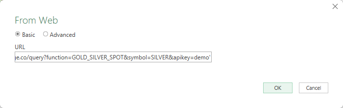
This link can then be used in Power Query.
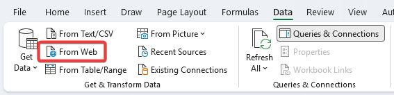
Click on the From Web button in the Data tab, which will give you a place to paste the URL into:
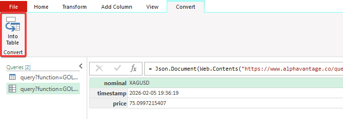
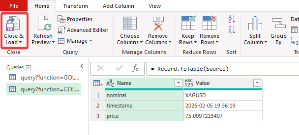
This will now open up Power Query and allow you to see what the data looks like:
After clicking on the option to convert into a table, you’ll now see the ability to Close & Load, which will download the data into Excel:
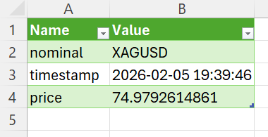
Doing this will create a new tab on your spreadsheet, with the following data now displayed in a table format:
To refresh the data, click the Refresh All button in Excel, or right-click the table and select Refresh.
How to import both gold and silver prices in a combined query
You can create a second query to pull in the price of gold, but there’s also another option: a combined query. This will allow you to set up multiple queries at once and, through a single refresh, pull in both data points.
The one hitch is that with Alpha Vantage, you can make only one request per second, so you’ll need to wait before initiating the second data pull. This, too, however, can be coded within Power Query.
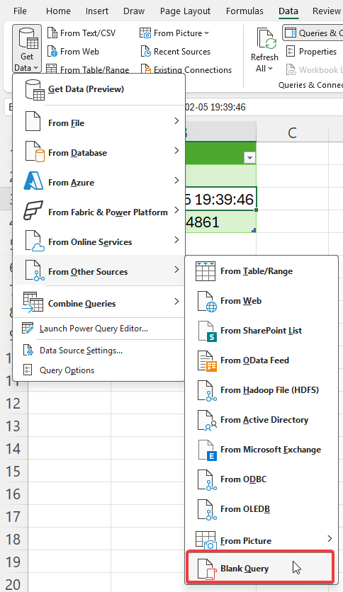
Let’s get back into Power Query to do this. From the Get Data option, select the button that allows you to create a Blank Query:
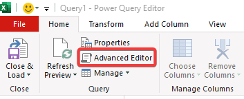
Then, click on the option to go straight into the Advanced Editor:
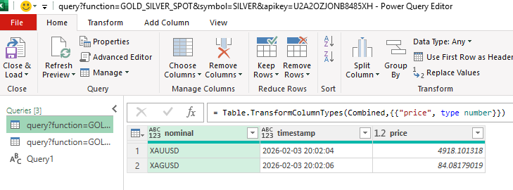
By doing this, you can now enter Power Query code, rather than going step by step. Here is the code that you can use to pull in both the price of gold and silver from Alpha Vantage:
let
    ApiKey = "YOURAPIKEY",

    FetchData = (symbol) =>
        let
            Source = Json.Document(Web.Contents("https://www.alphavantage.co/query?function=GOLD_SILVER_SPOT&symbol=" & symbol & "&apikey=" & ApiKey))

        in
            Source,

    Gold = FetchData("XAU"),

    Silver = Function.InvokeAfter(() => FetchData("XAG"), #duration(0, 0, 0, 2)),

    Combined = Table.FromRecords({Gold, Silver}),
    #"Changed Type" = Table.TransformColumnTypes(Combined,{{"price", type number}})
in
    #"Changed Type"
Note that you’ll need to put in your own API key at the beginning. But with this code, it’ll wait a couple of seconds before running the second query. And at the end, you have both gold and silver prices in a table:
If you liked this post on How to Get Gold and Silver Prices Into Excel, please give this site a like on Facebook and also be sure to check out some of the many templates that we have available for download. You can also follow me on X and YouTube. Also, please consider buying me a coffee if you find my website helpful and would like to support it.
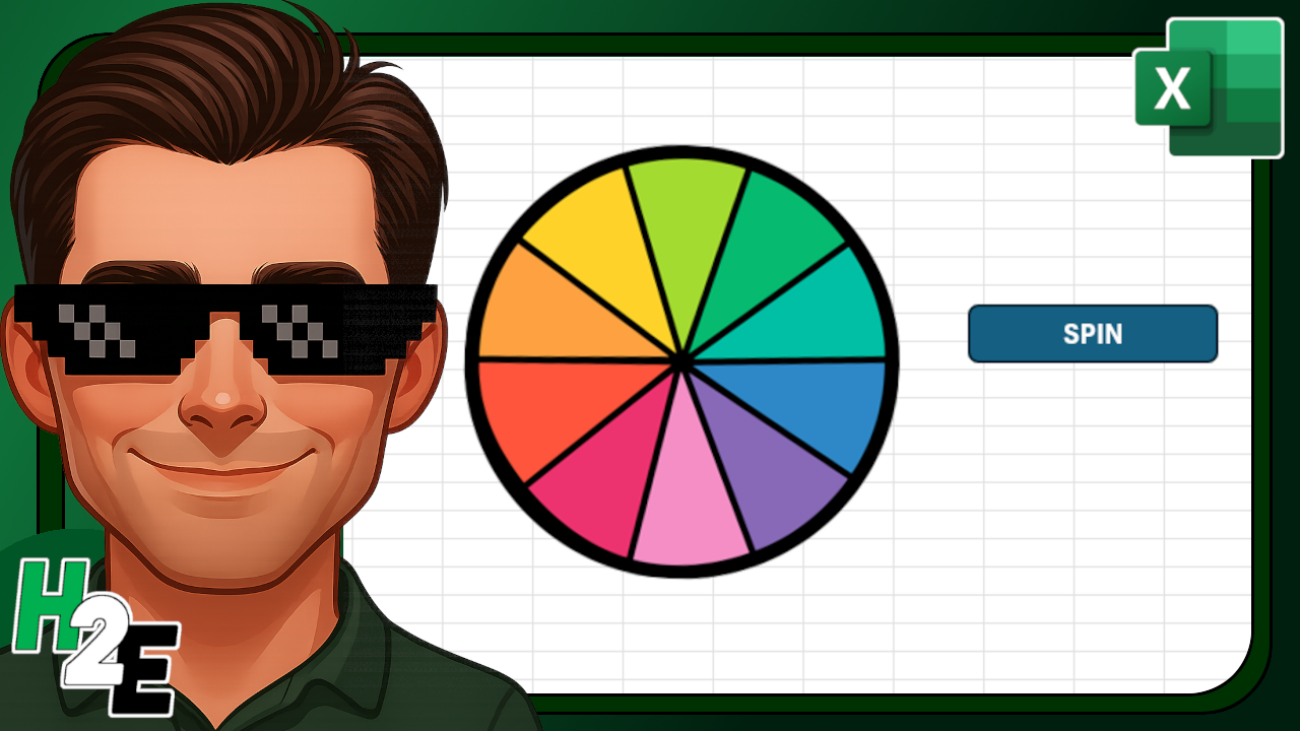
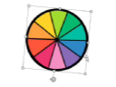
Do you want to create a spinning wheel like in the video below?
In this post, I’ll show you how you can do this, with the help of visual basic. There are a couple of ways you can create a spinning wheel effect. I’ll go over both approaches, and share the code with you so that you can set it up in your own spreadsheet.
Create a spinning wheel effect by rotating an object
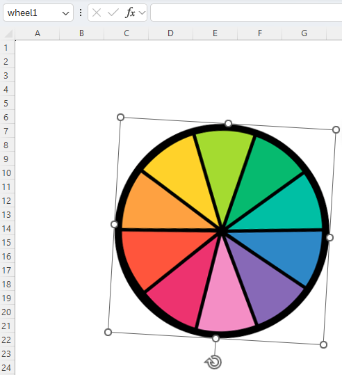
The easiest way to spin a wheel, or any object for that matter, is to rotate it. This can be done in visual basic. Before you get started, however, you need to know the name of the shape that you want to spin.
In the above screenshot, I have inserted a wheel into my spreadsheet, but you can use any image. In the top-left-hand corner, you’ll notice it says wheel1 — this is the name of the object. You change this to whatever you want. However, this is what you’ll need to reference in the macro when applying the spin effect.
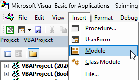
Now, go into visual basic. This can be done using ALT+F11 shortcut. Then, you’ll need to go to the Insert option from the menu and click on Module.
Then in Module 1, copy the following code in:
Sub SpinEffect()
    Dim i As Long
    Dim wheel As Shape
    Set wheel = ActiveSheet.Shapes("wheel1")

     For i = 1 To 100 Step 1
        wheel.IncrementRotation 5
        DoEvents
    Next i


     For i = 1 To 100 Step 1
        wheel.IncrementRotation 3
        DoEvents
    Next i


     For i = 1 To 100 Step 1
        wheel.IncrementRotation 2
        DoEvents
    Next i


     For i = 1 To 500 Step 1
        wheel.IncrementRotation 1
        DoEvents
    Next i
End Sub
At the beginning of the code, I specify the name of my object — wheel1. This is where you need to update the code to reflect the name of your object.
The rest of the code is going through a series of loops. The first one is rotating the image by 5 degrees, then 3 degrees, then 2, and finally 1. The last loop goes through 500 steps and is the longest. You can adjust these to change the speed of the wheel’s rotation.
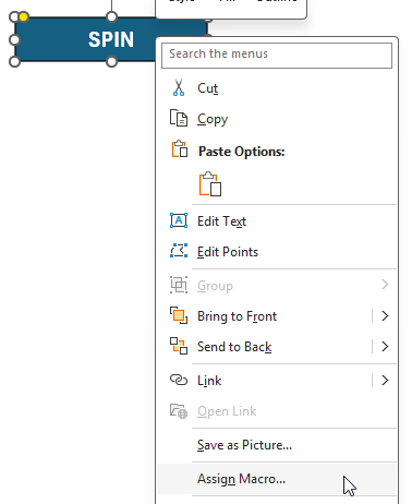
You can also insert a shape that links to this macro, so that it effectively becomes a button. In my example, I created a rectangle and added the text ‘SPIN’ onto it. If you go to the Insert menu on the Excel ribbon and select Shapes, you can create your own.
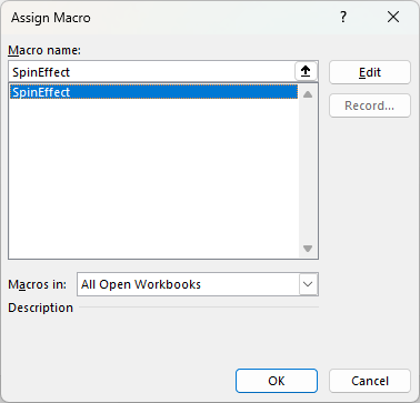
Once you’ve created a shape, you can assign a macro to it by right-clicking on the shape and selecting Assign Macro.
Then, select your macro and click on OK.
Now, anytime you click on the button, the macro will run, and your object will spin.
The one limitation about this method is that there is no way to know which value your wheel landed on. It spins, but there is no easy way to determine what it landed on. This is where the second method comes into play.
Creating a spin effect by changing visibility
This method is a bit more complex, but it addresses the main issues from the first approach, which is that you’ll known which value was selected.
I’m going to use the same wheel, but this time I’m going to make nine copies of it — one for each possible outcome. I will do the rotations myself and then just toggle the visibility using code. The setup can be a bit more tedious here because you’ll need to make sure the objects are on top of one another and that the rotations are precisely in the right position.
You’ll have to do this for each rotation and each object. You’ll also want to name each individual object so that you know which value it corresponds to.
Once the objects are all aligned, then you can insert the following code:
#If VBA7 Then
    Public Declare PtrSafe Sub Sleep Lib "kernel32" (ByVal dwMilliseconds As LongPtr)
#Else
    Public Declare Sub Sleep Lib "kernel32" (ByVal dwMilliseconds As Long)
#End If

Sub spin()

Dim wheel1 As Shape
Dim wheel2 As Shape
Dim wheel3 As Shape
Dim wheel4 As Shape
Dim wheel5 As Shape
Dim wheel6 As Shape
Dim wheel7 As Shape
Dim wheel8 As Shape
Dim wheel9 As Shape
Dim wheel10 As Shape

Set wheel1 = ActiveSheet.Shapes("wheel1")
Set wheel2 = ActiveSheet.Shapes("wheel2")
Set wheel3 = ActiveSheet.Shapes("wheel3")
Set wheel4 = ActiveSheet.Shapes("wheel4")
Set wheel5 = ActiveSheet.Shapes("wheel5")
Set wheel6 = ActiveSheet.Shapes("wheel6")
Set wheel7 = ActiveSheet.Shapes("wheel7")
Set wheel8 = ActiveSheet.Shapes("wheel8")
Set wheel9 = ActiveSheet.Shapes("wheel9")
Set wheel10 = ActiveSheet.Shapes("wheel10")

Dim i As Integer, j As Integer, cycle As Integer
    Dim winningNumber As Integer
    Dim delay As Long

    winningNumber = Int((9 * Rnd) + 1)

    ' 1. Initial Reset
    For i = 1 To 10
        ActiveSheet.Shapes("wheel" & i).Visible = msoFalse
    Next i

    ' --- STAGE 1: FAST (10 Cycles) ---
    delay = 10
    For cycle = 1 To 10
        For j = 1 To 10
            ActiveSheet.Shapes("wheel" & j).Visible = msoTrue
            DoEvents
            Sleep delay
            ActiveSheet.Shapes("wheel" & j).Visible = msoFalse
        Next j
    Next cycle

    ' --- STAGE 2: MEDIUM (10 Cycles) ---
    delay = 30
    For cycle = 1 To 10
        For j = 1 To 10
            ActiveSheet.Shapes("wheel" & j).Visible = msoTrue
            DoEvents
            Sleep delay
            ActiveSheet.Shapes("wheel" & j).Visible = msoFalse
        Next j
    Next cycle

    ' --- STAGE 3: SLOW (10 Cycles) ---
    delay = 40
    For cycle = 1 To 10
        For j = 1 To 10
            ActiveSheet.Shapes("wheel" & j).Visible = msoTrue
            DoEvents
            Sleep delay
            ActiveSheet.Shapes("wheel" & j).Visible = msoFalse
        Next j
    Next cycle


    ' --- STAGE 4: SLOW (10 Cycles) ---
    delay = 50
    For cycle = 1 To 10
        For j = 1 To 10
            ActiveSheet.Shapes("wheel" & j).Visible = msoTrue
            DoEvents
            Sleep delay
            ActiveSheet.Shapes("wheel" & j).Visible = msoFalse
        Next j
    Next cycle


    ' --- STAGE 5: SLOW (10 Cycles) ---
    delay = 60
    For cycle = 1 To 10
        For j = 1 To 10
            ActiveSheet.Shapes("wheel" & j).Visible = msoTrue
            DoEvents
            Sleep delay
            ActiveSheet.Shapes("wheel" & j).Visible = msoFalse
        Next j
    Next cycle


    ' --- FINAL LAP: STOP ON WINNER ---
    ' Even slower for the "crawl" to the finish line
    delay = 70
    For j = 1 To winningNumber
        ActiveSheet.Shapes("wheel" & j).Visible = msoTrue
        DoEvents
        Sleep delay

        ' Only hide if it's not the final winning shape
        If j < winningNumber Then
            ActiveSheet.Shapes("wheel" & j).Visible = msoFalse
        End If
    Next j

    MsgBox "The wheel stopped on Wheel " & winningNumber & "!"

End Sub
This code is longer and how it works is it determines the winning value at the beginning, based on a random number generator. Then the macro goes through loops to change the visibility of all the wheels, eventually revealing the winning one at the end.
If you liked this post on How to Create a Spinning Wheel in Excel, please give this site a like on Facebook and also be sure to check out some of the many templates that we have available for download. You can also follow me on X and YouTube. Also, please consider buying me a coffee if you find my website helpful and would like to support it.
A weighted average is a type of average that assigns different weights or values of importance to each element in a dataset. Unlike a simple average that treats all elements equally, a weighted average adjusts the contribution of each element based on its relative significance. This means that some elements have a greater impact on the final result than others, depending on their weights.
Why use a weighted average?
Weighted averages are useful because they provide a more accurate representation of the data by taking into account the importance of each element. For example, in financial analysis, a weighted average may be used to calculate the average interest rate of a portfolio of loans or investments, where the weight of each loan or investment is based on its size or duration. In schools, a weighted average may be used to calculate a student’s overall grade by assigning different weights to assignments, quizzes, and exams based on their importance or difficulty. Anytime you don’t want everything to have the same weighting or importance is when you’ll want to use a weighted average.
Calculating a simple weighted average in Excel
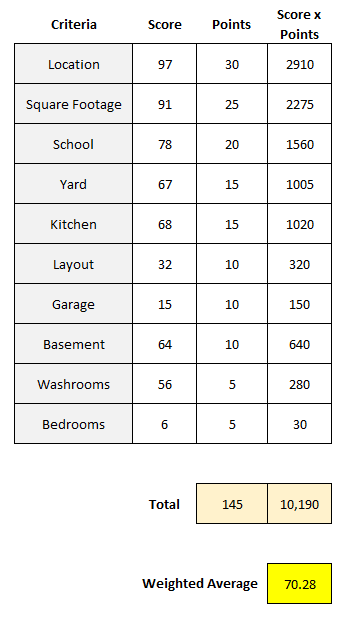
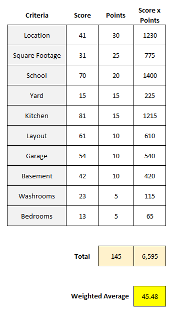
A common way to apply a weighted average is by using a points system. Suppose you are looking to buy a house and have many different criteria that you want to take into consideration, such as square footage, location, if it has a basement, etc. But not all of these items are equally important, and so you may want to say that location is worth 30 points and square footage is worth 25 points, and so on.
The first step is to assign a weight, or point value, to each one of these criteria. Then, assign a score to each one of them criteria, perhaps within a range of 1 to 100. Once you’ve done that, you multiply the score by the points. Total that up, and divide it by the total points, and you’ve got your score, or weighted average. Here’s an example:
This particular house scored high on the most important items, and thus, resulted in a high weighted average. The total of the score x points column was 10,190. Taking that value and dividing it by 145, the total points, results in a weighted average of 70.28.
Here’s another house, which scores far lower, with a weighted average of just 45.48:
Although it scored high on areas such as school and kitchen, because of its low scores on the top two weightings — location and square footage — that kept its weighted average down.
Creating a template like this in Excel and comparing your different scores can be a way to help compare houses and other things, while giving each criteria an appropriate weighting. By simply scoring everything on a value of 1-100 without weighting, the problem would be that each criteria would effectively be equal, saying that things like layout and the garage are just as important as the location and size of the house, which most people likely wouldn’t agree with. By using weights, you can better take into account the value of each individual criteria.
Calculating grades using weighted averages
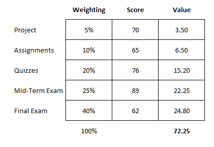
Another use for calculating weighted averages is when it comes to grading. In a class, you might have a specific weighting scale that says assignments are worth 10% of your grade, quizzes are 20%, a project is worth 5%, a mid-term is 25%, and the final exam accounts for 40%.
In this case, you’re using percentages that add up to 100% rather than weights, which may be more subjective. This still works in largely the same way as you are multiplying a score by the weight. Except now, since the weights add up to 100%, you don’t need to worry about taking the total and dividing it by the total weights. Whatever your result is, that is the total score. Here’s an example of how a student scored in a class:
When using percentages for weighting, it’s important to double check they add up to 100% to ensure everything is accounted for. In this example, the student had a score of 72.25, which would be the same as saying they scored 72.25%, which would be their grade for the course. As you’ll notice, the student’s high scores on the quizzes and mid-term exam were unfortunately offset by a poor final exam mark.
In this example, since we’re just looking at percentages, you can do without the extra column for value, which takes the weight x the score. Instead, you can use SUMPRODUCT. If the weightings are in cells A2:A6 and the scores are in B2:B6, the grade can be calculated with the following formula:
=SUMPRODUCT(A2:A6,B2:B6)
The formula will multiply each value by the corresponding value in the same row, thereby eliminating the need to use an extra column. By using an Excel formula, you can save yourself the extra step of having to tally up the values and then dividing them by their weights again.
If you liked this post on How to Calculate Weighted Average in Excel, please give this site a like on Facebook and also be sure to check out some of the many templates that we have available for download. You can also follow me on Twitter and YouTube. Also, please consider buying me a coffee if you find my website helpful and would like to support it.
Pivot tables are one of the most powerful tools in Excel and Google Sheets, allowing users to quickly analyze and summarize large datasets. This article will provide a comprehensive guide to pivot tables, including advanced features and common troubleshooting tips.
What is a Pivot Table?
A pivot table is a data summarization tool that is used in the context of data processing. Pivot tables can automatically sort, count, and total data stored in one table or spreadsheet and display the summarized data. This makes them invaluable for data analysis tasks, especially when dealing with large datasets.
How to Create a Pivot Table in Excel
Creating a pivot table in Excel is straightforward:
Select the range of data you want to analyze.
Go to the Insert tab and click on PivotTable.
Choose where you want the pivot table to be placed.
Drag and drop fields into the Rows, Columns, Values, and Filters areas to organize your data.
TIP: You can use ALT+N+V+T as a shortcut to create a pivot table in Excel instead of going through the Insert tab.
In some cases, you may have a data set which shows as a summary and with important fields going across horizontally rather than vertically. That can be challenging, but you can use Power Query to help you flip your data into a tabular format, which can be more useful for data analysis.
If you are have multiple worksheets, then you don’t have to create one pivot table for each of them. Instead, you can combine them together with the help of Power Query. By doing so, this can drastically make your data analysis more efficient by having multiple sheets linked into just one pivot table, where you can easily slice and dice data. And with Power Query, it’s easy to trigger a refresh.
Working with Dates in a Pivot Table
Dates are a common type of data that often require special handling in pivot tables. Analyzing date-related data can provide valuable insights into trends, seasonality, and performance over time. One of the most powerful features of pivot tables is the ability to group dates into various intervals such as months, quarters, and years. This can make your data analysis more effective, especially when dealing with long periods.
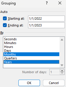
Grouping Dates in a Pivot Table
Grouping dates allows you to summarize data on a periodic basis. This is particularly useful for identifying monthly trends and patterns, such as sales performance or seasonal variations. To group dates in a pivot table, follow these steps:
Right-click on any date in the pivot table.
Select Group from the context menu.
In the Grouping dialog box, select how you want to group your dates.
Click OK.
This is a great way of grouping your existing data. But you can also add to your data by creating calculated fields, which can take your pivot table to the next level.
Creating Calculated Fields in a Pivot Table
Calculated fields in pivot tables allow you to perform custom calculations on the data within your pivot table. This feature is invaluable for creating new metrics, combining existing data in meaningful ways, and enhancing your data analysis capabilities without altering the original dataset.
A calculated field is a new field that you add to your pivot table, which derives its value from performing calculations on other fields in the pivot table. For example, you can create a calculated field to calculate profit by subtracting costs from revenue or to determine the percentage change between two periods.
How to Add a Calculated Field
Here are the steps to create a calculated field:
Go to the PivotTable Analyze tab.
Click on Fields, Items & Sets in the Calculations group.
Select Calculated Field from the dropdown menu.
Define the Calculated Field:
In the Insert Calculated Field dialog box, enter a name for your new field in the Name box.
In the Formula box, enter the formula you want to use. You can use standard arithmetic operations (e.g., +, -, *, /) and reference other fields by their names.
For example, to calculate profit, you might enter a formula like =Revenue - Costs.
5. Click Add and then OK to insert the calculated field into your pivot table.
Benefits of Using Calculated Fields
Custom Metrics: Create specific metrics tailored to your analysis needs, such as profit margins, growth rates, or weighted averages.
Dynamic Analysis: Calculated fields update automatically as you change the layout or filter data within your pivot table.
Enhanced Insights: Combine data from different fields in new ways to uncover deeper insights and trends.
Tips for Using Calculated Fields
Use Descriptive Names: Give your calculated fields clear and descriptive names to make them easily identifiable in your pivot table.
Test Your Formulas: Ensure that your formulas are correct and yield the expected results by testing them with sample data.
Avoid Overcomplicating: Keep your calculated fields as simple as possible. Complex calculations can be harder to manage and troubleshoot.
By mastering calculated fields, you can significantly enhance the analytical power of your pivot tables, allowing for more sophisticated and insightful data analysis. You can even add IF statements to a pivot table with the help of calculated fields.
After leveraging calculated fields to generate custom metrics and enhance your data analysis, the next step is to efficiently filter and explore your pivot table data. This is where slicers come into play, offering an intuitive and interactive way to refine your data views and focus on specific subsets of information.
Setting Up Slicers in a Pivot Table
Slicers provide a user-friendly way to filter data in pivot tables, making it easier to view and analyze specific subsets of your data. They are particularly useful for interactive dashboards and reports, allowing users to quickly change the data displayed without modifying the underlying pivot table.
What is a Slicer?
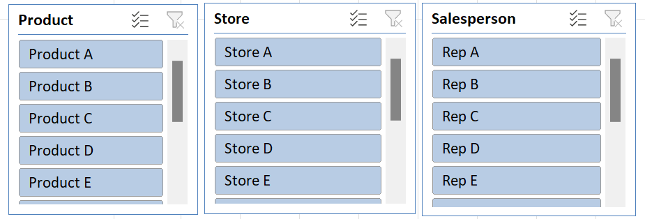
A slicer is a visual filter in the form of a button that allows you to filter pivot table data quickly. Slicers make it easy to filter data by simply clicking on the values you want to include or exclude, providing a more intuitive and interactive way to work with your pivot tables. This is similar to how you would filter your data on a table by using drop-down options; slicers simply make the process easier.
In the PivotTable Analyze tab, click on Insert Slicer in the Filter group.
The Insert Slicers dialog box will appear, listing all the fields available in your pivot table.
Select the fields you want to use as slicers. You can choose multiple fields if needed (e.g., Product, Store, Salesperson).
Click OK to add the slicers to your worksheet. Each selected field will have its own slicer.
Using Slicers to Filter Data
Once slicers are added to your worksheet, you can use them to filter your pivot table data:
Filter Data: Click on the buttons within the slicer to filter the data. Each button represents a unique value from the field you selected.
Multi-Select: To select multiple values, hold down the Ctrl key (or Cmd key on Mac) while clicking on the slicer buttons.
Clear Filters: To clear all filters applied by a slicer, click the Clear Filter button (a small filter icon with an X) in the top right corner of the slicer.
Benefits of Using Slicers
User-Friendly: Slicers provide a simple, visual way to filter data, making it easy for anyone to use, even those unfamiliar with pivot tables.
Interactive Reports: Slicers are perfect for interactive dashboards and reports, allowing users to dynamically filter data and gain insights quickly.
Multiple Field Filtering: You can use multiple slicers simultaneously to filter data by different fields, providing a more granular view of your data.
Consistent Filtering: Slicers ensure consistent filtering across multiple pivot tables that share the same data source, keeping your reports synchronized.
TIP: You can adjust the size and shape of your slicers. You can also spread the selections across multiple columns. Under the Slicer tab, just change the number of columns you want for that selection.
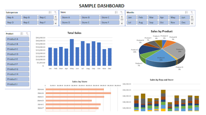
Now that you’re familiar with slicers, the next step is to integrate these elements into a comprehensive and visually engaging dashboard. Dashboards combine multiple pivot tables, charts, and other data visualizations into a single, cohesive view, providing a powerful tool for data analysis and reporting.
Creating Dashboards with Pivot Tables
Dashboards are powerful tools that can help visualize a company’s performance, various economic data, travel statistics, and any other reports you want to analyze. They provide an interactive interface for users to explore and analyze data, making it easier to gain insights and make informed decisions.
What is a Dashboard?
A dashboard is a visual representation of key metrics and data points, typically displayed in a single view. Dashboards combine various elements such as pivot tables, charts, and interactive filters to provide a comprehensive overview of your data. They are particularly useful for monitoring performance, identifying trends, and facilitating data-driven decision-making.
Creating Pivot Charts
For any metric you want to create a chart or visualization for, you’ll want to consider creating a pivot table for it. From there, you can use pivot charts to do the rest.
To insert a pivot chart:
Click anywhere in your pivot table.
Insert a chart the way you normally would.
Select the type of chart that best represents your data (e.g., bar, line, pie chart) and click OK.
Format your pivot charts to enhance readability. Add titles, labels, and legends as needed. Use colors and styles that make the charts visually appealing and easy to interpret.
Combining Elements into a Dashboard
To create a cohesive and interactive dynamic dashboard, combine your pivot tables, charts, and slicers into a single worksheet. Some things to consider when doing so:
Layout Design:
Arrange the pivot tables and charts in a logical and visually appealing layout. Group related elements together.
Leave space for slicers and ensure they are positioned in a way that is easy for users to interact with.
Add Visual Enhancements:
Use shapes, colors, and borders to highlight key areas and separate different sections of your dashboard.
Add headers and text boxes to provide context and explanations for the data presented.
Arrange the slicers on your dashboard so they are easily accessible. Slicers should be placed near the relevant pivot tables and charts to facilitate easy filtering.
TIP: Connect Slicers to multiple pivot tables. To do this, right-click on the slicer and select Report Connections. Check the boxes for all the pivot tables you want to filter with the slicer.
Benefits of Using Dashboards
Real-Time Insights: Dashboards update automatically with changes to your underlying data, providing real-time insights.
User-Friendly Interface: Slicers and interactive charts make it easy for users to explore and filter data without advanced technical skills.
Comprehensive View: By combining multiple data points and visualizations, dashboards offer a holistic view of performance, trends, and key metrics.
Improved Decision-Making: Dashboards facilitate data-driven decision-making by presenting clear and actionable insights.
By following these steps, you can create powerful and interactive dashboards that leverage the full capabilities of pivot tables, charts, and slicers. This enables you to present complex data in an accessible and visually engaging format, driving better understanding and more informed decisions. You can create a dashboard in Google Sheets using similar approaches.
While pivot tables offer powerful data analysis capabilities and can significantly enhance your ability to work with large datasets, they are not without their challenges.
Biggest challenges with pivot tables
Some of the most common issues that users often encounter with pivot tables are the following:
Pivot tables by default aren’t formatted in a convenient way; users often end up adjusting the layout so that it is in a tabular setup.
Labels do not repeat, and that can make it difficult to read the table to determine what each line relates to. Here too, users need to change the default layout.
The formatting for fields can change when the data is refreshed if users haven’t adjusted the actual field settings themselves.
When referencing a pivot table in a formula, the GETPIVOTDATA function can be triggered if the option isn’t disabled.
Pivot tables are incredibly useful in data analysis and by learning how to create and use them, you can improve your data analysis capabilities and create some stunning visuals. But be sure to watch out for some common pitfalls when creating pivot tables.
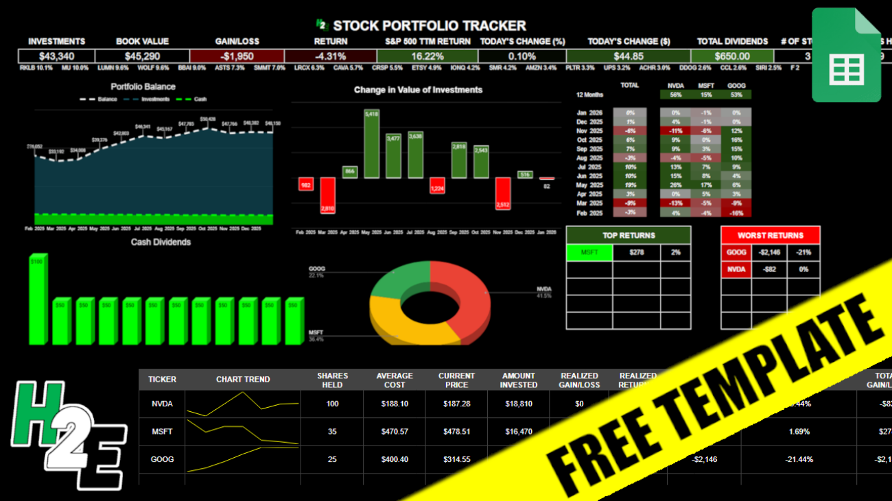
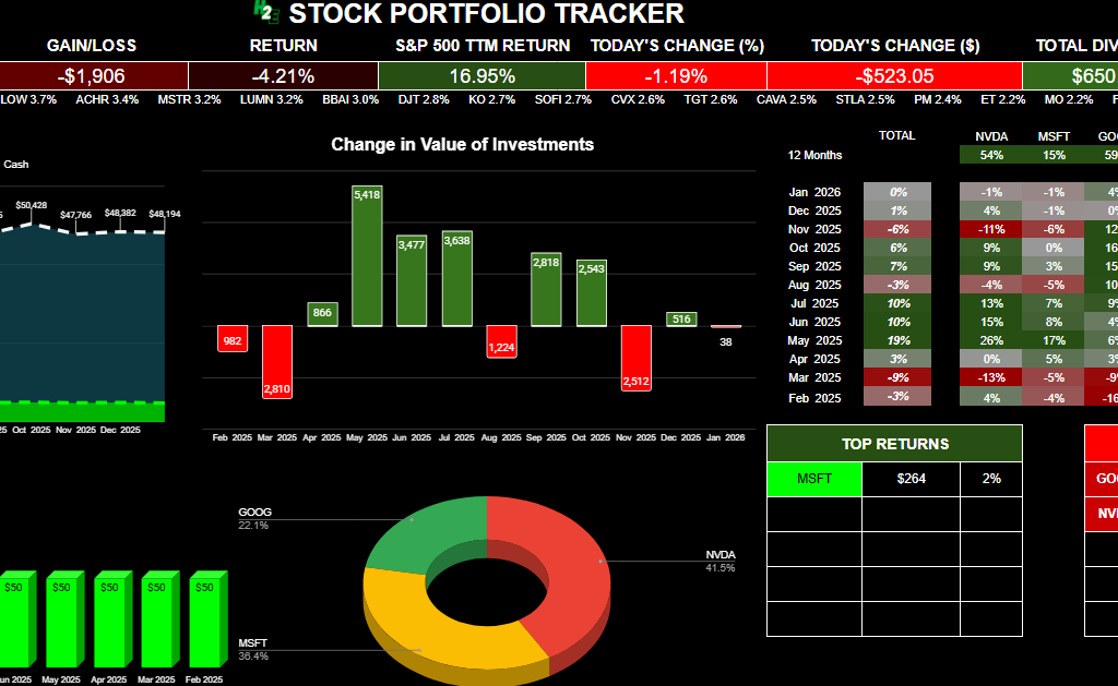
If you want to track your investments in a spreadsheet, with visuals, metrics, and up-to-date data, you can download my free Google Sheets template. Below, I’ll go over how the template works, and provide you with a link that will enable you to copy the file for your own use.
How the H2E 2026 Stock Trading Template Works
There are five tabs in the worksheet, which I’ll guide you through: guide, watchlist, activity, pricehistory, and summary.
Guide
This is the overview of the file and the instructions and also what not to do. There are no inputs on this sheet.
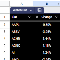
Watchlist
This is a list of stocks that you want to track. The top-performing stocks from this list will display on the Summary page, giving you a way to see what’s doing well on a specific day. You only need to update the stocks in column A. Column B pulls in the percent change for the current day and is driven by a formula.
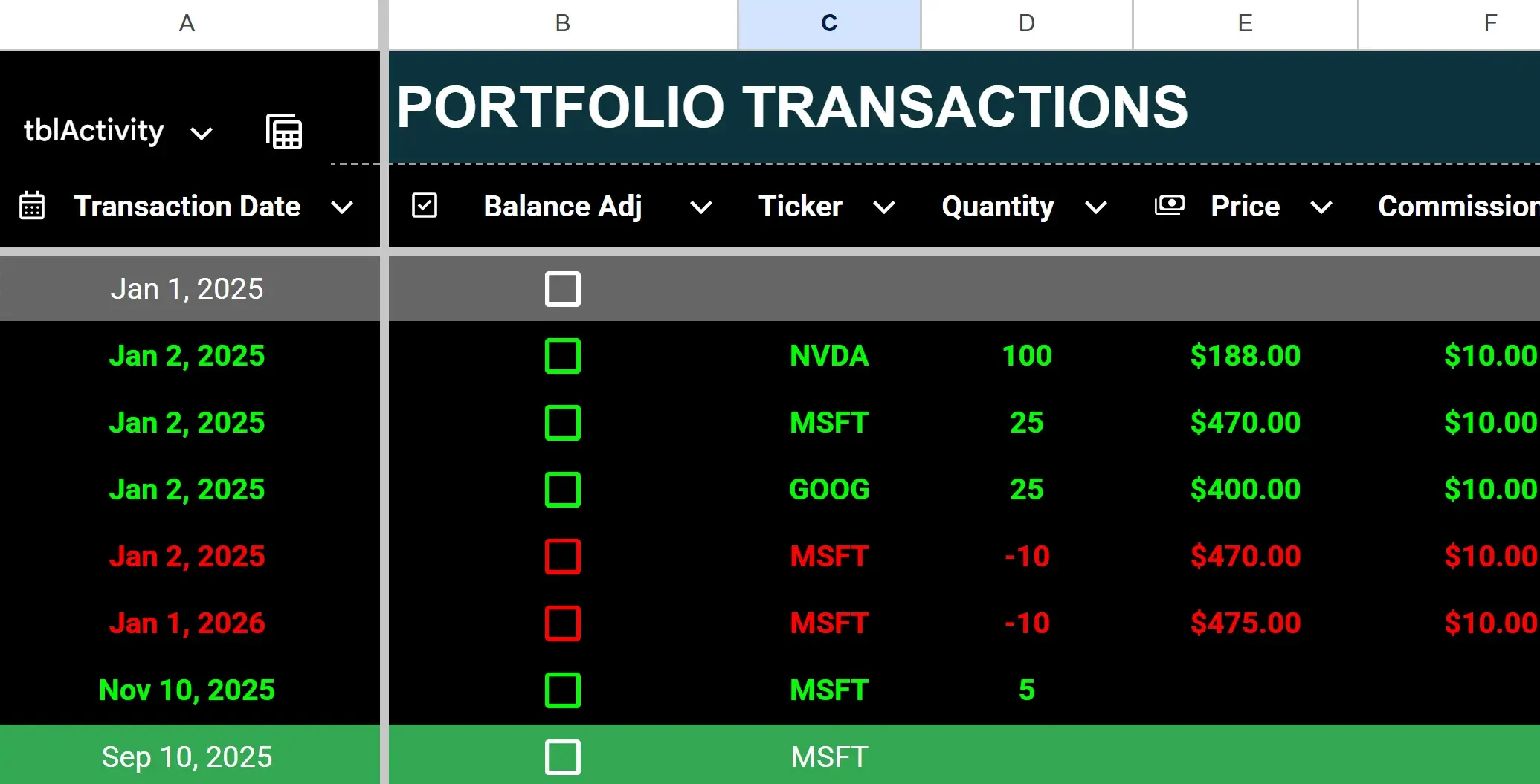
Activity
This sheet is where you will enter any transactions, including buy, sell, dividends received, contributions, and withdrawals. The headers that are highlighted in red indicate that those columns have formulas and shouldn’t be updated. The columns with headers in black are where you’ll want to input data.
To enter a purchase, enter the ticker, quantity (positive), price, and any commission.
To enter a stock sale, populate the same fields but for quantity, make the value negative. Any stock sales will have their font turn red (regardless of whether the transaction is a gain or loss) and purchases will be green.
To enter dividends received, enter a value in column I for cash dividends. Dividend entries will highlight with a green background.
To enter a deposit or withdrawal from your portfolio, enter a positive value in column J for a deposit, or a negative one for a withdrawal. If there is a negative calculated cash balance, the value(s) in column Q will highlight red.
To enter starting stock balances, enter them as you would for a purchase (with a positive quantity) but check off the box in column B for balance adjustment. By doing this, you won’t affect the cash balance. Otherwise, a purchase will deplete your cash position.
If you make a mistake, it’s important to remember not to delete any rows. Doing so can lead to errors and values not calculating properly. Simply delete the values or override them.
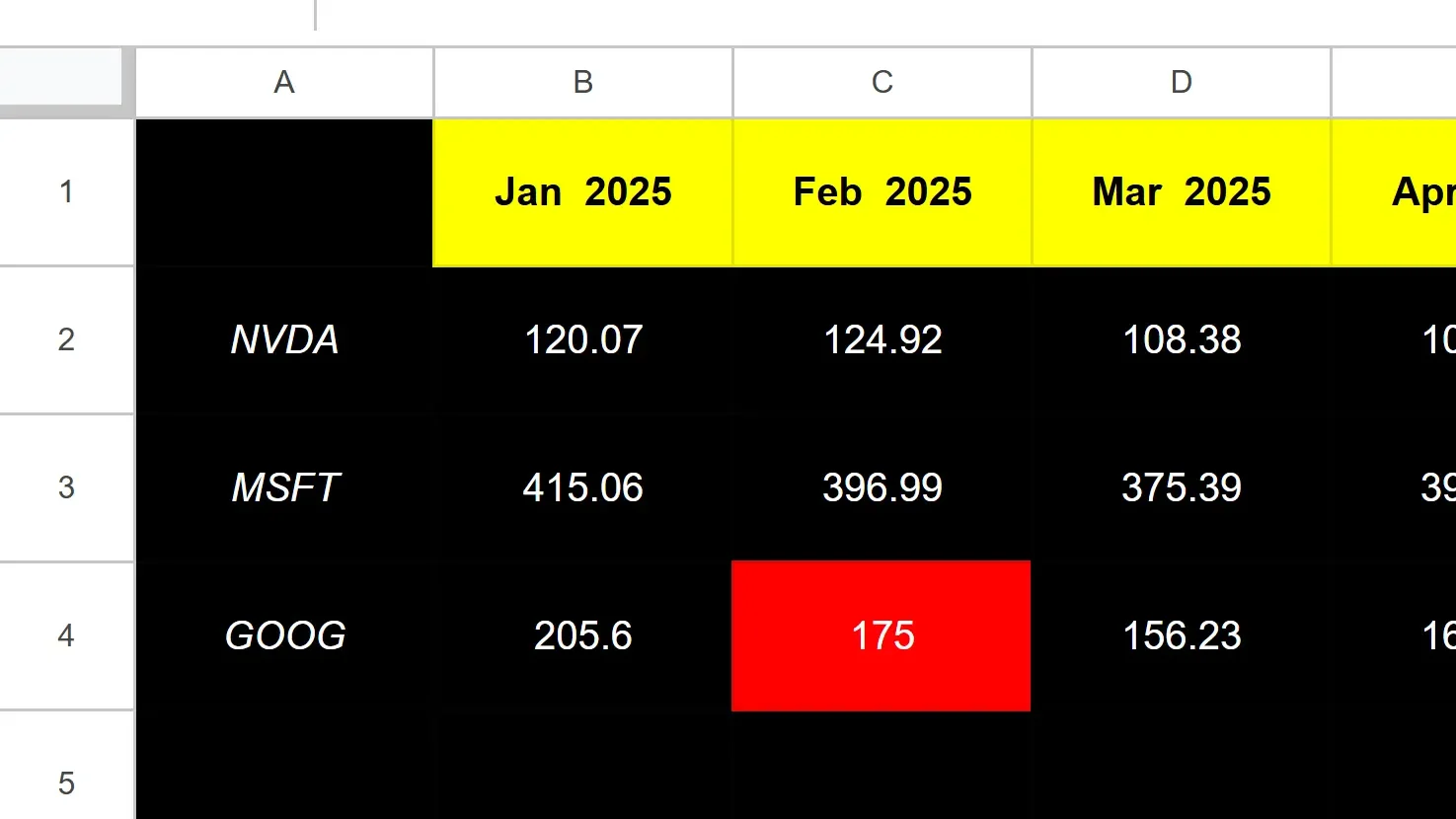
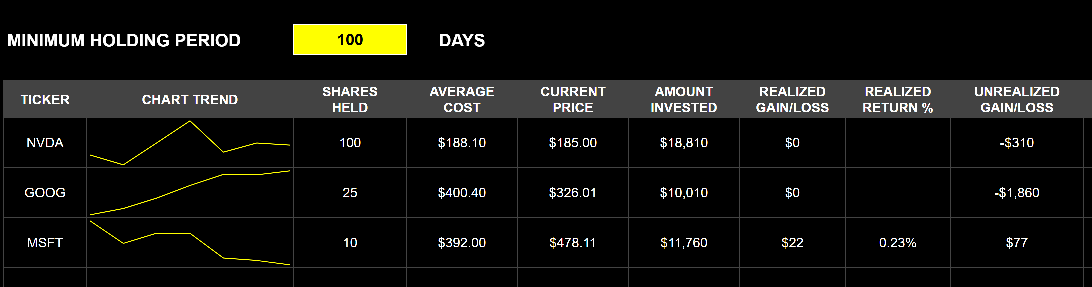
Pricehistory
The Pricehistory sheet pulls in the stock prices from Google Finance for each stock, by month. You won’t need to enter any values on this sheet unless there is an error, such as if a stock isn’t found (perhaps it began trading recently or changed symbols). In those cases, you can override the formulas with a hardcoded amount, at which point you’ll just need to remember to update them later. When you no longer need the hardcoded amounts, you can copy the formulas down and let them take over.
The cell highlighted in red in the screenshot above tells me that value is hardcoded.
If, however, it’s erroring out for every month, then you’ll want to double-check that you’ve entered the ticker symbol correctly. This can happen if you have a stock that Google Sheets isn’t able to recognize without more information, such as the exchange. And in some cases, you’ll want to specify the exchange to ensure Google isn’t pulling the wrong ticker. It may assume you want the ticker that trades on the NASDAQ or NYSE, but if it’s a different one, you may want to specify the exchange.
For example, TSE:AC is the notation you would use to specify the Toronto Stock Exchange (TSE) and AC for Air Canada. The best way to check what the exchange notation should be is to go to Google Finance, look up the ticker there, and see how Google is referencing it.
Summary
The summary sheet is effectively your dashboard, that will show you how your portfolio’s balance has changed over the past year, the dividends you’ve received, the breakdown of your positions, and your gains and losses.
Below, there is also a table summarizing your positions, including realized, unrealized, and total gains and losses. The total gain and loss will include realized and unrealized gains and losses. Realized gains and losses will be populated anytime you have closed out of a position. The unrealized gain or loss will reflect your current position based on the number of shares you still own.
There is also a space where you can enter the minimum holding period, which may be useful if for tax purposes you need to hang on to an investment for a certain number of days. If you enter it and you haven’t been holding onto a stock for that long, it will highlight in grey to indicate that you are short of that minimum. If you don’t need it, you can just clear out the value and it will not highlight.
Download the Free H2E 2026 Stock Trading Template
Now that you know how the file works, feel free to test it out in Google Sheets. The link below will prompt you to make a copy of the file. The sample data will remain there but you can clear it out (just do not delete any rows!). If you have any questions, comments, or suggestions about the template, please contact me.
Disclaimer: This Google Sheets template is a personal tool shared for educational purposes. It is provided “as is” and has not been fully tested in all trading scenarios. I cannot guarantee its accuracy or freedom from errors. Use this tool at your own risk; I am not responsible for any financial losses or damages arising from its use. Please verify all calculations independently before placing trades.
If you like the 2026 Stock Trading Template, please give this site a like on Facebook and also be sure to check out some of the many templates that we have available for download. You can also follow me on X and YouTube. Also, please consider buying me a coffee if you find my website helpful and would like to support it.
Every business owner, financial analyst, and student asks the same fundamental question: “How much do I need to sell to cover my costs?”
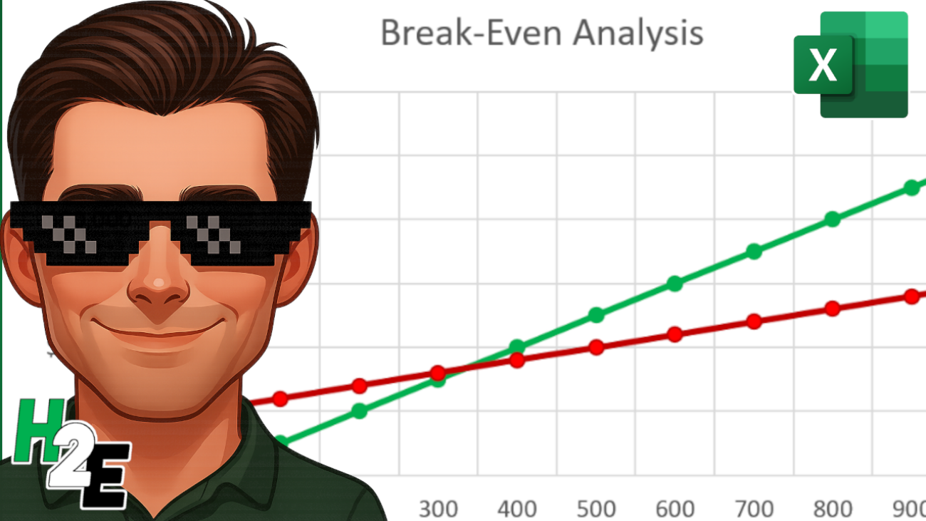
This is what your break-even point would be. It is where your total revenue equals your total costs, yielding zero profit, but also zero loss. This is a crucial number because you know if you produce more than what’s needed to hit break even, you’ll be turning a profit. Calculating this manually can be time-consuming, but building a dynamic break-even analysis in Excel can enable you to test different pricing strategies and cost structures instantly. In this guide, I’ll walk you through the process, the formulas, and how to visualize the data using Excel charts.
What is a Break-Even Analysis?
Before opening Excel, it is crucial to understand the three components that make up the break-even calculation:
Fixed Costs: Expenses that stay the same regardless of how much you sell (e.g., rent, insurance, salaries).
Variable Costs: Expenses that increase with every unit sold (e.g., raw materials, shipping, packaging).
Selling Price: The amount you charge for one unit of your product.
The formula to find the number of units you need to sell to break even is:
Break-Even Units = Fixed Costs/(Selling Price - Variable Cost per Unit)
The denominator (Selling Price – Variable Cost) is also called the Contribution Margin. It represents how much money is left over from each sale to contribute toward paying off your fixed costs. If your contribution margin is not positive, then you’ll never been able to hit your break-even point.
Now that we understand the terms and key formulas, we can move on to setting up the break-even calculation in Excel.
Step 1: Set Up Your Data Table
First, we need to input our variables. Open a new Excel sheet and create a distinct input area. This makes it easy to change numbers later without breaking your formulas.
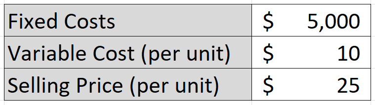
Let’s pretend we are running a specialized T-shirt business, with the following costs and selling prices:
Step 2: Calculate the Break-Even Point
Now, let’s calculate the exact number of T-shirts we need to sell to cover that $5,000 in fixed costs. Using the aforementioned formula where we take the fixed costs and divide them by the contribution margin (selling price less variable cost), this results in the following calculation:
The formula in cell C6 is as follows:
=ROUNDUP(C2/(C4-C3),0)
The result is 333.33 units, but that ROUNDUP function rounds the result up to the nearest whole number, which is 334. Since you can’t sell a portion of a shirt, it’s necessary to round up.
Step 3: Create a Dynamic Data Model
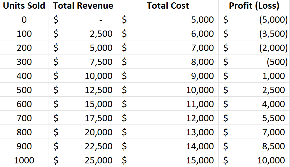
Knowing the break-even point is helpful, but seeing the trend can be much more useful. Let’s create a table that calculates revenue and costs at different volume levels (e.g., selling 0 units, 100 units, 200 units, etc.).
I’m going to set up a table with headers for the following fields: Units Sold, Total Revenue, Total Cost, and Profit (Loss). For Units Sold, the units will start from 0 and increment by 100 at a time. The Total Revenue field will multiply the units sold by the selling price. The Total Cost field will be equal to the units sold multiplied by the variable cost, with the fixed costs added on top. The Profit (Loss) will take the Total Revenue and deduct the Total Cost.
The table should look something like this:
Step 4: Visualize with a Break-Even Chart
Visuals make financial data easier to understand. We can create a chart that shows where the Total Revenue line crosses the Total Costs line.
To do this, start by highlighting three columns in your data table: Units Sold, Total Revenue, and Total Costs. Go to the Insert tab, open up the Charts window, and select any Line Chart you wish to use. You’ll need to adjust the data so that the Horizontal Axis Label for the Revenue and Cost fields is the Units Sold column.
You should now see a chart that looks similar to this:
As per the earlier analysis, we can see that the break-even point is right around 300 units, which is what the chart above indicates.
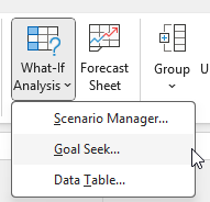
Step 5: Advanced Tip: Use Goal Seek to do a What-If Analysis
What if you don’t just want to break even? What if you want to make exactly $2,000 in profit this month? You can use Excel’s Goal Seek feature rather than guessing. In the following example, I’ve setup a couple of extra cells for units sold and one for profit (loss), which will be used in the goal seek calculation:
Now, let’s go to the Data tab, select What-If Analysis (under the Forecast section), and click on Goal Seek.
Based on the table above, let’s input the following values for the Goal Seek inputs:
The Set cell value is the ending value that we want, which in this case is the Profit (Loss) value, which is determined by selling price, variable cost, and fixed costs. We want this value to equal 2000, by changing cell C8, which is the number of units sold. After clicking OK, Goal Seeks does the work to figure out what the value in C8 needs to be for C9 to be equal to 2000.
By clicking on OK, you’ll accept the results and they’ll remain in your table. This calculation tells me that by selling approximately 467 units, the profit will be $2,000.
If you liked this post on How to Calculate Break-Even Analysis in Excel: A Step-by-Step Guide, please give this site a like on Facebook and also be sure to check out some of the many templates that we have available for download. You can also follow me on X and YouTube. Also, please consider buying me a coffee if you find my website helpful and would like to support it.
Most people rely on online mortgage calculators in order to calculate and estimate their mortgage payments. But with Excel, you can do the exact same thing with just a single function. The PMT (Payment) function can quickly and easily calculate payments. It is precise, flexible, and easy to use.
Here is how to calculate your mortgage payment in seconds.
Calculate your mortgage payment with three variables
In order to calculate the payment, you need to enter the following items into the PMT function: Rate, Term, and Loan Amount.
The syntax looks like this:
=PMT(RATE, NPER, PV)
With a monthly mortgage payment, you need to divide the annual interest rate by 12, and convert the number of periods into months. This involves taking the number of years and multiplying it by 12.
RATE: The interest rate per year / 12
NPER: The total number of years x 12
PV: The Present Value (the amount you are borrowing).
Note that the rate is not your APR, as this strictly looks at just the interest rate. Refer to this post on how to calculate APR in Excel.
Step-by-Step Example
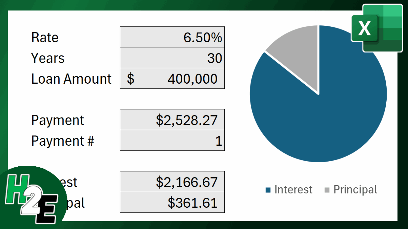
Let’s calculate the payment for a $400,000 home loan at 6.5% interest for 30 years.
1. Set up your cells
It is best to list your variables in cells rather than typing them into the formula. This makes your calculator dynamic, allowing you to just change a cell and having the result update automatically. Let’s suppose the following values are in each cell:
B1 (Rate):6.5%
B2 (Years):30
B3 (Loan Amount):$400,000
2. Enter the PMT Formula
In payment formula, enter the following:
=PMT(B1/12,B2*12,-B3)
Notice the dash in front of B3. In accounting terms, money coming to you (the loan) is positive, and money leaving from you (the payment) is negative. By putting a negative sign before the Loan Amount, Excel returns a positive monthly payment. This is necessary to ensure that amount is calculated correctly.
3. The Result
The formula will return a value of $2,528.27. This is the monthly payment which includes both principal and interest. This is the amount that will need to be paid on a monthly basis to ensure that your balance is paid off at the end of the term.
Calculating the total interest and principal portions
If you want to see exactly how much of that first payment is just the interest vs. the amount that goes towards paying off the house (the principal), you can use the following two functions:
Principal Portion:=PPMT(Rate/12, Period, Years*12, -LoanAmount)
For the first month of our example:
Interest: $2,166.67
Principal: $361.61
Pro Tip: Since the arguments are the same, you can copy and paste the same formula and just change the function name, changing from an I to a P, so that IPMT becomes PPMT. The above example pertains to the first period, so the period argument would be set to 1. But if you want to calculate the interest or principal portion of the 10th payment, you would change the period argument to 10.
Calculating the cumulative interest and principal portions
You can also calculate the entire amount of interest and principal you’ll pay over a loan period, without having to build out an entire amortization table. Instead, here you can use the CUMIPMT and CUMPRINC for the interest and principal payments, respectively.
For the CUMIPMT formula, the arguments are similar, with the key difference being you are setting a starting and ending period. You can specify during which periods you want to calculate the interest for, but you can also just selecte everything, such as in the example below:
=CUMIPMT(B1/12,12*B2,B3,1,360,0)
The starting period is 1 and the last one is 360 (i.e. 12 x 30 years). This produces a result of $510,177.95 in total interest cost for the duration of the loan.
As for the principal, the formula is the same, with the main difference just being the function name:
=CUMPRINC(B1/12,12*B2,B3,1,360,0)
This results in a value of $400,000, which coincides correctly with the entire loan amount, as after period 360 we would expect that the entire principal has been paid back. By using these two functions, it puts into context just how much you’re paying in interest versus principal, without having to create an entire amortization table.
Free template to download
Although it isn’t terribly difficult to do these calculations once you’re familiar with the formulas, you can also just use this free mortgage payment calculator template that I’ve created. It’s easy to use an includes a sensitivity analysis, making it easy for you to look at various scenarios.
If you liked this post on How to Calculate Your Mortgage Payment in Excel, please give this site a like on Facebook and also be sure to check out some of the many templates that we have available for download. You can also follow me on X and YouTube. Also, please consider buying me a coffee if you find my website helpful and would like to support it.
Are multiple fields taking up just a single column in your Excel spreadsheet? This is a common issue when working with data from an external source. But manually retyping data into separate columns is tedious and error-prone. Fortunately, Excel offers a powerful feature designed exactly for this problem: Text to Columns. In this guide, I’ll walk you through how to use the Text to Columns wizard, and if you’re using the latest version of Excel, I’ll also show you other ways you can convert your text into multiple columns.
What is “Text to Columns” in Excel?
Text to Columns is a built-in Excel tool that splits a single cell of text into multiple cells based on a specific boundary. This boundary is usually a character (like a comma or space) or a fixed position in the text.
Common use cases include:
Splitting full names (John Doe) into First Name (John) and Last Name (Doe).
Separating product SKUs (Item123Red) into ID, Batch, and Color.
Cleaning up data exported from CSV files or database software.
Method 1: Using the Text to Columns Wizard (Delimited)
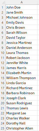
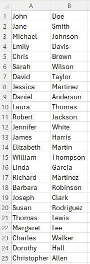
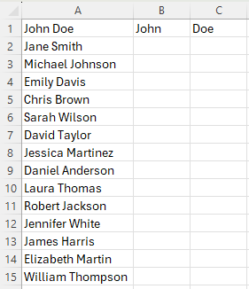
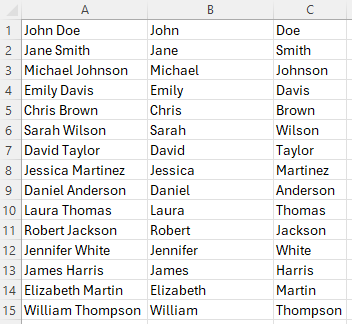
This is the most common method. You use this when your data is separated by a specific character, known as a delimiter (e.g., commas, tabs, semicolons, or spaces). In the following example, I have a list of values in one column showing first and last name. I am going to break it out so that first name is in one column and last name is in another.
Step 1: Select Your Data
Starting by highlighting the range of cells containing the text you want to split.
Pro Tip: Ensure the columns to the right of your data are empty. Excel will overwrite any existing data in those cells.
Step 2: Open the Wizard
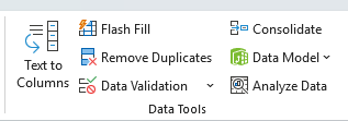
Go to the Data tab on the Ribbon and click Text to Columns in the Data Tools group.
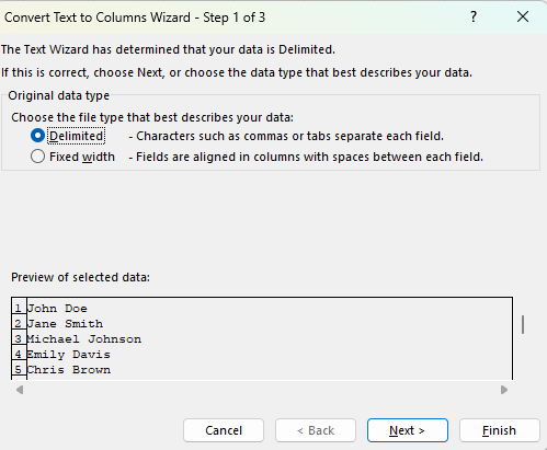
Step 3: Choose “Delimited”
A wizard window will pop up. Select Delimited and click Next.
Pro Tip: Unless you always need to split a cell in the exact same place each time, you won’t need to use the Fixed Width option.
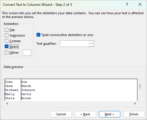
Step 4: Select Your Delimiter
Check the box that matches how your data is separated.
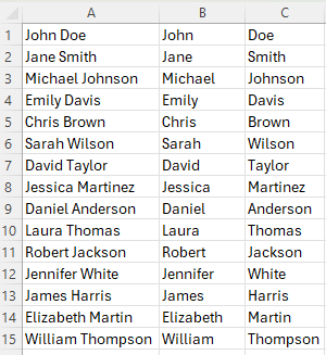
If your data looks like Doe, John, check Comma.
If your data looks like Doe John (as it does in the example above) check Space.
You can see a preview of how your data will be split in the Data preview window at the bottom. If it looks okay, click Next.
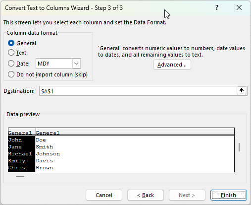
Step 5: Format and Finish
In the final step, you can choose the data format (e.g., Text or Date) for each column.
Destination: By default, Excel overwrites the original column. If you want to keep the original data, change the Destination cell to the next empty column (e.g., $B$1).
Click Finish.
The end result is that the original column has now been split into two.
Method 2: Using the Text to Columns Wizard (Fixed Width)
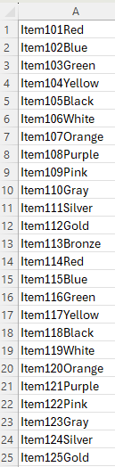
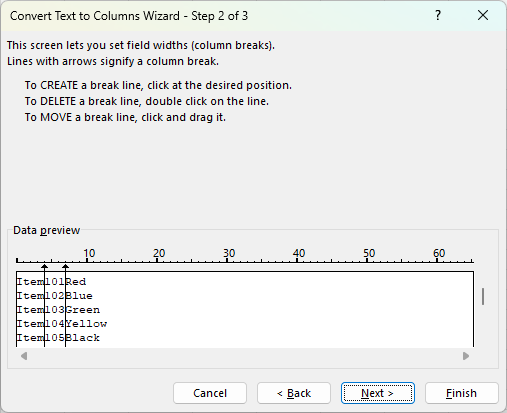
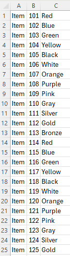
Use this method when your data isn’t separated by a character, but rather organized by specific spacing (e.g., the Product ID is always the first 5 characters, followed by a space, then the Date). In the below example, the first two fields always contain the same length, and there is no delimiter that can break all of them apart.
Select your data and open Text to Columns.
Choose Fixed width and click Next.
Set Field Widths: Click in the ruler area within the Data preview section to create a break line. You can drag the line to adjust the width or double-click to delete it.
Click Next, verify your format, and click Finish.
Since the lengths of the first two fields are always the same, using Fixed Widths is an ideal solution in this example. This produces the following result:
Method 3: The Faster Alternative (Flash Fill)
If you are using Excel 2013 or newer, you might not need the wizard at all. Flash Fill uses pattern recognition to do the work for you.
How to use Flash Fill:
Suppose your data is in Column A. In Column B (the adjacent cell), manually type exactly what you want to extract from the first cell.
Move to the cell below it and start typing the second entry.
Excel usually detects the pattern and offers to fill the rest in ghosted gray text. Press Enter to accept.
The Shortcut:
Simply type the first example, click the cell below it, and press Ctrl + E. In the following example, I’ve entered my first values in column B and C, as an example of what my output should look like.
Next, I’ll go to cell B2 and press CTRL + E, and do the same in cell C2. Excel has now automatically filled in the pattern for me:
Method 4: Using Excel Formulas (TEXTSPLIT)
For users with Excel 365, you can use dynamic array functions to keep your data live. If the original text changes, the split columns update automatically.
The formula simply takes two inputs, the range, and the delimiter. In the case of a space being the delimiter, this is what the formula would look like:
=TEXTSPLIT(A2, " ")
This produces the same result as the other methods.
The benefit of this approach is that even if your data changes in column A, the formula will update; there’s no need to redo the flash fill or use the text to columns tool again.
If you liked this post on How to Convert Text to Columns in Excel: The Ultimate Step-by-Step Guide, please give this site a like on Facebook and also be sure to check out some of the many templates that we have available for download. You can also follow me on X and YouTube. Also, please consider buying me a coffee if you find my website helpful and would like to support it.
Adding a trendline to a chart in Microsoft Excel is a powerful way to visualize data trends and perform basic analysis. It can help you forecast future values and understand the underlying direction of your data.
Step-by-Step Guide to Adding a Trendline
Follow these steps to quickly add a trendline to a chart in Excel:
1. Select and Create Your Chart
Select Data: Highlight the range of data you want to chart, including column headers.
Insert Chart: Go to the Insert tab on the Ribbon. For a trendline to be meaningful, you typically need an appropriate chart type, such as a Scatter chart or a Line chart. Click on the desired chart type to insert it into your worksheet.
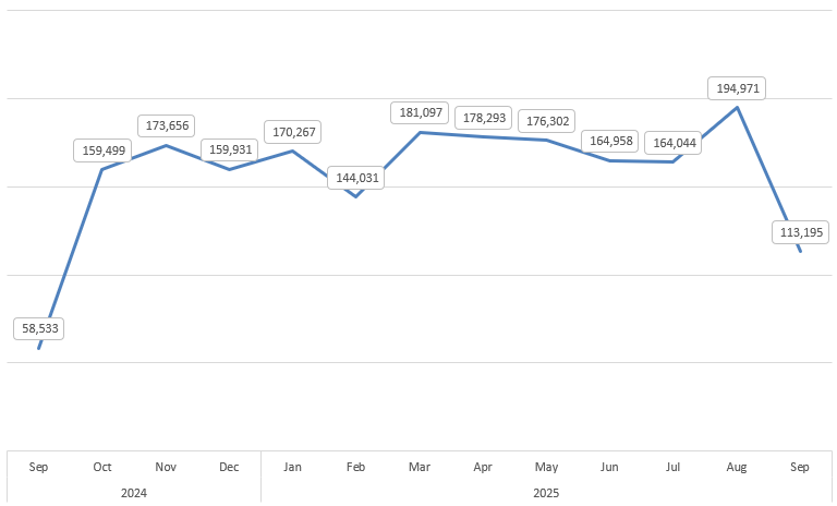
In the example below, I have a line chart showing sales by month.
2. Access Trendline Options
Select the Chart: Click anywhere on the chart to select it.
Use the Chart Elements Button: A small + icon, known as Chart Elements, will appear on the top-right corner of the chart. Click this icon.
Add Trendline: In the list of chart elements, check the box next to Trendline. Excel will automatically add a linear trendline by default.
3. Customize the Trendline (Optional)
To change the type of trendline or show the equation:
More Options: Click the small arrow next to the Trendline checkbox in the Chart Elements menu, and then select More Options…
Alternatively, you can right-click the trendline itself on the chart and select Format Trendline…
Choose Trend/Regression Type: In the Format Trendline pane that appears on the right, you can choose a different regression type, such as:
Linear: Best for data points that resemble a straight line.
Exponential: Best for data that rises or falls at increasingly higher rates.
Logarithmic: Best for data where the rate of change increases or decreases quickly, then levels out.
Polynomial: Best for oscillating data.
Power: Best for data sets that compare measurements that increase at a specific rate.
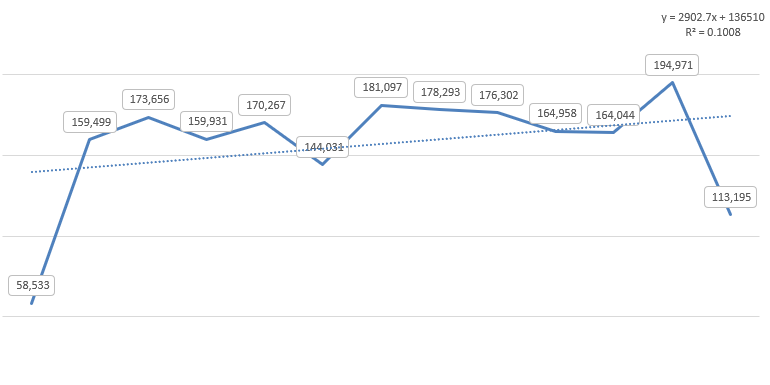
Display Equation and R-squared Value: Check the boxes for Display Equation on chart and Display R-squared value on chart at the bottom of the pane.
The equation allows you to calculate projections.
The R-squared value indicates how well the trendline fits the data (a value closer to 1 is a better fit).
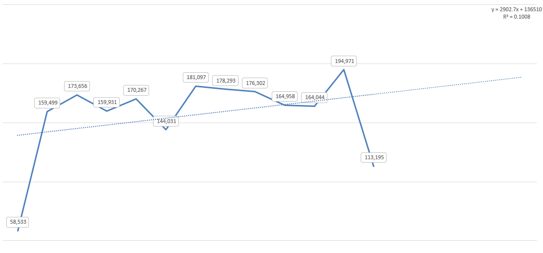
In my chart, I added the equation and the R-squared value on the chart. With a fairly low R-square value, this equation doesn’t indicate a good fit, and thus, it may not be helpful in forecasting future values.
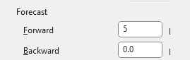
Forecast values with the trendline
What you can also do is forecast out future values based on this trendline. To do this, go to the Forecast section of the trendline options. Here you can specify the number of periods you want to forecast. You can go either backwards or forward. In the example below, I’ve set to forecast 5 additional periods:
The chart now shows these future periods on the chart, with the trendline indicating where future values may lie. However, given the low R-square value, there isn’t a lot of confidence in these forecasted values being accurate predictors.
Benefits of Using a Trendline
The main advantage of adding a trendline is to gain analytical insight from simple visual data.
Visualize Direction: A trendline instantly shows you the overall direction (upward, downward, or flat) and the strength of the trend in your data, filtering out the “noise” of individual data fluctuations.
Forecasting (Extrapolation): By extending the trendline into the future (or past), you can make reasonable projections about values outside your current dataset. Use the Forecast option in the Format Trendline pane to set periods for forward or backward prediction.
Identify Correlation: The R-squared value helps you quickly determine the relationship between your two variables—how much the dependent variable (Y-axis) is explained by the independent variable (X-axis).
Simplification: It provides a simple mathematical model (the equation) to represent a complex series of data points.
If you liked this post on How to Add a Trendline to a Chart in Excel, please give this site a like on Facebook and also be sure to check out some of the many templates that we have available for download. You can also follow me on X and YouTube. Also, please consider buying me a coffee if you find my website helpful and would like to support it.
Have you ever stared at a complex business problem in Excel, wondering what the best possible solution is? You might be trying to maximize profit, minimize costs, or hit a specific target, but you have a long list of limitations — like a budget, time limits, or resource constraints.
Instead of manually changing numbers for hours (doing a what-if analysis), you can use Excel’s Solver.
Solver is a powerful add-in that finds the optimal solution for a problem by adjusting a set of input cells while taking into account a set of rules and constraints you define. It’s like Goal Seek on steroids: while Goal Seek finds a single input for a single output, Solver can juggle multiple inputs and complex limitations all at once.
Here’s how to get started.
Step 1: First, Enable the Solver Add-in
By default, Solver isn’t visible on the ribbon. You need to “turn it on” first.
Go to File > Options (at the very bottom).
In the Excel Options window, click on Add-ins from the left-hand menu.
At the bottom of the window, see the “Manage:” dropdown. Make sure it says Excel Add-ins and click Go…
A new, smaller window will pop up. Check the box next to Solver Add-in and click OK.
You will now see a new Solver button on the far-right-hand side of your Data tab.
Step 2: Understand the 3 Key Parts of the Solver Equation
Before we build our example, you need to know the three components Solver works with.
Objective Cell (The Goal): This is one single cell that you want to optimize. It must contain a formula. You’ll tell Solver you want to make this cell’s value:
Max (e.g., maximize total profit)
Min (e.g., minimize total cost)
Value Of (e.g., hit a target sales number of exactly $1,000,000)
Variable Cells (The Levers): These are the cells that Solver is allowed to change to reach your objective. These are your “decision” cells, like the number of units to produce, the amount of money to invest, or the hours to assign to a project.
Constraints (The Rules): These are the rules and limitations that restrict your variable cells. They ensure the solution is realistic. For example:
“We can’t spend more than our $10,000 budget.”
“We must produce at least 50 units.”
“The number of hours worked can’t be negative.”
“The number of units produced must be whole numbers (integers).”
Step 3: Set Up Your Model & Run Solver (Example)
Let’s use a classic business problem. Imagine we run a small bakery that makes two products: Cakes and Cookies. We want to find the perfect product mix to maximize our total profit.
Part A: Prepare the Model in Excel
Here’s an example of what the data might look like.
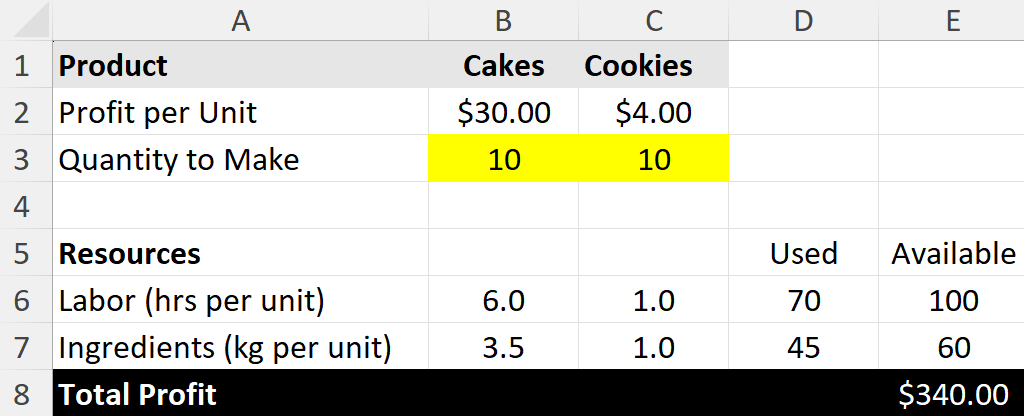
First, set up your data like this. The yellow cells (B3 and C3) are the Variable Cells (the ones we’ll tell Solver to change). The total profit cell (E8) is our Objective Cell. Right now, we’re making an equal number of cakes and cookies, but our resources are underutilized.
Key Formulas:
Total Profit (E8):=B3*B2+C3*C2
Labor Used (D6):=B3*B6+C3*C6
Ingredients Used (D7):=B3*B7+C3*C7
Right now, making 10 cakes and 10 cookies gives us a profit of $340. But are we using our resources well? Can we do better? Let’s ask Solver.
Part B: Use the Solver Dialog Box
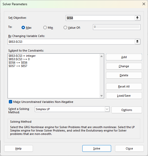
Click the Data tab and click the Solver button. The main dialog box will appear.
Set Objective: Click in the box, then click cell E8 (our Total Profit cell). Select the Max radio button.
By Changing Variable Cells: Click in this box. Select cells B3:C3 (the “Quantity to Make” for both products).
Subject to the Constraints: This is where we add our rules. Click the Add button.
Constraint 3 (No negative products): Cell Reference: B3:C3 >= Constraint: 0. (We can’t make negative cakes). Click Add.
Constraint 4 (Integers): Cell Reference: B3:C3 = integer (This forces Solver to find whole numbers, as we can’t sell half a cake). Click OK.
Your Solver window should now look like this:
Make sure “Make Unconstrained Variables Non-Negative” is checked (it’s good practice).
Select a Solving Method: For simple problems like this, Simplex LP (Linear Programming) is the best and fastest choice.
Pro-Tip: Always try Simplex LP first. If Excel tells you the problem isn’t linear, try GRG Nonlinear next. Use Evolutionary as the last resort when your model is truly complex and non-smooth.
Click Solve!
Part C: Get the Answer
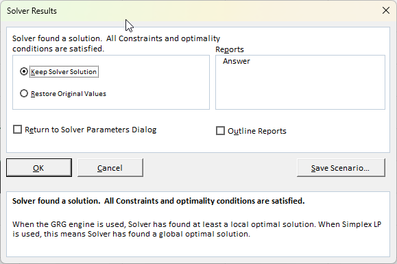
Solver will run for a moment and then a new window will pop up, “Solver Results.”
Solver found a solution. All constraints and optimality conditions are satisfied.
This is great news! You can see the solution in the background. Excel has changed your Variable Cells (B3 and C3) to the optimal numbers.
Quantity to Make (Cakes): 16
Quantity to Make (Cookies): 4
This new mix gives us a total profit of $496 (cell E8), which is better than our initial $340 guess, and it perfectly uses all 100 hours of labor and all 60kg of ingredients.
Click OK to keep the solution.
When Should You Use Solver?
Solver is incredibly versatile. Use it any time you need to find the “best” answer while balancing limitations.
Finance: Find the optimal investment portfolio to maximize returns for a given level of risk.
Operations: Create a production schedule that minimizes cost while meeting all customer orders.
Staffing: Design a weekly staff schedule that meets shift requirements with the fewest employees.
Marketing: Allocate an advertising budget across different channels (TV, digital, radio) to get the maximum exposure without exceeding the total budget.
If you liked this post on How to Use Solver in Excel: A Simple Step-by-Step Guide, please give this site a like on Facebook and also be sure to check out some of the many templates that we have available for download. You can also follow me on X and YouTube. Also, please consider buying me a coffee if you find my website helpful and would like to support it.