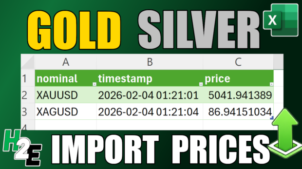
How to Get Gold and Silver Prices Into Excel With Power Query
If you want to look up the price of gold or silver, you can do that easily through a quick Google search. But did you know that you can also import prices right into Excel? With the help of Power Query, I'm going to show you how that's possible. ...