

Charts can be an effective way to convey data, as opposed to just tables. By visualizing numbers, readers can easily see the highs and lows, and just how much of a variance exists between them. In this example, I’m going to show you how to turn a table summarizing S&P 500 sector performance into a chart.
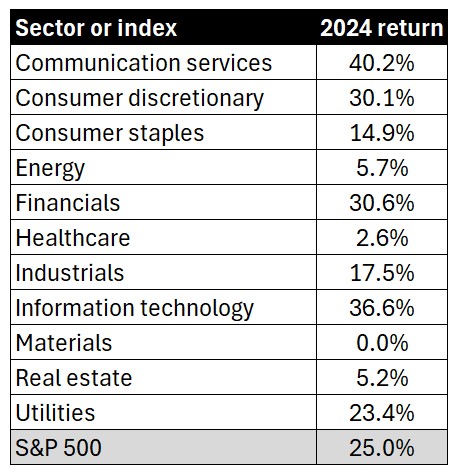
The data we’re going to use for this example is as follows:
Let’s turn this into a more helpful visual, which will sort these values from highest to lowest. Here are the steps you can take to do that:
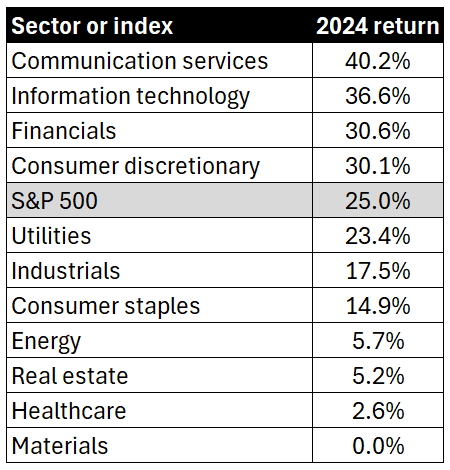
1. Sort the list from largest to smallest
This can be done by simply selecting the 2024 return header and clicking on the sort descending button. The table is now re-arranged as follows:
2. Create a column chart
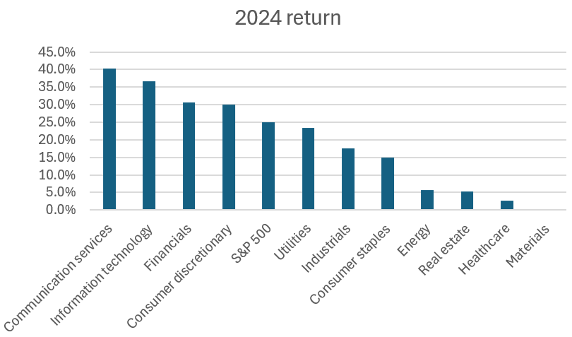
By selecting the data and choosing to create a column chart, you can create a visual that now displays the returns, from highest to lowest.
3. Select a chart style
If you select the chart and click on the Chart Design tab, there will be many different styles to choose from. This can save you the time from making multiple adjustments yourself.
Let’s select the dark one on the bottom-left corner.
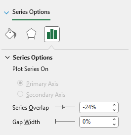
4. Remove gaps
To make the column chart more snug, you can remove the gaps between them. To do this, right-click on the chart and select Format Data Series. Adjust the Gap Width to 0%.
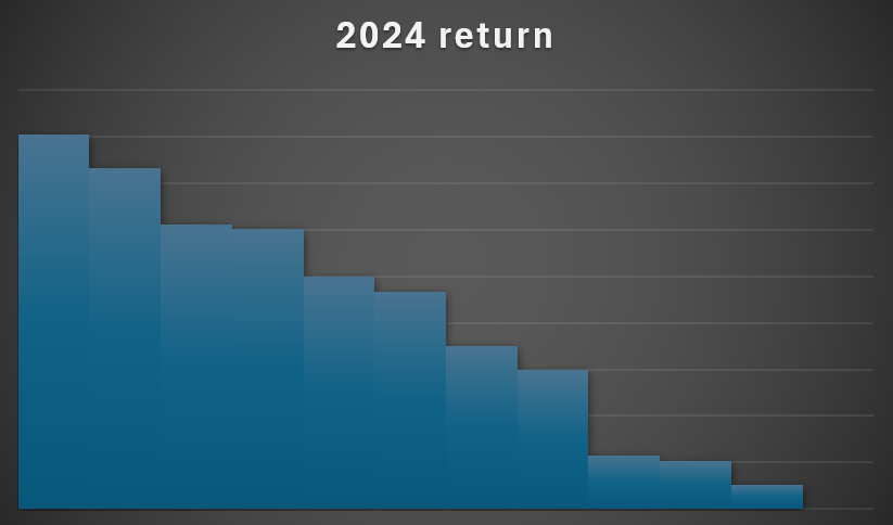
5. Remove axis labels
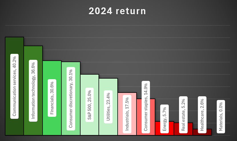
Since we’re going to incorporate the labels into the actual chart, you can remove the axis labels themselves. To do this, simply click on each axis and click on the delete key. You’ll now have a chart that looks like this:
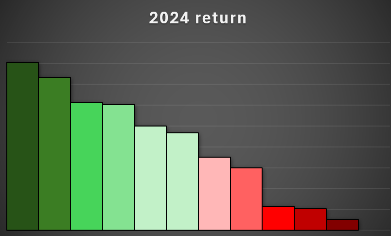
6. Setup the color formatting for the column charts
To help display the largest and worst-performing sectors, let’s apply different colors to each column. Starting with the first column chart, set that to a dark green color and apply a black border around it. Then, proceed to the next one, by clicking on ctrl + right arrow. This avoids having to manually select each item. If you need to go back in the opposite direction, you can use ctrl + left arrow.
Here’s how I’ve setup my chart so it gradually goes from a dark green to a lighter green, to light red, and dark red.
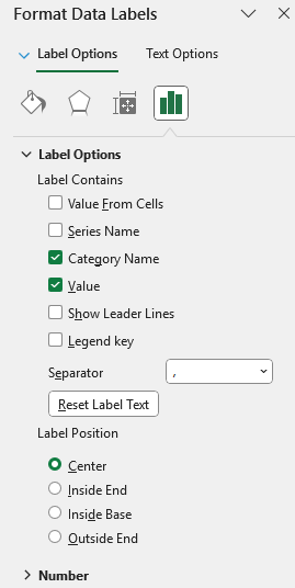
7. Add labels
If you right-click on any of the columns, there will be an option to Add Data Labels. Once added, you can also right-click on them to select Format Data Labels. Let’s select the option to show the value along with the category name, and set the label position to Center.
What we can also do is setup a data label shape, so that it’s easy to see. To do this, right-click on any of the labels and select Change Data Label Shapes. Let’s choose a rounded rectangle.
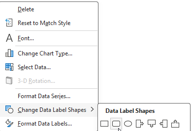
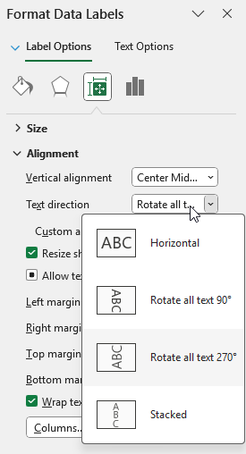
Next, on the alignment section, let’s also set the text direction to rotate all text 270 degrees.
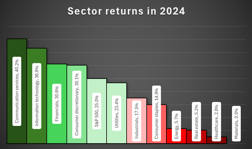
This now results in the following chart:
8. Add a title
The last step is simply to update the title, to more accurately reflect the data. Let’s rename it by double-clicking on the title, and setting the name to ‘Sector returns in 2024’
If you liked this post on How to Analyze S&P 500 Sector Performance Using an Excel Bar Chart, please give this site a like on Facebook and also be sure to check out some of the many templates that we have available for download. You can also follow me on Twitter and YouTube. Also, please consider buying me a coffee if you find my website helpful and would like to support it.