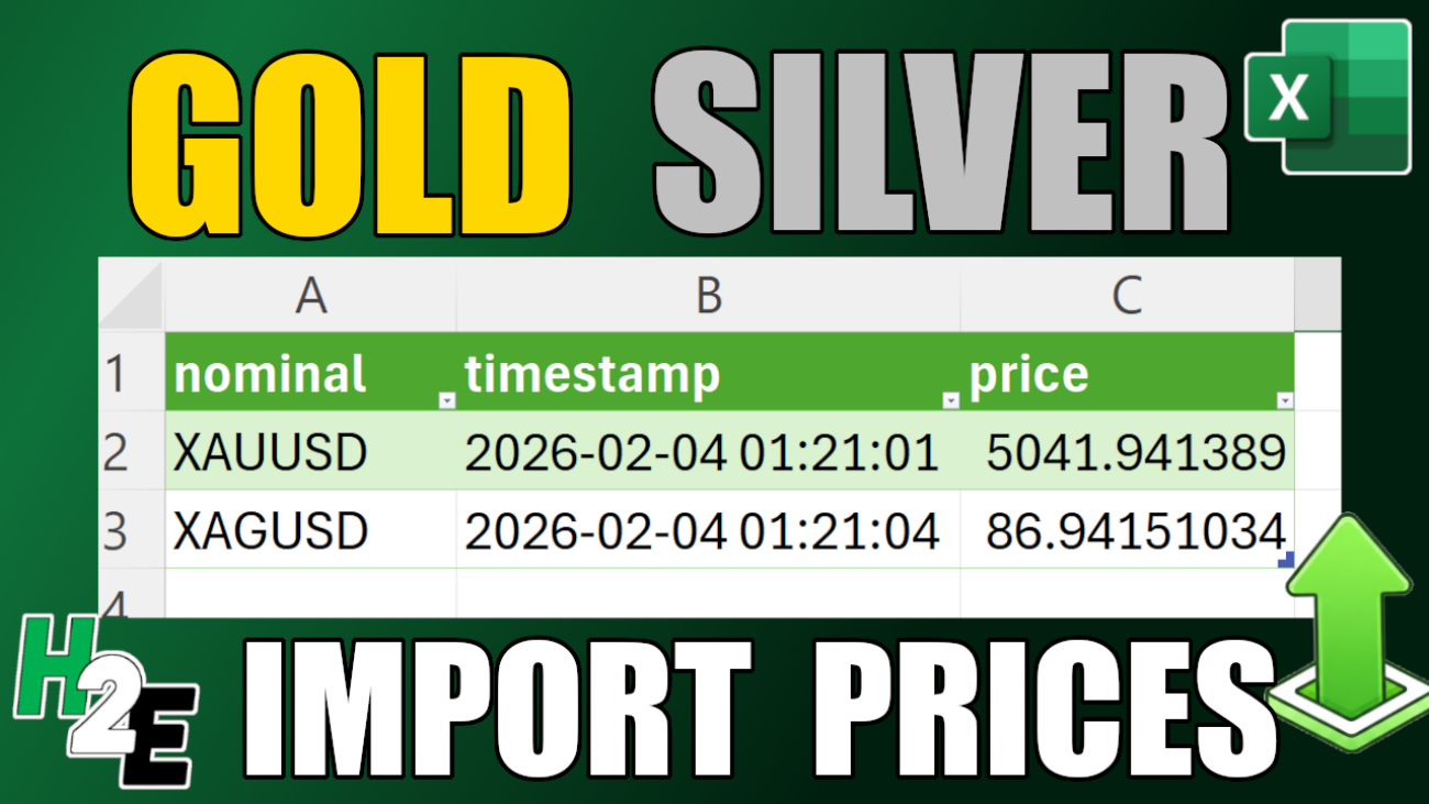
If you want to look up the price of gold or silver, you can do that easily through a quick Google search. But did you know that you can also import prices right into Excel? With the help of Power Query, I’m going to show you how that’s possible.
Start by getting access to an API
There isn’t a built-in Excel function that pulls in the price of gold or silver. But we can use an API connection to get that in. I suggest using alphavantage.co, where you can get a free API key. You can pull up to 25 requests per day. After that, you’ll have to wait until the next day. But at the very least, you can refresh several times over the course of a day. If you need more frequent updates, you can also choose from paid plans.
If you go with an API service, then you’ll need to refer to their documentation on how to reference and pull data. In the case of Alpha Vantage, it gives the following URL as an example of how you would pull in silver prices:
I’ve bolded the parts that you would change. If you want to pull the price of gold, simply change the value that is bolded above, from SILVER to GOLD. You’ll also need to change the demo API key to the one that you’ve set up.
This link can then be used in Power Query.
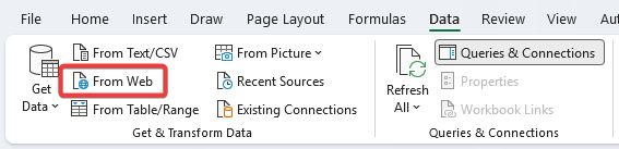
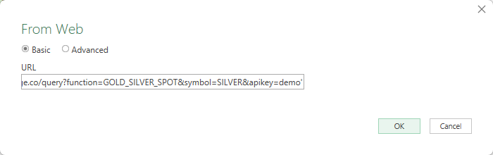
Click on the From Web button in the Data tab, which will give you a place to paste the URL into:
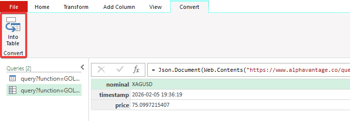
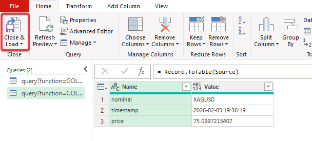
This will now open up Power Query and allow you to see what the data looks like:
After clicking on the option to convert into a table, you’ll now see the ability to Close & Load, which will download the data into Excel:
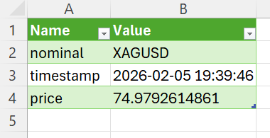
Doing this will create a new tab on your spreadsheet, with the following data now displayed in a table format:
To refresh the data, click the Refresh All button in Excel, or right-click the table and select Refresh.
How to import both gold and silver prices in a combined query
You can create a second query to pull in the price of gold, but there’s also another option: a combined query. This will allow you to set up multiple queries at once and, through a single refresh, pull in both data points.
The one hitch is that with Alpha Vantage, you can make only one request per second, so you’ll need to wait before initiating the second data pull. This, too, however, can be coded within Power Query.
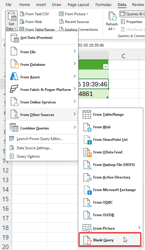
Let’s get back into Power Query to do this. From the Get Data option, select the button that allows you to create a Blank Query:
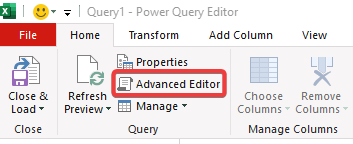
Then, click on the option to go straight into the Advanced Editor:
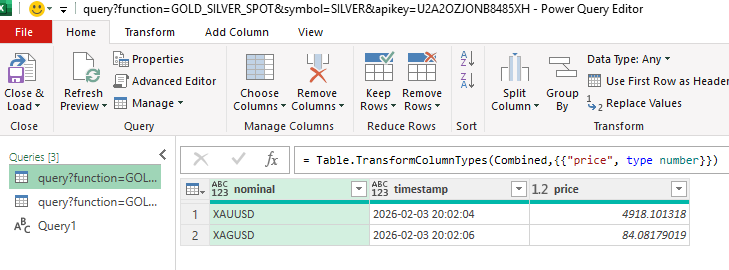
By doing this, you can now enter Power Query code, rather than going step by step. Here is the code that you can use to pull in both the price of gold and silver from Alpha Vantage:
let
    ApiKey = "YOURAPIKEY",

    FetchData = (symbol) =>
        let
            Source = Json.Document(Web.Contents("https://www.alphavantage.co/query?function=GOLD_SILVER_SPOT&symbol=" & symbol & "&apikey=" & ApiKey))

        in
            Source,

    Gold = FetchData("XAU"),

    Silver = Function.InvokeAfter(() => FetchData("XAG"), #duration(0, 0, 0, 2)),

    Combined = Table.FromRecords({Gold, Silver}),
    #"Changed Type" = Table.TransformColumnTypes(Combined,{{"price", type number}})
in
    #"Changed Type"
Note that you’ll need to put in your own API key at the beginning. But with this code, it’ll wait a couple of seconds before running the second query. And at the end, you have both gold and silver prices in a table:
If you liked this post on How to Get Gold and Silver Prices Into Excel, please give this site a like on Facebook and also be sure to check out some of the many templates that we have available for download. You can also follow me on X and YouTube. Also, please consider buying me a coffee if you find my website helpful and would like to support it.
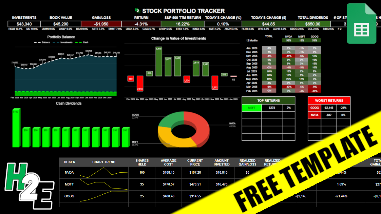
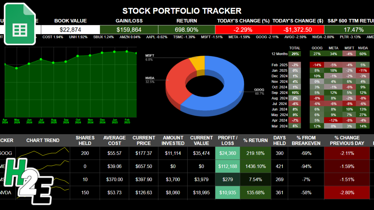
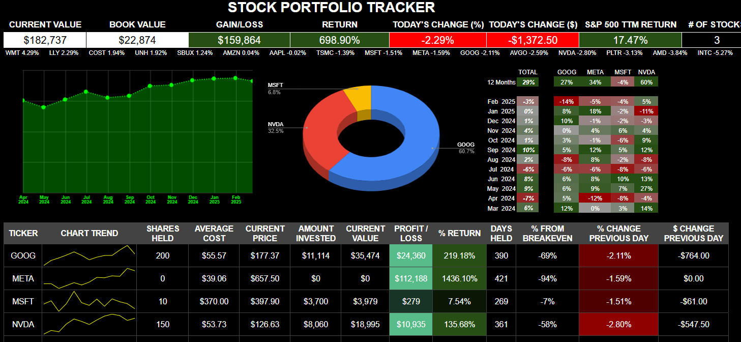
If you want to track your investments in a spreadsheet, with visuals, metrics, and up-to-date data, you can download my free Google Sheets template. Below, I’ll go over how the template works, and provide you with a link that will enable you to copy the file for your own use.
How the H2E 2026 Stock Trading Template Works
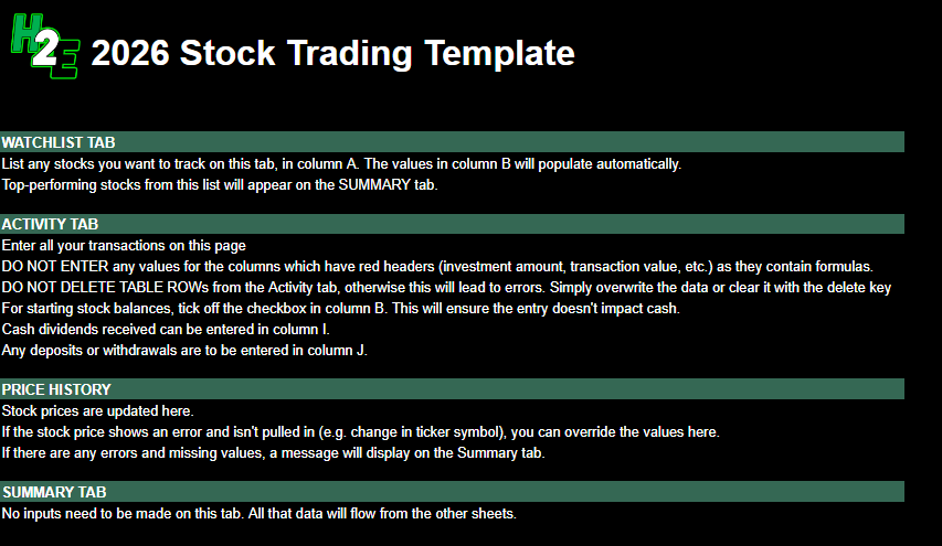
There are five tabs in the worksheet, which I’ll guide you through: guide, watchlist, activity, pricehistory, and summary.
Guide
This is the overview of the file and the instructions and also what not to do. There are no inputs on this sheet.
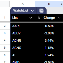
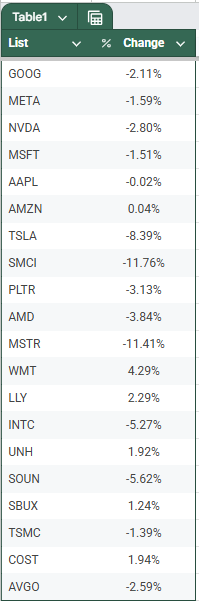
Watchlist
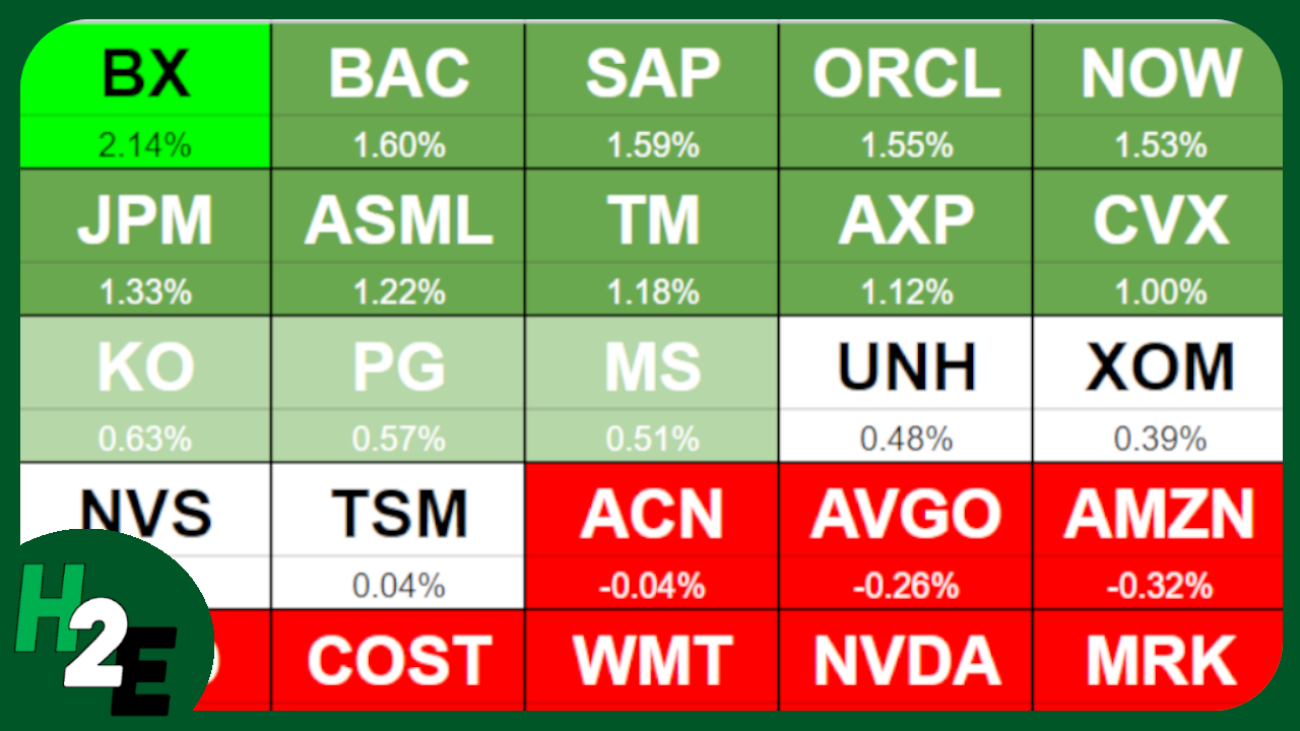
This is a list of stocks that you want to track. The top-performing stocks from this list will display on the Summary page, giving you a way to see what’s doing well on a specific day. You only need to update the stocks in column A. Column B pulls in the percent change for the current day and is driven by a formula.
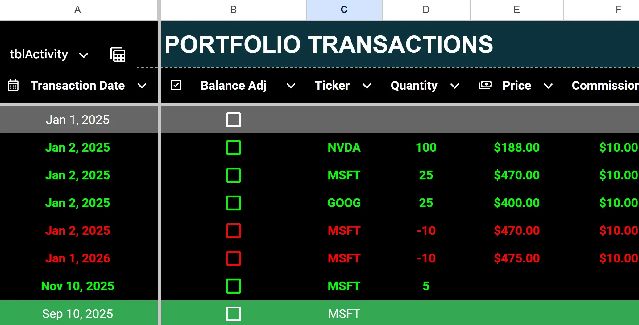
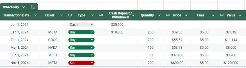
Activity
This sheet is where you will enter any transactions, including buy, sell, dividends received, contributions, and withdrawals. The headers that are highlighted in red indicate that those columns have formulas and shouldn’t be updated. The columns with headers in black are where you’ll want to input data.
To enter a purchase, enter the ticker, quantity (positive), price, and any commission.
To enter a stock sale, populate the same fields but for quantity, make the value negative. Any stock sales will have their font turn red (regardless of whether the transaction is a gain or loss) and purchases will be green.
To enter dividends received, enter a value in column I for cash dividends. Dividend entries will highlight with a green background.
To enter a deposit or withdrawal from your portfolio, enter a positive value in column J for a deposit, or a negative one for a withdrawal. If there is a negative calculated cash balance, the value(s) in column Q will highlight red.
To enter starting stock balances, enter them as you would for a purchase (with a positive quantity) but check off the box in column B for balance adjustment. By doing this, you won’t affect the cash balance. Otherwise, a purchase will deplete your cash position.
If you make a mistake, it’s important to remember not to delete any rows. Doing so can lead to errors and values not calculating properly. Simply delete the values or override them.
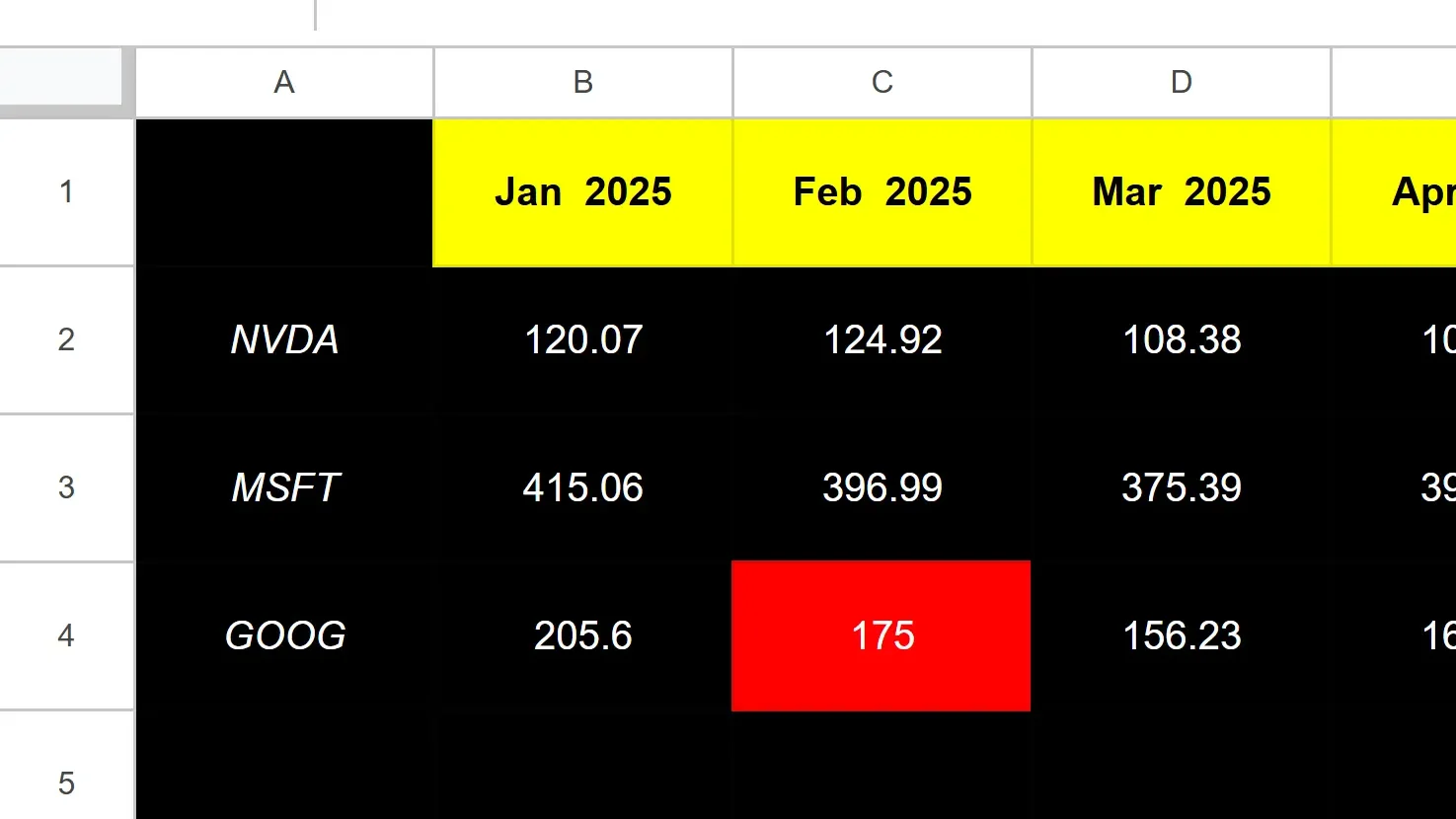
Pricehistory
The Pricehistory sheet pulls in the stock prices from Google Finance for each stock, by month. You won’t need to enter any values on this sheet unless there is an error, such as if a stock isn’t found (perhaps it began trading recently or changed symbols). In those cases, you can override the formulas with a hardcoded amount, at which point you’ll just need to remember to update them later. When you no longer need the hardcoded amounts, you can copy the formulas down and let them take over.
The cell highlighted in red in the screenshot above tells me that value is hardcoded.
If, however, it’s erroring out for every month, then you’ll want to double-check that you’ve entered the ticker symbol correctly. This can happen if you have a stock that Google Sheets isn’t able to recognize without more information, such as the exchange. And in some cases, you’ll want to specify the exchange to ensure Google isn’t pulling the wrong ticker. It may assume you want the ticker that trades on the NASDAQ or NYSE, but if it’s a different one, you may want to specify the exchange.
For example, TSE:AC is the notation you would use to specify the Toronto Stock Exchange (TSE) and AC for Air Canada. The best way to check what the exchange notation should be is to go to Google Finance, look up the ticker there, and see how Google is referencing it.
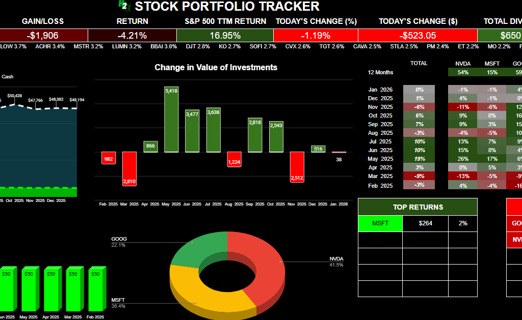
Summary
The summary sheet is effectively your dashboard, that will show you how your portfolio’s balance has changed over the past year, the dividends you’ve received, the breakdown of your positions, and your gains and losses.
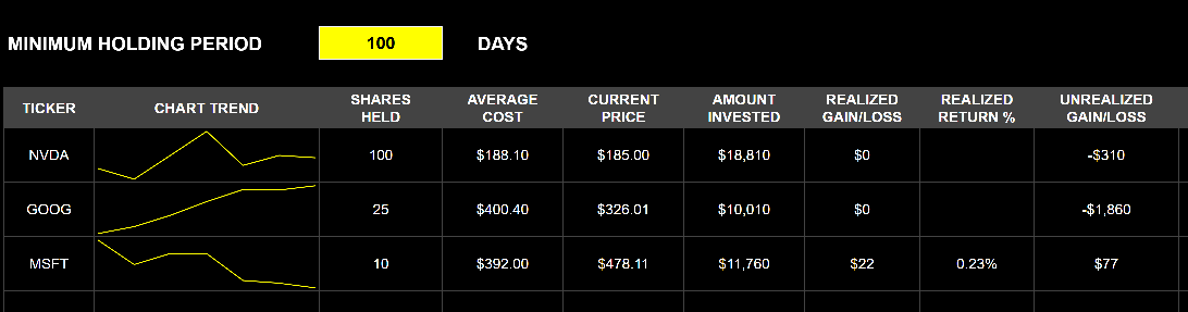
Below, there is also a table summarizing your positions, including realized, unrealized, and total gains and losses. The total gain and loss will include realized and unrealized gains and losses. Realized gains and losses will be populated anytime you have closed out of a position. The unrealized gain or loss will reflect your current position based on the number of shares you still own.
There is also a space where you can enter the minimum holding period, which may be useful if for tax purposes you need to hang on to an investment for a certain number of days. If you enter it and you haven’t been holding onto a stock for that long, it will highlight in grey to indicate that you are short of that minimum. If you don’t need it, you can just clear out the value and it will not highlight.
Download the Free H2E 2026 Stock Trading Template
Now that you know how the file works, feel free to test it out in Google Sheets. The link below will prompt you to make a copy of the file. The sample data will remain there but you can clear it out (just do not delete any rows!). If you have any questions, comments, or suggestions about the template, please contact me.
Disclaimer: This Google Sheets template is a personal tool shared for educational purposes. It is provided “as is” and has not been fully tested in all trading scenarios. I cannot guarantee its accuracy or freedom from errors. Use this tool at your own risk; I am not responsible for any financial losses or damages arising from its use. Please verify all calculations independently before placing trades.
If you like the 2026 Stock Trading Template, please give this site a like on Facebook and also be sure to check out some of the many templates that we have available for download. You can also follow me on X and YouTube. Also, please consider buying me a coffee if you find my website helpful and would like to support it.
The Altman Z Score is a financial formula that evaluates a company’s financial health by analyzing key balance sheet and income statement ratios. In simple terms, it produces a single number (“Z-score”) that helps predict the probability that a company will go bankrupt.
A low Z-score can alert you that a company is at high risk of insolvency before obvious signs of distress appear. Since it relies on objective financial data, the Z-score offers an unbiased measure of a company’s stability.
What are the five key ratios in the Altman Z Score Formula?
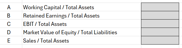
The Altman Z Score is calculated from five financial ratios, each capturing a different aspect of a firm’s financial health:
A: Working Capital / Total Assets: This measures liquidity by comparing net working capital (current assets minus current liabilities) to total assets. It indicates the company’s short-term financial stability and ability to cover its short-term obligations. A higher ratio means the firm has more liquid assets relative to its size, which is a positive sign.
B: Retained Earnings / Total Assets: This profitability ratio shows the cumulative profits that a company has retained (not paid out as dividends) relative to its total assets. It reflects the company’s long-term earning power and age – older, profitable firms will have large retained earnings.
C: EBIT / Total Assets: EBIT stands for Earnings Before Interest and Taxes, essentially the operating profit. This ratio measures operating efficiency – how effectively the company’s assets generate earnings. Higher values mean the company’s core business operations are very profitable relative to its asset base.
D: Market Value of Equity / Total Liabilities: This leverage ratio compares the company’s market capitalization (market value of all shares) to its total liabilities. It introduces a market perspective on leverage. A larger value suggests investors value the company’s equity highly relative to its debts, implying more of a buffer to absorb losses.
E: Sales / Total Assets: This is an asset turnover ratio indicating how efficiently the company generates revenue from its assets. It varies by industry, but generally a higher Sales/Assets ratio means the company is using assets effectively to drive sales.
Each of these five ratios captures one dimension of financial performance – liquidity, retained profitability, operating performance, market leverage, and asset productivity respectively. Altman’s insight was that a weighted combination of these ratios could reliably distinguish healthy firms from those likely to fail.
What the different Z-score values mean
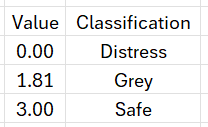
Once you calculate a company’s Z-score, it falls into one of three risk categories (zones) originally defined by Altman:
Z > 2.99 – “Safe” Zone: A score above 2.99 is considered safe. The company is likely in solid financial health and at low risk of bankruptcy in the near term. Investors can take comfort if a firm’s Z-score is around 3 or higher – it suggests the business is financially stable.
1.81 <= Z <= 2.99 – “Grey” Zone: A score between 1.81 and 2.99 falls into a grey zone. This is an ambiguous middle range indicating some moderate risk. The company isn’t obviously about to fail, but there are enough warning signs that it’s not completely safe either. Investors should be cautious and perhaps investigate further – the firm could go either way over time.
Z < 1.81 – “Distress” Zone: A score below 1.81 signals the company is in distress and has a high risk of bankruptcy. In Altman’s study, companies with Z < 1.81 often did go bankrupt within a couple of years. Such a low score is a glaring red flag for investors to be extremely careful – it suggests the company’s financial foundations are very weak.
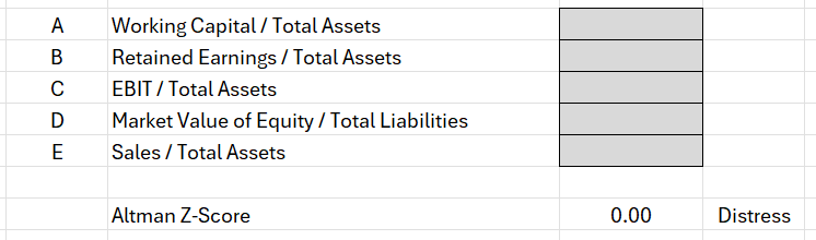
Setting up the Altman Z Score Calculation in Excel
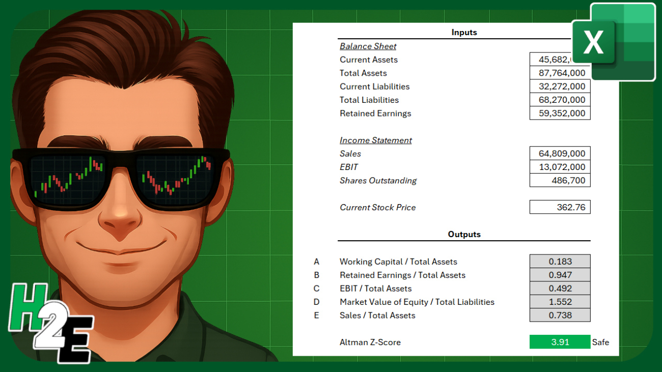
To calculate the Altman Z Score in Excel, we can set up some inputs to make it easy to enter data. And from there, formulas can be setup to take care of the remaining calculations. We’ll need inputs for the balance sheet, income statement, along with the current share price. Here’s a look at what the inputs look like on my sheet:
The point of these inputs is for the user to easily plug in values from the income statement and balance sheet, without having to worry about setting up the formulas. Those will be done on the following cells:
For item A, the working capital balance will be calculated by taking the current assets and deducting the current liabilities, and then taking that result and dividing it by the total assets.
For item D, we need to multiply the shares outstanding by the stock price to get the market value of the equity, and then dividing that by total liabilities.
For all other items, the calculations should be self explanatory as they are referencing different values from the input cells.
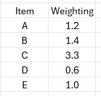
There is also a weighting that gets applied (multiplied) to the cells, and this lookup table can also be setup on the worksheet:
The Altman Z Score weighting is designed primarily for manufacturing companies but there are other variations. And by setting a place where you can change the weighting, you can easily customize the weighting should you need to.
Let’s also setup a lookup table for the different thresholds. If the Z-score is below 1.81, for instance, then the business is in distress. If it’s 3.00 or more, then it’s considered safe. Anything else falls into the Grey zone. The following lookup table will enable us to do a lookup to determine which zone a company falls within:
The above table can be used with a VLOOKUP function and by setting it up for approximate matches (rather than exact ones), it will ensure the correct classification is applied based on the Z-score value.
Now, to pull it all together, what we need to do is to calculate the Z-score. And this can be done by tallying up the calculated fields. And next to the output, I’ll setup a VLOOKUP formula to determine which classification it falls under: distress, grey, or safe.
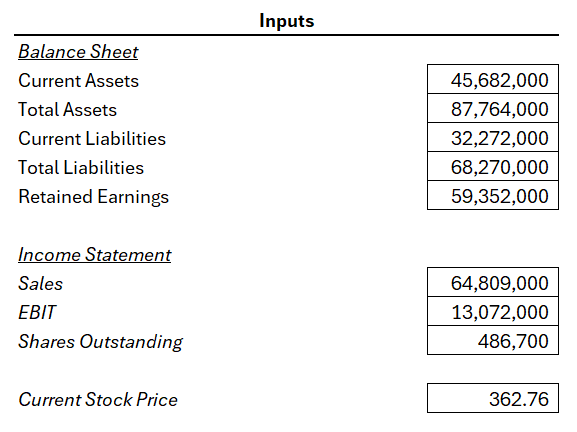
Now, let’s try it out by entering the following values for a manufacturing company, Caterpillar. These values are pulled from Yahoo Finance for 2024:
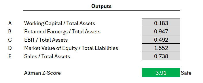
Based on my Excel spreadsheet, this produces the following values and related Z-Score:
If you liked this post on How to Calculate the Altman Z Score in Excel, please give this site a like on Facebook and also be sure to check out some of the many templates that we have available for download. You can also follow me on Twitter and YouTube. Also, please consider buying me a coffee if you find my website helpful and would like to support it.
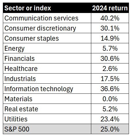
Charts can be an effective way to convey data, as opposed to just tables. By visualizing numbers, readers can easily see the highs and lows, and just how much of a variance exists between them. In this example, I’m going to show you how to turn a table summarizing S&P 500 sector performance into a chart.
The data we’re going to use for this example is as follows:
Let’s turn this into a more helpful visual, which will sort these values from highest to lowest. Here are the steps you can take to do that:
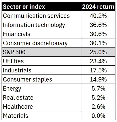
1. Sort the list from largest to smallest
This can be done by simply selecting the 2024 return header and clicking on the sort descending button. The table is now re-arranged as follows:
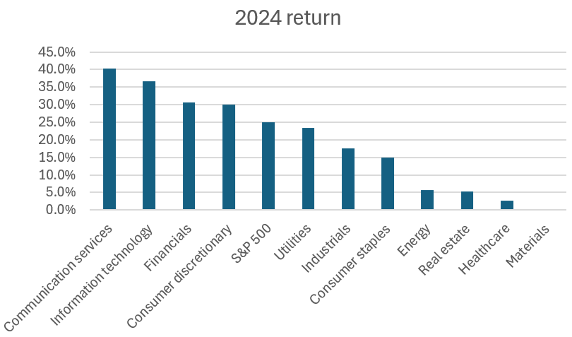
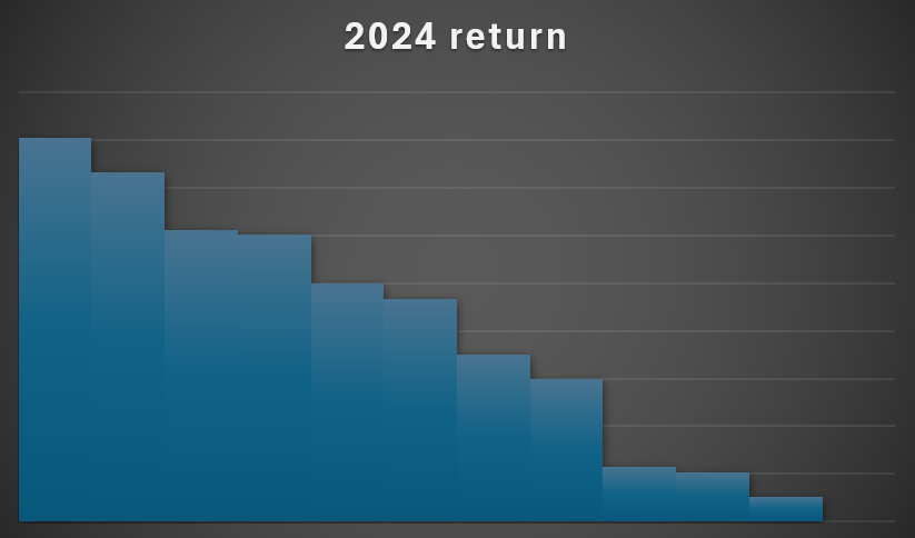
2. Create a column chart
By selecting the data and choosing to create a column chart, you can create a visual that now displays the returns, from highest to lowest.
3. Select a chart style
If you select the chart and click on the Chart Design tab, there will be many different styles to choose from. This can save you the time from making multiple adjustments yourself.
Let’s select the dark one on the bottom-left corner.
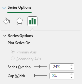
4. Remove gaps
To make the column chart more snug, you can remove the gaps between them. To do this, right-click on the chart and select Format Data Series. Adjust the Gap Width to 0%.
5. Remove axis labels
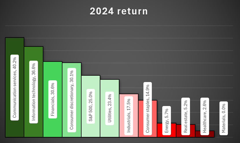
Since we’re going to incorporate the labels into the actual chart, you can remove the axis labels themselves. To do this, simply click on each axis and click on the delete key. You’ll now have a chart that looks like this:
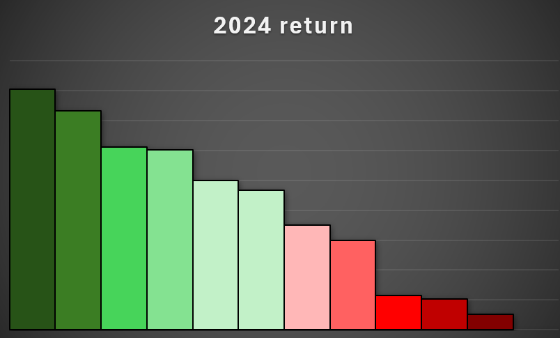
6. Setup the color formatting for the column charts
To help display the largest and worst-performing sectors, let’s apply different colors to each column. Starting with the first column chart, set that to a dark green color and apply a black border around it. Then, proceed to the next one, by clicking on ctrl + right arrow. This avoids having to manually select each item. If you need to go back in the opposite direction, you can use ctrl + left arrow.
Here’s how I’ve setup my chart so it gradually goes from a dark green to a lighter green, to light red, and dark red.
7. Add labels
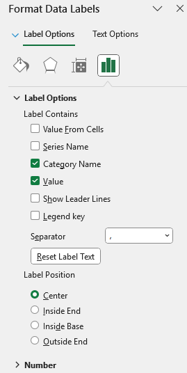
If you right-click on any of the columns, there will be an option to Add Data Labels. Once added, you can also right-click on them to select Format Data Labels. Let’s select the option to show the value along with the category name, and set the label position to Center.
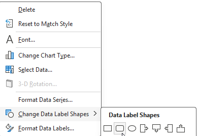
What we can also do is setup a data label shape, so that it’s easy to see. To do this, right-click on any of the labels and select Change Data Label Shapes. Let’s choose a rounded rectangle.
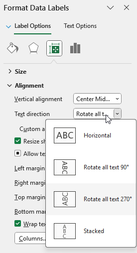
Next, on the alignment section, let’s also set the text direction to rotate all text 270 degrees.
This now results in the following chart:
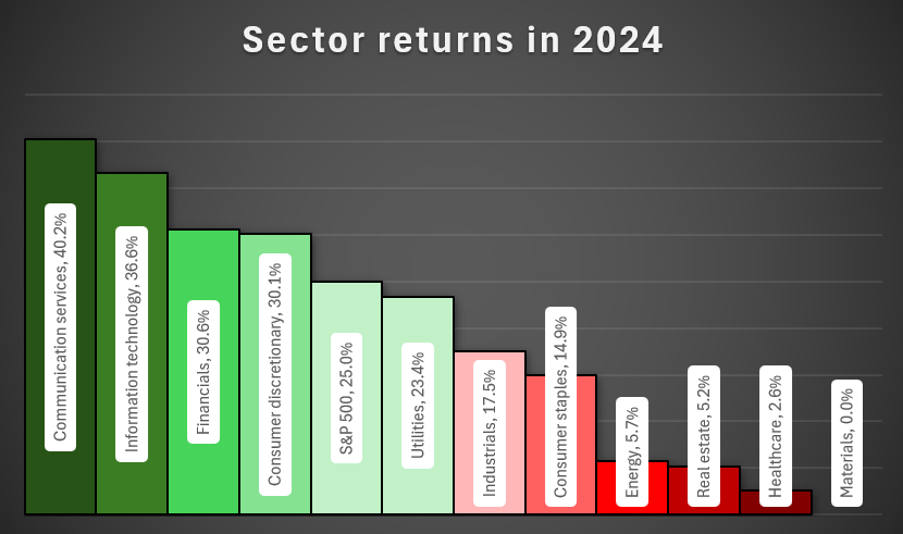
8. Add a title
The last step is simply to update the title, to more accurately reflect the data. Let’s rename it by double-clicking on the title, and setting the name to ‘Sector returns in 2024’
If you liked this post on How to Analyze S&P 500 Sector Performance Using an Excel Bar Chart, please give this site a like on Facebook and also be sure to check out some of the many templates that we have available for download. You can also follow me on Twitter and YouTube. Also, please consider buying me a coffee if you find my website helpful and would like to support it.
If you want to track your investments and stay on top stocks in a watchlist, I’ve created a template which will make that easy to do. My 2025 Stock Trading Template is a free template in Google Sheets that you can use for that purpose. It will give you a place to enter trades, populate a watchlist, and visually see how your investments are doing on a dashboard. Below, I’ll go over how the template works and how you can access it.
Entering in stock trades on the template
The template contains an Activity tab where you can enter any buy and sell transactions. You can also specify cash-only transactions if you make a deposit or withdrawal. It’s also possible to enter both a trade and a cash transaction on the same line.
In the screenshot below, you’ll see a cash-only transaction on the first row, and the one below has a stock purchase along with cash deposit amount. Any withdrawals should be entered as negative values in column D. This is for the purpose of tracking both the value of your investments and cash in your portfolio.
You’ll want to reconcile your cash balance in the last column to ensure that it is properly accounted for. The current value of your holdings will pull into Google Sheets using the most recent stock prices; there’s no need to update the current price.
The only columns you need to populate in this table are A:G. The others will calculate automatically.
Keeping track of a watchlist
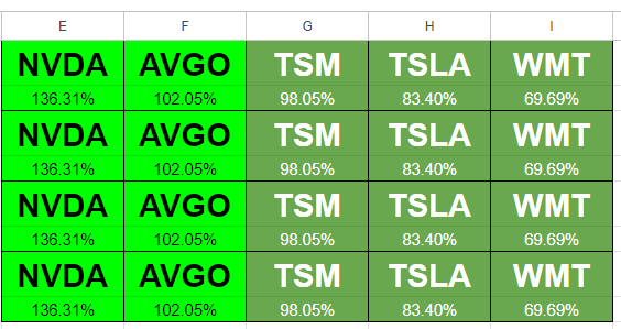
If you want to also track certain stocks, you can do so using the Watchlist tab. Simply enter the ticker symbol in column A and the value in column B will populate, which shows the stock’s percent change for the most recent trading day.
You only need to enter data in column A. The rest of the values will populate on their own and display on the summary tab.
View your holdings and watchlist on the summary tab
Once you’ve entered your holdings and the stocks you want to track, you can head over to the Summary tab which will summarize your financial position. Here you’ll see the current value of your investments, your gains and losses, and your return over the trailing 12 months (TTM) as well as how stocks have been performing in individual months.
Below the headers, in row 4, you’ll also see your watchlist, sorted in order of highest to lowest returns for that day. It will cut off after 300 characters so you may not see all of them on there if you have a large watchlist.
Download the template
You can access the Google Sheets template in the link below, which will prompt you to make a copy of it. I have entered some sample data for you to see how it works, and you can overwrite it with your own entries.
If you have any feedback, comments, or suggestions for improvement on the template, please feel free to contact me and let me know.
If you like the 2025 Stock Trading Template, please give this site a like on Facebook and also be sure to check out some of the many templates that we have available for download. You can also follow me on Twitter and YouTube. Also, please consider buying me a coffee if you find my website helpful and would like to support it.
Heat maps can help you easily identify high and low values. You’ll often find them to display stock prices to show which stocks did well, and which ones didn’t. They can also make it easy to see whether it was a good or bad day on the markets when looking at a list of stocks. In this post, I’ll show you how to create a heat map in Google Sheets to do this.
Step 1: Populating your list of stocks
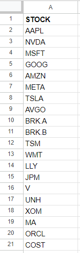
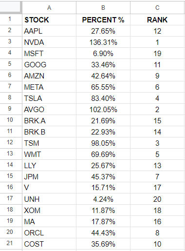
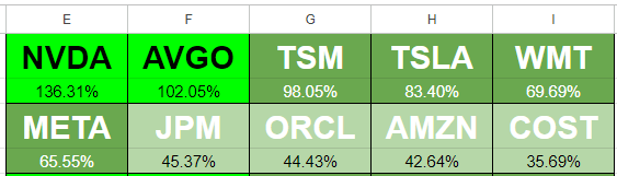
To start with, I’m going to need a list of stocks to track. I’m going to use the top 20 most valuable stocks as of today’s date and put them into a list:
Step 2: Calculate the percentage change
Next, I’ll need to setup the percentage change. This can be either the percent change from the previous day, or I could calculate how a stock has done over a specific timeframe, such as a 12-month period. In Google Sheets, you can use the GOOGLEFINANACE function to track the percent change from the previous day. Here’s what that formula would look like, assuming I want to calculate this for the ticker symbol in cell A2:
=GOOGLEFINANCE(A2,”changepct”)
This will return a value to display the percent change.
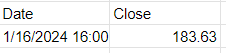
I’m going to use a more complicated example, however, to show how the stock has performed over the past year. First, I’ll pull in the current stock price, using the following formula:
=GOOGLEFINANCE(A2,”price”)
The trickier part is to pull in the price from a year ago. To go back 365 days, I can set the start date equal to today’s date minus 365 days:
=GOOGLEFINANCE(A2,”price”,TODAY()-365)
The problem is that this returns a table, occupying two rows and columns:
To ensure I’m just pulling in the closing price, I’ll use the INDEX function to grab the value from the second row and second column:
=INDEX(GOOGLEFINANCE(A2,”price”,TODAY()-365),2,2)
Now, to calculate the percent change, I will take the current price and divide it by the historical price:
I add the -1 at the end to get just the percent change. Now, if I format my values in percentages, I can see how the stocks have performed over the past 12 months:
Step 3: Ranking the values
Using the RANK function in Google Sheets, I can easily determine which stocks were the best and worst performers in the range. The following formula just takes the percentage value in column B and compares it against all the values in that column:
=RANK(B2,B:B)
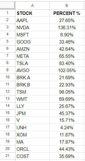
By copying this formula down, I can now see a ranking of all the values:
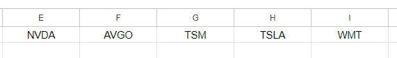
Step 4: Populate the stocks in order of their performances
Now that the data is setup, I can start arranging the values in order of largest to smallest. To do this, I’m going to use the INDEX function along with the MATCH function to extract the stocks based on their performances. Here is what the first formula will be:
=INDEX($A:$A,MATCH(COLUMN(A1),$C:$C,FALSE),1)
I use the COLUMN function because what I am going to do is drag this formula to the right, so that my largest values go from left to right. And as I copy the formula, A1 will become B1, then C1, and so on. The purpose of this is to increment the function to get the next value. Here is what my table looks like for the first five values:
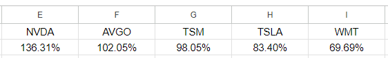
These were the five best-performing stocks that were in my list. Below these values, I’m going to also pull in the percentages. This is accomplished through the following formula:
=INDEX($B:$B,MATCH(COLUMN(A1),$C:$C,FALSE),1)
Now I have a list of the top ticker symbols and their percentage gains:
Step 5: Creating conditional formatting rules
I have the values setup and next I’ll need to create conditional formatting rules to display different colors based on their relative performances. I’ll use a bright green for the best performance, and gradually show a white color when the values are close to zero, and red when they are negative.
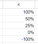
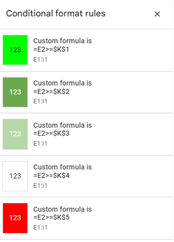
I’m going to setup a table which shows the different thresholds I want to track, so it’s easy to change these conditional formatting rules right on the spreadsheet:
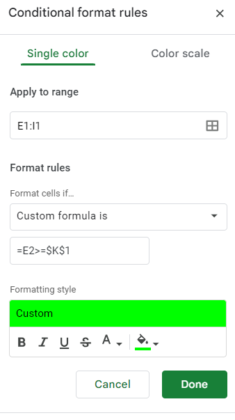
This is my table of values in column K. To setup the rules, I’m going to select the ticker symbols which I ranked in step 4, and create the following conditional formatting rule to start with:
I’m going to repeat these steps for the values in K2, K3, K4, and K5. I’ll adjust the colors to differentiate between the colors ranges I specified earlier. I use the same formula but simply adjust the cell I’m comparing to:
One thing to note here is that the value I’m using as my comparison is in row two, which is where my percentages are. This means for the conditional formatting rules in the first row, Google Sheets is looking the row below, which contains the percentages.
I’ll need to create another set of conditional formatting rules for the actual percentages themselves in row two. In order to avoid disrupting the formulas and the logic for the first row, I’ll need to create these rules from scratch again. It’s important not to just copy the formatting rules as Google Sheets will end up misinterpreting what I want it to do.
After selecting the values in E2:I2, I create the same conditional formatting rules. The one key difference is that this time I’m referencing the values in row two, not the row below. Once that’s setup, you should now see the same conditional formatting rules applied to both rows:
Step 6: Create borders and setup additional formatting
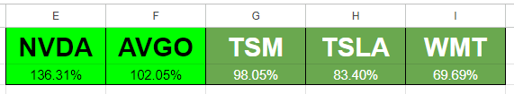
Before I copy over the formulas and conditional formatting to more rows, I’m going to setup additional formatting and borders. I’m going to make the ticker font larger and bold. And I’ll also outline a border for each stock and its percent change. Here’s what my tickers look like after making these changes:
Step 7: Copying the formatting rules and formulas to accommodate more stocks
I created a row of top 5 stocks but I’m going to expand this so that I have four rows of five stocks each, so that I’m capturing all 20 stocks in my list. To do this, I’m going to copy the cells in E1:I2 multiple times:
I’ve copied the formulas but I need to adjust them so that they aren’t all starting from the top-ranking stock all over again. Here’s how I’m going to adjust this. For the formulas in cells E3:E4, I’m going to add five so that they start at the sixth value. This is the updated formula in E3:
=INDEX($A:$A,MATCH(COLUMN(A3)+5,$C:$C,FALSE),1)
Now I’m going to do the same thing for cell E4. Once I’m done, I’ll copy the formulas across and now my second row is updated to show the stocks in the 6th, 7th, 8th, 9th, and 10th positions:
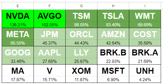
For the next row, I’ll add 10 to the formulas in column E. Then copy those across. Repeat the same process for the next set of rows and add 15, and do the same. Here’s what my updated table looks like:
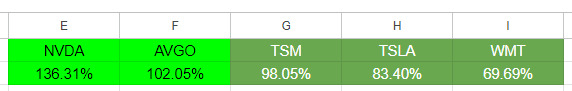
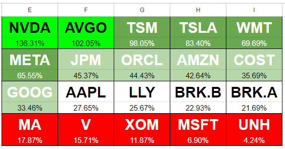
Now my heat map is setup to show the percent changes. But as you can see, there’s not a lot of variability here. I’m going to change my values in column K as follows: 100%, 60%, 30%, 20%, -100%. I always leave the last one to -100% to ensure it captures everything else. With the updated rules, now my heat map looks as follows:
Although the values in red are not negative, based on the rules I’ve set out, it highlights the lowest-performing stocks in this list as red, and thus, the sheet follows the rules correctly. You can expand this to include more stocks or to track daily changes or other values.
If you like this post on How to Create a Stock Heat Map in Google Sheets, please give this site a like on Facebook and also be sure to check out some of the many templates that we have available for download. You can also follow me on Twitter and YouTube. Also, please consider buying me a coffee if you find my website helpful and would like to support it.
Calculating trailing-12 month values, also known as TTM, can be a powerful way to analyze financial or business data over the most recent year. This method focuses on the latest 12-month period, providing a rolling snapshot of performance or trends. Unlike calendar-based analysis, which adheres strictly to yearly or quarterly periods, TTM values are dynamic and update with each new data point. This makes them ideal for ongoing monitoring, where understanding recent trends is more relevant than sticking to predefined reporting periods.
The concept of a TTM value is straightforward: it involves summing, averaging, or otherwise aggregating data from the most recent 12 months. For instance, if you’re tracking monthly revenue, a TTM sum would include the total revenue for the latest 12 months, updating automatically as new months’ data becomes available. This ensures that you’re always working with the most current information, offering a more flexible and actionable view of performance.
Why Are 12-Month Trailing Values Useful?
Calculating TTM values is valuable in contexts where trends or seasonality play a significant role. For example, retail businesses may experience seasonal spikes during the holiday season, while other industries might have cyclical patterns tied to the economy. A TTM analysis smooths out these seasonal fluctuations, offering a clearer picture of overall performance without being skewed by short-term anomalies.
For investors, financial analysts, and business owners, this calculation can be a crucial metric. It helps in understanding key financial ratios (including price-to-earnings ratios), by providing a consistent timeframe for comparison. It also allows for benchmarking against competitors or industry averages, as trailing metrics are widely used in reporting and valuation. Moreover, it can aid in spotting trends early, such as declining sales or increasing costs, enabling proactive decision-making.
Calculating TTM Values in Excel
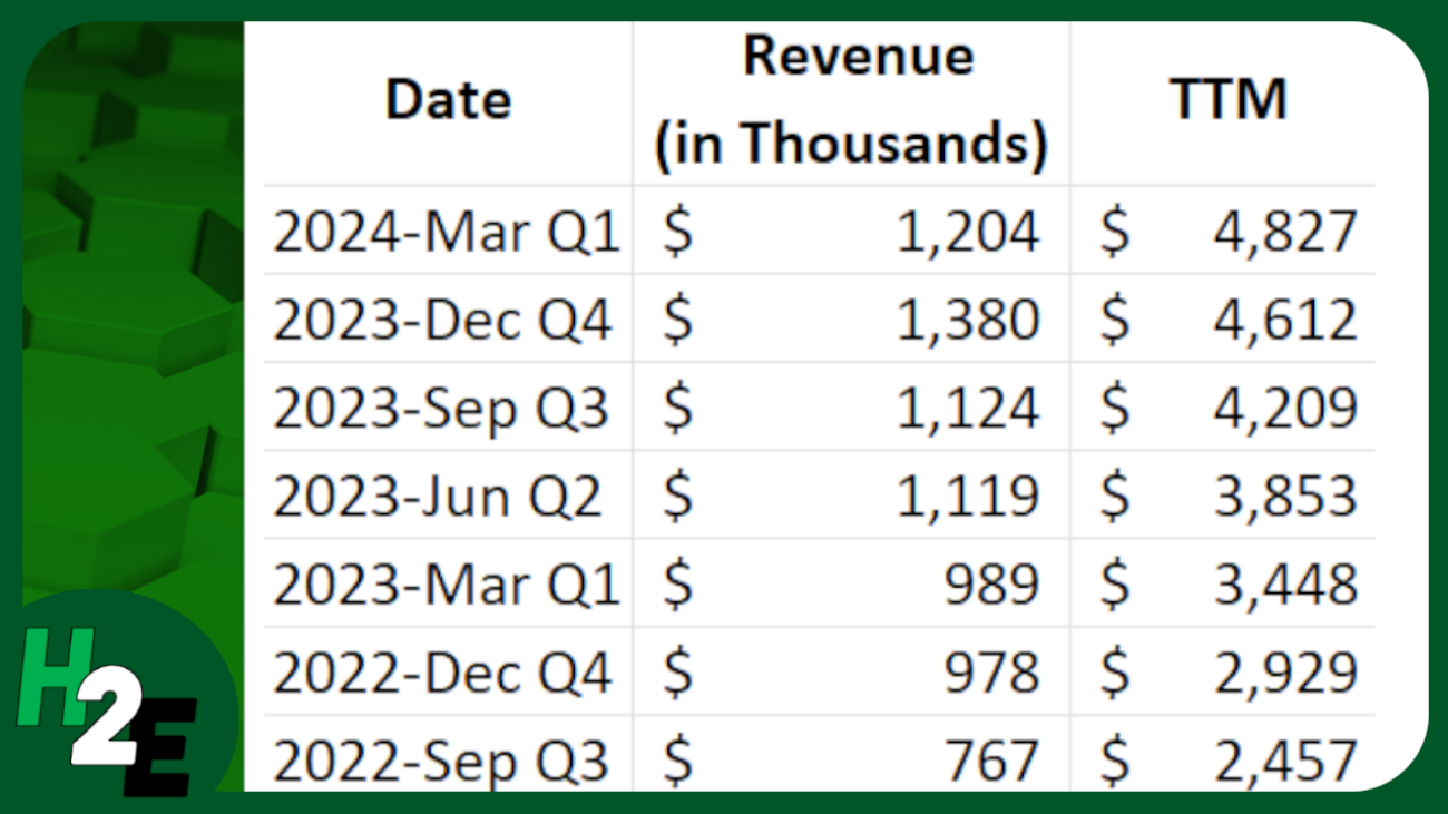
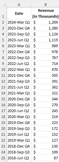
In the following example, I have sales data by quarter. Since they are quarters, I only need to pull the last four values to get the last 12 months worth of values.
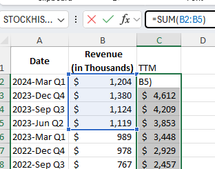
In the simplest approach, you can just use the SUM function and grab the last four values from the top:
By not freezing any cells and copying the formula down, it will automatically adjust so that it’s always getting the most recent four values.
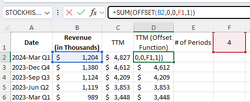
You can make the formula more dynamic by using the OFFSET function. You can change the number of values you want to add up. And it can be useful if your data is at the bottom, and you want to start from the last value you input. Here’s how you can use a variable to determine how many trailing values you want to calculate.
Using the OFFSET function, you can specify the height and width of the range. In the above example, I’m using cell F1 to specify the number of periods I want to sum up.
If your most recent values are at the bottom of your range, the OFFSET function can help you with this as well. Here’s how the formula would look like:
=SUM(OFFSET(B2,COUNTA(B:B)-2,0,-4,1))
B2 is the starting reference point.
The COUNTA function counts the number of nonblank cells in column B. It is reduced by 2 since the reference point, B2, is in row 2. It needs to be reduced by 2 to get back to 0.
There are 0 columns to offset, hence the next argument is 0.
The -4 tells the formula that you want to go back 4 rows.
The 1 at the end tells the formula that it is just 1 column wide.
This produces an array, which is then summed up through the SUM function.
If you like this post on How to Calculate Trailing 12 Month (TTM) Values in Excel, please give this site a like on Facebook and also be sure to check out some of the many templates that we have available for download. You can also follow me on Twitter and YouTube. Also, please consider buying me a coffee if you find my website helpful and would like to support it.
Google Sheets makes it easy to pull in data from the internet, including stock prices. An advantage it has over Excel’s StockHistory function is that it can pull prices even before the trading day has finished. This gives users access to more up-to-date information. Plus, it’s easy to track not just one or two stock prices in Google Sheets but even hundreds.
How to pull in a stock price for a ticker symbol in Google Sheets
Using the GOOGLEFINANCE function, you can quickly pull in a stock price easily. Here are the main components of the function:
Ticker
Attribute. Below are the attributes you can use for stocks:
“price”: current price, up to 20 minutes delayed.
“priceopen”: the opening price.
“high”: the current day high.
“low”: the current day low.
“volume”: the current day’s volume.
“marketcap”: the stock’s current market cap.
“tradetime”: the time the last trade was made.
“datadelay”: how delayed the real-time data is.
“volumeavg”: the stock’s average trading volume.
“pe”: the price-to-earnings ratio.
“eps”: the most recent earnings per share.
“high52”: the stock’s 52-week high.
“low52′: the stock’s 52-week low.
“change”: the change in stock price from the previous day’s close.
“changepct”: the percentage change in price from the previous day’s close.
“beta”: the stock’s beta value.
“closeyest”: the previous day’s closing price.
“shares”: the number of shares outstanding.
“currency”: the stock’s currency
Start Date
End Date
Interval
You don’t, however, need to fill in all of the arguments. For example, the following formula only uses the ticker and the attribute field and it will pull in Amazon’s current stock price:
=GOOGLEFINANCE(“AMZN”,”price”)
If you want to pull in Amazon’s stock price for the first trading day of the year, you could use the following formula:
=GOOGLEFINANCE(“AMZN”,”price”,”1/1/2024″)
This will return the following table:
Although January 1 was not a trading day, the formula automatically gets the data for the next trading day. If you just want to get the closing price and don’t want the rest of the table, you can nest this formula within the INDEX function as follows:
Since we are getting the second column and the second row, it will only retrieve the closing price for that day. This method works when you are just pulling in the stock price for a single date.
Adding a prefix for exchanges
If you want to track a lot of stocks, the one thing you may inevitably run into is a situation where Google Sheets doesn’t correctly identify your stock ticker. If, for example, you want to pull in a stock from a different exchange, entering just the ticker symbol alone won’t be enough. If I wanted to pull in the price for Air Canada stock, which has a ticker symbol AC on the Toronto Stock Exchange (TSX), this formula won’t work:
=GOOGLEFINANCE(“AC”,”price”)
Instead, that formula will return the value for Associated Capital Group, which trades on the NYSE. Google Sheets effectively takes its best guess as to which ticker you want to pull in. But as you can imagine, it may get it wrong if you have a symbol which is active on multiple exchanges.
To get around this, you can incorporate an indicator for the exchange. For the TSX, it’s TSE. If you’re not sure which one to use, go to the Google Finance website and look for the stock you want, and take note of the code for the exchange:
To ensure the GOOGLEFINANCE function is retrieving the correct stock, I can adjust my formula as follows:
=GOOGLEFINANCE(“TSE:AC”,”price”)
You can follow the same methodology for other stocks and exchanges.
Creating a template to track hundreds of stocks
To create a template to help you track stocks in Google Sheets, all you really need are a few fields. One for the ticker, one for the exchange, plus one for the stock price. I’ll also add one for the % change. This can help you build out a dashboard.
If I have my tickers in column A and the exchange code in column B, I can combine the values to create a dynamic formula which will update based on those combinations. This way, I can avoid having to hardcode the individual stock tickers. Here’s how that formula would look:
=GOOGLEFINANCE(B2&”:”&A2,”price”)
The key is to combine those values and separate them with a colon in-between, so that the format is exchange:ticker. Now, when I create my template, I can copy that formula down and it will pull in stock prices which aren’t based solely on just the stock ticker:
Let’s extend this a bit further and now also include the percent change from the previous day. If I want to format it as a percentage, I need to make sure I divide the value by 100:
=GOOGLEFINANCE(B2&”:”&A2,”changepct”)/100
And now I can display both the stock price and the percent change from the previous day:
You can copy these formulas down hundreds of rows, making it possible to track as many stocks as you need in Google Sheets.
If you like this post on How to Track Hundreds of Stocks in Google Sheets, please give this site a like on Facebook and also be sure to check out some of the many templates that we have available for download. You can also follow me on Twitter and YouTube. Also, please consider buying me a coffee if you find my website helpful and would like to support it.
In a previous post, I went over how to download a company’s financial statements from the Wall Street Journal’s website. However, that connection appears to now be closed. One of the risks when using Power Query to download data from a website that the connection will always be there. But there is another way to get financial statement data, and it can allow you to download much morethan what was available through the Wall Street Journal.
You’ll need to setup an account with Alpha Vantage
The website that you can use is Alpha Vantage. It provides API access which you can use to download financial data. There is a free account but there is a limit to the number of requests you can make every day — up to 25. But with the wealth of information you can get with just a single query, there’s a lot of data you can accumulate.
Once you sign up for an account with Alpha Vantage, you’ll have an API key that you can use to connect to its database. You’ll need to save that key to download the data.
Use the site’s custom Excel add-in
Once you have the API key, you can start downloading data. But rather than creating your own template or even using Power Query, what you can do is download the sample Excel files that are available on the site on the spreadsheets page. Here you can select to download the Office 365 add-on, which also includes sample Excel files that can get you started in seconds.
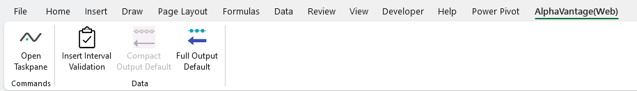
There is a template called FundamentalData.xlsx which contains a file that’s ready to go to import the financials. When you first open it, you’ll need to select the AlphaVantage(Web) tab and click on the Open Taskpane command.
From there, you’ll see an option to input your API Key.
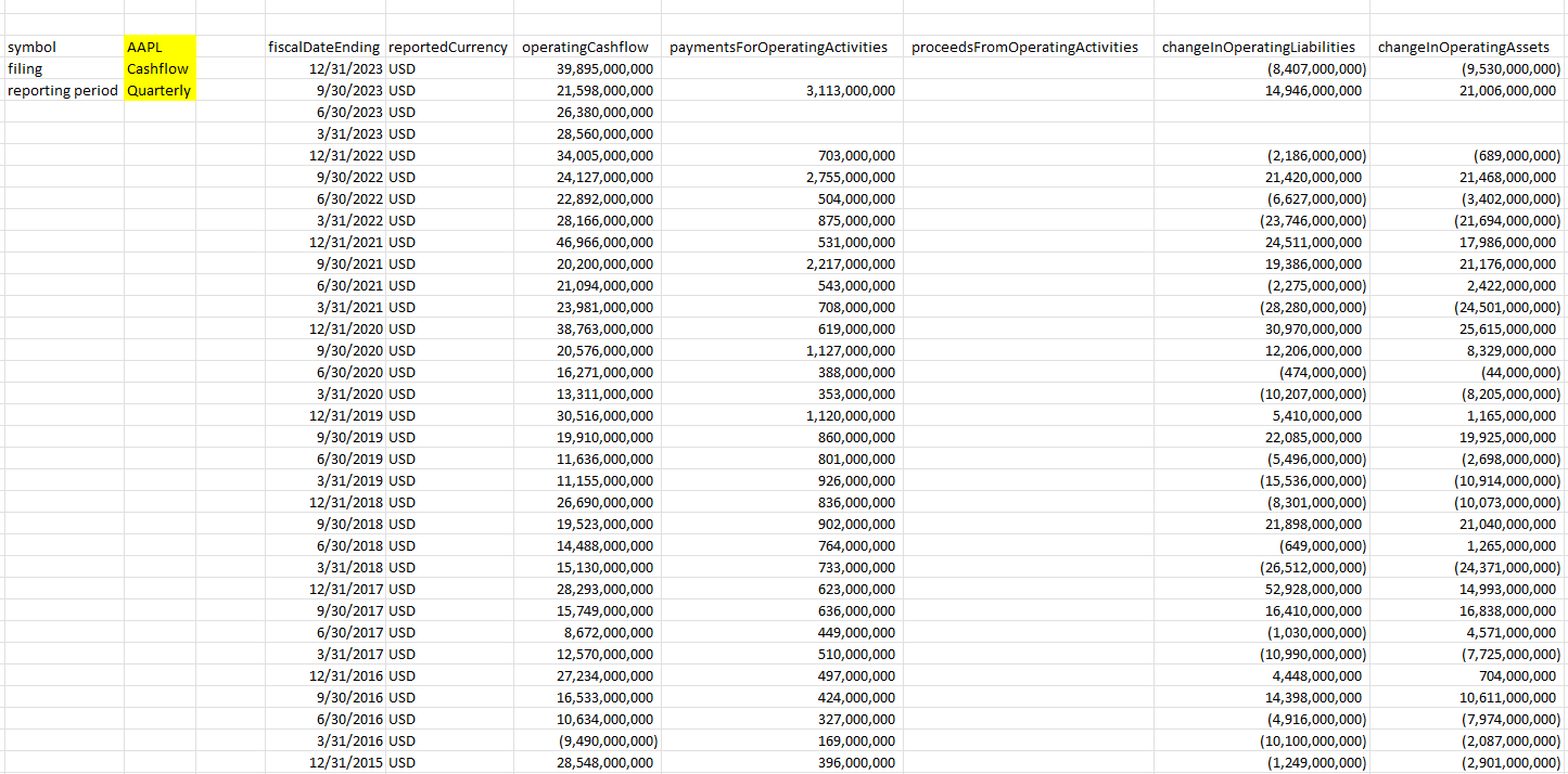
Then, on the filings tab, you’ll see an area where you can specify the ticker symbol you want, the type of filing (cash flow, income statement, or balance sheet) and the reporting frequency (quarterly versus annual). Then, as you make your selections, the data on your spreadsheet will update with various financial metrics.
Using Alpha Vantage is one of the better options for investors today who want to download financial data into Excel.
Importing financial statement data in Google Sheets
The company also has a Google Sheets add-on available from the Google Workspace Marketplace, just go to Extensions ->Add-ons -> Get add-ons. Then search for ‘Alpha Vantage’ and download the add-on:
Once installed, go back to the Extensions menu, select Alpha Vantage Market Data and select Enter API Key, where you can paste your API key into. Once that’s done, you can use formulas to pull in financials. The following pulls in the quarterly income statement data for MSFT stock:
For a full breakdown of what you can download on Google Sheets, refer to the documentation on the Alpha Vantage website.
Download the data using Power Query
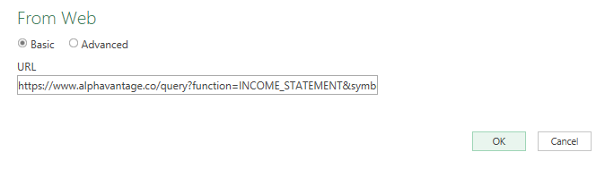
If you prefer not to install an add-in, then you can still download the data from Alpha Vantage using Power Query. You can refer to the documentation for the various links to pull financial data. For the income statement, for example, this is the following url:
Where Ticker is the stock symbol and Demo is your API Key. To generate the data in Power Query, use the Get Data option and select From Web and paste the URL into there:
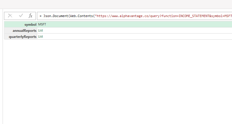
Then, once Power Query is loaded up you have the option to specify whether you want the list for the annual reports or the quarterly reports.
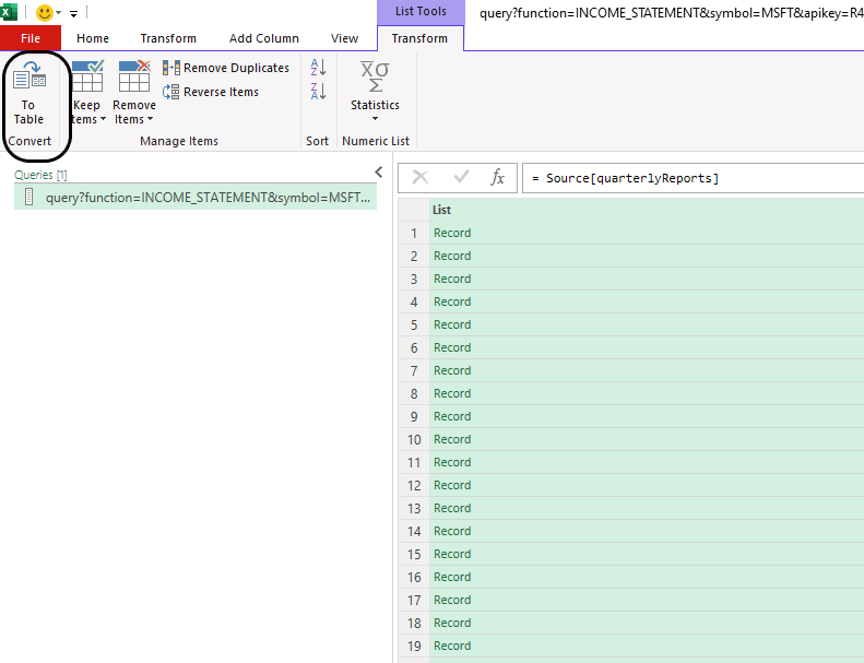
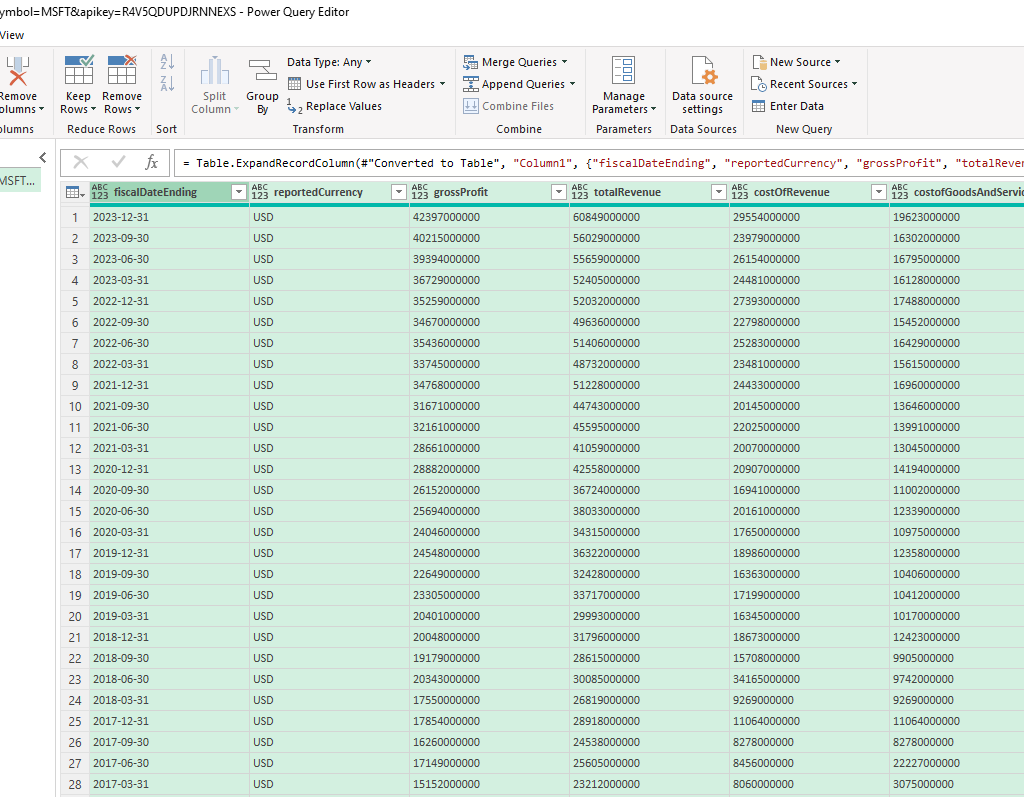
If I select the quarterlyReports list, I’ll have another list of records. I can expand this by clicking on the Convert To Table button in Power Query:
This will put everything back into a single column. This time, however, I can expand all the fields out by clicking the two arrows going in opposing directions.
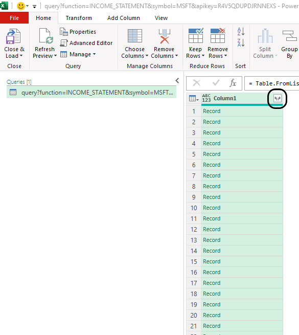
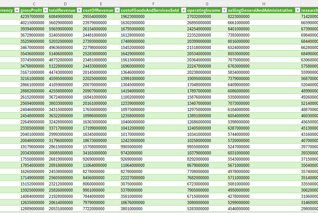
Now my data looks complete:
And this is what it looks like once it’s loaded back into Excel:
If you like this post on How to Import Financial Statements Into Excel and Google Sheets please give this site a like on Facebook and also be sure to check out some of the many templates that we have available for download. You can also follow me on Twitter and YouTube. Also, please consider buying me a coffee if you find my website helpful and would like to support it.
Moving averages can be useful in data analysis, when looking at trends both in finance and in the stock market. You can look at 30, 60, 90 day trends, and even longer or shorter durations. There’s also a difference between whether you are looking at a simple moving average and an exponential moving average. In this article, I’ll go over the differences between the two, and show you how you can calculate them in Excel.
How to Calculate a Moving Average (MA) in Excel
A moving average is a simple tool used by investors and traders to smooth out price data over a specified period. It is called “moving” because it is continually recalculated based on the latest data, providing a dynamic view of an asset’s average price over time. The advantage of an MA is its simplicity as it can easily be calculated.
A moving average is calculated by simply taking the average of the trailing periods. In the case of a 60-day MA, you would look at the average over the past 60 days. If it’s a 90-day MA, then you average the past 90 days. In the following example, I have the price of Bitcoin over the past few years. Ideally, when setting up moving averages, you want your dates in ascending order, going from oldest to newest.
Here are the steps to calculate the moving average:
Determine the number of periods you want to go back. For 5 days, it will be 5, for 10 days it will be 10, and so on.
Calculate the average in the adjacent column. Make sure you do not freeze cells.
Copy the formula down so that the average moves (hence why you do not want to freeze cells).
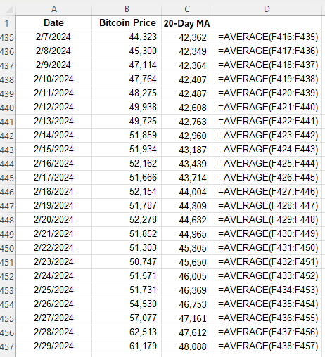
Here is what the values look like, along with the formula for each cell:
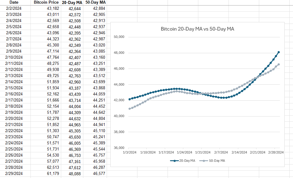
The average is continuously moving with each cell, but it always contains a range of 20 values since the 20-day MA contains 20 days. Oftentimes, people using multiple moving averages as a way to identify crossovers, such as when stocks cross 20-day MAs and 50-day MAs. Depending on the direction of the crossover, it can be a very bullish indicator (20-day MA crosses from underneath) or a very bearish indicator (20-day MA crosses from above). This is what those moving averages look like for Bitcoin and how they appear on a chart:
In this example, the 20-day MA made a bullish crossover recently, going higher than the 50-day MA. This is a very bullish trend. However, with simple moving averages, these trends can take a while to develop, and that is one of the drawbacks of using them — they are slower to react to recent price movements.
How to Calculate an Exponential Moving Average (EMA) in Excel
The exponential moving average (EMA) gives more weight to recent prices, making it more responsive to new information, and thus, there’s less of a lag effect; changes and crossovers can occur much more rapidly. This characteristic makes the EMA a preferred choice for many traders, especially those looking to capitalize on short-term trends.
Here’s how to calculate an exponential moving average in Excel:
Determine the number of periods, as you did with the simple moving average.
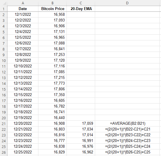
Calculate a multiplier, using the formula 2 / (period +1). In the case of a 20-day MA, the multiplier would be 0.095, which is 2/(20+1).
Calculate the moving average for the first period. The very first period needs to be a simple moving average.
For every value afterwards, you’ll use the following formula: =Multiplier x (Current Price – Previous EMA) + Previous EMA.
Here’s how this would be calculated with the price of Bitcoin, as in the previous example:
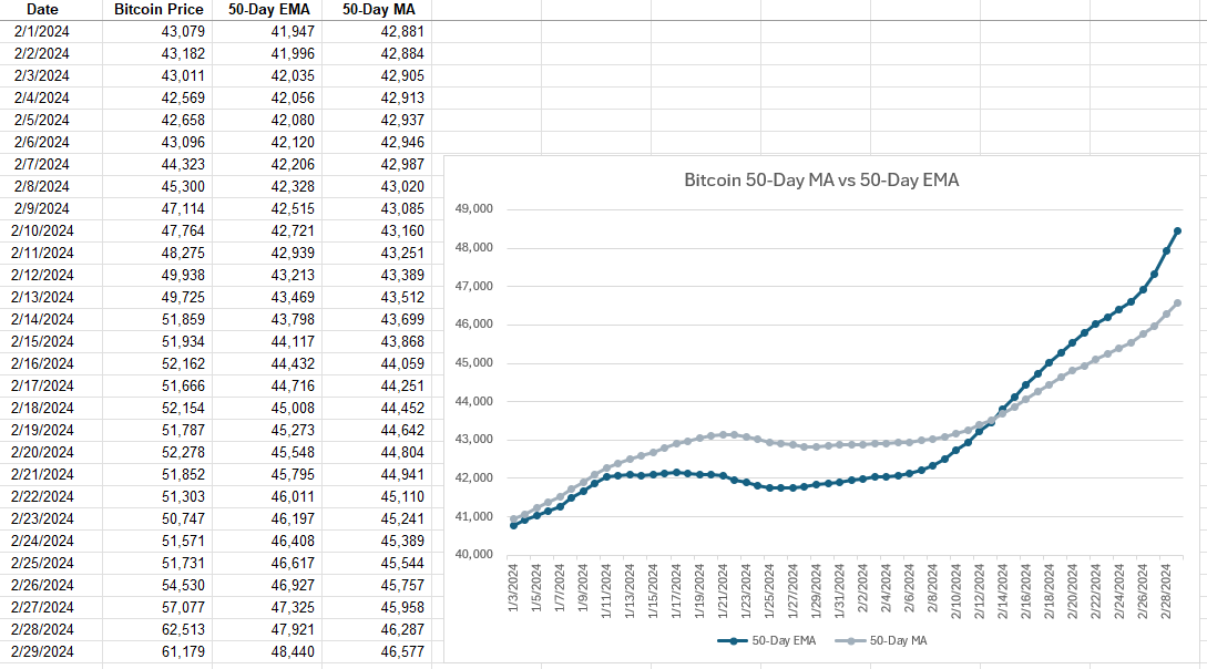
After the initial moving average, the subsequent averages are calculated using the weighting. Here’s a side-by-side comparison of how the 50-day EMA compares with the 50-day MA. I’m using 50-day averages here since they are normally slower to see movements in. But by using an EMA, that can help expedite trends.
The 50-day EMA makes quicker, more rapid movements and is changing more frequently while the 50-day MA is smoother and more gradual in its changes. With Bitcoin’s price rising rapidly in recent weeks, that uptrend is observed more immediately with the EMA than with the simple MA.
Which Should You Use: MA or EMA?
While both MAs and EMAs provide valuable insights into market trends, the choice between them depends on the specific needs of the trader or analyst. MAs are best suited for identifying long-term trends, as they smooth out price fluctuations evenly. In contrast, EMAs are ideal for those looking to react quickly to recent price changes due to their emphasis on newer data.
By understanding the differences between these two types of averages and knowing how to calculate them in Excel, investors and analysts can better tailor their strategies to suit their goals. Whether it’s the simplicity and broad trend identification of the MA or the responsiveness of the EMA to new information, both tools can be useful.
If you liked this post on What Is the Difference Between a Moving Average and an Exponential Moving Average, please give this site a like on Facebook and also be sure to check out some of the many templates that we have available for download. You can also follow us on Twitter and YouTube.