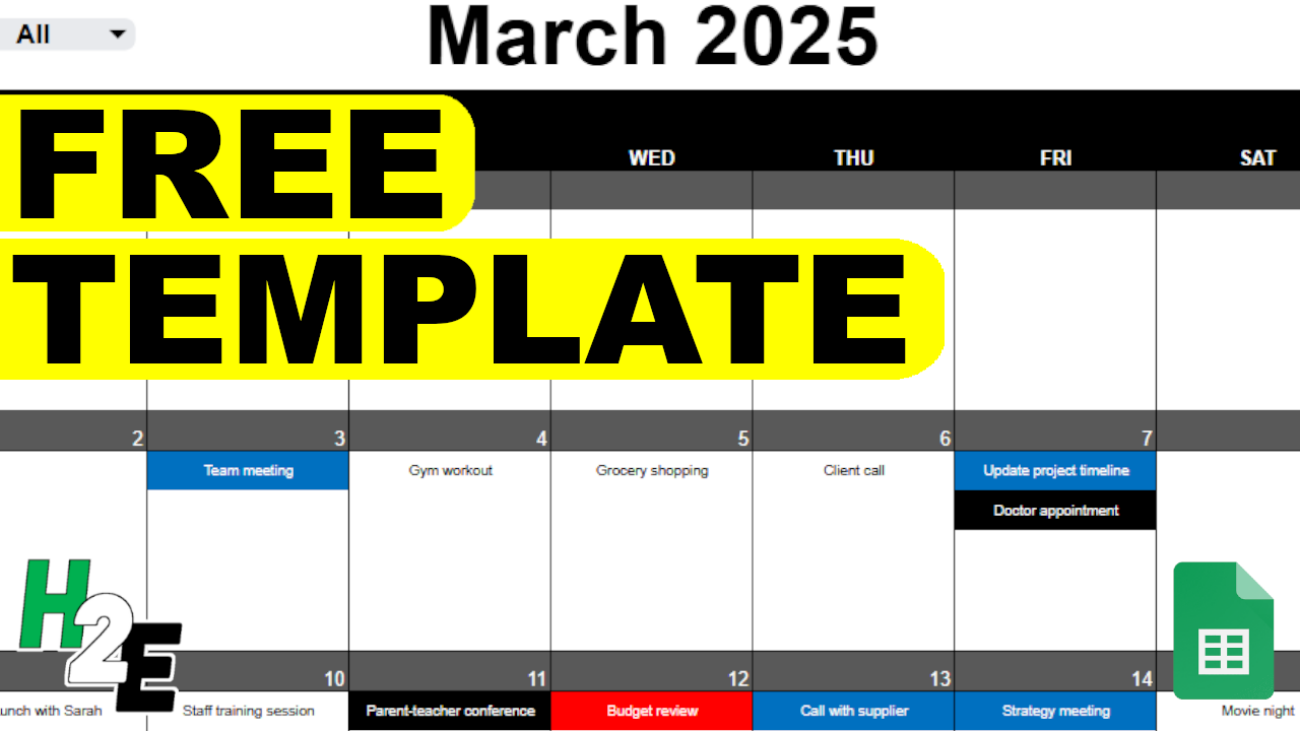
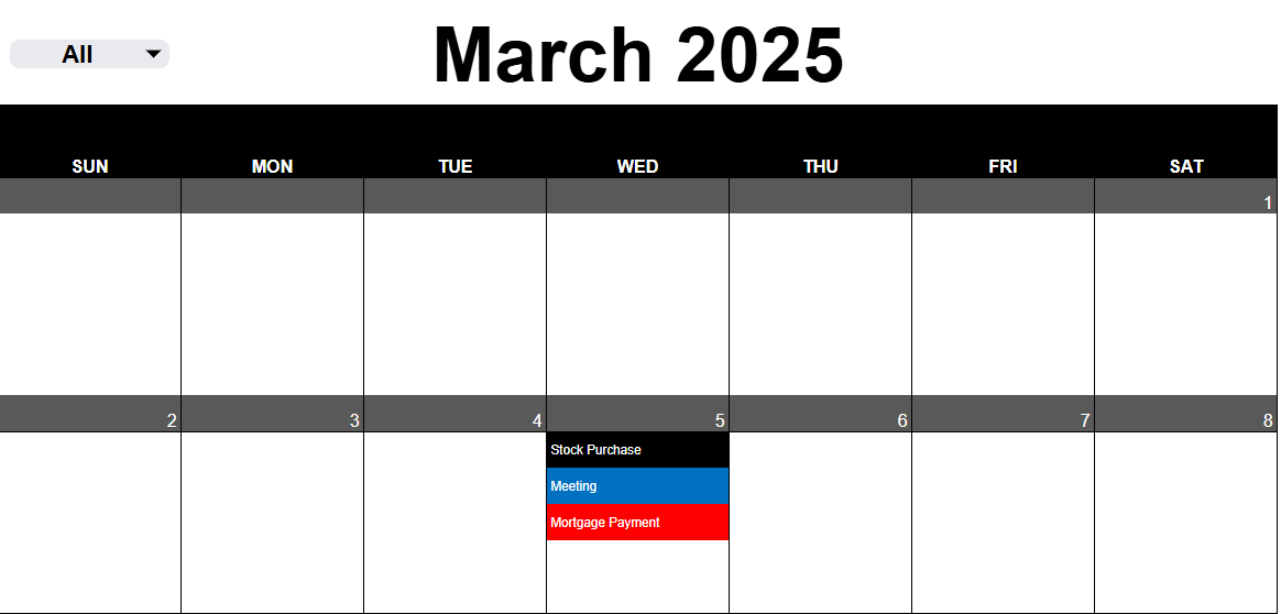
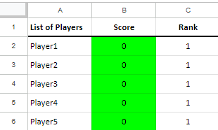
Do you want to create conditional formatting rules in Google Sheets that are linked to specific cells? Below, I’ll show you how to do that, so that it’s easy to update, maintain, and see what conditional rules you have setup. This avoids having to set your values directly in the conditional formatting settings.
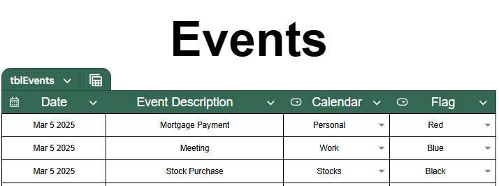
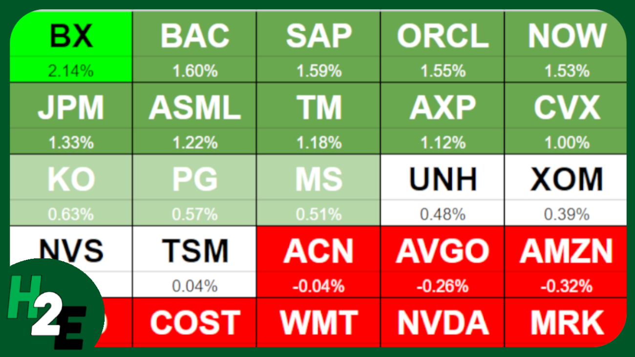
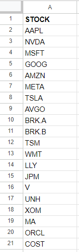
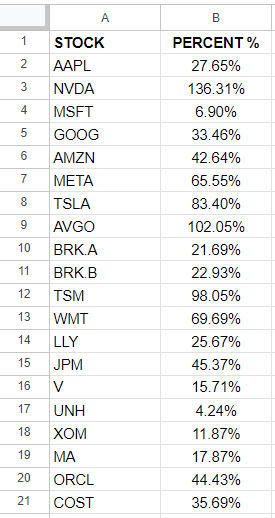
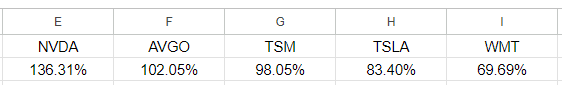
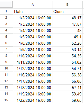
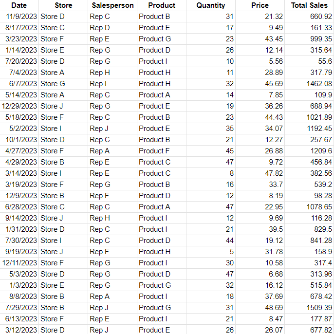
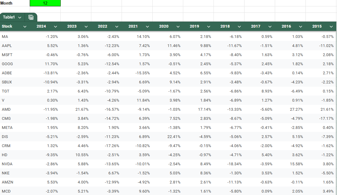
In this example, I have a list of stock tickers and their historical performances for a specific month of the year. I’m going to create rules to highlight cells based on their values.
You can follow along with my practice file here. Simply create a copy to see my conditional formatting settings or start from scratch.
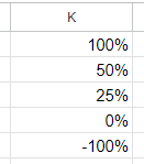
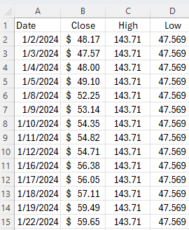
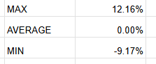
I will create three different cutoff points for my conditional formatting, a maximum value for the highest threshold, the average, and a minimum value for the lowest threshold. I’ll call refer to them as MAX, AVERAGE, and MIN.
For the MAX value, I’m going to set this to the third largest value, and multiply it by a factor of 0.5, just to ensure that the cutoff is low enough that it includes enough data points. My formula utilizes the LARGE function and is as follows:
=LARGE(Table1[[2024]:[2015]],3)*0.5
For the average, I’m going to simply calculate the average for the entire table:
=AVERAGE(Table1[[2024]:[2015]])
For the MIN value, I’ll use the same logic as for the largest value, except this time I’ll use the SMALL function so that I can get the third smallest value.
=SMALL(Table1[[2024]:[2015]],3)*0.5
You can obviously setup whatever cutoff points you want for your conditional formatting. But I just want to give you some ideas and ways where you can make your formatting rules a bit more dynamic, based on the data set. I have these cutoff points set up but I can adjust them as necessary:
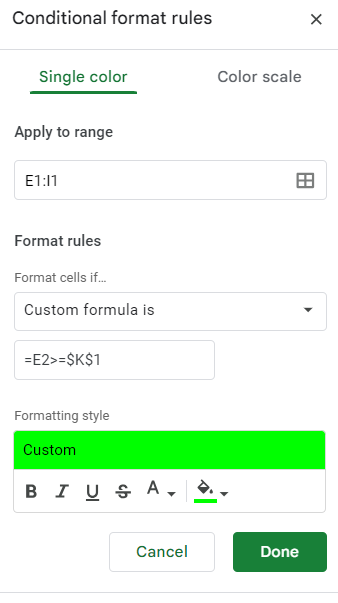
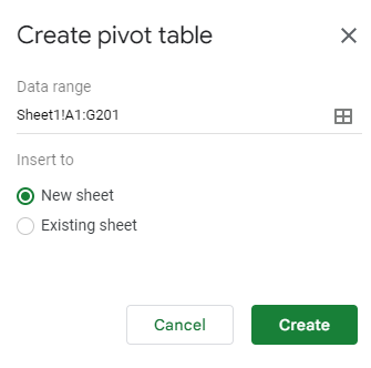
Now, we can go and setup the conditional formatting rules, linking them to these cells. To do this, start by selecting all the values to apply conditional formatting to. In this example, I’m going to select the entire table. Then, go to Format and select Conditional Formatting.
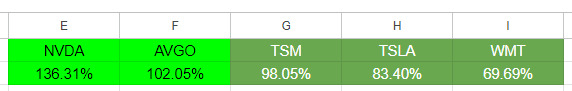
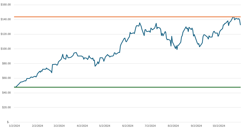
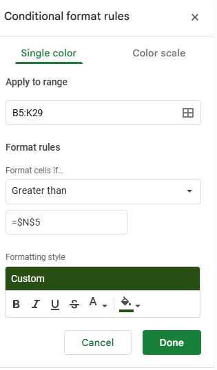
For the first rule, I’m going to check the option to format cells if they are Greater than a specified value. Here is where instead of entering a value, you can reference a specific cell. My max value of 12.16% is in cell N5, and I’m going to enter that in my conditional formatting rule. Note that it’s important to freeze the cell to ensure every cell is looking at this same value.
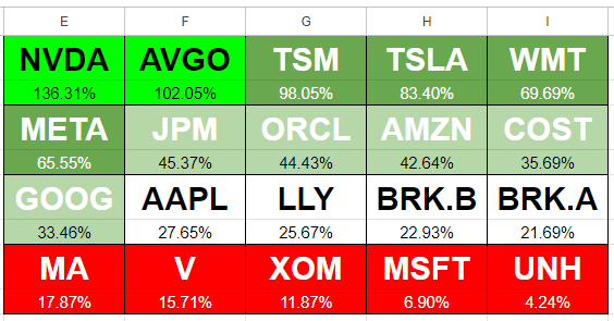
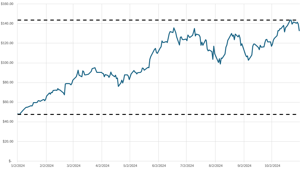
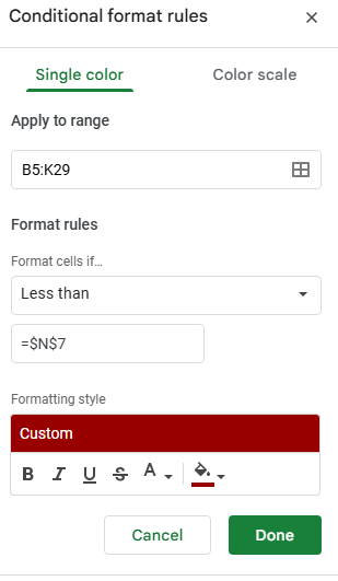
Next, click on the button below the conditional formatting rule that says + Add another rule. It will copy the settings and so now, for the next rule, all that’s necessary is to adjust the linked cell so that it’s referencing N7 (the minimum) rather than N5. And instead of greater then, I’ll select the option for Less than. I’ll also change the formatting so that it is red:
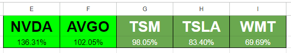
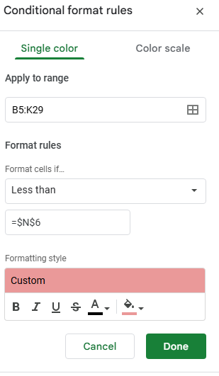
Now, let’s create another rule, this time for the average. This rule will look at if a value is below the average and apply a lighter shade of red:
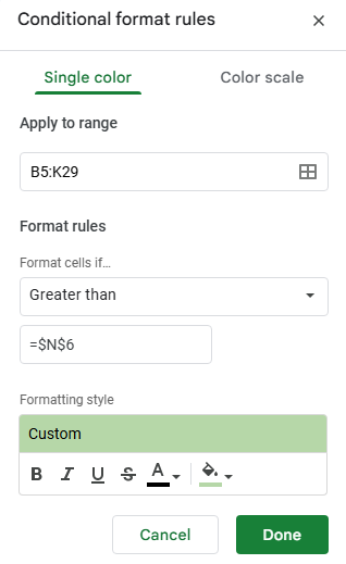
The last rule I’ll setup is if the value is greater than the average, and apply a light green highlighting:
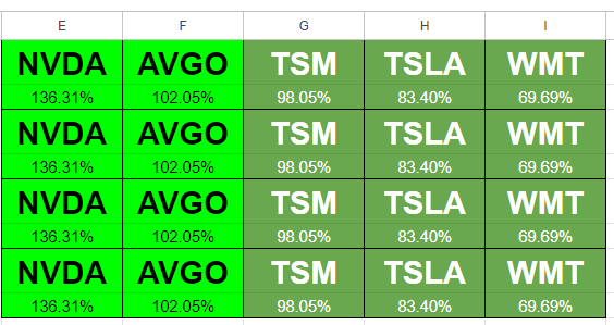
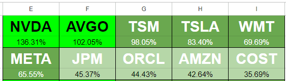
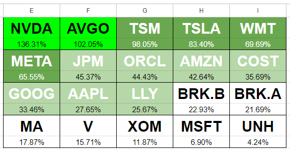
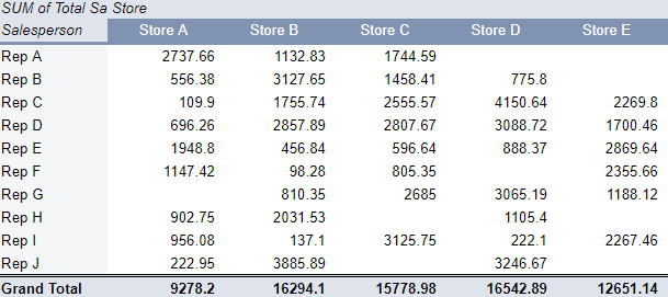
In my example, the formatting rules are now applied based on which cutoff points they fall within:

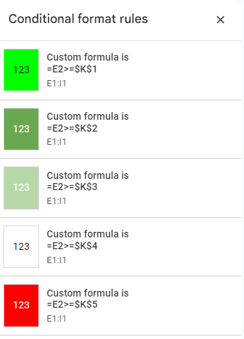
At this stage, I’ve created four conditional formatting rules:
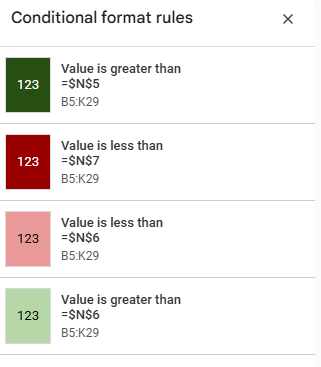
If your cells aren’t formatting properly, make sure to check the hierarchy. The most extreme rules which are greater than the maximum or lower then the minimum values should be at the top, followed by the ones that are simply higher or lower than the average. This order is important to ensure the rules are applied in the correct order.
If you liked this post on How to Create Google Sheets Conditional Formatting Rules Based on Another Cell, please give this site a like on Facebook and also be sure to check out some of the many templates that we have available for download. You can also follow me on Twitter and YouTube. Also, please consider buying me a coffee if you find my website helpful and would like to support it.