
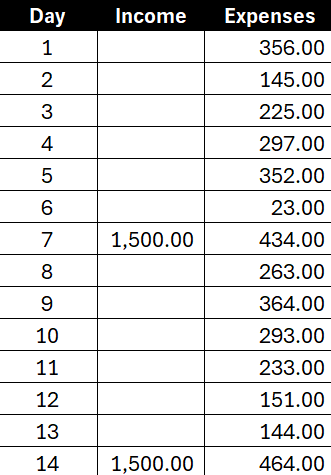
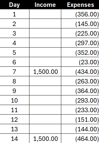
Do you want to create a budget which tracks income and expenses on just one chart? There’s an easy way you can combine them where you can show positive and negative values in a single column. Suppose we have the following income and expenses over a 14-day period:
You might be tempted to plot these values on a simple column chart like this:
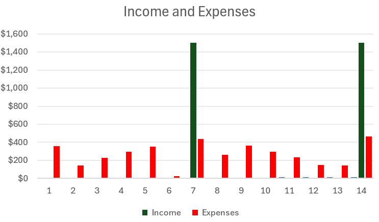
This, however, means you’re using up two columns for each day. One for income, and one for expenses. While it is effective, what you can also do is combine the income and expense amounts into a single column. The key is to change the chart type and instead of using the default Clustered Column Chart, you select the option for a Stacked Chart. By doing this, you’ll now have both values on a single column:
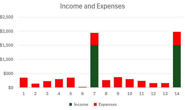
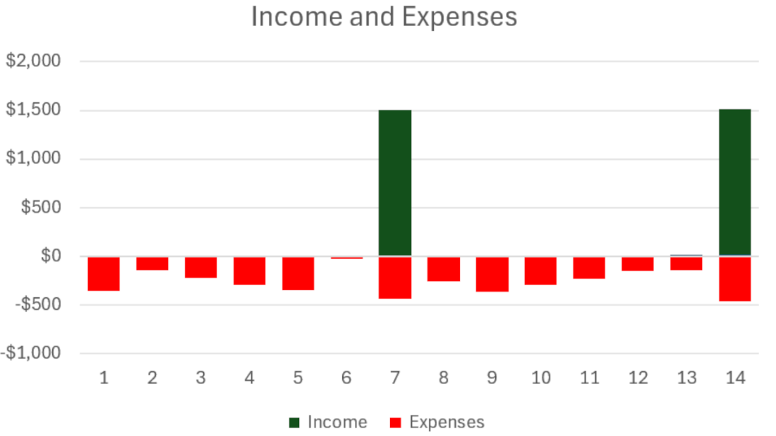
This is still not optimal, however, as now we are just adding the income and expense together. Even though they are color coordinated, there is a better way to display this. Ideally, we will show expenses being a negative outflow on a given day while income will be positive. To fix this, let’s flip the expenses so that they are negative. But rather than doing this manually, you can do this with just a few steps.
To flip values from positives to negatives in Excel, do the following:
1. Enter a value of -1 into a cell.
2. Copy that cell.
3. Select the range which contains the values you want to flip from positive to negative.
4. With those cells selected, right-click and select Paste Special and select Multiply
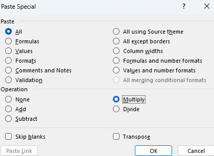
Doing this will flip your values negative by multiplying all the values by a factor of -1. You can also follow these steps if you want to flip negative values into positives.
After updating the formatting, my table now looks like this:
And now my chart has also updated to show negatives beneath the income.
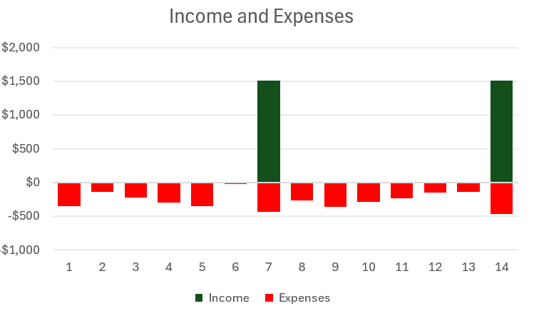
This ensures I’m not taking up extra space with an extra column and it still makes it easy to compare the outflows versus the inflows.
If you like this post on How to Track Income and Expense in a Single Chart, please give this site a like on Facebook and also be sure to check out some of the many templates that we have available for download. You can also follow me on Twitter and YouTube. Also, please consider buying me a coffee if you find my website helpful and would like to support it.