
Want to get better at Excel?
This site will help you...

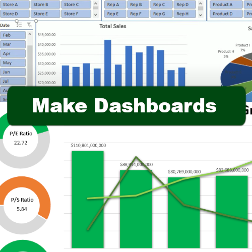


New content every week on this site and on social media
Recent posts
Free NFL Squares Template for Excel
An NFL Squares game can make watching NFL games more interesting and fun with friends. And in this post, I'm going to share with you a free template I've creat ...
How to Use Wildcards in Excel
Wildcards in Excel are special characters that can stand in for other characters in a text string. They are incredibly useful for finding, filtering, or matchi ...
How to Use the Macro Recorder in Excel
If you find yourself performing the same steps over and over in Excel, whether it's formatting reports, importing data, cleaning up columns, or just about anyt ...
How to Fix a Pivot Table That Is Not Refreshing
Is your pivot table not updating even though you're refreshing the data? If that's the case, that usually means there's a problem with the data that your pivot ...
How to Do a Lookup in Excel With Multiple Criteria
A VLOOKUP function in Excel can be an effective and easy way to pull in a value from a list. But what if you needed to base your lookup on multiple values? You ...
Free 2025 MLB Playoff Template for Excel
The MLB playoffs are approaching and I have created a template for you to track the games and also make predictions. The playoff picture and standings are as o ...
Create Google Sheets Conditional Formatting Rules Based on Another Cell
Do you want to create conditional formatting rules in Google Sheets that are linked to specific cells? Below, I'll show you how to do that, so that it's easy t ...
How to Create Conditional Formatting Rules in Excel: The Ultimate Guide
Conditional formatting in Excel is one of the most powerful tools for making your spreadsheets more insightful and easier to read. Instead of manually scanning ...