Do you want to create conditional formatting rules in Google Sheets that are linked to specific cells? Below, I’ll show you how to do that, so that it’s easy to update, maintain, and see what conditional rules you have setup. This avoids having to set your values directly in the conditional formatting settings.
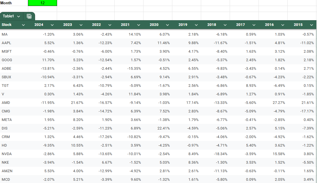
In this example, I have a list of stock tickers and their historical performances for a specific month of the year. I’m going to create rules to highlight cells based on their values.
You can follow along with my practice file here. Simply create a copy to see my conditional formatting settings or start from scratch.
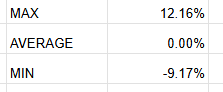
I will create three different cutoff points for my conditional formatting, a maximum value for the highest threshold, the average, and a minimum value for the lowest threshold. I’ll call refer to them as MAX, AVERAGE, and MIN.
For the MAX value, I’m going to set this to the third largest value, and multiply it by a factor of 0.5, just to ensure that the cutoff is low enough that it includes enough data points. My formula utilizes the LARGE function and is as follows:
=LARGE(Table1[[2024]:[2015]],3)*0.5
For the average, I’m going to simply calculate the average for the entire table:
=AVERAGE(Table1[[2024]:[2015]])
For the MIN value, I’ll use the same logic as for the largest value, except this time I’ll use the SMALL function so that I can get the third smallest value.
=SMALL(Table1[[2024]:[2015]],3)*0.5
You can obviously setup whatever cutoff points you want for your conditional formatting. But I just want to give you some ideas and ways where you can make your formatting rules a bit more dynamic, based on the data set. I have these cutoff points set up but I can adjust them as necessary:
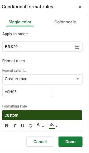
Now, we can go and setup the conditional formatting rules, linking them to these cells. To do this, start by selecting all the values to apply conditional formatting to. In this example, I’m going to select the entire table. Then, go to Format and select Conditional Formatting.
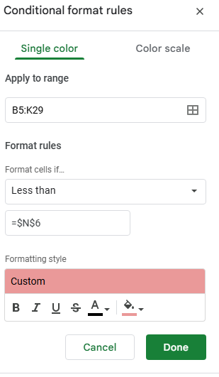
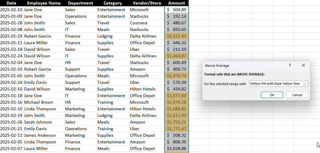
For the first rule, I’m going to check the option to format cells if they are Greater than a specified value. Here is where instead of entering a value, you can reference a specific cell. My max value of 12.16% is in cell N5, and I’m going to enter that in my conditional formatting rule. Note that it’s important to freeze the cell to ensure every cell is looking at this same value.
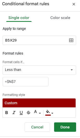
Next, click on the button below the conditional formatting rule that says + Add another rule. It will copy the settings and so now, for the next rule, all that’s necessary is to adjust the linked cell so that it’s referencing N7 (the minimum) rather than N5. And instead of greater then, I’ll select the option for Less than. I’ll also change the formatting so that it is red:
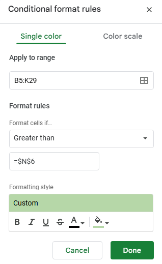
Now, let’s create another rule, this time for the average. This rule will look at if a value is below the average and apply a lighter shade of red:
The last rule I’ll setup is if the value is greater than the average, and apply a light green highlighting:
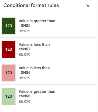
In my example, the formatting rules are now applied based on which cutoff points they fall within:
At this stage, I’ve created four conditional formatting rules:
If your cells aren’t formatting properly, make sure to check the hierarchy. The most extreme rules which are greater than the maximum or lower then the minimum values should be at the top, followed by the ones that are simply higher or lower than the average. This order is important to ensure the rules are applied in the correct order.
If you liked this post on How to Create Google Sheets Conditional Formatting Rules Based on Another Cell, please give this site a like on Facebook and also be sure to check out some of the many templates that we have available for download. You can also follow me on Twitter and YouTube. Also, please consider buying me a coffee if you find my website helpful and would like to support it.
Conditional formatting in Excel is one of the most powerful tools for making your spreadsheets more insightful and easier to read. Instead of manually scanning rows of numbers or text, conditional formatting automatically highlights the most important parts of your data based on rules that you set. With just a few clicks, you can spot trends, identify outliers, or flag potential issues—all without adding a single formula to your worksheet.
For example, imagine managing a budget where any expense over $1,000 turns red, or tracking project deadlines where tasks due this week are highlighted in yellow. Conditional formatting allows you to create these kinds of dynamic visual cues, making your data tell a story at a glance. Whether you’re a beginner just learning Excel or an advanced user building dashboards, mastering conditional formatting can transform how you work with spreadsheets.
What is Conditional Formatting in Excel?
Conditional formatting in Excel is a feature that applies formatting (such as colors, icons, or data bars) to cells based on specific conditions or rules. This helps in:
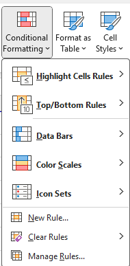
To access conditional formatting, navigate to Home > Conditional Formatting on the Excel ribbon.
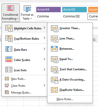
General Conditional Formatting Rules in Excel
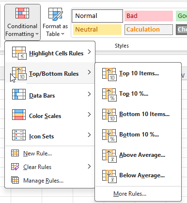
Excel provides several built-in conditional formatting rules, which can be applied with just a few clicks:
Highlight Cells Rules
These rules apply formatting to cells based on their values.
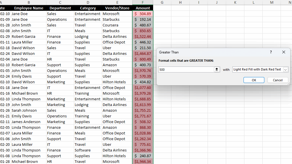
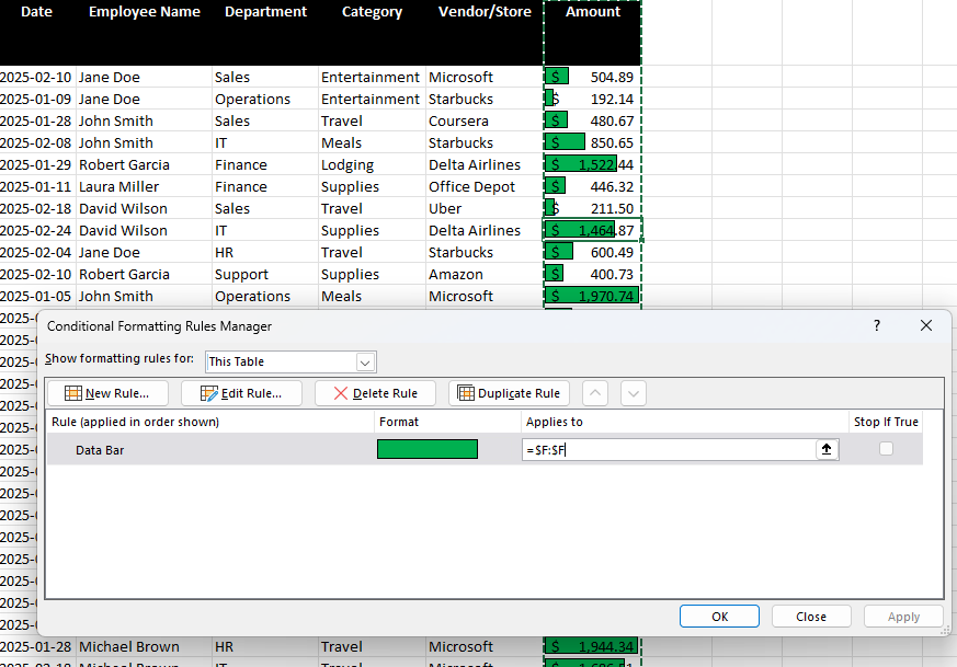
Greater Than / Less Than: Highlights numbers above or below a certain threshold. In the below data set, all the values that are greater than $500 are highlighted.
Equal To: Highlights cells that contain a specific value. In the example below, when the Vendor is equal to Office Depot, the cell is highlighted in yellow.
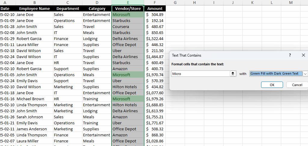
Text That Contains: Applies formatting to cells that contain certain text. This is useful if you are looking for partial matches. In the below example, any Vendor which contains the word ‘Micro’ is highlighted in green.
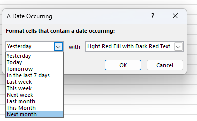
Dates Occurring: This is useful for highlighting recent, upcoming, or past dates. And the values are dynamic and will change based on the current date.
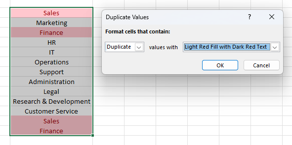
Duplicate Values: Conditional formatting can help with quickly identifying values in a range of data, showing when there are duplicates found. Below, I’ve highlighted any duplicate values in red.
Top/Bottom Rules
In addition to just highlighting specific values, duplicates, or ranges of dates, you can also use conditional formatting to analyze data for you. Here are some of the pre-set options you can highlight:
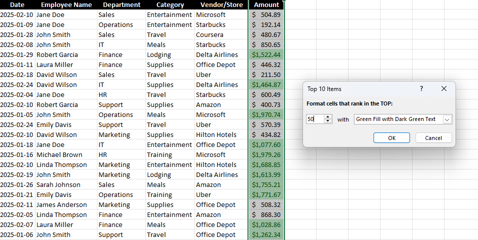
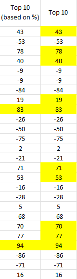
Top 10 Items / Bottom 10 Items: This option highlights the highest or lowest values in a dataset. While it says the top or bottom 10, this can be modified to show a different number. Below, I’ve highlighted the top 50 largest values in green.
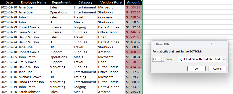
Top 10% / Bottom 10%: This highlights values that fall in the top or bottom 10%. While the default is to look at the top or bottom 10%, you can change this percentage to whatever cutoff point you want. In the below screenshot, I’ve set the cutoff to 25, to highlight the bottom 25% of values in the data set. By doing this, it’s easy to highlight the largest values without first having to calculate what that cutoff point is — Excel does it all.
Above / Below Average: This highlights values above or below the dataset’s average. Below, all the values that are above average are highlighted in yellow. Here again, there’s no need to actually calculate what that cutoff point is. Excel determines the average and then highlights the values that are over that.
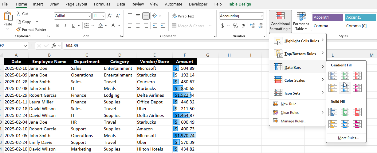
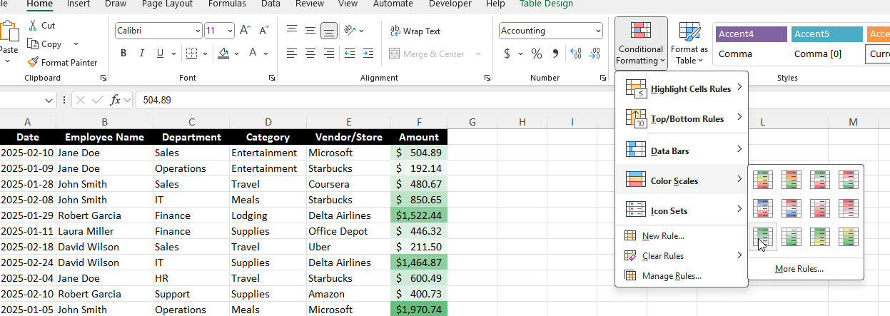
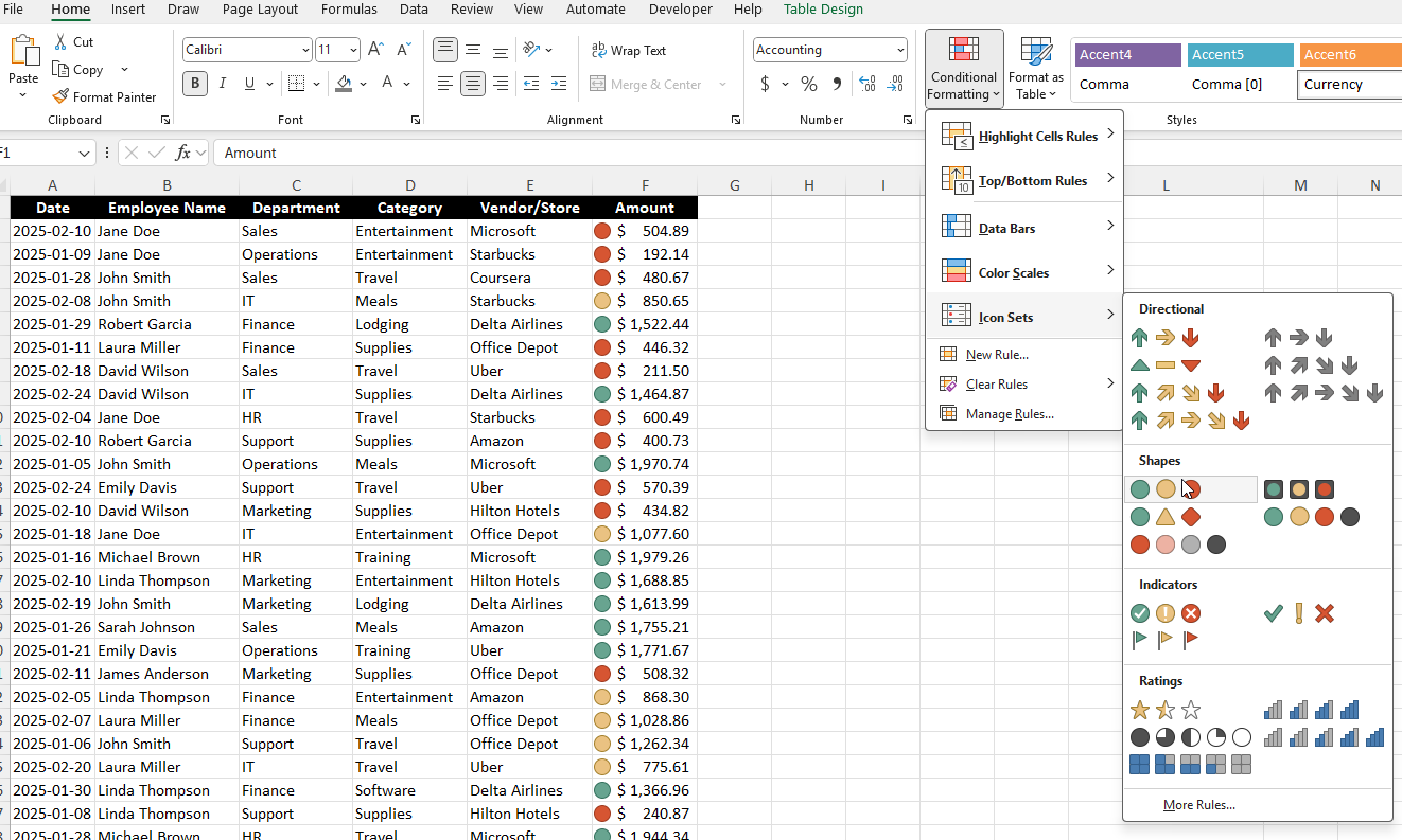
Data Bars, Color Scales, and Icon Sets
These options provide a graphical representation of data, and they can be a more powerful way to visualize your numbers.
Data Bars: Fill the cell with a bar proportional to its value. And with this conditional formatting, it’s easy to spot high and low values in relation to one another.
Color Scales: Apply a gradient of colors based on value distribution. You can use three different colors, or you can use shades of a color, where larger values will appear darker while smaller ones will be lighter in color.
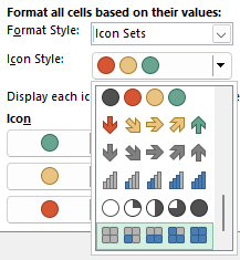
Icon Sets: Display different icons (arrows, checkmarks, etc.) based on value thresholds. This does a similar job as the other options, but now you can utilize icons instead of just colors.
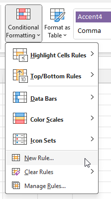
Creating your own rules
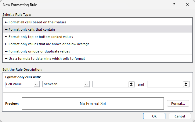
The pre-defined conditional formatting options can be useful, but you may prefer to make your own. By doing so, you can apply more customization to your rules. If you skip pass the first options on the conditional formatting menu, you’ll see an option to create a New Rule:
From here, you’ll get similar options as to the pre-defined ones, including formatting them based on their values, top or bottom rankings, above or below average, and so on.
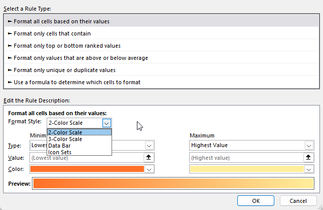
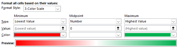
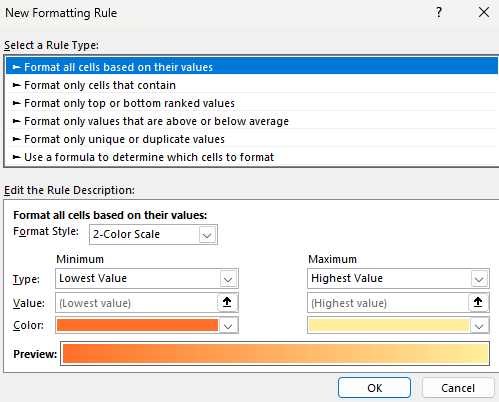
Formatting cells based on their values
For this rule, you can specify the type of color scale you want to use (2 colors, 3 colors, data bars, or icons)
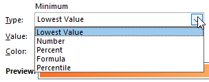
You can also change how the minimum and maximum values are determined, whether they are based on simply the lowest value in the range, a specific number, a percentage, formula, or percentile.
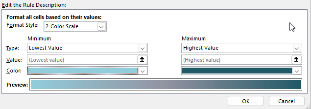
And you can also change the color scheme, to determine how you want the gradient to look, and how it will progress from the minimum to the maximum. By changing the drop downs, below I’ve changed the gradient to go from a light teal to a dark teal color.
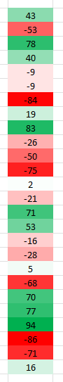
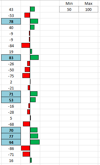
If you select a 3-color scale, you’ll notice you’ll also have a midpoint option, where you can have a third color. If you’re dealing with values that are positive and negative, you may want to use a 0 value for the midpoint and make the color white. This is how I’d set it up for high and low values when there are negatives. The largest negative values will be in red and the highest positive values will be green, while anything close to 0 will be white.
Here’s how this would look on a range of values between -100 and +100:
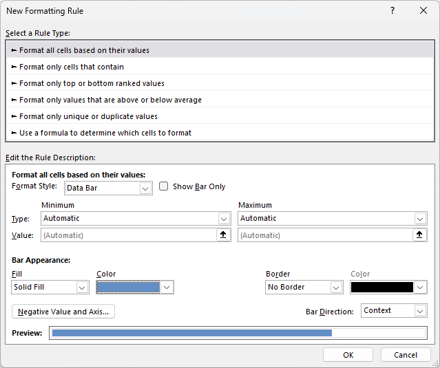
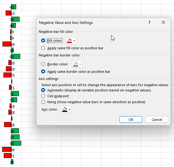
If you select a data bar as your option, you’ll notice different settings for that. Not only can you specify the minimum and maximum values, but you can also adjust the appearance of the bar:
In the below example, I’ve modified the data bar so that it is green with a black solid border:
If you have negative values, you can click on the Negative Value and Axis to modify how those values will show. By default, if they are negative, the fill color is set to red, but this too can be changed.
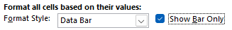
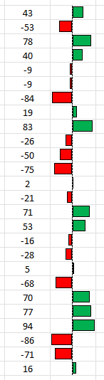
TIP: If you don’t like the look of the above formatting because it looks messy, consider copying the values in the next column. Then, create the same conditional formatting rules but select the option to Show Bar Only next to the Data Bar option:
By doing this, you can have your values in one column, and then just the bar in the other column. When you show just the bar only, it doesn’t display the values anymore. In the below example, the values are in both columns, but with this formatting applied, they are no longer visible in the column on the right.
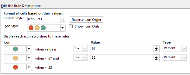
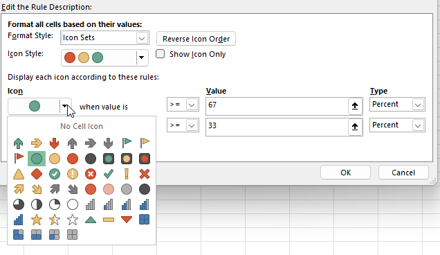
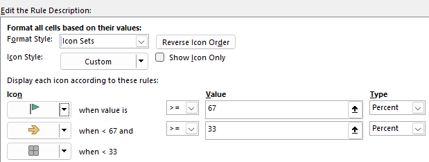
If you create a new rule using icon sets, you’ll get yet a different set of options:
There are many different types of icons you can choose from, allowing you to be creative in how you want the formatting to be applied.
However, you can still mix and match. You aren’t locked into a specific set of icons. You can change the look of each icon by clicking on the drop-down option next to it.
Below, I’ve used a mix of various icons that don’t conform to any pre-defined style:
Although the default is to use a percent, you can also change this to formatting a value based on its numerical value, a formula, or a percentile.
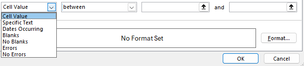
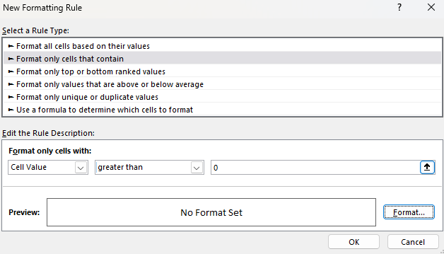
Format only cells that contain certain values or text
This next section is a bit simpler in that there are fewer options. You specify how you want to format them based on what they contain, and if they meet a certain criteria:
For the first drop-down option, you can specify if you’re looking for a certain value, text, date, or whether it’s a blank or error.
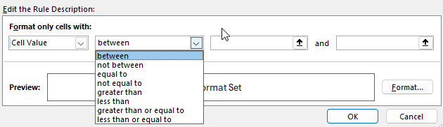
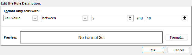
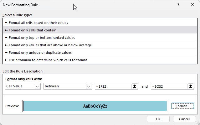
Depending on what you select, the next drop-down option may change. But if you leave it to the default cell value, then you can also specify whether it’s within a range of values, greater than, equal to, or less than a certain value.
Since I’ve selected between, I need to enter multiple values, one being the start of the range and the other being the end. In the below example, I’m looking at values that are between 5 and 10.
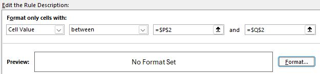
TIP: Anytime you see the up arrows, that means you can specify a certain cell to link the rule to. And when you do so, your rule becomes dynamic. As the value changes in the cell that you’ve specified, the formatting rule will update. This can be helpful because you can easily change the value without having to go into the conditional formatting settings.
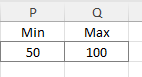
In the example below, I’m no longer specifying exact values but instead referencing ranges, P2 and Q2:
In my spreadsheet, I can setup these cells accordingly, so that I know they are my min and max values for my conditional formatting rule:
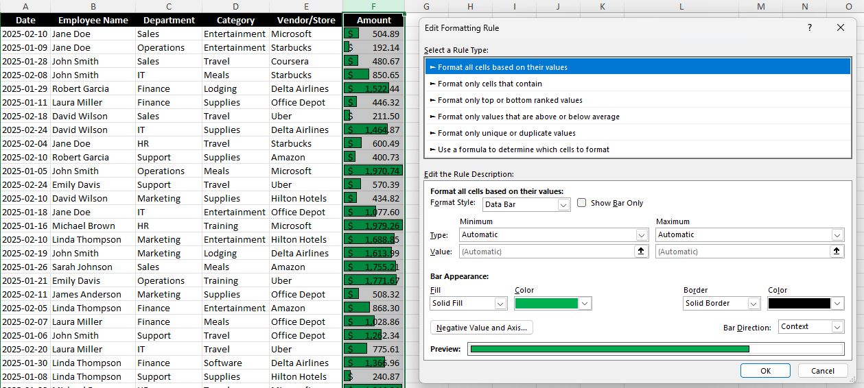
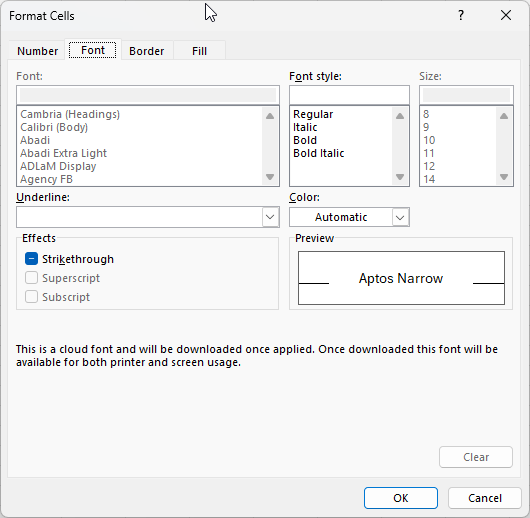
But before any conditional formatting gets applied, I need to specify the formatting I want. Since I’m creating a rule type from scratch and not relying on pre-defined rules, I also have to set my formatting. To do this, I need to click on the Format button, which opens up the Format Cells options. And just like when you’re formatting cells in Excel, you can specify how you want the cell to look, including its font style, number formatting, border, and fill color.
In my example, I’ve created the rule so that it will apply a blue fill color, with a solid black outline, and bolded black text.
This is how it has been applied to my range of values:
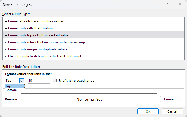
Format only top or bottom ranked values
This rule type is an even simpler one since we are only looking at the largest or smallest values. The first drop-down option allows you to choose from either Top or Bottom.
The next field is where you specify the number of items. If I leave it to 10, then it will grab the 10 largest items in the range I’ve selected. But if I check off the option to say % of the selected range, then it will grab the top 10% of the values. For example, if in my range I select 26 values, it will highlight only the two largest values since that will mark the top largest ones, based on the size of the range. Here’s the difference in the two approaches:
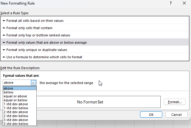
Format only values that are above or below average
This option is similar to the one in the pre-defined conditional formatting rules. However, you have a bit more flexibility here in being able to also format them based on how many standard deviations they are away from the average.
You will also need to set the formatting you want to apply. You could create one rule for if something is 1 standard deviation away and another one for if it is 2 standard deviations, etc.
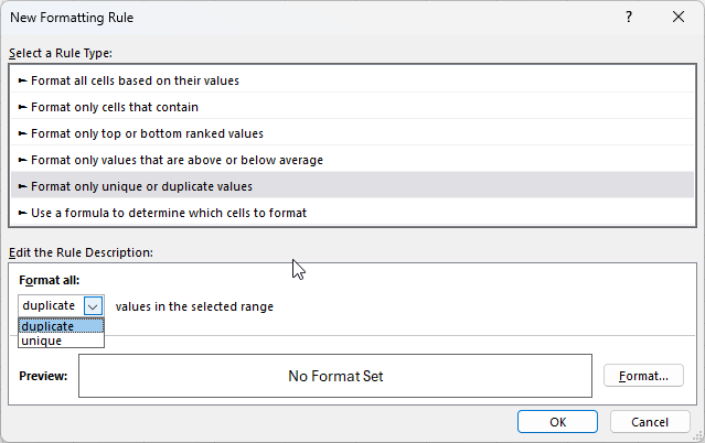
Format only unique or duplicate values
With this option, there are the fewest choices to select from. You can either highlight duplicate values or unique values. And as is the case with other conditional formatting rules you create from scratch, you also have to specify your own formatting.
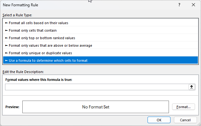
Using Formulas in Conditional Formatting
The last section is the one which can allow for the most customization. Here, you can create your own custom formulas. This allows dynamic formatting based on complex conditions.
The key thing to remember is that you want the formula result to be either a TRUE or a FALSE value in the end. That will determine whether the criteria is met. A good strategy here is to set up your formulas first in your spreadsheet, and then copy them into the conditional formatting formula. Follow this guide to setup advanced conditional formatting rules like a pro.
Here’s a quick overview of what you can do:
Highlight Cells Based on Another Cell’s Value.
To highlight cells in column B if the corresponding cell in column A is greater than 100: =A1>100
These are just a few examples of what you can do with formulas but you have many more options with this approach.
Common issues with conditional formatting rules in Excel
Here are some of the most common issues you may encounter when creating conditional formatting rules in Excel.
Why are my conditional formatting rules being applied to the wrong cells?
This can happen for a couple of reasons. The first is that you haven’t selected the correct range when setting up your rule. If you go into the Conditional Formatting menu and select Manage Rules, you will see all the ones that are applicable (to your current selection).
The current rule here applies to all the cells in column F. If I need to change that, I can either edit right within the Applies to box or I can click on the up arrow and select the range manually.
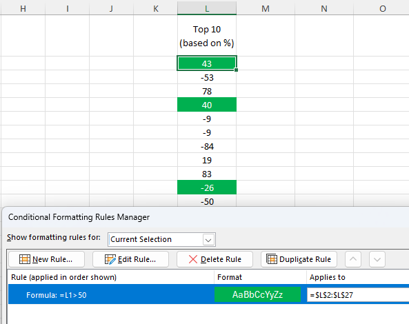
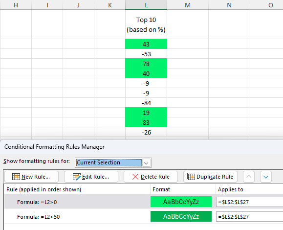
Another issue related to ranges can happen when there is a problem with the cells your formula is referencing. Take a look at the screenshot below and see if you can figure out why the formatting isn’t correctly applied. Even though the rule is simple and is just looking at whether the cell’s value is greater than 50, it is being applied to the wrong cells.
Although the column is correct, the problem is the range. Notice that the rule is L1>50 but it is being applied to $L$2:$L$27. The first cell is off by 1 row, so the formula will always be offset by 1 row. That means that when it’s evaluating L2, it will look at L1. And when it is looking at L3, it is looking at L2. In the above example, because there is a text value it is not a number and thus meets the criteria. And the value of 40 is highlighted because the formula is looking at the value above it (78).
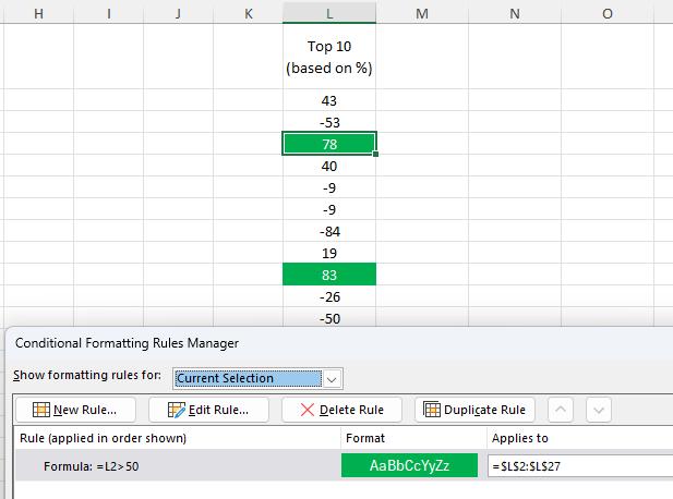
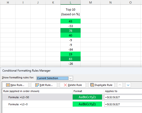
If I modify the formula so that it is changed to L2>50, now the conditional formatting is applied correctly.
The rules won’t update, however, until you click the Apply button. This is necessary to do anytime you make changes to a conditional formatting rule.
Why are the wrong conditional formatting rules being applied?
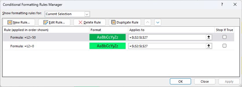
If you have multiple conditional formatting rules in place, you may encounter an issue where the wrong ones are being applied. Consider the below example, where I have created a rule when a value is greater than 0 to be highlighted light green, and another one so that it is dark green when it is greater than 50.
Since a cell can meet both criteria and be both higher than 50 and 0, it’s important to prioritize the rules correctly. To fix this issue, I need to select the bottom rule, and click on the up arrow to push it to the top. After doing this, and clicking apply, the values over 50 are filled in with the darker green color.
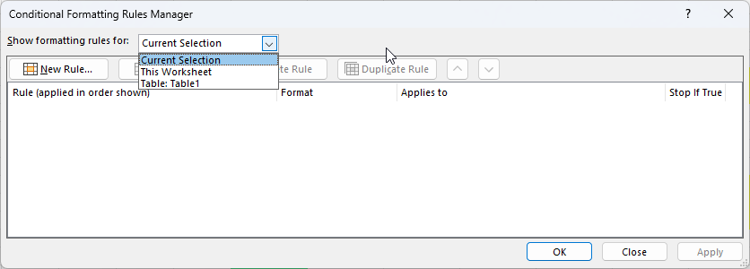
Why am I not able to find my conditional formatting rule?
If you’ve created a conditional formatting rule but can’t find it, it’s likely that you’ve selected a cell it isn’t applied to. If you go to the Conditional Formatting menu and select Mange Rules, you’ll see all the rules that you’ve created. But by default, this shows the rules that are applied to your current selection. You can, however, change the drop-down option to show rules for the entire sheet and anywhere else there are rules setup:
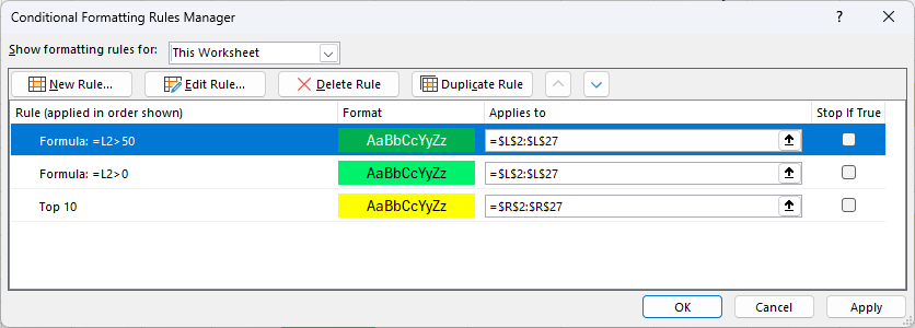
After changing it to This Worksheet, I now see all the rules that I’ve created on the worksheet.
How do I delete a conditional formatting rule?
In some cases, you may find that you have too many conditional formatting rules and want to get rid of some. In this case, go back to the conditional formatting rules manager where you’ll see a list of all the rules you have created.
From here, you can select any rules that you don’t need anymore, and click on the option to Delete Rule. Be sure to click on Apply afterwards to make sure your changes go into effect.
If you liked this post on How to Create Conditional Formatting Rules in Excel: The Ultimate Guide, please give this site a like on Facebook and also be sure to check out some of the many templates that we have available for download. You can also follow me on Twitter and YouTube. Also, please consider buying me a coffee if you find my website helpful and would like to support it.
Conditional formatting rules can help highlight values and identify when certain criteria is met. You can also create advanced rules that include formulas. And I’ll walk you through how to to do so in a way where it’s easy to test your logic and ensure you setup your rules correctly.
Start with creating a formula in your spreadsheet
You might be tempted to jump right into the conditional formatting settings and create your rules. But you’re probably better off not doing that, because if you need to make an adjustment later on, it can be challenging to try to tweak the formula there.
Instead, start with creating a formula within your spreadsheet. The goal is to setup a formula so that it results in either a TRUE or FALSE result. If it’s TRUE, then your conditional formatting will get applied. Otherwise, it won’t.
In the below example, I’m using the NFL prediction template I created earlier. If you want to follow along, download that template and delete the conditional formatting rules that are already there.
I’m going to create a rule to track if teams I’m interested in are playing. If they are, I want to highlight those games.
In this template, I have a section for a watchlist, starting in row 14. I’m going to select a few teams I want to track.
This watchlist is in the range A14:A21. I need to create a conditional formatting rule that meets two conditions:
If the home team is found in the watchlist, or
If the away team is found in the watchlist.
While this doesn’t sound complex, creating the conditional formatting rule for this can be a bit of a challenge. A good way to set this up is to create a formula in an adjacent column to see if it is calculating correctly.
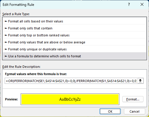
Let’s start by using the MATCH function. This function will search through the watchlist to see if it finds the lookup value.
=MATCH($E4,$A$14:$A$21,0)>0
Column E is where the home team is listed. I’ve frozen column E since the search criteria shouldn’t change, regardless of which cell I’m in. This is important to ensure the entire row is highlighted.
Currently, how this formula works is if a value is found on the watchlist, it will result in a value of 1 or more, and that will return a value of TRUE. However, if the team isn’t found, then the formula results in an #N/A error. To fix this, I’m going to put the entire formula within the IFERROR function:
=IFERROR(MATCH($E4,$A$14:$A$21,0)>0,0)
Next, I need to also setup the formula to check if the away team is found in the watchlist. This is the exact same formula, except instead of referencing column E I’m referencing column I, which is where the away team is listed.
=IFERROR(MATCH($I4,$A$14:$A$21,0)>0,0)
Now, I’ll combine the two formulas within the OR function:
Now, I’m going to copy this formula down to confirm it is calculating correctly:
On the right-hand side, you can see the values being returned as either TRUE or FALSE. And the TRUE values are showing for the teams in my watchlist (Carolina, Tampa Bay, Seattle, and Green Bay). This confirms that the conditional formatting rules are setup correctly.
Adjust the starting range for your conditional formatting formula
When I initially setup the conditional formatting rules I referenced row 4, since that was where the first game was. But when I setup my conditional formatting rule, I need to change it to row 1, since I’m going to select columns B:L, and thus, I need to start from row 1 to ensure my conditional formatting is not being offset by any number of rows.
Thus, the formula I’m going to copy into the conditional formatting is as follows:
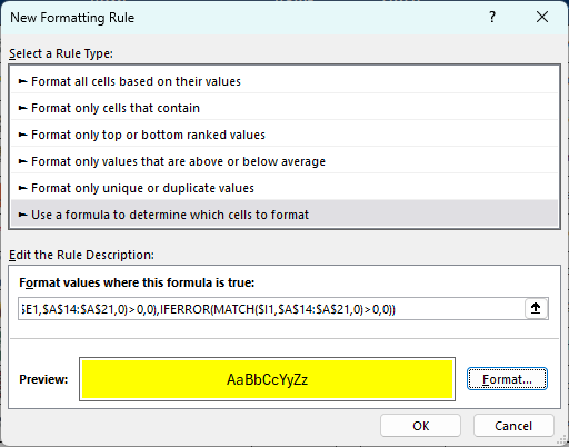
With columns B:L selected, I’m going to go into the Conditional Formatting menu and select New Rule. And I’m going to select the option to use a formula, which is where I will paste the above formula into:
I have also set the formatting so that the fill color is yellow and the font color is black. Now, I’ll click on OK. Initially, it looks as though my conditional formatting rules are incorrectly applied:
Double-check your conditional formatting rule and change it if necessary
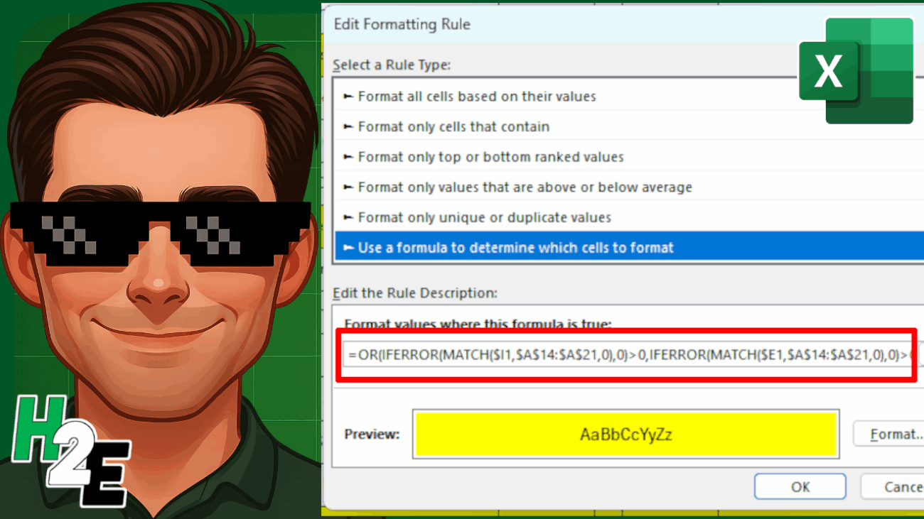
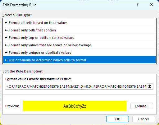
I’m going to go back into the conditional formatting settings, where I see Excel has modified my starting row:
Since I selected the entire columns, Excel has selected the very last row, 1048576, which is clearly not what I wanted. This can happen when you select an entire column and so it’s always important to go back in and double check the formatting once it has been setup. I’m going to have to manually go into here and adjust the formula so the first cells in the MATCH functions are $E1 and $I1 again.
This is a one-time fix that’s necessary. And after doing so, now I can see that my conditional formatting is correctly applied, and the values that show TRUE in the far right column are indeed highlighted.
With the conditional formatting correctly applied, I can now clear the formulas I setup earlier in the column that is checking if the condition is met (where the TRUE and FALSE values are showing).
To use formulas in conditional formatting, it’s a good idea to first test your logic within your spreadsheet. That way, it’s easier to confirm it’s evaluating correctly and easier to make adjustments as necessary.
If you liked this post on How to Setup Advanced Conditional Formatting Rules in Excel Using Formulas, please give this site a like on Facebook and also be sure to check out some of the many templates that we have available for download. You can also follow me on Twitter and YouTube. Also, please consider buying me a coffee if you find my website helpful and would like to support it.
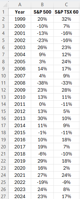
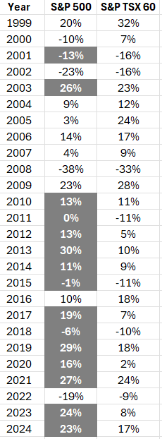
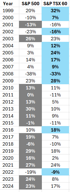
Microsoft Excel can help you analyze data, even without having to do any computations. By simply setting up conditional formatting rules, you can easily visualize data and identify trends. Doing that can help focus your attention on key numbers and make your analysis process much more efficient. In the following data set, I have a list of investment returns by year. I’ll show you how you can setup a rule to highlight which return was larger in each year:
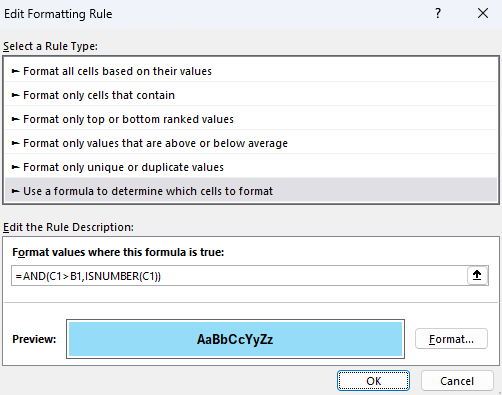
Creating the conditional formatting rule
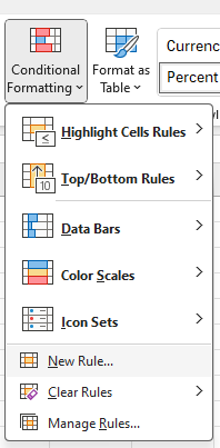
To create a conditional formatting rule to highlight the largest values, I’m going to select column B. Then, I’m going to go into the Conditional Formatting menu on the Home tab and will click on New Rule.
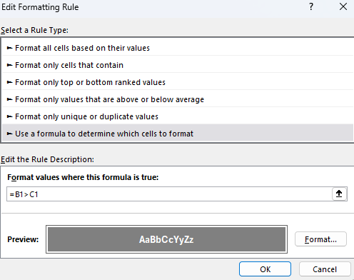
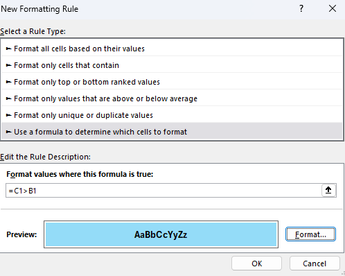
Under the option for the rule type, I’m going to select use a formula to determine which cells to format, and I’ll enter the following formula:
=B1>C1
Then I’ll adjust the format so that the cell has a dark grey color and a white, bolded text.
After clicking apply, the formatting will take effect:
A similar rule needs to be setup for column C. And in this case, I’ll highlight the values in blue.
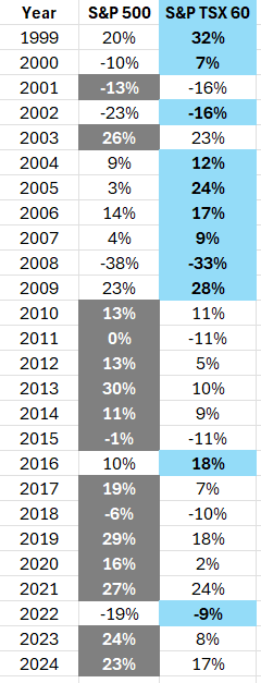
Now there is highlighting applied to both columns:
However, the header is also highlighted in column C. To fix this, I’ll add a condition to check to make sure that it is a number:
Now the conditional formatting is properly applied, and ignores the header row.
If you like this post on How to Highlight the Largest Values in Excel With Conditional Formatting, please give this site a like on Facebook and also be sure to check out some of the many templates that we have available for download. You can also follow me on Twitter and YouTube. Also, please consider buying me a coffee if you find my website helpful and would like to support it.
If you want to create conditional formatting rules but want to easily change the cutoff values for them, you can link your rules to specific cells, to make that process easy. Below, I’ll show you how to make your conditional formatting rules dynamic. Rather than going into the settings each time, you can just update specific cells, which will change your cutoff points.
Creating conditional formatting rules for changes in stock prices
A common example where you might want to adjust the cutoff values for conditional formatting rules is when dealing with stock prices. Suppose you want to highlight stocks when they have risen by more than 5%. But in other cases, such as when you’re looking at a long time frame, you may want the threshold to be much higher than that. This is where linking conditional formatting rules can be advantageous, by making the update process easier.
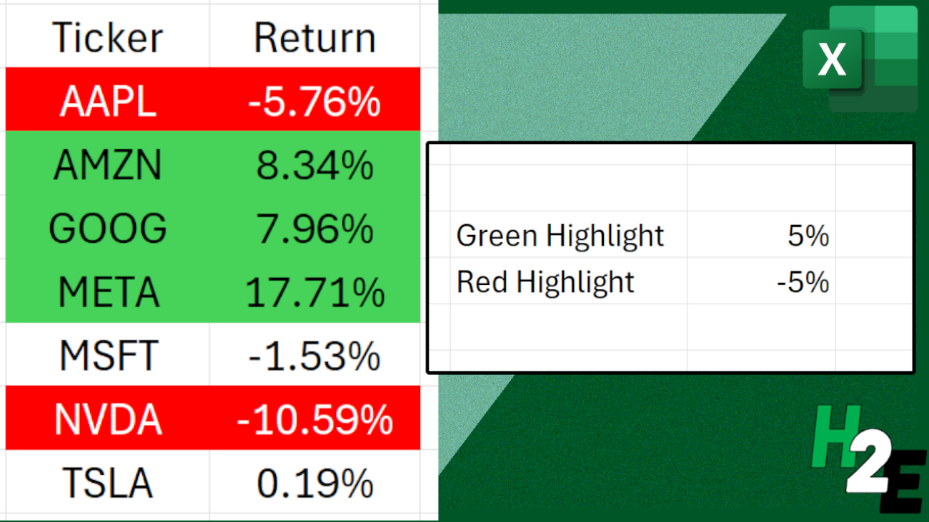
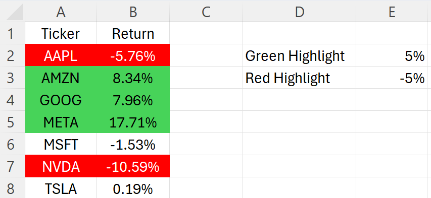
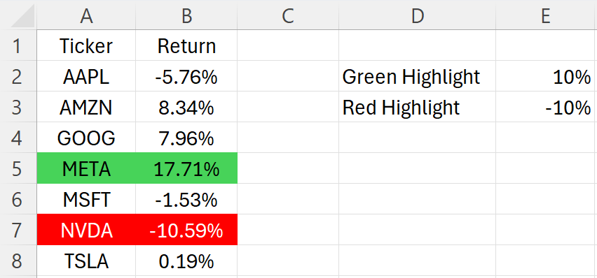
In the spreadsheet below, I have a list of stocks and their respective returns between December 31, 2024 and January 31, 2025. I have pulled in their performances using Excel’s STOCKHISTORY function.
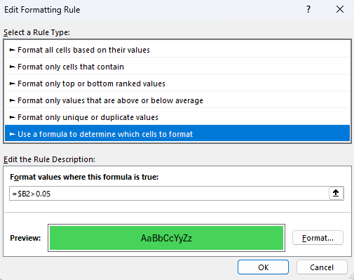
In this scenario, I may want to highlight stocks which have returns of more than 5% as green, and those which are down by 5% in red. I’ll create two conditional formatting rules to highlight both the return and the stock. Here’s how one of the rules looks:
The downside of this rule is that the 0.05 value is hardcoded. If I want to change the threshold, I would need to go back into the conditional formatting rules and modify it. There is an easier way around this, and that’s by just linking to a specific cell.
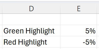
In the above example, I’ve entered the values that I want to link my conditional formatting rules to. In the case of a green highlight, I’m going to link to cell E2. And when I’m formatting the cells red, I’ll link to cell E3. Here’s how my updated conditional formatting rule will look:
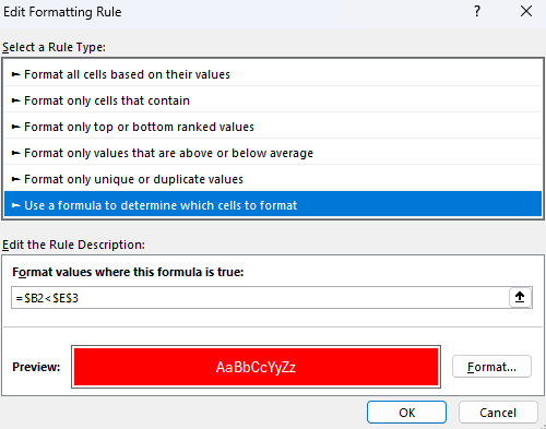
Now, I’ve removed the hardcoded value and my conditional formatting rule now points to a specific cell, which is frozen and doesn’t change. To do the same thing for my red highlight rule, when the values are down 5%, I do the same thing, except flip the sign and refer to cell $E$3:
My conditional formatting rules are correctly applied to my data set, highlighting returns of more than 5% in green, and returns of less than negative 5% in red:
The advantage here is I can easily update my thresholds by just modifying the values in column E. If I change them to 10% for green and -10% for red, I simply make the changes in those cells and my conditional formatting updates immediately:
By setting up my conditional formatting rules this way, it’s easy to update the process in seconds and at the same time, I can see what my threshold are.
If you like this post on How to Apply Dynamic Conditional Formatting and Link Rules to Specific Cells, please give this site a like on Facebook and also be sure to check out some of the many templates that we have available for download. You can also follow me on Twitter and YouTube. Also, please consider buying me a coffee if you find my website helpful and would like to support it.
The Price/Earnings to Growth (PEG) Ratio is a metric that enhances the traditional price-to-earnings (P/E) ratio by incorporating the company’s earnings growth rate into the calculation. This ratio is calculated by dividing the P/E ratio by the annual earnings per share (EPS) growth rate.
This calculation provides a more nuanced view of a stock’s valuation by factoring in future earnings growth, offering a more comprehensive perspective compared to the P/E ratio alone, which only considers the current price relative to earnings.
Why Investors Find the PEG Ratio Useful
Investors use the PEG ratio for several reasons. It allows for a more balanced comparison between companies with differing growth rates. A high P/E ratio might suggest a stock is overvalued, but when accounting for strong anticipated growth (as the PEG ratio does), the stock might actually be undervalued. This makes the PEG ratio a favored tool for identifying stocks that might offer a better return on investment, particularly when looking for good growth stocks.
The PEG ratio also aids in evaluating the potential overvaluation or undervaluation of a stock in relation to its growth prospects. A PEG ratio below 1 is often interpreted as a stock being undervalued given its earnings growth, whereas a ratio above 1 might indicate overvaluation. This simple benchmark can guide investors in making more informed decisions.
What is the Formula to Calculate the PEG Ratio?
The PEG ratio includes two components: the stock’s P/E ratio and the annual EPS growth rate. This is what the formula looks like:
Creating a template in Excel to calculate the PEG Ratio
Calculating the PEG ratio in Excel is straightforward, allowing investors to efficiently assess multiple stocks’ growth prospects against their valuations. Here’s a step-by-step guide to setup a worksheet to help you do this:
Input Data: Begin by entering the necessary data into Excel. You’ll need the current stock price, EPS, and the annual EPS growth rate. Ideally, you’ll want to setup the inputs first, followed by the formulas at the bottom. This will make it easier to enter the data in logical steps: first the ticker, the stock price, the EPS, and then the annual EPS growth.
For the annual EPS growth rate, you can pull this from a site such as Yahoo Finance (it’s under the ‘Analysis’ section). The percentage used is based on the next 5 years. Although it is percentage, enter it as a number (i.e. 100% would be 100).
Calculate P/E Ratio: In the first calculation cell, I’ll calculate the P/E ratio by dividing the stock price by the EPS.
Calculate PEG Ratio: The next calculation cell is the PEG ratio. This is calculated by taking the P/E ratio and dividing it by the annual EPS growth rate. If a stock is expected to grow at a 50% growth rate, the value should be 50, not 0.5 (i.e. don’t enter it as a percentage). Otherwise, this won’t calculate correctly.
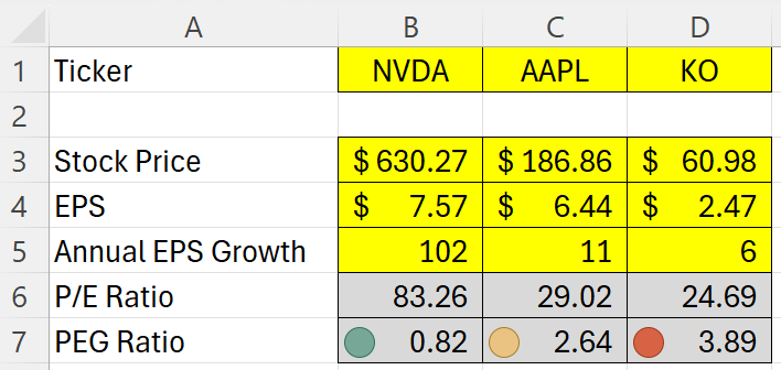
Conditional Formatting. This is an optional step, but one which can help with your analysis. Use conditional formatting rules to highlight the PEG ratio based on its value. If it is less than 1, I’ll apply a green highlighting, a red highlight if it is more than 3, and yellow for anything in-between. Here is how you might set that up with an icon set
Here is how the template looks based on their stock prices and data as of Feb. 1, 2024:
In the above example, we have a fast-growing stock in NVDA, a moderate-growing stock in AAPL, and a slower-growing one in KO. Essentially what we are doing here is looking if the EPS growth rate is higher than the P/E ratio. If it is, that suggests it is not an expensive buy. NVDA, for example, is expected to more than double each year for the next five years, as is evident by its 102% EPS growth rate. While that would make it look like a cheap buy, you’re also assuming that it really can achieve that kind of a growth rate, which would be no easy feat. That leads us to an important part section: the limitations of this calculation.
Limitations of the PEG Ratio
While the PEG ratio offers valuable insights into a stock’s potential value by incorporating growth into the valuation equation, it’s important to recognize its limitations. Understanding these constraints can help investors use the PEG ratio more effectively alongside other analysis tools.
Growth Rate Estimations: The PEG ratio is heavily dependent on the accuracy of the earnings growth rate projections. These forecasts can be highly speculative and vary widely among analysts. Overly optimistic or pessimistic growth estimates can skew the PEG ratio, leading to potentially misleading conclusions about a stock’s valuation.
Historical Growth vs. Future Potential: The PEG ratio typically uses historical data to predict future growth, but past performance is not always a reliable indicator of future results. Companies in rapidly changing industries or facing new competitors may not sustain their previous growth rates.
One-Size-Fits-All Approach: The simplicity of the PEG ratio, while a strength, can also be a drawback. It does not account for the nuances of different industries or the specific risks and opportunities facing individual companies. A low PEG ratio does not guarantee success, nor does a high PEG ratio always indicate a bad investment.
Dividend Exclusion: The PEG ratio does not consider dividend payments. For income-focused investors, a company’s dividend yield and the stability of its dividend payments can be as important as growth. Companies with high dividend yields might be undervalued by the PEG ratio, which only focuses on earnings growth.
Market Conditions: The effectiveness of the PEG ratio can also be influenced by the overall market conditions. During bull markets, growth stocks tend to perform well, and their high PEG ratios may be justified by the market’s momentum. Conversely, in bear markets, value stocks with lower PEG ratios might be more favorable, regardless of growth projections.
Quantitative Focus: The PEG ratio is a purely quantitative tool and does not take qualitative factors into account. Elements such as management quality, brand strength, market position, and industry trends can significantly impact a company’s future performance but are not reflected in the PEG ratio.
If you liked this post on How to Calculate the PEG Ratio in Excel, please give this site a like on Facebook and also be sure to check out some of the many templates that we have available for download. You can also follow us on Twitter and YouTube.
Conditional formatting in Excel allows you to automatically format and highlight cells based on their values. You may want to apply custom rules to values that are too high or too low. You may also want to use conditional formatting for budgeting purposes, to show when something is overbudget. Users typically use colors when applying custom formatting. A cell with a high value might be highlighted red versus a lighter color when it is low.
What you can also do is add symbols, including flags, to your conditional formatting rules. This can add another element to make your conditional formatting stand out even more.
Creating conditional formatting rules
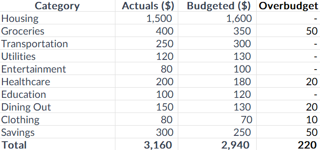
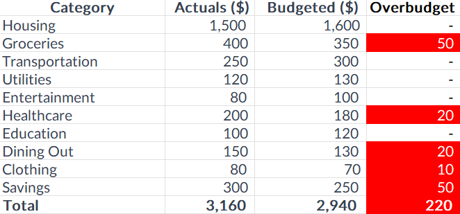
In the following example, I have some expense categories, budgeted amounts, actuals, and a field to show when an expense has run overbudget.
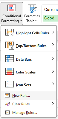
To create conditional formatting rules for this table, you’ll first need to select the cells you want to apply the formatting to. In this case, I’m going to select the Overbudget field and select all the values there. Next, I’ll select the Conditional Formatting button on the Home Screen and click on the option to create a New Rule:
On the next screen, there are many different options for creating rules:
I’m going to select the following option: Format only cells that contain. This allows me to specify a criteria, and then apply formatting to any cells that meet that criteria. Since I’m interested in values that are overbudget, I can create a rule for when the cell value is greater than 0:
Next, I’ll click on the Format button to determine what I want the cells that meet the criteria to look like. If I set the highlighting color to be red and the text to be white, here’s what my table will look like:
It’s a simple and effective way to alert your eyes to amounts that show a category is overbudget. But you don’t have to be limited to just changing colors.
Adding symbols to your conditional formatting
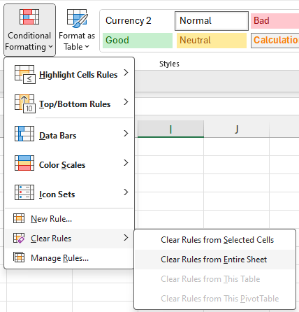
Instead of changing cell and text colors, I’ll simply add a red flag next to an amount when it is overbudget. First, I’ll clear off the conditional formatting rules I’ve already created. You can remove rules one by one or you can just delete all of them. To do that, go to the Conditional Formatting button and this time select the option to Clear Rules and to Clear Rules From Entire Sheet.
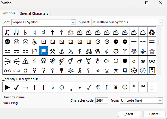
Now the conditional formatting is gone and I can start over. But before I do that, I need to find the symbol that I want to use in the custom formatting. If you go to the Insert tab, off to the right there is an option for Symbols.
By clicking on that, you’ll see many different symbols you can insert into your spreadsheet. If you scroll around you can find symbols that look like flags, which is what I’m going to use.
The one that I have highlighted above is for a Black Flag. I can click on Insert to put it into my spreadsheet.
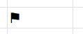
To get this symbol into my custom format, I first need to copy it. To do that, double-click on the cell so that you are editing it, and then select the flag, and then press CTRL+C to copy. While it’s copied and in the clipboard, now is the time to setup the conditional formatting rules. The process is the same as before.
Except this time, when it comes to applying the custom formatting, go to the Number section, and select Custom. Then, enter a value of 0 and then paste the flag symbol. If you want to also highlight everything in red, you can add [Red] in front. Here’s what that custom number format could look like:
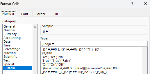
After applying the rule, now the table looks like this, with the custom formatting:
This is a bit of a cleaner format that you can use rather than having to highlight the entire cells. You can use this approach for other symbols in Excel. The key is just to find the symbol you want to use and then copy and paste it into your custom format.
If you liked this post on How to Add Flags to Conditional Formatting Rules, please give this site a like on Facebook and also be sure to check out some of the many templates that we have available for download. You can also follow me on Twitter and YouTube. Also, please consider buying me a coffee if you find my website helpful and would like to support it.
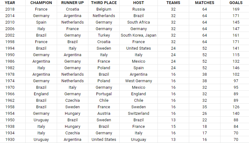
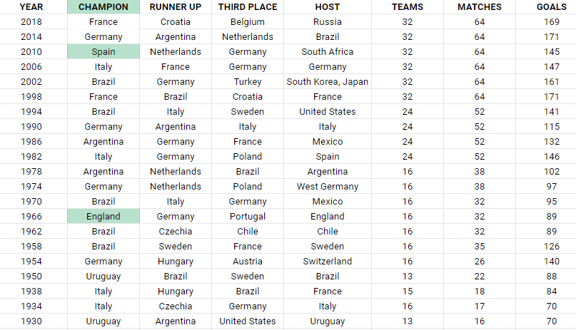
Duplicate and unique values can be difficult to find in a large data set. In this post, I’ll show you how you can find and highlight duplicate values, as well as how to extract unique values, in Google Sheets. In this example, I’m going to use a list that shows historical World Cup results, including the winners of past years.
Highlighting and finding duplicate values
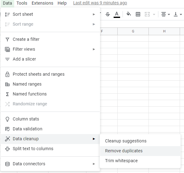
There is a built-in function in Google Sheets that allows you to filter out unique values. Under the Data menu, there is a section for Data cleanup where you can select the option to Remove duplicates.
However, by doing this, you will actually remove duplicates. And if you don’t want to remove data, this could lead to unintended results. If you simply want to find and highlight duplicate values, you’re better off using conditional formatting.
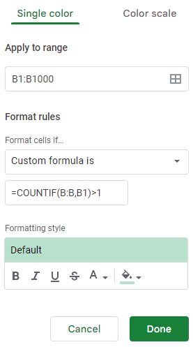
In this data set, I’m going to highlight the duplicate values in the champion field to identify repeat winners. To do this, I can create a conditional formatting rule in Google Sheets to apply formatting when criteria is met. My criteria will be to look at whether a value shows up more than once within a list. The formula utilizes the COUNTIF function:
=COUNTIF(B:B,B1)>1
This formula needs to be added when creating a conditional formatting rule. To set that up, I’ll select the entire column and under that Format menu, click on the option for Conditional formatting. In that section, there will be an option to Add another rule. And under the drop down for Format cells if…, I select the option that says Custom formula is. And in that box, I’ll enter in the above formula:
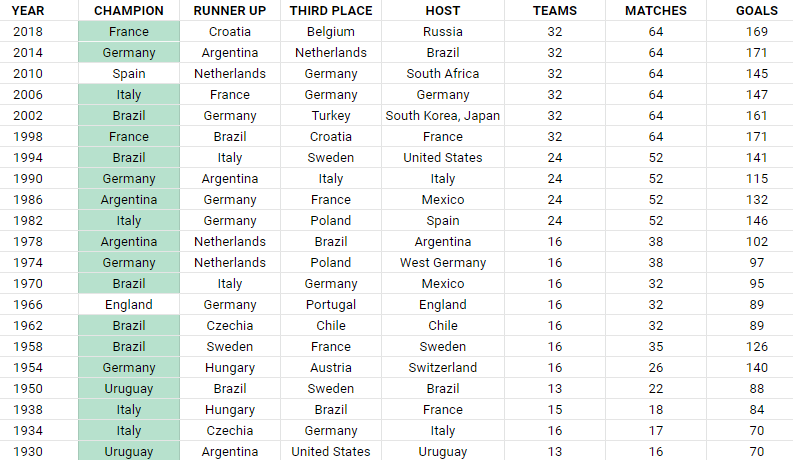
I’ll leave the default highlighting options, and now it will highlight all the values that show up more than once in column B:
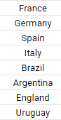
As you can see, there are many repeat winners in this list. If I only wanted to see the winners that only won once, then I would adjust the formula so that it looks for a value of equal to one, as opposed to more than one.
=COUNTIF(B:B,B1)=1
By altering the formula, it will highlight only the values that show up once:
You could also go further and make even more specific conditional rules, such as highlighting countries that have won two or more times. Through conditional formatting, you can make your highlight rules as specific as you need them to be.
Extracting and counting unique values
If instead of getting the duplicates you wanted to just get a list of unique values, that’s an even easier process in Google Sheets. Using the UNIQUE function, all you need to do is select your range, and Google Sheets will give you a list of the unique values:
=UNIQUE(B2:B22)
This formula results in the following list:
There have only been eight countries that have won the World Cup heading into 2022. But suppose you only wanted to count the number of unique winners. For this, you can use the COUNTUNIQUE function, which takes the same range as the argument:
=COUNTUNIQUE(B2:B22)
The above formula returns a value of 8, which is the same if I were to count the number of values from the Unique formula. There’s also the COUNTUNIQUEIFS function that you can deploy which allows you to also apply an IF statement to the CountUnique function. Suppose I wanted to count the number of unique winners after 1980, that formula would be as follows:
=COUNTUNIQUEIFS(B2:B22,A2:A22,">1980")
Column A contains the year and this returns a value of 6, excluding the two countries that only won prior to 1980: England and Uruguay. Using this function, you can apply multiple criteria if you need to.
If you liked this post on How to Find Duplicates and Unique Values in Google Sheets, please give this site a like on Facebook and also be sure to check out some of the many templates that we have available for download. You can also follow us on Twitter and YouTube.
Conditional formatting cells can be an effective way to highlight values so that they can easily stand out. You can apply similar logic to charts, and in this post, I’ll show you how you can use conditional formatting with Excel charts. By doing so, you can highlight gaps and key numbers.
Create more than one series to categorize your results
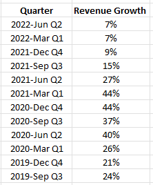
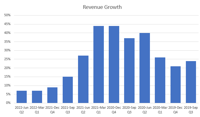
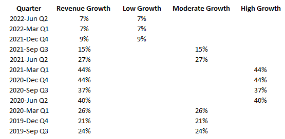
Excel’s conditional formatting isn’t designed to work on charts. But one way you can still achieve the same results is by categorizing results, and creating a series for each category. Here’s an example, using Amazon’s sales growth. Below are the year-over-year growth rates it has achieved over the past 12 quarters:
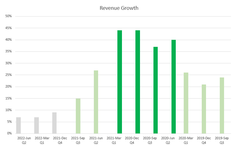
Charting the data out would show the highs and lows effectively:
However, suppose you wanted to highlight the high-growth periods (30% or more), with the more moderate ones (15%), and the quarters which were below that. To do that, I’m going to add a few more columns and use IF statements to populate the columns based on the growth rate.
Now, if I populate these values on a chart, they shows up like this:
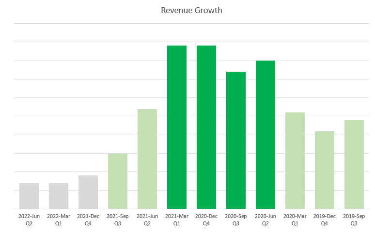
These column charts are skinnier and that’s because they are taking up more space as there are three different series for each quarter. To get around this, I can just change the charts so that they are stacked. Since only one of these columns will ever contain a value, there’s no danger they will actually ever stack. But by changing the chart type, they won’t take up as much space.
The advantage of this approach is that you don’t even need to rely on the axis to determine what range the growth rate falls within. Although you have to create additional columns by doing this, you can hide any columns that you don’t need to see. You can apply this type of logic to other types of charts as well.
If you like this post on How to Apply Conditional Formatting to a Chart in Excel, please give this site a like on Facebook and also be sure to check out some of the many templates that we have available for download. You can also follow us on Twitter and YouTube.
Have you ever wondered how a stock has typically performed month over month? Using a spreadsheet, you can calculate monthly returns and identify patterns of which months are traditionally strong for a stock, and which ones aren’t. In this example, I’m going to use Google Sheets to pull in stock prices and calculate historical stock returns by month.
Start with pulling in historical stock prices
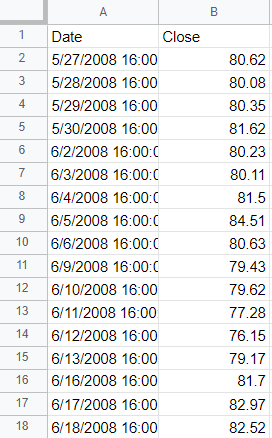
To get started, I’ll need to extract a stock’s price history. This can be done using Google Sheets’ GOOGLEFINANCE function. The key is in setting a start date that goes far enough back to ensure you get enough historical data to use in your calculations. A good function to use within that is the TODAY() function which ensures you will always be counting backward from today’s date and don’t need to hardcode a date. If I want to go back to 2008, for example, I can set my formula to deduct about 5,000 days.
To pull Amazon’s stock price going back that far, this is what my formula would look like in Google Sheets:
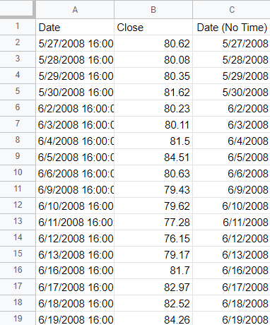
The one problem here is that the date values contain the time, 16:00:00, which represents the 4 pm closing time of the stock market. I only want the actual date since I’m going to be doing a lookup and don’t want to include time. To extract just the date, I can use the DATE() function and use the YEAR(), MONTH() and DAY() functions to refer back to the values in column A. For example:
=DATE(YEAR(A2),MONTH(A2),DAY(A2))
The above formula would give me the date in column A without the time. I’ll add an IF statement at the start so that in case the value in column A is blank, my formula simply won’t compute anything:
=if(A2="","",DATE(YEAR(A2),MONTH(A2),DAY(A2)))
Now I have a table that has just date values without any time:
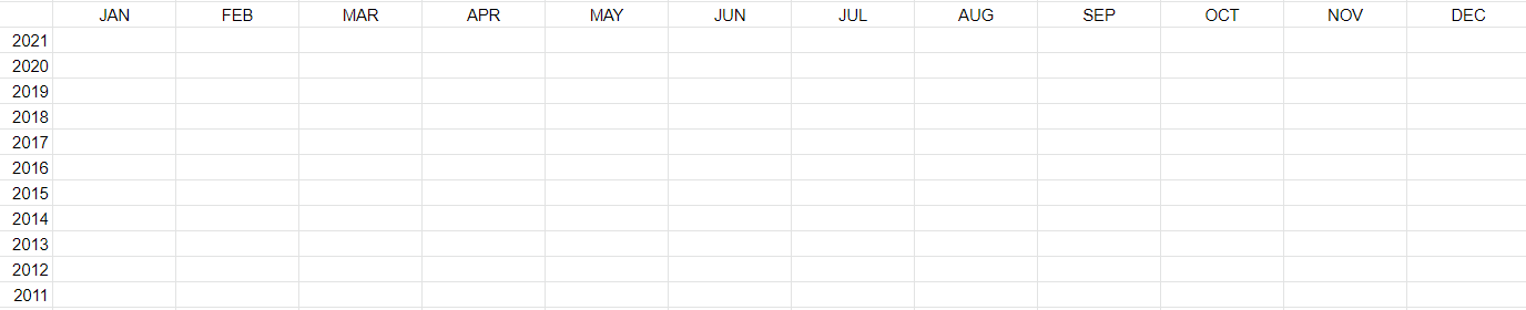
Creating a date matrix
Next, what I’m going to do is create a matrix that has years going vertically and months going across:
I’m going to fill in these values with the stock’s returns in each of those months. The key to making this work is by using the DATEVALUE() function which allows me to enter a date. For example, if I entered the following formula:
=DATEVALUE("Jan 1, 2022")
It would result in the following output:
1/1/2022
In the first cell of my matrix, for the JAN 2021, I’ll combine the month abbreviation (JAN) with the year (2021) and the first day (1). Here’s how that would work if the month name is in cell F1 and the year is in E2:
=DATEVALUE(F$1&" 1, "&$E2)
However, let’s assume I don’t want to pull the first day of the month and instead want to pull the ending month’s value. For that, I can use the EOMONTH() function. And then I would enclose the current formula within that:
=EOMONTH(DATEVALUE(F$1&" 1, "&$E2),0)
The 0 value at the end indicates how many months I want to jump by. And since I just want the end of the current month, I don’t need to jump by any months, which is why I set it to 0. At this point, I have a date, and now I can use this inside of a MATCH() function to find the row that matches this date. Assuming the date values in are column C, here is the formula:
Now the formula will pull in the price for a given month. But if I want the month-over-month return, I need to take the month-end price and divide it by the previous month’s ending value. To get the previous month’s price, I use the same formula except instead of a 0, I’ll enter -1 for the number of months:
I’ll combine the two formulas now, taking the current month-end price and dividing it by the previous month’s value and also deduct -1 at the end to adjust for it being a percent-change calculation:
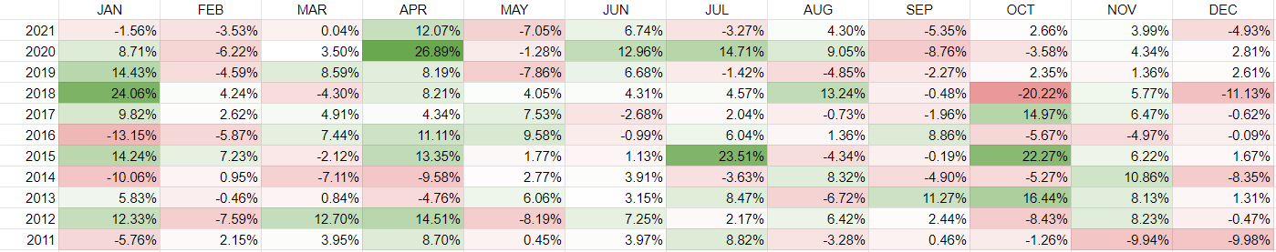
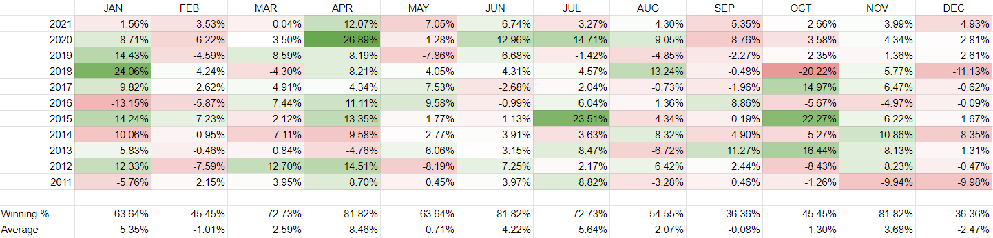
Now, copying this formula across the entire matrix, I can see the stock’s historical returns by month. I’ve added some conditional formatting to contrast the good months from the bad ones:
Besides relying on colors, I can also add a win rate % where I can count the times where the return was more than 0% (i.e. a ‘win’) and divide this by the total number of values. In column F, for January, the formula looks like this:
=COUNTIF(F2:F12,">0")/COUNTA(F2:F12)
I’ll also average the returns so that it’s easier to see the best and worst-performing months:
Judging from this, April looks to be the best time to own Amazon’s stock. It normally returns a positive return and its average over the past 11 years has been a gain of just under 8.5%. To re-create this analysis for other stocks, simply change the ticker symbol.
If you liked this post on How to Calculate Historical Stock Returns by Month, please give this site a like on Facebook and also be sure to check out some of the many templates that we have available for download. You can also follow us on Twitter and YouTube.