Want to create a dashboard to track the stock market and the latest business-related news? Below, I’ll show you how you can create a stock market dashboard using Excel and Google Sheets to pull in all the data you’ll need. If you’d prefer to just download the file, you can do so here.
Step 1: Compiling the data
You can get stock prices into Excel using the STOCKHISTORY function. However, that isn’t available on older versions of Excel and it also doesn’t pull in the current day’s prices. Using Google Sheets can be more effective for this purpose. Plus, on there, I can pull in business-related news as well.
To start, I’m going to pull in values for the Dow Jones, Nasdaq, and S&P 500. I’ll also download the values of a couple of exchange-traded funds (ETFs) that track healthcare and tech stocks. To get the latest price, you can use the built-in GOOGLEFINANCE function that’s only available on Google Sheets. To get the latest value of the Dow Jones, the following formula will work:
=GOOGLEFINANCE(“.DJI”,”price”)
And to calculate the percentage change:
=GOOGLEFINANCE(“.DJI”,”changepct”)/100
For the Nasdaq, you’ll use “.IXIC” and for the S&P 500 the ticker is “.INX”
For the ETFs, since they aren’t indexes, there is no period beforehand and I reference XLK for tech and XLV for healthcare. In my Google Sheets file, I have a simple layout for the values and their changes that I will later pull into Power Query:
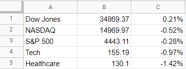
Next, I’ll also download the latest business-related news. Google Sheets has another unique function for this: IMPORTFEED. All you need to do is find an rss feed from a website that you want to pull information from. Not every website has an rss feed but what you can do is just do a Google search for the name of a source and ‘rss’ to see if you can find a link. There are three sources I’m going to use for this dashboard:
CNBC: https://www.cnbc.com/id/10001147/device/rss/rss.html
WSJ: https://feeds.a.dj.com/rss/RSSMarketsMain.xml
NYT: https://feeds.a.dj.com/rss/RSSMarketsMain.xml
I will pull them all in the same way, using the IMPORTFEED function. Here’s an example with the CNBC feed:
=IMPORTFEED(“https://www.cnbc.com/id/10001147/device/rss/rss.html”,”items”,true,10)
In Google Sheets, the top articles from each of those rss feeds will show up, including the title, URL, date created, and even a brief summary:
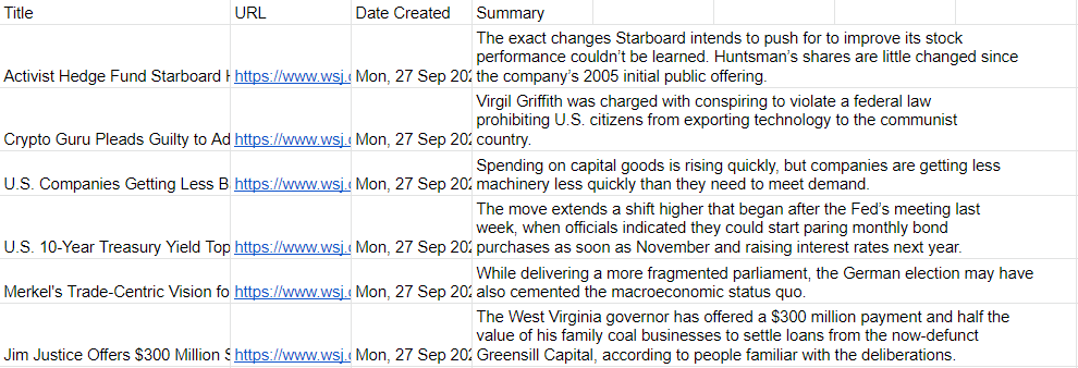
Now, it’s time to pull all this data into Excel.
Step 2: Loading the data into Excel using Power Query
To import data from Google Sheets into Excel, you need to first share the sheet. While in Google Sheets, go into File -> Share -> Publish to web. Then, you’ll be prompted to select what you want to share. I’ll start with the Markets tab I created and then the News tab:

Copy this URL as you’ll need it to load the data into Power Query. While you’re back in Excel, go under the Data tab and click on the From Web button under the Get & Transform Data section. You’ll be prompted to enter a URL. This is where you’ll paste the link that you copied from Google Sheets:

On the next page, select Table 0 as where you want to extract data from. And if you want to do some cleanup (getting rid of extra columns), you can do so by clicking on the Transform Data button:
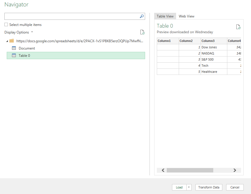
To remove any unneeded columns in Power Query, just right-click on a column header and click Remove:
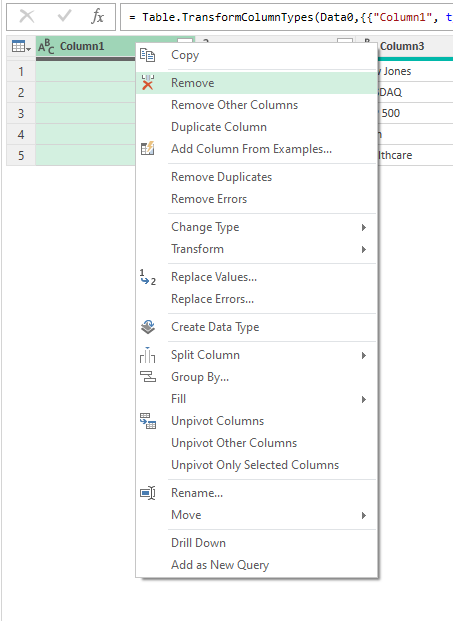
Once you’re done, click on the button to Close & Load if you want the data to be loaded on a new sheet. If you want to control where it gets pasted, then use the drop down and select Close & Load To.
Repeat these steps for the other Google Sheets tab.
In addition, I’m also going to load data from a few other sources:
Top 100 Gainers on Yahoo Finance: https://finance.yahoo.com/gainers/?offset=0&count=100
Top 100 Losers on Yahoo Finance: https://finance.yahoo.com/losers?offset=0&count=100
Upcoming IPOs from IPOScoop: https://www.iposcoop.com/ipo-calendar/
The process for importing these links into the dashboard is the same as for Google Sheets. Go through Power Query, import from web, and paste in the URL plus make any formatting changes necessary. The next step involves putting all this data together in a dashboard.
Step 3: Creating the dashboard
In my spreadsheet, I’ve created two tabs: one that hold all my Power Query downloads (the ‘Data’ tab) and a ‘Dashboard’ tab for where all the information will be displayed.
To make the set up of the dashboard easy to manage, I’m going to change the column width to 10 for everything. To do that, press CTRL+A to select all the cells on the Dashboard tab, then right-click on any of the headers, and there you’ll be able to select column width.
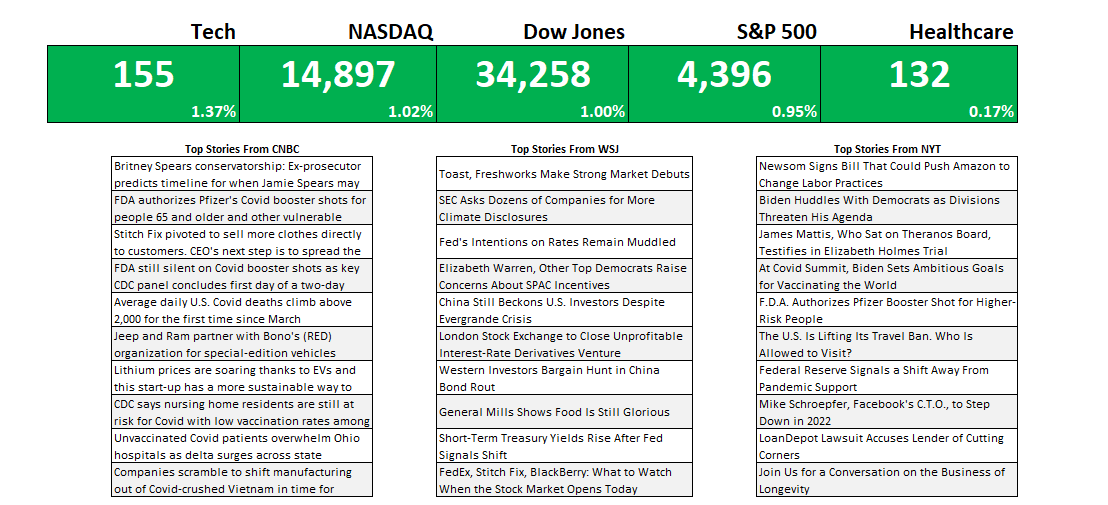
First up, I’m going to get the indexes and market indicators as a starting point. To do this, all I need to do is link to the values and the percentages for the S&P 500, Dow Jones, Nasdaq, Tech, and Healthcare tickers I imported from Google Sheets. By default, I’ll set the formatting for all the cells to be green:

To make this more dynamic, I will add some conditional formatting so that if the percentage change is negative, the corresponding cells will highlight in red. For this, I can select all the cells in green above and create a conditional formatting rule the starts with where the first percentage is (in my spreadsheet, it is cell E6):
=E$6<0
This is a simple rule but by not freezing the column (E) and freezing only the row (6), it can be applied to all the cells above. I can apply a red background color so that if any of the percentages are negative, the cells will highlight accordingly:

For the next part of the dashboard, I will copy over the news stories that were also downloaded from Google Sheets. This time, I’m going to use the HYPERLINK function so that I can not just link to the title but also create a clickable link that will allow me to open the story should I want to open it in my default browser. The function itself is simple and involves just two arguments, one for the actual URL and another for what the text should show up. Since it’s shorter, I’m going with the title. After applying some formatting and copying all three sources, this is what my dashboard looks like:
For the last part of the dashboard, I’m going to pull in the tables from the other data sources (top 100 gainers, losers, and upcoming IPOs). If these are on the Data tab, you can just cut and paste them onto the Dashboard tab. And for each one of the tables, I’m going to create a chart based on the symbol and the percent change.
To do this, select the Symbol column and the % Change columns. Then under the Insert tab in Excel, open up the charts and select Treemap. If you selected too many columns or didn’t specify which ones you wanted, you might get a different look. But if you only selected those two, you should see something like this:
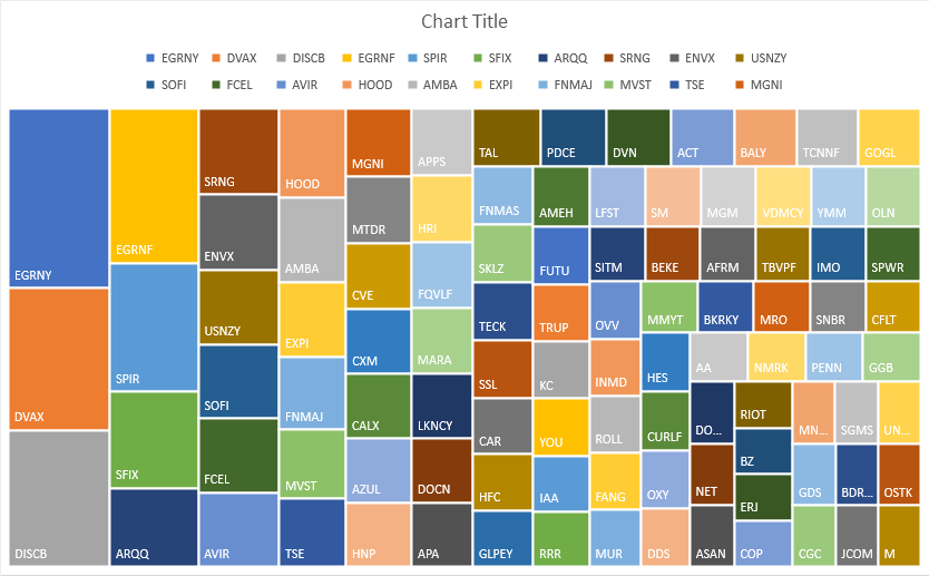
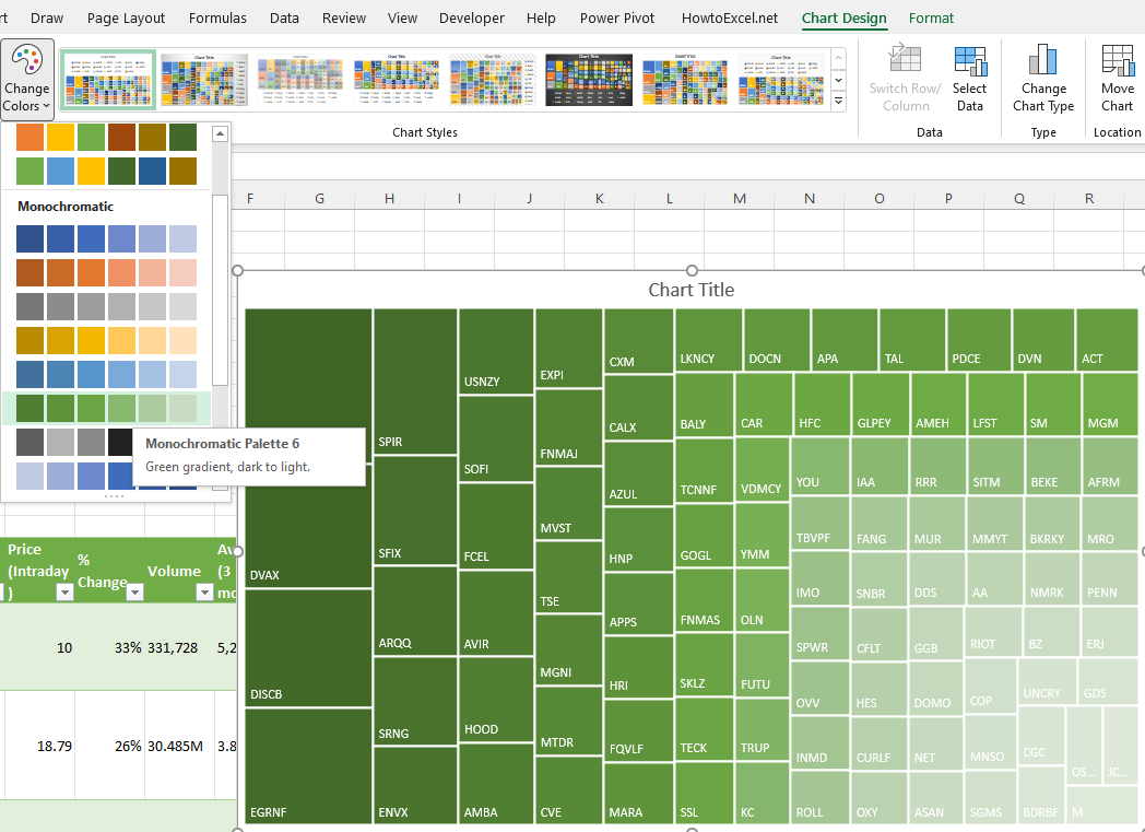
Since the chart includes the symbols, the legend can be deleted. Also, I’m going to change the color scheme so that it goes from dark green to light green. This change can be made by clicking the Change Colors button next to the chart:
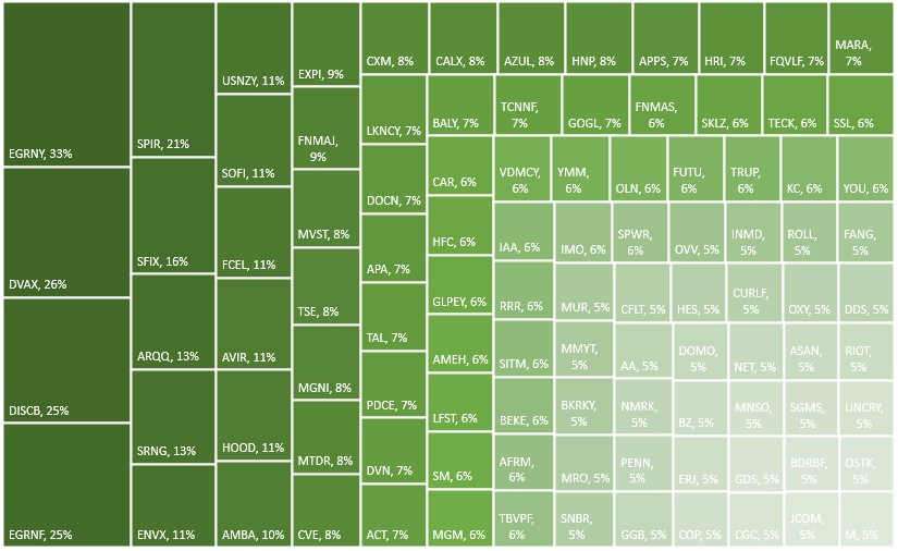
To add the percentage to each of the boxes, right-click on one of the ticker symbols and click Format Labels. Then, check off the box for value so that the percentages will also show up next to the symbols:
These steps can be repeated for the other charts. However, for the losers table, since the percentage change is negative, it needs to be flipped to positive first. To do that, that query needs to be edited. If you click on Queries & Connections section under the Data tab, you’ll see a list of all your queries. Click on the one that takes you to the top losers query. Right-click edit and Power Query will open up.
Once in Power Query, select the % Change column and under the Transform column at the top, click on the Standard drop down, which will show you all the different calculations you can apply:
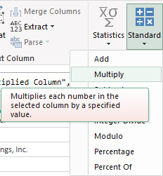
Click on Multiply and then for the value in the next box, enter -1. Pressing OK will then flip all the values to negatives.

Now, you can create the same Treemap chart for this table. For the IPOScoop download, the field I’m going to use is Est. $ Volume. This query will also need to be edited in order to use that field since it is text. Although it is a bit more complex since this field contains text and dollar signs, there’s a relatively easy way to parse out what you need.
In Power Query, select the column, and under the Add Column tab, click on the Column From Examples button (choose the option for From Selection):
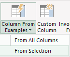
That will create a new column:

In Column1, I can enter the value that I want Power Query to extract. If I just enter a few values to show what I want (in this case, I only need to enter 300), Power Query fills in the rest, figuring out what I am trying to do. It’s an easy way to parse data in Power Query.

After creating the new column, I can change the format from text to currency by clicking on the ‘abc’ letters in the title:
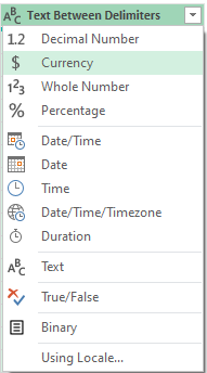
Now that I have the column created, I can remove the original one and load the data back into Excel and proceed with making a Treemap for this chart using the symbol and the newly created column.
The last thing I’m going to do is create a new column to show the change in volume to determine how much more (or less) trading there was for each stock on the day compared to the average. This will compare the average three-month volume with the current day’s volume. The one complication is that some of the values contain letters:
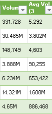
To convert these values, it’s important to first parse out the letters. If a value doesn’t contain a letter, then it is in thousands. I’m going to set everything to millions. So if the value doesn’t contain a letter, it will be multiplied by 0.000001 to convert it into a fraction of a million. And if it contains a ‘B’, it will multiply by a factor of 1,000. Otherwise, the value will remain as is. Here’s how the first part of the formula will look like, which involves determining the multiplication factor:
IF(RIGHT([@Volume])=”B”,1000,IF(RIGHT([@Volume])=”M”,1,0.000001))
Since the letter is always at the end of the string, just using the RIGHT function (which looks at the right-most string) will suffice. This result needs to be multiplied by the remaining value. That value can be extracted by using the SUBSTITUTE function which will replace one value with another:
SUBSTITUTE([@Volume],”B”,””)
In the above formula, the value of B will be replaced with an empty string. This is the same as simply removing the value. To ensure that any ‘M’s are also removed, I will embed this formula within another one that will substitute out those values:
SUBSTITUTE(SUBSTITUTE([@Volume],”B”,””),”M”,””)
I multiply this by the first part of the formula, and my numerator is as follows:
(IF(RIGHT([@Volume])=”B”,1000,IF(RIGHT([@Volume])=”M”,1,0.000001))*SUBSTITUTE(SUBSTITUTE([@Volume],”B”,””),”M”,””)
For the denominator, I’m going to use the exact same formula, except instead of the current volume, I’m going to use the field for the three-month average:
IF(RIGHT([@[Avg Vol (3 month)]])=”B”,1000,IF(RIGHT([@[Avg Vol (3 month)]])=”M”,1,0.000001))*SUBSTITUTE(SUBSTITUTE([@[Avg Vol (3 month)]],”B”,””),”M”,””))
The last part involves putting all this together:
=(IF(RIGHT([@Volume])=”B”,1000,IF(RIGHT([@Volume])=”M”,1,0.000001))SUBSTITUTE(SUBSTITUTE([@Volume],”B”,””),”M”,””)/(IF(RIGHT([@[Avg Vol (3 month)]])=”B”,1000,IF(RIGHT([@[Avg Vol (3 month)]])=”M”,1,0.000001))SUBSTITUTE(SUBSTITUTE([@[Avg Vol (3 month)]],”B”,””),”M”,””)))-1
The -1 at the end is to put the change in a percentage of less than 100%.
Another step you might consider at this point to help identify these changes is to format these numbers so they are easier to read. You can use conditional formatting (color scales) to easily highlight the highs and lows. And if you want to format the percentages so that they show commas and negative percentages show up red, use the following in the custom number format:
#,##0%;[Red]#,##0%
The semi-colon before the [Red] separates out what the percentages should look like when they are positive (the part before the semi-colon) and what they should like when negative (the part that comes afterward). The [Red] text indicates the value should be in red text.
Here’s how this section looks as part of my dashboard:
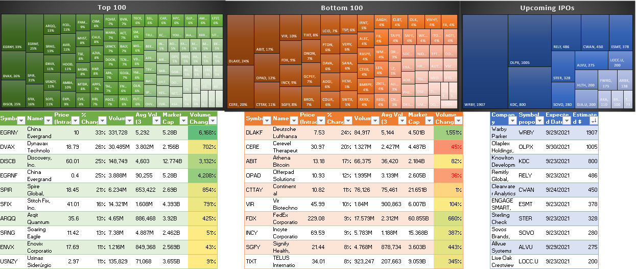
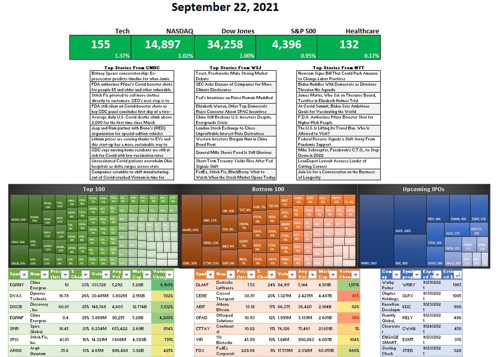
And here’s a snapshot of the dashboard as a whole.
One thing to remember: if you want to update the queries and the dashboard, make sure you go under the Data tab and click the Refresh All button. Otherwise, your data may not be up to date.
Also, to prevent your tables from stretching out when updating the queries, select each one of them and under the Table Design tab, click the Properties button (under the External Table Data section), where you should see this:
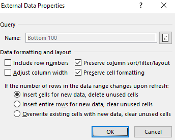
Make sure the Adjust column width checkbox is unticked. This will prevent your columns from stretching out and disrupting your layout.
If you liked this post on Creating a Stock Market Dashboard in Excel, please give this site a like on Facebook and also be sure to check out some of the many templates that we have available for download. You can also follow us on Twitter and YouTube.


Add a Comment
You must be logged in to post a comment