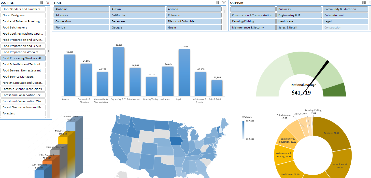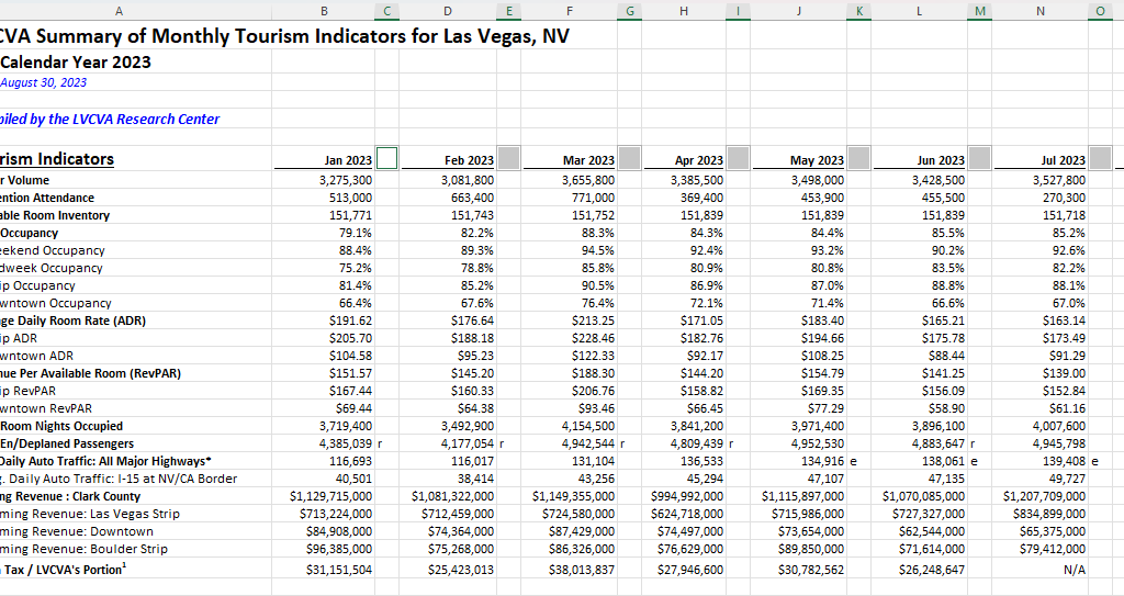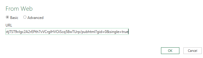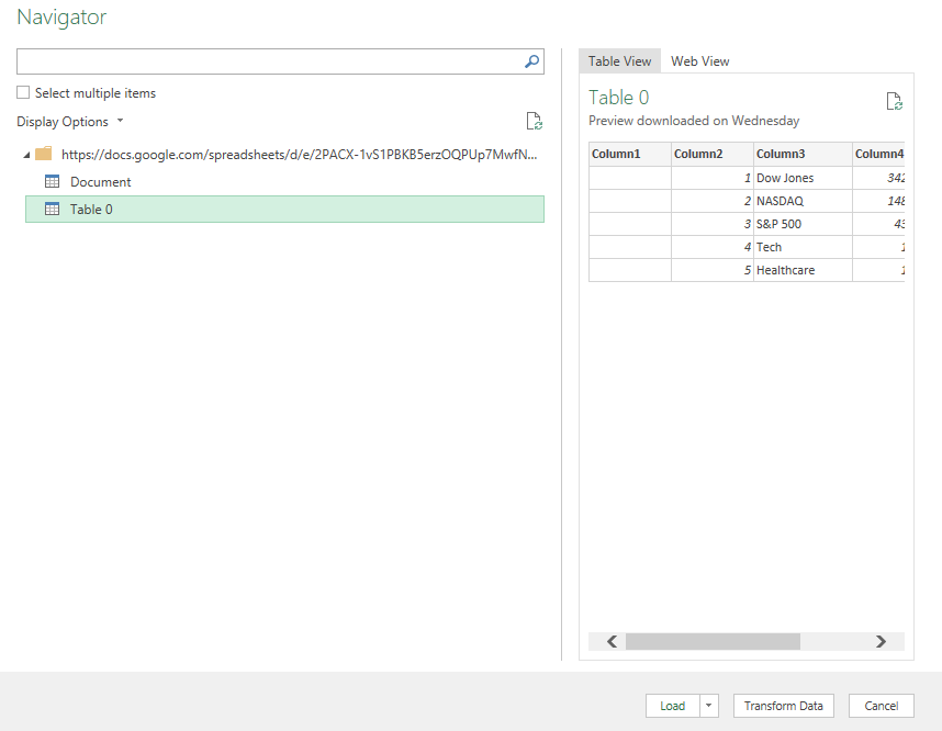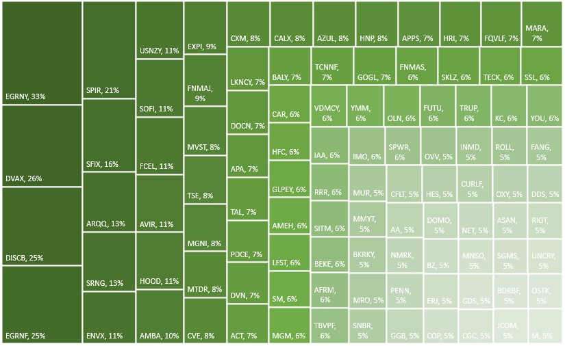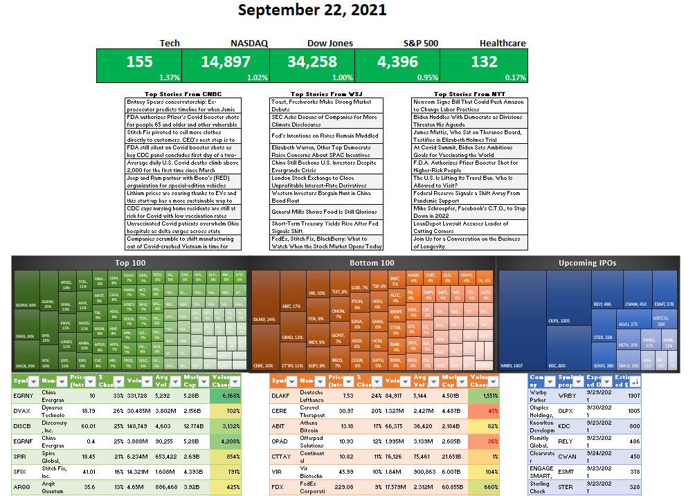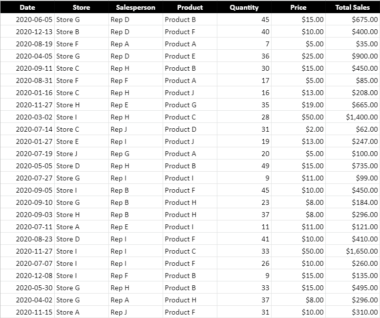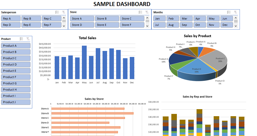
In this post, I’m going to walk you through the steps of creating a dashboard in Excel, from start to finish. You can use the sample data file to follow along with my example, which is not based on any real information but it represents a realistic data set. Here is an overview of it:
We’ll first start with preparing the data by creating pivot tables, then turning those pivot tables into charts, formatting the charts, and linking the relevant pivot tables together using slicers. We’ll also add some data that isn’t connect to any pivot tables but which can summarize the overall data set.
Step 1: Plan your dashboard and the key metrics you want to track
An important step in any dashboard creation is first thinking what data you want to track. This is crucial because if you can’t think of at least four metrics you want to plot on charts, then you may not have enough relevant data to create a useful dashboard. You may need to pull in more data. A dashboard that has just a few key data points is not going to be all that useful. For many users, the whole point of a dashboard is being able to easily stay on top various metrics and track trends and gain multiple insights in just a single page.
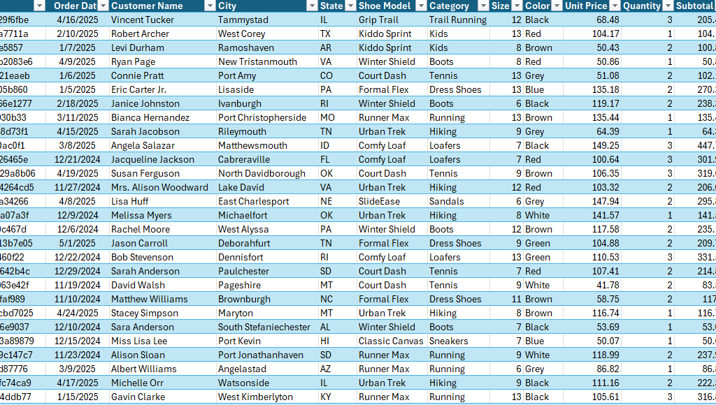
The sample data above has customer name, city, state, shoe model, category, size, and color. Those are a lot of useful metrics. Some easy metrics to track could include sales by date, by state, by category, and by model. That gives us a lot of things to track. You can add more but at the very minimum, you should be able to think of at least four charts you can create from your data set. Any less than that, and you might want to consider adding to your data set.
Step 2: Make sure your data is in a table
If you data isn’t already in a table, make sure to convert it into one. This is useful because when you create a table, you can setup an easy name to remember when creating your pivot tables. Rather than having to remember the sheet name and a specific range, you can just use a named range such as tblData.
To turn the data set into a table, click anywhere on your data and use the CTRL+T shortcut. Excel should automatically detect your range. If it doesn’t, make sure to adjust it. And then once it is correct, click on OK and you can set your table name in the top-left-hand corner, by simply typing tblData.

Another benefit of using a table is that if you add to your data set over time, you don’t have to worry about adjusting the range you’re referencing. If you use tblData as your range when creating your pivot table, you can confidently know that it will include new rows added to your data set (as long as there are no gaps).
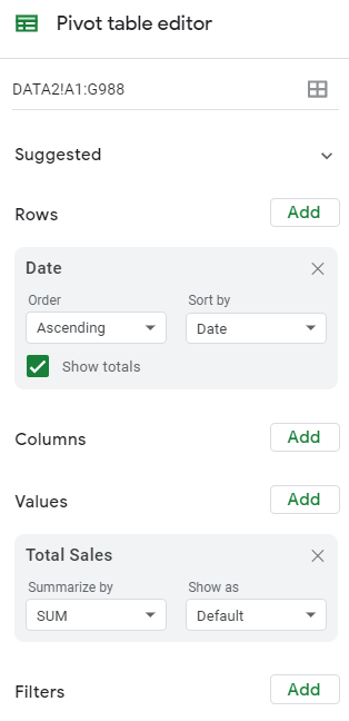
Step 3: Create multiple pivot tables
I create a pivot table for every chart I want to track on a dashboard. This makes it easy to ensure everything is pulling from the same data source. To create a pivot table quickly, you can use the ALT+N+V+T shortcut. I prefer to put all the pivot tables on a separate sheet, which I’ll call the PT tab in this example.
Setup each pivot table with the metrics you want to track (e.g. shoe model in rows, sales in the values section). Repeat this for each metric you want to show on your dashboard.
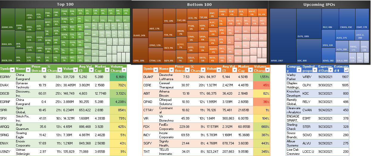
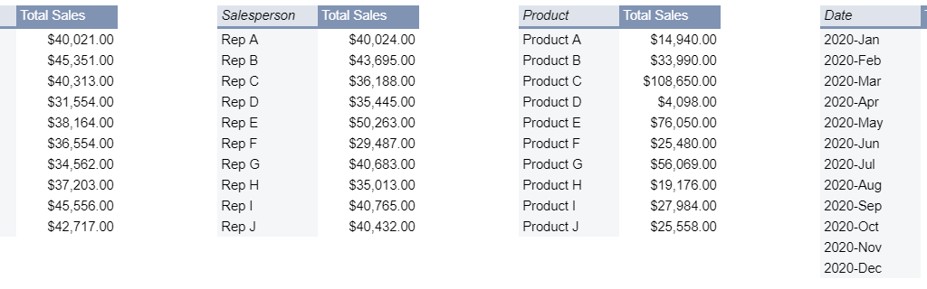
Here are the pivot tables I’ve setup:
- PivotTable 1: Rows: Shoe Model; Values: Sales
- PivotTable 2: Rows: Category; Values: Sales
- PivotTable 3: Rows: State; Values: Sales
- PivotTable 4: Rows: Date; Values: Sales
PRO Tip: create one pivot table, then copy and paste it multiple times. Afterwards, adjust your fields. There is no need to go back to the data set each time and create a new one.
Step 4: Customize your pivot tables (optional)
For Pivot Tables 3 and 4, I’m going to make some additional adjustments. Since there are 50 possible states that can appear in my pivot table, this is not going to be useful to display on a chart; it will get very cluttered. Instead, what I will do is display the top 10 states.
To do this, select the drop-down option for the State field and choose Value Filters and Top 10.
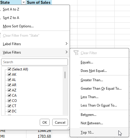
By leaving the default selection, it will leave the top 10 items by sales. We can also sort the data from largest to smallest, by right-clicking on any of the items and selecting Sort and Sort Largest to Smallest

This now shows us the top 10 states, sorted from largest to smallest in terms of sales.

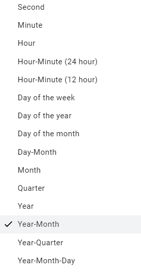
Next, for Pivot Table 4, which contains dates, we need to setup the correct grouping, as it may simply show the ungrouped dates. This may not be the case in your version of Excel, and that will ultimately depend on your settings.

To group this, right-click on any of the dates and select Group, where you’ll see the following options for grouping your dates:
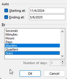
Let’s select months and years for the grouping. This avoids the potential issue of including multiple months together, which can be problematic if you have multiple years (e.g. you don’t want January 2025 and January 2024 being added together).
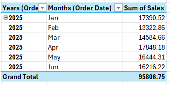
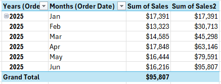
Now, we have a more organized data set by year and month.
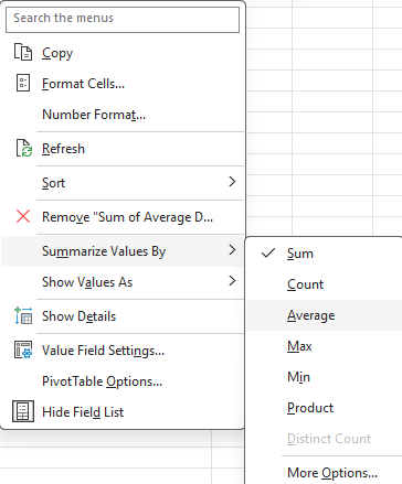
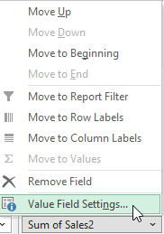
But let’s also show current monthly values as well as cumulative values. To do this, simply drag the sales field a second time into the values section. The data will look identical, but if you select the drop-down arrow for the field, you can select Value Field Settings which will allow you to change how the data is displayed.
In the Show Values As tab, there will be an option to show values as Running Total In. There, you can select Months (Order Date). We can also rename the field to say Cumulative Sales:
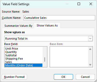
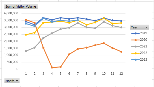
This now gives us multiple views for the sales data: a monthly view, as well as a cumulative view. You’ll notice since it is based on month, the cumulative values don’t reset and continue adding on.

Step 5: Format your value fields
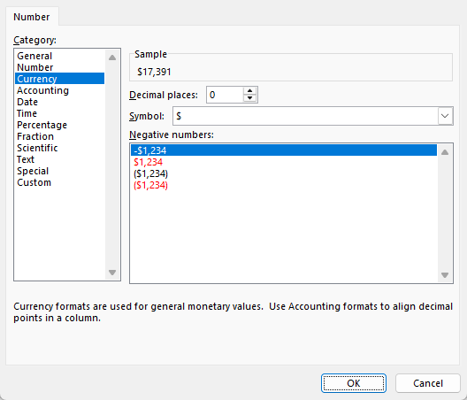
Before moving on to the next step, now is a good time to adjust the different field settings for all your pivot tables, to ensure the values are formatted properly as numbers. This will make them easy to display on your dashboard. By going into each of the different fields in your value section and selecting Value Field Settings, you can adjust the Number Formatting. Let’s set the format to Currency and remove any decimal places, to minimize the space the values take up, while also making it clearing they are dollars (you can also adjust the symbol to your local currency):
Repeat these steps for all of your different value fields in your pivot tables.
Step 6: Create the charts
With the pivot tables setup, the next step is to actually start creating the different charts. Here again, you’ll want to consider planning out your charts as well. You don’t want to create a boring dashboard which just has the same column or bar charts over and over again.
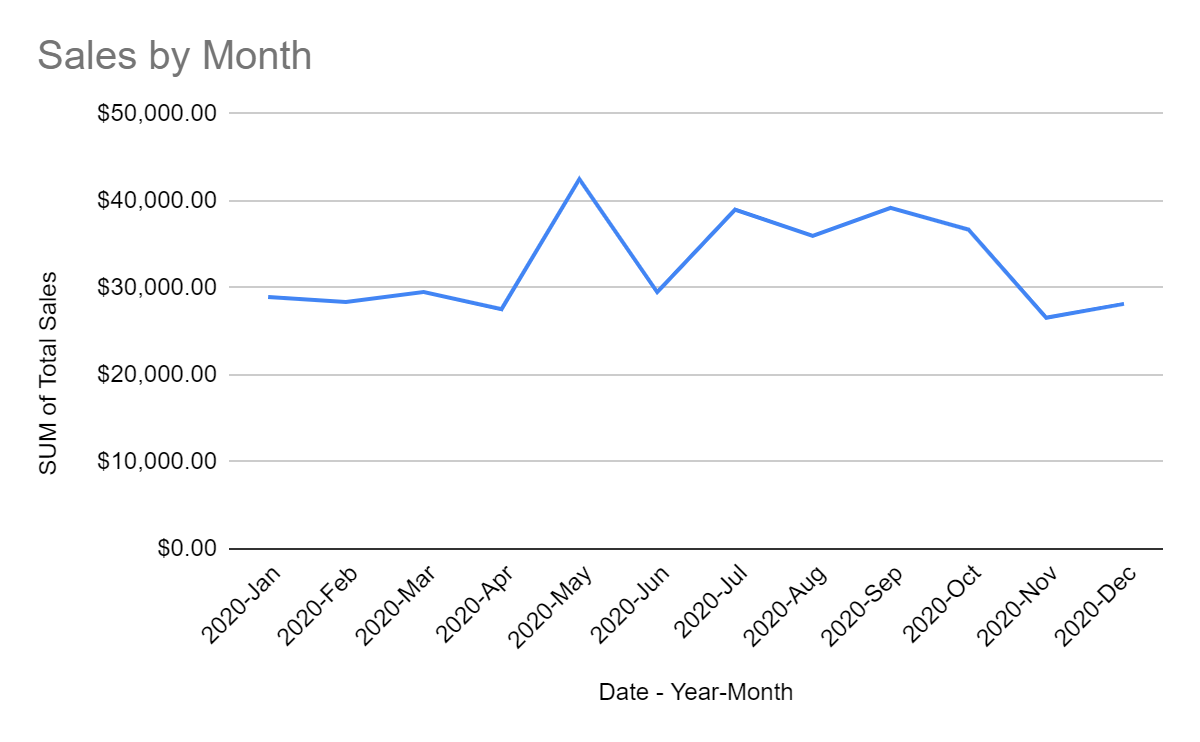
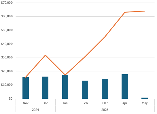
For the pivot table which shows dates, let’s use a combination that displays both column charts and line charts. To set this up, ensure you select Combo when choosing a chart type.
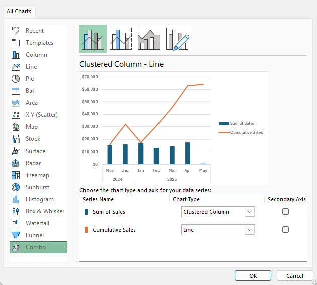
This creates the following chart:
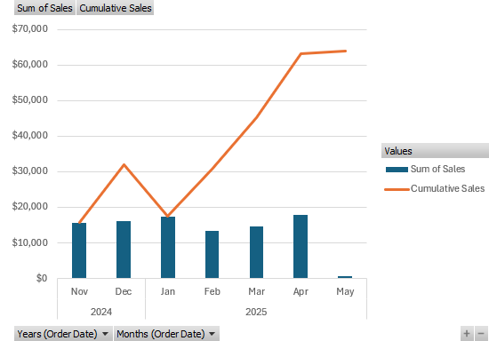
To clean this chart up, I’m going to remove the drop-down options and also the legend for values. For the latter, just select the legend and click the delete button. And to turn off the drop-down buttons, go into the PivotChart Analyze tab and press the Field Buttons option so it no longer shows that it is pressed:

This now creates a cleaner look for the chart:
One optional change you may want to consider is to shrink the gap width to minimize the white space in the chart. By right-clicking on the chart and selecting Format Data Series, you’ll see an option to modify the gap width.

By changing the gap width to 100%, this makes the columns wider:
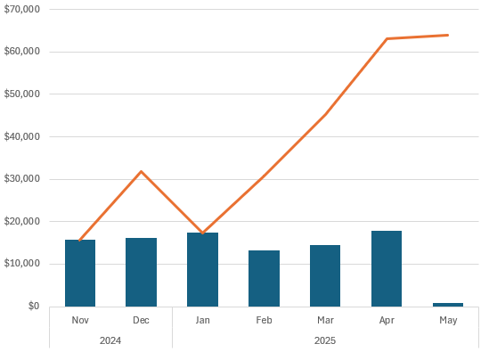
At this stage, it’s just a matter of customizing the chart to how you want it to look and feel. The changes I’ve applied are as follows:
- Setting the columns to a green fill color.
- Setting the line chart to grey with black data points.
- Adding vertical lines to the chart.
- Setting the plot area to a grey color.
- Adding a border to the plot area.
This results in the following chart:

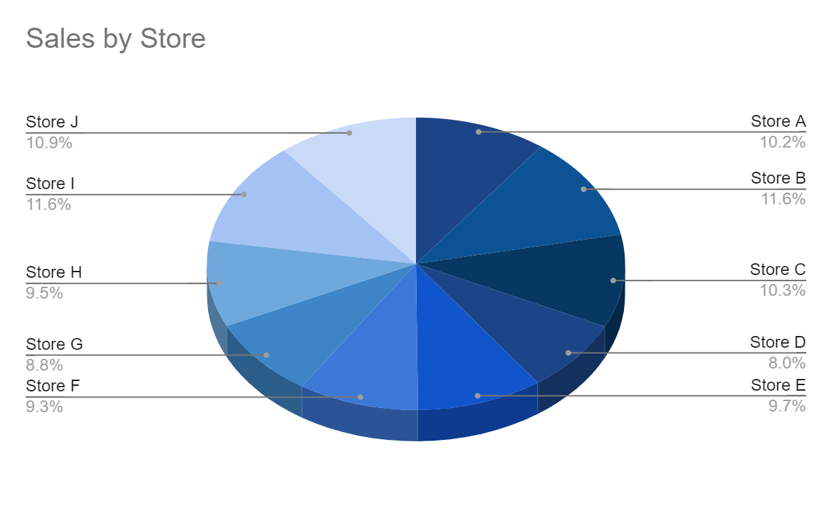
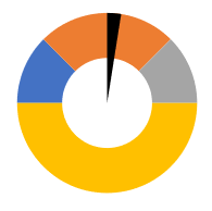
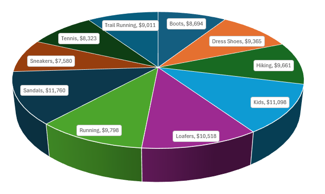
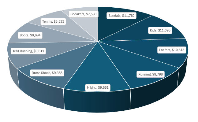
The next chart to create is for sales by category. For this one, let’s create a pie chart. The 3D pie chart in particular, looks like a good option for this pivot table:

Let’s remove the legend and the field buttons again with this template. However, without legends, it’s hard to read and understand this chart. To get around this, let’s add labels. This can be done by clicking on any of the pie chart slices and selecting Add Data Labels. You can then right-click on any of the labels and select Format Data Labels where you can specify to include both the value and the Category Name. This, unfortunately is still a bit difficult to read:
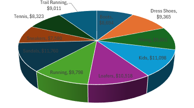
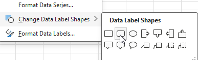
To make this easier to read, right-click on any of data labels and select Change Data Label Shapes and select the rounded rectangle.
After shrinking the font for the labels, it’s now easy to see them:
Let’s also make the following changes:
- Sort the pivot table so that the values in arranged from highest to lowest. This is helpful in reading a pie chart by seeing the largest values first.
- Adjust the colors of the pie chart so that they are more gradual. On the Design tab, let’s adjust the colors so that they are different shades of blue.
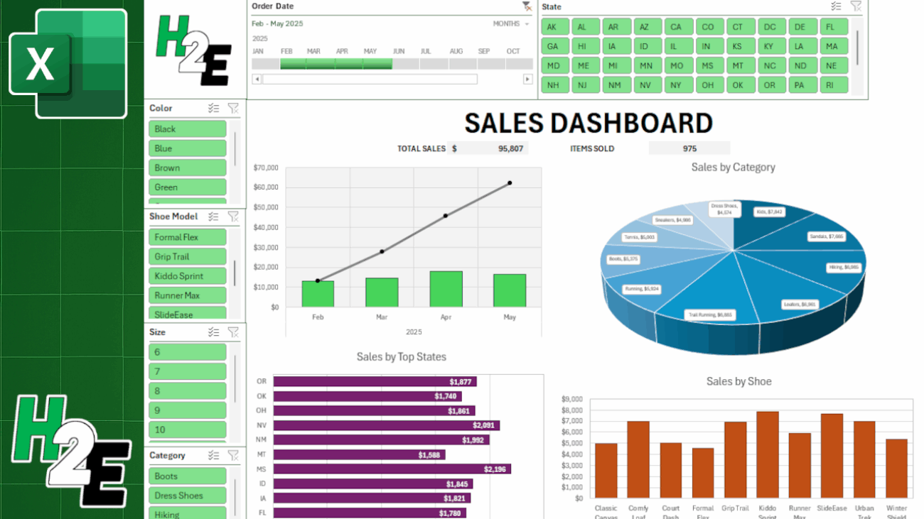
Now, here is my finished 3D pie chart:
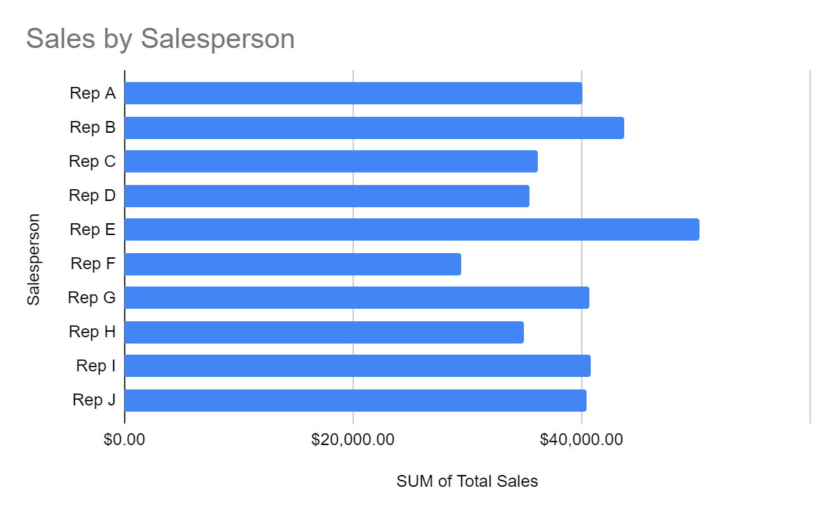
Next, let’s create a chart for the top 10 states. This one will be a simple, clustered bar chart. Here is how it initially looks:
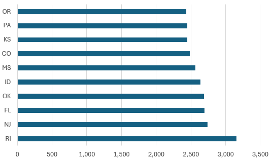
For this chart, I’ll make the following changes:
- Reduce the gap width for the bar charts to 50%.
- Change the color to purple.
- Add data labels.

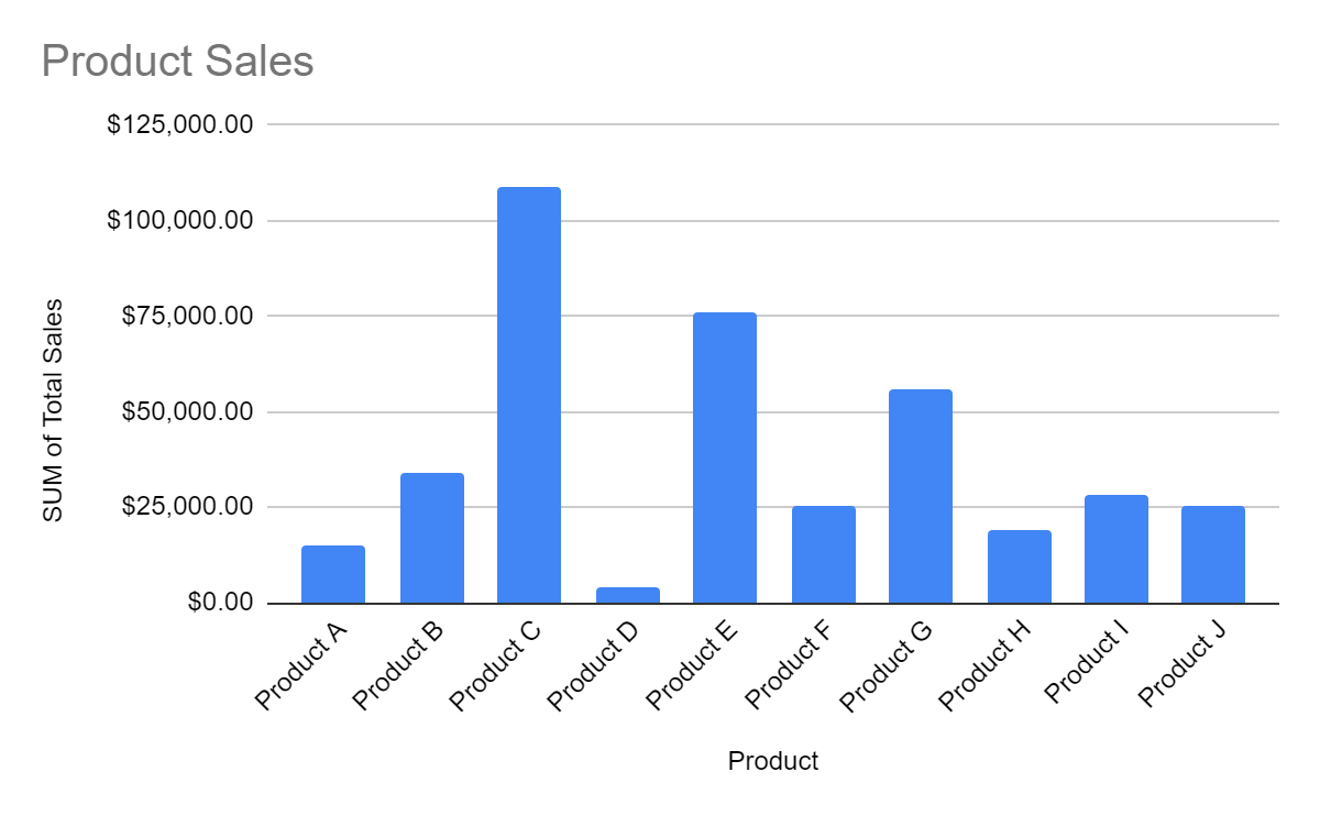
Lastly, I’ll setup the chart to show sales by shoe model. This will be just a simple clustered column chart that will be set orange:

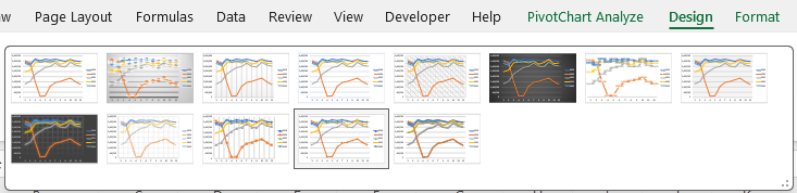
PRO TIP: If you want to expedite the process of setting up your charts, you can select your chart and on the Design tab select a pre-defined style to apply to your dashboard. You can still make adjustments afterwards, but this can give you a good starting point.
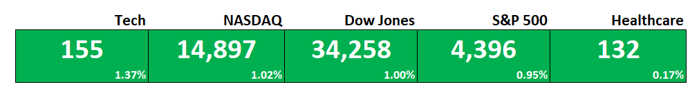
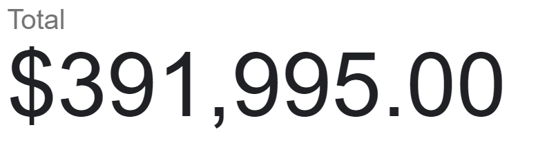
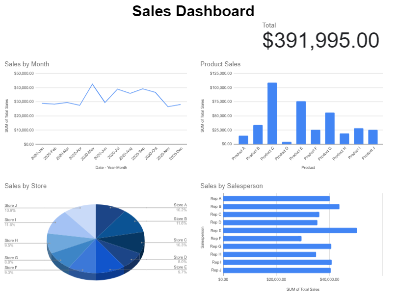
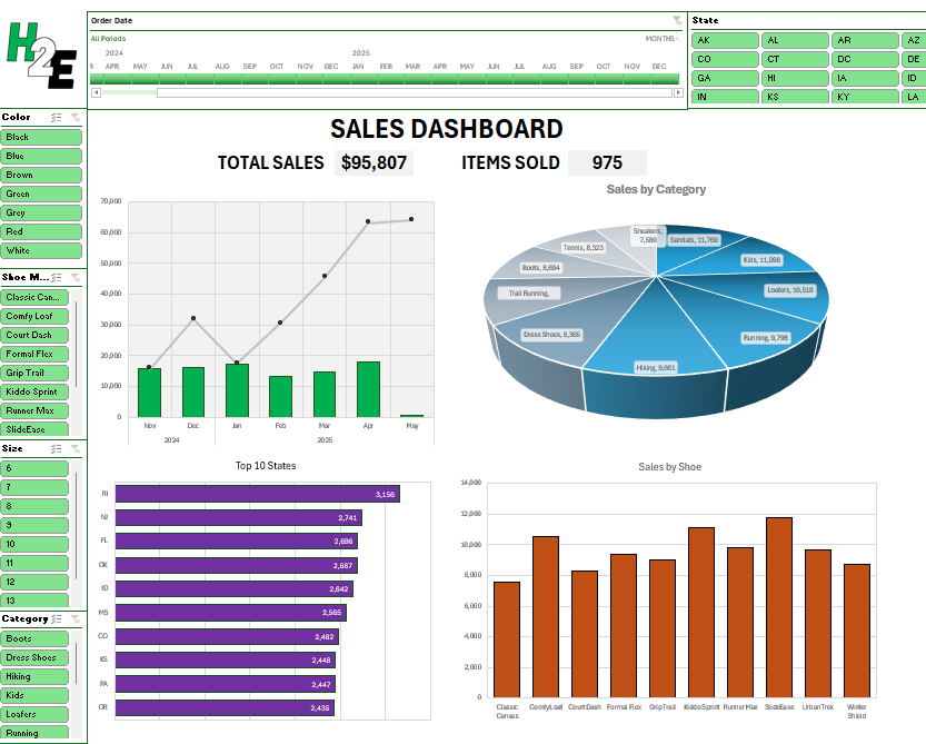
Step 7: Add totals and headers
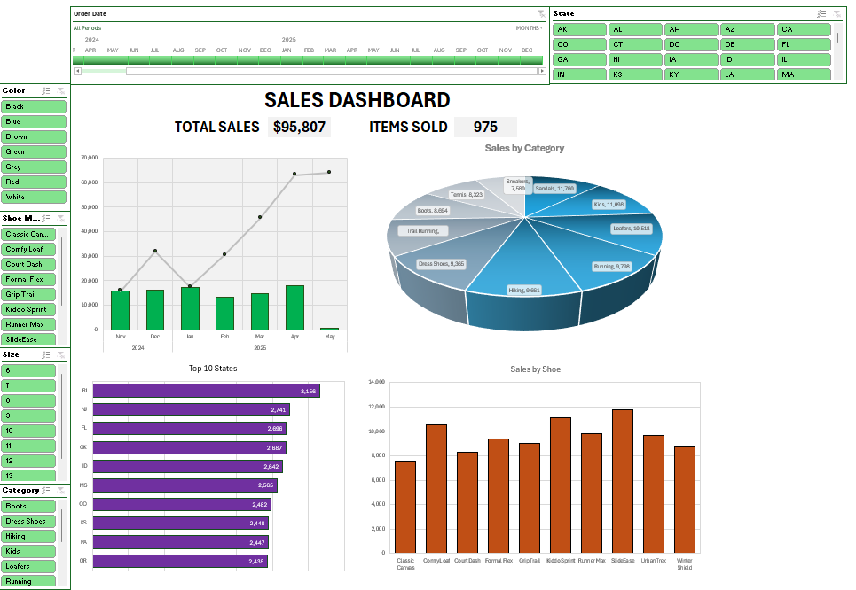
In addition to creating pivot charts, let’s also incorporate metrics, such as total sales and items sold. We can position these metrics above the main charts and slightly below the header. For now, let’s just refer to this as ‘Sales Dashboard’ for the sake of keeping it simple.
Let’s also merge cells and create a title for the metrics. One will be called ‘total sales’ and another will be ‘items sold’. This can be helpful to always show these totals, regardless of which filters are applied to pivot tables. Let’s also create a grey background color for these items to allow them to stand out more easily.
To generate these totals, all we need to do is sum up the sales from the main data table, which will be used for the Total Sales metric. And for the total items sold, we’ll need to total the quantity field from the data sheet.
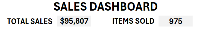
With these metrics, these numbers will not change even if the pivot table values change. This can be useful to just get a quick snapshot of everything that’s important.
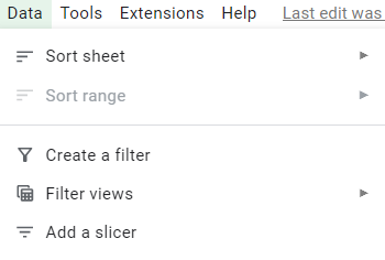
Step 8: Add slicers and a timeline
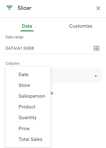
To make this dashboard dynamic, it’s important to also add slicers. By doing this, someone can quickly apply multiple filters to all the pivot tables at once. To add slicers, select any of the pivot tables and click on the Insert tab and click Slicer. This will give you a list of all the fields which you can add as slicers:
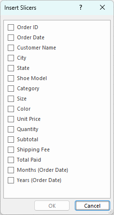
These are the fields to add which may be ideal for this dashboard:
- Category
- Color
- Shoe Model
- Size
- State
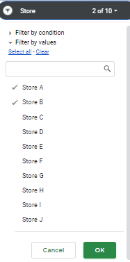
Let’s add all that slicers on the left-hand-side of the page, with the exception of the state slicer, which can go across the top. For that slicer, since there are so many different options, we can select the slicer and change the number of columns to 5.
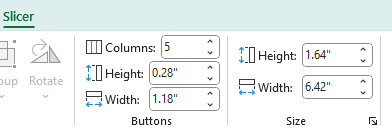
This now produces a slicer that’s easier to scroll through:

For fields where the items are short in length, setting up multiple columns can be ideal in this situation.
Since we have a date field, we can also add a timeline to this dashboard. Similar to adding slicers, select any pivot table, and on the insert tab, select the Timeline button.

There is only one date field to select. Choose that and click OK, which will add the timeline.
At this stage a key part is to organize your slicers in a way that’s easy to read the options and scroll through them all. You can also apply custom formatting to all of them. In my example, I’ve applied a green color to the slicers. Here is how they are organized:
Step 9: Link slicers and timelines to all pivot tables
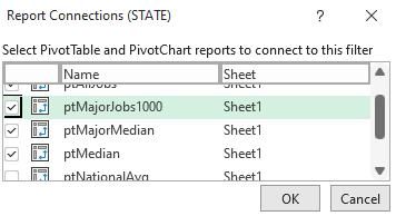
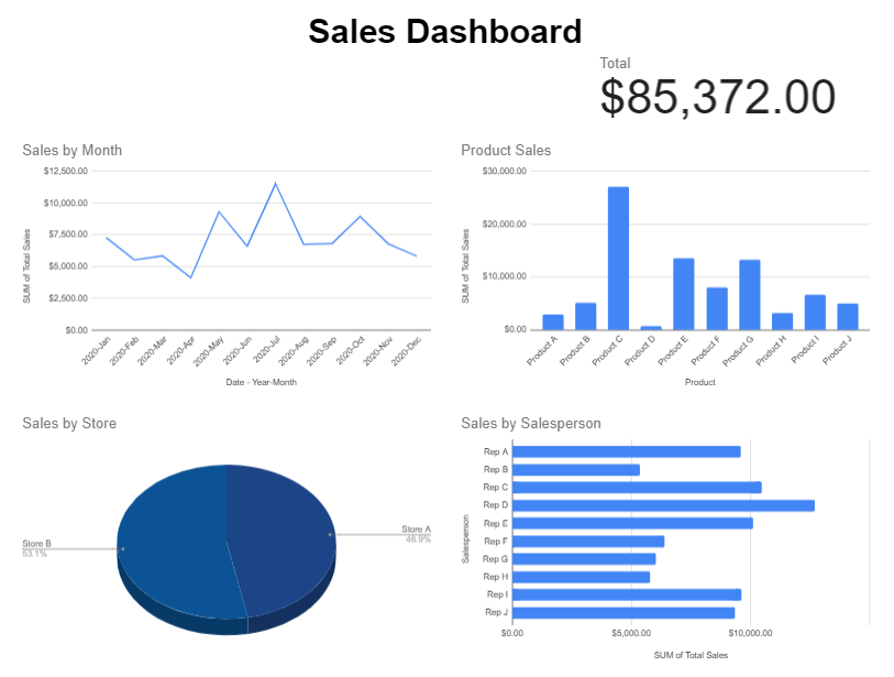
You might think you’re done after the last step, but and important thing to do is to link all your slicers to all your pivot tables. This is key to ensure that all your charts updated based on a slicer or timeline selection. To do this, go through your slicers and the timeline created, and right click on them to select Report Connections. Upon doing so, you’ll see a list of all the different pivot tables that you can link to. Check them all off.
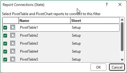
If you do this for all of the slicers and timelines you’ve setup, clicking any one of them will now link to all of your charts. Now, any slicers you select will impact all of the charts on your dashboard.
Step 10: Personalize your dashboard with a logo
You can structure your dashboard in a way that your slicers intersect in the top-left-hand corner, which can leave a space for a logo. This can allow you to easily insert an image for a company’s logo. You can go to the Insert tab and select Place Over Cells and This Device, if you want to select an item from your computer.

I’ve inserted my logo, which ties in well the green theme of my slicers.
You can also follow this video tutorial to help walk you through the process of creating this dashboard.
If you liked this post on How to Create a Dashboard in Excel to Summarize Sales Data, please give this site a like on Facebook and also be sure to check out some of the many templates that we have available for download. You can also follow me on Twitter and YouTube. Also, please consider buying me a coffee if you find my website helpful and would like to support it.