A weighted average is a type of average that assigns different weights or values of importance to each element in a dataset. Unlike a simple average that treats all elements equally, a weighted average adjusts the contribution of each element based on its relative significance. This means that some elements have a greater impact on the final result than others, depending on their weights.
Why use a weighted average?
Weighted averages are useful because they provide a more accurate representation of the data by taking into account the importance of each element. For example, in financial analysis, a weighted average may be used to calculate the average interest rate of a portfolio of loans or investments, where the weight of each loan or investment is based on its size or duration. In schools, a weighted average may be used to calculate a student’s overall grade by assigning different weights to assignments, quizzes, and exams based on their importance or difficulty. Anytime you don’t want everything to have the same weighting or importance is when you’ll want to use a weighted average.
Calculating a simple weighted average in Excel
A common way to apply a weighted average is by using a points system. Suppose you are looking to buy a house and have many different criteria that you want to take into consideration, such as square footage, location, if it has a basement, etc. But not all of these items are equally important, and so you may want to say that location is worth 30 points and square footage is worth 25 points, and so on.
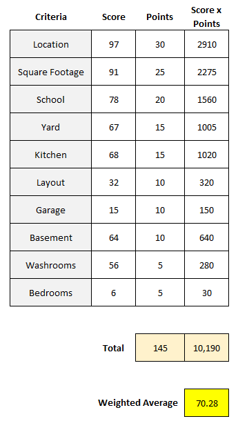
The first step is to assign a weight, or point value, to each one of these criteria. Then, assign a score to each one of them criteria, perhaps within a range of 1 to 100. Once you’ve done that, you multiply the score by the points. Total that up, and divide it by the total points, and you’ve got your score, or weighted average. Here’s an example:
This particular house scored high on the most important items, and thus, resulted in a high weighted average. The total of the score x points column was 10,190. Taking that value and dividing it by 145, the total points, results in a weighted average of 70.28.
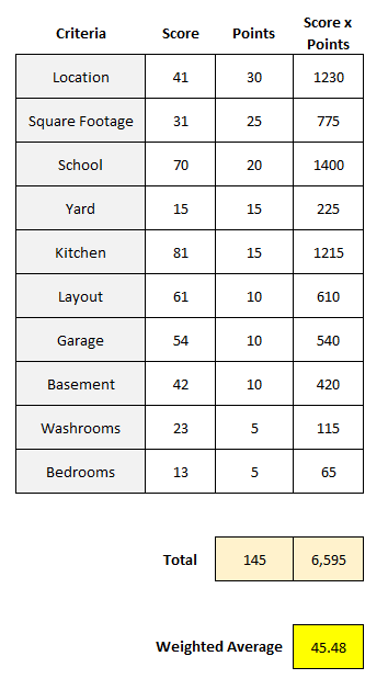
Here’s another house, which scores far lower, with a weighted average of just 45.48:
Although it scored high on areas such as school and kitchen, because of its low scores on the top two weightings — location and square footage — that kept its weighted average down.
Creating a template like this in Excel and comparing your different scores can be a way to help compare houses and other things, while giving each criteria an appropriate weighting. By simply scoring everything on a value of 1-100 without weighting, the problem would be that each criteria would effectively be equal, saying that things like layout and the garage are just as important as the location and size of the house, which most people likely wouldn’t agree with. By using weights, you can better take into account the value of each individual criteria.
Calculating grades using weighted averages
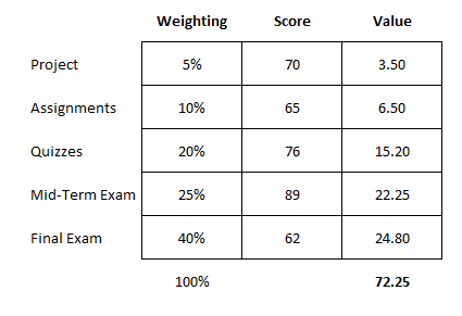
Another use for calculating weighted averages is when it comes to grading. In a class, you might have a specific weighting scale that says assignments are worth 10% of your grade, quizzes are 20%, a project is worth 5%, a mid-term is 25%, and the final exam accounts for 40%.
In this case, you’re using percentages that add up to 100% rather than weights, which may be more subjective. This still works in largely the same way as you are multiplying a score by the weight. Except now, since the weights add up to 100%, you don’t need to worry about taking the total and dividing it by the total weights. Whatever your result is, that is the total score. Here’s an example of how a student scored in a class:
When using percentages for weighting, it’s important to double check they add up to 100% to ensure everything is accounted for. In this example, the student had a score of 72.25, which would be the same as saying they scored 72.25%, which would be their grade for the course. As you’ll notice, the student’s high scores on the quizzes and mid-term exam were unfortunately offset by a poor final exam mark.
In this example, since we’re just looking at percentages, you can do without the extra column for value, which takes the weight x the score. Instead, you can use SUMPRODUCT. If the weightings are in cells A2:A6 and the scores are in B2:B6, the grade can be calculated with the following formula:
=SUMPRODUCT(A2:A6,B2:B6)
The formula will multiply each value by the corresponding value in the same row, thereby eliminating the need to use an extra column. By using an Excel formula, you can save yourself the extra step of having to tally up the values and then dividing them by their weights again.
If you liked this post on How to Calculate Weighted Average in Excel, please give this site a like on Facebook and also be sure to check out some of the many templates that we have available for download. You can also follow me on Twitter and YouTube. Also, please consider buying me a coffee if you find my website helpful and would like to support it.
Every business owner, financial analyst, and student asks the same fundamental question: “How much do I need to sell to cover my costs?”
This is what your break-even point would be. It is where your total revenue equals your total costs, yielding zero profit, but also zero loss. This is a crucial number because you know if you produce more than what’s needed to hit break even, you’ll be turning a profit. Calculating this manually can be time-consuming, but building a dynamic break-even analysis in Excel can enable you to test different pricing strategies and cost structures instantly. In this guide, I’ll walk you through the process, the formulas, and how to visualize the data using Excel charts.
What is a Break-Even Analysis?
Before opening Excel, it is crucial to understand the three components that make up the break-even calculation:
Fixed Costs: Expenses that stay the same regardless of how much you sell (e.g., rent, insurance, salaries).
Variable Costs: Expenses that increase with every unit sold (e.g., raw materials, shipping, packaging).
Selling Price: The amount you charge for one unit of your product.
The formula to find the number of units you need to sell to break even is:
Break-Even Units = Fixed Costs/(Selling Price - Variable Cost per Unit)
The denominator (Selling Price – Variable Cost) is also called the Contribution Margin. It represents how much money is left over from each sale to contribute toward paying off your fixed costs. If your contribution margin is not positive, then you’ll never been able to hit your break-even point.
Now that we understand the terms and key formulas, we can move on to setting up the break-even calculation in Excel.
Step 1: Set Up Your Data Table
First, we need to input our variables. Open a new Excel sheet and create a distinct input area. This makes it easy to change numbers later without breaking your formulas.
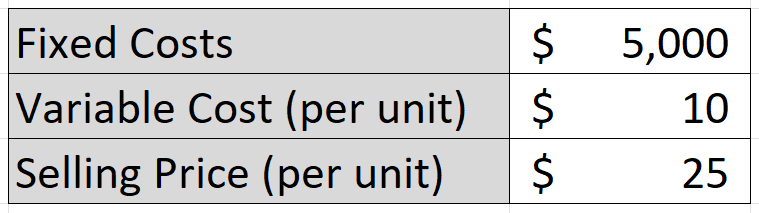
Let’s pretend we are running a specialized T-shirt business, with the following costs and selling prices:
Step 2: Calculate the Break-Even Point
Now, let’s calculate the exact number of T-shirts we need to sell to cover that $5,000 in fixed costs. Using the aforementioned formula where we take the fixed costs and divide them by the contribution margin (selling price less variable cost), this results in the following calculation:
The formula in cell C6 is as follows:
=ROUNDUP(C2/(C4-C3),0)
The result is 333.33 units, but that ROUNDUP function rounds the result up to the nearest whole number, which is 334. Since you can’t sell a portion of a shirt, it’s necessary to round up.
Step 3: Create a Dynamic Data Model
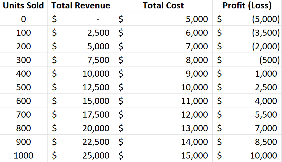
Knowing the break-even point is helpful, but seeing the trend can be much more useful. Let’s create a table that calculates revenue and costs at different volume levels (e.g., selling 0 units, 100 units, 200 units, etc.).
I’m going to set up a table with headers for the following fields: Units Sold, Total Revenue, Total Cost, and Profit (Loss). For Units Sold, the units will start from 0 and increment by 100 at a time. The Total Revenue field will multiply the units sold by the selling price. The Total Cost field will be equal to the units sold multiplied by the variable cost, with the fixed costs added on top. The Profit (Loss) will take the Total Revenue and deduct the Total Cost.
The table should look something like this:
Step 4: Visualize with a Break-Even Chart
Visuals make financial data easier to understand. We can create a chart that shows where the Total Revenue line crosses the Total Costs line.
To do this, start by highlighting three columns in your data table: Units Sold, Total Revenue, and Total Costs. Go to the Insert tab, open up the Charts window, and select any Line Chart you wish to use. You’ll need to adjust the data so that the Horizontal Axis Label for the Revenue and Cost fields is the Units Sold column.
You should now see a chart that looks similar to this:
As per the earlier analysis, we can see that the break-even point is right around 300 units, which is what the chart above indicates.
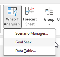
Step 5: Advanced Tip: Use Goal Seek to do a What-If Analysis
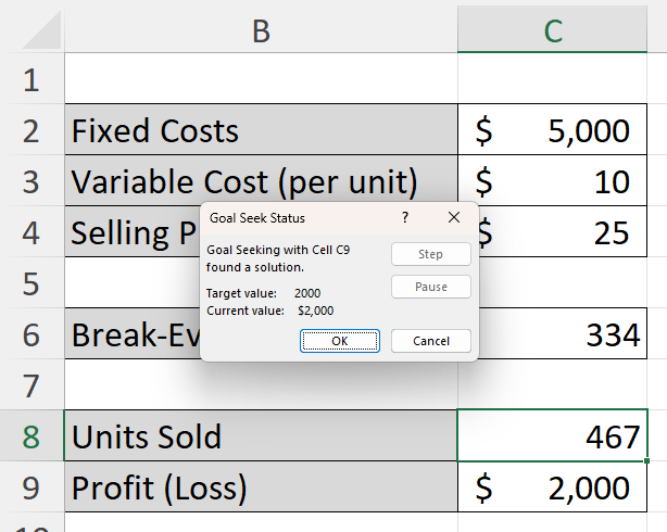
What if you don’t just want to break even? What if you want to make exactly $2,000 in profit this month? You can use Excel’s Goal Seek feature rather than guessing. In the following example, I’ve setup a couple of extra cells for units sold and one for profit (loss), which will be used in the goal seek calculation:
Now, let’s go to the Data tab, select What-If Analysis (under the Forecast section), and click on Goal Seek.
Based on the table above, let’s input the following values for the Goal Seek inputs:
The Set cell value is the ending value that we want, which in this case is the Profit (Loss) value, which is determined by selling price, variable cost, and fixed costs. We want this value to equal 2000, by changing cell C8, which is the number of units sold. After clicking OK, Goal Seeks does the work to figure out what the value in C8 needs to be for C9 to be equal to 2000.
By clicking on OK, you’ll accept the results and they’ll remain in your table. This calculation tells me that by selling approximately 467 units, the profit will be $2,000.
If you liked this post on How to Calculate Break-Even Analysis in Excel: A Step-by-Step Guide, please give this site a like on Facebook and also be sure to check out some of the many templates that we have available for download. You can also follow me on X and YouTube. Also, please consider buying me a coffee if you find my website helpful and would like to support it.
Calculating trailing-12 month values, also known as TTM, can be a powerful way to analyze financial or business data over the most recent year. This method focuses on the latest 12-month period, providing a rolling snapshot of performance or trends. Unlike calendar-based analysis, which adheres strictly to yearly or quarterly periods, TTM values are dynamic and update with each new data point. This makes them ideal for ongoing monitoring, where understanding recent trends is more relevant than sticking to predefined reporting periods.
The concept of a TTM value is straightforward: it involves summing, averaging, or otherwise aggregating data from the most recent 12 months. For instance, if you’re tracking monthly revenue, a TTM sum would include the total revenue for the latest 12 months, updating automatically as new months’ data becomes available. This ensures that you’re always working with the most current information, offering a more flexible and actionable view of performance.
Why Are 12-Month Trailing Values Useful?
Calculating TTM values is valuable in contexts where trends or seasonality play a significant role. For example, retail businesses may experience seasonal spikes during the holiday season, while other industries might have cyclical patterns tied to the economy. A TTM analysis smooths out these seasonal fluctuations, offering a clearer picture of overall performance without being skewed by short-term anomalies.
For investors, financial analysts, and business owners, this calculation can be a crucial metric. It helps in understanding key financial ratios (including price-to-earnings ratios), by providing a consistent timeframe for comparison. It also allows for benchmarking against competitors or industry averages, as trailing metrics are widely used in reporting and valuation. Moreover, it can aid in spotting trends early, such as declining sales or increasing costs, enabling proactive decision-making.
Calculating TTM Values in Excel
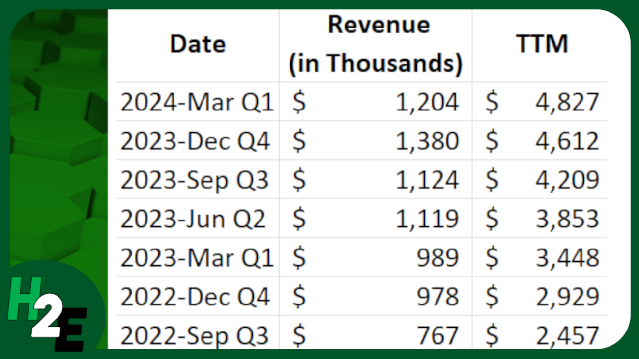
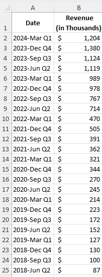
In the following example, I have sales data by quarter. Since they are quarters, I only need to pull the last four values to get the last 12 months worth of values.
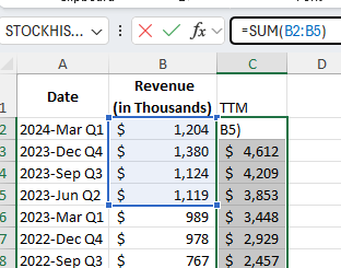
In the simplest approach, you can just use the SUM function and grab the last four values from the top:
By not freezing any cells and copying the formula down, it will automatically adjust so that it’s always getting the most recent four values.
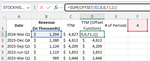
You can make the formula more dynamic by using the OFFSET function. You can change the number of values you want to add up. And it can be useful if your data is at the bottom, and you want to start from the last value you input. Here’s how you can use a variable to determine how many trailing values you want to calculate.
Using the OFFSET function, you can specify the height and width of the range. In the above example, I’m using cell F1 to specify the number of periods I want to sum up.
If your most recent values are at the bottom of your range, the OFFSET function can help you with this as well. Here’s how the formula would look like:
=SUM(OFFSET(B2,COUNTA(B:B)-2,0,-4,1))
B2 is the starting reference point.
The COUNTA function counts the number of nonblank cells in column B. It is reduced by 2 since the reference point, B2, is in row 2. It needs to be reduced by 2 to get back to 0.
There are 0 columns to offset, hence the next argument is 0.
The -4 tells the formula that you want to go back 4 rows.
The 1 at the end tells the formula that it is just 1 column wide.
This produces an array, which is then summed up through the SUM function.
If you like this post on How to Calculate Trailing 12 Month (TTM) Values in Excel, please give this site a like on Facebook and also be sure to check out some of the many templates that we have available for download. You can also follow me on Twitter and YouTube. Also, please consider buying me a coffee if you find my website helpful and would like to support it.
Whether you’re managing projects or working towards a goal, visualizing progress is important to ensure you’re on track for meeting your target. And by using charts in Excel, you can easily track your progress, making it easy for you to view and share it with your stakeholders. This post will walk you through the steps to create insightful progress charts in Excel.
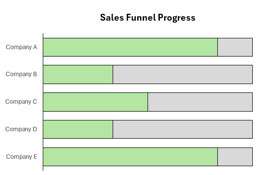
Using a bar chart to track progress
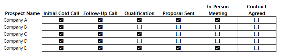
One example where you might want to track progress is if you’re tracking how much progress a sales rep may be making with a customer account. You may have various stages in the process, such as making an initial contact, obtaining an in-person interview with management, all the way to getting a signed and approved contract. Rather than having someone verbally track this progress for you, you can use a combination of checkboxes and charts to help visualize progress.
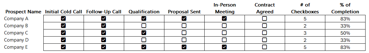
With the help of Excel’s checkboxes, we can create a table which looks like this, making it easy to simply tick off boxes to indicate progress by prospect:
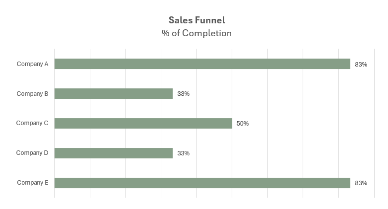
This table, while it’s helpful, isn’t easy to visualize the progress. Using a COUNTIF function, we can count the number of times a checkbox is set to TRUE. With 6 possible values, if there are 6 checkboxes ticked off, that tells us the sales rep has fully completed all the stages in the funnel and the deal is now closed. By then dividing this number by 6, we can numerically display the percentage of completion:
Now, this data can be put into a chart, which displays those percentages.
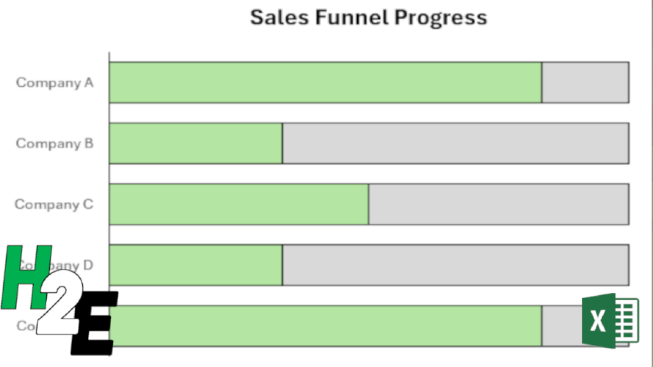
Another way to display this progress is by adding another field, simply to show the total number of stages. Then, we can plot on a chart the # of checkboxes that have been ticked off, along with the number of total stages.
To make this work, make sure you do the following:
Select both the series for the # of checkboxes ticked off, and total stages. When selecting the data, make sure that the the field which contains the total is on top, in the legend entries.
Format the data series and ensure that series overlap is set to 100%. This way the bar charts will completely overlap with one another.
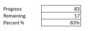
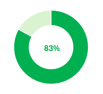
Creating a circle progress chart
Bar charts can be effective when you want to track multiple projects and tasks at once. But if you want to track just one project individually, or your overall total progress, then a circle chart may be more effective for that purpose.
Going back to the previous example, let’s suppose we want to track the progress of one prospect at a time. Company A is at 83%. Here’s how we could show that on a circle chart. We can display the information in the following way, to show what the progress is, in both raw numbers and as a percentage
By setting it up this way, we can now create the following donut chart in Excel:
With the percent %, I used that as a data label to put within the middle of this chart.
Using a donut chart, you can easily set up progress for one particular project. But it doesn’t have to be for just one particular item; this can also be part of a greater set of key performance indicators.
If you like this post on How to Create Progress Charts in Excel, please give this site a like on Facebook and also be sure to check out some of the many templates that we have available for download. You can also follow me on Twitter and YouTube. Also, please consider buying me a coffee if you find my website helpful and would like to support it.
Do you need to create weekly sales reports that compare the same days of the week? This kind of analysis can be tricky to ensure that you are comparing the same day of the week against the same week in the previous year. Simply comparing dates may not be sufficient, as you could end up comparing a Sunday’s revenue numbers against a Friday’s, and depending on the industry you are in, the results could look drastically different. In this post, I’ll show you how you can make reliable comparisons which look at the same weeks and the same days of the week.
Preparing the data
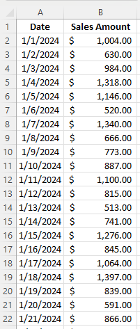
Let’s start with a pretty simple data set which just has the date and the sales amount, as such:
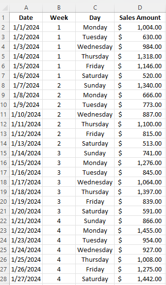
The data set contains sales for January and February of 2024 and 2023. To facilitate the comparisons, I’m going to add fields for the week # and the day of the week. For the week, I can use the WEEKNUM function, which just takes the date as a single argument. And for the day of the week, I’ll use the TEXT function, which can use the “dddd” format type to specify the day. Here’s how the data looks after I’ve added those fields:
Loading the data into a Pivot Table
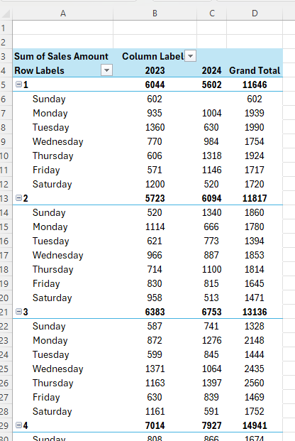
Now that my data is ready to analyze, I can create a pivot table. While any cell on the data set is selected, I’ll click on the Insert tab and select Pivot Table. Next, I’m going to set up the pivot table as follows:
Columns: Year
Rows: Week , Day
Values: Sales Amount
To get the year to show, I’ll select the Date field and put the Years (Date) value under columns. You could also create a formula in the previous step to calculate the year value based on the date. Here is what my pivot table looks like thus far:
There are a few things I will do improve the appearance and usefulness of the pivot table, including:
Removing the grand total, since I’m comparing and not adding the values.
Changing the report layout to a tabular format so that the Week values will now create subtotals.
Change the value field settings for the Sales Amount so that it resembles a currency format.
Now, I’m ready to do the analysis in the pivot table.
Comparing values in a Pivot Table
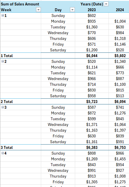
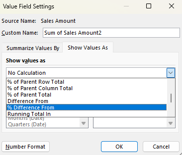
If I want to compare values from one year to the next, I need to pull in another field for the values section. I’m going to pull in the Sales Amount into the section again. While at first, this looks like I’m just duplicating the values, I’m going to change the appearance of the second field. If I click ok the Sum of Sales Amount2 field and select Value Field Settings, I can change how the values are shown. Instead of a sum, when selecting the Show Values As tab, I have the ability to select % Difference From:
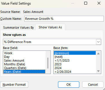
I then select my base field. I need to select the Years (Date) field, since I’m comparing years. As for the base item, I’m going to select (previous). If you’re always going to be comparing against a certain year, you can select the specific year. But if you always want to be comparing against the previous year, choose previous.
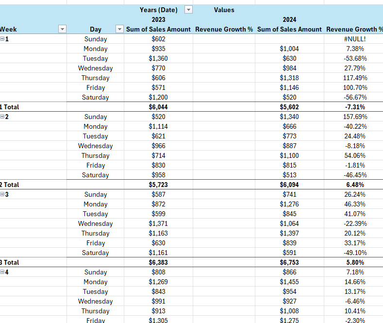
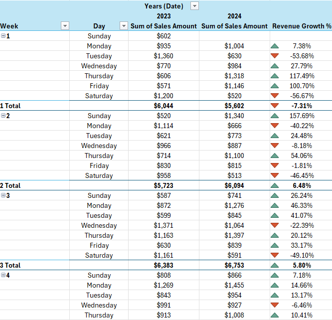
I have also renamed the field to ‘Revenue Growth %’ to signify that the value in the field represents the growth (or decline) compared to the previous year. Here’s how my data looks with the new field:
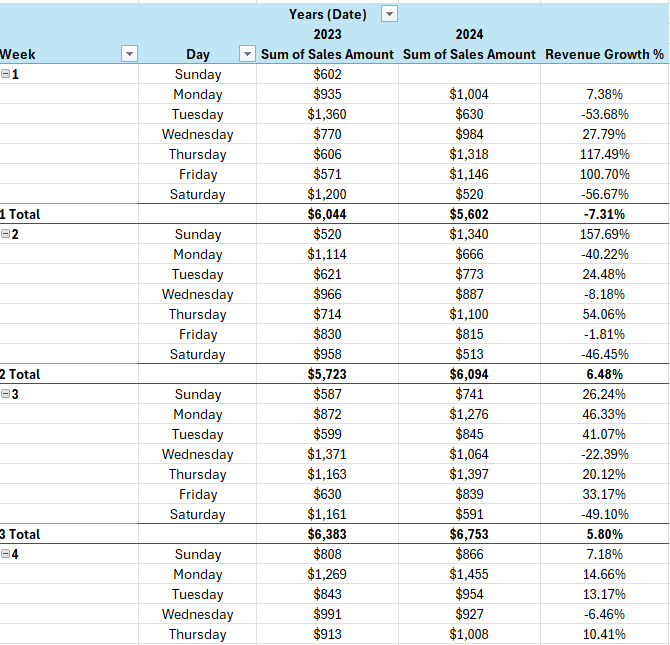
There are a few things I need to fix there. The first is that I have a #NULL! error in the first row. This is because in the previous year, there was no sales, presumably as this would have been a holiday. To fix this, I can go into the Pivot Table options and check off the option For error values show and just leave it blank.
That gets rid of the error. Another thing I need to do is get rid of the unnecessary revenue growth field for 2023. As there is no comparable, it will always be blank for the first year. The simple solution here is to just hide the column entirely. Now I’m left with a pivot table that shows my sales data by week, day, and year, and the year-over-year change in percent:
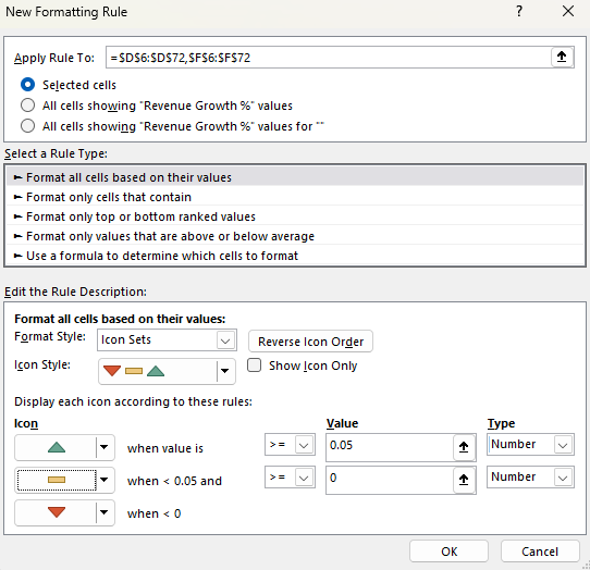
One last thing you may want to do is add some conditional formatting, to help highlight the good and bad weeks and days. Using a directional icon set could help make the results stand out:
By using this formatting, any values where the growth rate is more than 5%, will have a green triangle. Anything less than 0 will be red, while anything in-between will show a yellow horizontal line.
If you liked this post on How to Compare Weekly Sales in Excel Using a Pivot Table, please give this site a like on Facebook and also be sure to check out some of the many templates that we have available for download. You can also follow us on Twitter and YouTube.
Inflation is a critical economic indicator, reflecting the rate at which the general level of prices for goods and services is rising, and subsequently, how that erodes the purchasing power of money. To gauge inflation accurately, economists and policymakers rely on various metrics, with the Consumer Price Index (CPI), the Personal Consumption Expenditures Price Index (PCE), and the Core PCE being the most prominent. Each of these measures has its unique methodology and scope, making them useful in different economic contexts.
Let’s start with breaking down how these different measures are calculated, and what their strengths and weaknesses are.
Consumer Price Index (CPI)
The CPI, published by the Bureau of Labor Statistics, is one of the most widely recognized measures of inflation. It calculates the average change over time in the prices paid by urban consumers for a basket of goods and services. This basket includes a wide range of items such as food, clothing, shelter, fuels, transportation fares, charges for doctors and dentists’ services, drugs, and the other goods and services that people buy for day-to-day living. Prices are collected monthly from about 75 urban areas across the country, from about 6,000 housing units and approximately 22,000 retail establishments.
The strength of the CPI lies in its detailed breakdown of expenditure categories, which makes it a useful tool for understanding the impact of inflation on consumers. However, it has its limitations. For instance, it does not account for changes in consumer behavior or substitutions they make in response to price changes. Also, the CPI focuses only on urban consumers and may not accurately represent the experience of people in rural areas.
Personal Consumption Expenditures Price Index (PCE)
The PCE, published by the Bureau of Economic Analysis, measures the prices that people living in the United States, or those buying on their behalf, pay for goods and services. Unlike the CPI, the PCE includes all goods and services consumed by households, including those paid for by third parties such as employer-provided healthcare. The PCE is calculated by using data on nearly all goods and services businesses sell to households and on the incomes that households receive from business and from government.
One key advantage of the PCE is its ability to reflect changes in consumer behavior and the substitutions they make, which the CPI does not fully capture. This makes the PCE a broader measure of inflation. However, its wide scope can sometimes dilute the impact of price changes in specific categories, which might be more apparent in the CPI.
Core PCE
The Core PCE Price Index is a version of the PCE index that excludes the more volatile and seasonal food and energy prices. By excluding these items, Core PCE provides a clearer picture of the underlying inflation trend and is less subject to short-term volatility. This makes Core PCE a preferred metric for policymakers, including the Federal Reserve, when making decisions about monetary policy. This metric is often referred to as ‘core inflation.’
The exclusion of food and energy prices can be both a strength and a weakness. While it offers a more stable view of inflation, it can sometimes underrepresent the actual burden on consumers, especially during periods when food and energy prices are rapidly changing.
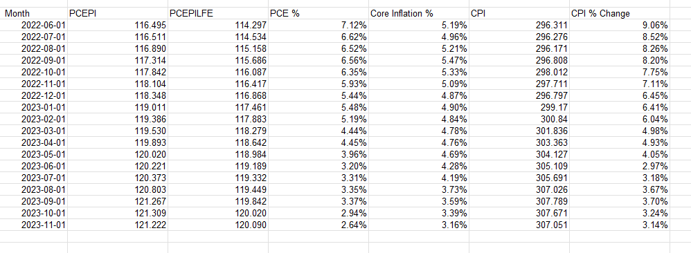
Calculating CPI, PCE, and Core PCE
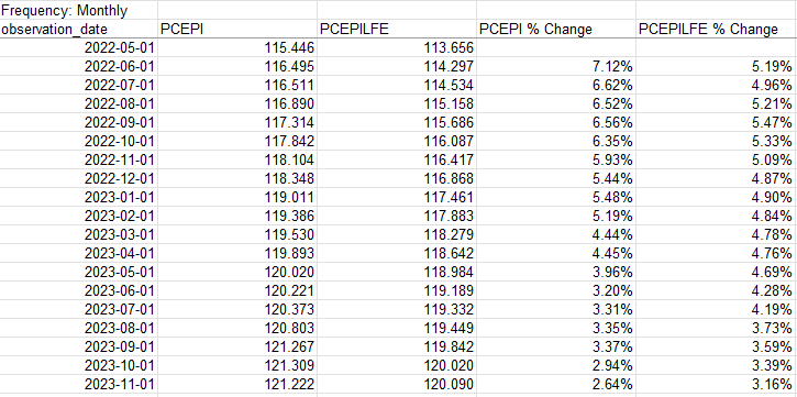
Now that we know what these metrics are, let’s grab that data and plot them in a chart, to see how they have been trending in recent periods.
For the % change, take the current month value and divide it by the same value in the prior-year month and deduct 1. Here’s how all the data points and inflation rates look when compared against one another:
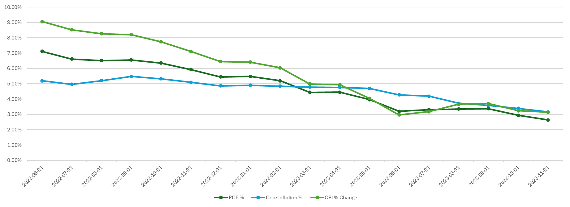
With that data set up, it’s now easy to plot the different inflation rates on a chart to see how they have varied and converged over the past year and a half:
If you liked this post on How to Calculate Inflation, Core Inflation, and CPI in Excel, please give this site a like on Facebook and also be sure to check out some of the many templates that we have available for download. You can also follow us on Twitter and YouTube.
Credit card interest is a cost that cardholders incur when they carry a balance beyond the grace period, which is typically between 25 to 30 days after a billing cycle ends. This interest is calculated based on the Annual Percentage Rate (APR) provided by the credit card issuer. Understanding how this interest is computed is vital for managing financial liabilities and making informed decisions. This article goes over how to calculate credit card interest in Excel, in a step-by-step process.
Getting the correct rate
Before we get started, they key is finding out what your APR is. This is a yearly interest rate which is provided by credit card companies. It tells you how much you’ll be paying. The APR is usually stated in the credit card agreement or on the credit card statement. It’s essential to note that different transactions may have varying APRs; for instance, cash advances often have higher APRs compared to purchases. If you have cash advances to consider that are at difference rates, then you may need to break this out into two separate calculations.
Once you have APR, you need to convert that into a daily rate as credit card interest is usually calculated on a daily basis. To calculate the Daily Periodic Rate (DPR), this involves taking the APR and dividing it by 365.
DPR = APR / 365.
This can involve a lot of decimal places so you may need to do some rounding. But if you do this in Excel, you don’t have to, and that means a more precise calculation.
Calculating your average daily balance
To determine your interest expense, you’ll also need to determine what your balance was during each day that fell within your billing cycle. To calculate the Average Daily Balance (ADB), sum up the total of those daily balances and divide it by the number of days. The formula is the same as if you were to calculate any average:
ADB = Sum of daily balances / Number of days in billing cycle
It’s important to note that you’ll also need to carry over any balance from your last bill if it was unpaid. And you’ll also want to deduct any payments you make from the balance and add any purchases to ensure the balance is always correct and up to date.
Calculating the interest charge
To get your daily interest charge, simply multiply the two variables, DPR and ADB by one another.
Daily interest charge: DPR x ADB
And if you want to calculate the monthly charge, then you take the daily charge and multiply it by the number of days in your billing cycle.
Monthly interest charge = Daily Interest * Number of days in billing cycle
Creating a template to calculate monthly interest costs in Excel
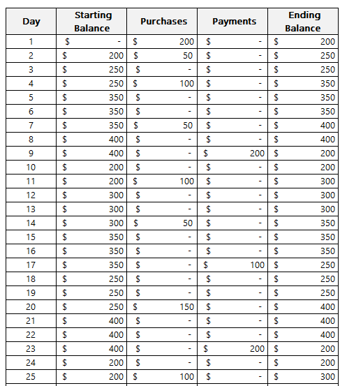
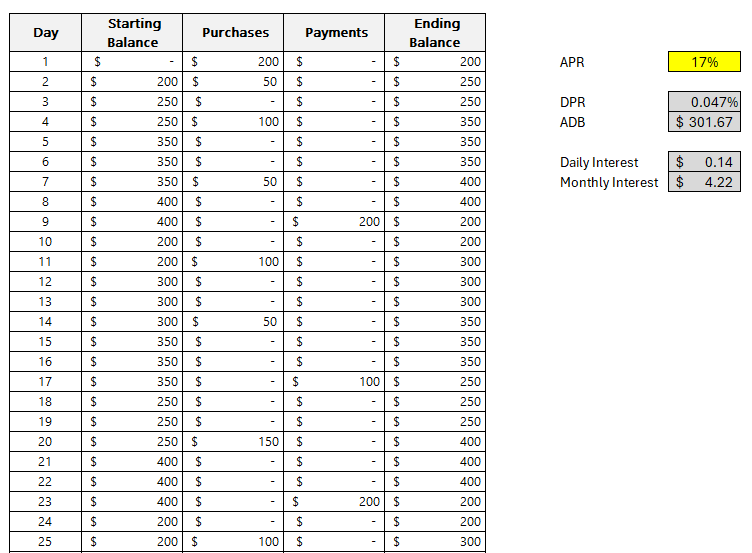
Now it’s time to create a template in Excel which will make it easy to adjust for different scenarios. First off, we need to get the daily balances in a table format. Ideally, there should be a column for the starting balance, the day, purchases, payments, and the ending daily balance. This way, you can easily account for purchases and payments should you want to determine what your balances and interest expenses will be ahead of time.
The formula for the ending balance will be as follows:
In the above example, the assumption is you start with a starting balance of 0. However, if you’re carrying over a balance from the previous period, then you can enter it in the starting balance.
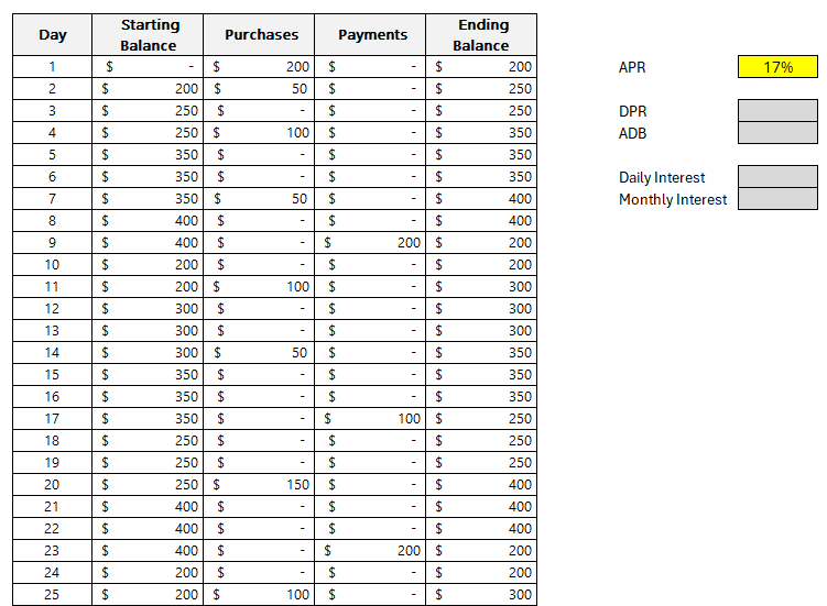
Next, we need to enter the APR. Refer to this page on how to calculate APR. In this example, I’m going to use a rate of 17%. Here’s how my template looks thus far:
The values highlighted in dark grey are reserved formulas while the yellow cell pertaining to APR indicates that this is value that requires manual entry.
The formula for DPR just needs to reference the APR and divide it by 365:
DPR = APR/365
This returns a value of approximately 0.047%.
This will also have a named range of DPR to make it easier to reference later on. The benefit of using Excel for these calculations is that they will be more accurate; there’s no need to do any rounding.
For the ADB, a simple AVERAGE function can be used on column F, which in my spreadsheet, contains the ending balances.
ADB = AVERAGE(F:F)
The average in my spreadsheet is a value of $301.67.
Since there is nothing else in column F, we can just average everything that’s in there. The function will ignore any blank values. This will be another named range, ADB.
To calculate the daily interest, the formula will should look familiar, this time, it’s within Excel as this involves named ranges:
Daily Interest = DPR * ADB
This returns a value of $0.14 (rounded).
Lastly, to collect monthly interest we take the Daily Interest and multiply it by the number of days. For this example, I’ve set a named range of DailyInterest. And to calculate the number of days, I can use the following MAX formula to get the largest value in column B, which has the day numbers:
=MAX(B:B)
There are 30 days within the billing period in my example.
Then, this gets multiplied by the DailyInterest named range to arrive at the total monthly interest cost. Here is the full formula within the cell for Monthly Interest:
Monthly Interest =MAX(B:B)*DailyInterest
The monthly interest in my example computes to $4.22.
Understanding this process sheds light on the significance of the APR and how maintaining a lower balance or paying off the balance before the end of the grace period can mitigate the interest charges. It also underscores the importance of being aware of the different APRs for various types of transactions.
Many credit card issuers offer a grace period during which no interest is charged on new purchases if the previous month’s balance was paid in full. Utilizing such grace periods effectively can lead to substantial savings on interest charges.
If you liked this post on How to Calculate Credit Card Interest, please give this site a like on Facebook and also be sure to check out some of the many templates that we have available for download. You can also follow me on Twitter and YouTube. Also, please consider buying me a coffee if you find my website helpful and would like to support it.
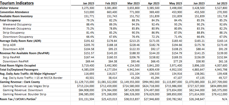
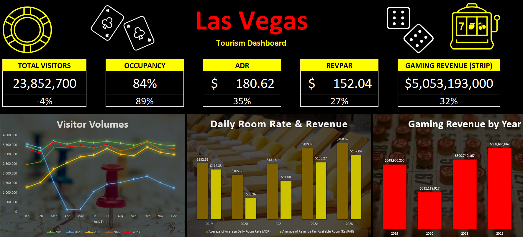
A good way to gauge the strength of the U.S. economy and how well it is returning to normal level is by looking at Las Vegas’ visitor data. The Las Vegas Convention and Visitors Authority (LVCVA) has plenty of important metrics that it tracks on its website. From the number of visitors to the city to occupancy levels to daily room rates, and other key performance indicators (KPIs). Using data from that website, which you can find here, I’ll guide you through the step-by-stop process as to how you can build a dashboard to track some of those key metrics.
Step 1. Preparing and consolidating the data
One of the most important parts of data analysis is to clean up your data from the beginning. By doing this, you’ll avoid headaches later on. It’ll also make it easier for you to do analysis in the first place. To get a proper glimpse of how Las Vegas is doing now, it’ll be useful to track multiple years. On the LVCVA website, you can download data for multiple years. For this example, I’m going to download data from 2019 through to 2023 YTD.
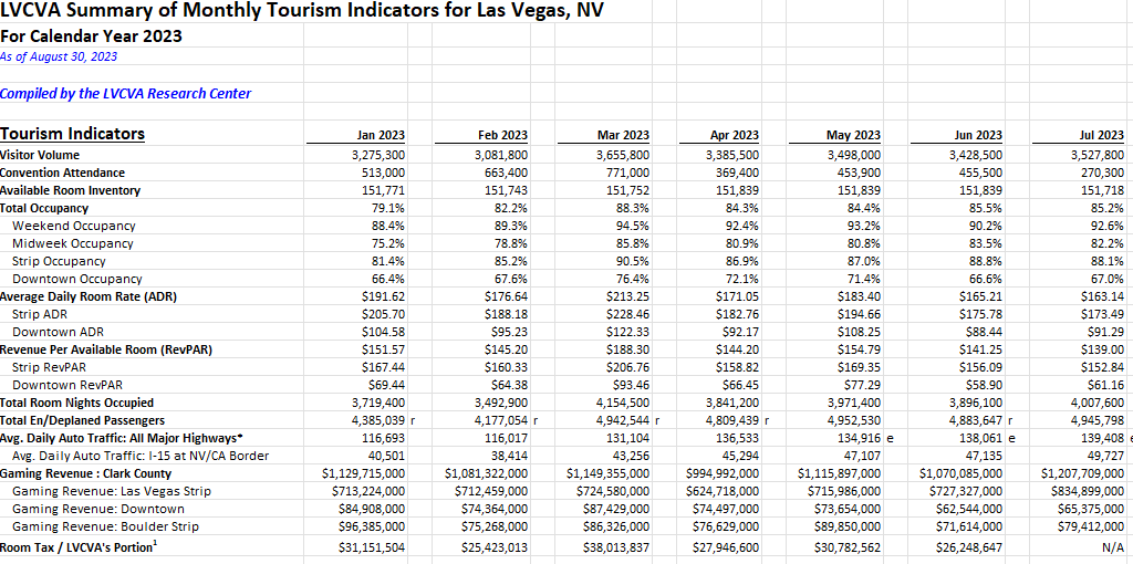
This is what one of the files looks like:
As of writing this article, data for 2023 is available up until the end of July. Since the data is organized in the same format on all of the files I’m downloading, I can just copy and paste one year after another. The key is for the rows to line up.
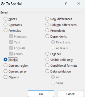
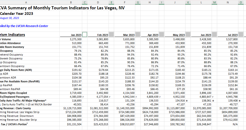
But I still need to clean up this data. One problem is that there are gaps between the months. Once I’ve loaded all the years together, I’ll remove those blank columns. The easiest way to do this is the highlight the top row. Then, press F5 and select Special. There will be an option to select Blanks:
Then, all those gaps are selected:
If your right-click on any one of them, select Delete, choose Entire Column, and press OK. Now those columns are gone:
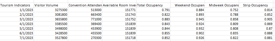
There’s still one problem here. The way the data is structured right now isn’t useful when creating pivot tables. And if you’re creating a dashboard, you’ll want to be able to create pivot tables easily. Doing so can make it easy to create reports on the fly and easy to make changes. It’s easier to have dates going vertically than horizontally to scroll through data. So what I will do is use the TRANSPOSE function to flip it. All that’s necessary here is to use the function and select your entire data set. Then, voila:
Before I make any further changes, I want to convert this into values. Since I used the TRANSPOSE function, it’s sitting as an array. To change this, I’ll select the entire data set, press CTRL+C, and then press CTRL+SHIFT+V to paste as values. If you don’t have that functionality on your version of Microsoft Excel, right-click and select Paste Special and click on Values.
I will also add a few more columns to make the analysis easier. I’ll create a column for the month and year. This will involve using the MONTH and YEAR functions. The only argument that is needed is the original date, which in the screenshot above, appears under ‘Tourism Indicators.’
And since I want to compare 2023 to 2019, I’ll add a column for ‘Current Period’ and ‘Comparable Period.’ The point of this is to make sure that I can filter the current YTD values against the same values from 2019. Since I have data up until July, any comparisons should also run up until July 2019. For the Current Period, I’m using the MAXIFS function to grab the maximum value for the Month field for the current year (I can use the TODAY function to make it dynamically pull in the current year). Then, for the Comparable Period column, I can compare the Month field to see if it is less than or equal to the Current Period. If it is, then I’ll set the value as a “Y” to indicate it falls in the comparable period or “N” if it doesn’t. This way, if I come across month 8 and my current period only goes up to 7, it will mark that as an “N” which will allow me to easily filter out those results.
Lastly, I will convert all this data into a table. The purpose of this is so that I can easily reference the different fields later on, without having to remember column letters. To convert this into a table, select Insert and click on Table. Then, on the Table Design tab, you can name the table something that’s easy to remember. In my example, I’ll refer to it as tblConsolidated.
Step 2: Identifying the KPIs to track
Before rushing out to create the pivot tables, it’s important to know what you want to track. You don’t want to create a pivot table and track everything possible, otherwise it won’t be a useful summary, which is what a good dashboard should aim to do. That’s why you should devote some time to identify what some of your KPIs should be.
There are a lot of metrics on here and these are the ones that I am going to use, which will help gauge how active and busy Las Vegas is:
Visitor volume. Obviously the number of people visiting the city is a great indication of how many people there are.
Occupancy levels. If hotels are booked up, that’s another positive sign that the city is busy.
RevPAR. This takes the room revenue divided by the number of available rooms. It shows how well a hotel is filling up its rooms at a given rate.
Average Daily Rate. This is partly reflected in RevPAR but it can be a useful indicator as people are more familiar with room prices than they are with RevPAR, especially those who visit Las Vegas often.
En/Deplaned Passengers. This is a helpful metric to know how much out-of-town traffic there is coming to the city.
Average Daily Auto Traffic. With this metric, readers can see how busy the roads are.
Gaming Revenue (Las Vegas Strip). This is another important KPI because it tracks how much people are spending at casinos.
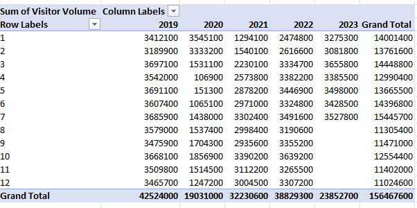
Step 3: Creating the pivot tables
Now it’s on to creating a pivot table for each KPI you want to track. To make this process easier, just create a pivot table one time, and then copy it for as many charts that you want to create. This way, you don’t have to go back and select Insert->Pivot Table over and over again. Just make sure to leave enough room so that they don’t overlap, otherwise you’ll encounter errors.
It’s also a good idea to label your pivot tables by going into the PivotTable Analyze tab. For a pivot table to track visitor volume, you might want to call that ptVisitorvolume, for example. This will be helpful later on if you want to change charts and aren’t sure what PivotTable1 relates to. You’ll also likely want to change the default formatting for a pivot table:
To change the format, don’t just highlight the cells and make the changes, otherwise they’ll revert back once you update the data. Instead, right-click on one of the values and select Value Field Settings. Then, select Number Format and apply the formatting you want to apply to that field.
What I also like to do is put all the pivot tables on a separate tab to keep them organized, while all the charts will go on a main tab dedicated for the dashboard.
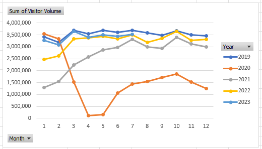
Step 4: Creating the charts
When creating your charts, one thing to consider is how you want the data to be visualized. You can do this as part of the stage to identify KPIs. For visitor volume, for example, I’ll use a line chart since I want to see the month-over-month progression. This will also make it easy to compare against multiple years.
Since these are charts created from pivot tables, they are pivot charts, and they come with drop-down options:
They aren’t terribly appealing and to get rid of them, click on the chart, select the PivotChart Analyze tab and unselect the option for Field Buttons:
One thing that can help with creating charts is by using Excel’s existing Chart Styles, which are on the Design tab (which is visible if the chart is selected):
This can be an easy way to customize your charts without having to do so manually.
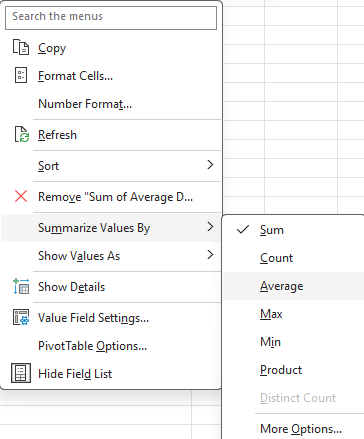
You may also want to adjust how the data is displayed. Visitor volume, for example, may make sense to leave as the default, which is a summation. But when looking at ADR or RevPAR, you wouldn’t want to sum those values up. Instead, you may want to calculate the average instead. To do that, right-click on one of the fields and select Summarize Values By and select Average
Now, you’ll see an average based on period, which makes more sense than summing up prices.
At this point, it comes down to your personal preferences as to how you want to design the charts, and it would be far too deep to try and get into all those options here. However, I’d suggest mixing up a bit of bar and column charts and also changing up the colors so your dashboard doesn’t look like the same item over and over.
Some additional things you may want to consider are:
Adding data labels. And if you do use them, consider not using axis labels;
Using legends where and when make sense to do so;
Adding background images to your charts to have a different look and feel to them;
Having descriptive titles to help summarize what the chart is displaying;
Not plotting too much on on chart. You may want to consider plotting years instead of months;
Not using a border color so that your charts blend in with the background.
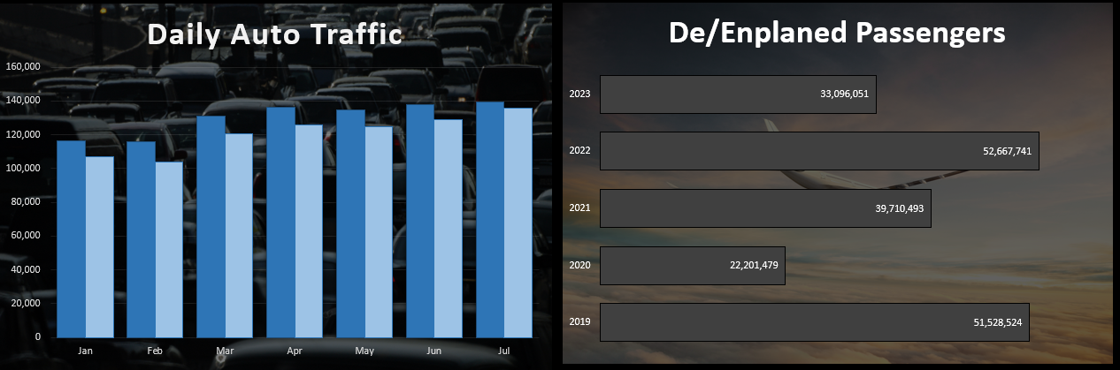
Here are a couple of charts I created with images in the background to make it clear what they are showing:
Step 5: Adding key numbers at the top for further emphasis
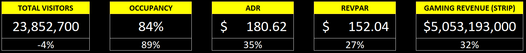
Charts are good, but what can also be useful is to put key numbers right at the top so that readers don’t have to spend much time looking for the most important metrics. For example, using formulas, you can pull in the total number of visitors for the period, the occupancy rate, the ADR, RevPAR, and other items, based on the latest information.
While these can be good to include in charts, by making them big and allowing them to stand out as soon as you open up the dashboard, it can help drive the point home even further.
In the example above, I have a list of the current metrics along with the growth rate or comparable percentage from 2019, to help show how the metric is doing compared to that year. You could also add conditional formatting to this to highlight where there is an improvement and where things may have worsened.
Step 6: Finishing touches
Once you’ve got your charts and metrics all on there, the last piece of the puzzle is to add a title as well as any icons or images that may be relevant to help give some added pop to your dashboard. If you go to the Insert tab, you can use that to pull in pictures from the internet. Excel also has built-in icons and stock images that you can use, just by doing a search:
This can be an easy way to help your dashboard stand out even further. Here’s a snapshot of the dashboard I created:
If you liked this post on How to Create a Dashboard to Track Las Vegas’ Visitor Data, please give this site a like on Facebook and also be sure to check out some of the many templates that we have available for download. You can also follow me on Twitter and YouTube. Also, please consider buying me a coffee if you find my website helpful and would like to support it.
If you’ve got a big, complex spreadsheet with lots of formulas, it can be slow to run. In those situations, turning off calculations can be a life saver. But the downside of doing so, is that you might forget that those calculations haven’t been updated. Relying on stale values can be risky and lead to poor decision making and analysis.
Thankfully, there’s a new feature in Excel that now helps you find and identify those values easily.
Finding stale values
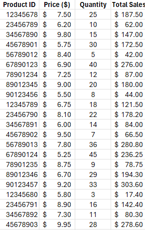
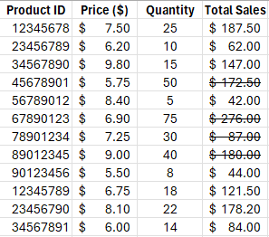
For this example, I’m going to use a simple table. It shows product IDs, prices, quantities, and total sales.
The only calculation that happens here is in the total sales column, where price is multiplied by quantity. If the calculations are on, changing either the price or quantity fields will change the value in the total sales field automatically. But if I turn on Manual Calculations, then the calculation won’t happen until I either set the calculations to Automatic, or to manually force calculations (e.g. by pressing F9).
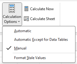
To turn off calculations in Excel, go to the Formulas tab and select Calculations Options, where you’ll see the following options:
The one danger is that if you set your calculations to Manual, it will change the setting for all the workbooks you currently have open. This change isn’t just set to one sheet or workbook.
In the above screenshot, the calculations are set to Manual. And if you’ve updated to the latest version of Excel, you’ll see the option at the bottom: Format Stale Values. If you check this off, you will now see different formatting for calculations that Excel hasn’t updated.
After checking that off and making changes to some of the quantities in my table, some of the values in the total sales column haven’t updated. And it’s easy to see which ones those are:
There are now strikethroughs showing for the values which aren’t updated. This tells you that those values are no longer accurate. As you can see from the value of $172.50 where the corresponding quantity is 50 and the price is $5.75, the total sales based on that calculation should be $287.50. Without applying the formatting for stale values, it would be difficult to notice that the value of $172.50 is incorrect.
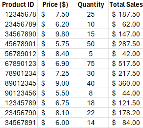
Once the values are recalculated, either by manually triggering them (F9) or by changing them back to automatic, then the strikethrough goes away. And that’s because the value has also been updated:
If you never turn your calculations off and set them to manual, you’ll never need to use this feature of stale formatting. But if you do occasionally turn off calculations, then it can be valuable to you as it can help you avoid errors and making incorrect decisions based on outdated information.
If you don’t see this option available yet then it may not be available on your version of Excel. You need Microsoft/Office 365 and for the latest beta updates to be installed. Eventually, however, it will be rolled out to all 365 users.. But if you want new features as soon as they are available, be sure to sign up for the (free) Office Insiders Program to ensure that you get them earlier than the general rollout.
If you liked this post on How to Find Stale Values in Excel, please give this site a like on Facebook and also be sure to check out some of the many templates that we have available for download. You can also follow me on Twitter and YouTube. Also, please consider buying me a coffee if you find my website helpful and would like to support it.
In this post, I’m going to show you how to group dates in a pivot table by month. By doing this, you can do analysis by month rather than individual day. And that will also make it easier to plot the data on a chart.
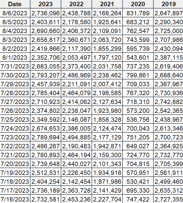
For this example, I’m going to use TSA passenger volumes as my data set and analyze them by month and year. Here is the data I’m going to use, which runs up until Aug. 6, 2023:
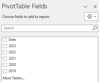
If I load this into a pivot table, my fields are as follows:
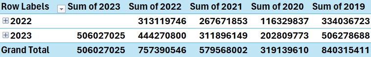
I have the date field which shows the current year’s dates. And there is also a field for each year, which contains the passenger volumes. If I put the Date in the Rows section of the pivot table and then years into the values section, then my pivot table looks like this:
There are a few things that I need to fix for this analysis to work:
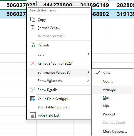
I need to change each year field so that it is taking an average instead of summing the values. If I leave it as is, summing the values may not be helpful as the months are not going to be identical eah year. Taking an average will help smooth the data.
The formatting should be changed so that the values are separated by commas. This will make it easier to visually see the data. The numbers are too big and can be difficult to interpret in their current format.
The Row labels are broken down by year. But I already have the year values going across. This is not necessary and I need to have only the month values.
Here’s how to address these items.
To change the year field so that it takes an average, right-click on the field and select the option to summarize as an average:
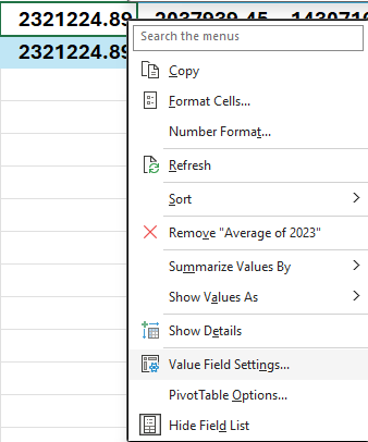
Repeat this for each field, so that everything says average. To fix the number formatting, right-click on each field and select Value Field Settings:
Change the formatting to Number and check off the option for the 1000 separator. Repeat these steps for the other fields as well.
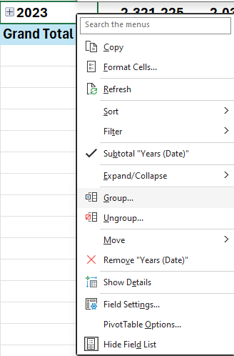
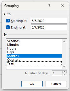
Next, for the date grouping, right-click on any of the date values and select the Group button:
At the following dialog box, uncheck years and quarters and just leave Months:
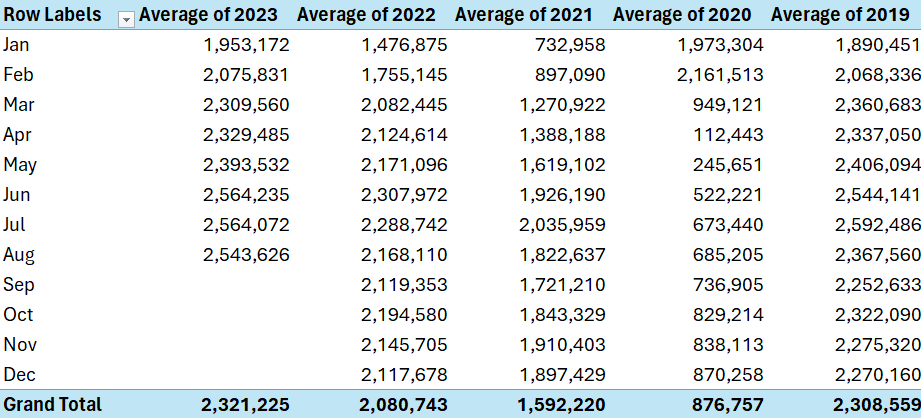
After making all those changes, my pivot table now looks like this:
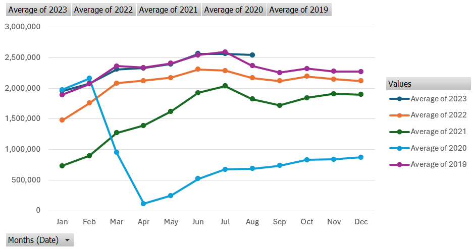
It’s now easier to compare the different months and years. And it’s also easier to put it on a chart. If I insert a line chart, it’s easy to spot the trends by a monthly and yearly basis:
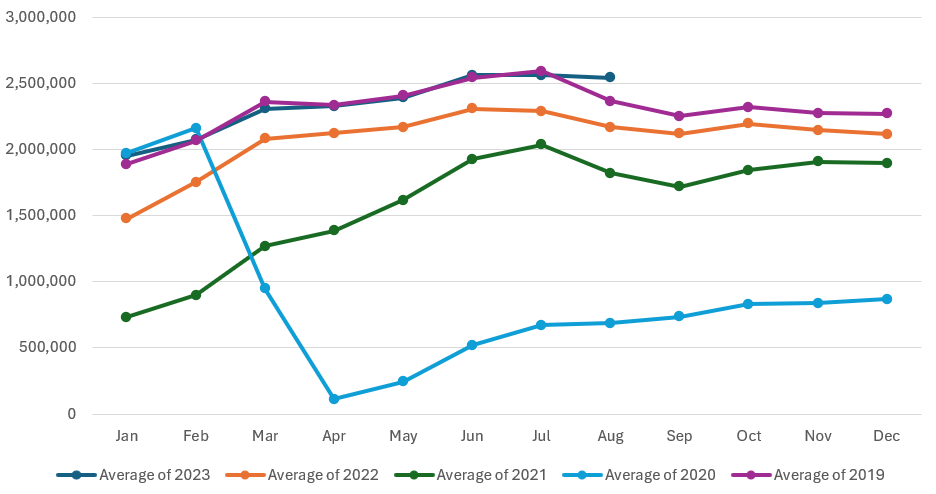
This is a PivotChart, as it evident from the grey drop-down options. If you prefer to get rid of the filters, go to the PivotChart Analyze tab and uncheck the Field Buttons option. Now you’ll have a cleaner chart layout. In the below example, I have also moved the legend to the bottom:
As you can see, by grouping your pivot table dates by month, it becomes easier to analyze data. And by not doing a daily analysis, it’s possible to look at the data from a year-to-date view to compare the monthly averages. This way, you are able to still see the story behind the data without having a crowded chart.
If you liked this post on How to Group Dates by Month in a Pivot Table, please give this site a like on Facebook and also be sure to check out some of the many templates that we have available for download. You can also follow me on Twitter and YouTube. Also, please consider buying me a coffee if you find my website helpful and would like to support it.