IRR

How to Calculate Internal Rate of Return (IRR) in Excel

Last week, I covered how to calculate discounted cash flow. In this post, I’ll build off that worksheet and show you how you can calculate the internal rate of return (IRR) in Excel. IRR tells you the return that you’re making on an investment or project, and at what discount rate the net present value of all the cash flows will be zero. In these scenarios, there’s typically an outlay of cash, usually at the beginning.

In my previous example, I only looked at cash flows coming in. This time, I’ll look at a scenario where you pay money out at the beginning and generate cash flow in future periods. A common example is paying to upgrade a piece of equipment and then generating cost savings from it for x number of years. Knowing the IRR can tell you if you’re making enough of a return off of the investment and whether you should move forward with it. Using IRR can also be helpful when you’re comparing multiple options to see which one is the best one.

Setting up the spreadsheet

This step is about the same as when setting up the discounted cash flow template. You’ll need to enter the different years, the cash you expect to come in or out, and then calculate back what the present value is today.

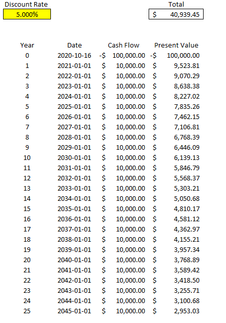
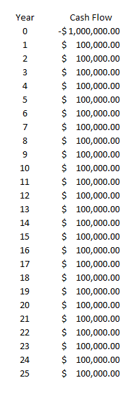
Here’s what the file looks like setting in a scenario where you pay $100,000 upfront and then generate $10,000 in cash flow for 25 years. At a 5% discount rate, in this example the present value of all that cash flow is a positive $40,939.45:

Discounted cash flow calculation using an interest rate of 5%.

Calculating the IRR

The problem here is the discount rate can be difficult to determine, and that can have a significant impact on your overall returns. And so rather than worry about what your discount rate should be, you only need to determine the IRR — which is to say at what point would your present value be worth $0? If you need a higher return than the IRR the project would be a no-go but if you’re okay with anything up to and including the IRR, then the project or investment would be passable. What it comes down to is the lower the IRR is, the worse the investment is

There are a couple of different ways to calculate IRR in Excel. One way is through a formula called XIRR. It only has two required arguments — dates and cash flow. This is why in this example I entered dates for my cash flows rather than just numbering the years. This makes it easier for me to use the XIRR formula. In my spreadsheet, I enter the following formula:

=XIRR(D6:D31,C6:C31)

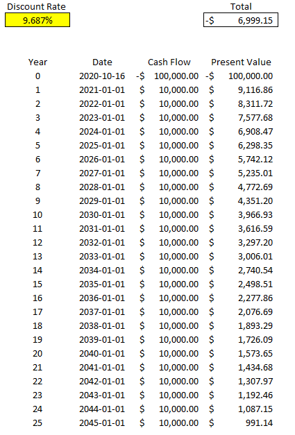
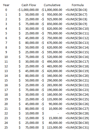
Column D contains my cash flow and column C contains the dates. Doing this, Excel tells me the IRR is 9.687% for this specific project. But if I work backwards and calculate the net present value, it doesn’t get me right to 0:

It certainly gets close to 0 and it’s probably close enough that it can help you make a decision about your investment. However, there’s another way to calculate IRR and that’s using Excel’s What-If Analysis. On the Data tab, there’s a drop-down for this option in the Forecast section:

What-if analysis on the forecast tab in Excel.

Depending on which version of Excel you’re using, it may show a bit differently, but what you’re ultimately looking for is Goal Seek.

Selecting goal seek from the What-If Analysis drop-down.

Goal Seek is an accelerated way of doing trial-and-error. Excel’s doing it for you much quicker than you could ever do it by yourself. For IRR, it’s the best solution.

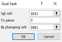
Here’s how it works. You’ll need to enter the cell that you want to get to a certain value, what value that is, and which cell Excel should be changing values in. In my spreadsheet, E2 is where my net present value formula is, and I want that to equal 0. In cell B2 is my discount rate, which is what I want Excel to be changing. Here are what my inputs look like:

Setting the inputs in goal seek.

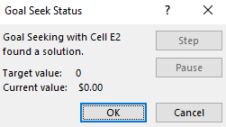
Then, once I click on OK, Excel goes to work. After a few seconds you should see Excel show you that the target value and the current value are a match (e.g. they’re both 0), meaning it’s done its job successfully:

Goal seek after completion.

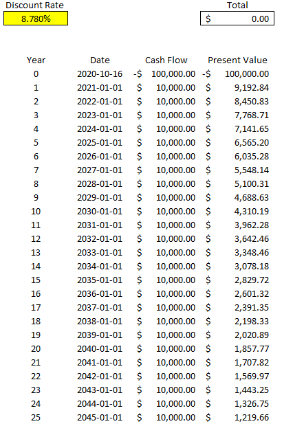
Now, if I look at my template, I see a different discount rate and my total present value is netting out to 0:

Discounted cash flow template after using goal seek to calculate the internal rate of return.

As you can see, this is much more accurate than Excel’s XIRR function. You can repeat these steps and make this table for other projects that you can assess side-by-side.

If you’d like to test this out, try downloading the discounted cash flow spreadsheet from my last post and then just using Goal Seek or the XIRR function to determine your IRR. You can remove unnecessary columns from the sheet and then duplicate the table, and then you’ve got a template where you can assess multiple investments against one another.


If you liked this post on how to calculate IRR in Excel, please give this site a like on Facebook and also be sure to check out some of the many templates that we have available for download. You can also follow us on Twitter and YouTube.

sensitivityanalysis

How to Do Sensitivity Analysis in Excel

Sensitivity analysis is a powerful way to make your template or Excel model update to reflect changes in variables. It makes it easy to run various what-if scenarios at once. In this post, I’ll show you how you can conduct sensitivity analysis in Excel in a way that’s user friendly and that can make your spreadsheet that much more versatile.

In this example, I’m going to compare two dividend stocks. One that pays a high yield right now versus one that pays a lower yield but that grows its payments over the years. I’ll look at how long it’ll take for the growing dividend to become larger than the one that’s higher today. I’ll also look at what the projections are when I make changes to my assumptions.

Setting up the analysis

First thing’s first, let’s start with the basic analysis. Once that’s setup, then we can move on to adjusting the variables and setting up the visuals. To make things simple, we’ll assume that the investment in both stocks is going to be a nice, round, $10,000.

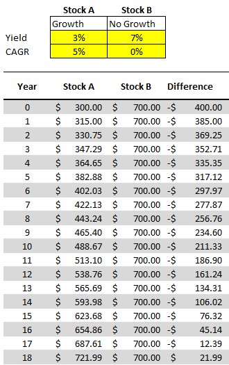
Let’s say that in our example, Stock A pays a dividend yield of 3% per year and on average it will increase its payouts by 5% ever year. Stock B, however, won’t increase its dividend payments but it currently yields 7%.

Here’s how much dividend income each stock would generate annually over the years:

Comparing two dividend stock yields.

Under these assumptions, it would take 18 years before Stock A begins producing more in annual dividend income.

All that this spreadsheet is doing is just taking the total investment of $10,000 and multiplying it by the dividend yield for the first year. And for subsequent years, it’s adding on the compounded annual growth rate (CAGR). That will determine what the dividend payment will be after factoring in any increase. With Stock B, since there aren’t any increases, the dividend income remains the same. Stock A, however, increases by 5% every year.

To prove the calculations out: 1.05^18 * $300 = $721.99.

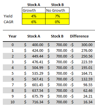
Now, suppose we change these assumptions and say that Stock A’s yield is 4% and that it grows by 6%, and Stock B’s yield remains the same. With those assumptions, it would take just 10 years before Stock A’s yield becomes the larger payout:

Comparing two dividend stock yields in excel.

But rather than updating our model each and every time, we may want to have a quick glimpse as to what these differences will look like at different dividend yields.

Adding in the comparables

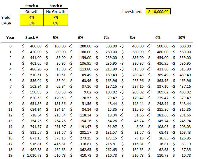
Instead of repeating these steps over and over for different stocks, to do a sensitivity analysis, I can quickly compare Stock A against a series of other stocks. For instance, I’m going to keep the assumptions for Stock A the same, and now I’ll simultaneously compare it to stocks that yield 5% all the way to 10%. I’m going to create a column for each percentage and then calculate the difference between that column and Stock A. Here’s how that looks:

Sensitivity analysis of multiple stock yields.

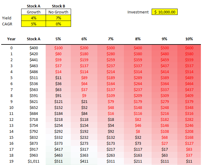
All that I’m doing for these different columns is taking the value from Stock A and subtracting from it the dividend income earned at a 5% yield, at a 6% yield, 7% yield, and so on. The difference between a 4% yield and a 5% yield on $10,000 is just $100 (this the first value under the 5% column). But as the dividend rates rise, that delta grows. At a 10% yield, there’s a difference of six percentage points. That means the non-growing dividend stock pays $600 more in year 0.

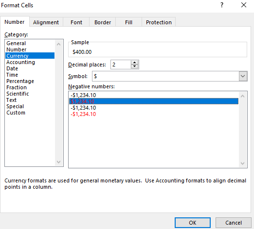
One thing that helps a sensitivity analysis chart is some formatting. First, I’ll change the format of these numbers so that negatives show up in red. I can select the cells in the other columns and change their formatting to Currency and select the red option for negative numbers:

Formatting cells to show negatives in red.

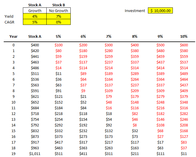
I also removed the decimals to save space. Now, it becomes easier to see my data and when the numbers flip from positive to negative:

Applying formatting to sensitivity analysis.

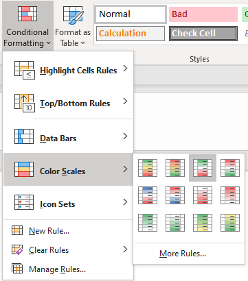
Another thing I can do is add conditional formatting. Color scales can be really helpful here, such as these ones:

Using color scales to add conditional formatting.

Now it’s even easier to see the progression and how it relates from one dividend yield to the next:

Applying conditional formatting to sensitivity analysis table.

You can adjust the formatting to how you prefer. These are just some of the ways you can help your numbers pop out.

Changing your data becomes much easier

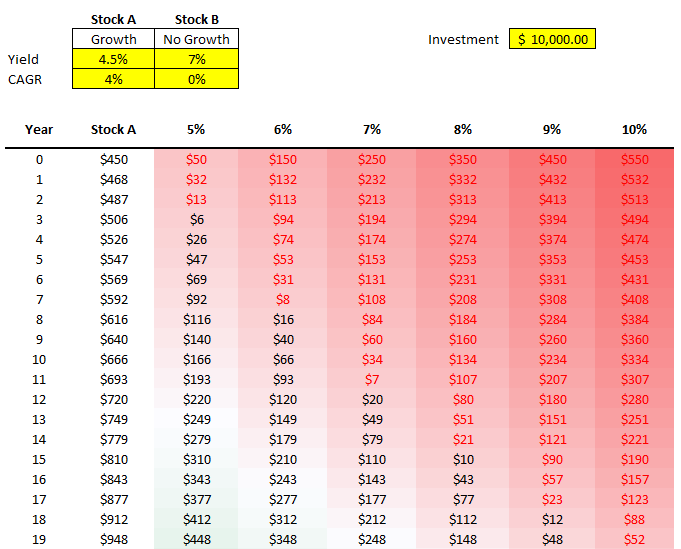
Now, what if the stock you’re comparing changes? You’ve found one that pays 4.5% and grows by 4%. You can easily change Stock A and now the rest of the values and the formatting will update:

Changing variables in the sensitivity analysis spreadsheet.

By being able to easily update your base stock (Stock A) and then just see the changes update for all your other comparables, you can easily run through various what-if scenarios on the fly without having to update all your other formulas. That’s where a sensitivity analysis becomes very useful; it prevents you from having to repeat steps over and over to compare different scenarios. It does it all at once for you and avoids the inevitable follow-up questions you may receive in your analysis of what about this scenario or that one.

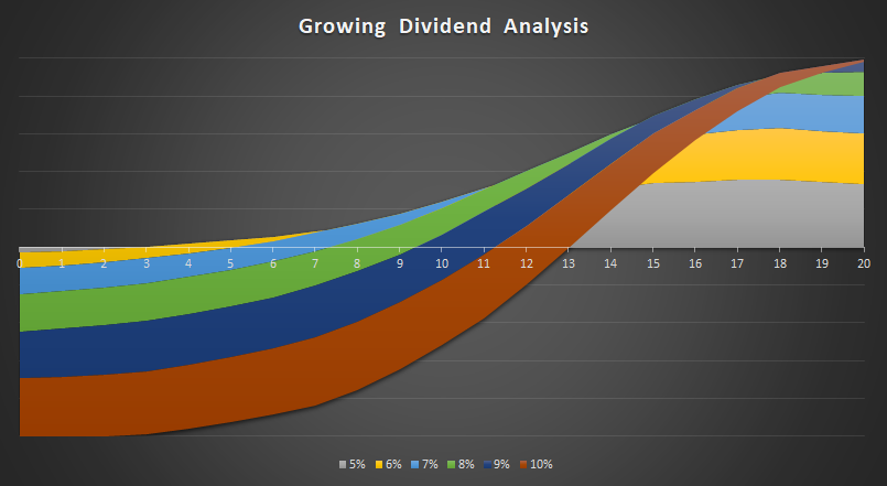
And Another way to visualize the data, is of course, through charts. And rather than a boring line chart, one that I found particularly effective to demonstrate these differences is the 100% Stacked Area Chart. Here’s how it looks like:

Sensitivity analysis in a chart.

I only mapped the first 20 years. That’ because by that rate, it’ll capture the year when Stock A surpasses the 10% dividend yield. The chart does a great job of showing the size of the differences over the years and just how much longer it’ll take for Stock A to overtake a 5% yield versus a stock that’s yielding 10%. It’s certainly not the only chart that might work. However, it definitely has a nice effect that helps it stand out and summarizes the data well.

If you’d like to follow along, you can download the spreadsheet I created for this example here.


If you liked this post on how to do a sensitivity analysis in Excel, please give this site a like on Facebook and also be sure to check out some of the many templates that we have available for download. You can also follow us on Twitter and YouTube.
H2Epercentages

How to Calculate Percentages in Excel

When doing any kind of data analysis, it’s important to be able to pull in not just raw data but also to show percentages. From a period-over-period percent change to how much an item represents of a total, showing a percentage can give readers multiple different viewpoints. Below, I’ll show you how to calculate percentages in Excel and to give your data more context.

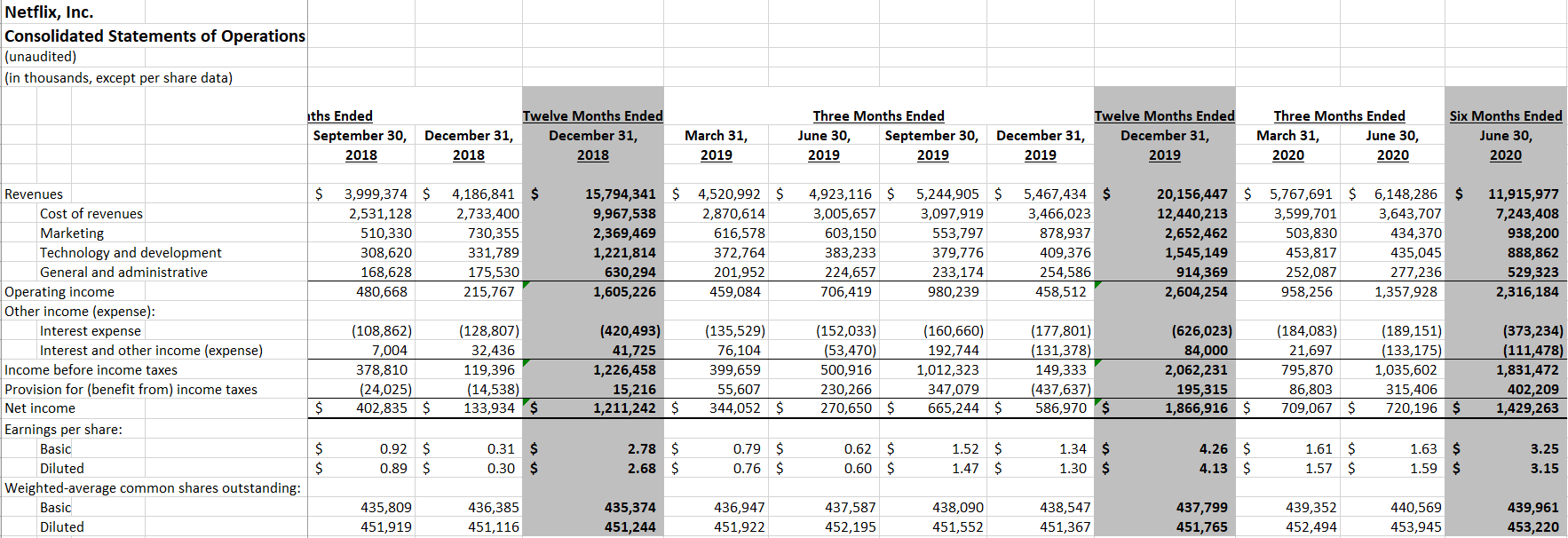
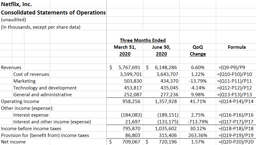
In this example, I’m going to use data from Netflix’s most recent quarterly results. The streaming giant always releases its numbers in a friendly Excel format, making it easy to analyze the data. Here’s what its income statement tab looks like, unchanged for the second quarter of fiscal 2020, which includes previous periods:

Netflix income statement in Excel.

Showing period-over-period changes

Netflix’s numbers look impressive — $6.1 billion in revenue for the quarter ending June 30, 2020. However, that number on its own may not be very helpful. One way to add some context is to calculate the percentage change to show the increase or decrease from a previous period, aka its rate of growth.

I’ll add a column next to those quarterly results and add a formula that shows the percentage difference from the previous quarter (ending March 31, 2020). To calculate the percent change, all I need is to take the difference and divide it by the old number, or base amount. A good way to remember this is: (new-old)/old.

In this example, column Q contains the quarterly results for June 30 and column P is the previous period. And the revenue is in row nine. The formula for the first item looks as follows:

=(Q9-P9)/P9

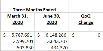
Where Q9 is the new total, while P9 is the old number. This gives me the following:

Quarter over quarter change.

The $0 isn’t really helpful here, and it’s also not a dollar amount. Excel’s just defaulted it to that format based on the other numbers. To properly show it as a percent change, I need to change it to a % format. It’s as simple as selecting the entire column and clicking on the % sign on the Number tab:

Number group in Excel.

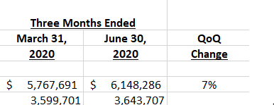
That will now give me the following results, after centering the column:

Quarter over quarter change in percent format.

However, this still may not be ideal. If I want a bit more detail, such as to show multiple decimal places, you’ll again want to go back to the format section and select the item to add decimal places:

Add decimal places button.

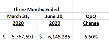
Clicking on this button twice will now give me a couple more decimal places:

Percent change with two decimal places.

Now, with my percentage change looking correct, I can copy the formula down for the rest of the items:

Quarter over quarter percent change across all items.

Showing the percentage of a base amount, or grand total

Another way you may want to show a percentage is how much an item makes up of a total. One common way to analyze financial statement is to look at items as a percentage of revenue. A company’s profit margin, for instance, takes its total profit and divides it by revenue to determine what percentage of its top line makes it through to the bottom line.

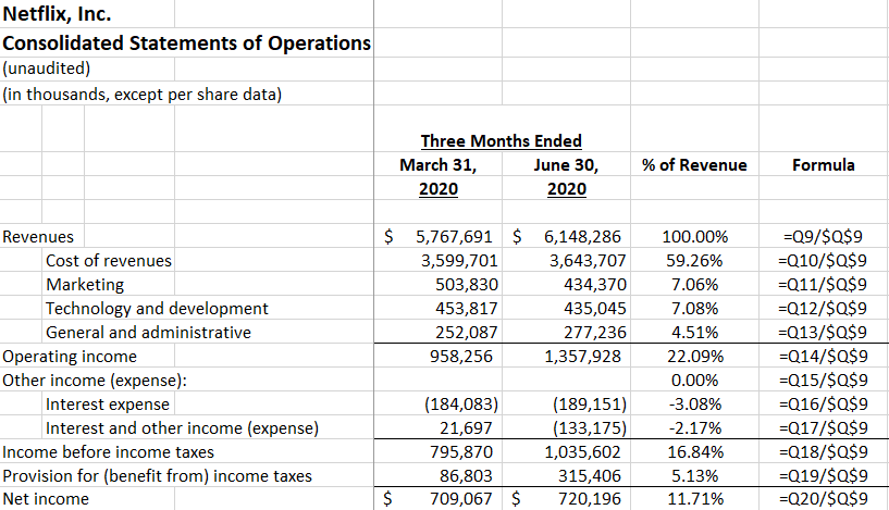
How to calculate percentages in Excel when just looking at how much an item makes up of a grand total is an easier process. In this example, the calculation just takes the current item and divides it by revenue. The key is just freezing the denominator, which in this case is revenue. Here’s how the formula looks like:

Percent of revenue by line item.

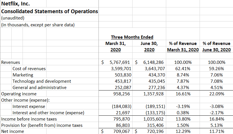
Using the % of revenue analysis, it’s easy to see that operating income was 22% of revenue and Netflix’s profit margin was 11.7%. Replicating these formulas for other periods can help compare multiple periods to see the % of revenue trends. Here’s how the current quarter looks against the previous one when looking at the percent of revenue:

Multiple periods percent of revenue analysis.

Compared to the earlier quarter, Q1, the profit margin becomes a bit less impressive in Q2 as it’s declined from the previous period. Despite a stronger overall Q2 performance, a higher tax bill led to a smaller overall profit margin than in Q1.

As you can see, by adding percentages to your analysis you can create very different viewpoints and add a lot more context to the numbers.


If you liked this post on how to calculate percentages in Excel, please give this site a like on Facebook and also be sure to check out some of the many templates that we have available for download. You can also follow us on Twitter and YouTube.

wallet-2292428_640

Paying Off Debt vs Adding to Savings: Analysis in Excel

Excel is a great tool for financial questions and analysis, and one popular one is whether someone is better off paying down their debt vs adding to their savings. There are temptations to both, but this is where Excel can help identify a clear winner.

As much as it is a math question, it’s also a question about opportunity cost. If you’re paying down debt then you’ll incur fewer interest charges, and if you add to your savings then you can earn more in interest income. While both options will put someone in a better financial position, that doesn’t mean that one option isn’t better than the other.

Adding to Savings

Typically, banks pay interest rates of around 1% at best, unless there’s a promotional period. But generally, you aren’t making much when it comes to your savings. However, if you’ve got an amount of $5,000 to add to your savings, then that will produce an extra $50 per year at a 1% interest rate, or about $4.17 per month. It’s by no means huge, but it’s still incremental income that can help grow your savings over time.

Paying down debt

If you’ve got credit card debt, however, you’re probably paying anywhere from 15% to 20% in interest. There are exceptions, but most credit cards will likely fall within that range. On a credit card with an interest rate of 20%, that’s going to be an annual interest charge of $1,000 on a $5,000 balance. And so by paying down off a card at that rate, you’ll be saving a lot in expenses.

Difference in interest rates is key

It’s pretty clear that it all comes down to the difference in interest rates, and that’s why paying down debt will always provide you with more of a benefit than adding extra cash to your savings will. While it might be tempting to add to your savings, the reality is that you’ll likely be losing in the long run.

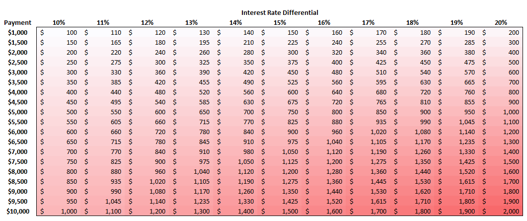
Using a color scale in Excel, I mapped out the difference in interest rates by the size of the possible payment. It’s a very linear relationship: the higher the differential and the higher the payment, the more money you’ll lose by putting money into savings rather than paying off debt:

In the example above, the difference in interest rates was 19% (20% in credit card rate less the 1% in savings rate). Multiplied by a $5,000 payment, that would have resulted in an annual loss of $950. Rather than avoiding $1,000 in interest charges, I would have made just $50 in interest income ($1,000 – $50 = $950 opportunity cost). On the matrix above, you’ll notice this is also the amount that is at the intersection of 19% and $5,000.

Summary

This isn’t the most groundbreaking discovery but it’s one that can be visualized well using Excel. After all, this is a numbers problem, nothing else. While some people may argue there are other reasons to add to savings such as having cash for a rainy day, the reality is that whether you add to your savings or free up room on your credit card, you can access funds from either option. And in the meantime, if you add to savings, you’re still incurring the interest charges. To make matters worse, the interest income you earn may be subject to income taxes, which will further erode the benefit of adding money to savings. Interest expenses on credit cards likely won’t be tax-deductible.

Overall, there really isn’t a strong argument for contributing to savings instead of paying down debt. It’s comes down to what interest rate you’re paying vs what rate you’re earning. And I’ve yet to see anyone earn more in interest than they’ve had to pay on a credit card.

The post is not a substitute for financial advice and is only intended to show how an analysis in Excel can be done when comparing two different options – in this case, paying down debt vs contributing to savings.

You can download the file that I used in these calculations here.


If you liked this analysis on Paying Off Debt vs Adding to Savings, please give this site a like on Facebook and also be sure to check out some of the many templates that we have available for download. You can also follow us on Twitter and YouTube.
money-2696219_640

How to Calculate CAGR in Excel

When you’re doing financial analysis, it’s helpful to add some context to growth numbers. That’s where using a Compounded Annual Growth Rate (CAGR) is very useful. Rather than saying a company has grown 50% over 10 years, you could say instead that they’ve grown by an average of 4.1% every year. It also gives you a percentage to use going forward if you need to forecast what you expect next year’s growth to be since you’ll have a starting point. The CAGR effectively tells you what the average growth rate has been during that period of time. It doesn’t mean that it’s grown every year by that rate, but that on average, it has risen by that amount. Below, I’ll go over how to calculate CAGR in Excel.
Using Amazon as an example

To calculate CAGR what you need to know are just two things: the total growth and the duration of time. Let’s use Amazon’s sales as an example. In 2018, total revenues for the year reached $233 billion. Back in 2010, the company had $34 billion in sales, meaning that Amazon’s revenues have grown by 585% during that time. Impressive, no doubt, but it doesn’t tell us how well it’s typically done on a yearly basis. This is where we calculate CAGR to help determine what the average growth was over that time.

From 2010 to 2018, that’s eight years that it took for sales to grow by 585%. To calculate CAGR, we use the following equation:

(Current Year Amount / Base Year Amount) ^ ( 1 / # of Years)

In the Amazon calculation, it would look as follows:

(233/34) ^ (1/8) – 1 = 27%

What this tells us is that Amazon for the past eight years has averaged an annual growth rate of around 27.2%. There’s an easy way we can prove this out. Starting with our base year of 2010, take the sales amount of $34 billion and multiply it by (1 + growth rate) each and every year. Here is how the level of growth looks like year over year:

YearPrior Year
Revenue
GrowthCurrent Year
Revenue
2010 $34, 000
2011 $34,000 27.2% $43,248
2012 $43,248 27.2% $55,011
2013 $55,011 27.2% $69,973
2014 $69,973 27.2% $89,006
2015 $89,006 27.2% $113,215
2016 $113,215 27.2% $144,008
2017 $144,008 27.2% $183,177
2018 $183,177 27.2% $233,000

As you can see, if we assume a 27.2% growth rate each and every year, we arrive to the same end value. Although Amazon did not grow at this consistent of a pace, using CAGR helps to average the results over a period of time.

Whether you’re looking at sales, dividends, or any other kind of growth, using CAGR can be a very useful tool in putting into context just how the strong the rate of growth was.

Using CAGR to help forecast

Having CAGR is also useful if we want to forecast out future sales. Let’s assume that Amazon will have a more modest rate of growth for the next 10 years. That rather than a CAGR of 27.2%, it’ll be closer to 20% instead. Now, we can create a forecast around that and assume that sales will grow by 20% each year (on average) for the next 10. Our forecast would look as follows:

YearPrior Year
Revenue
GrowthProjected
Revenue
2019$233,000 20%$279,600
2020$279,600 20%$335,520
2021$335,520 20%$402,624
2022$402,624 20%$483,149
2023$483,149 20%$579,779
2024$579,779 20%$695,734
2025$695,734 20%$834,881
2026$834,881 20%$1,001,857
2027$1,001,857 20%$1,202,229
2028$1,202,229 20%$1,442,675

To prove this out, what we can do is the following: 233,000 x (1.20^10) = 1,442,675

Based on these projections, we would expect amazon to hit the one trillion dollar mark in sales by the end of 2026. Maintaining a CAGR of 20%, however, will be difficult, even for a company like Amazon. Although all it takes is some big acquisitions and it will be well on its way!

If you don’t want to calculate CAGR on your own, you can use our free online calculator!


If you liked this post on How to Calculate CAGR in Excel, please give this site a like on Facebook and also be sure to check out some of the many templates that we have available for download. You can also follow us on Twitter and YouTube.