TrendFunction

How to Use the Trend Function in Excel

The TREND function in Excel is a powerful tool that allows users to perform linear regression analysis and make predictions based on existing data. This function is particularly valuable for professionals dealing with data analysis, financial modeling, and forecasting. In this article, I will go over how the function works, and provide step-by-step instructions on how to utilize it in your Excel worksheets.

Using the TREND function

To use the TREND function, follow the steps below:

1. Organize the data

Before you can use the function, you need to have your data organized so that it includes at least two columns. One needs to be for the independent variables, or the x-values, and another one for the dependent variables, or y-values. It is necessary for the data to be aligned correctly so that the information correctly relates to one another (i.e. you don’t want the wrong values lined up next to one another).

Below is sample data for a company which sells seasonal products. In warmer weather, revenue rises while in cooler temperatures, sales are lower.
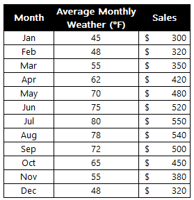
Excel table showing sales by month and the average temperature.

2. Calculate the Trend Line

With the data populated, you can now enter it into the TREND function in Excel. This involves specifying the following arguments:

  • known_y’s
  • known_x’s
  • new_x’s
  • constant

In the above example, the known_y’s are the sales, the known_x’s are the average monthly temperatures. If I don’t fill in any new_x’s or specify the constant, the function will still try and plot out the rest of the values:
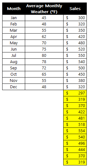
Excel table showing the effect of a trend function without plotting in new x values.

The problem in this scenario is that it doesn’t take into account the temperature; it simply assumes a similar trend as before. The function is much more useful if I have forecasted monthly temperatures. That way, the trend calculation will take that into account. Suppose I fill in the data, telling Excel that I expect the temperatures to be much warmer over the next 12 months:
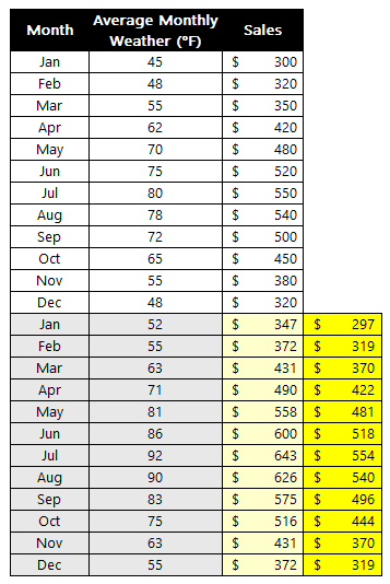
Excel table showing forecasted and actual amounts.

With the previous forecast off to the right, you can see that the TREND function has adjusted to reflect the newer information. Thus, the more data you plug into the function, the more reliable the forecast will be. Otherwise, it will simply assume the same patterns will repeat from before, which may not necessarily be the case.

There is an additional argument in the function that you can also adjust, and that is the constant. If you set it to false it will be 0. If set to true, then the formula will calculate it. This is the b variable which is part of the y=mx+b equation. If you expect there to always be a minimum, a constant amount, then you may want this to be calculated. If, however, the data can fluctuate wildly, then you may want to set it to true so that there is no intercept. Here’s a comparison with the above data both when there is a constant and when there isn’t:
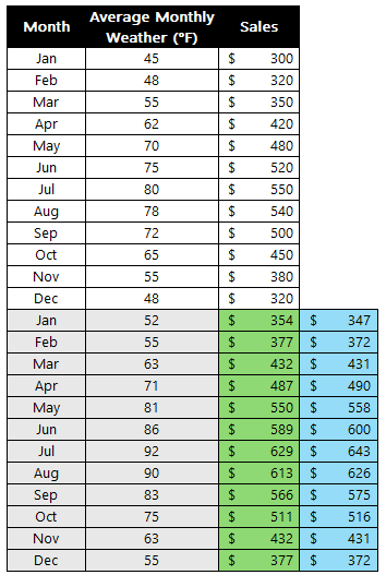
Excel table showing actual and forecasted amounts with a constant and without one.

The forecast in green is where the argument is set to false (constant is set to zero) and blue is where it is true and a constant is calculated. From the chart below, you can see that there isn’t a big difference but the highs are higher and the lows are lower when there is a constant. This may, however, not always be the case as it will depend on your individual data set.
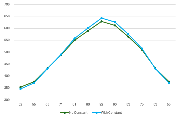
Chart showing the trend calculation with both a constant and without one.

Create a chart to differentiate between actuals and forecast

One thing you may find helpful to do when creating a forecast is to put those amounts on a different column:
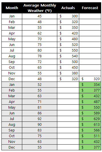
Actual and forecasted amounts in a table.

By doing this, you leave yourself space to add actuals later on and to compare them against your forecast. You can also create a chart with the forecast being a different series. In the below chart, I have used a dotted line to show the forecast while the actuals remain solid. For the first forecast amount, I set it to the same as the actual. This way, when I create the chart below, there are no gaps and it is merely a continuation of the line.
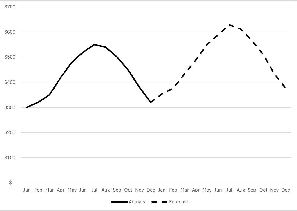
Actual and forecasted amounts plotted on an Excel chart.

If you liked this post on How to Use the Trend Function in Excel, please give this site a like on Facebook and also be sure to check out some of the many templates that we have available for download. You can also follow me on Twitter and YouTube. Also, please consider buying me a coffee if you find my website helpful and would like to support it.

H2Eforecastrange

How to Make a Forecast Chart Showing a Range of Possible Values

In a previous post, I showed how to make a forecast chart in Excel with a dotted line. This time around, I’m going to go one step further and show you how to create a chart that shows a range of possible values. This is useful in the event that you want to show some flexibility in your forecast and where providing a range might be a more realistic option.

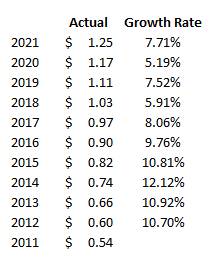
For this example, I’m going to project a company’s future dividend payment. Below, I have a a record of the past dividend payments along with the annual rate of increase:

Historical dividend payments along with their annual growth rates.

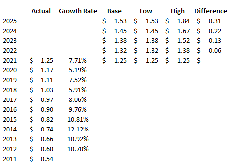
In order to create a range, I’m going to set both a high rate of growth and a low one. Since the company has made 10% increases in the past, I’m going to use that as the high. And for the low rate of growth, that will be 5%. Using those different rates, I can set up additional columns for what the dividend would be if the low rate were used and if the high one were applied. I will also create a column to calculate the difference between the high and low amounts, as well as one for a base amount — which will just be equal to the low amount. This will be used for stacking the difference on top of it to create the desired area chart:

Historical and projected dividend rates.

Creating the chart

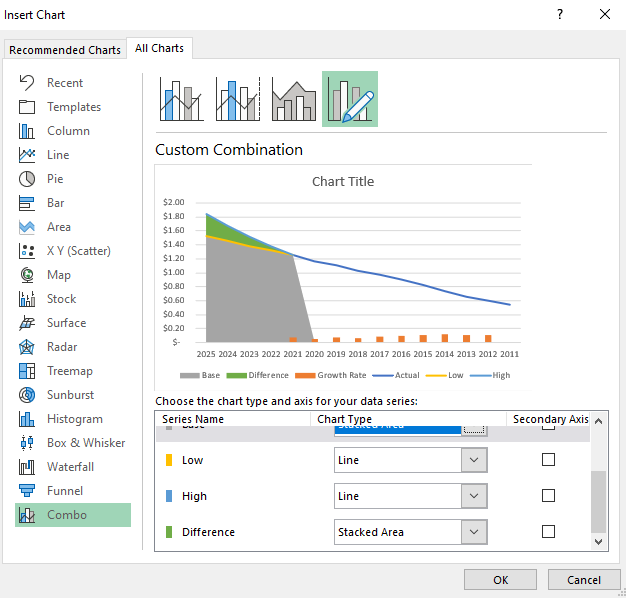
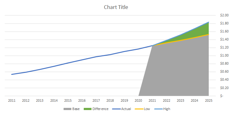
Now that the data is set up, I’m going to start creating the chart. Using a combination approach, I’ll set a line chart for the actual, low, and high columns. And for the base and difference amounts, I will set those to be stacked area charts. The growth rate I’ll leave as is because I will remove that once the chart is created:

Using a combo chart for line and stacked area charts.

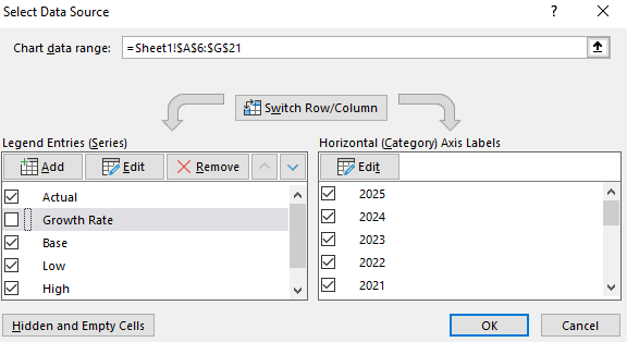
Next, I’ll right-click on the chart and click on Select Data. From the next screen, I will untick the box for the Growth Rate:

Removing a series from an Excel chart.

Then, I will right-click on the x-axis, select Format Axis and select the option to put Categories in reverse order. Now my chart looks as follows:

Forecast chart showing line and stacked area charts.

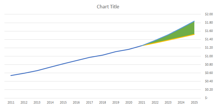
Now, I’ll remove the legend and format the base color, which is currently grey, to a blank fill color:

Forecast chart showing line and stacked area charts.

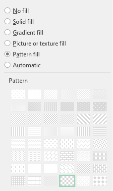
I’ll change the line color for the high amount to green, the low amount to red, and apply dashed lines to both. For the actuals, I’ll set that to a black line. And for the area chart that is in green right now, I will apply a Pattern Fill and use a checkered pattern:

Using a checkered pattern fill for a stacked area chart.

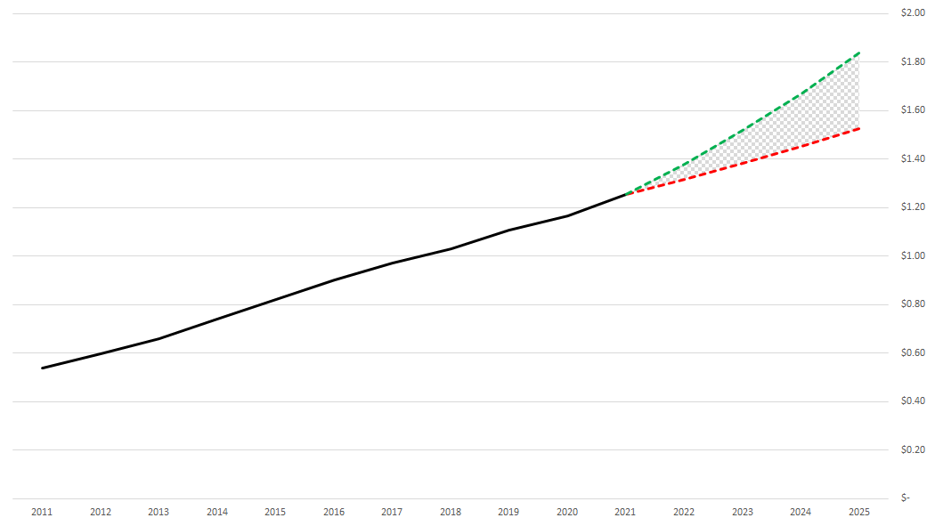
With all those changes, my updated forecast chart now looks like this:

Finished forecasted line chart showing a pattern fill area for the range of possible values.

If you liked this post on How to Make a Forecast Chart in Excel With a Dotted Line, please give this site a like on Facebook and also be sure to check out some of the many templates that we have available for download. You can also follow us on Twitter and YouTube.

H2EForecastChart

How to Make a Forecast Chart in Excel With a Dotted Line

Charts are an effective tool in forecasting. In this post, I’ll show you can show you can make an actual and forecast chart in Excel look like one continuous line chart, with the forecasted numbers being shown on a dotted line.

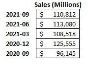
For this example, I’m going to use Amazon’s recent quarterly sales as my starting point:

Amazon's quarterly sales.

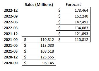
I’m going to create another column for forecasted amounts for future quarters. I’ll make a simple forecast and assume that sales will increase by 10% every quarter:

Amazon's quarterly sales alongside a forecast.

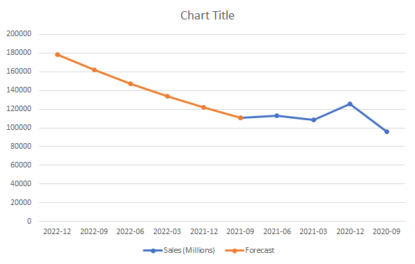
For the last quarter (2021-09), I’m including the same total in the Forecast column. This is to ensure that the new line chart picks up where the last one ends and that there isn’t a gap. Then, I’ll create a line chart for these data points, which, by default, looks like this:

Two line charts showing actual and forecasted amounts.

I’m going to flip this chart in reverse order so that the forecasted values are on the right. To do this, right-click on the x-axis and select Format Axis. Then, check off the box that says Categories in reverse order:

Categories in reverse order setting on Excel.

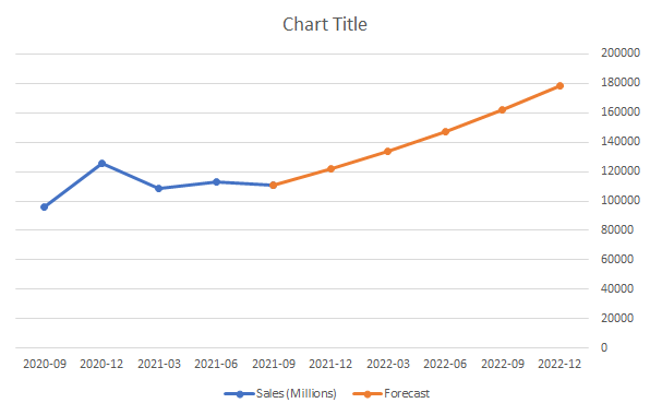
Now, at least my chart is going in the right direction (an alternative could be to structure your data in the opposite direction):

Two line charts showing actual and forecasted amounts with categories reversed.

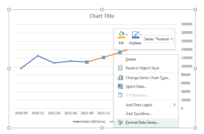
Because of the change in colors, this makes it easy to differentiate my actuals from my forecast. But I want it to be all the same color and only be differentiated by dotted lines. To do this, I will right-click on the forecasted line and select Format Data Series:

Formatting the data series on a line chart.

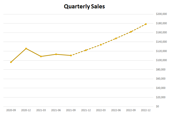
There will be an option to change the Dash type. The default is solid, and I’m going to change that to the second option from the top — Square Dot. After changing that and making the colors the same, and applying some formatting, here’s what my chart looks like:

Line chart showing Amazon quarterly sales with forecasted amounts as dashes.

If you liked this post on How to Make a Forecast Chart in Excel With a Dotted Line, please give this site a like on Facebook and also be sure to check out some of the many templates that we have available for download. You can also follow us on Twitter and YouTube.

Optimized-H2Epayback

How to Calculate Payback Period

In previous posts, I went over how to calculate the internal rate of return and how to discount future cash flows to arrive at a net present value. Today, I’ll go over another way you can evaluate projects, and that’s using the payback period. The payback period calculation is a simpler method than the other two approaches in that it just looks at how long it’ll take for you to recoup your money from an investment, or when you’ll hit breakeven.

Setting up the spreadsheet

To do this calculation, I’ll again use the discounted cash flow spreadsheet from my earlier example. The key difference in calculating the payback period is that you don’t need to worry about present value since this won’t take into account the time value of money.

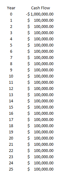
Let’s assume a scenario where you invest $1,000,000 into a project and generate cost savings of $100,000 every year. Here’s how that might look like over a 25-year period:

Cash flows over the next 25 years.

This is a really simple setup but let’s set up a formula to determine when the investment reaches breakeven. In this scenario, since the cash savings are always $100,000 every year, you can simply take the initial investment and divide it by the annual cost savings. The formula looks as follows:

Payback period calculation.

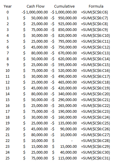
After 10 years, the investment will be paid back in its entirety and reach breakeven. If your cash flows will vary over the years, what you can do is use an average to try and smooth it out and get to an approximate payback period. Another alternative is to create another column that shows your cumulative savings or cash inflows and how much is left to reach breakeven. To calculate a cumulative sum, just use a regular summation formula but freeze the first cell so that your formula will always start from the same position. Here’s how you might set this up:

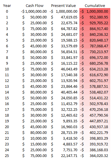
Cumulative cash flow over 25 years.

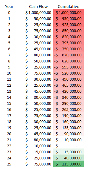
You’ll see that cell C6 is frozen as that’s where my first value is, and that’s where the $1,000,000 outflow of cash is. I’ve also changed my cash flows so that they’re different amounts each year, and under this scenario, you’ll notice that it’s not until year 22 that I reach breakeven. A better way to illustrate this is through conditional formatting, by highlighting the negative values and the positive ones in different colors.

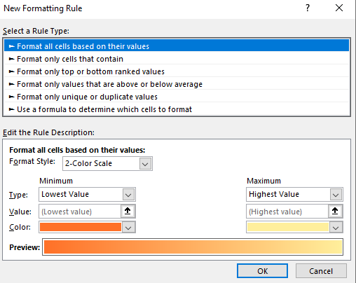
You can do this by selecting all the values in the cumulative field and under Conditional Formatting, selecting Format all cells based on their values, which gets you to this menu:

Conditional formatting rules.

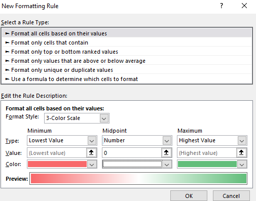
The first thing I’ll do here is to change the color scale so it shows three colors instead of just two. Then, I’ll set it up so that the lowest value is red, the midpoint is set to 0 and white, and the maximum is set to green:

Conditional formatting with a 3-color scale.

Then, after clicking on OK, my values look like this:

Cumulative cash flow with conditional formatting.

Using the conditional formatting, I can easily see the progression of the red into white (breakeven), and then into green. It’s a lot easier on the eyes and allows you to quickly see the progress. If you want to look into more ways you can do this, check out this post on conditional formatting.

Payback period when factoring in time value

If you just want to calculate the payback period using a simple formula and your cash flow / savings is the same every year, then simply dividing your total investment by that amount will suffice. Then, it’s simply a matter of determining whether the number of years in the payback period is acceptable to you. If it is, you can move forward with the project. If the payback period is too far into the future, then you may want to re-consider it.
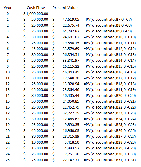
However, when you’re looking at a longer timeframe, you may want to consider incorporating discounted cash flow to give you a more realistic picture of the payout period over time. And while the typical payback period calculation doesn’t incorporate the time value of money, that doesn’t mean you can’t do it. In this example, I’ll calculate the present value of the cash flows like I did in the earlier post which looked at discounted cash. Using a discount rate and raising the cash flow to a negative power (years in the future), I can arrive at the present value. Here’s how that looks in an additional column, with the respective formulas off to the right:
Present value of future cash flows.

Note that I used a named range for the discount rate. Column B relates to the Year field and Column C is the cash flow value in the future.

This time I use Excel’s built-in present value function, which requires you to enter the rate, the number of periods, payments (not applicable here), and the future value (which needs to be negative for this to calculate correctly). Using a 5% discount rate, I’ve populated the present values of each of the future cash flows.

Now, I can add a column to track the cumulative values:

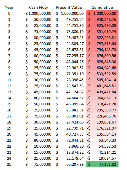
Cumulative total of all present values.

When factoring in the time value of money, my payback period is now well over 25 years. It’s an important reminder of just how important time value is. Under the previous payback period calculation that didn’t factor in the time value of money, the payback period was 22 years. In order for my payback period in this example to get to breakeven within 25 years, I’d have to set my discount rate to less than 1%. At 0.5%, this is what the schedule looks like:

Cumulative present value when at a 0.5% discount rate.

Only after 24 years does the project attain breakeven in this situation, and that’s with a minuscule discount rate. Normally, in a payback period calculation, you’ll just stick to the investment total divided by the savings or cash flow that the investment will generate. However, there are significant drawbacks to doing so when it may take many years for an investment to breakeven. In that case, it may be worthwhile to consider the time value of money.


If you liked this post on how to calculate payback period in Excel, please give this site a like on Facebook and also be sure to check out some of the many templates that we have available for download. You can also follow us on Twitter and YouTube.

IRR

How to Calculate Internal Rate of Return (IRR) in Excel

Last week, I covered how to calculate discounted cash flow. In this post, I’ll build off that worksheet and show you how you can calculate the internal rate of return (IRR) in Excel. IRR tells you the return that you’re making on an investment or project, and at what discount rate the net present value of all the cash flows will be zero. In these scenarios, there’s typically an outlay of cash, usually at the beginning.

In my previous example, I only looked at cash flows coming in. This time, I’ll look at a scenario where you pay money out at the beginning and generate cash flow in future periods. A common example is paying to upgrade a piece of equipment and then generating cost savings from it for x number of years. Knowing the IRR can tell you if you’re making enough of a return off of the investment and whether you should move forward with it. Using IRR can also be helpful when you’re comparing multiple options to see which one is the best one.
Setting up the spreadsheet

This step is about the same as when setting up the discounted cash flow template. You’ll need to enter the different years, the cash you expect to come in or out, and then calculate back what the present value is today.

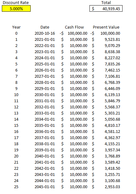
Here’s what the file looks like setting in a scenario where you pay $100,000 upfront and then generate $10,000 in cash flow for 25 years. At a 5% discount rate, in this example the present value of all that cash flow is a positive $40,939.45:

Discounted cash flow calculation using an interest rate of 5%.

Calculating the IRR

The problem here is the discount rate can be difficult to determine, and that can have a significant impact on your overall returns. And so rather than worry about what your discount rate should be, you only need to determine the IRR — which is to say at what point would your present value be worth $0? If you need a higher return than the IRR the project would be a no-go but if you’re okay with anything up to and including the IRR, then the project or investment would be passable. What it comes down to is the lower the IRR is, the worse the investment is

There are a couple of different ways to calculate IRR in Excel. One way is through a formula called XIRR. It only has two required arguments — dates and cash flow. This is why in this example I entered dates for my cash flows rather than just numbering the years. This makes it easier for me to use the XIRR formula. In my spreadsheet, I enter the following formula:

=XIRR(D6:D31,C6:C31)

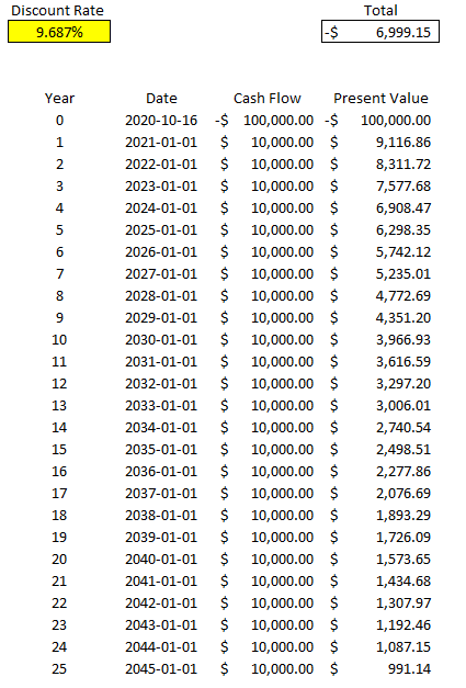
Column D contains my cash flow and column C contains the dates. Doing this, Excel tells me the IRR is 9.687% for this specific project. But if I work backwards and calculate the net present value, it doesn’t get me right to 0:

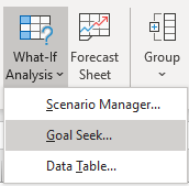
It certainly gets close to 0 and it’s probably close enough that it can help you make a decision about your investment. However, there’s another way to calculate IRR and that’s using Excel’s What-If Analysis. On the Data tab, there’s a drop-down for this option in the Forecast section:

What-if analysis on the forecast tab in Excel.

Depending on which version of Excel you’re using, it may show a bit differently, but what you’re ultimately looking for is Goal Seek.

Selecting goal seek from the What-If Analysis drop-down.

Goal Seek is an accelerated way of doing trial-and-error. Excel’s doing it for you much quicker than you could ever do it by yourself. For IRR, it’s the best solution.

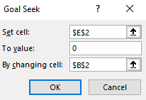
Here’s how it works. You’ll need to enter the cell that you want to get to a certain value, what value that is, and which cell Excel should be changing values in. In my spreadsheet, E2 is where my net present value formula is, and I want that to equal 0. In cell B2 is my discount rate, which is what I want Excel to be changing. Here are what my inputs look like:

Setting the inputs in goal seek.

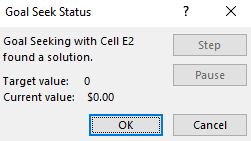
Then, once I click on OK, Excel goes to work. After a few seconds you should see Excel show you that the target value and the current value are a match (e.g. they’re both 0), meaning it’s done its job successfully:

Goal seek after completion.

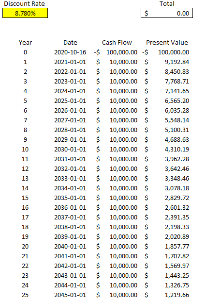
Now, if I look at my template, I see a different discount rate and my total present value is netting out to 0:

Discounted cash flow template after using goal seek to calculate the internal rate of return.

As you can see, this is much more accurate than Excel’s XIRR function. You can repeat these steps and make this table for other projects that you can assess side-by-side.

If you’d like to test this out, try downloading the discounted cash flow spreadsheet from my last post and then just using Goal Seek or the XIRR function to determine your IRR. You can remove unnecessary columns from the sheet and then duplicate the table, and then you’ve got a template where you can assess multiple investments against one another.


If you liked this post on how to calculate IRR in Excel, please give this site a like on Facebook and also be sure to check out some of the many templates that we have available for download. You can also follow us on Twitter and YouTube.

calendar-309912_640

How to Do a Weekly Sales Analysis and Compare the Same Days of the Week

Whether you’re doing a forecast or looking back at how your sales were over a period of time, it’s important to ensure that you’re comparing apples to apples. While monthly and yearly numbers won’t have too much noise, once you’re trying to do a daily or weekly sales analysis, that’s when things can get a little challenging.

Below, I’ll show you how you can do a weekly sales analysis where you’re comparing the same days of the week against one another. This will give you an accurate picture of your year-over-year performance.

Step one: determine which day of the week you want to start on

This is a simple step and you’re probably going to go with either Sunday or Monday. But it’s an important one to consider because when you’re looking at weekly sales numbers, you want to be consistent. And while you can refer to the week number when comparing one week to a previous year, saying week 32 is not going to be as useful as saying the week starting August 5 or ending August 11.

In my example, I’m going to use Monday as my starting point to ensure that I’m not breaking up the weekend (the default in Excel is Sunday). To make it easy to compare a week, it will be helpful to create a header for the days of the week so it looks like a calendar.

Step two: entering the first date of the weekday you selected

The first Monday of 2020, wasn’t until Jan. 6 this year, which would be the second week of the year if we start on Mondays. The previous Monday was Dec. 30, which was technically week 53. Weeks 1 and 53 are often abbreviated. For now, just accept that there’s no Monday in Week 1 of 2020. I’ll show you how we can get around this problem further down.

For now, Jan. 6 will be our starting point which we’ll call Week 2. Now, that we have our starting point, we can build out what our subsequent weeks will look like.

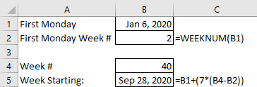
For example, if I want to find out the start date for week 40, what I can do is simply use the following formula:

weekly sales analysis dates

First, I multiply 7 by the difference in weeks. Then, add that to the first Monday value. In this example, it tells me the 40th Monday of the year is Sep 28, 2020. That’s why setting up the first Monday values is important to ensure that it’s easy to get the remaining dates.

This is the easier approach to take. However, later on I’ll show you a way where you don’t have to enter in the first Monday of the year.

Step three: filling in the remaining dates of the week for your sales analysis

Getting the starting date of the week is the toughest part. From there, all you have to add is just add 1 to each subsequent day:

weekly sales analysis dates

Just adding 1 to the previous date will increment to the next day. No special formulas needed here.

Step four: getting the prior-year date

To get the previous year’s data you can follow the same approach as in step two. However, I’ll use this as an opportunity to show you another way that you can get the data. One that won’t require you to pull out the calendar.

First, we need to know what day of the week Jan. 1, 2019 fell on. To do this, we can just use the following formula:

=WEEKDAY(“Jan 1, 2019”,2)

The reason I put the number 2 as the second argument is because my week is starting on a Monday. If I set it to 1 or left it blank, the default would be Sunday. This is important because if Monday is my first day of the week then it’s day value is 1 and Sunday is 7. Had I used Sunday, then Sunday would have a value of 1 and Monday would be 2. This is why it’s important to know which day of the week you want your week to start on.

In 2019, Jan. 1 fell on a Tuesday, and the formula above gave me the result of 2. (Monday is 1, so Tuesday would be 2). The reason I need to know the weekday is because I need to adjust the date to find out when that week actually started. I use the following formula to do that:

=DATEVALUE(“Jan 1, 2019”)-(WEEKDAY(DATEVALUE(“Jan 1, 2019”),2)-1)

What this formula does is subtracts Jan 1, 2019 from the number of days it is above day 1. It then moves the date back. I can simplify this formula by entering Jan 1. 2019 in cell A1. Then my formula looks like this:

=A1-(WEEKDAY(A1,2)-1))

I no longer need to use the DATEVALUE function and now it’s a bit easier to use. There’s also less chance of an error when entering the date. Now, when I want to find out the first day of the week, I can multiply 7 times the week number and add to this calculation:

=(A1-(WEEKDAY(A1,2)-1))+(7*(B1-1))

B1 is the week number. In this example, if I were to enter Jan 1. 2019 for cell A1, that would give me a result of Dec 31. 2018 for the start of Week 1. Excel also considers this to be the week that contains Week 53 and Week 1. This is where you can get around this issue. By calling this Week 1 of the current year and including December’s days into this week, it will ensure you don’t have the Week 53 problem. It may not look great to call the previous year’s dates part of the new year but it avoids having to manually make adjustments for this period.

Using the updated formula, I can change the Jan. 1 date to reflect 2019 and use week 40 to update my comparables for the weekly sales analysis:

weekly sales analysis dates

From here, it’s just a matter of now using a SUMIF function on your data to pull the sales for each one of these dates and you’ve got your comparable sales numbers. With 2020 being a leap year, you can see that the dates have moved up two days from the prior year. Without the date adjustment, you could have ended up comparing a Sunday (Oct 4, 2020) against a Friday (Oct 4, 2020).


If you liked this post on how to do a weekly sales analysis, please give this site a like on Facebook and also be sure to check out some of the many templates that we have available for download. You can also follow us on Twitter and YouTube.

cashflow

Cash Flow Forecast Template

Download Template

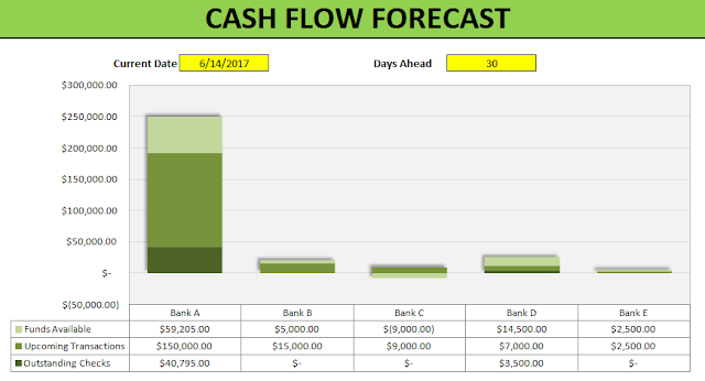
cash flow forecast
 

This template allows you to monitor and forecast out cash flows for a specified number of days. The current date defaults to today’s date but you can override it manually but if you do the formula will be gone.

You can also change the number of days you want to look in advance. For instance, you may only want to look at the cash you expect to have available for the next 7 days, 14, or however long you want.

First you will want to populate the current balance for each of the accounts. Right now they are hard-coded cells but you can certainly add formulas to populate this. The input section is on the second page of the Summary tab (scroll to the right if you do not see it on your screen)

cash flow forecast table
 

The cells above in yellow are ones you can edit. The ones in grey are formulas and need to remain the same as they are used in the chart.

There are three main sections in the chart:
– Funds Available
– Upcoming Transactions
– Outstanding Checks

Funds Available is simply a formula to show what cash on hand is expected at the end of the forecasted days. It looks at the current bank balance, deducts upcoming transactions, as well as the current outstanding checks. A positive number indicates the account will have cash remaining at the end of the period. A negative amount indicates that not enough cash is in the account to accommodate all the upcoming expenses and checks to be cashed.

Upcoming Transactions are populated from the Recurring Transactions tab.

upcoming recurring transactions

You can specify if a recurring transaction recurs monthly or annually. Based on this, along with today’s date, it will calculate the next occurrence of the transaction.

Further down on the Summary tab you can see a breakdown of the largest upcoming expenses on the left-hand side for all the banks and bank-specific transactions on the right-hand side. The yellow cell indicated below can be toggled to another bank and you will see transactions just for that bank. Both of these tables will only show expenses that fall within the date range you specified (e.g. if you specify only the next 7 days, it will only show expenses up until that date).

summary of upcoming and recurring transactions
 

The Outstanding Checks are fueled by the individual bank tabs. Each tab allows you to list any checks you have outstanding along with their amounts. Note that if you change any of the bank names on the input section you will also have to rename the tab. If the tab name does not match the bank name, the checks outstanding will not populate.