Nowadays, everything is available on a subscription. Even BMW now offers heated seats on a recurring subscription. It can be a challenge to keep on track of all your subscriptions, including when they renew and when trials end. However, I have a free template just for these purposes. With my free template, you can stay on top of your subscriptions and see just how much you are spending on them on a monthly and annual basis.
How the subscription manager template works
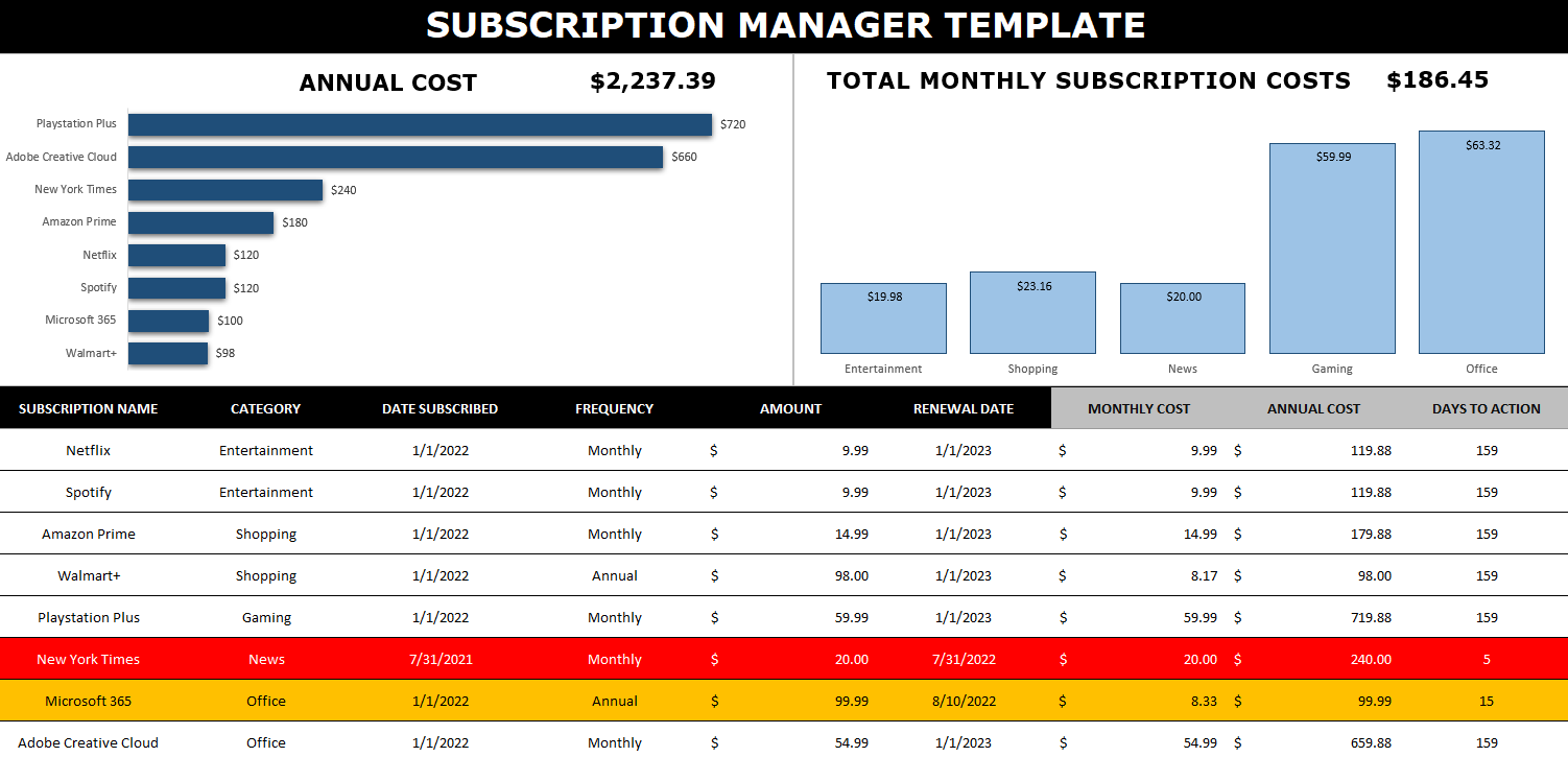
This template has no macros and is designed to be easy to update and track. Here’s how it looks:
There are multiple charts to show you the annualized cost of your subscriptions and the monthly cost (which is shown by category). This can be effective for budgeting purposes to know how much all of these subscriptions are costing you.
To add a subscription, simply add it to the bottom of the table. You can enter a category name, a frequency, amount, as well as subscription and renewal dates. The columns that have headers highlighted in grey don’t need to be updated as there are formulas there. This is where the amounts for the monthly and annual costs get calculated. Whether your subscription is paid monthly or annually, these columns will work out the calculation to determine what it costs you both on an monthly and annual basis. That way, you don’t need to worry about grouping monthly and annual subscriptions separately.
There’s also another column called Days to Action — this will calculate the days between today’s date and the renewal date. It will highlight in yellow when you are within 30 days of the renewal date, and it will turn red when you’re within two weeks of it. The point here is to give you a warning that a renewal is coming up (or a trial is ending). This can help you prevent forgetting about it and incurring a surprise fee. If you don’t care to track this, you can just leave the renewal date blank.
Updating the data in the template
When you enter a new line for a subscription or want to make modifications to one, the charts won’t automatically update as there are no macros within the file. In order to trigger an update, go to the Data tab and click on the Refresh All button. Upon doing so, your charts will be updated.
If you want to remove a subscription, simply right-click on the row and delete it. If you’re within the table, then while you’re on the row, right-click and select Delete. You’ll see an option to remove Table Rows. Either method will work fine.
If you like the Subscription Manager Template, please give this site a like on Facebook and also be sure to check out some of the many templates that we have available for download. You can also follow us on Twitter and YouTube.
A stock screener allows you to filter through stocks that meet your investment criteria. It can help you find undervalued stocks and great dividend investments. But sometimes it can be cumbersome to always go back to a website and re-apply filters, even if you save them. In this post, I’ll go over how you can populate a list of stock data into Excel and then run your own filters on it, and thus, creating a screener you can easily access from within your own spreadsheet.
Step 1: Populating the list
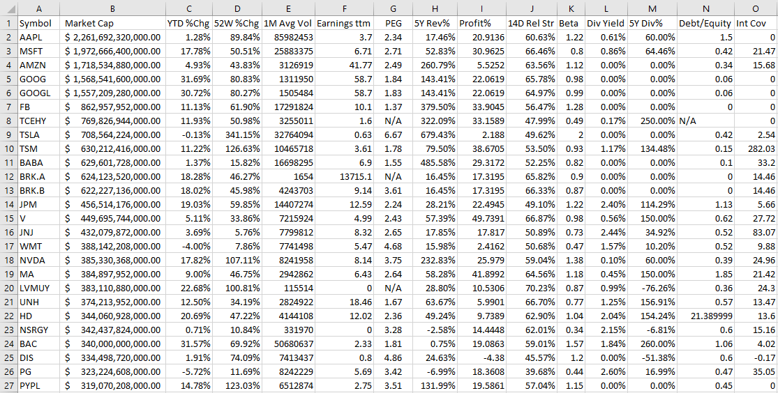
The one thing you’ll want to do before you can create the screener in Excel is to download an array of stock data from a database. Personally, I like using Barchart because it has lots of useful information on there and you can get a wide range of data, and it is easily downloadable into an Excel format. It lets you do five free downloads each day and you can download 1,000 rows at a time. That’s thousands of stocks you can add. Using that in conjunction with the STOCKHISTORY function, and you can create a pretty versatile template. After all, since data like earnings, dividends, and other fields won’t often change, downloading a snapshot from Barchart once a month or even less frequently shouldn’t be a big issue. You can obviously use other databases but I’m going to use a free example for the purpose of this post.
On Barchart, I’ve customized the fields I want to use for my downloads, and this allows me to re-use them again and make subsequent downloads easier. To keep it simple, I am going to download just the top 1,000 North American stocks based on market cap. This is what my download looks like in Excel:
Now that the data is loaded, the next step is to create the layout.
Step 2: Organizing the stock screener and setting up the fields
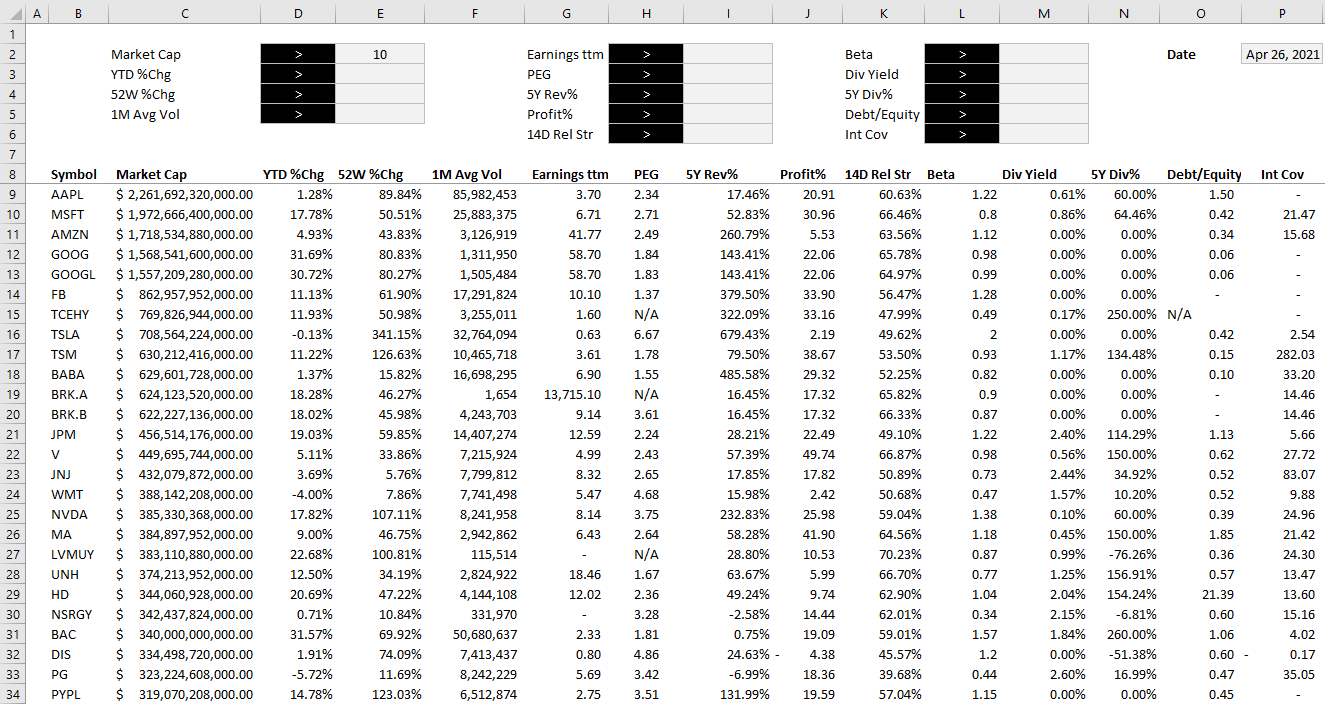
I find it most convenient to always put any inputs on a spreadsheet on the top of the page, and the results below. This way, you can freeze panes to make it easy to scroll through all the rows while seeing your selections.
To start, I will create a field for each major field I have downloaded. After formatting some of my values, this is how my screener looks thus far:
Off to the right, I’ve added a date field because I am going to utilize Excel’s STOCKHISTORY function to pull in the price. This will allow me to calculate the current price to earnings ratio without having to download it from the screener as that multiple will change every day based on the stock’s price.
When downloading so many stock prices, it may take a while for the formulas to update. But once they are loaded, then I can calculate the P/E ratio by just taking the stock price and dividing it by the earnings per share.
Step 3: Creating the formulas to evaluate the criteria
The part that will take the most time is to now evaluate each of the criteria to determine if a stock meets all of it and whether it should be included in the results. Rather than trying to do this in one large formula, I’m going to break this up into one formula per field. I’m going to name these fields exactly the same so that it is easy to reference them.
For the first criteria, Market Cap, my formula looks as follows:
D2 is where I have the dropdown for the > or < symbol and E2 is the value that I want to filter for market cap. C9 is the first row of data. My goal here is to evaluate to either a TRUE or FALSE value. I also divide the value in C9 by 1,000,000 just to make it easier to filter the market cap by millions.
For the % change calculations, I will do a similar calculation. Except this time I don’t need to divide by 1,000,000 and so it looks a lot simpler:
=IF(E3=””,TRUE,IF(D3=”>”,D9>E3,D9<E3))
D3 is my > or < dropdown while E3 is the percent change I am entering. Since I will enter a percentage here, I don’t need to make any special calculations. This is the same format that I will follow for the other fields.
Once I have set up all my calculations for the various criteria, I’m going to add one column that will check to see if the stock meets all of them. This is a simple formula where I can multiple all the values. A TRUE value will compute as 1 and a FALSE will be 0. And so even if there is one FALSE value, the entire result will return FALSE and not meet the criteria. The formula looks as follows:
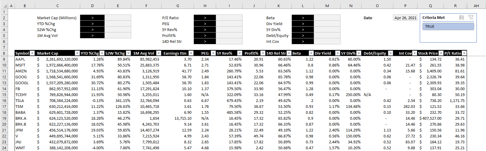
The final step is a simple one but it’s also important to make this sheet work smoothly. Select anywhere on the data set and on the Insert tab, click on Table. Hit OK and now you should see Excel’s default table applied to your data.
The reason for converting this into a table is that now we can apply slicers to it. And really, only one is needed here. If you go to the Table Design tab, there is a button to Insert Slicer. Click on it and select the one for the field that checks all the other criteria. In my example, it is called Criteria Met.
After hiding all the criteria fields, changing some of the formatting and adding the slicer, this is now how my screener looks like:
The beauty of this stock screener is that by clicking on the TRUE button in the slicer, you are automatically refreshing the data in Excel and updating your filters based on the selections. All this is done without macros and it makes the screener easy to change with the press of a button.
You can download my completed template here. Please note that if you do not have STOCKHISTORY available on your version of Excel, some of the values will not populate.
If you liked this post on creating a stock screener in Excel, please give this site a like on Facebook and also be sure to check out some of the many templates that we have available for download. You can also follow us on Twitter and YouTube.
If you do a lot of driving and you need to expense it for tax purposes, then you know you need a good log to keep track of it. That’s what the mileage log template will help you do. Along with tracking all your trips, it will let you do the following:
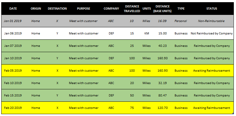
Track both kilometers and miles and convert back to a base unit. So if you travel outside of the country and don’t want to do the conversions yourself, you can enter them as either kilometers or miles and the spreadsheet will convert it into your base unit.
Allow you to categorize statuses based on whether you are going to be reimbursed by your company or not.
Track both personal and business travel so you have a complete picture of all your mileage
A summary tab to help you see your mileage by month
How the template works
In the Log tab, simply enter the details from columns A through to J. There are drop-down options for units, type, and status. These drop downs can be changed from the Setup tab. If you need to add more lines to the table, look for the next empty row and in column A enter a date. The table will automatically expand.
The template currently is set to fit onto one page in landscape, but you can adjust the columns as you need. If you do not need to see the status and would just prefer the template goes until column I, then you can delete column J and all the conditional formatting will go away along with it.
Summary of the mileage log
On the Summary tab, you’ll see a breakdown by month of all the different statuses and km/miles traveled. This makes it easy for you to see how much mileage you still have to claim versus how much has been reimbursed for. If you delete the status column then you’ll of course not see this information and simply have the totals.
Customizing the mileage log template in the setup tab
On the Setup tab, you can make changes to the travel type. For instance, you could put a vehicle description in addition to whether it is personal or business. There’s no limit to the number of options you can have in this field.
In the status section, in the description field I’ve indicated what color a status will be highlighted in. If you want to change the name of the status, column C is where you can rename it.
In column G, you specify whether you want your base units to be in KM or miles. This will be used to convert the mileage and determining whether a calculation is needed. If you select miles as your base unit and on the log you put in KM for the units, then it will do a conversion back to miles on the log.
Download options
Feel free to test out the mileage log template by downloading the trial version here. The limitations of the trial version are that the setup tab is not available and it also has an advertisement.
If you’ve tried the trial and would like full version, please visit the product page here.
This template allows you to monitor and forecast out cash flows for a specified number of days. The current date defaults to today’s date but you can override it manually but if you do the formula will be gone.
You can also change the number of days you want to look in advance. For instance, you may only want to look at the cash you expect to have available for the next 7 days, 14, or however long you want.
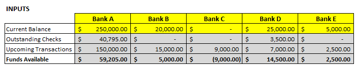
First you will want to populate the current balance for each of the accounts. Right now they are hard-coded cells but you can certainly add formulas to populate this. The input section is on the second page of the Summary tab (scroll to the right if you do not see it on your screen)
The cells above in yellow are ones you can edit. The ones in grey are formulas and need to remain the same as they are used in the chart.
There are three main sections in the chart: – Funds Available – Upcoming Transactions – Outstanding Checks
Funds Available is simply a formula to show what cash on hand is expected at the end of the forecasted days. It looks at the current bank balance, deducts upcoming transactions, as well as the current outstanding checks. A positive number indicates the account will have cash remaining at the end of the period. A negative amount indicates that not enough cash is in the account to accommodate all the upcoming expenses and checks to be cashed.
Upcoming Transactions are populated from the Recurring Transactions tab.
You can specify if a recurring transaction recurs monthly or annually. Based on this, along with today’s date, it will calculate the next occurrence of the transaction.
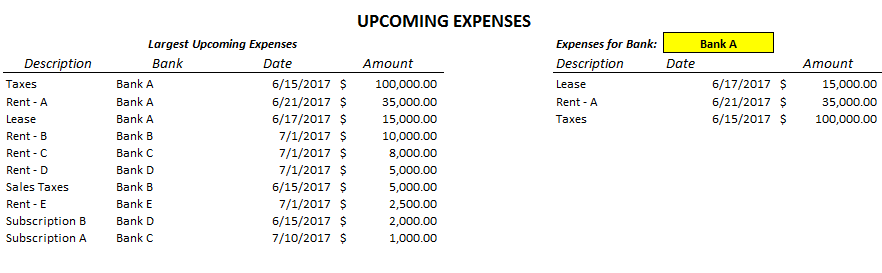
Further down on the Summary tab you can see a breakdown of the largest upcoming expenses on the left-hand side for all the banks and bank-specific transactions on the right-hand side. The yellow cell indicated below can be toggled to another bank and you will see transactions just for that bank. Both of these tables will only show expenses that fall within the date range you specified (e.g. if you specify only the next 7 days, it will only show expenses up until that date).
The Outstanding Checks are fueled by the individual bank tabs. Each tab allows you to list any checks you have outstanding along with their amounts. Note that if you change any of the bank names on the input section you will also have to rename the tab. If the tab name does not match the bank name, the checks outstanding will not populate.
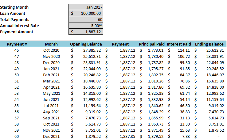
This template allows you to track multiple amortization / depreciation schedules and summarize them all in one tab. Above is a completed schedule with the inputs (highlighted in grey at the top) filled in. As you can see the last payment will also take care of any balloon payment required. I have made 10 different tabs but you can copy additional ones or delete ones you do not need. Each schedule accommodates up to 1,000 payments by default and assumes monthly payment intervals however this can be adjusted.
In the sample file I have three different amortization schedules. If I go to the Summary tab I see the following break:
The tab names must match to what is written in the Tab Name field otherwise they will not pull correctly. If you update the Current Month field (just enter a date value, do not enter text even though it looks like text) the formulas will update and show you what your balance currently is, how much interest has been paid to date, and how many payments are still remaining. The benefit of this template is if you are managing many different amortization schedules you can get a snapshot of all of them in one tab.
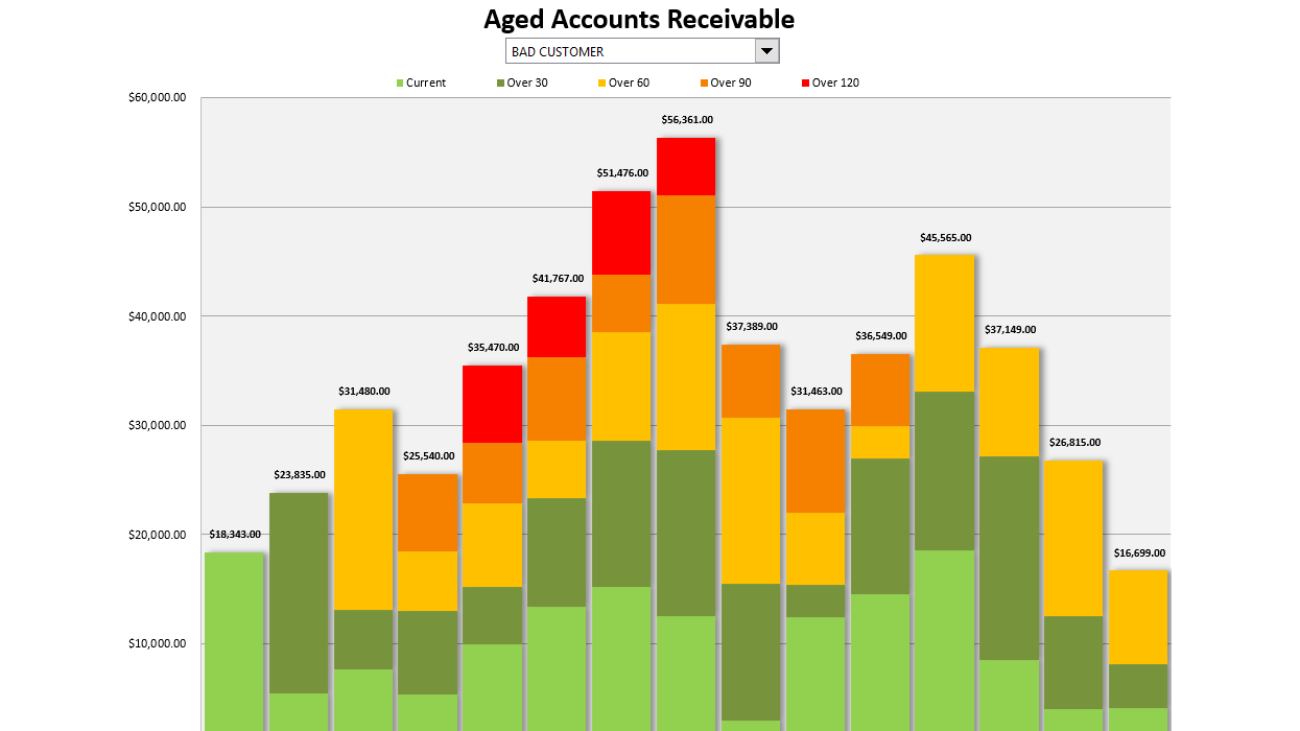
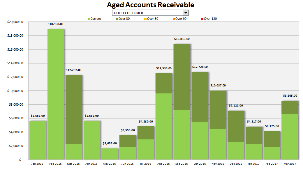
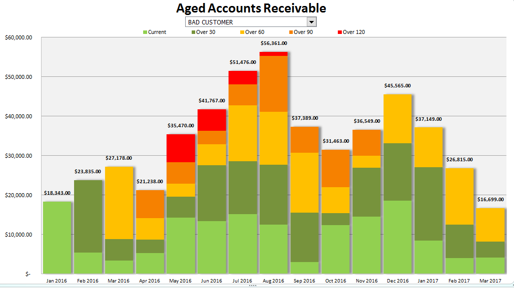
In this template you can generate a chart showing the history of a customer’s aged accounts receivable. This chart will show a breakdown by invoice age so it will be able to tell you a great deal in one picture: the customer’s total receivables by month, breakdown of the age of the receivables by month, how much sales is being done with the customer (this would be the current receivables), and whether the receivables are growing or declining. It could be a very useful tool in evaluating a customer’s credit worthiness and in helping detect potential problems.
The main input tab is the AllTransactions tab, columns A:E. Column D specifies the type of transaction and should either be PAYMENT or INVOICE. Column C (Date) relates to the date of the transaction – either payment date or an invoice date. Columns F:H are formulas.
The other input is the Customers tab. You will need to enter all the customers onto here. The easiest way would be to copy the names from all transactions and just extracting unique value (see this post on how to do that). Note that the customer names here must match the names on the AllTransactions tab otherwise when you select a customer data may not populate correctly if the transaction data does not have a match for that customer name.
Once entered, you can go to the Aging Chart tab and select your customer from the drop-down menu and the chart will update:
It is a stacked column chart so in addition to just seeing overall receivables by month you can see their age makeup. This customer did not go past over 30 days so they don’t venture past the dark green shading. Now, my other customer, Bad Customer, has a lot more colour:
This customer has gone as high as 120+ so they have the full spectrum of the aging schedule on here. The closer the colour is to red, the older the receivable is. You can modify these colours to your liking.
The current period that I have the chart running for is from January 2016 until March 2017. You can change the starting period in cell B2 on the Summary tab and if you want to add more months then simply drag the last column’s cells from rows 1 to 8 into the next column so that the formulas will update.
Because there are no macros in this template, you will also need to update the chart range so that it includes the new months you have added. To do so, right-click on the chart and click select data and in the chart data range enter ChartData – this is a named range that will automatically select the furthest column.
After you hit OK the chart will update. If you delete columns you don’t need to re-size the chart, this step is only needed when adding additional columns and months
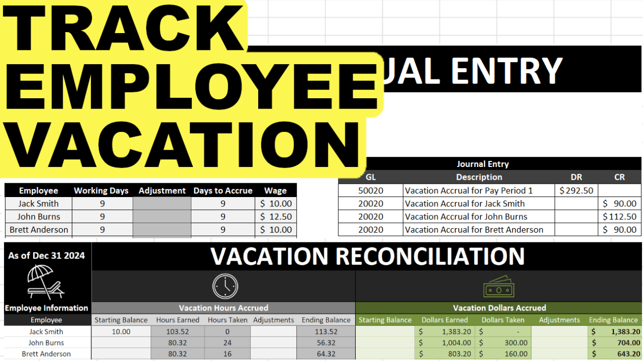
Tracking employee vacation and time-off requests can be a bit of a headache. This template will help track time off as well as how much vacation has been used up and how much is remaining. It also helps to prepare your recurring journal entries to expense vacation.
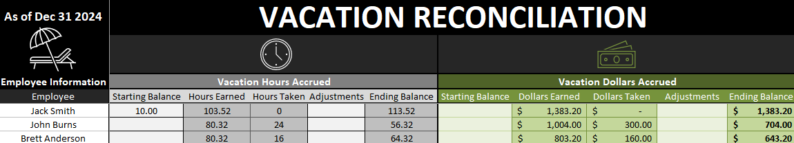
This template will help you track and reconcile vacation liability owed to employees. It will calculate this both in hours accrued and taken, and in dollar values if you need to as well.
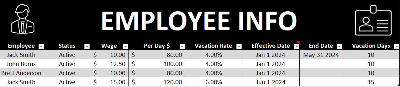
The first tab is the EmployeeInfo tab which is where you will need to enter your employee information. The Per Day $ and Vacation Rate fields are automatically calculated. Everything else, you’ll need to enter in. In the below example I’ve filled in some sample employee information:
You can replace the data in the table and you can also add rows by just typing the employee name in the next blank row in column A and the table will automatically re-size.
If you do not want to track dollars accrued then you can simply leave the wage field blank. This template will allow you to track vacation dollars and hours even if there are wage or vacation rate changes. In the above example, Jack Smith had a wage of $10 from January 1 until May 31. And from June 1st his wage changed to $15 and vacation rate increased from 4% to 6%. I’ll go over this calculation later in this post to show you that it has calculated properly in the reconciliation tab.
If there are no rate changes you can leave the end date field blank. You only need to use the end date field if the employee has a change in vacation days or wages, or is no longer with the company. In the latter case you will also want to set their status to Inactive. Doing so will exclude them from the JE tab and calculation.
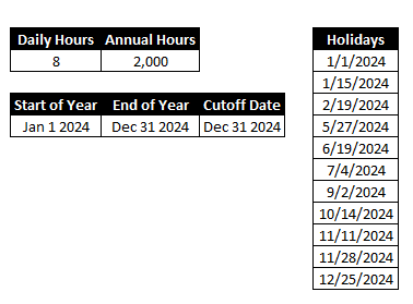
The next section is to ensure the calculation is done correctly and the right percentages are used – daily hours will likely stay as 8 and the annual hours to used in the vacation rate calculation. So if you are paying an employee 4% vacation that is equivalent to 10 vacation days based on 2,000 hours.
Also on this tab is a section to enter the holidays for the year, and this is to ensure that the vacation calculation ignores these non-working days.
The cutoff date is up to what date you want to reconcile to. So if you wanted to know what the vacation liability looks like at the end of the year you would set it to Dec 31, as I have below.
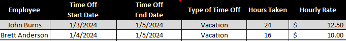
The next tab is the TimeOff tab. This is where you can select when the employee took vacation, and I added an option for sick as well in case you wanted to track that as well.
In the above example, John Burns is away January 3rd, 4th, and 5th, so I enter the 3rd as the start date, and the 5th as the end date. The next business day would be the day he is back at work. The hours taken reflects the average daily hours from the previous tab. The wage information also comes from that tab.
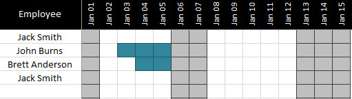
On the Calendar tab you will see a year-long calendar off the time off. This isn’t part of the vacation calculation but allows you to visually track vacation and sick time taken.
You see above that the days for January 3,4, and 5 are highlighted for John Burns to indicate he took vacation on these days. Sick days will show in a different colour. Weekends and holidays are also filled in with light grey. This would be more of a scheduling tool when you are dealing with many employees and wanted to minimize time off conflicts and overlaps.
The Reconciliation tab shows a summary of all of the time earned and vacation time taken off.
You can enter a starting balance if you carry forward vacation from the previous year, and adjustments for any items not captured in the hours earned or time off taken (e.g. vacation pay out). The other cells are formulas and should not be modified.
Verifying the Vacation Reconciliation Calculations
I will refer to my example above where Jack Smith had a change in wage and vacation rate. His wage won’t affect this calculation but his vacation rate will.
From January 1 to May 31 he will accrue at a rate of 4%. Since he works 8 hours a day x 106 working days which fall within this range once holidays are factored in, that is a total of 848 working hours. 4% of this total is 33.92 vacation hours.
The second range is from June 1 until the end of the year (you can adjust the cut-off date in the EmployeeInfo tab). During this range there are 145 working days x 8 hours for a total of 1,160 total hours worked. At his new rate of 6% this is 69.60.
If I total 33.92and 69.60 that gives me 103.52 hours earned which is what the reconciliation shows.
If you track dollars there is a separate section for the dollars accrued which works in the same way.
Again, going back to my example earlier, Jack Smith had a $10 wage from January 1 to May 31st at a 4% vacation rate. If I multiply 106 working days by his daily pay (daily hours of 8 x wage of $10 = $80 per day) then I arrive at 106 x 80 = $8,480. And 4% of this is $339.20.
Now from June 1st to Dec 31st that is 145 working days x his new daily rate of $120 ($15 wage x 8 daily hours) is a total wage of 17,400. And 6% of 17,400 is $1,044.00.
If I add the two amounts together, I get $1,383.20 (1,044.00 + 339.20). As you see this equals the dollars earned for Jack Smith.
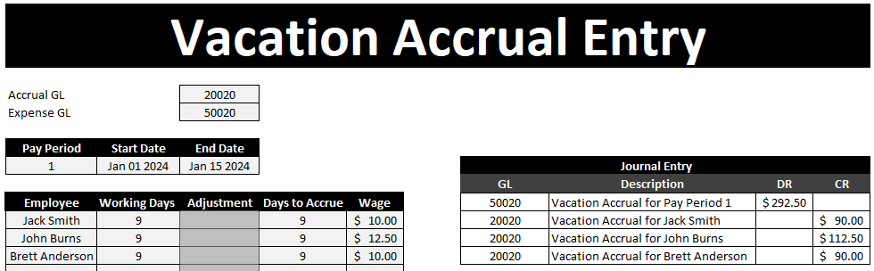
Vacation Accrual Journal Entry
The last tab is the JE tab which is used to generate your vacation accrual journal entry.
You will need to specify the GL accounts, pay period, start, and end dates. There is also a space where you can put an adjustment for an employee. For instance, your accrual might be for a two week period but if someone was terminated or shouldn’t have accrued for any period of time here is where you can make the adjustment.
The employees listed as active will show up in this list as well as their wage during the dates you enter – as long as you don’t have rate changes that occur in the middle of a pay period there should be no issues here.
Please note this spreadsheet should be used to help reconcile to your payroll provider’s data to ensure accuracy and completeness. Do not use this spreadsheet alone in determining your vacation liabilities as I do not offer any guarantees as to its accuracy.
Download the Vacation Accrual Template
Free version: Download Here. The free version is limited to 4 spots for employees on the EmployeeInfo tab and the sheets are locked and there is an ad in the Excel ribbon.
For the full version (no ads, locks, or limits to # of employees) click on the following button:
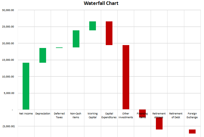
This is a chart that is useful in reviewing variances and monitoring change from one period to another. Favourable (positive) variances are green, and unfavourable (negative) variances are red. In this example I used a statement of cash flow. Increases or inflows in cash are favourable, while decreases or outflows of cash are unfavourable.
On the data tab all that is required is the change column (B), and the remaining formulas can stay intact.
If you were to track the changes in an income statement, you want to be careful to make sure favourable changes are positive and unfavourable ones negative. For example, if sales are up 100,000, that should be favourable since it has a positive impact on net income. However if expenses are up 100,000 that is unfavourable since it has a negative impact on net income, so although it is technically an increase, the change should be negative. This is where the cumulative change column is helpful because it shows you the running balance, and the ending figure in that column is what you are reconciling to. If that number is not correct then you know somewhere a sign is wrong or an amount is missing.
The remaining columns (D:H) simply have to do with the appearance of the chart. Columns D:E are positive changes, G:H are negative, and F represents the amount that is not visible or blank. The purpose for the blank values is what allows the waterfall chart to create the effect of starting from the last position and just showing the change in the cumulative value.
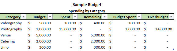
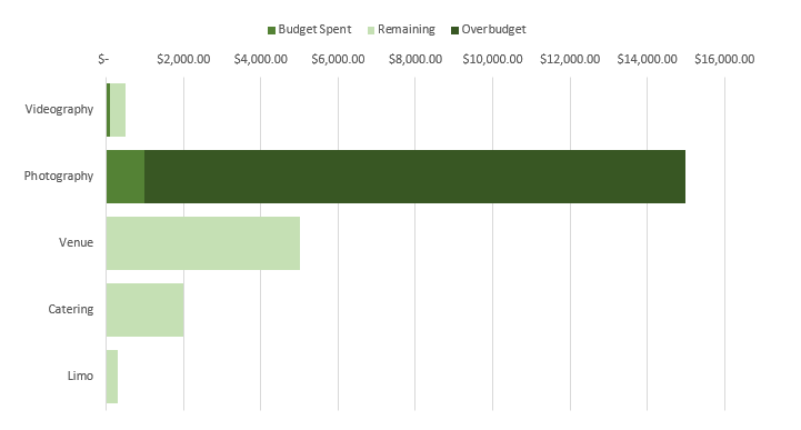
The project budget template is designed to help track expenses that you do not need to compare against multiple time periods. That being said you could copy the template and create a separate instance for each period you want to cover. This template does not use macros so does not requiring enabling content.
The budget categories can easily be added by just entering a new category in the space below and the formulas will autofill and the chart adjust to contain the new category. To remove a category you can delete the cells and adjust the table by pulling on the corner in the bottom right section of the table (in the overbudget column). This will re-size the data to ensure the chart is not pulling up blank values and making the chart show blank values.
See above for the sample categories, and the chart below summarizes the data visually to show how much of a budget remains, how much has been spent, and how much is overbudget.
The RANK() function in Excel is limited to a single range and if you do not have a set of unique numbers to use the rank function on it will return repeating values.
There is a workaround however. If you can afford an extra column for a ‘rank total’ then it will be easy to accommodate. Or you can use an array formula.
The easiest example in creating a rank total column is to look at standings in sports:
Team
W
Points
GF
GA
Goal Differential
Team A
5
15
20
5
15
Team B
4
12
19
18
1
Team C
6
12
12
7
5
Team D
4
11
17
15
2
In this scenario I’m going to say the rank order will first be by points, the first tiebreaker will be wins, followed by goal differential. My rank total formula will be as follows: Points + wins/100 + goal differential/10,000. I’ve broken out how the values look and after totaling them:
Team
W
Points
GF
GA
Goal Differential
Win Value
Differential Value
Rank Total
Team A
5
15
20
5
15
0.05
0.0015
15.0515
Team B
4
12
19
18
1
0.04
0.0001
12.0401
Team C
4
12
12
7
5
0.04
0.0005
12.0405
Team D
4
11
17
15
2
0.04
0.0002
11.0402
For Team A, their rank total is made up of 15 (points), .05 (wins) and .0015 for goal differential. If the factor for goal differential was only 1,000, then goal differential adds 0.015 and now it affects the decimal position for wins and has the same effect as a sixth win, which is wrong. So you want to choose your factors carefully so as not to effect the higher ranking tiebreaker. If goal differential was only ever single digits then you could have used a denominator of 1,000 instead of 10,000.
The result of this rank total tells me Team C should be ranked higher than Team B because both teams have the same points, same wins, but Team C has the higher goal differential.
Now what you can do to pull the ranks is use the following formula:
RANK(ranktotalvalue, ranktotalcolumn)
Or if you want to put the name of the teams in order of their rank rather than just saying Team A is in position 1, then you can use the index and match functions as follows. Assume the Team column is column A and the rank total is column I:
=INDEX(A:A, MATCH(LARGE(I:I,ROW(A1)),I:I,0))
Let’s break down this formula:
=INDEX(A:A
This tells the formula I want to extract the value from column A.
LARGE(I:I,ROW(A1))
This extracts the largest value in column I. The reason I use ROW(A1) instead of the number one is because now if I drag this formula down the relative reference will become ROW(A2), ROW(A3), and ROW(A4) which then looks for the second, third, and fourth largest values respectively.
MATCH(LARGE(I:I,ROW(A1)),I:I,0)
This formula looks for where the value matches the result of the large formula calculation. Where that match is made, the related value from column A is returned. And the following list is generated:
Team A
Team C
Team B
Team D
This correctly puts Team C ahead of Team B in the rankings.
WHAT IF I DON’T HAVE ANY TIEBREAKERS?
If you do not have any tiebreakers then what you can do is pull them in the order that they appear. If you want them to be in ascending or descending order, then you will first need to sort the data in such a way.
In this case, you can calculate your rank total using a value for the row the values are on. The formula for the ‘row value’ would be calculated as follows: 1/(ROW()*100). The fraction is used to make sure the rows higher up will appear first. I multiple the denominator by 100 to push it further down the decimal location. Below is how my rank totals now look:
Team
W
Points
GF
GA
Goal Differential
Row Value
Rank Total
Team A
5
10
20
5
15
0.005
10.005
Team B
4
12
19
18
1
0.003333333
12.00333333
Team C
4
12
12
7
5
0.0025
12.0025
Team D
4
11
17
15
2
0.002
11.002
I changed Team A’s point total to 10 for the sake of this example. Now the top two ranked teams (B and C) both have 12 points. Because B is in a higher row and thus shows up before C, it has a higher row value which in turn gives it a higher total rank value. So the correct order now is Team B, Team C, Team D, and Team A.
THE FORMULA METHOD
Now if you don’t have the luxury to put an extra column in your worksheet, you can certainly do this in a formula, although it won’t be pretty. Essentially you’ll recalculate the rank total and search through the values using an array formula.
To recalculate the rank for the non-tiebreaker method:
The INDEX formula again looks at the Team column while looking for the largest value when adding the points value to the row value. The calculation for the row value is the same as above just now dumped into a formula. An array formula has to be used to ensure each team’s results are looked at individually.
For the multiple tiebreaker scenario from above, the formula will be longer to accommodate for all the extra tiebreakers it has to look at:
Again, same logic and formulas are involved except without a rank total column it has to be done in an array. The results yield the same order as through adding an extra column.