15ExcelAccounting

15 Excel Functions Accountants Should Know

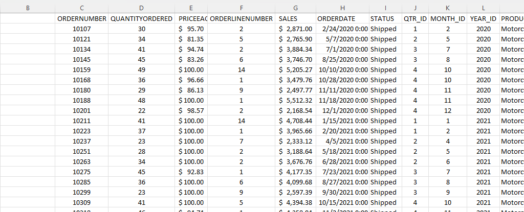
If you’re an accountant, you know that working with large amounts of data can be a daunting task. But with Excel, that work can get a whole lot easier and more efficient. Understanding Excel’s advanced features and functions can improve productivity, reduce errors, make your work more accurate, and most importantly — save you time. Below, I’ll go over some of the most important Excel functions that accountants should know, and provide examples of how to use them. For this example, I’ll use the following spreadsheet. Feel free to download it and follow along with the calculations.
1. SUM

The SUM function is a basic but essential function in Excel. It allows you to add up a range of values, which is helpful when calculating totals, such as revenue, expenses, and profits. Suppose you have a spreadsheet with sales data. In the above example, the total sales are in column G. If you wanted to sum up the entire column, the formula would be as follows: =SUM(G:G)

2. AVERAGE

The AVERAGE function calculates the average of a range of values. It is useful when analyzing data and preparing financial statements. In the above example, suppose you wanted to calculate what the average sale was. To do this, you can just use the AVERAGE function on column G, similar to the SUM function before. Here’s the formula: =AVERAGE(G:G)

3. IF

The IF function allows you to test a condition and return one value if the condition is true and another value if the condition is false. This can be useful because it can send your formulas to the next level. By knowing to use the IF function, you could also use SUMIF, AVERAGEIF, and many other functions that involve an if statement. In the above example, let’s say you only wanted to know if a value in cell M2 was part of the Motorcycles product line. The formula would be as follows: =IF(M2=”Motorcycles”,1,2). If it is part of Motorcycles, you would have a value of 1, otherwise, it would be 2.

4. SUMIF

By knowing the SUM and IF functions, you can combine them together with SUMIF, which is an incredibly popular function. It gives you a quick way to tally up the totals that meet a criteria. For example, let’s say you want all sales that relate to the Motorcycles category. The formula for that would be as follows: =SUMIF(M:M,”Motorcycles”,G:G). If the criteria is met in column M, then the formula will sum up the corresponding values in column G. There’s also the super-powered SUMIFS function, which allows you to combine multiple criteria.

5. EOMONTH

The EOMONTH function calculates the last day of the month for a specified number of months in the future or past. It is useful when working with data that is organized by date. For accountants, this can be useful when you’re calculating when something is due. Let’s say in this example, we need to calculate the date orders need to go out on, and that needs to be the end of the next month. Using the ORDERDATE field in column H, here’s how that calculation would look in the first cell, which would then be copied down for the rest: =EOMONTH(H2,1)

6. TODAY

The TODAY function is helpful for accountants in calculating deadlines and knowing how many days are remaining or past a certain date. Suppose that you wanted to know how many days have past since the ORDER DUE DATE that was calculated in the previous example. Rather than entering in a static date that every day you would need to change, you can just use the TODAY function. Here’s how a formula calculating the days since the deadline for the first cell would look like, assuming the due date is in column N: =TODAY()-N2. The next day you open up the workbook, the calculations will update to reflect the current date; there’s no need to make any changes. There are many more date calculations you can do in Excel.

7. FV

The FV function calculates the future value of an investment based on a fixed interest rate and a regular payment schedule. You can use it to calculate the future value of an investment or savings account. Let’s say that you wanted to save $10,000 per year and expect to earn a return of 5% per year on that investment. Using the FV calculation, you can do that with the following formula: =FV(0.05,5,-10000). If you don’t enter a negative for the payment amount, the formula will result in a negative value. You can also specify whether payments happen at the beginning of a period (1) or end (0 — this is the default) with the last argument in the function.

8. PV

The PV function lets you do the opposite and work backwards from a future value to the present. Knowing that the calculation in example 7 returns a value of $55,256.31, that can be used in the PV calculation to check our work: =PV(0.05,5,10000,-55256.31). The formula returns a value of 0, which is correct, as there was no starting value in the FV calculation.

9. PMT

The PMT function calculates the periodic payment required to pay off a loan with a fixed interest rate over a specified period. It is helpful when determining the monthly payments required to pay off a loan or mortgage. Let’s take the example of a mortgage payment where you need to pay down $500,000 over the period of 30 years, in monthly payments. At a 5% interest rate, here’s what the payment calculation would be: =PMT(0.05/12,12*30,-500000,0). Here again the ending value needs to be a negative to avoid a negative value in the result. And since the payments are monthly, the periods need to be multiplied by 12 and the interest rate is dividend by 12.

10. VLOOKUP

The VLOOKUP function allows you to search for a value in a table and return a corresponding value from another column in the same row. It’s one of the most common Excel functions because of how useful and easy to use it is. It is helpful when working with large data sets and performing data analysis. Let’s suppose in this example that you want to find the sales related to order number 10318. The formula for that calculation might look like this: =VLOOKUP(10318,C:G,5,FALSE). In a VLOOKUP function, you need to specify the column number you want to extract from, which is what the 5 represents. If you’re using Office 365, you can also use the newer, flashier XLOOKUP function. I put VLOOKUP on this list because it’ll work on older versions of Excel — XLOOKUP won’t.

11. INDEX

The INDEX function allows you to return a value from a data set by specifying the row and column number. It’s also helpful if you just want to return data from a single row or column. For example, the sales column is in column G. If I know the order number is on row 20 (which relates to order number 10318), this formula would do the same job as the VLOOKUP in the previous example: =INDEX(G:G,20,1).

12. MATCH

The MATCH function allows you to find the position of a value within a range of cells. Oftentimes, Excel users deploy a combination of INDEX and MATCH instead of VLOOKUP due to its limitation (e.g. VLOOKUP can’t extract values to the left of the lookup field). In the previous example, you had to specify the row belonging to the order number. But if you didn’t know it, you could use the MATCH function within the INDEX function. The MATCH function would look like this: =MATCH(10318,C:C,0). Placed within an INDEX function, it can replace the argument where in the previous example, we set a value of 20: =INDEX(G:G,MATCH(10318,C:C,0),1). By doing this, you have a more flexible version of the VLOOKUP function. You can also create dynamic formulas using INDEX and MATCH that use lookups for both the column and row.

13. COUNTIF

The COUNTIF function allows you to count the number of cells in a range that meet a specified condition. Let’s count the number of values in the data set that are Motorcycles. To do this, you would enter the following formula: =COUNTIF(M:M,”Motorcycles”).

14. COUNTA

The COUNTA function is similar to the previous function, except it only counts the number of non-empty cells. With no criteria, it is helpful to just the total number of values within a range. To calculate how many cells are in this data set, you can use the following formula: =COUNTA(C:C). If there are no gaps in data, then the result should be the same regardless of which column is used. And when combined with the UNIQUE function, you can have an easy way to count the number of unique values.

15. UNIQUE

The UNIQUE function returns a list of unique values within a range, and it’s a much easier method than the old-school way of extracting unique values. If you wanted to extract all the unique product lines in column M, you would enter the following formula: =UNIQUE(M:M). If, however, you just wanted to count the number of unique values, you could embed it within the COUNTA function as follows: =COUNTA(UNIQUE(M:M)). You can adjust your range if you don’t want to include the header.

This is just a sample of some of the useful Excel functions that accountants can utilize. If you are familiar with them, you’ll put yourself in a great position to improve the efficiency of your workflow and make your spreadsheets easier to use. Plus, you can confidently say that you are highly competent with Excel, which can make your resume more attractive and make you better suited for accounting jobs that require advanced Excel skills — and there are many of them that do!.


If you liked this post on 15 Excel Functions Accountants Should Know, please give this site a like on Facebook and also be sure to check out some of the many templates that we have available for download. You can also follow me on Twitter and YouTube. Also, please consider buying me a coffee if you find my website helpful and would like to support it.

H2EKPIs

How to Create and Track KPIs in Excel Using Donut Charts

A key performance indicator (KPI) is a way to track how well you’re progressing towards a particular goal. Oftentimes, you might have many KPIs that you will want to track. You can create these visuals in Excel using donut charts, and below, I’ll show you how you can also have them change color based on whether you’re on track for hitting your goal or not.

Start by categorizing your results

One thing you should consider doing is to create different groups to categorize your results. For example, suppose a key metric was to ensure operating expenses were no more than $10,000 for the current period. If my actual expenses are at $9,000, I would want the chart to show green and to indicate I’m on track versus if my actuals were over $15,000 and I was way over budget.

I can classify these values based on how close they are to the target amount. Here are three categories I will set up and the rules for them:

On Target: If the actual amount is <= 100% of the target.

Slightly Over: If the actual amount is >100% and <=125%.

Well Over: If the actual amount is >125%.

One field I will also create to help track the progress will be % of Target where I take the actual and divide it by the target. Your rules could vary depending on KPI. With expenses, obviously the goal will be to come in under them whereas with sales the incentive will be to come in higher. So you don’t want to assume that your calculations will always be the same in every situation.

I also created a field called Remainder which will capture the unfilled part of the circle. Think of the top half of a circle adding to 1 and the bottom half to another 1, together they total 2. And for the remainder, I use the a formula that takes the maximum of 0 and 2 – the % of Target amount. The purpose of this is to ensure that the remaining amount isn’t negative and that everything adds up to 2.

By creating these classifications, it will be easier to set up the chart to show different colors based on which category a result falls into. Here’s an example of how this might look on Excel. These categories have been created using IF statements based on the rules noted earlier.

Table categorizing KPIs in Excel.

The key goal of creating these categories is by ensuring no result shows up in more than one place. For Expense 1, it was on target so that’s the only category it falls under. Expense 2 was 20% higher than the target, so it goes into the ‘slightly over’ category. And Expense 3, which was 50% higher, it falls into the ‘well over’ category.

Now that these categories are set up, I can go about and create the actual chart.

Creating the donut chart

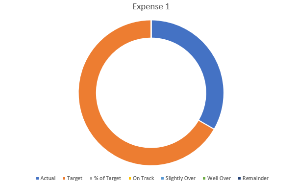
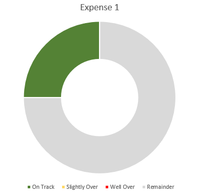
Using the table shown above, I’ll create a donut chart for Expense 1.

Donut chart in Excel.

This includes all the categories I have set up, which isn’t what I want. There are multiple changes I’m going to make to this chart:

  1. Remove the unneeded fields.
  2. Apply different colors for the categories.
  3. Adjusting the chart so it goes from left to right.
  4. Adding some text boxes.

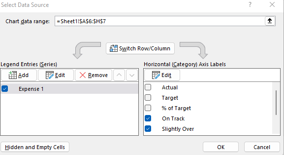
To remove the fields that aren’t needed, I’ll right-click on the chart and click on Select Data. Then, uncheck the first three field:

Selecting the fields to include in an Excel chart.

Next up, I’ll adjust the colors. The easiest way to do this is to click on the different colors in the legend box:

A chart legend showing different colors.

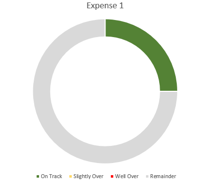
I’ll click on the blue box for ‘On Track’ series and select the color Green from the Home tab for that (note: you’ll first have to select the legend, and then click on the individual series). After setting all the different colors, this is what my chart looks like thus far:

Donut chart with green slice indicating progress.

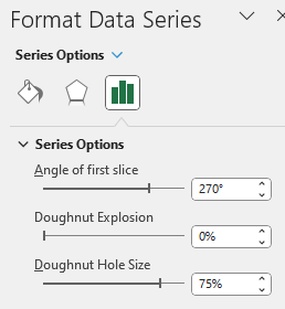
I still need to adjust the starting point of the chart as the green slice starts from the middle, not the left. To fix this, I right-click on the chart and select Format Data Series. Then, I’ll change the angle of the first slice to 270:

The format data series settings for a chart in Excel.

Here you can also change the hole size. The smaller the hole, the larger the slices will be. If I adjust it down to 50%, here’s what my updated chart looks like:

A donut chart that starts from the left and that has a smaller hole size.

At this point, the legend really isn’t necessary anymore since the colors will do the job and I don’t really need the labels.

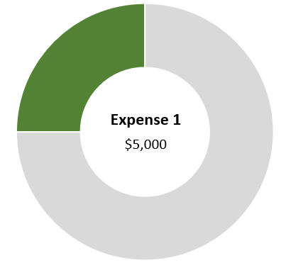
One final step you may want to consider is to use a text box instead of a label. Once you’ve added a text box, you can link it to the name of your metric (this can be done through the formula bar). Repeat the same steps for the Actual, and you can have both the name of the metric and the value to automatically update:

Donut chart with text boxes linking to the description and amount.

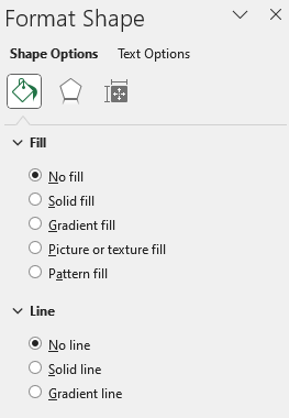
When using textboxes, I always format them to remove the background fill and remove the border. You can do this by right-clicking Format Shape and select No Fill and No Line

The format shape settings in Excel.

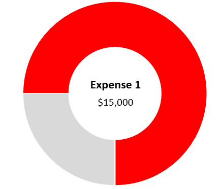
Now if I were to update the Actuals for Expense 1 to $15,000, pushing me into the ‘well over’ category, my chart would automatically update:


If you liked this post on How to Create and Track KPIs in Excel Using Donut Charts, please give this site a like on Facebook and also be sure to check out some of the many templates that we have available for download. You can also follow us on Twitter and YouTube.

H2EParsePowerQuery

How to Parse Data in Excel Using Power Query

In an old post, I went over how to parse data using various different functions. This time around, I’m going to show you how much easier it is do that in Power Query. If you’re not comfortable using LEN or MID functions, then this will make your life a whole lot easier. And to keep things simple, I’m going to use the same data set as I did in the previous post, which you can download from here.

Setting up the query

The first step involves copying the data from the webpage and then just pasting it into cell A1. With no adjustments, my data just contains the raw data:

Raw data download.

The one thing I’m going to do is remove the blank rows just so that Excel recognizes the full data set without having to adjust it. I can remove the blank rows in Power Query, but I’m going to do it at this stage so I don’t need to worry about finding what row number I need the range to go down to. To remove blanks, I will select column A, press F5, special, blanks, and then right-click delete on one of the cells. Now that there are no gaps in my data, I can set up the query.

To do that, I’ll go into the Data tab, and in the Get & Transform Data section, click on the From Sheet button.

Get & Transform section of the Data tab.

Excel should now autodetect the entire range. Click OK and the query will be created:

Data exported into Power Query.

Right now, it looks the same as what it was before, except it’s in the Power Query window. Next, I’ll actually start making the transformations.

Parsing the data using delimiters

Just like in the older post, I am going to set up fields for Country, City, and Population. But this time, you won’t have to fumble around and worry about setting up complex formulas. In the Power Query Editor, I’ll select the Add Column tab. And in there, I’m going to select the Extract drop-down selection and choose Text Before Delimiter:

Extract menu in Power Query.

I’m going to use the colon (:) as the delimiter and then click OK

Setting up the text before delimiter in Power Query.

That nicely parses out the countries:

Applying the text before delimiter for the Country field.

I can double-click on the header where it says Text Before Delimiter and change it say ‘Country’

Next, let’s parse out the City field. I need to make sure that Column1 remains selected. This time, I’m going to select Extract under the Add Column tab and then select Text Between Delimiters. I’m going to set my start delimiter as a colon. And the end delimiter will be the opening bracket:

Setting up the text between delimiters in Power Query.

And after re-naming the field to City, this is why my Power Query Editor looks like:

Power Query Editor after setting up the Country and City fields.

The last column to parse out is the Population. For this, I’m going to follow a similar step as above except I’m going to extract the text within the brackets. But in some instances, there is data within brackets that doesn’t relate to the population. But one consistency is that the population always comes at the end. So in this case, I’m going to use the Advanced options and specify that I want to start searching from the end of the string. I have left the other options the same:

The Advanced options in the Text Between Delimiters section.

Now, my fields look pretty good:

Country, City, and Population fields set up in the Power Query Editor.

The one thing I still need to do is remove the headers for the different letters. Since there is nothing in brackets, I can filter for any blank value in the City field. To do, this, I will click on the drop-down arrow for that field and select the option to Remove Empty:

Removing empty values from the City field.

Now, the data looks good and ready to import back into the worksheet:

City field after removing the blank values.

I technically don’t need that first column anymore. It’s done its job and one of the great things about Power Query is I can delete it, and it won’t impact everything else I’ve done. I’m going to right-click and delete that column so that all I’m left with are the fields I actually need:

Power Query Editor after removing the first column.

All that’s left now is to load the data into the spreadsheet. To do this, click on the Close & Load button in the top-left corner. It will now put that into a new tab by default:

Power Query data loaded back into an Excel sheet.

And just like that, you’ve parsed the data without having to go a painstaking effort of figuring out the correct formulas. But as easy as this was, there is an even easier way of parsing the data out (most of the time).

Parsing the data using examples

I’m going to re-do the previous step, this time taking a different approach, without the use of delimiters. This time, I’m going to the Add Column tab and select the Column From Examples button. This will generate another column on the right-hand-side:

Using Column From Examples in Power Query.

What I’m going to do in Column2 is give Power Query some examples of what I want this field to contain. Since it is the Country field, I’m going to start by typing out a country name. Even after just entering the first one, Power Query has figured out the pattern and does the rest for me:

Column From Example after entering in one value for the Country field.

You’ll notice at the top it has the Text Before Delimiter which is what I used when I did this manually. The less complicated the data, the quicker and easier it will be for Power Query to predict what I’m trying to do.

I’ll repeat the step for the City field. This time when I enter just one value, it hasn’t figured out the rest of the values:

Column From Example after entering in one value.

Instead of La Paz at the bottom of the above screenshot, it only pulls ‘La’ and so what I will do is correct that entry manually. Upon doing that it updates the calculations, but they still aren’t quite right. For Bosnia and Herzegovina, it is including part of the country name:

Column From Example after entering in two values.

I will manually update that value to just enter Sarajevo, and once I do that it now looks correct:

Column From Example after entering in three values.

And if I look at the formula that it has generate, it now is the same as what I did manually with selecting the delimiters:

Column From Examples formula.

The last column, Population, was the most challenging to set up because I needed to use the Advanced settings. Let’s see how well Power Query is able to extract this one using examples. Again, I’ll start with entering in the first value:

Column From Example after entering in one value for the population.

It doesn’t look too bad except for La Paz, it pulls in ‘seat of government’ which is in brackets, as opposed to the population. I’ll manually correct this one, and upon doing so this is what my column looks like:

Column From Example after entering in two values for the population.

Now the problem is the n/a values aren’t picking up correctly. Once I correct them, the column looks to be correct, except for Delhi:

Column From Example after entering in three values for the population.

After making a few more adjustments, the column looks to be correct:

Column From Example after entering in several values for the population.

One of the challenges with doing it this way is if a field isn’t easy to predict for Power Query, it may take some manual entry before it is able to get it just right. And even then, you may not be certain that you’ve accounted for all the possible variations. While this method can make it really easy for simple data parsing, for more advanced ones you will likely want to familiarize yourself with how to use the different Extract options.


If you liked this post on How to Parse Data in Excel Using Power Query, please give this site a like on Facebook and also be sure to check out some of the many templates that we have available for download. You can also follow us on Twitter and YouTube.

H2EStockScreener1

Creating a Stock Screener in Excel

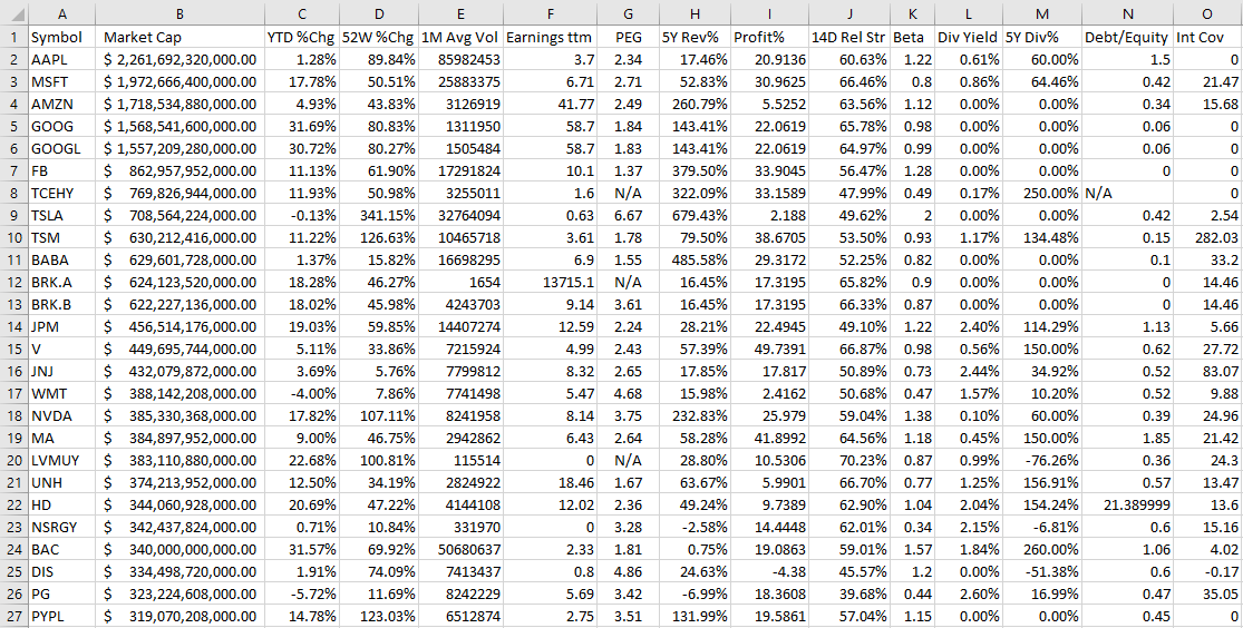
A stock screener allows you to filter through stocks that meet your investment criteria. It can help you find undervalued stocks and great dividend investments. But sometimes it can be cumbersome to always go back to a website and re-apply filters, even if you save them. In this post, I’ll go over how you can populate a list of stock data into Excel and then run your own filters on it, and thus, creating a screener you can easily access from within your own spreadsheet.

Step 1: Populating the list

The one thing you’ll want to do before you can create the screener in Excel is to download an array of stock data from a database. Personally, I like using Barchart because it has lots of useful information on there and you can get a wide range of data, and it is easily downloadable into an Excel format. It lets you do five free downloads each day and you can download 1,000 rows at a time. That’s thousands of stocks you can add. Using that in conjunction with the STOCKHISTORY function, and you can create a pretty versatile template. After all, since data like earnings, dividends, and other fields won’t often change, downloading a snapshot from Barchart once a month or even less frequently shouldn’t be a big issue. You can obviously use other databases but I’m going to use a free example for the purpose of this post.

On Barchart, I’ve customized the fields I want to use for my downloads, and this allows me to re-use them again and make subsequent downloads easier. To keep it simple, I am going to download just the top 1,000 North American stocks based on market cap. This is what my download looks like in Excel:

Stock screener downloaded into Excel.

Now that the data is loaded, the next step is to create the layout.

Step 2: Organizing the stock screener and setting up the fields

I find it most convenient to always put any inputs on a spreadsheet on the top of the page, and the results below. This way, you can freeze panes to make it easy to scroll through all the rows while seeing your selections.

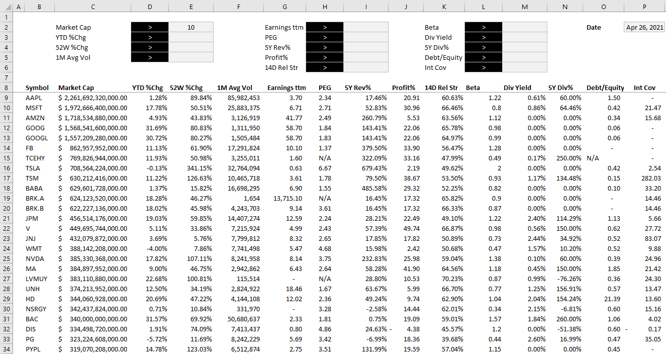
To start, I will create a field for each major field I have downloaded. After formatting some of my values, this is how my screener looks thus far:

Stock screener with input fields.

Off to the right, I’ve added a date field because I am going to utilize Excel’s STOCKHISTORY function to pull in the price. This will allow me to calculate the current price to earnings ratio without having to download it from the screener as that multiple will change every day based on the stock’s price.

When downloading so many stock prices, it may take a while for the formulas to update. But once they are loaded, then I can calculate the P/E ratio by just taking the stock price and dividing it by the earnings per share.

Step 3: Creating the formulas to evaluate the criteria

The part that will take the most time is to now evaluate each of the criteria to determine if a stock meets all of it and whether it should be included in the results. Rather than trying to do this in one large formula, I’m going to break this up into one formula per field. I’m going to name these fields exactly the same so that it is easy to reference them.

For the first criteria, Market Cap, my formula looks as follows:

=IF(E2=””,TRUE,IF(D2=”>”,C9/1000000>E2,C9/1000000<E2))

D2 is where I have the dropdown for the > or < symbol and E2 is the value that I want to filter for market cap. C9 is the first row of data. My goal here is to evaluate to either a TRUE or FALSE value. I also divide the value in C9 by 1,000,000 just to make it easier to filter the market cap by millions.

For the % change calculations, I will do a similar calculation. Except this time I don’t need to divide by 1,000,000 and so it looks a lot simpler:

=IF(E3=””,TRUE,IF(D3=”>”,D9>E3,D9<E3))

D3 is my > or < dropdown while E3 is the percent change I am entering. Since I will enter a percentage here, I don’t need to make any special calculations. This is the same format that I will follow for the other fields.

Once I have set up all my calculations for the various criteria, I’m going to add one column that will check to see if the stock meets all of them. This is a simple formula where I can multiple all the values. A TRUE value will compute as 1 and a FALSE will be 0. And so even if there is one FALSE value, the entire result will return FALSE and not meet the criteria. The formula looks as follows:

=(T9*U9*V9*W9*X9*Y9*Z9*AA9*AB9*AC9*AD9*AE9*AF9*AG9)>0

Step 4: Converting it into a table

The final step is a simple one but it’s also important to make this sheet work smoothly. Select anywhere on the data set and on the Insert tab, click on Table. Hit OK and now you should see Excel’s default table applied to your data.

The reason for converting this into a table is that now we can apply slicers to it. And really, only one is needed here. If you go to the Table Design tab, there is a button to Insert Slicer. Click on it and select the one for the field that checks all the other criteria. In my example, it is called Criteria Met.

After hiding all the criteria fields, changing some of the formatting and adding the slicer, this is now how my screener looks like:

Stock screener after applying a table slicer to it.

The beauty of this stock screener is that by clicking on the TRUE button in the slicer, you are automatically refreshing the data in Excel and updating your filters based on the selections. All this is done without macros and it makes the screener easy to change with the press of a button.

You can download my completed template here. Please note that if you do not have STOCKHISTORY available on your version of Excel, some of the values will not populate.


If you liked this post on creating a stock screener in Excel, please give this site a like on Facebook and also be sure to check out some of the many templates that we have available for download. You can also follow us on Twitter and YouTube.

3D Bubble Chart

How to Make a 3D Bubble Chart in Excel

The bulk of Excel users will likely stick to 2D charts that just have an x and y axis. But if you want to add a third element and give your visuals a bit more context, you can create a 3D bubble chart in Excel. Below, I’ll show you how to do just that.

In the following example, I’m going to compare the average mobile data cost in select countries versus their average speeds. I’ll also include what percentage of their populations are smartphone users. Often you hear about one of these metrics but not all three. This is a good example of how adding in more data can provide more context and a more complete picture.

For instance, Canada has one of the highest costs per GB while India has the lowest. But how does that stack up when you consider speed and how much of the country actually uses a smartphone. Using a 3D bubble chart, I can easily add that extra context.

Setting up the data

I pulled in these numbers from a variety of sources to make this work (there were some gaps that I also had to estimate based on older data) and using a series of vlookup formulas I connected them all together.

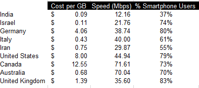
As far as setting up the data for a chart goes, it’s not much different than what I would do for a 2D chart. Enter the headers and then all of the values. Here’s a summary of what the table looks like with all three data points per country:

Cost per gb, speed, and percentage of smartphone users among countries.

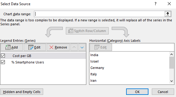
Unfortunately, if I try to just create a 3D chart the way I normally would a 2D chart, I’d get a bit of a mess:

Default 3D bubble chart.

Setting up the chart

As you can see, this initial set up isn’t very intuitive. There’s a bit more manual entry involved when setting up a 3D bubble chart in Excel for the first time. What I’m actually going to do is remove all the default data and delete all these items.

Modifying the data source for a bubble chart.

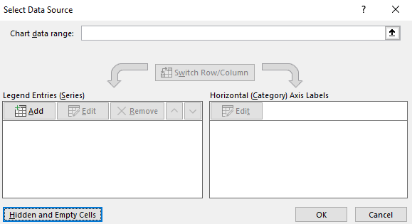
You’ll get the above dialog box if you right-click on the chart and click Select Data. I then click remove from all the Legend Entries until it’s all empty:

Adding data sources for a 3D bubble chart.

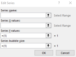
Now, I’ll click on the Add button to add each entry individually to ensure my data’s pulling correctly:

Adding a series.

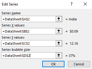
Here’s an example of one that’s filled out:

Adding values for a 3D bubble chart.

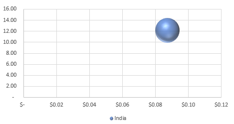
After clicking on OK, then I’ll start to see a bubble chart forming:

One bubble in a 3D chart.

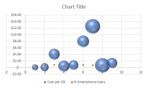
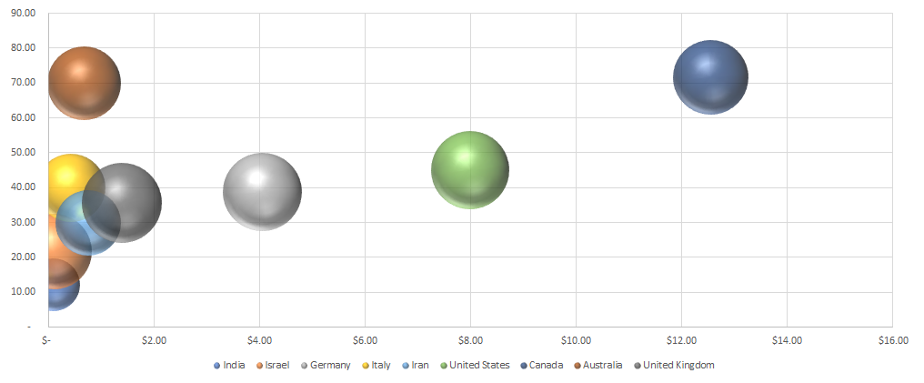
As I repeat and continue adding more items, my bubble chart ends up looking like this:

3D bubble chart showing country average cost per GB, average speed, and percentage of smartphone users.

What the chart tells us

India went from being in the top-right quadrant to the bottom left. This incidates that while it’s low cost per GB, it’s average speed is the slowest of the countries on this list. And its relatively small bubble also tells us that a small fraction of the population uses smartphones compared to the other countries here.

It also confirms Canada’s still the most expensive. Australia offers much cheaper rates while having similar speeds and a similar portion of the population using smartphones.

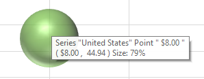
You can easily see the details of each individual bubble. If you hover over any one of these bubbles you’ll now get information showing all the values related to them. Here’s the U.S. one:

Smartphone with one bubble.

It may seem like a painstaking effort to create all the bubbles but once you’ve got it set up you don’t have to repeat these steps. You can change the values and the 3D bubble chart will automatically update. The problem is that Excel doesn’t make it easy to set it up initially. But once you’ve selected which values you want to pull, then it gets easier to update the information and use the format again.

The big advantage of using a bubble chart in Excel is that it provides much more information in just one snapshot than a simple 2D chart would give you. Using a 2D chart, I’d only be able to display two data points for each country. A 3D chart allows me to add even more information into a single chart. And that makes it much more useful to the reader.


If you liked this post on how to create a 3D bubble chart in Excel, please give this site a like on Facebook and also be sure to check out some of the many templates that we have available for download. You can also follow us on Twitter and YouTube.

ArrayFormula1

Use an Excel Array Formula to Do Multiple Calculations at Once

Array formulas can be challenging to understand but they’re worth learning as they can create significant efficiencies for your spreadsheets. Below, I’ll show you how you can do two calculations within a single array formula in Excel.

Using an array to categorize and sum data

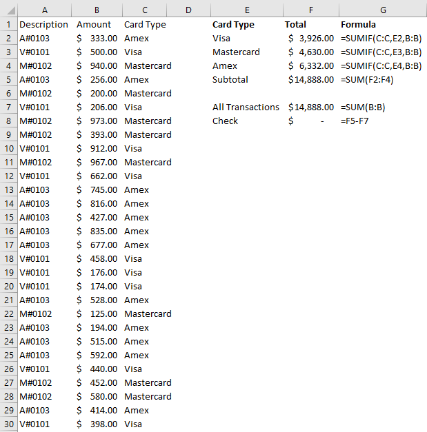
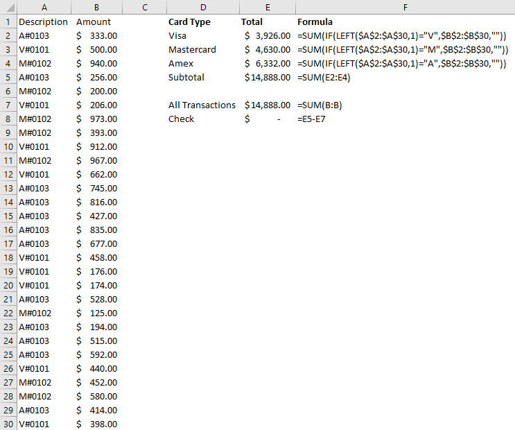
To demonstrate how to do multiple calculations, I’m going to use credit card transactions as an example:

Credit card transactions showing descriptions and amounts.

Suppose in column A you have the first letter indicating whether it’s a Visa, Mastercard, or Amex. The numbers afterward could be authorization codes. And then in column B, you have the total dollar amount of the transaction. Without the use of an array, what you might end up doing is creating another column that would use the description in column A to determine the card type. Then, you could use a SUMIF function to calculate the sales volume by card type. Here’s how that might look:

Summarizing credit card transactions using a SUMIF function.

This is an approach I’d expect most people to use. It’s perfectly fine but if you’re not able to add an extra column or need to make your formula more efficient, that’s where an array can be helpful.

Through the use of an array, you don’t have to create that extra column. You can determine the card type and also sum the data all in one cell. Let’s start by calculating all the Visa transactions.

First, we’ll start by determining the card type — this process would have been the same regardless of whether you’re using an array or a SUMIF calculation. And to do this, we need to use the LEFT function to grab the first letter and determine if it is a ‘V’ to indicate Visa. This is how the formula looks like:

LEFT(A2:A30,1)=”V”

Right now, we can’t really use this on its own, it’ll just return TRUE or FALSE values. What we can do is put this formula inside of an IF function and using it as the first argument:

=IF(LEFT(A2:A30,1)=”V”

In the second IF argument, we’ll want to return the values in case the condition is true, and that V is the first character of the corresponding value in column A. In such a case, we just want to return the values that are in column B:

=IF(LEFT(A2:A30,1)=”V”,B2:B30

And if the value in column A doesn’t start with a V, then, in that case, we just want the value to be blank:

=IF(LEFT(A2:A30,1)=”V”,B2:B30,””)

I use blanks rather than a 0 value because it’s cleaner, and you’ll see why that is when I evaluate the formula further down.

The formula will now return a list of values, ignoring those which don’t start with a V in column A. All that’s left now is to sum those values. To do that, we’ll simply wrap the function above inside the SUM function and freeze the cells:

=SUM(IF(LEFT($A$2:$A$30,1)=”V”,$B$2:$B$30,””))

And here’s the result:

Summarizing credit card transactions through the use of an array formula.

If you’re using an older version of Excel, you may need to use CTRL+SHIFT+ENTER to turn this into an array formula. But on newer versions, it’s no longer necessary. I didn’t need to in my case, and I can show you that it still calculates as an array. If I run the EVALUATE FORMULA button on the Formulas tab, you’ll see that it is evaluating each cell and pulling the first letter from each of the values in column A:

Evaluating the first part of the array formula.

Then it converts that into a series of TRUE or FALSE depending on whether those values are equal to ‘V’:

Evaluating the second part of the array formula.

And then it returns the corresponding values if they are TRUE, and “” if they are FALSE:

Evaluating the third part of the array formula.

Notice how easy it is to separate the numbers out from the blank cells. Had I used zeros rather than blanks, it would be a bit more difficult to discern which were Visa transactions and which were not. Anytime you can hide zero values, your data is always a lot cleaner.

The last step of this formula involves just summing all the values, which gives us our total. This is a much simpler approach than having to create another column for determining the card type. You can also use this with other functions. If we wanted to get the average Visa transaction, we could just sub out the SUM function with the AVERAGE function. Arrays are very powerful and can do some incredible things.


If you liked this post on how to use an Excel array formula to do multiple calculations at once, please give this site a like on Facebook and also be sure to check out some of the many templates that we have available for download. You can also follow us on Twitter and YouTube.

convertsummary

Convert a Summary Table in Excel Into a Pivot Table

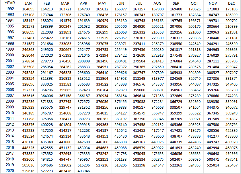
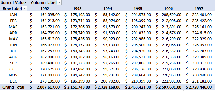
Often times, when you download a data table from somewhere it’s not in the format you need it to be. Tables are often in a summary format where you have months going down and years going across, or vice versa. It’s the end result of what you want a pivot table to look like, but you can’t easily turn that into a pivot table itself. Below, I’ll show you how to turn a summary table in Excel that looks like this:

Summary table.

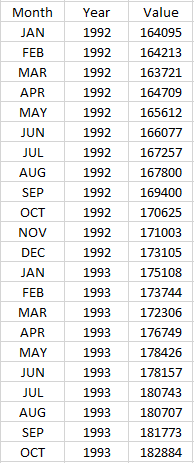
Into this:

Data in tabular format in Excel.

This format is much more Excel-friendly and one that you can easily convert into a pivot table.

Converting the table

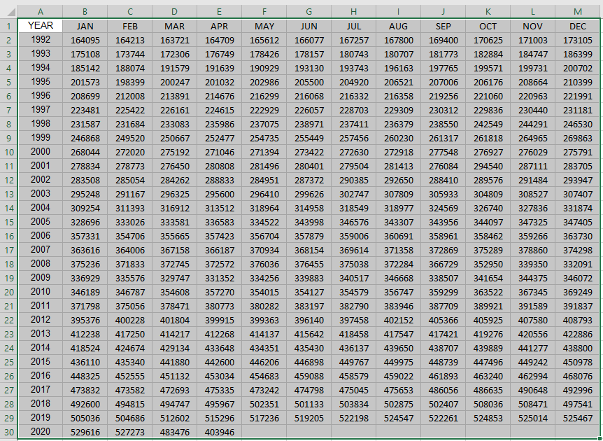
The data I’m using is the same one that I used in an earlier post that went over transposing data. Transposing data, unfortunately, isn’t enough to make data workable if you want to convert it into a pivot table. You’ll want data to be in a tabular format so that there’s a header for the month, year, and value.

You could manually transpose one year at a time and copy the data one by one. But of course, that isn’t optimal at all. The good news is I’ve got a macro that can help you flip that data in one click. It will go through the painstaking process of reorganizing the data for you.

Here’s the code for the macro. You can just put it into a module (I’ll leave a template to download below if you aren’t comfortable doing this step yourself):

Sub flipdata()

Dim cl, nxtcl As Range
Dim lastcol, lastrow, firstcol, firstrow As Integer


'get total number of rows and columns in range
lastcol = Selection.End(xlToRight).Column
lastrow = Selection.End(xlDown).Row

'get first column and row
firstcol = Selection.Column
firstrow = Selection.Row

'assign output starting point
Set nxtcl = Cells(lastrow + 2, firstcol)

nxtcl = "Header 1"
nxtcl.Offset(0, 1) = "Header 2"
nxtcl.Offset(0, 2) = "Value"

Set nxtcl = nxtcl.Offset(1, 0)


'cycle through data

For yr = (firstrow + 1) To lastrow

    For mth = (firstcol + 1) To lastcol

        nxtcl = Cells(firstrow, mth)
        nxtcl.Offset(0, 1) = Cells(yr, firstcol)
        nxtcl.Offset(0, 2) = Cells(yr, mth)
        Set nxtcl = nxtcl.Offset(1, 0)

    Next mth

Next yr

End Sub

It will output the data a couple of rows below where your data ends. It’s important to select the entire range of data before running the macro since it will go through the range that you’ve selected, nothing else. And if there’s data below your selection, it will overwrite that.

After you’ve selected the data, then you run the macro. In my template, I’ve got a button that you can press that will do the job for you and then you’ll get something that looks like this:

Data in tabular form.

Once in this format, you can easily create a pivot table:

Pivot table.

If you’d like to download the file that contains the macro, it’s available here.


If you liked this post on how to convert a summary table in Excel into a pivot table, please give this site a like on Facebook and also be sure to check out some of the many templates that we have available for download. You can also follow us on Twitter and YouTube.

big data excel pivot tables getpivotdata

How to Use GetPivotData

For many users, the GETPIVOTDATA function in Excel is a nuisance and people are often looking for how to turn it off, rather than to actually use it. It can be a bit of a clunky formula, to say the least, but it can be very useful once you’ve learned how to use it effectively, which is what I’ll show you to do in this post.

Using GETPIVOTDATA to extract data using a single criterion

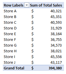
I’ll start with a simple pivot table that just shows stores and sales:

If I select the cell that has the sales for Store A, Excel populates the following formula:

=GETPIVOTDATA(“Total Sales”,$B$4,”Store”,”Store A”)

Let’s break down the different parts of this formula:

“Total Sales” is the first argument, and it is the name of the data field that I’m pulling my numbers from.

$B$4 is where my pivot table is located. However, this specific cell doesn’t matter, as long as the range is somewhere on your pivot table. For example, I could use B5 or B6; as long as the cell is located on the pivot table, the result will remain the same. The cell also doesn’t have to be frozen. However, if the range refers to a cell that isn’t on the pivot table, you’ll get a #REF error.

“Store” is the third argument, and it’s the field that relates where the “Store A” item is found, which is the last argument of the formula.

In essence, the GETPIVOTDATA starts with selecting the field you want to pull data from, the second argument pointing to somewhere on the pivot table, and with the third and fourth arguments relating to the relevant criteria. Think of it similarly to how you might use a SUMIFS function where you first specify what you want to sum, and where you can keep adding criteria to it.

If I only used the first two arguments of the GETPIVOTDATA function, it would return the total for the entire pivot table:

=GETPIVOTDATA(“Total Sales”,$B$4).

This would give me a value of 394,380 – which is the total of everything in the pivot table.

Using multiple criteria in the GETPIVOTDATA function

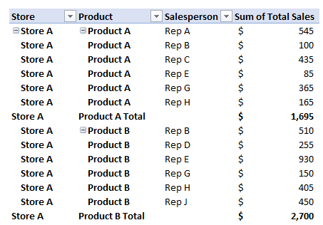
Let’s make this calculation a bit more complex and add both a product field and one for the sales rep as well:

If we want to pull the sales that Rep A had for Product A in Store A, that means we now have three criteria instead of just one. The good news is that all we have to build off the previous formula:

=GETPIVOTDATA(“Total Sales”,$B$4,”Store”,”Store A”)

To follow the pattern, what we’ll want to do is add the field name followed by the item in the field that’s our criteria. That means we need to add the “Product” field followed by “Product A” for the item:

=GETPIVOTDATA(“Total Sales”,$B$4,”Store”,”Store A”,”Product”,”Product A”)

Now, if we want to make it more complex and add Rep A as another filter, then it’s just a matter of adding the “Salesperson” field and “Rep A”:

=GETPIVOTDATA(“Total Sales”,$B$4,”Store”,”Store A”,”Product”,”Product A”, “Salesperson”,”Rep A”)

As you can see, you can add in as many criteria as you like. The key is just making sure that the field names you use match exactly what the fields are called on your pivot table. Otherwise, if the field cannot be found or if it is misspelled, you’ll get a #REF error.

Making the GETPIVOTDATA dynamic

Entering in all these fields is not optimal, and the real value in using GETPIVOTDATA is by being able to make the results dynamic and using variables to do the work for us.

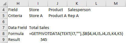
To do this, I’ll set aside cells for both the field names as well as the criteria. Here’s how the new, dynamic formula would look now:

What you’ll notice is the GETPIVOTDATA now has nothing hardcoded that you’d have to change in the formula. Instead, you could change the fields in rows 4 and 5 instead. Let’s breakdown the formula in a bit more detail to see how it works:

=GETPIVOTDATA(TEXT(I7,””),$B$4,I4,I5,J4,J5,K4,K5)

The first argument, TEXT(I7,””), references the Total Sales field in cell I7. The reason I use the TEXT function here is that the value needs to be forced into a text format, and by using “” as the second argument in that function, it will keep everything the same.

The following argument, $B$4 still just has to point to somewhere on the pivot table. Unless you move your pivot table, you won’t need to change this argument.

The following arguments: I4,I5,J4,J5,K4,K5 all relate to the cells that have the field and criteria data. Change the values in those cells and the formula will automatically update, rather than having to fumble around and make changes in the actual formula.

Limitations

There are some important limitations that you should be aware of when using GETPIVOTDATA.

Blank values will cause errors

If in the example above you want to use fewer than three criteria, you’ll have to modify the formula, otherwise, you’ll get a #REF error if you simply clear the variables and make them blank.

Data must be visible

Another important thing to remember: if your pivot field isn’t showing the data, the GETPIVOTDATA won’t be able to use it.

Since I’ve removed the Salesperson field from the pivot table, I can no longer use that as part of the criteria in my GETPIVOTDATA formula, and hence is why there is now a #REF error in my result. Even though it is still in the dataset, GETPIVOTDATA will only be able to extract from information that is visible on your pivot table.

Order is important

The order that the fields show on the pivot table will impact how you can use GETPIVOTDATA. For example, if I have Store, then Product and then Salesperson in my pivot table, I have to take that into account when creating the GETPIVOTDATA formula; I can’t just use GETPIVOTDATA to use criteria from the Store and Salesperson fields and skip over Product. I can, however, pull the totals for Store and Product and then just not include Salesperson, since I’m not following a different hierarchy than what’s shown in the pivot table.

Too many fields will make it difficult to summarize totals at lower levels

The GETPIVOTDATA function can be very particular, especially when it comes to hierarchy. For instance, you won’t be able to total sales by rep for everything in the pivot table if you’ve got the store and product fields shown higher up in the hierarchy; you’ll need to incorporate those fields into your calculation. That means adding all those combinations where the sales rep is found, which isn’t optimal. I can’t just say I want to see the total sales this rep made, forget all the product and store combinations that come above it in the hierarchy. The easiest way would be to simplify the pivot table to remove those fields or make the Salesperson field at the top of the hierarchy, and then it would be possible to do that by just using one criterion.

Why formulas may be a better option

GETPIVOTDATA has its strengths, but as you can see, it also has many weaknesses and limitations. This is where using formulas like SUMIFS can be a lot more useful if you’re comfortable using them. GETPIVOTDATA can be useful for pivot tables that aren’t going to move or change and it could also be a bit quicker than a lookup or other function. If you’ve got a lot of cells that you need to populate, SUMIFS may just end up slowing down your spreadsheet too much, and you may find it easier just having multiple pivot tables with different views instead.

At the end of the day, if you hate GETPIVOTDATA and prefer a simpler approach like just using lookup functions to get your data, this post will show you a simple way to get rid of it when selecting cells on a pivot table.


If you liked this post on How to Use GetPivotData, please give this site a like on Facebook and also be sure to check out some of the many templates that we have available for download. You can also follow us on Twitter and YouTube.

excel-3873854_640

How to Customize the Ribbon in Excel Using XML

If you want to customize the ribbon in Excel then you know simply changing doing it through the front end is only going to work on your computer. The customization isn’t technically saved within the file and it won’t move from one file to another unless you actually adjust the xml.

It’s by no means an easy process, but if you’re just looking to add a custom tab with some buttons for some macros that you have, I can show you a quick way to do that as painlessly as possible. It’s by no means comprehensive, but it’ll get the job done.

Step 1: Open your Excel file in a program like Winzip/7-Zip

If you right-click on your Excel file you should have an option that says Open Archive if you have a program like Winzip or 7-Zip installed. There, you should see something that looks like this:

These are the files and folders that are within the Excel file itself.

Step 2: Create a folder called customUI

Step 3: Open up notepad and paste the following into it:

<customUI xmlns="http://schemas.microsoft.com/office/2006/01/customui">
<ribbon startFromScratch="false">
<tabs>
<tab idMso="TabHome">
<group id="myMacros" label="My Macros">
<button id="Macro1" label="Macro1" imageMso="HappyFace" size="large" onAction="cbMacro1" />
<button id="Macro2" label="Macro2" imageMso="TableDrawTable" size="large" onAction="cbMacro2" />
</group>
</tab>
</tabs>
</ribbon>
</customUI>

What the code will do is add two buttons to the end of the Home tab. I’ll show you how to modify it further down this post.

Save the file as customUI.xml

Step 4: Put the file into the customUI folder that you created in Step 2

Step 5: Back in the archive, navigate to the _rels folder and open the .rels file (in Notepad)

Find this line:
<Relationships xmlns="http://schemas.openxmlformats.org/package/2006/relationships">

and then insert the following right after it:

<Relationship Id="R4863ef4e23f1404c" Type="http://schemas.microsoft.com/office/2006/relationships/ui/extensibility" Target="customUI/customUI.xml"/>

Step 6: Close the archive, save changes and open the file

You should now see the two buttons at the end of the home tab:

The problem is that they don’t do anything just yet. In the code that you copied back in Step 3, there were some callback items (‘CB’) that we need to reference back to inside VBA. Those are effectively a link from when a user presses the button on the ribbon to the macro that you’ve coded.

What you’ll need to do now is go into a module within VBA and enter the following code:

Sub cbMacro1(control As IRibbonControl)
***name of your macro***
End Sub

Sub cbMacro2(control As IRibbonControl)
***name of your macro***
End Sub

In the subprocedures for the two buttons all you need to do is call your macro (in place of the code within the ***), and now the buttons should work.

Modifying the code to add more customization

In Step 3, the code there was for a couple of buttons that you could add to your ribbon. If you want to add more, simply following the sequence you can easily add another button:

<button id="Macro3" label="Macro3" imageMso="Smile" size="large" onAction="cbMacro3" />

The button id doesn’t matter too much itself. The label is what will show up underneath the button. ImageMso is the image that will show up. If you do a google search for ImageMso you’ll find what some of the different codes are.

You can shrink the image down to “small” by changing the size attribute here. Note that some of the ImageMso’s are already small and can’t be made large, but you can shrink large ones down in size.

The most important item when adding a button is the onAction attribute as this is what your callback code needs to reference inside VBA. Obviously the more consistently you name your buttons the easier it’ll be to add more without getting lost in your code.

Adding a new tab

In the above code, I added the buttons to the Home tab. However, if you’ve got more that you want to add then you can put them on an entirely new tab instead.

What you can do then is just change the following:

<tab idMso="TabHome">

into this:

<tab id="MyMacros" label="My Macros">

And now all of your macros will be saved onto a new tab rather than take up space on the Home tab. You can also group your buttons based on the group code as well.

This is a small sample of what you can do to customize the ribbon in Excel. The benefits of making these changes through XML and not within Excel’s interface is that your modifications are stored within the file regardless of what computer you open it on and won’t be lost.

There is another way that you can do this using the CustomUI editor and I’ll include that in a later post.


If you liked this post on How to Customize the Ribbon in Excel Using XML, please give this site a like on Facebook and also be sure to check out some of the many templates that we have available for download. You can also follow us on Twitter and YouTube.

card-1673581_640

How to Parse Data in Excel: DBA Names

If you deal with credit card transactions a lot then you know that trying to get the vendor name out of the descriptions can be challenging to say the least. Companies can sometimes cram a lot of information into their doing business as (DBA) name that can show up on your statement. Information such as store number or even the contact phone number can show up in there. The problem is that when trying parse this data in Excel, it can get a little messy.

However, I’ll show you how you can pull valuable information out of the data just by using a formula. Because there are no rules around DBA names, there’s no way that will work 100% as ultimately it’s up to the company to determine how the data shows up.

Quick side note – I’ve seen some interesting variations when it comes to DBA names, especially on corporate cards when some less-than-savory adult establishments tried to decoy themselves as restaurants. For example, it took some digging when I was examining expense reports to find out that a DBA name of Glenarm Restaurant in Denver was actually a strip club, the Diamond Cabaret. So yes, there’s not even a guarantee that the DBA name will reflect what’s even the name of the company. It’s a clever (and sleazy) way for an establishment to disguise itself as something else, especially say if someone’s spouse were to catch glimpse of their credit card statement…

…And we’re back from commercial break.

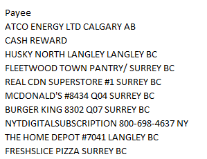
So as you can see from the above example, there’s an inherent limitation when it comes to using DBA names. However, we can still find ways to pull useful data from the majority of names that have at least predictable patterns and honest names in their descriptions. Here are some items from my latest credit card statement:

When it comes to parsing data it’s all about patterns. And there are a few things that stand out from the above list.

  • The vendor name shows up at the beginning of the description.
  • For those that have a store #, anything to the right of it is store and location level data and unnecessary for pulling the vendor name.
  • For those that don’t have a # we can usually just take the first couple of words as in most cases a vendor name won’t go to three words, and at the very least ,two should be enough for us to figure out who the vendor is.

So what we’ll have to do now is to build a formula that accounts for these assumptions to effectively create a formula that will parse it out.

First, let’s create a formula that will pull everything up until the # sign. A good test will be the fast food transactions, which typically have store numbers. To do this I’ll rely on the MID function as well as the FIND function. Here’s how it looks like:

=TRIM(MID(B1,1,FIND(“#”,B1,1)-1))

In the above example, assume that column B is where the data is stored in. Since the name begins in the first position, the second argument is the number 1, and the third argument is up until where the # sign is and that’s the point of the find function. A -1 is deducted to ensure the # sign itself isn’t included. That way, the description will grab everything up to just before the # sign. To clear off any trailing space, we can also the TRIM function to make sure no extra spaces are included in the results.

That takes care of the descriptions that have a # sign, but for the ones that don’t, it’ll result in an error. This is where we’ll want to create another formula to pull the first two words. The formula for that looks like this:

=MID(B1,1,FIND(” “,B1,1+FIND(” “,B1,1))-1)

This is a bit more complicated of a formula because it’s looking for the second space within the string. To do that, I have to the second FIND function picking up where the first one left off at is it starts looking for the blank cell after the first one is found (this is why the starting point is 1+ where the first blank cell is found). For the length of the string, here too we’ll want to add a -1 to the end to make sure that the blank space isn’t picked up.

So now we’ve got two formulas, and the next step is going to be to combine them into one. To do that, I’ll add an IF function to say if there is a # sign found within the text, to use the # sign formula, otherwise to use the two word formula. The IF condition looks like this:

=IF(ISNUMBER(FIND(“#”,B1,1)),1,0)

I will now replace the 1 or true argument with the # formula, and the 0 with the two word formula. And here’s what we’ve got so far:

=TRIM(IF(ISNUMBER(FIND(“#”,B1,1)),MID(B1,1,FIND(“#”,B1,1)-1),MID(B1,1,FIND(” “,B1,1+FIND(” “,B1,1))-1)))

The one change I made was I moved the TRIM function at the beginning of the formula to include all the arguments.

Lastly, I’ll want a catch all just in case I run into a DBA name that has fewer than two spaces in its name and no # signs. To do this, I’ll just use an IFERROR function at the beginning and the default will then be to just use the entire cell’s contents:

=IFERROR(TRIM(IF(ISNUMBER(FIND(“#”,B1,1)),MID(B1,1,FIND(“#”,B1,1)-1),MID(B1,1,FIND(” “,B1,1+FIND(” “,B1,1))-1))),B1)

It’s gotten to be a pretty big formula but this will do a pretty good job of getting the vendor names pretty well. Like I mentioned, it won’t be perfect, but at the very least it’ll do a good job of pulling out most of the vendor information that you need.

In my example, the DBA name was in cell B1, but you can just do a quick find and replace on this formula to adapt to your data set and then just copy the formula as you need it.

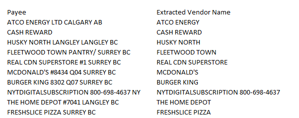
Here’s how my data looked like using this formula:

Looks like a pretty good job by the looks of it. At the very least, the vast majority look to be unique enough in case I wanted to group them.

This is part of an upcoming template that I’m working on to help quickly analyze expenses, and a key part of that is being able to efficiently pull out vendor data from your statement.

If you have any questions, comments or suggestions please let me know.


If you liked this post on How to Parse Data in Excel: DBA Names, please give this site a like on Facebook and also be sure to check out some of the many templates that we have available for download. You can also follow us on Twitter and YouTube.