15ExcelAccounting

15 Excel Functions Accountants Should Know

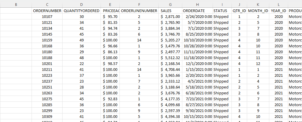
If you’re an accountant, you know that working with large amounts of data can be a daunting task. But with Excel, that work can get a whole lot easier and more efficient. Understanding Excel’s advanced features and functions can improve productivity, reduce errors, make your work more accurate, and most importantly — save you time. Below, I’ll go over some of the most important Excel functions that accountants should know, and provide examples of how to use them. For this example, I’ll use the following spreadsheet. Feel free to download it and follow along with the calculations.

1. SUM

The SUM function is a basic but essential function in Excel. It allows you to add up a range of values, which is helpful when calculating totals, such as revenue, expenses, and profits. Suppose you have a spreadsheet with sales data. In the above example, the total sales are in column G. If you wanted to sum up the entire column, the formula would be as follows: =SUM(G:G)

2. AVERAGE

The AVERAGE function calculates the average of a range of values. It is useful when analyzing data and preparing financial statements. In the above example, suppose you wanted to calculate what the average sale was. To do this, you can just use the AVERAGE function on column G, similar to the SUM function before. Here’s the formula: =AVERAGE(G:G)

3. IF

The IF function allows you to test a condition and return one value if the condition is true and another value if the condition is false. This can be useful because it can send your formulas to the next level. By knowing to use the IF function, you could also use SUMIF, AVERAGEIF, and many other functions that involve an if statement. In the above example, let’s say you only wanted to know if a value in cell M2 was part of the Motorcycles product line. The formula would be as follows: =IF(M2=”Motorcycles”,1,2). If it is part of Motorcycles, you would have a value of 1, otherwise, it would be 2.

4. SUMIF

By knowing the SUM and IF functions, you can combine them together with SUMIF, which is an incredibly popular function. It gives you a quick way to tally up the totals that meet a criteria. For example, let’s say you want all sales that relate to the Motorcycles category. The formula for that would be as follows: =SUMIF(M:M,”Motorcycles”,G:G). If the criteria is met in column M, then the formula will sum up the corresponding values in column G. There’s also the super-powered SUMIFS function, which allows you to combine multiple criteria.
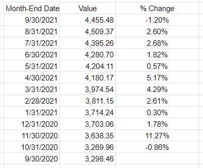
5. EOMONTH

The EOMONTH function calculates the last day of the month for a specified number of months in the future or past. It is useful when working with data that is organized by date. For accountants, this can be useful when you’re calculating when something is due. Let’s say in this example, we need to calculate the date orders need to go out on, and that needs to be the end of the next month. Using the ORDERDATE field in column H, here’s how that calculation would look in the first cell, which would then be copied down for the rest: =EOMONTH(H2,1)

6. TODAY

The TODAY function is helpful for accountants in calculating deadlines and knowing how many days are remaining or past a certain date. Suppose that you wanted to know how many days have past since the ORDER DUE DATE that was calculated in the previous example. Rather than entering in a static date that every day you would need to change, you can just use the TODAY function. Here’s how a formula calculating the days since the deadline for the first cell would look like, assuming the due date is in column N: =TODAY()-N2. The next day you open up the workbook, the calculations will update to reflect the current date; there’s no need to make any changes. There are many more date calculations you can do in Excel.

7. FV

The FV function calculates the future value of an investment based on a fixed interest rate and a regular payment schedule. You can use it to calculate the future value of an investment or savings account. Let’s say that you wanted to save $10,000 per year and expect to earn a return of 5% per year on that investment. Using the FV calculation, you can do that with the following formula: =FV(0.05,5,-10000). If you don’t enter a negative for the payment amount, the formula will result in a negative value. You can also specify whether payments happen at the beginning of a period (1) or end (0 — this is the default) with the last argument in the function.

8. PV

The PV function lets you do the opposite and work backwards from a future value to the present. Knowing that the calculation in example 7 returns a value of $55,256.31, that can be used in the PV calculation to check our work: =PV(0.05,5,10000,-55256.31). The formula returns a value of 0, which is correct, as there was no starting value in the FV calculation.

9. PMT

The PMT function calculates the periodic payment required to pay off a loan with a fixed interest rate over a specified period. It is helpful when determining the monthly payments required to pay off a loan or mortgage. Let’s take the example of a mortgage payment where you need to pay down $500,000 over the period of 30 years, in monthly payments. At a 5% interest rate, here’s what the payment calculation would be: =PMT(0.05/12,12*30,-500000,0). Here again the ending value needs to be a negative to avoid a negative value in the result. And since the payments are monthly, the periods need to be multiplied by 12 and the interest rate is dividend by 12.
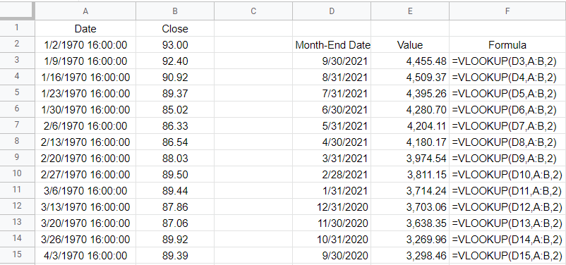
10. VLOOKUP

The VLOOKUP function allows you to search for a value in a table and return a corresponding value from another column in the same row. It’s one of the most common Excel functions because of how useful and easy to use it is. It is helpful when working with large data sets and performing data analysis. Let’s suppose in this example that you want to find the sales related to order number 10318. The formula for that calculation might look like this: =VLOOKUP(10318,C:G,5,FALSE). In a VLOOKUP function, you need to specify the column number you want to extract from, which is what the 5 represents. If you’re using Office 365, you can also use the newer, flashier XLOOKUP function. I put VLOOKUP on this list because it’ll work on older versions of Excel — XLOOKUP won’t.

11. INDEX

The INDEX function allows you to return a value from a data set by specifying the row and column number. It’s also helpful if you just want to return data from a single row or column. For example, the sales column is in column G. If I know the order number is on row 20 (which relates to order number 10318), this formula would do the same job as the VLOOKUP in the previous example: =INDEX(G:G,20,1).

12. MATCH

The MATCH function allows you to find the position of a value within a range of cells. Oftentimes, Excel users deploy a combination of INDEX and MATCH instead of VLOOKUP due to its limitation (e.g. VLOOKUP can’t extract values to the left of the lookup field). In the previous example, you had to specify the row belonging to the order number. But if you didn’t know it, you could use the MATCH function within the INDEX function. The MATCH function would look like this: =MATCH(10318,C:C,0). Placed within an INDEX function, it can replace the argument where in the previous example, we set a value of 20: =INDEX(G:G,MATCH(10318,C:C,0),1). By doing this, you have a more flexible version of the VLOOKUP function. You can also create dynamic formulas using INDEX and MATCH that use lookups for both the column and row.

13. COUNTIF

The COUNTIF function allows you to count the number of cells in a range that meet a specified condition. Let’s count the number of values in the data set that are Motorcycles. To do this, you would enter the following formula: =COUNTIF(M:M,”Motorcycles”).

14. COUNTA

The COUNTA function is similar to the previous function, except it only counts the number of non-empty cells. With no criteria, it is helpful to just the total number of values within a range. To calculate how many cells are in this data set, you can use the following formula: =COUNTA(C:C). If there are no gaps in data, then the result should be the same regardless of which column is used. And when combined with the UNIQUE function, you can have an easy way to count the number of unique values.

15. UNIQUE

The UNIQUE function returns a list of unique values within a range, and it’s a much easier method than the old-school way of extracting unique values. If you wanted to extract all the unique product lines in column M, you would enter the following formula: =UNIQUE(M:M). If, however, you just wanted to count the number of unique values, you could embed it within the COUNTA function as follows: =COUNTA(UNIQUE(M:M)). You can adjust your range if you don’t want to include the header.

This is just a sample of some of the useful Excel functions that accountants can utilize. If you are familiar with them, you’ll put yourself in a great position to improve the efficiency of your workflow and make your spreadsheets easier to use. Plus, you can confidently say that you are highly competent with Excel, which can make your resume more attractive and make you better suited for accounting jobs that require advanced Excel skills — and there are many of them that do!.


If you liked this post on 15 Excel Functions Accountants Should Know, please give this site a like on Facebook and also be sure to check out some of the many templates that we have available for download. You can also follow me on Twitter and YouTube. Also, please consider buying me a coffee if you find my website helpful and would like to support it.

H2Estockreturns

How to Calculate Stock Returns

In this post, I’ll show you how you can calculate stock returns using Google Sheets. However, you can use a similar approach in Excel by using the STOCKHISTORYFUNCTION.

First thing’s first — let’s pull in the historical data

For this example, I’m going to pull in the S&P 500’s historical values to see how the index has performed both in the past 12 months and over the course of several years.

To do that in Google Sheets, I’m going to use the GOOGLEFINANCE function which allows me to pull in historical prices. To get the values from the S&P 500, the ticker symbol I’m going to use is ‘.INX’ and to get the last year of data, I’m going to set my start date equal to TODAY()-365 and my end date will be TODAY(). Here’s the full formula:

=GOOGLEFINANCE(“.INX”,”price”,today()-365,today())

If you want to go back years, you can go as far back as 1970. For that, it’s easier to just manually enter that using the DATE function:

=GOOGLEFINANCE(“.INX”,”price”,date(1970,1,1),today())

If you don’t want to return 13,000 rows, you can add an argument at the end to set it to ‘Weekly’ prices (the default is daily):

=GOOGLEFINANCE(“.INX”,”price”,date(1970,1,1),today(),”weekly”)

Looking up the correct values

Once you’ve got the data loaded, then what you’ll want to do is enter the dates that you need values for. In this example, I’m going to use the last day of every month. For this, I can use the EOMONTH function. It takes two arguments: the start_date and the number of months. If I want the current month-end date, then I just set the second argument (months) to zero. As for start date, that can just be any date that falls within the month, which I can enclose within a DATE function. Here’s how the formula would look if I want the last day of September 2021:

=EOMONTH(date(2021,9,1),0)

But since I need to adjust this so that I can copy the formula down and have it automatically adjust, I am going to use the ROW function, which will return the current row number. Since I want the values to be increasingly negative as I copy down the formula (e.g. the current month should be 0, the following one -1, then -2, and so on), I will multiply this by a factor of negative 1 and add 1 to the total (to ensure the first value start at zero):

ROW(A1)*-1+1

That replaces the zero value from the earlier formula:

=EOMONTH(date(2021,9,1),ROW(A1)*-1+1)

And now, I can easily copy this formula down and my month-end dates will populate without requiring me to make any manual adjustments along the way:

Ending month dates in Google Sheets.

Next, I’ll do a lookup to get the values. And that’s as simple as a VLOOKUP on my dates, which are in column A with the corresponding values in column B. If you use weekly dates, then be careful not to set the last argument in the VLOOKUP function to false because you’ll end up with errors as the weekly values won’t always fall neatly on the end of the month. Instead, leave the last argument blank or set it to TRUE so that it finds the closest match. Here’s what that looks like:

VLOOKUP formula to pull in prices based on date, in Google Sheets.

All that’s left at this point is to now just calculate the change in value. I can take the new value, divide it by the previous period’s value, and subtract one from it. This will give me a percent change:

Month-over-month percent change in the S&P 500 in Google Sheets.

If I wanted to determine the cumulative % change since my first month-end date, then the old value would always remain the same — it would be the first date in the series. By freezing that cell, I can calculate the cumulative % change:

Cumulative percent change in the S&P 500 in Google Sheets.

If you wanted to pull in the returns by year, you can do the same thing. All that changes is that instead of pulling in the month-end dates you will use the year-end dates. The main difference here is in calculating the different dates. Rather than multiplying by a factor of -1, you’ll need to use -12. And the starting date should be Dec. 1. Here’s how my formula looks like:

=EOMONTH(date(2020,12,1),ROW(A1)*-12+12)

And when I copy that down, it will automatically adjust for each previous year:

Annual percent change in the S&P 500 in Google Sheets.

The one thing you may notice in Google Sheets is that the GOOGLEFINANCE function returns a timestamp for the date. Each day ends at 16:00:00. This can create some unintended results. For example, using the VLOOKUP function, if I use the date 12/31/2020, because it looks for an approximate match, it will actually return the value from 12/30/2020. Unless you add the timestamp, an exact match won’t work. And since a date with no time will by default by 0:00, the lookup of 12/31/2020 16:00:00 won’t be a match. One way to get around this is just to use a different date. Rather than using the EMONTH function, I can just adjust the date by reducing the year by 1. This is the formula I can use if instead I want to get the first day of the year:

=DATE(2021-ROW(A1)+1,1,1)

Using the ROW function again can allow me to automatically adjust the year. Here is the updated table:

Annual percent change in the S&P 500 in Google Sheets.

If you liked this post on Using Tags in Excel, please give this site a like on Facebook and also be sure to check out some of the many templates that we have available for download. You can also follow us on Twitter and YouTube.

H2Etags

How to Use Tags in Excel

Did you know that you can group numbers in Excel using tags? By just listing all the categories an item should belong to, you can make it easier to group them. In this post, I’ll show you how you can use tags in Excel to efficiently summarize different categories.

Creating tags

Suppose you wanted to list all the possible streaming services you might subscribe to. You might have a list that looks something like this:

List of streaming services.

This is fine if you want to compare them or even tally them all up. But what if you wanted to look at different scenarios, such as what if you select some of these services, but not all of them? This is where tags can be really helpful. Let’s say I want to create the following categories:

  • Basic
  • Kids
  • Tier 1
  • Tier 2
  • Tier 3

Each category will have a different mix of services. Here’s how I can use tags to make that happen. I’ll create another column next to the price where I specify all the categories a service will fall under:

Streaming services grouped by tags.

In the above example, Netflix is included in every package but HBO Max is only included in Tier 3. Next, what I’m going to do is create columns for each one of these tags, such as follows:

Streaming services grouped by tags.

Without using tags, you might be tempted to put a checkmark to determine which service belongs in which category. But that’s not necessary here. Instead, I’m going to use a function to determine whether to pull in the price or not.

Using a formula to determine if a tag is found

The key to making this work is the SEARCH function. This will look within the tag values to see if there is a match. If there is, then the price will be populated within the corresponding category. To check if the ‘basic’ keyword is found within the tags related to Netflix (assume this is cell C2), this is how that formula would look:

=SEARCH(“basic”,C2,1)

This will return a value of 1, indicating that the term is found at the very start of the string. If you use the function to look for the word ‘kids’ then it would return a value of 8 as that comes after ‘basic in my example.’ Of key importance here is that there is a number. If there isn’t a number and instead there is an error, that means that the tag wasn’t found. I will adjust the formula as follows to check if there is a number:

=ISNUMBER(SEARCH(“basic”,C2,1))

This will return a value of either TRUE or FALSE. But the formula needs to go further than just identifying if the tag was found. It needs to pull in the corresponding value. To do this, I’ll need an IF statement to extract the value from column B:

=IF(ISNUMBER(SEARCH(“basic”,C2,1)),B2,0)

By freezing the formulas and copying this across the other categories, this formula will now allow me to pull in the amounts correctly based on the tags:

Summary of streaming services based on tags.

But let’s say you don’t even want to do this, you just want to quickly group the totals without these extra columns. You can also do that with the help of tags.

Summarizing the totals by category

You don’t need to create a column for each group if you don’t want to. You summarize the total in just an array formula. Simply use the formula referenced earlier and include it within a SUM function, while referencing the entire range:

=SUM(IF(ISNUMBER(SEARCH(“basic”,C2:C6,1)),B2:B6,0))

This is the same logic as before, except this time the values will be totaled together. On older versions of Excel, you may need to use CTRL+SHIFT+ENTER after entering this formula for it to correctly compute as an array. But if you’re using a newer version, you don’t need to. If you copy the formula to the other categories, you’ll be able to sum the values by without the need for additional columns:

Summary of streaming services based on tags.

If you liked this post on Using Tags in Excel, please give this site a like on Facebook and also be sure to check out some of the many templates that we have available for download. You can also follow us on Twitter and YouTube.

H2EPostDropDowns

Create an Excel Drop Down List Without Blanks

In a previous post, I covered how to create a form in Excel. Although I didn’t go over drop down lists specifically, they are one element you could incorporate into them. The problem is that your list can change over time, getting bigger or smaller. And that can make it difficult to maintain if your list isn’t dynamic as it will involve you always having to manually change the range of your drop down list. Otherwise, it could be incomplete or contain blanks. Below, I’ll show you how you can manually change your drop down list in excel and create it without blanks while also making it dynamic so that you don’t need to worry about whether it changes over time.

Setting up the drop down list

First, let’s start with the basics — creating the list. To create a drop down list in Excel, you just need a series of options to choose from. My list is going to be made up of the top 30 places to visit. I’m just going to put those names in a list.

After entering in the list of places into Excel, the next thing I will do is select all the values, and create a named range. This is as simple as just entering a value next to the formula bar, where you see the cell location. I will call this range VacationSpots:

Named range in Excel containing popular vacation spots.

There is no need to add headers or anything else. Just select the values, enter in a name for the list, and hit enter. A longer approach would be to go to the Formula tab and select Name Manager:

Name Manager in Excel.

Clicking this will show you all of the named ranges in the workbook:

Name manager showing a list of all the named ranges in an Excel workbook.

It shows you the named range I created. However, I could also create one from this screen and also Edit my existing range. This is where you would go to make the change manually. Clicking on the Edit button would give you this screen:

Editing a named range in Excel.

As you can, here I can manually change the address as needed in case the list changes. However, this is obviously not optimal as it can be a tedious process if your list changes frequently.

Creating the drop down

Now that my list has been created, I can set up the actual drop down. To do this, I’m going to select a cell and under the Data tab, click on Data Validation. Here, there is a place to enter your list of values:

Entering in data validation in Excel.

Under the Allow section, I choose List. And for the Source, I enter the ‘=’ sign followed by my named range, VacationSpots. Now, when I click OK and go to the cell that contains the data validation, this is what I see when I select it:

Cell showing a drop down arrow.

Clicking on the drop down arrow will show me my list of options, in the same order that they appear in my list:

Selecting from a list of drop down options in Excel.

I can select any of the values and my cell will update accordingly. This is great, but what if I decided to add more items to my list, perhaps 10 or 20 more locations I want to visit? Next, I’ll go the different ways you can create drop down lists in Excel without blanks.

Option 1: Create extra spaces in your drop down list at the very end

Technically this step involves blank spaces, which is not what this post is supposed to be about. However, I just wanted to show you how this could work. If your list has dozens of items, then having extra blanks may not be that big of a deal. For example, say I edit my named range so that it goes to 50 rows. If you do that and include empty cells, this is the biggest problem you’ll face:

Empty values in a drop down list.

My list no longer starts from the top, it goes to the first blank cell. This can be an annoying problem because now it looks like all of my options aren’t there (they are, but I have to scroll up every time). This is probably the main reason people want to avoid having blank values in their lists. If the blank values simply came after all of your selections, that might be more tolerable. But because they impact where your drop down list begins from, it can be a nuisance.

The good news is there is a simple way to get around this. For all your empty cells, enter just a single empty character. Select a cell, hit the space bar, get out of the cell, and copy that value down. Now, your empty cells technically aren’t empty because they contain a space. And by doing so, the drop down list now starts from the top again. You will still have blank values, but this time they will show at the bottom of your drop down list:

Drop down list with blanks at the bottom.

If this is acceptable then you can stop here. If you are still intent on getting rid of any possible blank value whatsoever, then head over to the next option.

Option 2: Creating a table to create a nonblank list

This option is the easiest method for getting rid of blank values. What you need to do here is convert your list into a table. Select a cell on your list, click on the Insert tab and then click Table:

Creating a table in Excel.

Leave the option for headers unchecked and then click OK. You should see something like this:

Newly created table in Excel.

By default, Excel will apply its formatting and design but you can change the look of it to make it blend in more with your spreadsheet. You can also re-name the header from Column1. Either way, you can now create a new drop down list from this table. Since the values are in range A2:A31 in my spreadsheet, that is what I will enter for my new Data Validation list:

Data validation list in Excel.

You can either select the range, or enter it in yourself. But if you enter it, you need to include the $ signs otherwise it will not auto-update properly. Now, I’ll go to my list add ‘New City’ to the bottom of the table. When I do that, the table automatically expands which you can notice because I haven’t changed the design and so the colors change:

Table in Excel after adding a new value.

And if I go back to the Data Validation settings, my source has automatically been updated:

Data validation list in Excel updated.

This is a really easy way to make your drop-down list automatically update without the need for any formulas.

If the table you are referencing isn’t on the same sheet as your drop-down list, then you will need to use the INDIRECT function reference it. For instance, if you have created a table called Table1 (which should contain just one column for your list) on a different sheet, you can reference it the following way:

This will allow you to reference the list even if it is on a different sheet.

Option 3: Using a formula to remove the blanks in your drop down list

If for whatever reason creating a table isn’t an option for you, you can still create a dynamic list using a formula. Here, I’ll go back to creating a named range. Except rather than selecting a fixed set of cells, I will rely on a single formula. First, I’ll go back to the Name Manger. I’ll create a new named range. The formula for this can look a bit complex so I will break it down into parts.

First, I’m going to use the OFFSET function. This is because it can allow me to specify a height and width, which is crucial to making this work. My data starts in cell A1, and that’s where my formula will begin:

=OFFSET(A1,0,0

A1 is my starting point and that is the first argument. The next two arguments are whether I want to offset and move to any adjacent rows or columns. Since I don’t, I leave those values as zeros. It is the next argument that is critical, as it relates to the height. Here is where I will use a COUNTA function. I want to count the number of nonblank values in my list. My formula looks as follows:

=COUNTA(A:A)

I will embed this within my previous formula:

=OFFSET(A1,0,0,COUNTA(A:A)

For the width, I will set the last argument to 1, since I don’t want to include any extra columns. Here is my completed formula:

Named range in Excel using the Offset function.

You always want to used $ signs in named ranges so that they don’t move on you. Now that this is set up, I can use this NewRange as my Data Validation source. And just like with a table, whether the list gets bigger or smaller, my named range and the drop down list will automatically update.

However, what if your list contains some formulas that look blank but really aren’t? Formulas are a great example of cells that can look empty even if they aren’t. The COUNTA function will count these values and you could again be back to square one with additional blank values. One way you can get around this is by counting the cells that are blanks, and subtracting that from the total rows. The formula would look as follows:

=ROWS(A:A)-COUNTIF(A:A,””)

Using this, you should correctly arrive at the number of cells that contain text and that aren’t blank as a result of a formula You can then insert that formula in your named range, in place of the COUNTA formula:

Named range in Excel using the countif and offset formula.

As you can see, this method isn’t the easiest and that is why I left it for the end. However, there are multiple different ways you can create a drop down list in excel without blanks. But it’s important because by removing blanks, it will make your form or spreadsheet look more polished by not having blank values in them.


If you liked this post on how to create a drop down list in Excel without blanks, please give this site a like on Facebook and also be sure to check out some of the many templates that we have available for download. You can also follow us on Twitter and YouTube.

H2EsecondaryAxis

How to Add a Secondary Axis in Excel

Charts can be great tools to help visualize data. And sometimes, you will want to combine different types of information in one place. That can be tricky because if the scales are different, information may not display the way you would like it to. If something is shown in percentages while another value is in thousands, it isn’t going to be helpful to show that all on the same axis. That is where having a secondary axis can help you show all of that information on just one visual.

Below, I’ll go over how to do that using data from the Bureau of Labor Statistics. I will plot the unemployment rate against the average hourly earnings.

Creating the chart

The first step involves putting all the data together. If you want to follow along, you can download my data file here. This is an excerpt of what my DATA tab looks like:

Data table showing unemployment rate and average hourly earnings.

Next up, I’ll create a Bar Chart by clicking on the data set, selecting the Insert tab and then choosing the option for a clustered column. At first glance, the chart doesn’t look terribly easy to read:

Bar chart showing unemployment rate and average hourly earnings.

Since the hourly earnings are always above 25, those bar charts aren’t terribly helpful as they make it more difficult for the unemployment rate numbers to stand out. One thing I can do to make this a bit easier to read is to change the chart types.

Use a combo chart and a secondary axis to help display the data more effectively

Before I add another axis, I will first change up the look of these charts by using a combination. Rather than using bar charts for both data series, I’ll use a line chart for the average hourly earnings. Since those values are higher than the unemployment rate, it will help separate the data.

To change the chart type, right-click on the chart and select Change Chart Type

Changing the chart type in Excel.

Select Combo on the bottom and off to the right you will see the an area where you can choose the chart type you want for each data series:

Selecting combo charts in Excel.

By default, Excel has determined I probably want to use a line chart for the average hourly earnings, which is correct. However, I could change it to something else altogether. You will notice this is also where you can check off to use a secondary axis.

While the chart will work fine even without this option, you can see from the preview there is a big gap between the bar graph and the line chart. In the interest of minimizing white space, I will check off the secondary axis for the average hourly earnings. Once I do that and click OK, my chart looks as follows:

Excel chart with a secondary axis.

You can see the chart now tells a much different story and shows that in the early months of the pandemic, the average hourly earnings spiked. This could possibly be due to a combination of higher-paid earners being less impacted by layoffs and being able to work from home and at the same time, low-wage workers who weren’t laid off may have received bonus pay if they worked in some retail stores. Either way, it definitely shows a much different story than if I didn’t use the secondary axis.

The axis to the left is the primary axis and relates to the unemployment rate. The one on the right is the secondary one and is for the average hourly earnings. This is an important distinction to keep in mind as you can easily be confused if you are not sure which axis relates to which chart. But having the secondary axis makes a big difference to my chart. This is what it would have looked like if everything was just on a single axis:

Multiple excel charts using just one axis.

As you can see, it’s not as easy to visualize the data because of that big gap between the two chart types and them sharing the same scale. As a result, the spike in average hourly earnings is less pronounced than when using a secondary axis.

If you have yet another data series, you can also decide whether to plot that on the primary or secondary axis as multiple charts can be plotted on a single axis. However, if neither one is a good fit then that may be a sign that it is time to consider making a separate chart altogether.


If you liked this post on how to add a secondary axis in Excel, please give this site a like on Facebook and also be sure to check out some of the many templates that we have available for download. You can also follow us on Twitter and YouTube.

H2EForm

How to Create a Form in Excel

In a previous post, I covered how to add checkboxes. Now, I’m going to go a step further and show you how you can create a form in Excel from start to finish. And at the bottom of the page, you can download a file that you can use for your own custom forms. It will incorporate, list boxes, checkboxes, validation rules, and allow you to move the data onto a separate sheet. For now, let’s start from scratch.

Step 1: Determine the data you want and how it should be entered

The first step in creating a form in Excel is determining what information you want to collect. In this example, I’m just going to include name, address, city, state, email, a checkbox to confirm if it is okay to contact the person, a rating, and an area for comments. It is also important to determine how users should enter these values. While it’s easy to leave everything as text, that can make it difficult to ensure someone doesn’t enter invalid data. And if the data is not useful, it will defeat the purpose of the form.

Here are the types of inputs I’m going to use for my fields:

  • Name: Text
  • Address: Text
  • City: Text
  • State: List box
  • Email: Text
  • Contact confirmation: Checkbox
  • Rating: Radio button
  • Comments: Text

Next, let’s work on the form’s design.

Step 2: Designing the form and creating the inputs

One thing I did to help make the form cleaner from the beginning was to turn off gridlines. You can do that by going to the View tab and unchecking Gridlines under the Show group:

Hiding gridlines in Excel.

This will make your form look more like a form and less like a regular Excel sheet. Another thing you can do is in that same section, unselect the Formula Bar and Headings, which will add more white space and are unnecessary if someone is just filling in a form. However, you may want to save this for the end when your form is done.

Since an Excel form can come in all shapes and sizes, the one thing that may help you in the design process is to set every column to a width of 2. This way, it will be easier to maneuver in case one field needs to be bigger than another without having to try and force everything to be a similar length.

As for the input fields, there are a few things you will want to do:

  • Make sure they are long enough. A good way to test this is by entering a long value, or what you might think will be the longest value into each field and then adjusting its length so that everything displays correctly.
  • Assign a named range. This is useful to keep things organized and it will make it easier for you to refer back to the field later on if you only have to remember its name, as opposed to its cell reference.

Now, let’s move on to creating the fields in the Excel form. What you can do for text entries is to just add some outlining and highlighting to existing cells. A subtle light grey can be a good way to indicate that is an input value. And I’ll also add a border to help make these fields stand out. If you set the column width to 2, you’ll also need to merge the cells as needed.

Creating text fields in Excel.

For the State field, I’ll go back to the Developer tab where I will select the option for a List Box from the Form Control section — which is next to the Radio Button on the right. When in doubt, you can hover over each control to see what it is.

Form controls in Excel.

After creating the List Box, I need to populate the list plus link to a cell where the selected value should go. I’ll start with creating a range of cells for all 50 states and then assign a named range for them called StateList.

Then, I will set up a named range called StateNumber for the linked cell. Here is what the List Box control shows when I go into Format Controls and select the Controls tab:

Format control properties for a list box.

But this is not enough as the list box returns a number, not the state’s initials. I will need another cell to pull that in. I created a named range for State and here is what my sheet looks like:

List box displayed on an Excel spreadsheet.

In the list box, I selected MT, which returns a value of 26 in the StateNumber range. To extract the state’s initials, I need to use a formula to get that. Since I’m getting the data from one column, I’m just going to use the INDEX function. Here is what the formula in the State named range looks like:

=INDEX(StateList,StateNumber,1)

It is looking at the StateList and pulling out the row that relates to the StateNumber. Since MT is the 26th selection, that is the value that gets returned. So now my List Box is working correctly. What I like to do with these named ranges is to hide them so that the user doesn’t see all these intermediate steps. All it takes is to just move the List Box over top of these cells:

List Box in Excel.

And just like that, the user only sees their selection and not the calculations afterwards. You could certainly use a drop-down list for states but I thought I would try something different and more user-friendly for this example.

Next, let’s go to the email field. This can be tricky because although you want this to be text, you also want to control what a user enters to avoid a possible error. You can’t guarantee the email will be correct but you can take steps to at least prevent some errors. The key here is going to be to create a data validation rule. There are two things that should be present in email addresses: the @ sign and a period. To create a data validation rule, select on the cell and click on Data Validation under the Data tab:

Selecting data validation rules in Excel.

There are many rules you can set up such as limiting the entry to fall within certain dates, making sure it is a whole number, or that it is from a drop-down list. But this situation is unique and will require a custom formula.

Creating a custom formula for data validation in Excel.

To check for both the period and the @ sign, I will need to use the FIND function and check that the value is a number (which means that it was found). Here’s how that looks inside of an AND function:

=AND(ISNUMBER(FIND(“.”,Email)),ISNUMBER(FIND(“@”,Email)))

Since I set the field to a named range of ‘Email’ it is easy to reference it without worrying about whether I have selected the right cell. If I put this calculation in the formula section, now you won’t be able to enter a value that doesn’t include both a period and an @ sign. In addition, you can also specify the error alert and determine what pops up if someone enters something different that violates these rules. However, that’s not necessary as they will get an error anyway.

Now, I’ll add the checkbox for the email. This again comes from Excel’s Developer tab and the Form Control section. Simply select the checkbox and set up a linked cell. If you want more details on this, refer to the link at the top of this post for a more detailed outline of how to add checkboxes. I have positioned the checkbox right below the email field:

Email fields set up in Excel.

Next, I’ll add some radio buttons to allow someone to leave a rating. These are useful if you want to specify a number. Here I will go back to the Developer tab and create some radio buttons and re-size them so they don’t take up much space. Unlike the other controls, you will want them to all have the same linked cell; the purpose of radio buttons is that there is only one selection. Here is how I added them, just below the numbers that they refer to:

Radio buttons in Excel.

The radio buttons will automatically increment on their own so if you don’t pay attention to what order you’ve added them in you may get some unexpected results.

Lastly, I will add a large comment box where people can leave detailed comments. This can just be a large merged cell that takes up more space.

But the one thing you will want to do is make sure that Wrap Text is selected so that the comment fits in the box. And you will probably want to align it so that it is in the top left corner of the cell:

Wrap text selected for a cell.

Then, when I enter the text it looks correct:

Comment box filled in with top-left alignment and wrap text enabled.

Here is what my completed form looks like:

Form in Microsoft Excel.

It looks good, but we are still not done. Something needs to happen with these inputs otherwise the information goes nowhere. Let’s go over that next.

Step 3: Storing the data from the form in an Excel sheet

If you are sending just a single form over for someone to enter data in, what you can do is create an output page that will link to these values. Since they are all named ranges, you can easily reference back to them as such:

=Name

In the above example, if you created a named range called Name for the first field, it will pull in the data from there. On an output sheet, you might have formulas and values that look like this:

In column B I am showing the formulas. You can keep this tab hidden if you want it out of sight. You can even go one step further and make them very hidden.

Not sure whether your fields should go horizontally or vertically? In most cases, you’ll actually want them going across the top. When in doubt, consider the number of fields you have versus how much data you will be entering into the sheet. If you will have dozens of results that you will need to populate (or more), you probably don’t want to be cycling through that many columns; rows are easier to scroll through and that’s why it will probably make more sense for the fields to go across the top.

Once you have your output tab set up, you can copy the values you get back from these forms and start populating a database.

But what if you are doing data entry and need to make these entries multiple times and need the data to push to the output tab automatically after each entry? This is where you will need to set up a macro and need a button to trigger this movement onto the output tab. If you’d like to see how that code might work or just want a ready-to-use file that you don’t have to mess around with, you can download this free template.

The template will grab the input values and based on the named ranges, it will populate them in the output tab once you click the Post button on the main page. If there isn’t a named range that matches to a header on row 1 on the output tab, the data just won’t get copied over. Give it a try!

One additional step you may want to consider is locking down the form in Excel to make sure people don’t accidentally move things around or delete any formulas. You can protect the workbook and the individual sheets do that. Click here for information on how to lock cells.


If you liked this post on how to create a form in Excel, please give this site a like on Facebook and also be sure to check out some of the many templates that we have available for download. You can also follow us on Twitter and YouTube.

H2Echeckboxes

How to Add Checkboxes in Excel

One way you can make a form in Excel more user-friendly is by adding checkboxes to it. There are a few different ways you can do this which I’ll cover and I will also show you how you might incorporate this into a sample pricing sheet.

What you need to do first before you can add checkboxes

Before you can access the necessary form controls, you first need to ensure that the Developer tab is enabled on Excel. If you already have it enabled, you can skip to the next section. If you don’t see it on the Ribbon, then you will need to first go into Excel Options (on Office 365, you’ll find this on the File tab and then at the bottom there will be an Options button; other versions will vary). Once there, you’ll want to select the Customize Ribbon button. Off on the right, you will see a checkbox for the Developer tab:

Enabling the developer tab on Excel.

Once you click OK, you should see the Developer tab on your Ribbon. If you’ve left it at the default position, it should be right next to the View tab.

Next, let’s set up add some checkboxes in Excel!

Method 1: Using ActiveX Controls

On the Developer tab, you’ll see a section for Controls and by clicking the Insert button you’ll see two areas: one for Form Controls and the other for ActiveX. There are checkboxes for both. First, I’ll cover how to use the ActiveX checkbox.

Once you click on the checkbox, your mouse will turn into a cross and what you will need to do is drag and create a rectangle/box for your checkbox to go in:

Creating a checkbox control.

To modify the checkbox, you will need to right-click on it and select Properties. There, you will have the following options:

Modifying the properties on a checkbox.

There are a lot of fields here but the main ones to focus on for now include the Caption field and LinkedCell. The caption is what shows up next to the checkbox. To keep things clean, I suggest leaving this blank as that will allow you to make the size of the checkbox control smaller. It will be easier to fit it inside of a cell and prevent it from taking up much room. The LinkedCell value is which cell you want to update once you click on the checkbox. There, it will return a True/False value depending on if the checkbox has been ticked or not.

In my example, I have cleared the value of the caption and set my LinkedCell to B1 — the checkbox has been shrunk down to fix into cell A1.

But before you can interact with the checkbox, you need to get out of Design Mode. When you first start inserting the ActiveX control, Excel puts in you this mode so that you don’t accidentally trigger the control. This is also found on the Developer tab, and you will just need to click it so that it is unselected. This is what it looks like if you are in Design Mode:

Design mode on.

And this is with it off:

Design mode off.

Now that it is turned off, you can test your checkbox. Initially, it may show a greyed out image like this:

Greyed out checkbox.

This is because your linked cell doesn’t contain a true or false value yet but that will change once you click it:

Checkbox that has been checked off.

If you decide you want to change how your checkbox looks, you’ll need to go back into Design Mode, otherwise clicking it will just toggle it from checked to unchecked. If you want more checkboxes, just follow these steps (or copy the existing checkbox) and reference a different linked cell. This is important because if you just copy the checkbox without entering a new cell to link to, they will all link to the same one.

Next, let’s go over the other way to insert checkboxes.

Method 2: Using Form Controls

To create a checkbox using a form control, you will again go to the Developer tab except this time you will select the checkbox from the form controls section. The process will be similar in that your cursor will convert to a crosshair and you can expand the control to be as large or as small as you need it to be.

One main difference you’ll notice with the form controls — they don’t put you into design mode immediately. This means your checkbox is live right away. To set the properties, right-click on the control and click on Format Control. Here, you will want to go under the Control tab, where you will see the following:

Formatting a checkbox control.

The only thing you will need to worry about here is selecting the cell you want the checkbox to link to. You can type it in or click on the up arrow to select the cell. The 3-D shading option will make the control look more like the ActiveX checkbox, which looks sunken. Otherwise, the default form control checkbox looks as follows:

Default form control checkbox.

As for the caption that shows up next to the checkbox, if you want to change that, right-click on the checkbox and select Edit Text.

Overall, there isn’t a huge difference in which check box you decide to use. The form control may be preferable only because you don’t have to fumble around with the Design Mode. But either one can get the job done for you.

Using the checkboxes in a pricing template in Excel

Now that you know how you can create the controls, I’ll show you an example of how you might implement them in a spreadsheet. A good one is a pricing list that you might give a customer to determine which options they want to choose. Here’s an example of what that might look like:

Example pricing sheet with checkboxes.

The way the template works is by having the linked values hidden; I don’t want the user to see a series of true/false values. And then using IF statements, I can do a lookup on a pricing table to say that if something is checked off, the price gets pulled into the pricing sheet. Since you can’t alter the linked cell without impacting the checkbox itself, using another cell to bridge the gap helps bring everything together.

You can download the sample template here.


If you liked this post on how to add checkboxes in Excel, please give this site a like on Facebook and also be sure to check out some of the many templates that we have available for download. You can also follow us on Twitter and YouTube.

H2EPostImagstockprices1

How to Get Stock Quotes From Yahoo Finance Using Power Query

There are a few different ways you can pull stock prices into Excel. You can use the new STOCKHISTORY function, pull data from Google Sheets which has a native stock function, or you can also use Power Query. In this post, Power Query is what I am going to focus on and show you how you can pull data right from Yahoo Finance. Of course, if you don’t want to do it yourself, I also have a template that is ready to use and download (at the bottom of the page).

Creating the query

For this example, let’s pull Apple’s stock history for the past month. To do this, we can simply go to the Yahoo Finance page that shows the stock’s recent price history, located here and select any interval, whether it is five days, one month, or three, it doesn’t matter.

To get the complete data set, I’m going to copy the actual CSV download link from that page, not simply the URL. That way, it is possible to pull a much wider range than the default of 100 days.

I’m going to use that link to set up the query. To create it, go into the Data tab, select the From Web button next to Get Data:

Get & Transform data section in Excel.

On the next page, you’ll be given a place to enter a URL, and this is where I am going to enter the download link from Yahoo Finance:

Setting up the web query.

Click on OK and Power Query will connect to the web page. Next, you will see a preview of the data and if it looks okay, you can just click on the Load button:

Then, the data will load into your spreadsheet and it should look something like this:

Stock price data downloaded into Excel from Yahoo Finance using Power Query.

If that’s all you need, you can stop here. The only downside is if you wanted to look at a different ticker or change the date range, you would need to get a new link, and update the query manually, which is not ideal at all. This can be automated and takes a little more effort but it can be done by adding some variables and making some tweaks to the query.

Setting up the variables

In Power Query, you can utilize named ranges. In this case, I’ll set them up for the ticker symbol, as well as the start and end dates. That way, I can pull up a stock’s history for a specific time frame. The three named ranges I’m going to create are called Ticker, StartDate, and EndDate which can be entered all in the same place:

Named ranges.

For the dates to work on Yahoo Finance, they need to be converted to a timestamp. This is what that calculation looks like:

 =(A1-DATE(1970,1,1))*60*60*24

Where A1 is the date. This is what the dates look like when converted into this format:

Converting date into timestamps.

Those timestamps are needed for the Yahoo Finance URL to populate properly. These are the values that need to be tied to a named range.

Next, these ranges need to be coded into Power Query. To do this, click anywhere on the table that the query created, and you should now see a section for Query in the Ribbon and click on the Edit button:

Editing the power query.

That will launch the editor. From there, you will want to click on the Advanced Editor button:

Advanced editor in the power query menu.

Then, you’ll see how the query is coded:

You can see the source variable is where the URL goes. To insert a named range from the Excel document into this code, we need to use the following format:

VariableName = Excel.CurrentWorkbook(){[Name=”namedrange“]}[Content]{0}[Column1]

Creating the ticker variable will look as follows:

Ticker = Excel.CurrentWorkbook(){[Name=”TICKER”]}[Content]{0}[Column1]

To keep things simple, I kept the name of the variable the same as the named range within the Excel file. Here is what the editor looks like after adding in the variables for the ticker, start date, and end date:

Power query editor after adding variables.

The one thing that I still need to adjust is the source. This is a hardcoded URL and it needs to be more dynamic, utilizing the variables.

In this part, I’ll need to adjust the query carefully to ensure that it is generated correctly. I will put the ticker variable where the ticker should go, and put the start and end dates (in Unix format). This is an excerpt of how the updated source data looks like:

Note that for the start and end date named ranges, I included the = sign to ensure the variable is read as text.

Now that the source is changed, all you need to do is update the variables and click on the Refresh All button on the data tab, and the table will update based on what you have entered.

If you want to download my template, you can do so here.


If you liked this post on how to get stock quotes from Yahoo Finance using Power Query, please give this site a like on Facebook and also be sure to check out some of the many templates that we have available for download. You can also follow us on Twitter and YouTube.

H2EMapChart-min

How to Make a Map Chart in Excel

If you’re creating a dashboard or just want to visualize your data by what part of the world it’s coming from, a map chart can be a great way to accomplish that. Below, I’ll show how you can use a map chart to show data points at regional and global levels. And while you technically can’t use them with pivot tables, I’ll show you how you can use slicers to seamlessly drill down and dynamically update your chart.

Creating a global map chart

It should be easy to tell if the map chart is available on your version of Excel as the Maps icon stands out in the chart section:

Default chart options on the insert tab.

If you see the maps option, then you have a compatible version to work with.

To set up the data to work with the maps chart all you need is a simple table that shows a location along with a value. In this example, I’ll focus on different country data. My data set shows the GDP per capita (in U.S. dollars) by country, courtesy of the World Bank. Here’s what a glimpse of what it looks like:

GDP per capita by country in U.S. dollars.

This table doesn’t look terribly great in text and it’s an ideal thing to visualize on a map. As long as your data looks like this and the country names are correct, you can just select this data set and go to insert the map chart, and you’ll get something that looks like this:

GDP per capita by country on a map.

As you can see, the dark blue parts of the world have the highest GDP per capita while the lowest shades are on the bottom end of that scale. And the areas in grey do not contain data.

The map automatically adjusts based on how many countries you have included in your data set. If I only include data for Canada, the U.S., and Mexico, my map looks like this:

Map chart showing only North America.

One of the cool things is you can really zero in on specific regions depending on your data set.

The one thing you might be disappointed to learn is that this type of chart does not work with pivot tables. But in the next section, I’ll show you how you can still drill down on the data and the chart using slicers.

Using slicers to break down the data

Using data from the Bureau of Economic Analysis, I downloaded data for per capita income by county in the U.S., below is what the table looks like:

I had to do a bit of cleaning up the data to ensure that every line contained the state. And it’s also important to convert this into a table so that slicers will work with it.

With the maps chart, one of the things you’ll notice is you need to provide enough of a trail for Excel to be able to determine which location you are referring to. Cities, for example, could have the same names in multiple states or countries. And that’s why whether you’re looking at counties or cities, the more information you provide Excel, the more likely the chart will come out as you want it to.

When you first create a map chart it may not look as you expect it to as it could get the categories all wrong, especially if you have multiple fields. You’ll want to make sure that your series and categories are correctly set up if something looks off.

Under the Series, you should only have your values, such as in my example where it only contains per capita income:

Legend entries set up on a map chart.

If there’s anything else in there, you may need to delete it and adjust your range. And for your values to show up as a scale (which I’d recommend, otherwise you’ll see a big legend with many colors), you’ll want to edit the legend and make sure the following option is selected:

Selecting color by numeric values in Excel legend for a map chart.

You may also need to adjust the Horizontal Axis to ensure it includes all of your category columns. Again, this is if your map doesn’t look correct and the regions aren’t showing up correctly. Here is how my horizontal category axis looks like, showing both state and county:

Horizontal category axis in Excel for a map chart showing state and county data.

If it’s all set up correctly, your map chart should look something like this:

A map chart that shows per capita income by county.

Now, because this is county-level data, it’s not easy to conceptualize what you’re looking at. But with the help of slicers, you can easily jump to different states. Since the data is in a table, you can add a slicer for the state. If you’re not familiar with how slicers work, check out this post. Although that’s for pivot tables, they’ll work the same within a table.

Once the slicers are in place, you can easily jump through and toggle between the different states. Doing so will automatically adjust your map chart which will now focus in on that specific state, just like when it narrowed in on North America when I only had data for three countries:

Map of Washington showing country per capita income.

Just like with any other chart, you can hover over and see what the values are and the name of the county.


If you liked this post on how to make a map chart in Excel please give this site a like on Facebook and also be sure to check out some of the many templates that we have available for download. You can also follow us on Twitter and YouTube.

H2ESlowSpreadsheet-min

7 Ways to Fix a Slow Spreadsheet

Is your spreadsheet running slow or constantly freezing and crashing on you? There are many ways you can make it quicker and more efficient. Below, I’ll cover seven different ways you can fix some of the more common reasons your file may not running well.

1. Turn off calculations for the workbook

The first thing you can do is to turn off calculations. If you don’t need your data to constantly be updating, then the easiest way to ease the load of your spreadsheet is to make sure those formulas don’t keep calculating. To do this, you can go to the Formulas tab and under the Calculation group, select Calculation Options and choose Manual:

How to select manual calculations in Excel.

You can always turn the formulas back on and use F9 to do a force calculation. But if you don’t want to re-calculate everything, a quick trick you can do is to use Find and Replace and replace the equals sign (“=”) with equals. It seems redundant but doing this will refresh your formulas and recalculate the range you selected. This can be an easier alternative to enabling calculations for everything and then having to wait for every calculation to update.

The danger with turning off calculations is that you could end up looking at data that hasn’t been updated and potentially incorrect values as a result of that. This is why you’ll always want to be careful when turning off calculations for an entire workbook.

2. Turn off calculations for individual worksheets

If you don’t want to turn off everything, you can turn off the calculations for specific worksheets. Although there isn’t a way from the calculation options to specify which sheets to turn off, you can do this through a macro.

To do this, go into visual basic (ALT+F11) and go into the ThisWorkbook object:

VBA Project list.

We’ll want to turn off calculations when the workbook is first opened so you don’t have to remember to do it later. The initial subprocedure looks as follows:


Private Sub Workbook_Open()

End Sub


To turn off a calculation, you just need a single line of code:

Worksheets(“Sheet1”).EnableCalculation = False

Then entire subprocedure look as follows:


Private Sub Workbook_Open()

Worksheets(“Sheet1”).EnableCalculation = False

End Sub


Where Sheet1 is the name of the sheet that you want to turn calculations off for. And if you want to turn them back on, you change the value from False to True.

This isn’t the easiest option, especially if you aren’t familiar with macros or don’t want to worry about coding anything. But with VBA you can turn off the calculations and then use a button to turn them back on.

3. Separate the data into multiple tabs

If you have a data set that includes multiple years worth of data, you may want to consider breaking it up. Have one tab for the current year, one for the previous year, and so on.

Using the INDIRECT function, you can refer to different worksheets in your file. By naming a header the same name as a tab (e.g. ‘2020’), you can make your formulas dynamic and pointing to a different worksheet as opposed to one very large tab. Looking up 10,000 rows in one tab versus 50,000 rows in a massive collection of all your data can significantly improve the time it takes for your calculations to run.

4. Separate data into multiple files

A more drastic move than breaking up data into different tabs is moving them onto completely different files. If you’re carrying lots of old data into one big spreadsheet, consider archiving some of it and saving it in another file. Unless you really need access to the old data all the time, it might make a lot of sense to break up your files and to keep your current version as lean as possible. You could even have your data on one file and a separate file for your reporting while using PowerQuery to create a snapshot of your data and simply refreshing it as you need it.

5. Use COUNTA and INDIRECT to limit the scope of your calculations

The INDIRECT function can also help you to ensure your formulas don’t include too many rows or columns. If you select an entire column to run your calculations on rather than just the first couple hundred rows that actually have data in them is another way you can slow down your spreadsheet.

To do this, you can use the COUNTA function on a range to determine how many cells have values in them. The formula is a simple one that you can run on an entire column:

=COUNTA(“A:A”)

Then, using the INDIRECT function, you can write a formula that does something like this:

=SUM(INDIRECT(“A1:A”&B1))

B1 in the example above contains the COUNTA formula and will give you the total number of rows that are used. Rather than doing this:

=SUM(A:A)

and selecting everything in column A to sum up, you can shrink your range down using a combination of the INDIRECT and the COUNTA function. This can be a time-saver when you’re dealing with complex calculations, especially if there are thousands of rows of data.

6. Minimize formulas and utilize pivot tables where possible

Another way to cut down on resources is to make use of pivot tables. Pivot Tables are more efficient than formulas and using them can help make your spreadsheet run smoother. The one drawback is that they’re not as flexible as formulas are. Refreshing the data also takes seconds and you don’t have to worry about turning calculations off.

7. Make sure your worksheets aren’t too big

Large files can take long to open and they freeze up a lot. A common problem I see is that worksheets are sometimes thousands of rows long even though there’s nothing there. This can happen if you download a large data set into a sheet and clear it out later. And although those rows may no longer be occupied with data, they’re still technically taking up space. This can add several MB onto a file and make it a lot more difficult to run.

How can you spot this issue? An easy way is to cycle through the tabs and click CTRL+END. You’ll be taken to the last cell in your sheet. If that takes you far beyond your last row or column of data, then that tells you your sheet is using up more data than it needs to. What you can do is delete all the cells in between the last cell (using CTRL+END) and the last cell that actually contains information in it. Then, save the file. You should see your file come down in size. Do this for each worksheet that has this issue. Even though the cells appear to be empty, they can be making your file unnecessarily large.


If you liked this post on 7 ways to fix a slow spreadsheet please give this site a like on Facebook and also be sure to check out some of the many templates that we have available for download. You can also follow us on Twitter and YouTube.