If you find yourself performing the same steps over and over in Excel, whether it’s formatting reports, importing data, cleaning up columns, or just about anything else, the Macro Recorder can save you a ton of time. It’s one of Excel’s most powerful automation tools, yet many users overlook it because they think it requires coding knowledge. The truth is, you can create useful macros without writing a single line of VBA code.
In this guide, I’ll cover how to use the Macro Recorder, what you can (and can’t) do with it, and why it’s a great first step into Excel automation.
What Is the Macro Recorder?
A macrois a series of recorded actions in Excel that can be played back to repeat those steps automatically. The Macro Recorder captures your keystrokes, menu selections, and formatting actions in VBA (Visual Basic for Applications) code behind the scenes. It records everything you do in Excel, and then can replay them as a macro later.
How to Turn On the Developer Tab
Before you start recording, you’ll need access to the Developer tab, which is hidden by default. It’s on this tab where you’ll see the button for the macro record and other VBA and developer-related settings.
Go to File → Options → Customize Ribbon.
On the right side, check the box for Developer.
Click OK.
You’ll now see the Developer tab appear on the Ribbon.
How to Record a Macro
Now that you have the Developer tab, enabled, you can easily start using the macro recorder.
Go to Developer → Record Macro.
In the Record Macro window, give your macro a name (no spaces allowed).
Choose where to store it:
This Workbook (saves only in the current file)
Personal Macro Workbook (available across all Excel workbooks)
Optionally, assign a keyboard shortcut (e.g., Ctrl + Shift + R). But be careful to avoid overwriting existing shortcuts.
Add a description so you’ll remember what it does.
Click OK. The recording begins immediately.
Now perform the actions you want Excel to repeat, for example:
Apply formatting to cells
Insert a formula
Create a chart
Copy and paste data
When you’re finished, click on Developer → Stop Recording.
How to Run a Macro
Once you’ve saved your macro, you can easily run it by following either one of these steps:
Press the assigned shortcut key, or
Go to Developer → Macros, select your macro, and click Run.
Excel now repeats every step you recorded, instantly.
PRO TIP: You can also create your own button that launches your recorded macro. To do this, Go to Insert → Shapes, where you can draw your shape or image. After you’re done, right-click on it ,and select the option to Assign Macro. Select your macro. Now, anytime you click the button, the macro will run.
How to View and Edit Your Recorded Macro
All recorded macros are stored in VBA. To see what Excel recorded:
Go to Developer → Macros.
Select your macro and click Edit.
This opens the VBA Editor, showing the code Excel generated. Even if you don’t know VBA yet, this is a great way to learn how your actions translate into code. You might notice patterns like:
With a bit of practice, you can tweak this code to make your macro even more powerful, by adding loops, conditions, or user inputs.
The macro recorder can also be a useful way to find out what the specific syntax is for certain items, such as changing pivot table settings and formatting.
Benefits of Using the Macro Recorder
These are the big advantages of using the macro recorder in Excel:
Saves Time on Repetitive Tasks
Whether you’re formatting monthly reports or importing data, one click can now replace many manual steps.
No Coding Knowledge Required
The recorder handles all the VBA work for you, making it perfect for beginners.
Great Learning Tool
By examining the generated code, you can gradually learn VBA syntax and logic in a real-world context.
Consistency and Accuracy
Recorded macros ensure that repetitive tasks are done exactly the same way every time; no human error, no missed steps.
Drawbacks and Limitations of the Macro Recorder
While the Macro Recorder is powerful, it’s not perfect:
It Records Everything, Even Mistakes
If you make a wrong click, Excel records that too. You’ll either need to start over or clean the code manually later. Code that has used a macro recorder is easy to spot since there will be many unnecessary lines.
Absolute References
By default, macros record exact cell references (e.g., A1, B2). That means if you want the same steps applied to a different range, the macro might not behave as expected.
You can change this by turning on Relative References under the Developer tab before recording.
Limited Flexibility
Macros can’t make decisions or apply complex logic and apply if statements. For that, you’ll need to edit the VBA code directly.
Security Restrictions
Because macros contain code, Excel often disables them by default. Anyone who uses the file will need to enable Macro Settings under File → Options → Trust Center to run them safely.
When to Use the Macro Recorder vs. VBA
Situation
Best Option
You want to automate a short, repetitive sequence (e.g., format a report, clean a dataset)
Macro Recorder
You need logic (loops, conditions, user input) or flexibility
Write or edit VBA manually
You’re just starting to learn automation
Macro Recorder
You want scalable, reusable automation
VBA coding
If you liked this post on How to Use the Macro Recorder in Excel, please give this site a like on Facebook and also be sure to check out some of the many templates that we have available for download. You can also follow me on Twitter and YouTube. Also, please consider buying me a coffee if you find my website helpful and would like to support it.
Excel is a great program for data analysis. And one of the key tools that analysts can use within it is Power Query. While it can seem intimidating for novice users, this guide will walk you through how to use it and how it can help you analyze data.
Getting started with Power Query
Power Query is an Excel tool that enables users to connect, combine, and refine data sources easily. It’s especially useful for automating the data cleaning and preparation process. With Power Query, repetitive tasks like importing data, filtering, sorting, and other transformations become streamlined, saving valuable time.
Power Query was first introduced as an add-in for Excel in 2010 and 2013. However, it became a built-in feature starting from Excel 2016. In these later versions, it’s integrated into the Data tab in the Excel ribbon, offering a more seamless experience compared to the add-in version for earlier Excel releases. Users of Excel 2010 and 2013 can still access Power Query, but they need to download and install the add-in separately. In Microsoft 365 (formerly known as Office 365), Power Query is fully integrated into Excel.
How do I launch Power Query?
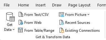
To launch Power Query and get started with it, you’ll first want a table or data set in mind that you want to work on. You could link to an external website, workbook, or just have a table or data set within your worksheet that you want to work on. Power Query, after all, is a tool for data analysis — you need data to start with. Here are some of the more common ways to launch Power Query:
1. Connecting to an External Workbook
Navigate to the Data Tab: Go to the Data tab in the Excel ribbon.
Get Data: Click on Get Data in the Get & Transform Data section.
Choose the Source: Select From File and then choose From Workbook.
Select the Workbook: Browse and select the external Excel workbook you want to connect to.
Load or Transform: Once you select the file, you can choose to either load the data directly into Excel or open the Power Query Editor to transform the data before loading.
2. Connecting to a Webpage
Navigate to the Data Tab: Go to the Data tab.
Get Data: Click on “Get Data” in the Get & Transform Data section.
Select Web as Source: Choose From Other Sources and then select From Web.
Enter the URL: Enter the URL of the webpage you want to import data from.
Load or Transform: After connecting to the webpage, you can choose to load the data directly or use the Power Query Editor for transformations.
3. Using a Range or Table Within the Existing Sheet
Create or Select a Range or Table: You don’t need to have your data formatted in a table for Power Query to load it, however, Excel will convert it to a table once you launch Power Query.
Navigate to the Data Tab: Go to the Data tab.
Get Data: Click on Get Data in the Get & Transform Data section.
Choose From Table/Range: Select From Table/Range.
Power Query Editor: This will open the Power Query Editor with the selected table data, ready for transformation.
Each of these methods serves a different purpose. Connecting to an external workbook is useful for consolidating or analyzing data spread across multiple Excel files. Connecting to a webpage allows for the import and analysis of data published online, such as tables on web pages. Using a table within the existing sheet is handy for quickly transforming or analyzing data already present in your workbook. In all cases, Power Query provides a robust set of tools for manipulating the data before loading it back into Excel for further use.
What can Power Query do?
Power Query can help adjust your data before loading it into Excel. Here are some of the key things you can do with it:
Transform data types
Handle missing data
Remove duplicates
Replace values
Filter data
Sort data
Concatenate columns
Split columns
Add conditional columns
Group and aggregate data
Want to follow along with these examples? Download the sample data set I will use here.
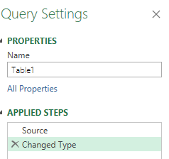
Transform data types
One of the first things Power Query does is it attempts to detect your data types. And when it does, it automatically adjusts them, so that numbers are formatted as numbers, and dates as dates. The Changed Type step appears automatically:
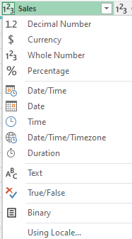
If, however, it hasn’t correctly applied a data type, you can make changes to it. You can specify many different data types, including:
Text
Whole Number
Decimal Number
Date
Time
Date/Time
Boolean
To change a data type, click on the header which shows the data type that it is, and then you’ll see a list of different options to choose from:
Handle missing data
Power Query in Excel is equipped with a variety of tools to effectively manage missing or null data, a common issue in data analysis. Ensuring accurate handling of missing data is crucial for the integrity of your analysis. Here are the ways Power Query can assist in managing missing data:
Highlight Null Values: Power Query visually represents null or missing values, making it straightforward to identify gaps in your dataset.
Remove or Keep Rows with Missing Values: You have the option to filter out rows that contain missing values in one or more columns, useful for analyzing complete records. Alternatively, you might want to focus specifically on rows with missing data.
Replace Nulls with Specific Values: Power Query allows for the replacement of missing values with a specified value, such as zero, a specific text string, or an average value. This is beneficial where a missing value has a logical default or substitute.
Fill Down or Up: Filling missing values with the value from the row above or below is possible, which is helpful in datasets where the missing value logically mirrors its neighbor.
Conditional Replacements: Implement logic to replace or handle missing values based on certain conditions, catering to different scenarios for different categories or columns.
Aggregate Functions: When performing functions like sums or averages, Power Query automatically accounts for null values, ensuring they don’t skew the results.
Merging with Missing Data: While merging tables, Power Query can be set up to handle missing values in key columns in various ways, such as including or excluding unmatched rows.
Data Type Impact: Changing data types might create missing values (like when a text can’t be converted to a number). Power Query helps in identifying and handling such cases effectively.
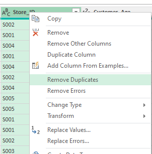
Removing duplicates
Removing duplicate values is an important part of the cleanup process when it comes to data analysis. If, for example, you’re working with a list of transactions or customer records, removing duplicates ensures that each record or transaction is unique and correctly represented in your analysis. And in Power Query, the process to remove duplicates is a fairly straightforward one. It’s as simple as selecting the column and selecting the option to Remove Duplicates.
You can also apply this for multiple columns at once. To select more than one column, just hold down the CTRL key while clicking on other column headers.
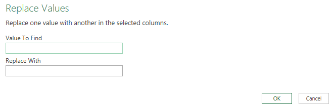
Replacing values
Replacing values in Power Query is a useful feature for cleaning and standardizing your data. It allows you to substitute specific values in your dataset with new ones, which is particularly helpful in correcting errors, standardizing terminology, or handling missing data. Think of it like using the Find and Replace feature in Excel. Here’s how it works:
Select the column you want to replace values on. Similar to with removing duplicates, you can select multiple columns.
Select the option to Replace Values.
In the next dialog box, select the value you want to find and what to replace it with.
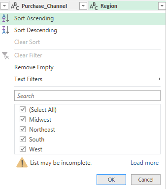
Filter data
Filtering data in Power Query is a fundamental aspect of data preparation and analysis, allowing you to narrow down your dataset to only the information relevant for your specific needs. The filtering process is similar to how you would do it in Excel. Here’s how it works:
Select the column you want to filter.
Click the drop-down arrow, and you can select how you want to apply your filter:
These are the same type of filters you can apply as in Excel, including criteria such as “contains”, “does not contain”, “starts with”, etc. For numeric columns, you can choose from number filters like “equals”, “greater than”, “less than”, and you can specify ranges. For date columns, you can filter by specific dates, before/after a certain date, or choose from a range of date filters.
After setting your filter criteria, Power Query will display only the rows that meet the criteria. You can apply multiple filters across different columns.
Filtering in Power Query is a versatile tool, allowing for basic operations like removing irrelevant rows, as well as more complex data segmentation, which is essential for detailed and accurate data analysis.
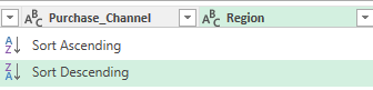
Sorting data
Sorting data in Power Query allows you to organize your dataset in a meaningful order, making it easier to analyze and understand. And by doing it in Power Query, when the data is loaded into Excel, your sorting rules have already been applied. Just like with filtering, the process for sorting data in Power Query is also comparable to how you would do it within your spreadsheet:
Choose the column to sort by.
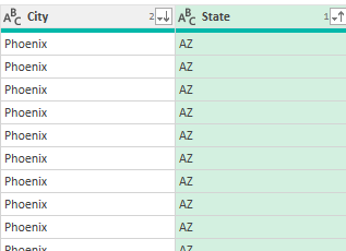
Select the sort order. For a simple, one-level sort, use the sort ascending (A to Z) or sort descending (Z to A) buttons in the Home tab of the Power Query ribbon. To sort ascending, click the small arrow in the column header and choose “Sort Ascending”. This will organize the data in that column from lowest to highest (e.g., A to Z, 0 to 9, earliest to latest date). To sort descending, click the arrow and choose “Sort Descending”. This will organize the data from highest to lowest (e.g., Z to A, 9 to 0, latest to earliest date).
If you want to sort by multiple columns (for example, first by state, then by city), sort the most significant column first, and then sort by the next column. When you apply multiple sorting rules, you will see a number next to the sorting icon to show you its priority. In the screenshot below, the State field has a 1 next to the up arrow, indicating that the data is first sorted in ascending order by state. Then, it sorts the City field in descending order.
Concatenate columns
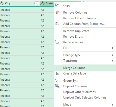
Concatenating fields (or columns) in Power Query involves combining the contents of two or more columns into a single column. This process is useful for creating unique identifiers, combining textual information, or formatting data in a more useful way. In this example, we’ll combine the State and City fields, by taking the following steps:
Select the two or more columns you want to concatenate or merge together. The order of your selection is important. If you want the City field first, then that is the one you need to select first.
Right-click and select the option to MergeColumns
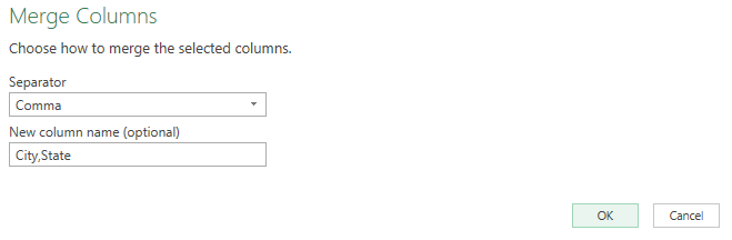
Specify if you want them to be separated in any way. In this example, we’ll use a comma so that it is in City,State format.
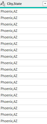
This results in a field that has grouped the two columns. Those two columns have now been replaced with the new merged column.
Split columns
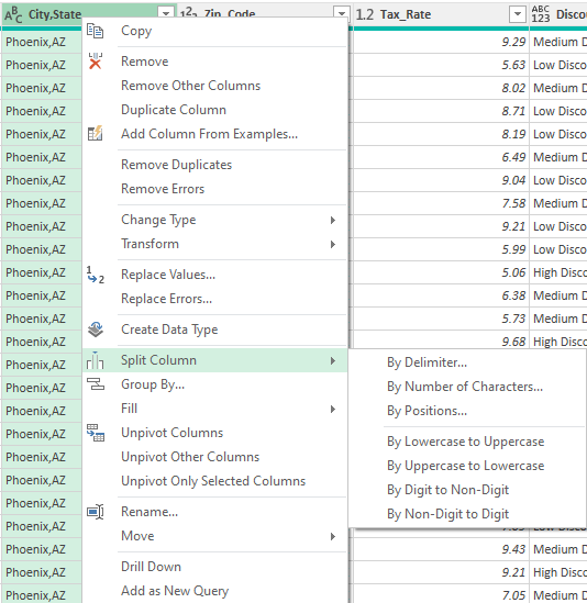
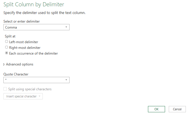
Splitting columns in Power Query is a handy feature that allows you to divide the contents of one column into multiple columns. This can be particularly useful when dealing with data that’s concatenated into a single column but needs to be separated for analysis or reporting. Here’s how we can undo the previous step, to break out the new City,State column back into separate columns:
Start with selecting the column to split.
Right-click on the option to Split column. Then select how you want it to be split.
These are the ways you can split them:
By Delimiter: Split the column based on a specific character or symbol, such as a comma, space, or custom character. This is the most common method used when data in a column is separated by a consistent symbol.
By Number of Characters: Split the column into new columns each containing a specific number of characters.
By Text Length: Split the column at a specific character position.
Advanced Options: Allow for more complex splits, such as splitting at the first or last occurrence of the delimiter.
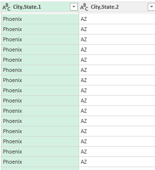
In the City,State field, we can split by delimiter — the comma. You can specify how it should be split. But in our example, the default options will suffice:
This will split the columns back into two:
The only thing that may be necessary to do is to rename the columns. To do that, just double-click on the headers and type in a new name for the columns.
Add conditional columns
Adding conditional columns in Power Query is a powerful way to create new columns based on conditions derived from other data in your table. It’s akin to using the IF function in Excel but allows for more complex and multiple conditions. Here’s how you can add a conditional column in Power Query:
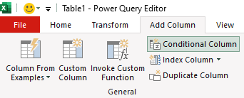
Select the Add Column tab on the ribbon.
Select the option to add a Conditional Column.
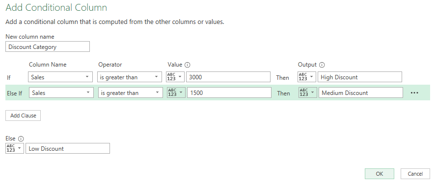
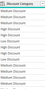
Next, you can create your conditions, and the column name. With the data set in this example, we can set up a column called Discount Category based on the sales price. This can tell us the type of discount a customer is eligible for. The conditions could be as follows:
If Sales > 3000, then “High Discount”
If Sales is between 1500 and 3000, then “Medium Discount”
Else, “Low Discount”
In the above example, the criteria is evaluated in order from top to bottom. This now creates a new column in the table:
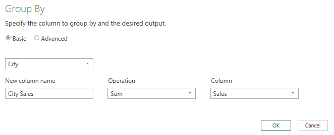
Group and aggregate data
Grouping and aggregating data in Power Query is a crucial process in data analysis, allowing you to summarize and analyze large datasets efficiently. This feature is especially useful for finding averages, sums, counts, minimums, and maximums for different categories or groups in your data. In this example, let’s total the sales by city. Here’s how:
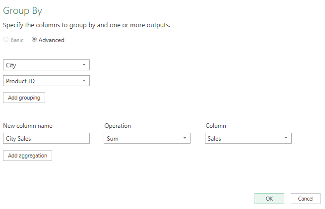
On the Home tab, click on the Group By button
Select City as the initial field. This is how the data will be grouped.
Then, enter a column name (City Sales), an operation (Sum), and specify the column to tabulate (Sales)
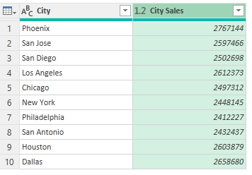
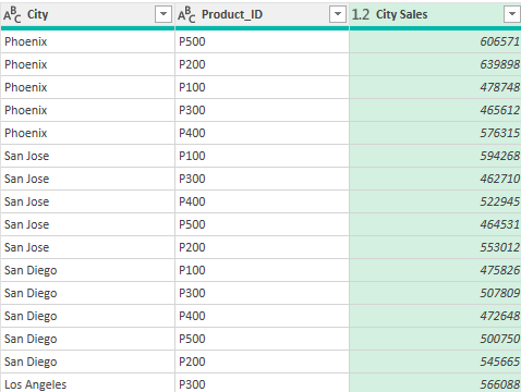
This now gives you a summary by city:
You can also do more complex grouping by more than one field. To do so, select the Advanced radio button when in the Group By dialog box. Then, select Add grouping. In this example, we can add the Product_ID field as another field to group by.
Now, when the grouping is completed, it breaks it down further:
Close & Load once you’re done making changes
Once you’ve finished making your changes in Power Query, you can select the option to Close & Load to get it into Excel.
What “Close & Load” Does:
Finalizes Changes: When you click “Close & Load”, Power Query applies all the transformations you’ve made to the dataset within the Power Query Editor.
Loads Data into Excel: After applying the changes, the transformed data is loaded into an Excel worksheet or data model. This can be a new sheet or table, depending on your settings and the nature of your task.
Creates a Connection: Power Query creates a connection between the source data and the Excel workbook. This connection is maintained, which means that you can refresh the data in Excel to reflect any updates in the source data or further transformations applied in Power Query.
Saves Transformations: The sequence of steps or transformations you applied in Power Query is saved. This allows for the data to be updated or reloaded with the same transformations applied automatically.
Why it’s beneficial to make changes in Power Query before loading it into your spreadsheet
You may be wondering why you wouldn’t just make all these changes in your spreadsheet. Why is there a need to make the changes in Power Query? Here’s why:
Data Size Management: Power Query can handle and process large datasets more efficiently than Excel. By filtering, reducing, and transforming data in Power Query, you minimize the load and improve performance in Excel.
Non-Destructive Data Manipulation: Changes made in Power Query don’t alter the original data source. This means you can experiment with and modify your data without the risk of corrupting the original dataset.
Automating Repetitive Tasks: Any sequence of steps you apply in Power Query is repeatable. If you regularly receive data in the same format, you can use the same query to process this data, saving time and effort.
Complex Transformations: Power Query offers more advanced data manipulation capabilities than standard Excel functions, including pivoting/unpivoting, advanced merging and appending, complex filtering, and more.
Data Cleansing and Preparation: It’s often necessary to clean and format data before analysis. Power Query provides a robust set of tools for handling common data issues like missing values, duplicates, and inconsistent formats.
Reduces Workbook Size: By transforming data in Power Query and loading only what’s needed, you reduce the overall size of the Excel workbook, leading to better performance and easier handling.
If you like this post on Power Query for Beginners: A Comprehensive Guide, please give this site a like on Facebook and also be sure to check out some of the many templates that we have available for download. You can also follow me on Twitter and YouTube. Also, please consider buying me a coffee if you find my website helpful and would like to support it.
Did you know that you can quickly change the look of your data in Excel with Custom Views? No need for pivot tables or having to change your file’s settings and view over and over again. If you don’t use tables but frequently change the look of your file, Custom Views can save you time.
What are Custom Views?
Custom Views in Excel allow users to save specific display settings (like column widths or cell formatting) and print settings for a worksheet. This becomes especially useful when you have a single Excel sheet but require multiple ways to interpret or present the data. Rather than manually adjusting settings each time, you can quickly switch between different Custom Views.
How do Custom Views work?
Here’s how you can create Custom Views in Excel.
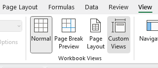
First, what you may want to do is create a default view with no changes applied to it. Go to the View tab and click on Custom Views.
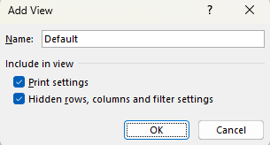
Then select Add and just call it Default.
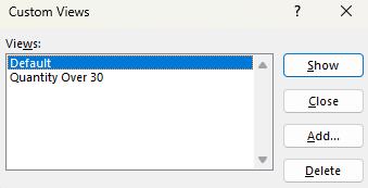
Now, I’m going to make some changes to my data set. Here’s how it looks right now:
I’m going to apply the following changes: hide all the columns that come after Sales and filter the Quantity Ordered Field so that it only shows orders of more than 30.
Now, I’m going to repeat the steps for creating a view and this call I will call it Quantity Over 30. Now that it’s saved. I can revert back and forth between the different views. In the Custom Views page, there’s a list of the views that have been created:
I can choose to Show, Add, or Delete the different views. I can also close the dialog box. If I click on Show while my Default view is selected, I’ll now get my original view, with no changes made:
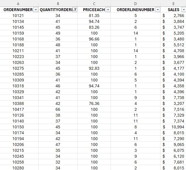
But if I go back to my Custom Views and select Quantity Over 30, then I’ll see only a list of the orders that have more than 30 in the QuantityOrdered field. I will also no longer see those extra columns beyond Sales:
What you’ll notice is that not only have those columns been hidden, but it has also applied a filter to my data. In addition, the view will save your cell position and if you scrolled on your page. So if you happen to scroll halfway down the page and then save your view, when you go to show that view, it will do the same.
TIP: If you want to quickly access Custom Views, you can use the following shortcut: ALT+W+C. You can also right-click on the option and select Add to Quick Access Toolbar. If you do this, it’ll be added to the top of your Workbook.
When should you use Custom Views?
The biggest reason to use Custom Views is they allow you to easily filter or change the look of your data without the need for tables. This can be helpful if you’re sending the file to another user. They can just change the view and quickly see whatever they need to see. That can include filters so they only see a certain region. Or perhaps have different print settings applied so that they will work with their specific printer setup.
You can’t, however, use Custom Views if you have a table. Even if the table is on a different sheet, the Custom Views option will be unavailable. You won’t be able to use it. You may also want to avoid using Custom Views if you expect that the structure of your sheet will change. If that happens, and you haven’t created new views to reflect those changes, you may see a different view than what you expected.
If you like this post on How to Use Custom Views in Excel, please give this site a like on Facebook and also be sure to check out some of the many templates that we have available for download. You can also follow me on Twitter and YouTube. Also, please consider buying me a coffee if you find my website helpful and would like to support it.
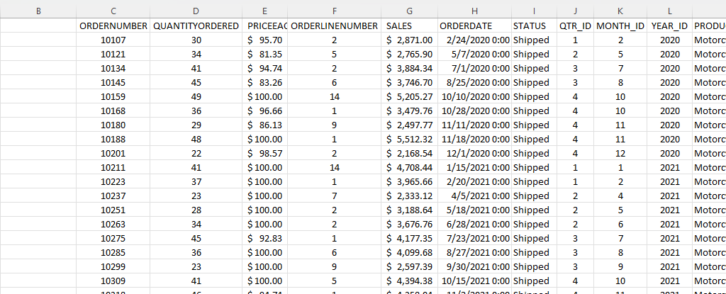
If you’re an accountant, you know that working with large amounts of data can be a daunting task. But with Excel, that work can get a whole lot easier and more efficient. Understanding Excel’s advanced features and functions can improve productivity, reduce errors, make your work more accurate, and most importantly — save you time. Below, I’ll go over some of the most important Excel functions that accountants should know, and provide examples of how to use them. For this example, I’ll use the following spreadsheet. Feel free to download it and follow along with the calculations.
1. SUM
The SUM function is a basic but essential function in Excel. It allows you to add up a range of values, which is helpful when calculating totals, such as revenue, expenses, and profits. Suppose you have a spreadsheet with sales data. In the above example, the total sales are in column G. If you wanted to sum up the entire column, the formula would be as follows: =SUM(G:G)
2. AVERAGE
The AVERAGE function calculates the average of a range of values. It is useful when analyzing data and preparing financial statements. In the above example, suppose you wanted to calculate what the average sale was. To do this, you can just use the AVERAGE function on column G, similar to the SUM function before. Here’s the formula: =AVERAGE(G:G)
3. IF
The IF function allows you to test a condition and return one value if the condition is true and another value if the condition is false. This can be useful because it can send your formulas to the next level. By knowing to use the IF function, you could also use SUMIF, AVERAGEIF, and many other functions that involve an if statement. In the above example, let’s say you only wanted to know if a value in cell M2 was part of the Motorcycles product line. The formula would be as follows: =IF(M2=”Motorcycles”,1,2). If it is part of Motorcycles, you would have a value of 1, otherwise, it would be 2.
4. SUMIF
By knowing the SUM and IF functions, you can combine them together with SUMIF, which is an incredibly popular function. It gives you a quick way to tally up the totals that meet a criteria. For example, let’s say you want all sales that relate to the Motorcycles category. The formula for that would be as follows: =SUMIF(M:M,”Motorcycles”,G:G). If the criteria is met in column M, then the formula will sum up the corresponding values in column G. There’s also the super-powered SUMIFS function, which allows you to combine multiple criteria.
5. EOMONTH
The EOMONTH function calculates the last day of the month for a specified number of months in the future or past. It is useful when working with data that is organized by date. For accountants, this can be useful when you’re calculating when something is due. Let’s say in this example, we need to calculate the date orders need to go out on, and that needs to be the end of the next month. Using the ORDERDATE field in column H, here’s how that calculation would look in the first cell, which would then be copied down for the rest: =EOMONTH(H2,1)
6. TODAY
The TODAY function is helpful for accountants in calculating deadlines and knowing how many days are remaining or past a certain date. Suppose that you wanted to know how many days have past since the ORDER DUE DATE that was calculated in the previous example. Rather than entering in a static date that every day you would need to change, you can just use the TODAY function. Here’s how a formula calculating the days since the deadline for the first cell would look like, assuming the due date is in column N: =TODAY()-N2. The next day you open up the workbook, the calculations will update to reflect the current date; there’s no need to make any changes. There are many more date calculations you can do in Excel.
7. FV
The FV function calculates the future value of an investment based on a fixed interest rate and a regular payment schedule. You can use it to calculate the future value of an investment or savings account. Let’s say that you wanted to save $10,000 per year and expect to earn a return of 5% per year on that investment. Using the FV calculation, you can do that with the following formula: =FV(0.05,5,-10000). If you don’t enter a negative for the payment amount, the formula will result in a negative value. You can also specify whether payments happen at the beginning of a period (1) or end (0 — this is the default) with the last argument in the function.
8. PV
The PV function lets you do the opposite and work backwards from a future value to the present. Knowing that the calculation in example 7 returns a value of $55,256.31, that can be used in the PV calculation to check our work: =PV(0.05,5,10000,-55256.31). The formula returns a value of 0, which is correct, as there was no starting value in the FV calculation.
9. PMT
The PMT function calculates the periodic payment required to pay off a loan with a fixed interest rate over a specified period. It is helpful when determining the monthly payments required to pay off a loan or mortgage. Let’s take the example of a mortgage payment where you need to pay down $500,000 over the period of 30 years, in monthly payments. At a 5% interest rate, here’s what the payment calculation would be: =PMT(0.05/12,12*30,-500000,0). Here again the ending value needs to be a negative to avoid a negative value in the result. And since the payments are monthly, the periods need to be multiplied by 12 and the interest rate is dividend by 12.
10. VLOOKUP
The VLOOKUP function allows you to search for a value in a table and return a corresponding value from another column in the same row. It’s one of the most common Excel functions because of how useful and easy to use it is. It is helpful when working with large data sets and performing data analysis. Let’s suppose in this example that you want to find the sales related to order number 10318. The formula for that calculation might look like this: =VLOOKUP(10318,C:G,5,FALSE). In a VLOOKUP function, you need to specify the column number you want to extract from, which is what the 5 represents. If you’re using Office 365, you can also use the newer, flashier XLOOKUP function. I put VLOOKUP on this list because it’ll work on older versions of Excel — XLOOKUP won’t.
11. INDEX
The INDEX function allows you to return a value from a data set by specifying the row and column number. It’s also helpful if you just want to return data from a single row or column. For example, the sales column is in column G. If I know the order number is on row 20 (which relates to order number 10318), this formula would do the same job as the VLOOKUP in the previous example: =INDEX(G:G,20,1).
12. MATCH
The MATCH function allows you to find the position of a value within a range of cells. Oftentimes, Excel users deploy a combination of INDEX and MATCH instead of VLOOKUP due to its limitation (e.g. VLOOKUP can’t extract values to the left of the lookup field). In the previous example, you had to specify the row belonging to the order number. But if you didn’t know it, you could use the MATCH function within the INDEX function. The MATCH function would look like this: =MATCH(10318,C:C,0). Placed within an INDEX function, it can replace the argument where in the previous example, we set a value of 20: =INDEX(G:G,MATCH(10318,C:C,0),1). By doing this, you have a more flexible version of the VLOOKUP function. You can also create dynamic formulas using INDEX and MATCH that use lookups for both the column and row.
13. COUNTIF
The COUNTIF function allows you to count the number of cells in a range that meet a specified condition. Let’s count the number of values in the data set that are Motorcycles. To do this, you would enter the following formula: =COUNTIF(M:M,”Motorcycles”).
14. COUNTA
The COUNTA function is similar to the previous function, except it only counts the number of non-empty cells. With no criteria, it is helpful to just the total number of values within a range. To calculate how many cells are in this data set, you can use the following formula: =COUNTA(C:C). If there are no gaps in data, then the result should be the same regardless of which column is used. And when combined with the UNIQUE function, you can have an easy way to count the number of unique values.
15. UNIQUE
The UNIQUE function returns a list of unique values within a range, and it’s a much easier method than the old-school way of extracting unique values. If you wanted to extract all the unique product lines in column M, you would enter the following formula: =UNIQUE(M:M). If, however, you just wanted to count the number of unique values, you could embed it within the COUNTA function as follows: =COUNTA(UNIQUE(M:M)). You can adjust your range if you don’t want to include the header.
This is just a sample of some of the useful Excel functions that accountants can utilize. If you are familiar with them, you’ll put yourself in a great position to improve the efficiency of your workflow and make your spreadsheets easier to use. Plus, you can confidently say that you are highly competent with Excel, which can make your resume more attractive and make you better suited for accounting jobs that require advanced Excel skills — and there are many of them that do!.
If you liked this post on 15 Excel Functions Accountants Should Know, please give this site a like on Facebook and also be sure to check out some of the many templates that we have available for download. You can also follow me on Twitter and YouTube. Also, please consider buying me a coffee if you find my website helpful and would like to support it.
Sorting data in Excel is relatively easy, and can be done with a click of just a button. However, it can be a bit more challenging when you’re trying to sort data by multiple columns. Once you’re familiar with the process, it’s not a whole lot more difficult. In this post, I’ll show you how you can do that.
How to sort just one field or column
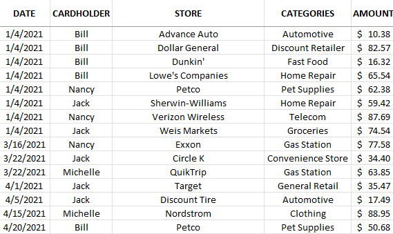
In this data set, I have multiple fields that I can sort by:
To sort by any field, it’s as easy as clicking on any column and clicking either the ascending button (the first button below) or the descending button (the second one shown):
The ascending order button will sort values from A->Z, lowest to highest, or oldest date to newest date. The descending order button will do the reverse, and sort values from Z->A while amounts will go from highest to lowest. Doing this will sort one column at a time. If I sorted the data above by dates in ascending order, this is how it would look:
This shows me the data from oldest to newest entries.
How to sort multiple columns in Excel
If I wanted to sort by date and then by store. I would need to apply multiple sorting rules. Even if I wanted them all to be in ascending order, I can’t just go and click on each column and click the ascending order button. If I did that, this is how my data would be sorted:
The data isn’t sorted by date anymore. You can see that only the store names are sorted properly. This is because it’s the most recent sort that has been applied. And the last field I clicked on to sort was store, so that’s what it will be sorted by. There are a couple of ways I can fix this.
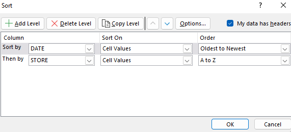
The first method is by going in reverse. Since the last column that I click in is what I’m sorting by at the top, that needs to be the first one I click on, not the last. If I click and sort (by ascending order) Store and then the Date field, this is what the data set will look like:
Another way you can accomplish this is by clicking the Sort button:
Then, you’ll have the ability to specify your sorting rules. To accomplish the same sort as above, you would set it up as follows:
The advantage of this approach is you don’t have to work backwards. It can be simpler to plan out how you want to sort your data without having to worry about remembering the sorting rules in reverse. For larger, more complex sorting rules, using the Sort button is going to be easier. If, however, you only have a few fields you want to sort, it may not make a difference which method you choose.
If you liked this post on How to Sort Data by Multiple Columns in Excel, please give this site a like on Facebook and also be sure to check out some of the many templates that we have available for download. You can also follow us on Twitter and YouTube.
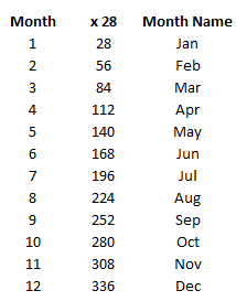
Do you have a report in Excel that lists the months as the numbers 1 through 12 and you want to convert that into the actual month names? Below, I’ll show you how you convert a month number into a month name in Excel.
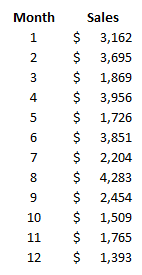
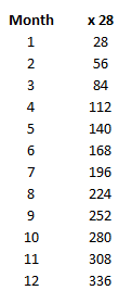
Here’s an example of data that shows monthly sales but it only lists the number as opposed to the name:
If you had the entire date in a cell you could format it so that it showed the month. For instance, what I could do is type in =TEXT(A1,”MMM”) which would convert the value in cell A1 into a three-letter abbreviation for the month. But the numbers 1 through 12 will return values of “Jan” as Excel will think that you are referring to the first month of the year.
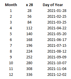
However, that changes once you get to the number 32. Since there are only 31 days in January, the number 32 will return a value of “Feb” if you were to continue on with that formula. And so the trick is to multiply these values all by a factor of 28. Since that’s the minimum number of days every month will have, it ensures that jumping by 28 each time will put you into each month of the year. This is what my values will look like:
To prove this out, here is which dates those days of the year would correspond to:
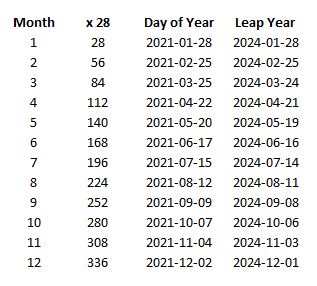
In month 12, we barely make it in December using this approach but that’s good enough. And even in a leap year, multiplying by 28 still works. In this example, I include 2024, the next year that February gets an extra day:
So now that we’ve confirmed that those numbers will fall within the correct months, we can use the TEXT formula noted above to convert those numbers into month dates, and this is what we end up with:
You can also multiply by 29 and this logic will still work. But if you use 27 then your months will be wrong by the time you hit September and if you use a multiple of 30, then in non-leap years you will be jumping too quickly and you will have two dates in March.
If you liked this post on How to Convert Month Number to Month Name in Excel, please give this site a like on Facebook and also be sure to check out some of the many templates that we have available for download. You can also follow us on Twitter and YouTube.
If you are creating an invoice and need to account for taxes, usually you just need to multiply the subtotal by the percentage due for taxes. However, it gets trickier when the tax amount is already included within the invoice total and you need to work out what the amount relating to tax is. This is important if you need to determine how much in taxes you need to claim on an expense or how much you need to collect if you’re the seller. Below, I’ll go over a sample invoice calculation to show how can determine the tax amount whether it is included in the total or not.
Calculating taxes on an invoice
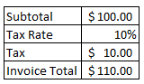
Let’s start with the basic calculation. This is how you might normally determine the taxes on an invoice and the total invoice value:
The calculation is straightforward as what you do is just take the subtotal, multiply that by the tax rate, and add that back to the subtotal. Another way is to just take the subtotal and multiply it by a factor of 1 + the tax rate. In this case, it would $100 x 1.10. But let’s pretend we don’t know the subtotal and just know that the invoice total is $110.00 and the tax rate is 10%. In order to calculate the pre-tax amount, we need to do the steps in the opposite order. To prove this out, let’s use a bit of algebra:
$100 + ($100 x 10%) = $110
This can be simplified as follows:
$100 (1 + 10%) = $110
Now let’s solve for $100 which I will assign a variable of ‘y’ to:
y (1 + 10%) = $110
To solve for y, all we need to do is move the factor of 1 + the tax rate and divide $110 by that:
y = $110/(1 + 10%)
Taking $110 and dividing by 1.1 will give us a value of $100. And so what our end result comes out to is essentially this:
invoice total / (1 + tax rate) = pre-tax amount
To calculate the tax, all that’s needed then is to take the total and subtract the pre-tax amount.
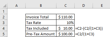
Now that the logic is set up, let’s convert this into an Excel formula:
Similar to how multiplying by a factor of the pre-tax amount by 1.1 (when the tax rate is 10%) would get you to the invoice total, dividing the total by 1.1 would get you to the amount before taxes. If the tax rate were 5%, then you would use 1.05, etc.
If you liked this post on How to Calculate the Tax Amount When it Is Included in the Total, please give this site a like on Facebook and also be sure to check out some of the many templates that we have available for download. You can also follow us on Twitter and YouTube.
In this post, I’m going to show you how you can easily calculate variances in Excel. I will also go over how to group variances and how using pivot tables, charts, and conditional formatting can help save you time in reviewing them.
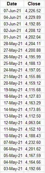
For this example, I’m going to use data from the S&P 500 as stock prices frequently fluctuate. To start, I’m going to download the data from the past year. I’m going to remove everything except the closing values just to keep this example simple:
Calculating the variances
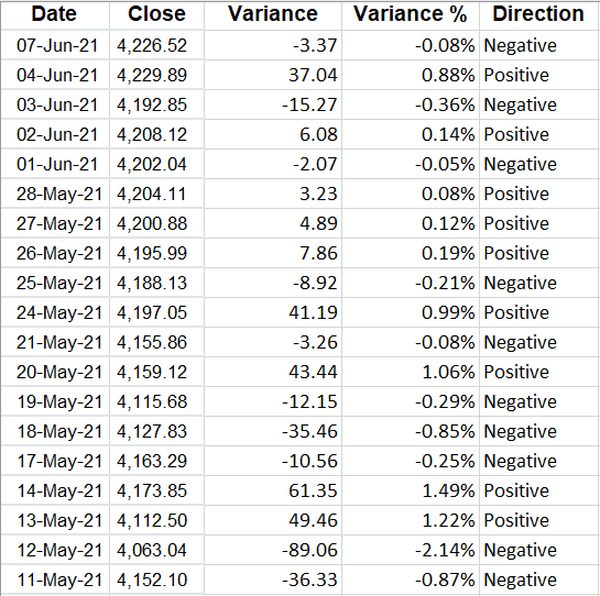
The calculate the variance in these data points, what I need to do is to take the current closing price, and subtract the previous day’s closing price from it. That will tell me how much of a move there was that day. On June 7, for instance, the S&P 500 fell from 4,229.89 on June 4 (the previous trading day) to 4,226.52. If I minus the current day’s close from the previous, I get a value of -3.37.
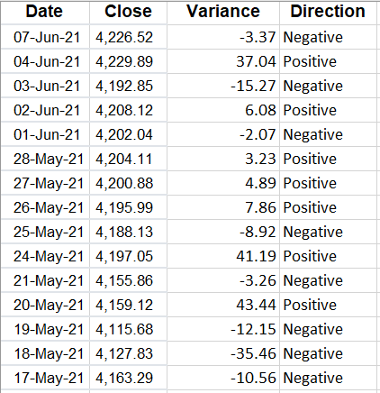
But we can dig a lot deeper than just looking at the difference in price. Let’s also create a field to indicate whether these variances are positive or negative. To do that, I’ll create another column called ‘Direction.’ For this calculation, I will take a look at the value in column C (where my variance is) and create a simple IF formula:
=IF(C2>0,”Positive”,”Negative”)
Here’s what my sheet looks like now:
Although you can determine whether it is positive or negative from the variance field, by creating another column you can quickly filter if you want to look at all the negative or positive values. Another column I’ll insert here is for the percentage change.
To do this, what I will do is take the variance amount and divide it by the previous day’s closing price. This will tell me how much the price has moved as a percentage of what its value was the day before — which is much more useful than just looking at the raw value. After inserting the column, I have the total variance, variance %, and which direction it went in:
I changed the variance % field to show percentages and I added a few decimal places since the percentages are fairly small. To add decimal places, go to the Numbers group on the Home tab and click the following button on the left:
The one on the left will add decimal places while the one on the right will remove them.
However, what if you don’t care about positives or negatives and are just interested in the absolute value of the changes? I’ll cover that next.
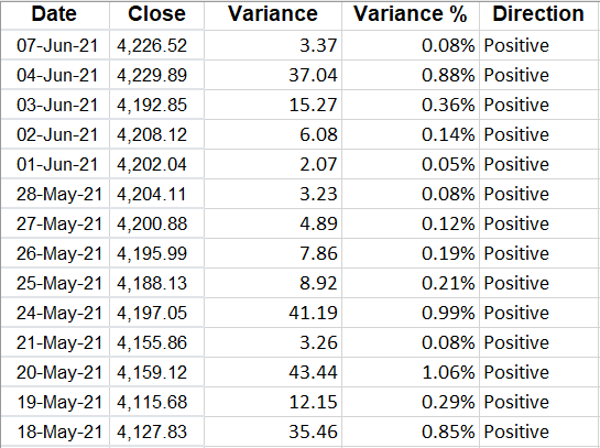
Calculating changes in absolute value
With absolute value, you remove the positive or negative indicator. And to calculate a variance this way, you just need to add a formula to the calculation in the variance field. Rather than this:
=B2-B3
You would enter this:
=ABS(B2-B3)
Now, my variances update and I no longer have a use for the Direction field since all the values will be positive:
Alternatively, you could also just create another column specifically for the change in absolute value.
Now that the variances have been created, what you may want to do next is to group them.
Grouping variances
Why would you want to group variances? The big advantage in doing so is they can make it easier to analyze a large data set by showing you where the bulk of the variances are.
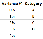
Rather than creating a bunch of IF statements, what I’ll do is create a table to show where the variances belong:
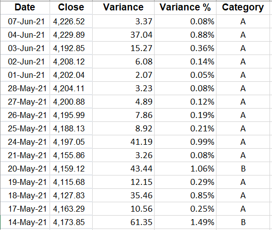
I’ve created a named range called VarianceTable for this. And now, all I need to is use a VLOOKUP formula to find which category a variance belongs in. Since I’m not using an exact match, I will set the last argument in the function to ‘TRUE’ :
=VLOOKUP(D2,VarianceTable,2,TRUE)
Now I have a category field instead of the Direction:
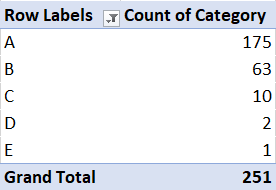
But this doesn’t tell me a whole lot. I could filter by the category. However, a better approach is to create a quick pivot table that shows me a summary of where the values fall:
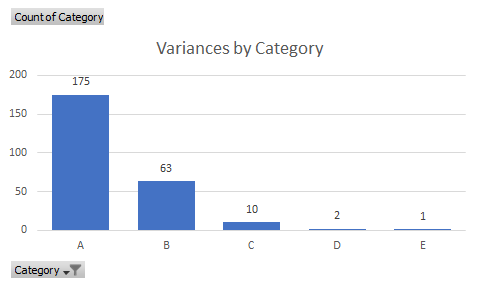
And from that, I can quickly display these variances on a chart:
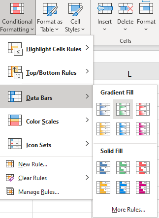
Another way you can help identify extreme values in variances is by using conditional formatting. To apply conditional formatting, select either the variance column or the variance % column and under the Conditional Formatting button on the Home tab, you can select either Data Bars or Color Scales. I prefer using Data Bars since there are fewer colors:
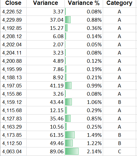
Then, my variances are easier to visualize and to see where the highs and lows are:
When you are analyzing variances, using conditional formatting, pivot tables, and charts can help you summarize your findings.
If you liked this post on How to Calculate Variances in Excel, please give this site a like on Facebook and also be sure to check out some of the many templates that we have available for download. You can also follow us on Twitter and YouTube.
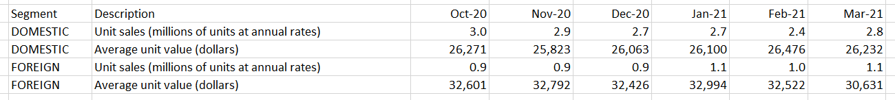
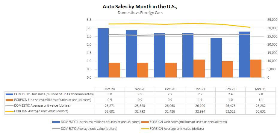
An Excel chart can provide lots of useful information but if it isn’t easy to read, people may skip over its contents. There are many simple things you can do that can quickly add to the visual to make it fit seamlessly within a presentation and that makes it more effective in conveying data. If you want to follow along, in this example, I am going to use data from the Bureau of Economic Analysis. In particular, I am pulling data on automobile sales both in units and average dollars. Here is what my data set looks like right now:
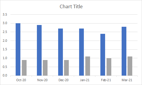
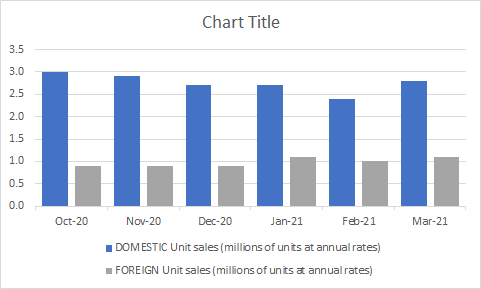
And this is my chart, which shows unit sales by month:
It’s a pretty basic chart that can show me the breakdown between the sales. These are the following changes I can make to improve the look and feel of it:
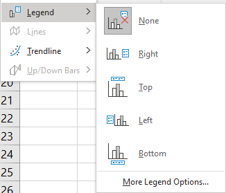
1. Add a legend
Unless you are just charting one item, most visuals will benefit from a legend. Otherwise, it will be difficult to know which data is represented where. To add a legend, all you need to do is select the chart and go into the Chart Design tab and select the Add Chart Element button, there you will see an option to determine where you want it to show up:
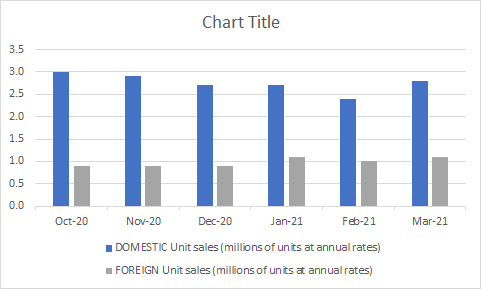
In most cases, you’ll probably want this on the top or bottom as that will help make it blend in easier with the chart. Here’s how it look after I add the legend:
Since my descriptions are long, putting them at the bottom will make more sense. Now I can easily see which bars relate to the foreign sales and which ones relate to domestic.
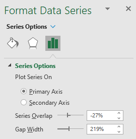
2. Shrink the gaps (for column charts)
If you have column charts, it can help to shrink the space in-between the bars. That will eliminate white space plus you can fit more items in your chart. To adjust the gaps, right-click on any of the bars and select Format Data Series.
I normally set the Gap Width to 50%. Upon doing so, my chart changes to the following:
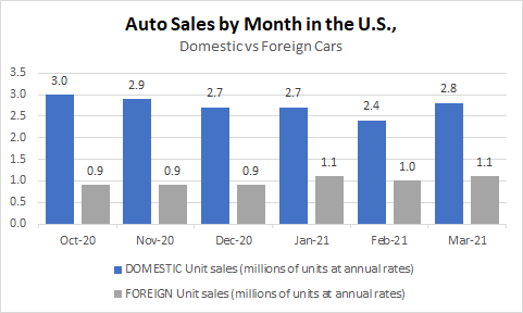
3. Adding a descriptive title and subheader
I haven’t set a title for my chart and that’s one thing you shouldn’t overlook doing. Although it may not seem necessary, doing so can help ensure that your chart can stand on its own and not have to rely on the context it is used in to give the reader the right information. A good example in this case can be as follows:
The main title is bolded and shows the reader what the chart is about. And the subheading further distinguishes the different groups of data.
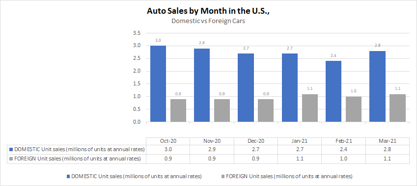
4. Adding data labels
You may want to consider adding data labels to make it easy for the reader to see the exact numbers your chart is showing. This prevents having to make any estimates or rounding off and quoting an incorrect number. To insert data labels, right-click on one of the column charts and select Add Data Labels. Do this for each data series you want to add labels for. This is how my chart looks, with labels:
You can modify the labels if you want to add more information besides just the value. This will depend on the type of chart you have and how much space is available. In this example, you probably wouldn’t want to add more information. However, what I will do is shrink the text size so that it is a bit smaller and so that everything looks less cluttered. To do that, I just click on any of the data labels and under the Home tab, make changes to the font size or color the way I normally would with any other data in Excel. After shrinking the font to size 7 and making it grey, here’ show it looks:
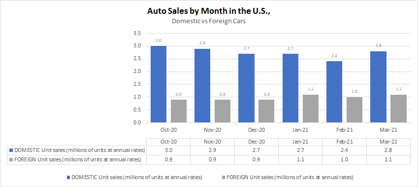
5. Adding a data table
If you don’t want to add data labels, another thing you can do is add a data table. This avoids putting any numbers or labels over top of your data series and still gives the user a helpful table summary. This is a great alternative if you don’t want to crowd too much information into one place and prevent your chart from looking too busy. To add a data table, just go back to the Add Chart Element drop-down option and select Data Table, where you can specify if you want to include the legend key or not. This is how the chart looks with the table:
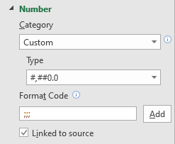
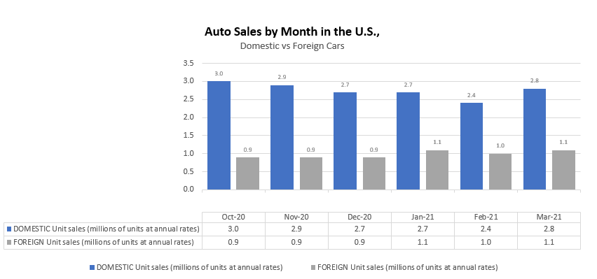
If you want to avoid the repetition in the axis labels without deleting them and losing those headers, one thing you can do is to change the text format. To do that, right-click on any of the axis labels and select Format Axis. Then, in the Number section, enter three semicolons in the Format Code section and click the Add button:
The three semicolons will remove any formatting and now the axis and data table wouldn’t double up on the names:
6. Remove the border
If you are using the chart in a Word document, presentation, or even Excel, eliminating the border around it can make it blend much easily with the background and other information. To remove the border, right-click on the chart, select Format ChartArea, and under the Border section, select No line. After making the change, this is what my chart looks like now:
With my gridlines turned off, you can no longer see the lines that show where the chart starts and ends.
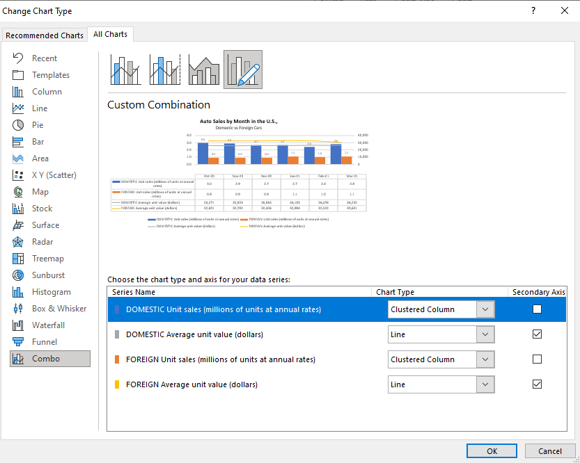
7. Use a secondary axis with multiple chart types
So far, I’ve only used column charts to show the number of units sold. However, now, I will also include the average selling price. But because the selling price can be in the thousands, I’ll want to move this onto another axis. Otherwise, the number of units sold, which are in millions, won’t show up because of the scale as it will need to accommodate values that are in the tens of thousands.
When you want to put a data series onto another axis, you will need to go to where you select the chart type. If you go to the bottom, select the Combo option. There, you can specify which chart type should be used for each data series. That’s also where you can specify which one should be on a secondary axis. In this example, I’m going to use a line chart for the average price and continue using a column chart for the number of units sold. It doesn’t matter which data set I put on the secondary axis. However, note that the one that is secondary will be on the right-hand-side of the chart.
This is what my updated chart looks like:
In this case, I’ve gotten rid of the data labels for the column charts so that it doesn’t interfere with the line charts.
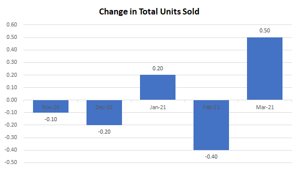
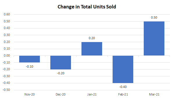
8.Move the axis categories down
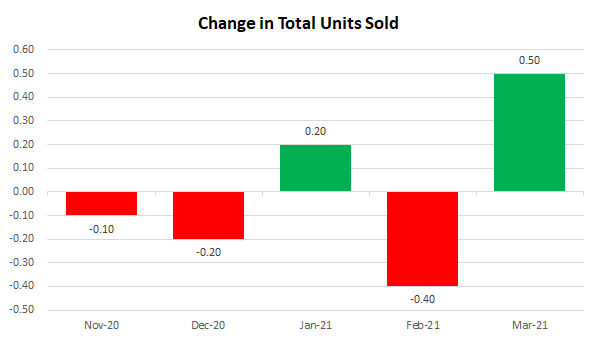
In the examples thus far, I haven’t had any negative values. However, suppose I change my data to now show the change in units sold from one month to the next:
For this example, I combined the data so that it totals both domestic and foreign cars. The above chart shows the month-over-month change. But one problem you’ll notice is that the date labels run along the middle of the chart. This makes it difficult to read when there are negative values.
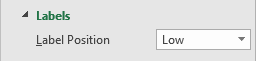
To make this easier to read, I am going to move the axis labels to the bottom This is useful when dealing with negatives. To make this change, right-click on the axis and select Format Axis. Then, under the Labels section, set the Label Position to Low.
Now, when my chart is updated it looks like this:
9. Showing negative values in a different color
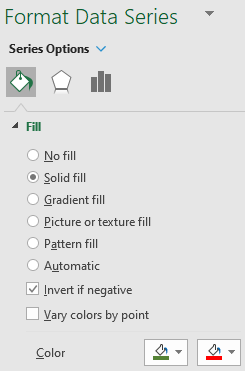
One other change that is going to be helpful when dealing with negatives is to change the color depending on if the value is positive or negative. All you need to do to make this work is to right-click on the column chart, select Format Data Series and switch over to the Fill section. There, you will want to check off the box that says Invert if negative:
Once you do that, you should see two different colors you can set aside for the color section. If you don’t, try and setting one color first, and then toggling the Invert if negative box. With the two different colors, my chart looks as follows:
While you can obviously tell if a chart is going up or down, adding some color to differentiate between positives and negatives just makes the chart all that more readable.
If you liked this post on 9 Things You Can Do to Make Your Charts Easier to Read, please give this site a like on Facebook and also be sure to check out some of the many templates that we have available for download. You can also follow us on Twitter and YouTube.
Do you want to learn how to quickly count the number of cells that meet certain criteria? How about partial matches using wildcards? Below, I’ll show you how you can do this using the COUNTIF function in Excel along with similar tasks.
How does the COUNTIF function work?
As the name suggests, the COUNTIF function in Excel will count the values in a range if they meet certain criteria. It is not case-sensitive and in most cases, people use it for entire matches. However, you can also use it if you want partial matches.
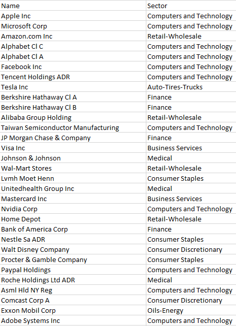
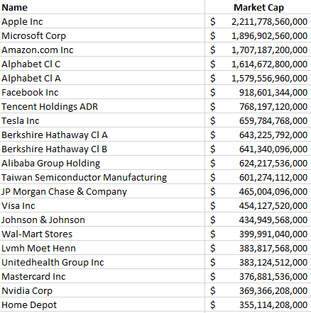
In the data sample below, I have a list of the largest stocks on the North American markets along with the sectors that they are in:
In total, my list contains 1,000 companies. To count the number that are in the Computers and Technology sector, I can do the following formula:
=COUNTIF(B:B,”computers and technology”)
Column B is where the sector name is. The above formula returns a value of 170. You’ll notice in the formula I didn’t bother matching the case because it isn’t case-sensitive and doesn’t matter how you enter the criteria in.
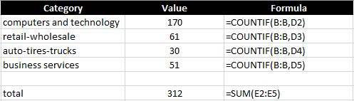
A better way to set this up is to reference an actual cell rather than hard-coding the criteria. This can help prevent errors and you don’t have to go into the cell to see what it is searching for. Here’s what the formulas look like:
I also added a SUM function at the bottom to see how many of the sectors are accounted for. With these formulas in place, I can easily copy down these functions to accommodate more sectors if I need more. This is what the COUNTIF function looks like in its simplest form. Next, let’s use wildcards to take it to the next level.
Using wildcards in a COUNTIF formula
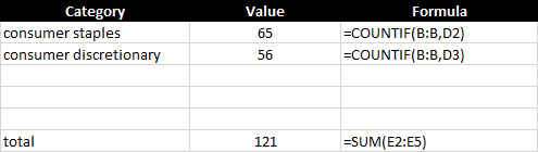
There are two sectors in this data set that are similar — consumer discretionary and consumer staples. If I use the approach above, I would need to create COUNTIF formulas for both of them and then total them up:
This isn’t optimal and since the word ‘consumer’ is in both sectors, I can just have the COUNTIF function look for that, rather than creating two separate formulas and then a third to total them. To accomplish this, I’m going to use a wildcard to just look for the word ‘consumer’ :
=COUNTIF(B:B,”consumer*”)
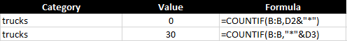
You’ll notice the asterisk at the end of the word ‘consumer’ which will ensure that it will also include any text that comes after it. But how can this work to make the formula dynamic and reference a cell? To do that, I’ll use the & to connect the string to the asterisk:
D2 is where the consumer value is, and by linking that with the asterisk (*) it still allows the cell to be dynamic. In the following example, I put the asterisk at the end of the text but you can also put it at the beginning if you want the value to end with the word:
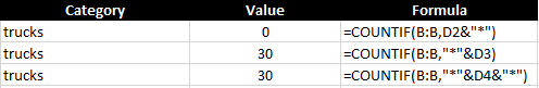
In my data, there is nothing that starts with trucks, but there are 30 values that end with it. The second formula counts those that end with the value. But what if you don’t care and just want to count every instance, regardless of where it is in the text? In that case, just add the asterisk before and after the criteria:
Suppose I just wanted to count all the sectors that included the letter ‘s’ :
A total of 709 sectors include the letter ‘s’ in their descriptions.
Using COUNTIF with blanks
You may also want to calculate how many of the cells are blank, nonblank, or don’t contain anything. Let’s cover those sections below:
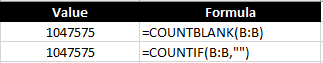
Counting blanks cells
To count all the blank values you have two options. You can use the COUNTIF along with an empty string (“”) or you can use the COUNTBLANK function if it is available on your version of Excel. Both can generate the same results:
Since I’m looking at the entire column, there are many blank cells in my entire range.
Counting nonblank cells
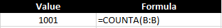
If you want to count the cells that have values in them, this is what the COUNTA function is used for:
My data set had 1,000 values in it and with the header, and so the formula returns a correct result of 1,001.
Using COUNTIF to count numbers
So far, I’ve covered how you can use the COUNTIF function in Excel with text. But you may also want to count numerical values as well. In this example, I am going to pull in the market capitalization of each of the stocks listed earlier. Here’s what that looks like:
You can use the COUNTIF function like with text but exact matches aren’t as useful when it comes to numbers. Neither are wildcards. Using the greater than (>) or less than (<) operations will be much more helpful in this situation.
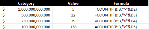
Let’s start with a scenario where I want to count all the stocks that are worth more than $1 trillion. To do this, my formula looks as follows:
=COUNTIF(B:B,”>1000000000000″)
Like with the wildcard, the greater than sign goes within the quotes, as does the number. You can also connect this to a cell using the & sign to make it more dynamic:
By referencing a cell and applying a number format, it is also easier to read the value than having to rely on counting the right number of zeroes within the formula. This formula correctly returns the number 5, indicating the number of stocks on the list with valuations of more than $1 trillion. I can copy this formula down and apply it to other valuations as well:
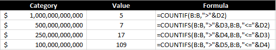
Each threshold tells me the number of stocks that are worth at least that value. But what if I don’t want to overlap and just want to know the number of companies between $500 million and $1 trillion? To do this, you will want to use the COUNTIFS function, which allows you to enter multiple criteria. It works similar to the COUNTIF function and you just continuing adding a pair of arguments (one for the range, the other for the criteria) until you are done. To count the number of companies that fall within $500 million and $1 trillion, my formula would look as follows:
In this example, I also included the equals ‘=’ operator so that it includes values that are less than or equal to $1 trillion.
This is how it might look in a table where you want the values to update dynamically:
In the first row, the COUNTIFS function isn’t needed since that is only looking at one criterion. But for the other calculations, it is pulling in only the values that fall within that range ensuring that they don’t overlap with other categories.
If you liked this post on how to use COUNTIF in Excel, please give this site a like on Facebook and also be sure to check out some of the many templates that we have available for download. You can also follow us on Twitter and YouTube.