In this post, I’m going to show you how you can easily calculate variances in Excel. I will also go over how to group variances and how using pivot tables, charts, and conditional formatting can help save you time in reviewing them.
For this example, I’m going to use data from the S&P 500 as stock prices frequently fluctuate. To start, I’m going to download the data from the past year. I’m going to remove everything except the closing values just to keep this example simple:

Calculating the variances
The calculate the variance in these data points, what I need to do is to take the current closing price, and subtract the previous day’s closing price from it. That will tell me how much of a move there was that day. On June 7, for instance, the S&P 500 fell from 4,229.89 on June 4 (the previous trading day) to 4,226.52. If I minus the current day’s close from the previous, I get a value of -3.37.
But we can dig a lot deeper than just looking at the difference in price. Let’s also create a field to indicate whether these variances are positive or negative. To do that, I’ll create another column called ‘Direction.’ For this calculation, I will take a look at the value in column C (where my variance is) and create a simple IF formula:
=IF(C2>0,”Positive”,”Negative”)
Here’s what my sheet looks like now:
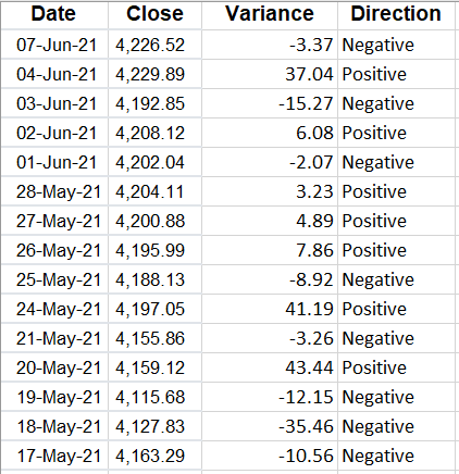
Although you can determine whether it is positive or negative from the variance field, by creating another column you can quickly filter if you want to look at all the negative or positive values. Another column I’ll insert here is for the percentage change.
To do this, what I will do is take the variance amount and divide it by the previous day’s closing price. This will tell me how much the price has moved as a percentage of what its value was the day before — which is much more useful than just looking at the raw value. After inserting the column, I have the total variance, variance %, and which direction it went in:
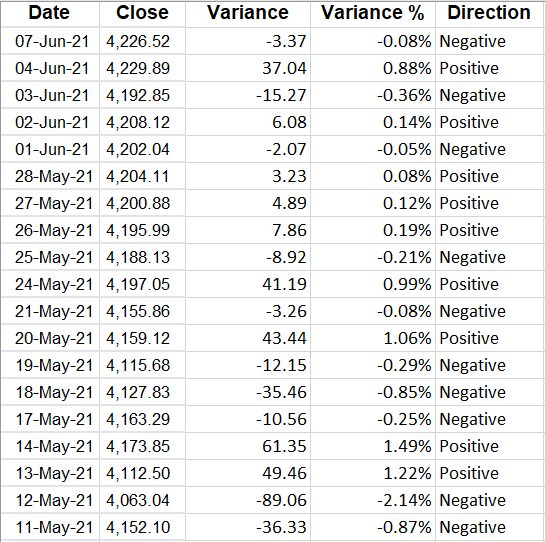
I changed the variance % field to show percentages and I added a few decimal places since the percentages are fairly small. To add decimal places, go to the Numbers group on the Home tab and click the following button on the left:

The one on the left will add decimal places while the one on the right will remove them.
However, what if you don’t care about positives or negatives and are just interested in the absolute value of the changes? I’ll cover that next.
Calculating changes in absolute value
With absolute value, you remove the positive or negative indicator. And to calculate a variance this way, you just need to add a formula to the calculation in the variance field. Rather than this:
=B2-B3
You would enter this:
=ABS(B2-B3)
Now, my variances update and I no longer have a use for the Direction field since all the values will be positive:
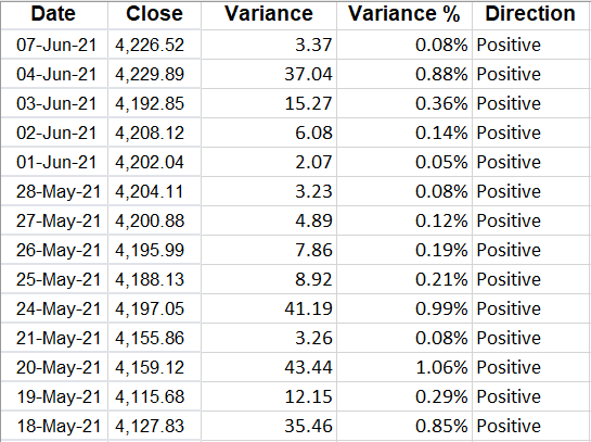
Alternatively, you could also just create another column specifically for the change in absolute value.
Now that the variances have been created, what you may want to do next is to group them.
Grouping variances
Why would you want to group variances? The big advantage in doing so is they can make it easier to analyze a large data set by showing you where the bulk of the variances are.
Rather than creating a bunch of IF statements, what I’ll do is create a table to show where the variances belong:
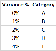
I’ve created a named range called VarianceTable for this. And now, all I need to is use a VLOOKUP formula to find which category a variance belongs in. Since I’m not using an exact match, I will set the last argument in the function to ‘TRUE’ :
=VLOOKUP(D2,VarianceTable,2,TRUE)
Now I have a category field instead of the Direction:
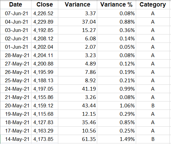
But this doesn’t tell me a whole lot. I could filter by the category. However, a better approach is to create a quick pivot table that shows me a summary of where the values fall:
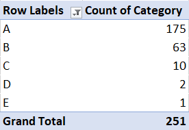
And from that, I can quickly display these variances on a chart:
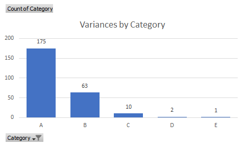
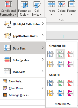
Another way you can help identify extreme values in variances is by using conditional formatting. To apply conditional formatting, select either the variance column or the variance % column and under the Conditional Formatting button on the Home tab, you can select either Data Bars or Color Scales. I prefer using Data Bars since there are fewer colors:
Then, my variances are easier to visualize and to see where the highs and lows are:
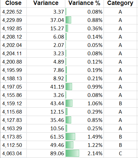
When you are analyzing variances, using conditional formatting, pivot tables, and charts can help you summarize your findings.
If you liked this post on How to Calculate Variances in Excel, please give this site a like on Facebook and also be sure to check out some of the many templates that we have available for download. You can also follow us on Twitter and YouTube.


