Adding a trendline to a chart in Microsoft Excel is a powerful way to visualize data trends and perform basic analysis. It can help you forecast future values and understand the underlying direction of your data.
Step-by-Step Guide to Adding a Trendline
Follow these steps to quickly add a trendline to a chart in Excel:
1. Select and Create Your Chart
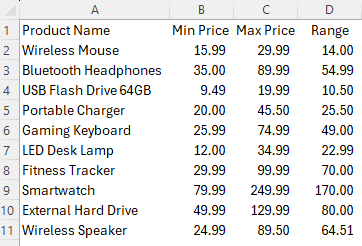
- Select Data: Highlight the range of data you want to chart, including column headers.
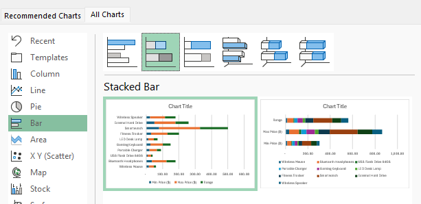
- Insert Chart: Go to the Insert tab on the Ribbon. For a trendline to be meaningful, you typically need an appropriate chart type, such as a Scatter chart or a Line chart. Click on the desired chart type to insert it into your worksheet.
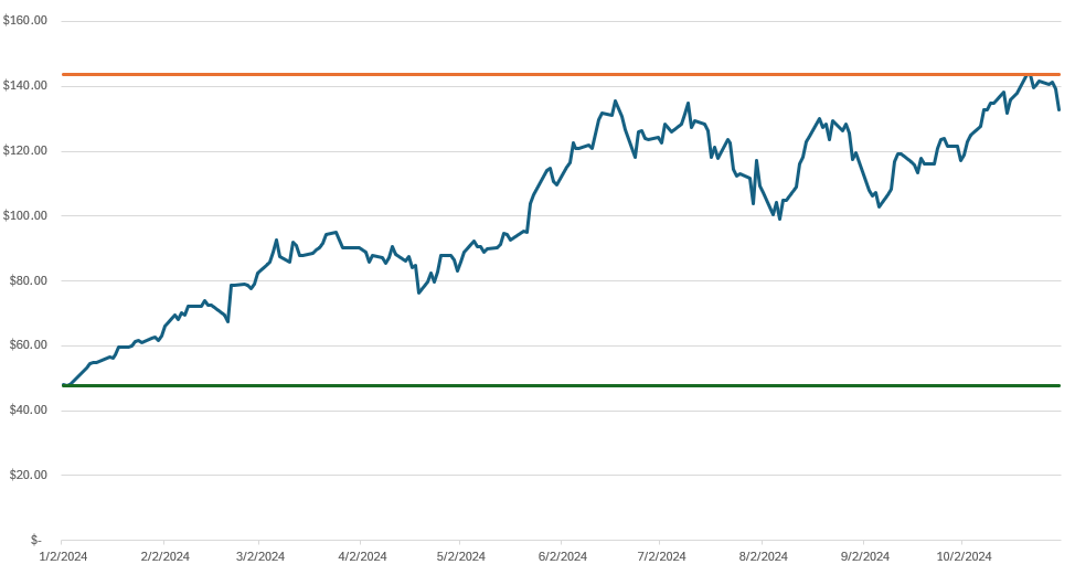
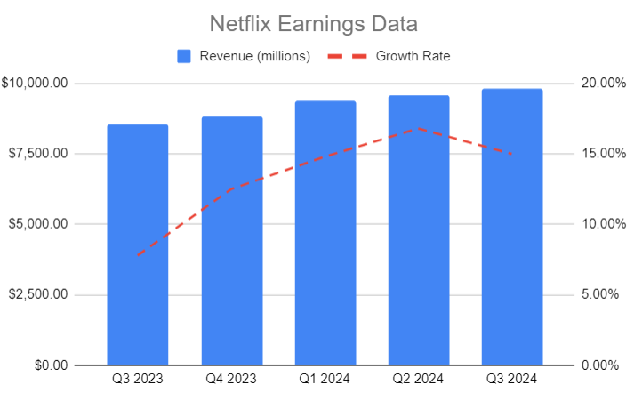
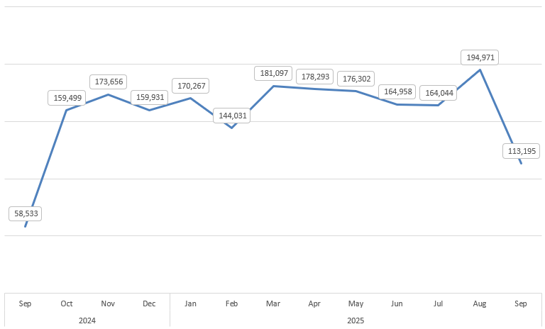
In the example below, I have a line chart showing sales by month.
2. Access Trendline Options
- Select the Chart: Click anywhere on the chart to select it.
- Use the Chart Elements Button: A small + icon, known as Chart Elements, will appear on the top-right corner of the chart. Click this icon.
- Add Trendline: In the list of chart elements, check the box next to Trendline. Excel will automatically add a linear trendline by default.

3. Customize the Trendline (Optional)
To change the type of trendline or show the equation:
- More Options: Click the small arrow next to the Trendline checkbox in the Chart Elements menu, and then select More Options…
- Alternatively, you can right-click the trendline itself on the chart and select Format Trendline…
- Choose Trend/Regression Type: In the Format Trendline pane that appears on the right, you can choose a different regression type, such as:
- Linear: Best for data points that resemble a straight line.
- Exponential: Best for data that rises or falls at increasingly higher rates.
- Logarithmic: Best for data where the rate of change increases or decreases quickly, then levels out.
- Polynomial: Best for oscillating data.
- Power: Best for data sets that compare measurements that increase at a specific rate.
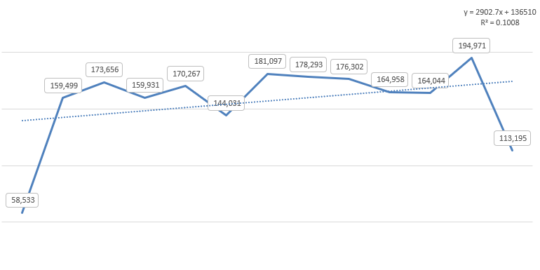
- Display Equation and R-squared Value: Check the boxes for Display Equation on chart and Display R-squared value on chart at the bottom of the pane.
- The equation allows you to calculate projections.
- The R-squared value indicates how well the trendline fits the data (a value closer to 1 is a better fit).
In my chart, I added the equation and the R-squared value on the chart. With a fairly low R-square value, this equation doesn’t indicate a good fit, and thus, it may not be helpful in forecasting future values.
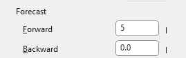
Forecast values with the trendline
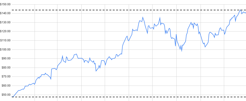
What you can also do is forecast out future values based on this trendline. To do this, go to the Forecast section of the trendline options. Here you can specify the number of periods you want to forecast. You can go either backwards or forward. In the example below, I’ve set to forecast 5 additional periods:
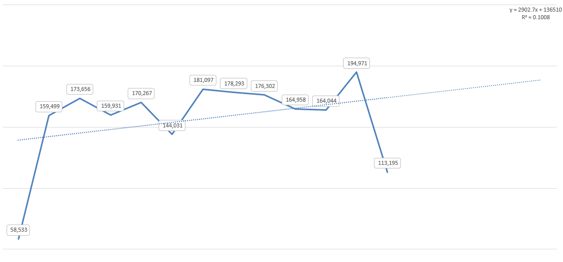
The chart now shows these future periods on the chart, with the trendline indicating where future values may lie. However, given the low R-square value, there isn’t a lot of confidence in these forecasted values being accurate predictors.
Benefits of Using a Trendline
The main advantage of adding a trendline is to gain analytical insight from simple visual data.
- Visualize Direction: A trendline instantly shows you the overall direction (upward, downward, or flat) and the strength of the trend in your data, filtering out the “noise” of individual data fluctuations.
- Forecasting (Extrapolation): By extending the trendline into the future (or past), you can make reasonable projections about values outside your current dataset. Use the Forecast option in the Format Trendline pane to set periods for forward or backward prediction.
- Identify Correlation: The R-squared value helps you quickly determine the relationship between your two variables—how much the dependent variable (Y-axis) is explained by the independent variable (X-axis).
- Simplification: It provides a simple mathematical model (the equation) to represent a complex series of data points.
If you liked this post on How to Add a Trendline to a Chart in Excel, please give this site a like on Facebook and also be sure to check out some of the many templates that we have available for download. You can also follow me on X and YouTube. Also, please consider buying me a coffee if you find my website helpful and would like to support it.