
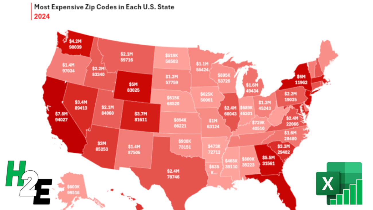
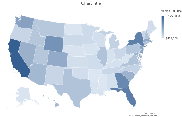
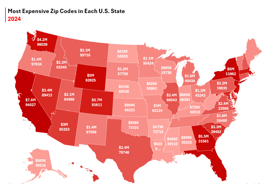
Map charts can help display a lot of data, showing you not only the largest values relative to other values. Below, I’m going to walk you through the steps of creating a map chart using real-world data, which looks similar to the one below:
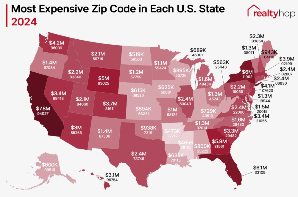
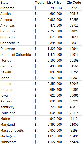
This is a chart I found on realtyhop.cm that I thought would be good to create from scratch. If you want to follow along, you can download the data from their website.
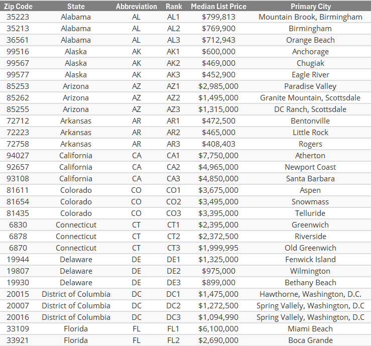
Here is a snippet of what the data looks like, loaded in Excel:
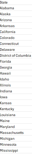
You’re not able to create a map chart with a pivot table, so instead, I’ll create the data that is necessary for the map chart. For starters, I’ll use in the UNIQUE function to grab a list of the unique values from the table:
=UNIQUE(Table1[State])
My table is called Table1, with the State field referring to the specific states. This produces a list of unique state values:
Next, I’ll pull in the largest price in the table based on state, using the MAXIFS function:
=MAXIFS(Table1[Median List Price],Table1[State],H2)
Where H2 is the state in my list. After doing that, I also need to lookup the related zip code. For this, I can use the INDEX and MATCH functions to look up multiple criteria:
=INDEX(Table1[Zip Code],MATCH(H2&I2,Table1[State]&Table1[Median List Price],0),1)
Where H2 is the state value and I2 is the median list price. I now have a table that following extracted values:
In order for the labels to display correctly on the chart, I also need to convert the values so that they show K for thousands and M for millions. The initial formula look as follows:
=IF(I2>=1000000,"$"&ROUND(I2/1000000,1)&"M","$"&ROUND(I2/1000,0)&"K")
What this formula does is checks if the value is at least $1 million, and if it is, then it adds an “M” to the end and converts it to a decimal. If it’s in thousands, then it divides it by 1,000 and adds a “K” to the end.
Here’s what the output looks thus far:
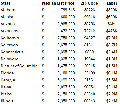
The ROUND function is used to limit the decimal places.
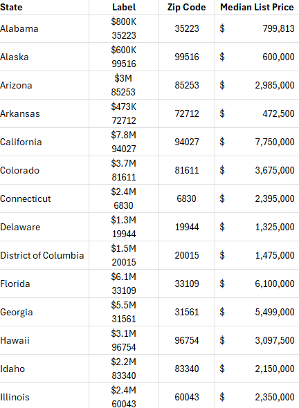
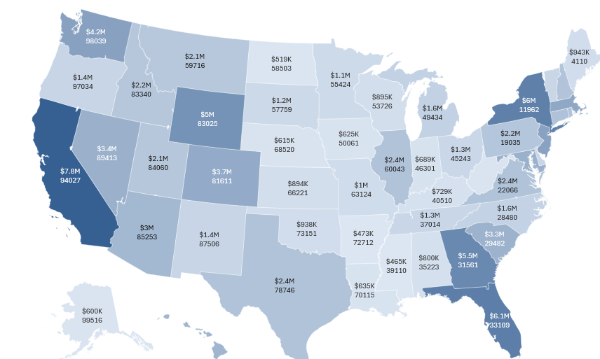
Since the labels also incorporate the zip code, that will also need to be added to the label. And since that value needs to be forced onto a separate line, I’ll need to use character code 10 to do that. I need to apply text wrapping to ensure it is displayed correctly in the table. The last thing I’ll do is move the median list price to the end and the label next to the state, making it easy to separate the values.
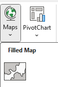
Now with the table setup, the next step is to create a map chart. From the Charts section on the Insert tab, there is an option to select Maps and there is an option for a Filled Map:
To ensure the data is selected correctly, right-click on the chart once it is setup and click on Select Data. Under the Legend Entries, ensure that just the column related to the Median List Price is selected. And for the Horizontal Category, just the first two columns for State and Label are selected. If you’ve set it up correctly, you should see something like this:
Next, it’s time to add the labels. Right-click anywhere on the chart and select Add Data Labels. Then right-click on any of the labels and select Format Data Labels. From here, you want to select the Category Name option — this pertains to the label column that was created earlier, which combines the value along with the zip code. Now the chart looks as follows:
Now, let’s adjust the color scheme so that it is red. Right-click on the data series again, then open up a section under the series option which says Series Color:
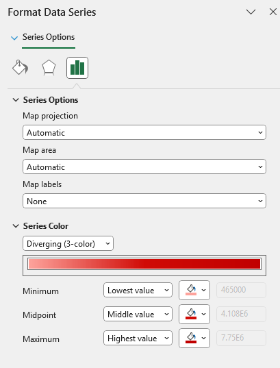
You can adjust the color based on the minimum, midpoint, and maximum values, and the gradient will update accordingly.
This now gives me a map chart that is highlighted in red:
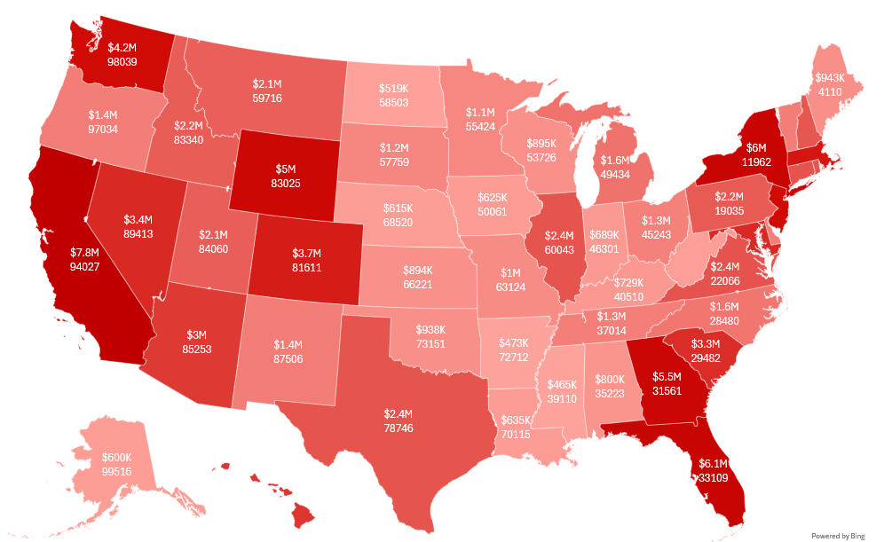
All that’s left at this point is to apply a title, and this can be done with the use of a text box. And after adding vertical red line next to the title, we get a fairly similar chart to the one initially shown:
If you liked this post on How to Create a Map Chart in Excel Showing the Most Expensive Zip Codes in Each U.S. State, please give this site a like on Facebook and also be sure to check out some of the many templates that we have available for download. You can also follow me on Twitter and YouTube. Also, please consider buying me a coffee if you find my website helpful and would like to support it.