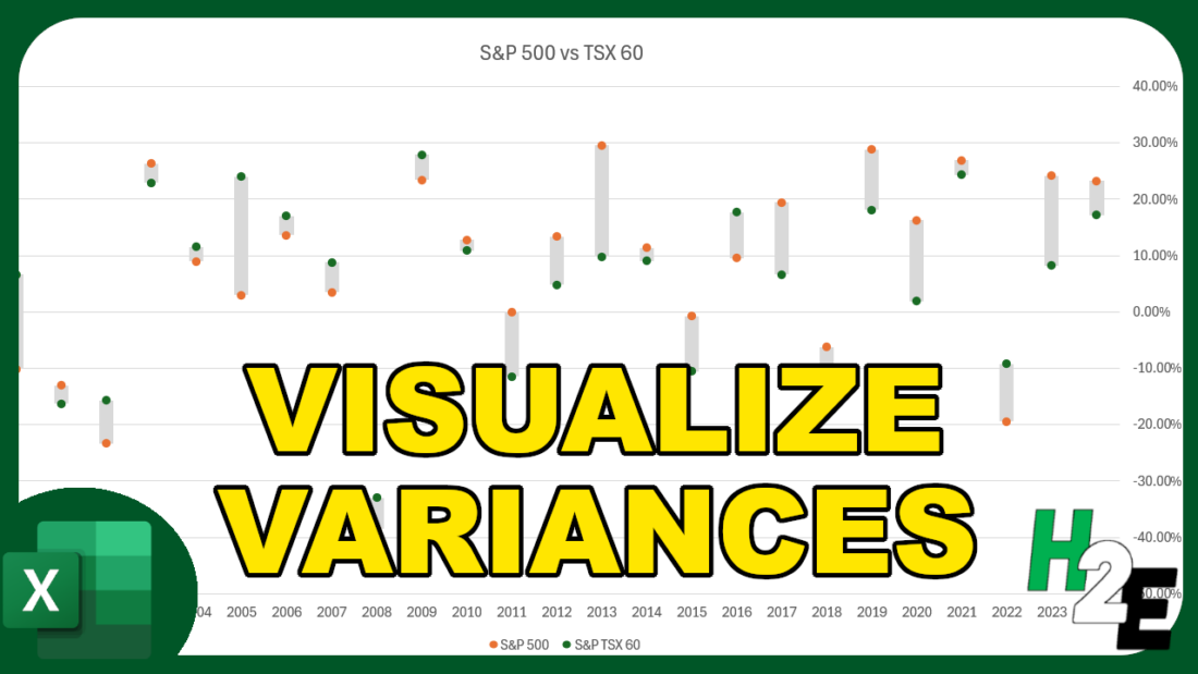
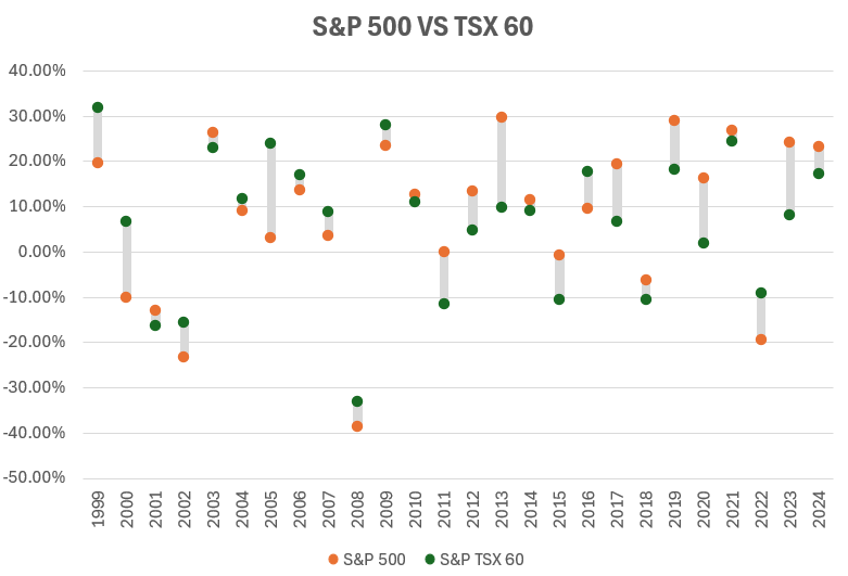
If you want to compare and contrast between two sets of values, a chart can help you accomplish that. In this post, I’m going to show you how you can compare multiple investment returns, and using a chart to not only map them but to also display the variances. For this example, I’m going to compare the historical returns of the S&P 500 against the S&P TSX 60.
Step 1: Setting up the table
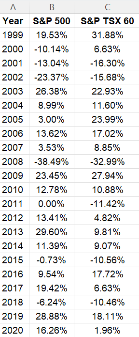
The first thing to do is to plot the values into a table format, making it easy to compare the differences. Below, I have multiple columns for the year, S&P 500 returns, and the S&P TSX 60 returns.
Step 2: Calculating the differences and starting point values
The goal of this chart is going to be to not just plot the values of these returns but to also show the gap between them. This can be a little tricky since the value scan be both positive and negative. It’s important to determine where the starting point for the column chart needs to be, and where it finishes.
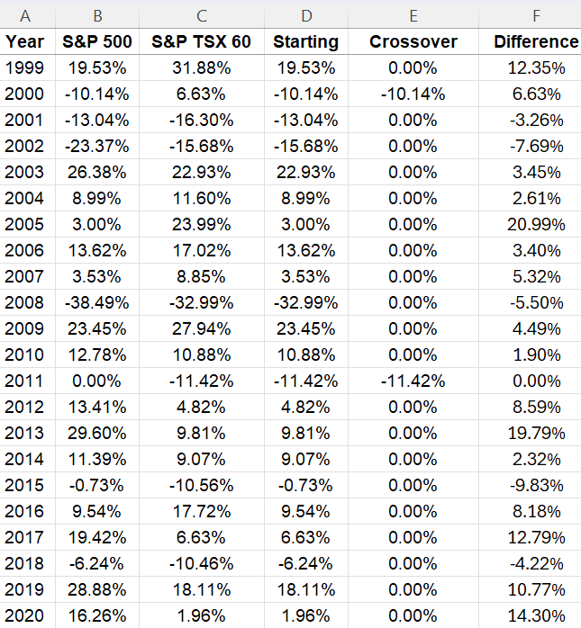
The first calculated column I’m going to create is for the starting point. If the two returns are both negative, then it will take the largest value (i.e. smallest negative number). Otherwise, it will take the smallest positive value. The formula for the first set of values in row 2 looks as follows:
=IF(AND(B2<0,C2<0),MAX(B2:C2),MIN(B2:C2))
Next, it’s necessary to calculate the gap for when there are both positive and negative returns, and when a crossover needs to happen to get to 0. This column, called crossover, will check to see if the returns are both positive or both negative. And if they are, then it will remain 0 since no crossover is needed. Otherwise, it will return the starting value. The formula for this column is as follows:
=IF((B2*C2)>0,0,D2)
By multiplying the values for both returns, it checks to see if there is a mix of positive values. If there is, then the value will be negative. If they aren’t, then it will return a 0 value.
Lastly, there is a column for the final difference field. First, it checks whether there is a value in the crossover field. If there is, it takes the maximum value in column B or C, which will be the other part of the gap to be filled in . If there isn’t a crossover value, then it looks at the starting value. If the starting value is positive, then it takes the largest value and subtracts the positive one. Otherwise, if the starting value is negative, then it takes the lowest value and subtracts the largest. This is what the formula looks like:
=IF(E2<>0,MAX(B2:C2),IF(D2>0,MAX(B2:C2)-MIN(B2:C2),MIN(B2:C2)-MAX(B2:C2)))
And here is the table, with the values calculated:
Step 3: Creating the chart
Now that the data is setup, the next step is to plot the values on a chart. This requires the use of a combination chart. To create it, make sure a cell on the data set is selected, click on the Insert tab and select the button to pop out more Charts. Go to the All Charts tab and select Combo. The S&P 500 and S&P TSX 60 fields, select the option for Line with Markers and for the others, choose Stacked Column.
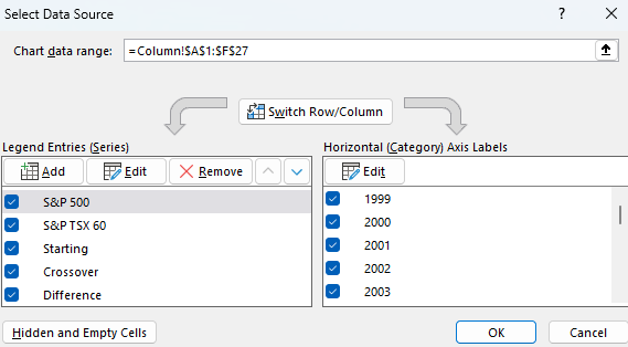
Initially, the chart is likely going to look incorrect and may include the date field. To fix this, right-click on the chart and click on Select Data. Remove the Year field if it is there. For the other fields, adjust the Horizontal Axis labels to ensure they are reflecting the year:
The chart still has a lot to fix in terms of formatting:
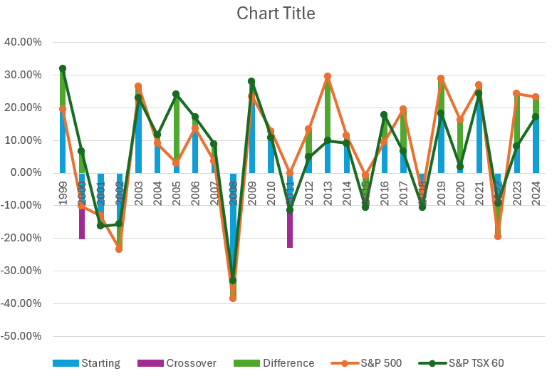
For the line charts, right-click on them and select Format Data Series. Since only the data point is necessary, I will go under the fill bucket tab and under the Line category, select No Line.
Next, the the starting value column, format the data series and for the fill bucket, set the Fill option to No Fill. Then, change the fill color for the difference and crossover columns so that they are the same color. I’ll use grey in this example.
To ensure the column charts stack properly, you’ll also want to modify the order of the series. Right-click to select the data, and ensure that Crossover field comes before the Starting field, followed by the Difference field. Here’s how the chart looks at this stage:
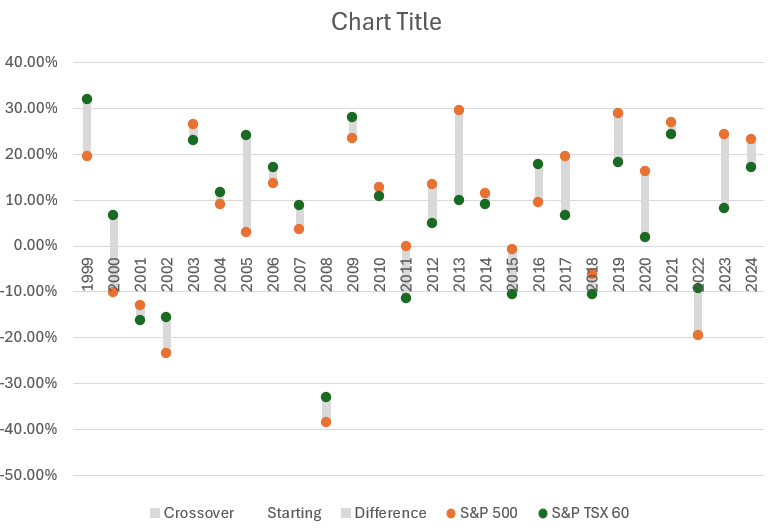
To clean up the chart a bit, I will move the labels to the bottom. This can be done by right-clicking on the years and selecting Format Axis. Under the Labels section, set the Label Position to Low. I’ll also delete the legend labels for the Crossover, Starting, and Difference fields. The last change is to set a chart title. This is what the final result looks like:
If you like this post on How to Create a Chart to Show a Range of Differences, please give this site a like on Facebook and also be sure to check out some of the many templates that we have available for download. You can also follow me on Twitter and YouTube. Also, please consider buying me a coffee if you find my website helpful and would like to support it.

