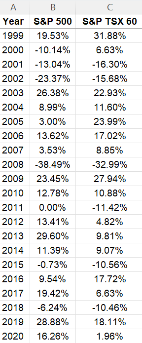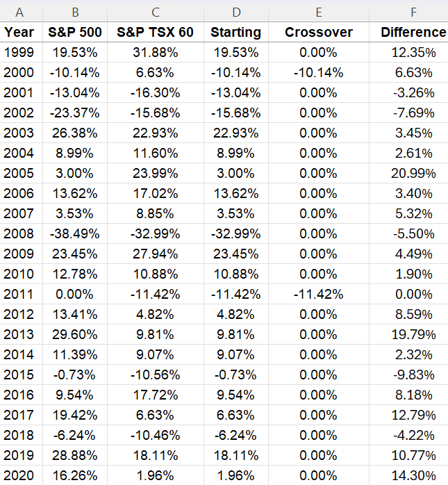
If you want to track your investments in a spreadsheet, with visuals, metrics, and up-to-date data, you can download my free Google Sheets template. Below, I’ll go over how the template works, and provide you with a link that will enable you to copy the file for your own use.
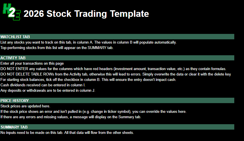
How the H2E 2026 Stock Trading Template Works
There are five tabs in the worksheet, which I’ll guide you through: guide, watchlist, activity, pricehistory, and summary.
Guide
This is the overview of the file and the instructions and also what not to do. There are no inputs on this sheet.
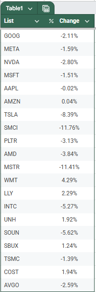
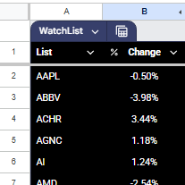
Watchlist
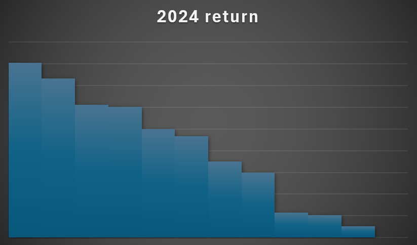
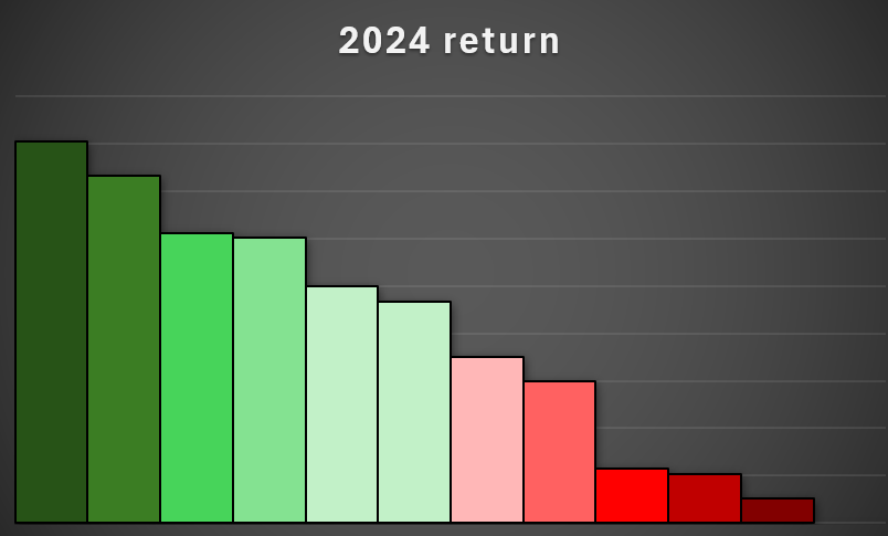
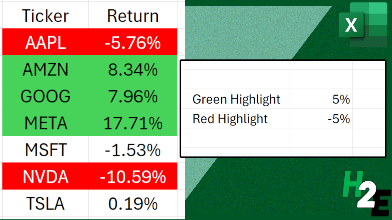
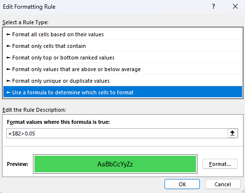
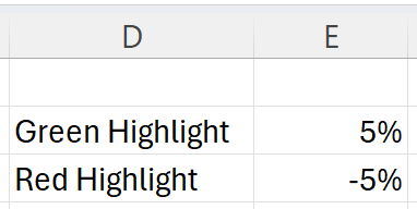
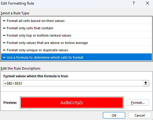
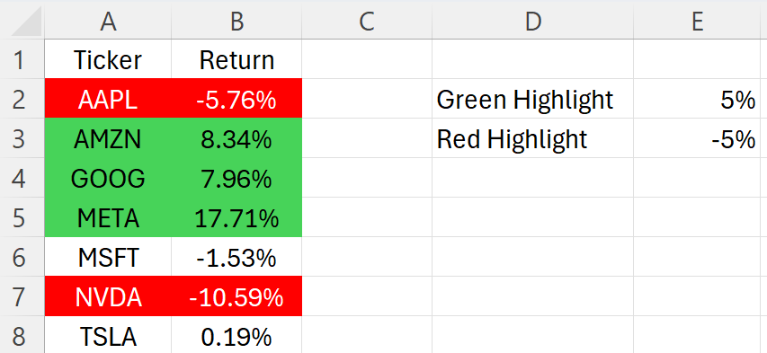
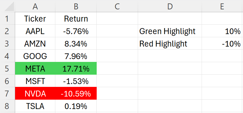
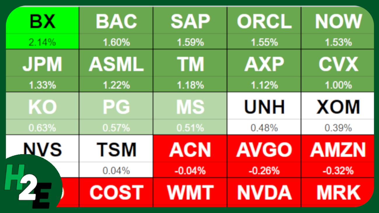
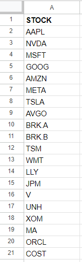
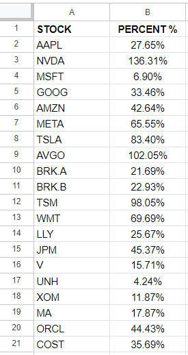
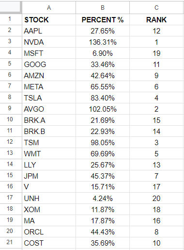
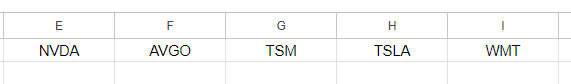
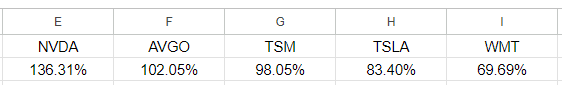
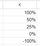
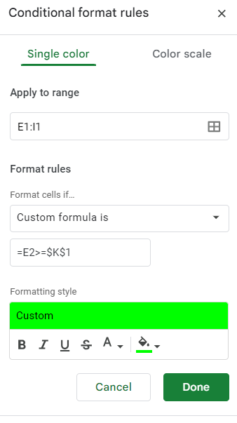
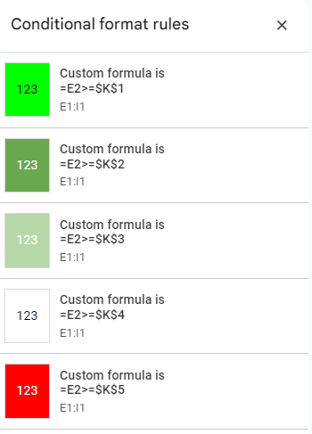
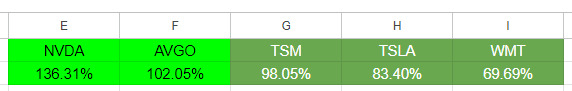
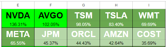
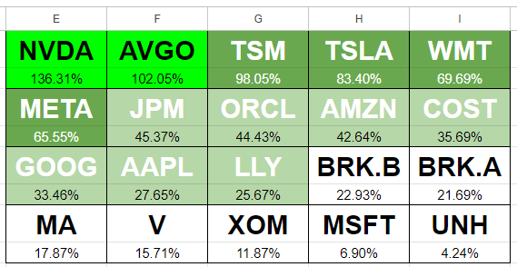
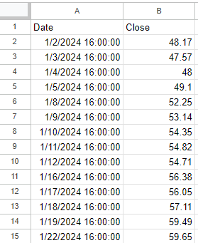
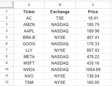
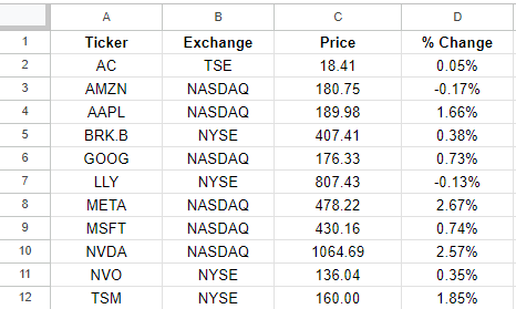
This is a list of stocks that you want to track. The top-performing stocks from this list will display on the Summary page, giving you a way to see what’s doing well on a specific day. You only need to update the stocks in column A. Column B pulls in the percent change for the current day and is driven by a formula.
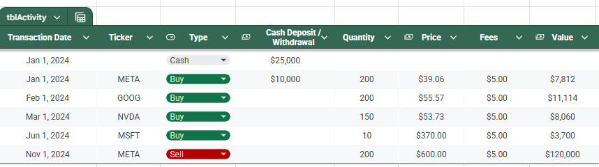
Activity
This sheet is where you will enter any transactions, including buy, sell, dividends received, contributions, and withdrawals. The headers that are highlighted in red indicate that those columns have formulas and shouldn’t be updated. The columns with headers in black are where you’ll want to input data.
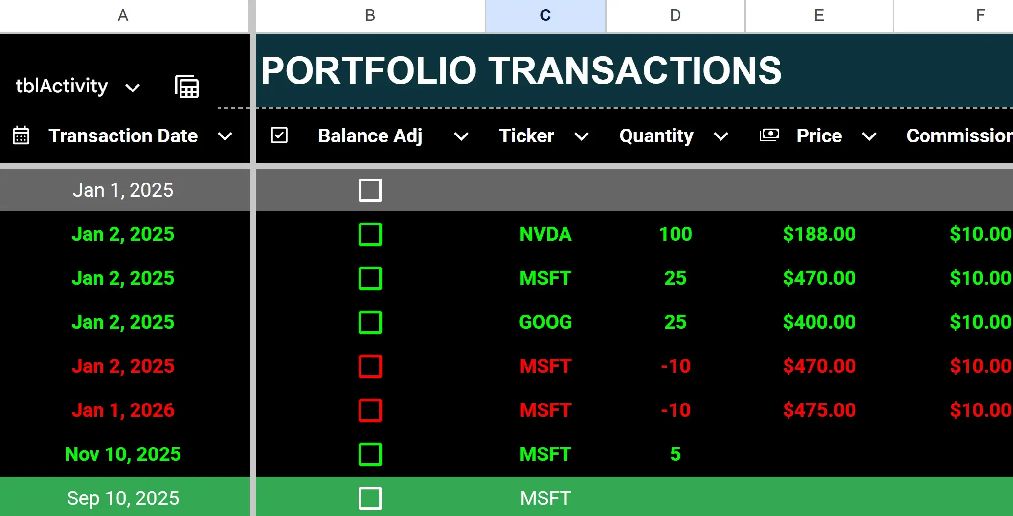
To enter a purchase, enter the ticker, quantity (positive), price, and any commission.
To enter a stock sale, populate the same fields but for quantity, make the value negative. Any stock sales will have their font turn red (regardless of whether the transaction is a gain or loss) and purchases will be green.
To enter dividends received, enter a value in column I for cash dividends. Dividend entries will highlight with a green background.
To enter a deposit or withdrawal from your portfolio, enter a positive value in column J for a deposit, or a negative one for a withdrawal. If there is a negative calculated cash balance, the value(s) in column Q will highlight red.
To enter starting stock balances, enter them as you would for a purchase (with a positive quantity) but check off the box in column B for balance adjustment. By doing this, you won’t affect the cash balance. Otherwise, a purchase will deplete your cash position.
If you make a mistake, it’s important to remember not to delete any rows. Doing so can lead to errors and values not calculating properly. Simply delete the values or override them.
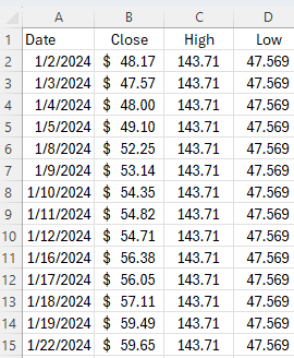
Pricehistory
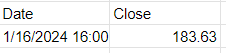
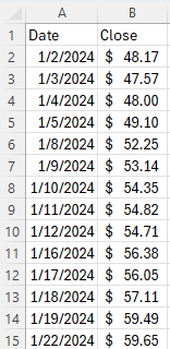
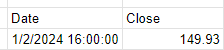
The Pricehistory sheet pulls in the stock prices from Google Finance for each stock, by month. You won’t need to enter any values on this sheet unless there is an error, such as if a stock isn’t found (perhaps it began trading recently or changed symbols). In those cases, you can override the formulas with a hardcoded amount, at which point you’ll just need to remember to update them later. When you no longer need the hardcoded amounts, you can copy the formulas down and let them take over.
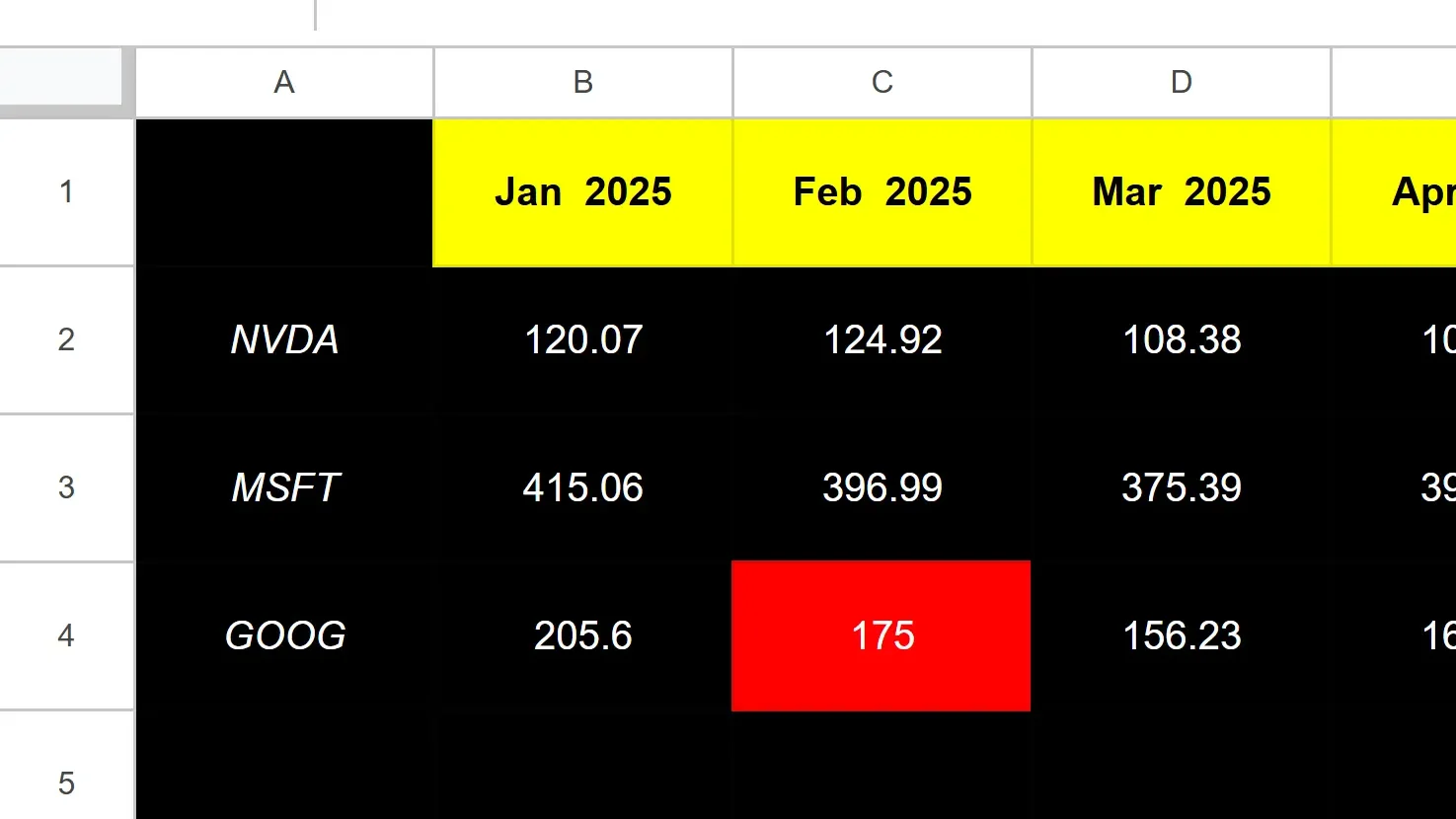
The cell highlighted in red in the screenshot above tells me that value is hardcoded.
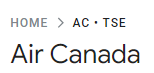
If, however, it’s erroring out for every month, then you’ll want to double-check that you’ve entered the ticker symbol correctly. This can happen if you have a stock that Google Sheets isn’t able to recognize without more information, such as the exchange. And in some cases, you’ll want to specify the exchange to ensure Google isn’t pulling the wrong ticker. It may assume you want the ticker that trades on the NASDAQ or NYSE, but if it’s a different one, you may want to specify the exchange.
For example, TSE:AC is the notation you would use to specify the Toronto Stock Exchange (TSE) and AC for Air Canada. The best way to check what the exchange notation should be is to go to Google Finance, look up the ticker there, and see how Google is referencing it.
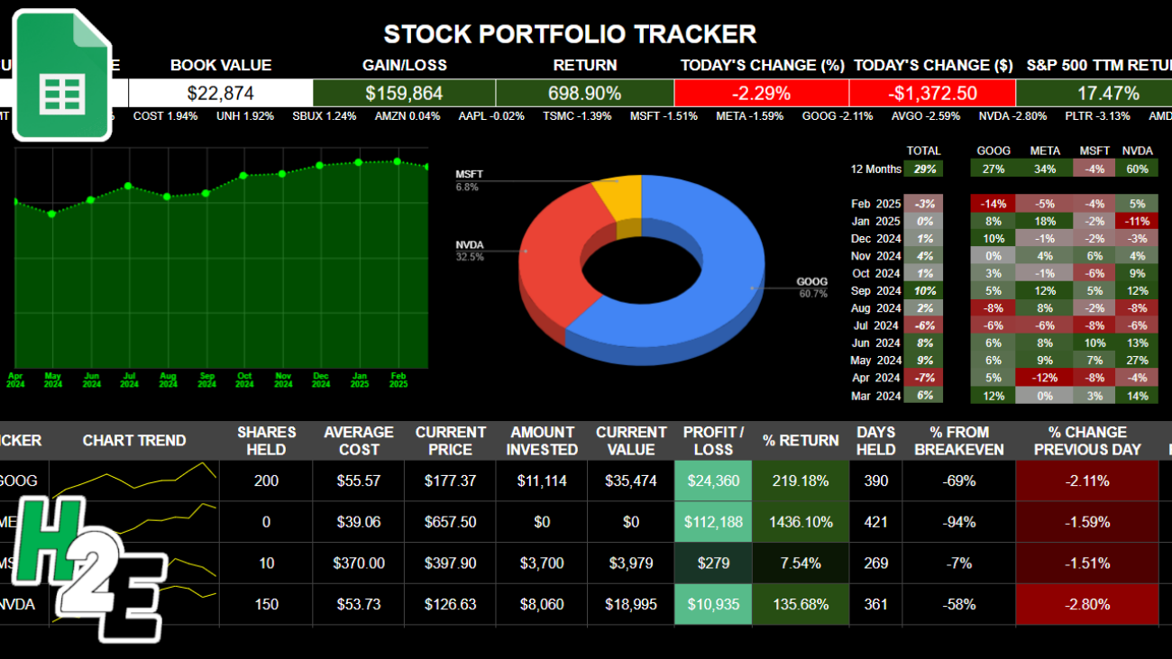
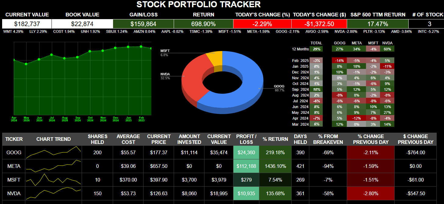
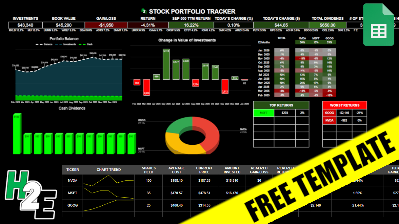
Summary
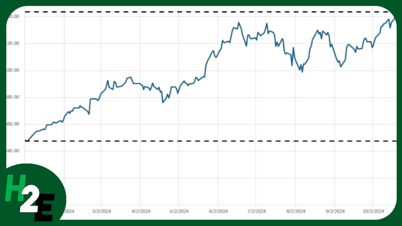
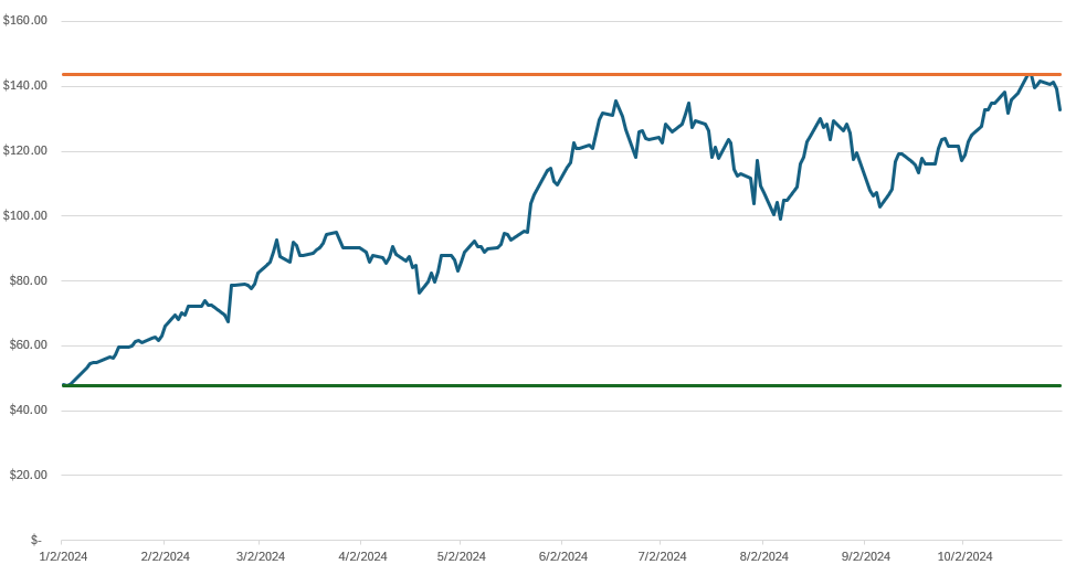
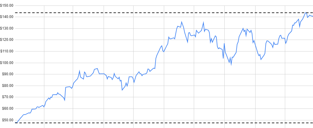
The summary sheet is effectively your dashboard, that will show you how your portfolio’s balance has changed over the past year, the dividends you’ve received, the breakdown of your positions, and your gains and losses.
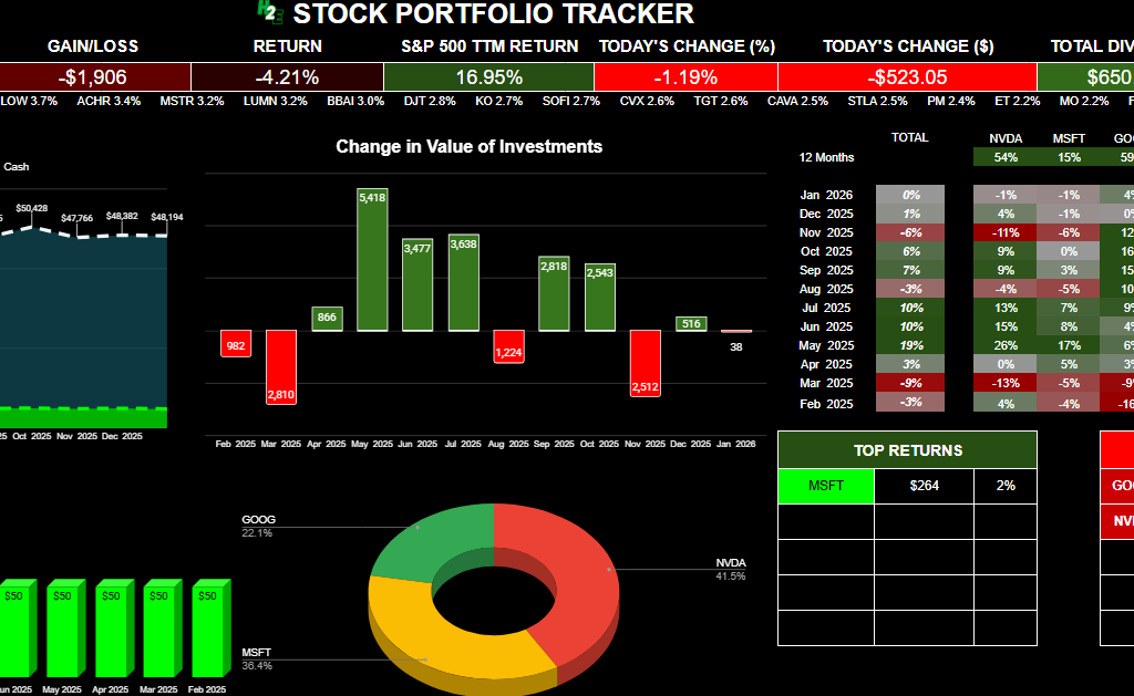
Below, there is also a table summarizing your positions, including realized, unrealized, and total gains and losses. The total gain and loss will include realized and unrealized gains and losses. Realized gains and losses will be populated anytime you have closed out of a position. The unrealized gain or loss will reflect your current position based on the number of shares you still own.
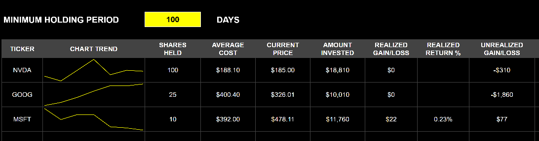
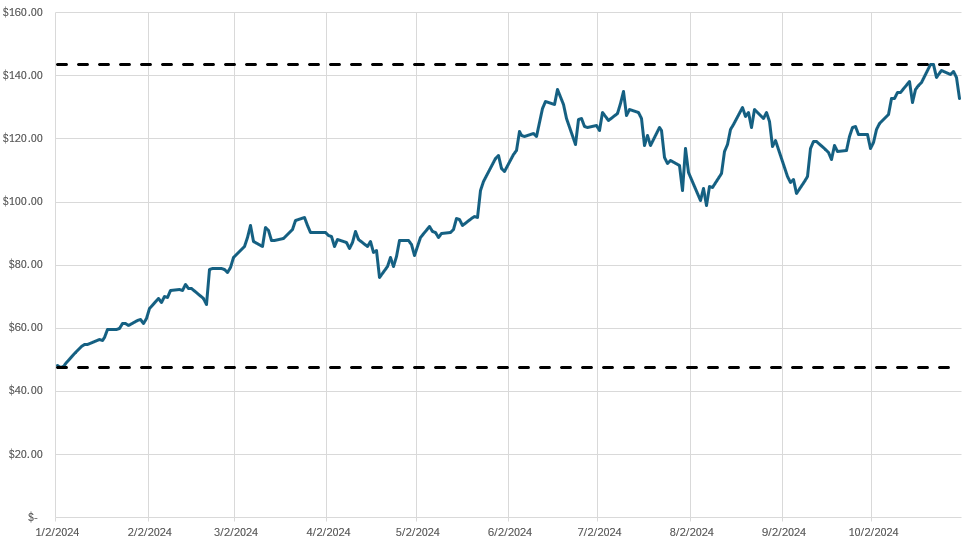
There is also a space where you can enter the minimum holding period, which may be useful if for tax purposes you need to hang on to an investment for a certain number of days. If you enter it and you haven’t been holding onto a stock for that long, it will highlight in grey to indicate that you are short of that minimum. If you don’t need it, you can just clear out the value and it will not highlight.
Download the Free H2E 2026 Stock Trading Template
Now that you know how the file works, feel free to test it out in Google Sheets. The link below will prompt you to make a copy of the file. The sample data will remain there but you can clear it out (just do not delete any rows!). If you have any questions, comments, or suggestions about the template, please contact me.
Disclaimer: This Google Sheets template is a personal tool shared for educational purposes. It is provided “as is” and has not been fully tested in all trading scenarios. I cannot guarantee its accuracy or freedom from errors. Use this tool at your own risk; I am not responsible for any financial losses or damages arising from its use. Please verify all calculations independently before placing trades.
Get the 2026 Stock Trading Template Here (Last updated: Jan. 8, 2026)
If you like the 2026 Stock Trading Template, please give this site a like on Facebook and also be sure to check out some of the many templates that we have available for download. You can also follow me on X and YouTube. Also, please consider buying me a coffee if you find my website helpful and would like to support it.