Moving averages can be useful in data analysis, when looking at trends both in finance and in the stock market. You can look at 30, 60, 90 day trends, and even longer or shorter durations. There’s also a difference between whether you are looking at a simple moving average and an exponential moving average. In this article, I’ll go over the differences between the two, and show you how you can calculate them in Excel.
How to Calculate a Moving Average (MA) in Excel
A moving average is a simple tool used by investors and traders to smooth out price data over a specified period. It is called “moving” because it is continually recalculated based on the latest data, providing a dynamic view of an asset’s average price over time. The advantage of an MA is its simplicity as it can easily be calculated.
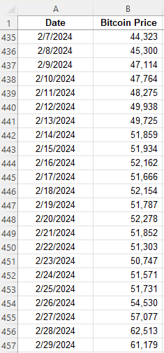
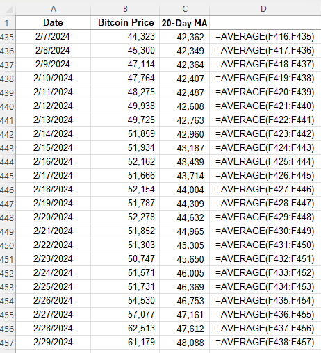
A moving average is calculated by simply taking the average of the trailing periods. In the case of a 60-day MA, you would look at the average over the past 60 days. If it’s a 90-day MA, then you average the past 90 days. In the following example, I have the price of Bitcoin over the past few years. Ideally, when setting up moving averages, you want your dates in ascending order, going from oldest to newest.
Here are the steps to calculate the moving average:
Determine the number of periods you want to go back. For 5 days, it will be 5, for 10 days it will be 10, and so on.
Calculate the average in the adjacent column. Make sure you do not freeze cells.
Copy the formula down so that the average moves (hence why you do not want to freeze cells).
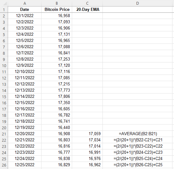
Here is what the values look like, along with the formula for each cell:
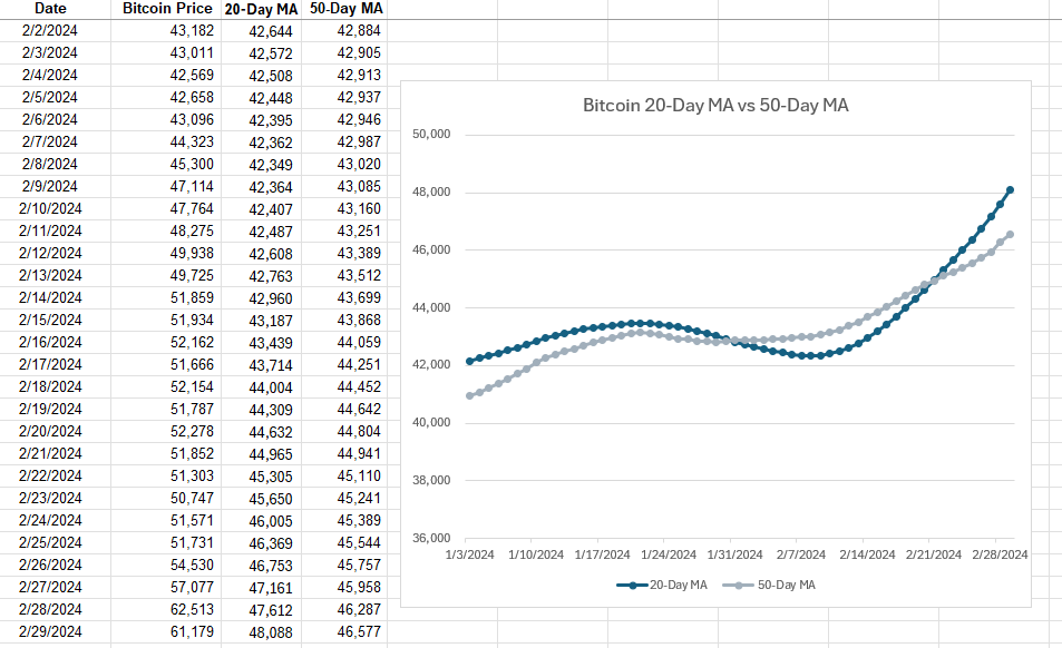
The average is continuously moving with each cell, but it always contains a range of 20 values since the 20-day MA contains 20 days. Oftentimes, people using multiple moving averages as a way to identify crossovers, such as when stocks cross 20-day MAs and 50-day MAs. Depending on the direction of the crossover, it can be a very bullish indicator (20-day MA crosses from underneath) or a very bearish indicator (20-day MA crosses from above). This is what those moving averages look like for Bitcoin and how they appear on a chart:
In this example, the 20-day MA made a bullish crossover recently, going higher than the 50-day MA. This is a very bullish trend. However, with simple moving averages, these trends can take a while to develop, and that is one of the drawbacks of using them — they are slower to react to recent price movements.
How to Calculate an Exponential Moving Average (EMA) in Excel
The exponential moving average (EMA) gives more weight to recent prices, making it more responsive to new information, and thus, there’s less of a lag effect; changes and crossovers can occur much more rapidly. This characteristic makes the EMA a preferred choice for many traders, especially those looking to capitalize on short-term trends.
Here’s how to calculate an exponential moving average in Excel:
Determine the number of periods, as you did with the simple moving average.
Calculate a multiplier, using the formula 2 / (period +1). In the case of a 20-day MA, the multiplier would be 0.095, which is 2/(20+1).
Calculate the moving average for the first period. The very first period needs to be a simple moving average.
For every value afterwards, you’ll use the following formula: =Multiplier x (Current Price – Previous EMA) + Previous EMA.
Here’s how this would be calculated with the price of Bitcoin, as in the previous example:
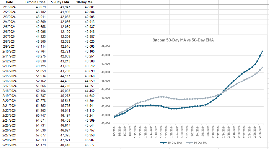
After the initial moving average, the subsequent averages are calculated using the weighting. Here’s a side-by-side comparison of how the 50-day EMA compares with the 50-day MA. I’m using 50-day averages here since they are normally slower to see movements in. But by using an EMA, that can help expedite trends.
The 50-day EMA makes quicker, more rapid movements and is changing more frequently while the 50-day MA is smoother and more gradual in its changes. With Bitcoin’s price rising rapidly in recent weeks, that uptrend is observed more immediately with the EMA than with the simple MA.
Which Should You Use: MA or EMA?
While both MAs and EMAs provide valuable insights into market trends, the choice between them depends on the specific needs of the trader or analyst. MAs are best suited for identifying long-term trends, as they smooth out price fluctuations evenly. In contrast, EMAs are ideal for those looking to react quickly to recent price changes due to their emphasis on newer data.
By understanding the differences between these two types of averages and knowing how to calculate them in Excel, investors and analysts can better tailor their strategies to suit their goals. Whether it’s the simplicity and broad trend identification of the MA or the responsiveness of the EMA to new information, both tools can be useful.
If you liked this post on What Is the Difference Between a Moving Average and an Exponential Moving Average, please give this site a like on Facebook and also be sure to check out some of the many templates that we have available for download. You can also follow us on Twitter and YouTube.
Do you buy stocks? Help track your transactions and your returns with this stock trading template. This is an update over the previous stock trading template, offering more reports and analysis, and the ability to more easily track your portfolio’s performance. In this post, I’ll go over how the template works, and how to use it.
Using the stock trading template for the first time
When you first use the 2024 stock trading template, there are a few items you may wish to modify on the Settings tab. These are the end date (by default set to today) and the short-term trading days cutoff. The end date is used because the reporting tab looks at the trailing 12 months. So if you want a cutoff as of Dec. 31, 2023 and see the full year, you can modify the cutoff there. But if you want to look at your returns up until today, you can leave that as is, up to today’s date.
The short-term trading days cutoff is used for a report which pulls your gains and losses over this number of days. If you’re a very active trader, you my want to lessen this interval to 30 days or less. If, however, you don’t trade that often, you may prefer a longer cutoff. The default is set to 60.
Enter transactions in the file
To make the data-entry process simple, there is a userform which will allow you to enter your buy and sell transactions. You can also enter starting balances and dividend payments. You can access the form from the Trading Journal section on the Home tab, right within the Excel ribbon.
By clicking the Enter Transaction button, you will see the following form pop up:
To start, you can use the Date Picker button to select the transaction date. With the date picker, you can use the button on the left and right side to move one month at a time. You can also select the month from the drop-down list. You can change the year by just typing in the year of the transaction. Once you have the right date and month, use the tab key so that the calendar updates. Then, click on the date the transaction relates to.
Next, select the action type. This will determine which fields you need to enter. There are multiple options to choose from.
If you are buying a new stock you don’t already own, select Open New Position.
If you already own a stock and are adding more shares, select Add to Existing Position.
If you are selling shares of a stock you own, select Sell Shares.
If you are adding cash to your portfolio, select Enter Contribution.
If you are withdrawing cash from your portfolio, select Enter Withdrawal.
If you are recording dividend payments, please select Enter Dividends.
If you are already own stocks and need to enter in your initial positions, select Starting Balance. For starting cash positions, use the Enter Contribution option.
You will then see a different form based on your selection, showing you which fields you need to enter.
Using different investing strategies
By default, there are three investing strategies you can select from when buying a stock: Buy and Hold, Contrarian, and Speculative. This can be helpful if you want to track how your different strategies work. If you don’t use different strategies, you can just leave everything as Buy and Hold. If, however, you want to add or modify strategies, click on the Update Strategies button when entering a new position:
That will then populate a new userform where you can manage the different strategies.
How the template tracks transactions
When you enter a transaction, it goes into two places. One is the Activity tab, and this acts as a log for everything you’ve entered. There is also the Transactions tab, which is designed for traders to track their opened and closed positions.
The data also flows through to the Summary tab, where you will be able to see your running portfolio balance, track gains and losses, and also see reports highlighting your overall trading performance. To make sure that all the charts update correctly, click on the Refresh button from the Trading Journal section on the Home tab.
Download the template
Want to try out the template? You can download the trial version here. It is limited to 25 transactions. If you like it, please consider purchasing the full version.
If you run into any issues with the template or have feedback or suggestions for improvements, please feel free to contact me. Please include the name of the template when drafting your message.
If you like the 2024 Stock Trading Template, please give this site a like on Facebook and also be sure to check out some of the many templates that we have available for download. You can also follow us on Twitter and YouTube.
The Price/Earnings to Growth (PEG) Ratio is a metric that enhances the traditional price-to-earnings (P/E) ratio by incorporating the company’s earnings growth rate into the calculation. This ratio is calculated by dividing the P/E ratio by the annual earnings per share (EPS) growth rate.
This calculation provides a more nuanced view of a stock’s valuation by factoring in future earnings growth, offering a more comprehensive perspective compared to the P/E ratio alone, which only considers the current price relative to earnings.
Why Investors Find the PEG Ratio Useful
Investors use the PEG ratio for several reasons. It allows for a more balanced comparison between companies with differing growth rates. A high P/E ratio might suggest a stock is overvalued, but when accounting for strong anticipated growth (as the PEG ratio does), the stock might actually be undervalued. This makes the PEG ratio a favored tool for identifying stocks that might offer a better return on investment, particularly when looking for good growth stocks.
The PEG ratio also aids in evaluating the potential overvaluation or undervaluation of a stock in relation to its growth prospects. A PEG ratio below 1 is often interpreted as a stock being undervalued given its earnings growth, whereas a ratio above 1 might indicate overvaluation. This simple benchmark can guide investors in making more informed decisions.
What is the Formula to Calculate the PEG Ratio?
The PEG ratio includes two components: the stock’s P/E ratio and the annual EPS growth rate. This is what the formula looks like:
Creating a template in Excel to calculate the PEG Ratio
Calculating the PEG ratio in Excel is straightforward, allowing investors to efficiently assess multiple stocks’ growth prospects against their valuations. Here’s a step-by-step guide to setup a worksheet to help you do this:
Input Data: Begin by entering the necessary data into Excel. You’ll need the current stock price, EPS, and the annual EPS growth rate. Ideally, you’ll want to setup the inputs first, followed by the formulas at the bottom. This will make it easier to enter the data in logical steps: first the ticker, the stock price, the EPS, and then the annual EPS growth.
For the annual EPS growth rate, you can pull this from a site such as Yahoo Finance (it’s under the ‘Analysis’ section). The percentage used is based on the next 5 years. Although it is percentage, enter it as a number (i.e. 100% would be 100).
Calculate P/E Ratio: In the first calculation cell, I’ll calculate the P/E ratio by dividing the stock price by the EPS.
Calculate PEG Ratio: The next calculation cell is the PEG ratio. This is calculated by taking the P/E ratio and dividing it by the annual EPS growth rate. If a stock is expected to grow at a 50% growth rate, the value should be 50, not 0.5 (i.e. don’t enter it as a percentage). Otherwise, this won’t calculate correctly.
Conditional Formatting. This is an optional step, but one which can help with your analysis. Use conditional formatting rules to highlight the PEG ratio based on its value. If it is less than 1, I’ll apply a green highlighting, a red highlight if it is more than 3, and yellow for anything in-between. Here is how you might set that up with an icon set
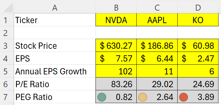
Here is how the template looks based on their stock prices and data as of Feb. 1, 2024:
In the above example, we have a fast-growing stock in NVDA, a moderate-growing stock in AAPL, and a slower-growing one in KO. Essentially what we are doing here is looking if the EPS growth rate is higher than the P/E ratio. If it is, that suggests it is not an expensive buy. NVDA, for example, is expected to more than double each year for the next five years, as is evident by its 102% EPS growth rate. While that would make it look like a cheap buy, you’re also assuming that it really can achieve that kind of a growth rate, which would be no easy feat. That leads us to an important part section: the limitations of this calculation.
Limitations of the PEG Ratio
While the PEG ratio offers valuable insights into a stock’s potential value by incorporating growth into the valuation equation, it’s important to recognize its limitations. Understanding these constraints can help investors use the PEG ratio more effectively alongside other analysis tools.
Growth Rate Estimations: The PEG ratio is heavily dependent on the accuracy of the earnings growth rate projections. These forecasts can be highly speculative and vary widely among analysts. Overly optimistic or pessimistic growth estimates can skew the PEG ratio, leading to potentially misleading conclusions about a stock’s valuation.
Historical Growth vs. Future Potential: The PEG ratio typically uses historical data to predict future growth, but past performance is not always a reliable indicator of future results. Companies in rapidly changing industries or facing new competitors may not sustain their previous growth rates.
One-Size-Fits-All Approach: The simplicity of the PEG ratio, while a strength, can also be a drawback. It does not account for the nuances of different industries or the specific risks and opportunities facing individual companies. A low PEG ratio does not guarantee success, nor does a high PEG ratio always indicate a bad investment.
Dividend Exclusion: The PEG ratio does not consider dividend payments. For income-focused investors, a company’s dividend yield and the stability of its dividend payments can be as important as growth. Companies with high dividend yields might be undervalued by the PEG ratio, which only focuses on earnings growth.
Market Conditions: The effectiveness of the PEG ratio can also be influenced by the overall market conditions. During bull markets, growth stocks tend to perform well, and their high PEG ratios may be justified by the market’s momentum. Conversely, in bear markets, value stocks with lower PEG ratios might be more favorable, regardless of growth projections.
Quantitative Focus: The PEG ratio is a purely quantitative tool and does not take qualitative factors into account. Elements such as management quality, brand strength, market position, and industry trends can significantly impact a company’s future performance but are not reflected in the PEG ratio.
If you liked this post on How to Calculate the PEG Ratio in Excel, please give this site a like on Facebook and also be sure to check out some of the many templates that we have available for download. You can also follow us on Twitter and YouTube.
Google Sheets provides investors with a great way to pull in stock prices, ratios, and all sorts of information related to stocks. Pulling in a stock’s history, for example, can make it easy for you to calculate a stock’s relative strength index, or create a MACD chart. But doing any sort of analysis for multiple stocks at a time isn’t easy. One way around this is to create a macro using Google App script that can automate the process for you and cycle through multiple stocks. Don’t know how to do it? No problem, because below I’ll provide you with a setup and a code that you can use.
First, I’ll go through creating the file from scratch and how it works.
Setting up the template
In this example, I’m going to find the stock’s largest value for a specific period. To start, I’m going to use the GOOGLEFINANCE function to get the stock history going back to Jan. 1, 2020. In the below example, I’ve got the price history for Meta Platforms, aka Facebook:
In cell B1 I’ve put a variable for the ticker symbol. This is to avoid hardcoding anything in the formula. This is important to make the process easy to update. In the macro, I’m going to cycle through ticker symbols. In Cell E2, I also have a formula that grabs the largest value in column B (the closing price):
=MAX(B:B)
However, this is where you can put your own formula or the results of your own calculation. Whether it’s a minimum, a maximum, or some other computation you want to do, you can put the results of that calculation here. This is the cell that will get copied during the macro.
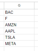
Then, in column G, I have a list of the stocks that I want the macro to cycle through:
As long as it’s a valid ticker symbol that the GOOGLEFINANCE function recognizes, you can enter it in this column. You can expand it as far as you like. However, if the macro goes on for too long then it will eventually time out and stop. If you want to cycle through every stock in the S&P 500, it is possible, but just be aware that you’ll likely have to do it in chunks. When testing it myself, I estimated I could do somewhere in the neighborhood of 200+ stocks in a single run. Once done, I copied the values onto another place on the spreadsheet with the values, and then replaced the stocks in column G with the next batch.
In Cell J1, I also have a variable called tickercount. This is a helper calculation to make the macro efficient. Instead of it having to count the number of stocks in my list, I provide it for the macro — anything to make it run quicker.
The Apps Script Code
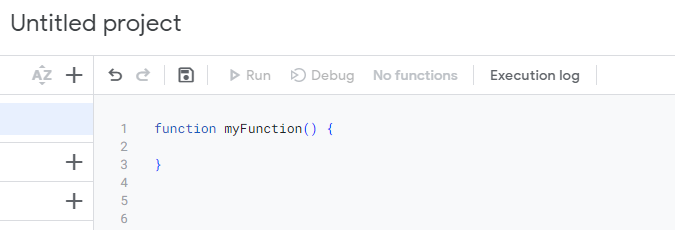
Now it’s time for the code to make this all work. To add code to your Google Sheet, select the Extensions menu and select Apps Script
Once in Apps Script, you can setup a new function. You should see the following:
Here’s the entire code that you can use based on my setup:
function myFunction() {

var sht = SpreadsheetApp.getActiveSheet();
var lastrow = sht.getRange("tickercount").getValue();

for (i=1; i<=lastrow;i++) {

  //change ticker
  sht.getRange('B1').setValue(sht.getRange('G' + i).getValue());

  //copy maximum value
  var result = sht.getRange('result').getValue();

  sht.getRange('H' + i).setValue(result);


}
}
Here’s a brief explanation of how the code works:
It begins by selecting the active sheet.
It determines the last value based on the ‘tickercount’ named range.
It loops through the values in column G.
It takes the value in column G and pastes it into cell B1 (the ticker variable).
The macro then gets the value from cell E1 (it has a named range called ‘result’)
It pastes the value of the result into column H, to the same row that the stock ticker was on.
If you leave my setup the way it is, what you can do is do any of your desired calculations on another part of the worksheet. As long as it doesn’t interfere with the ticker list or any of the ranges used in the macro, then you’re fine. You can also adjust where the cells are if that makes it easier. For example, you could move the ‘result’ named range from E1 to somewhere else in the spreadsheet. With a named range, you don’t need to worry about updating the cell reference.
Running the macro
A final part of this macro is actually running it. You need a way to trigger it. In my example, I’m using a button. This makes it easy to see what you need to click on for the macro to run. Here’s how you can create a button in Google Sheets and assign a macro to it:
1. Go to Insert and select Drawing
2. Create a shape, add text to it, and whatever colors/formatting you want. Then click Save and Close.
3. Select the button and click on the three dots on the right-hand side, where you will see an option to Assign Script.
4. In the following dialog box, enter the name of your function (don’t include the parentheses). The default function in Apps Script is called myFunction() and if that’s the macro you want to use, then you would just enter myFunction and click on OK.
If everything works, now when you click on your button, the macro will run. Check for any error messages to see if you run into any issues. If you need to edit the button afterwards, right-click on it first so that you don’t accidentally trigger the macro.
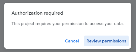
One thing to note is that when you run a macro on a Google Sheets file for the first time, you’ll be given a warning about doing so:
Click on Review permissions and select your Google account. You’ll get the next warning, saying that Google hasn’t verified this app and you’ll need to click on Advanced to continue despite the warnings. This is similar to the warnings you encounter in Microsoft Excel when enabling macros. Once you proceed and click on Allow, the macro will proceed to run.
Here’s how it looks in action:
Download my loop macro template
If you’ve gone through this post and run into issues or it is too complicated for you, feel free to download my loop macro template. Since it’ll create a copy for your use, you can modify it however you like to suit your needs.
If you like this post on Loop Through Stocks in Google Sheets With a Macro, please give this site a like on Facebook and also be sure to check out some of the many templates that we have available for download. You can also follow me on Twitter and YouTube. Also, please consider buying me a coffee if you find my website helpful and would like to support it.
Do you ever wonder how much of a return on an investment you would have made if you invested money into a stock or major index? In this post, I’ll show you how you can create a template to calculate those returns in Google Sheets. You can also download the one that I’ve made.
Setting up the inputs
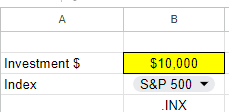
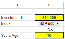
To make a template like this versatile and dynamic, it’s important to create cells for inputs so that the values can easily be updated. One cell should be for the investment amount. Another should be for the index or ticker, and the last option should be for the # of years in the past that you want to look back.
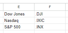
In Google Sheets, if you want to lookup the values for the S&P 500, Nasdaq, or Dow Jones, you’ll need to use the following symbols:
Dow Jones: .DJI
Nasdaq: .IXIC
S&P 500: .INX
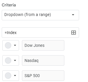
There is a period before each symbol. Regular stock symbols, such as GOOG for Alphabet are entered normally without any periods. But for an index, you need to add a period before the symbol. And as you can see from the symbols, they aren’t obvious as the S&P 500 uses INX while for the Nasdaq, it’s IXIC. Rather than entering in these symbols, it may be easier create a lookup list, which you can then use in data validation. For example, I have the list of related values posted in E1:F3
I can then use this lookup so that the user selects Dow Jones, Nasdaq, or S&P 500 and then the corresponding symbol will populate:
To create a drop-down list in Google Sheets, select a cell and click on Data and press Data Validation. From there, you can either manually enter your options, or you can reference a named range. In my example, I’ve referenced a named range called Index, which holds these values.
Next, there’s the field for the # of years you want to look back. This will be used in calculating the stock or index’s previous value. That is the final input that I will use for this template:
Calculating the return
To calculate the return from the investment, we need today’s value and the value from the past. To get the current value is simple and just requires the following formula:
=GOOGLEFINANCE(symbol,”price”)
In my file, I’ve created a named range called symbol which relates to the .INX value in the above screenshot. When no dates are entered, the formula will pull in the latest value for the symbol.
To get the previous value takes a bit more work. The formula will start off the same but I need to adjust the date so that it factors in the number of years I want to go back. To do this, I will use the DATE function and specify the year, month, and date values. Assuming I want the exact same date and only adjust the year, here is how I would adjust the formula:
In this formula, yearsback is the named range relating to the # of years I want to go back. In my example, it is set to 10. By adjusting the year argument in the date function by the number of years I want to go back, that will adjust the year and nothing else. The TODAY function returns the current date and acts as a starting point. For the last argument in the GOOGLEFINANCE function I set the value to 1, since I only want the value from a single day.
The formula will now grab the second row and second column, which relates to the value I want. Now that I have my current previous values, I can calculate the return. For this calculation, I only need to take the current value, divide it by the previous value, and subtract 1:
=currentvalue/previousvalue-1
Here again, I’m using named ranges to easily refer to those values and so it’s easy to see what I’m referencing. The result of this formula is a % change.
Lastly, I need to calculate the value of the investment today. This involves taking the original investment and multiplying it by 1 plus the return. This formula uses named ranges once more:
=originalinvestment*(pctreturn+1)
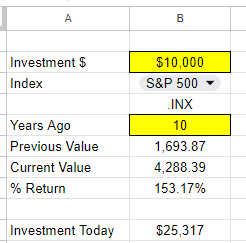
Here’s what my spreadsheet looks like now when I calculate what a $10,000 investment in the S&P 500 would be worth 10 years ago today:
You can see both the % return as well as the dollar amount of that investment. With the cells highlighted in yellow and a drop-down option, it makes it easy to see the fields that can be adjusted. If you prefer to use this calculation for just stocks, you can do away with the lookup and instead just enter the ticker symbol directly. If you’d like to download my version of the template, you can access a copy of it here.
If you liked this post on How Much Money Would You Have if You Invested in the S&P 500 10, 20, and 30 Years Ago, please give this site a like on Facebook and also be sure to check out some of the many templates that we have available for download. You can also follow me on Twitter and YouTube. Also, please consider buying me a coffee if you find my website helpful and would like to support it.
A popular investing strategy is dollar-cost averaging. With dollar-cost averaging, people invest a fixed amount of money into an investment on a recurring basis, regardless of whether the price has gone up or down. In this post, I’ll go over how it works, the benefits and disadvantages of dollar-cost averaging, along with a step-by-step guide on how to do it in Excel, using the stock market as an example.
What is dollar-cost averaging?
Dollar-cost averaging is an investment technique that takes the emotional aspect out of investing by spreading purchases over regular intervals, typically on a monthly basis. This means that regardless of market conditions or how you feel about an investment, you invest the same fixed-dollar amount on a recurring basis. When a stock’s price is low, that means you can buy more shares since they are cheaper. And when the price is higher, you buy fewer shares. But the end result is that you’re investing the same amount of money each time.
Why investors might use dollar-cost averaging
Below are the main reasons investors may want to consider using dollar-cost averaging:
Risk Mitigation
Dollar-cost averaging reduces the impact of market volatility on investment returns. By investing consistently over time, investors avoid the risk of investing a lump sum at the market peak and potentially suffering significant losses if the market subsequently declines. If the stock goes up in value, then that means your earlier buy-ins are generating profits and you’re buying into the rally. If the stock is going down, then you’re buying more of it and are averaging down. The benefit here is that as long as the business and investment remains sound, there’s a good chance that the stock will recover from a drop. Buying low could end up setting you up for some great returns.
Disciplined Approach
By dollar-cost averaging, investors establish habits that can help them resist the temptation to make impulsive decisions based on short-term market conditions. The investor remains focused on the long term and that can help lead to more rational decisions.
Ease of Implementation
Dollar-cost averaging is simple to execute, whether you’re an experienced investor or a novice one. You don’t need to do any complex analysis and instead just need to do the same thing every month or every period you plan to buy stock. By making the process easy, it makes it easier to adhere to.
Benefits of dollar-cost averaging
There are several advantages to using dollar-cost averaging:
Emotional Discipline
Emotions can often drive investment decisions, leading to irrational actions such as panic selling during market downturns or chasing after hot stocks during bull markets. Dollar-cost averaging can ensure you aren’t being reactive or making emotional decisions, which can lead to losses and risky behavior.
Lower Average Cost
Provided that you’re investing in a quality business that will grow over time, dollar-cost averaging can keep your average cost down. That’s because you’re buying more shares when prices are low, and thus, are able to average down. And if the investment grows over time and its value increases, so do your profits. By making incremental purchases along the way, you don’t need to worry about buying at the peak.
Reduced Timing Risk
Timing the market is notoriously challenging, even for seasoned investors. Dollar-cost averaging mitigates timing risk by spreading investments over time, reducing the impact of market fluctuations on the overall portfolio. Since you’re buying stock at regular intervals, there’s no temptation to time the markets and you get a more balanced investing strategy.
Flexibility and Scalability
Dollar-cost averaging makes it easy for anyone to build up their position in a stock. Whether you can afford to invest $5,000 or $500, you can spread the amount you plan to invest over the course of a full year into 12 monthly payments. Brokerages nowadays offer low or no-cost commissions, making it easy to justify investing even a modest amount; there’s no need to make a big buy-in.
Disadvantages of Dollar-Cost Averaging
These are the biggest drawbacks of using dollar-cost averaging:
Potential Missed Opportunities
The biggest downside of dollar-cost averaging is that if the price of a stock has dropped significantly, you are not investing more than your recurring amount. Even if the stock becomes a steal of a deal, with dollar-cost averaging you could potentially miss out on that opportunity since you aren’t making a big purchase at the time a stock becomes oversold or is trading at a big discount.
Increased Transaction Costs
In the event you aren’t using a low-cost brokerage and where you are incurring transaction fees, you could be incurring high expenses relative to your investment amount. This can be particularly troublesome when you’re making small investment amounts and fees will end up representing a big chunk of your overall investment. In these situations you may either want to increase your recurring investment amount, or simply not deploy dollar-cost averaging.
Diversification Limitations
Dollar-cost averaging is more effective when investing in a few stocks. It wouldn’t be practical or efficient if every month you had to invest the same amount in 10 or more different stocks. It can quickly become a time-consuming process, one that might not be worth sticking to. That’s why when investors talk of dollar-cost averaging, it usually relates to a small number of stocks, or perhaps even just one.
Market Trend Irrelevance
Dollar-cost averaging may not provide good returns in a bear market. When the market keeps going down, buying more simply ends up increasing your losses since you’re investing more during a downtrend. If you are going to use dollar-cost averaging, you need to have confidence in the business you’re investing in and be willing to be patient enough to hang on in the event of a bear market. If you need to sell your investment within a few weeks or months, dollar-cost averaging may not be a suitable strategy for you.
Step-by-Step Guide to Dollar-Cost Averaging
Here are the steps to take if you want to get started with dollar-cost averaging:
1. Set Investment Period
Determine the time interval for your investments. Monthly investments are common, but you can choose any frequency that suits your financial situation.
2. Allocate Investment Amount
Decide on the fixed amount you want to invest during each interval. This can be any amount that fits your budget and investment goals.
3. Choose Investment(s)
Select the asset or assets you want to invest in regularly. This can be individual stocks, exchange-traded funds (ETFs), mutual funds, or any other investment vehicle.
4. Start Investing
Begin investing the fixed amount at the chosen intervals, regardless of the asset’s price. Maintain consistency over the set investment period.
5. Monitor and Adjust
Regularly review your investment strategy and portfolio performance. Adjust the investment amount or asset allocation if your financial situation or investment goals change.
How to Calculate Dollar-Cost Averages in Excel
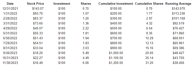
If you’ve begun dollar-cost averaging and want to know what the average cost of your investment is, you can do this easily in Excel. Create a table with the following headers: Date, Stock Price, Investment, Shares, Cumulative Investment, Cumulative Shares, and Running Average.
The Date relates to when the stock was purchased.
The Stock Price is what the stock price was when it was purchased.
The Investment is the total investment amount. This should be the same amount each period.
The Shares field is the number of shares purchased. This is the Investment total divided by the Stock Price.
The Cumulative Investment field is the sum of the Investment field up until the current date.
The Cumulative Shares field is the same thing, except it calculates the number of shares purchased up until the current date.
The Running Average takes the Cumulative Investment and divides it by the Cumulative Shares. Here’s an example of how dollar-cost averaging would have worked if you used to approach with Novavax, beginning in December 2021:
As you can see, with the very first row and very first purchase, the running average is the same as the stock price. But as the stock declines in value over the year, the running average becomes lower.
If you liked this post on How to Do Dollar Cost Averaging in Excel, please give this site a like on Facebook and also be sure to check out some of the many templates that we have available for download. You can also follow me on Twitter and YouTube. Also, please consider buying me a coffee if you find my website helpful and would like to support it.
In the fast-paced world of investing, identifying trending stocks in Excel can provide a valuable edge for investors seeking profitable opportunities. Fortunately, with the power of Excel’s Power Query and the ability to connect to a website’s API, accessing real-time data and uncovering trending stocks has become more accessible than ever. In this article, I will go through the process of using Power Query to connect to a website’s API and importing in trending stock information.
Why should investors try to identify trending stocks?
As an investor, it is crucial to identify trending and popular stocks for several reasons:
Profit Potential: Trending and popular stocks often have significant profit potential. When a stock is gaining popularity, it usually attracts more investors, leading to increased demand and potentially driving up the stock price. By identifying these stocks early, you can position yourself to benefit from the price appreciation and generate higher returns on your investment.
Liquidity: Popular stocks tend to have higher liquidity, meaning there is a larger pool of buyers and sellers in the market. This liquidity allows you to enter and exit positions more easily, ensuring that you can buy or sell shares without significantly impacting the stock’s price. Investing in liquid stocks provides flexibility and reduces the risk of being unable to execute trades at desired prices.
Market Validation: The popularity of a stock often reflects positive market sentiment and investor confidence. When a company is trending and gaining attention, it may indicate that the market believes in its growth prospects and overall performance. By identifying such stocks, you can align your investment choices with market sentiment and increase the likelihood of investing in companies with strong fundamentals and future growth potential.
InformationAvailability: Popular stocks generally attract more media coverage, research reports, and analyst attention. This increased coverage provides you with a wealth of information and analysis to make more informed investment decisions. You can leverage these resources to understand the company’s financial health, competitive position, industry trends, and other relevant factors that can impact the stock’s performance.
How to get trending stocks in Excel
To get trending stock data into Excel, you should start with finding a good source that you can rely on for trending data. For this example, I’m going to use apewidsom.io, which provides free access to its API using the following url: https://apewisdom.io/api/. Here’s how I’m going to use that to pull in trending data:
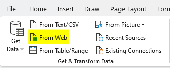
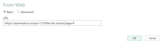
Extract the data using Power Query. To get started, I’ll select the Data tab in Excel and click on the From Web option.
Next, there will be a field to enter the URL, this is where I will paste the link that the API references:
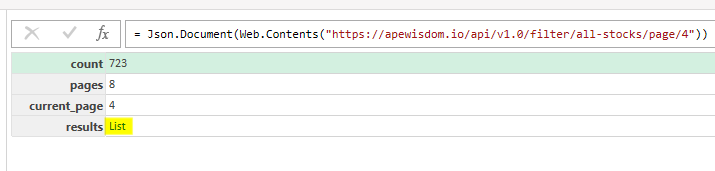
After clicking OK, Power Query will launch. When the screen opens up, the following table appears. I click on List to open up another table.
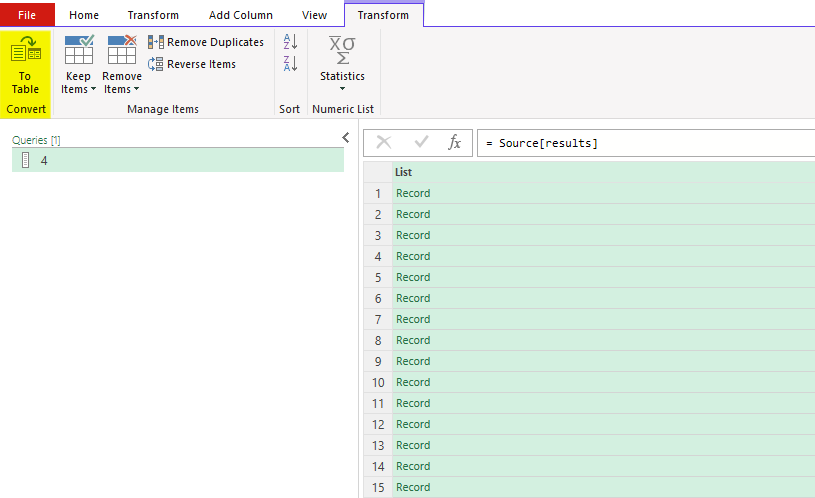
After clicking that, there’s another list of records.
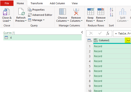
Here, I’ll select the option to convert to table and leave the default settings and click OK. Then, there is another list of records. Clicking on the button with the arrows going in opposite directions will expand them:
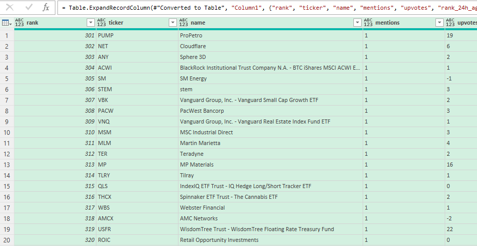
After expanding out those records, the table will now looks like a list of stocks and metrics relating to mentions, upvotes, and overall rank popularity:
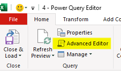
Now that this has been setup, I will convert this into a Power Query function. To do that, I’ll click on the Advanced Editor button:
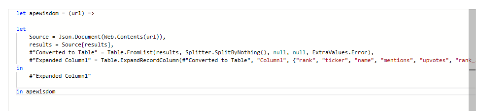
In the editor, I will add a line at the top to specify the name of the function. And at the bottom, I will add a line to circle back to it. Lastly, I’ll add a variable for the URL as well, and put that where the link used to be:
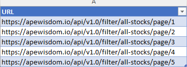
Next, with the custom function created, I’m going to go back into Excel and create a list of all the URLs I want to use this function on. In this situation, I’m going to adjust the page number at the end of the URL so that I have pages 1 through 5:
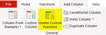
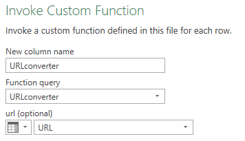
I’ll load this table, called URLtable, into Power Query using the From Table/Range button when selecting data. Next, I’ll select the Add Column tab and select Invoke Custom Function:
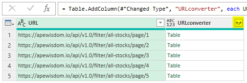
Then, I reference the query as well as the URL variable that is to be used:
Then, there will be a field with the results, in table format. Again, this needs to be expanded out:
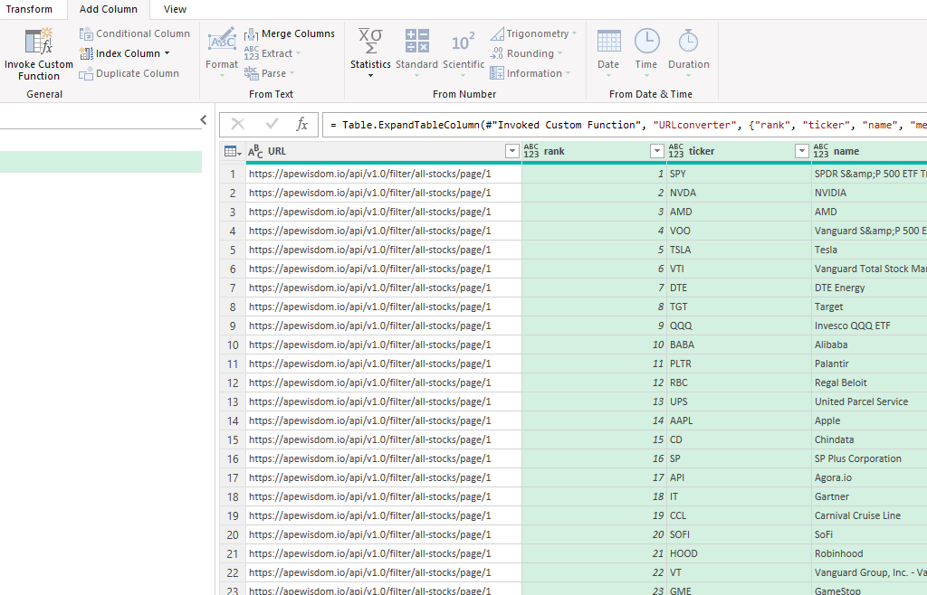
That will leave a list of stocks starting from page 1 all the way through page 5. You can remove the URL field, which is no longer needed:
If you don’t want to follow through all those steps yourself, you can download the template I’ve created here.
If you liked this post on Get Trending Stocks Into Excel Using Power Query, please give this site a like on Facebook and also be sure to check out some of the many templates that we have available for download. You can also follow me on Twitter and YouTube. Also, please consider buying me a coffee if you find my website helpful and would like to support it.
Do you have multiple lists in Excel or Google Sheets that you want to combine together? With new functions such as VSTACK and HSTACK, you can do just that. In this post, I’ll show you how you can also filter out duplicates and apply sorting so that your data is organized after consolidating all of your lists.
Combining multiple stock lists into a large one
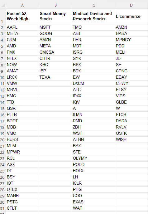
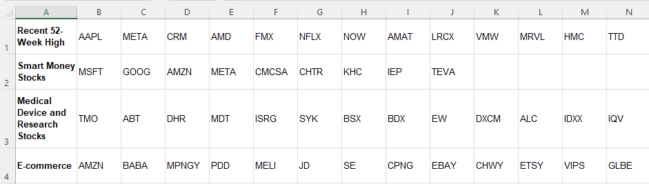
In this example, I’ll use various stock lists that I want to combine into one large list. On Yahoo Finance, you can find an assortment of different lists to help filter stocks. Below, I’ve pulled the lists of stocks that recently hit new 52-week highs, smart money stocks, medical device and research stocks, and e-commerce stocks:
The advantage of keeping the lists separate is that you can more easily update them. And by using VSTACK, you can combine these lists into a larger one so there’s no worry about having to consolidate them later on.
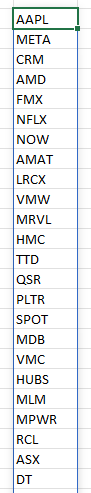
Based on the lists above, this is the formula that I use to combine them all together, using VSTACK:
=VSTACK(A2:A31,B2:B10,C2:C31,D2:D20)
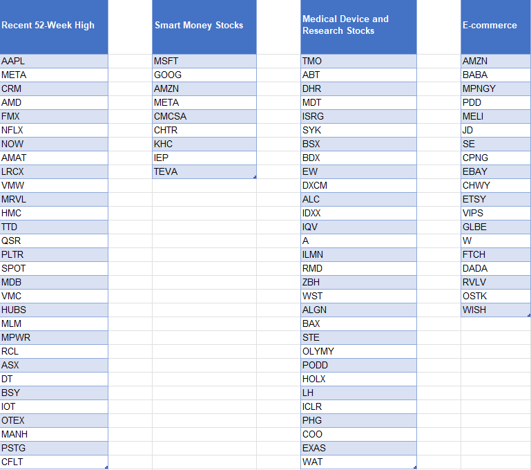
Since I don’t want to include the headers, I start from row 2. You’ll notice that I’ve hardcoded the ranges here. One way to make this more dynamic would be to use a COUNTIF or COUNTA function for the individual lists, and then use the INDIRECT function to limit the scope of the list. Another option involves converting the lists into tables. That way, you only have to list the table column and you don’t have to worry about the ranges. The one caveat here is that if you have lists that have different lengths, you’ll want to make each list its own table. Otherwise, Excel will automatically fill in the gaps with blank values:
While the data looks correct, if I were to use the VSTACK formula for these different table columns, I would get a consolidated list that involves many zero values. To keep it cleaner, it’s easier to just separate them into their own tables, and then reference them afterwards.
To reference these columns, my formula becomes much simpler:
=VSTACK(Table1[Recent 52-Week High],Table2[Smart Money Stocks],Table3[Medical Device and Research Stocks],Table4[E-commerce])
The advantage of doing it this way is that now I don’t have to worry about hardcoding the ranges, and thus, it’s easier to update.
Whichever method you prefer, the end result should look like a consolidated list:
Removing duplicates and sorting the list
In some of these lists, there is some overlap. AMZN and META are two stocks that show up twice. This means that my consolidated list will include those values multiple times. To get around this, I can embed the formula within the UNIQUE function:
=UNIQUE(VSTACK(A2:A31,B2:B10,C2:C31,D2:D20))
If you also want to sort your list, then you can add the SORT function as well:
If you have the same lists but instead have them going horizontally, then you can use the HSTACK function. It works the same way as the VSTACK but as the H suggests, it will require horizontal arrays. Here are the same list of stocks as in the first example, this time transposed so that they go horizontally:
In this case, the formula for HSTACK would be as follows:
=HSTACK(B1:AE1,B2:J2,B3:AE3,B4:T4)
You can apply the same steps as for the VSTACK to eliminate duplicates and to sort the results.
These formulas work the same in Google Sheets as in Excel
Whether you’re working in Google Sheets or Excel, these formulas will be the same. The VSTACK, HSTACK, SORT, and UNIQUE functions are all available on the latest version of Excel and on Google Sheets. There is no need to change any of the formulas besides just adjusting for any difference in ranges. The formulas themselves work in the same ways, making it easy to transfer data between Google Sheets and Excel and to replicate these formulas wherever makes sense for you.
If you liked this post on How to Use VSTACK and HSTACK in Excel and Google Sheets to Consolidate Lists, please give this site a like on Facebook and also be sure to check out some of the many templates that we have available for download. You can also follow me on Twitter and YouTube. Also, please consider buying me a coffee if you find my website helpful and would like to support it.
The Relative Strength Index (RSI) is a popular trading indcator that investors use for trading purposes. In this article, I’ll go over details as to what RSI is, why it’s useful, and how to calculate it in Excel.
RSI is a bounded oscillator that fluctuates between 0 and 100, providing insights to investors as to whether a stock is overbought or oversold. It compares the magnitude of recent price gains relative to recent price losses over a specified period of time, typically 14 days, and generates a value that indicates the potential for a price reversal or continuation.
The higher the losses are relative to the gains, the lower the RSI value becomes. And the opposite is also true, with the RSI value rising when a stock has been accumulating more gains than losses. Generally, an RSI value above 70 indicates an overbought condition, suggesting a potential price correction or reversal to the downside. Conversely, an RSI value below 30 indicates an oversold condition, implying a potential price bounce or reversal to the upside. Traders often use these overbought and oversold levels to identify possible entry or exit points in the market.
Why RSI Is a Useful Indicator for Traders
It’s important to note that the RSI is just one tool among many in technical analysis, and it should be used in conjunction with other indicators and analysis methods to make well-informed trading decisions. However, here are 4 reasons traders might find it useful:
1. Finding overbought and oversold levels
RSI can help investors identify buying and selling opportunities. When a stock is deeply oversold and the business is still in good shape but perhaps is down due to a bad quarter, it could be a sign to buy the beaten-down stock. In essence, it can help find market overreactions. At the same time, it can spot a stock that perhaps has become too hot when its RSI level is over 70 or 80, and that perhaps it has risen too much and too quickly.
It’s useful to also look at a stock’s historical RSI levels to gauge what kind of an opportunity it is. If it frequently dips in and out of oversold/overbought territory, it could simply be that the stock is volatile. But if it is rare for the stock to become oversold/overbought, then it could make for a good opportunity to buy or sell the stock depending on what the indicator says.
2. Measuring momentum and confirming a trend
The RSI provides insights into the strength and momentum of a price trend. When the RSI is rising and stays above 50, it indicates that buying pressure is dominant and the price trend may continue. Conversely, when the RSI is falling and stays below 50, it suggests that selling pressure is dominant and the price trend may continue downward. This information can help investors confirm the strength of a trend and make informed decisions about entering or exiting positions.
3. Identifying divergence patterns
Another valuable aspect of the RSI is its ability to identify divergence patterns. Divergence occurs when the direction of the RSI differs from the direction of the price. Bullish divergence happens when the price makes lower lows while the RSI makes higher lows, indicating a potential trend reversal to the upside. On the other hand, bearish divergence occurs when the price makes higher highs while the RSI makes lower highs, suggesting a potential trend reversal to the downside. Investors can use these divergence patterns as early warning signals of potential trend shifts and adjust their investment strategies accordingly.
4. Confirmation with other indicators
The RSI can be used in conjunction with other technical indicators to confirm signals and strengthen investment decisions. For example, if a stock shows overbought conditions based on the RSI, investors may look for additional indicators such as bearish candlestick patterns or negative volume divergences to support their decision to sell or take profits.
Other technical indicators investors can use alongside RSI
Investors often use many different indicators to make investment decisions. Here are a few commonly used indicators that can be used in conjunction with the RSI:
1. Moving Averages
Moving averages are trend-following indicators that smooth out price fluctuations over a specific period. The most commonly used moving averages are the simple moving average (SMA) and the exponential moving average (EMA). Investors often use moving averages in combination with the RSI to identify trend direction and potential support or resistance levels.
2. MACD (Moving Average Convergence Divergence)
The MACD is another trend-following momentum indicator that consists of two lines, the MACD line and the signal line. It helps identify potential buy and sell signals by measuring the relationship between two moving averages. Traders often look for convergence or divergence between the MACD and the RSI to confirm potential trend reversals or continuations.
3. Bollinger Bands
Bollinger Bands consist of a centerline (typically a moving average) and two bands that are plotted above and below it. These bands represent volatility levels. When the price reaches the upper band, it suggests that the asset is overbought, while reaching the lower band suggests oversold conditions. Combining Bollinger Bands with the RSI can provide additional insights into potential price reversals or breakouts.
4. Stochastic Oscillator
The Stochastic Oscillator is a momentum indicator that compares the closing price of an asset to its price range over a specific period. It consists of two lines, %K and %D, which oscillate between 0 and 100. Traders often look for oversold or overbought conditions on the Stochastic Oscillator in conjunction with the RSI to confirm potential trading signals.
5. Volume indicators
Volume indicators, such as On-Balance Volume (OBV) or Volume Weighted Average Price (VWAP), provide insights into the buying and selling pressure behind price movements. By analyzing volume alongside the RSI, investors can assess the strength and validity of potential price trends or reversals.
6. Fibonacci retracements
Fibonacci retracements are based on the mathematical relationships found in the Fibonacci sequence. They are used to identify potential support and resistance levels. Combining Fibonacci retracements with the RSI can help investors identify areas where a price correction or reversal may occur.
These are just a few examples of indicators that investors can use alongside the RSI. The choice of indicators depends on the investor’s trading strategy, timeframes, and personal preferences. It’s important to test and evaluate different combinations of indicators to find a system that works well for individual investment goals and risk tolerance.
Why you shouldn’t buy a stock just because the RSI is low
Buying a stock solely based on a low RSI level is not a recommended approach for several reasons:
1. It lacks context
The RSI is just one indicator and provides a snapshot of the stock’s recent price performance relative to its own historical price movements. It doesn’t take into account other fundamental factors or external market conditions that may impact the stock’s future prospects. For example, a stock may have a very low RSI because investors are selling it off due to liquidity issues or problems that may significantly impact the investing thesis behind a stock. Therefore, solely relying on the RSI without considering other relevant information may lead to an incomplete assessment of the stock’s potential.
2. False signals
The RSI is a bounded oscillator that fluctuates between 0 and 100. While an RSI below 30 may indicate an oversold condition, it doesn’t guarantee an immediate rebound or a profitable buying opportunity. Stocks can remain oversold for extended periods, and the RSI alone may not accurately predict the timing or magnitude of a price reversal. It’s essential to consider other technical and fundamental indicators to validate the potential opportunity.
3. Downtrends and value traps
A low RSI reading can sometimes be an indication of a stock in a prolonged downtrend. Just because a stock is oversold does not mean it will necessarily recover or provide substantial returns. There may be fundamental reasons behind the stock’s decline, such as poor financial performance, unfavorable industry conditions, or negative news. Investing solely based on a low RSI without understanding the underlying reasons for the low reading can lead to falling into a “value trap” not unlike how investors may buy a stock simply because its price-to-earnings multiple is low.
4. Confirmation bias
Relying solely on the RSI to make investment decisions may lead to confirmation bias, where investors seek information that supports their preconceived notions. It’s crucial to consider a broader range of indicators, conduct thorough research, and evaluate multiple factors to make well-informed investment decisions.
5. False oversold signals in strong downtrends
In strong downtrends, a stock can remain oversold for an extended period as selling pressure continues. Attempting to catch a falling knife solely based on a low RSI reading can result in further losses if the stock continues its downward trajectory. It’s important to assess the overall trend, market conditions, and other technical and fundamental factors to increase the probability of making successful investment decisions.
While the RSI can be a useful tool to identify potential opportunities, it should be considered as part of a comprehensive analysis that incorporates other indicators, fundamental analysis, and market conditions. By taking a holistic approach to investment decision-making, investors can make more well-rounded and informed choices.
How do you calculate RSI?
Here are the steps to take when determining how to calculate RSI:
1. Determine the timeframe
Traders usually use a 14-day timeframe for calculating the RSI, but it can be adjusted to suit different trading strategies and timeframes.
2. Calculate the average gain and average loss
The RSI compares the average gains and average losses over the chosen timeframe. To calculate the average gain, sum up all the positive price changes (gains) over the period and divide them by the number of periods. Similarly, calculate the average loss by summing up all the negative price changes (losses) and divide that by the number of periods.
3. Calculate the relative strength (RS)
The relative strength is the ratio of the average gain to the average loss. RS = Average Gain / Average Loss.
4. Calculate the RSI
The RSI is derived from the relative strength and is calculated using the formula: RSI = 100 – (100 / (1 + RS)).
Calculating RSI in Excel
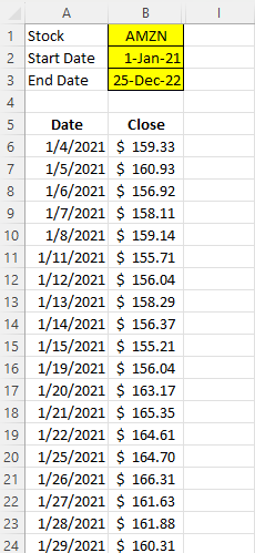
Using the STOCKHISTORY function in Excel, you can easily download a stock’s historical prices. In this example, I’ve downloaded Amazon’s stock price between the period Jan 1, 2021 and Dec 25, 2022.
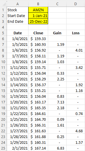
The next step is to calculate the gains and losses for each day. This just involves looking at the current closing price and the previous. If the price went down, the difference goes into the loss column. If it’s a gain, it goes into the gain column. Here’s an example of the formula for the gain column:
=IF(B7>B6,B7-B6,0)
Here’s a look at what the sheet looks like with the formulas filled in for the gain and loss columns:
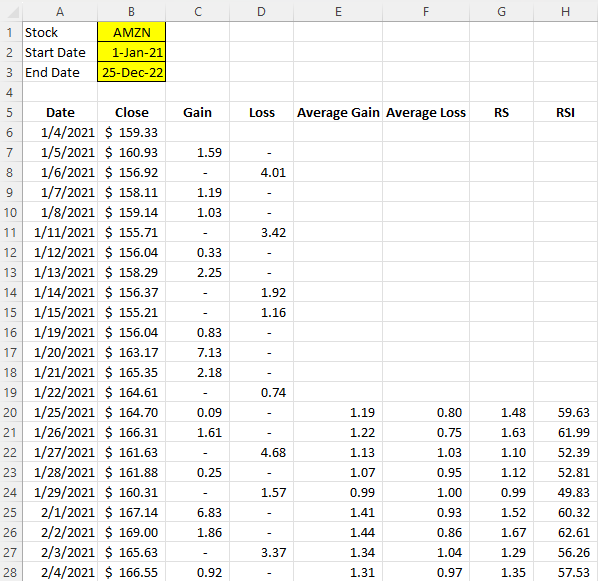
Next up, I need to calculate the average gains and average losses. I’ll do this for the past 14 trading days. For the first value, I just need to calculate a simple average:
=AVERAGE(C7:C20)
For subsequent cells, however, I’ll use an exponential average. That way, I’ll apply more weighting to the the most recent calculation:
=((E20*13)+C21)/14
Next, I will calculate the RS Value. To do this, I take the average gain and divide it by the average loss:
=E20/F20
Lastly, that leaves the RSI calculation, which contains the following formula:
=100-(100/(1+G20))
With all the fields filled in, this is what the spreadsheet looks like:
If you want to follow along with the file that I’ve created, you can download it from here. You can also watch the corresponding YouTube video that goes along with this tutorial:
If you liked this post on How to Calculate the Relative Strength Index (RSI) in Excel, please give this site a like on Facebook and also be sure to check out some of the many templates that we have available for download. You can also follow me on Twitter and YouTube. Also, please consider buying me a coffee if you find my website helpful and would like to support it.
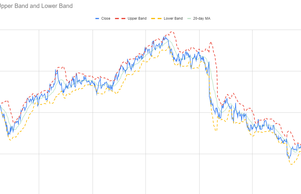
Bollinger Bands are used in technical analysis to help calculate and measure volatility. There are three bands that are included in chart: a moving average, and a lower and upper band. Normally, the upper and lower band are set to be within two standard deviations of the moving average. The standard deviation helps measure volatility and determines the width of the bands. As volatility increases, the band widens, and the opposite happens when volatility decreases.
The Bollinger Bands are often used by traders to identify opportunities for when to buy or sell a stock. If a stock price gets closer to the upper band, then it is considered to be overbought, and hence, this can be a time to sell. If, on the other hand, it is approaching the lower band, then it is oversold, and it may be an opportune time to buy. A similar tool that traders may also use is the Relative Strength Index, as that too tracks momentum and helps traders identify when a stock is overbought and oversold.
Why should you use Bollinger Bands?
Traders may use Bollinger Bands for a variety of reasons:
To identify buying and selling opportunities, such as when a stock is overbought or oversold. However, it’s important not to be overly reliant on a single indicator and it’s a good idea to also review other tools in conducting technical analysis to help confirm your trading decision.
Bollinger Bands can help gauge volatility. When the volatility is high, there is an opportunity for traders to take advantage of a large spread. With a large spread, there are more opportunities to buy low and sell high than there are when volatility is low and price is trading within just a narrow range.
Traders may also use Bollinger Bands to spot trends in the market as the bands will slope in a similar direction to price. This can help potentially identify buying and selling opportunities based on the stock’s trajectory.
How to create and chart Bollinger Bands
The process for creating a chart to show Bollinger Bands in Excel and Google Sheets is similar — the main difference is in how to pull in the stock price. The steps below go over the steps specific to Google Sheets:
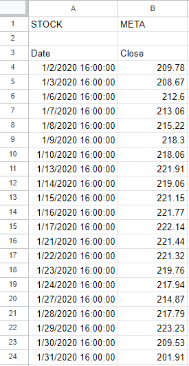
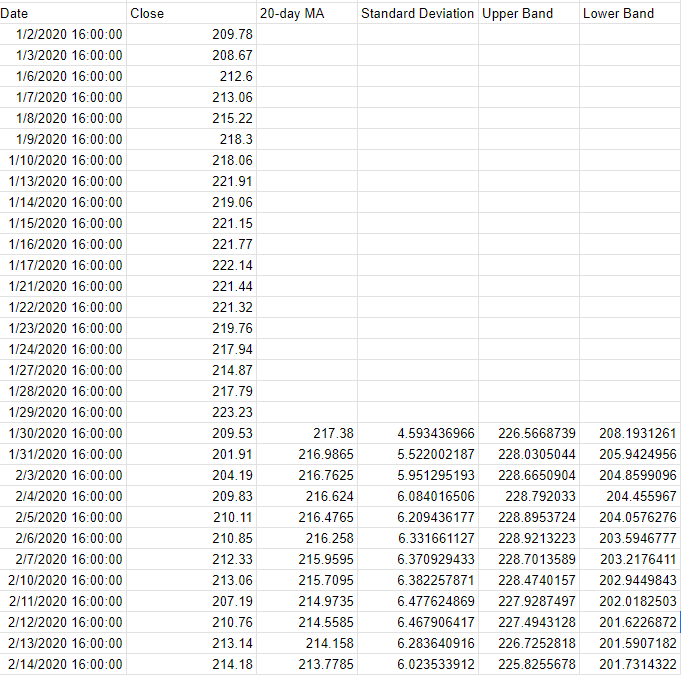
Start with downloading the stock prices. In my example, I have downloaded the stock price for Meta Platforms going back to 2020. This was done using the GOOGLEFINANCE function in Google Sheets, and the formula is as follows: =GOOGLEFINANCE(“meta”,”price”,”1/1/2020″,today())
Calculate the 20-day moving average from the closing prices. This is done using the AVERAGE function. Assuming the closing prices start from cell B4, the formula would be as follows: =AVERAGE(B4:B23). Copy the formula down to all the cells.
Calculate the standard deviation using the STDEV function. This is also based on the last 20 closing prices and is copied down to the bottom of the data set. This is the formula to calculate the standard deviation based on this example: =STDEV(B4:B23).
Calculate the Upper Band. Do this by multiplying the standard deviation by 2, and adding that to the 20-day moving average. Assuming the 20-day moving average is in cell C23 and the standard deviation is in cell D23, this is what the formula would look like: =C23+D23*2
Calculate the Lower Band. For this, multiply the standard deviation by -2, and add that to the 20-day moving average. Based on the above assumptions, the formula would be as follows: =C23+D23*-2
Once all those formulas are entered, your data set should look something like this:
Next, create a line chart to show the values on a graph. Then apply any formatting (e.g. dotted lines, colors, etc) and you should have a visual that looks like this:
If you liked this post on How to Create and Chart Bollinger Bands in Google Sheets and Excel, please give this site a like on Facebook and also be sure to check out some of the many templates that we have available for download. You can also follow us on Twitter and YouTube.