What are Bollinger Bands?
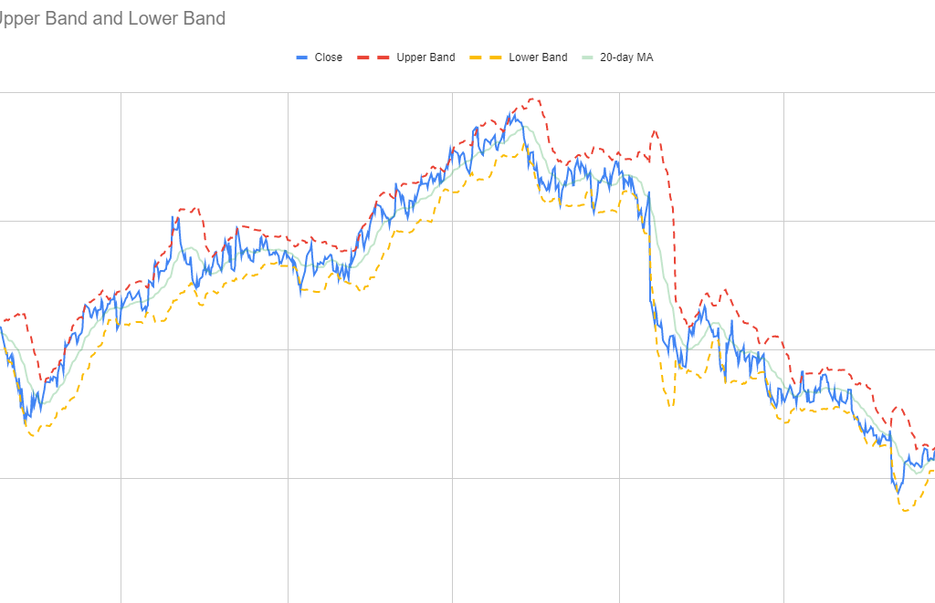
Bollinger Bands are used in technical analysis to help calculate and measure volatility. There are three bands that are included in chart: a moving average, and a lower and upper band. Normally, the upper and lower band are set to be within two standard deviations of the moving average. The standard deviation helps measure volatility and determines the width of the bands. As volatility increases, the band widens, and the opposite happens when volatility decreases.
The Bollinger Bands are often used by traders to identify opportunities for when to buy or sell a stock. If a stock price gets closer to the upper band, then it is considered to be overbought, and hence, this can be a time to sell. If, on the other hand, it is approaching the lower band, then it is oversold, and it may be an opportune time to buy. A similar tool that traders may also use is the Relative Strength Index, as that too tracks momentum and helps traders identify when a stock is overbought and oversold.
Why should you use Bollinger Bands?
Traders may use Bollinger Bands for a variety of reasons:
- To identify buying and selling opportunities, such as when a stock is overbought or oversold. However, it’s important not to be overly reliant on a single indicator and it’s a good idea to also review other tools in conducting technical analysis to help confirm your trading decision.
- Bollinger Bands can help gauge volatility. When the volatility is high, there is an opportunity for traders to take advantage of a large spread. With a large spread, there are more opportunities to buy low and sell high than there are when volatility is low and price is trading within just a narrow range.
- Traders may also use Bollinger Bands to spot trends in the market as the bands will slope in a similar direction to price. This can help potentially identify buying and selling opportunities based on the stock’s trajectory.
How to create and chart Bollinger Bands
The process for creating a chart to show Bollinger Bands in Excel and Google Sheets is similar — the main difference is in how to pull in the stock price. The steps below go over the steps specific to Google Sheets:
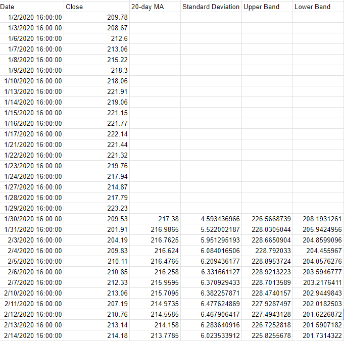
- Start with downloading the stock prices. In my example, I have downloaded the stock price for Meta Platforms going back to 2020. This was done using the GOOGLEFINANCE function in Google Sheets, and the formula is as follows: =GOOGLEFINANCE(“meta”,”price”,”1/1/2020″,today())
- Calculate the 20-day moving average from the closing prices. This is done using the AVERAGE function. Assuming the closing prices start from cell B4, the formula would be as follows: =AVERAGE(B4:B23). Copy the formula down to all the cells.
- Calculate the standard deviation using the STDEV function. This is also based on the last 20 closing prices and is copied down to the bottom of the data set. This is the formula to calculate the standard deviation based on this example: =STDEV(B4:B23).
- Calculate the Upper Band. Do this by multiplying the standard deviation by 2, and adding that to the 20-day moving average. Assuming the 20-day moving average is in cell C23 and the standard deviation is in cell D23, this is what the formula would look like: =C23+D23*2
- Calculate the Lower Band. For this, multiply the standard deviation by -2, and add that to the 20-day moving average. Based on the above assumptions, the formula would be as follows: =C23+D23*-2
Once all those formulas are entered, your data set should look something like this:

Next, create a line chart to show the values on a graph. Then apply any formatting (e.g. dotted lines, colors, etc) and you should have a visual that looks like this:

If you liked this post on How to Create and Chart Bollinger Bands in Google Sheets and Excel, please give this site a like on Facebook and also be sure to check out some of the many templates that we have available for download. You can also follow us on Twitter and YouTube.

