Correlations can be helpful in determining if there is a pattern or relationship between two sets of data. It can be useful when looking at stocks as those that are highly correlated may move together in the same direction (note: this doesn’t mean their returns will be the same). And if you want to diversify, that’s not what you’ll want to accomplish. Instead, negatively correlated investments or ones that aren’t correlated at all may be more preferable in that situation. Below, I’ll show you how you can easily calculate correlations between multiple stocks from data that you can download from a source like Yahoo Finance.
Downloading the data
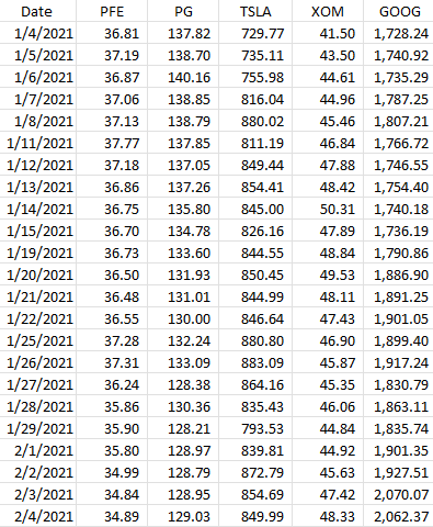
The first thing that’s needed when running correlations is to download at least two sets of data. In this example, I’ll download data for five stocks: Pfizer, Procter & Gamble, Tesla, Exxon Mobil, and Alphabet. None of those stocks is terribly similar to one another so there should be some decent diversification there.
Below, I’ve downloaded all the closing prices from Yahoo Finance for all of 2021. Here’s what that data looks like:
The key is you want to make sure that the data is the same; you don’t want to have one stock showing a price at a different date than the other. They all need the same baseline. And that’s what the date field serves to do here. It itself isn’t necessary for the correlation calculation, but it’s just there to ensure that when you’re downloading and matching up data, everything lines up correctly to the right date.
The CORREL() funciton is useful for doing just a quick correlation calculation
Using Excel’s CORREL function, you can quickly calculate the correlation between two stocks. Pfizer is in column B and Procter & Gamble is in column C. If I wanted to quickly calculate their price correlation, my formula would be as follows:
=CORREL(B:B,C:C)
It doesn’t matter which order the data is in but there are only two ranges that are used as arguments in this function. This formula tells me there is a 94% correlation between these two stocks, at least, over the past year. That’s incredibly high and it could be because these are two fairly safe, value-oriented investments. Now, I could repeat this process for the other stocks here but there’s a quicker way to do that.
Using the Data Analysis option
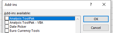
Excel has some built-in Add-ins that you can enable that can quickly do tasks like this for you. You can access the Excel Add-ins from the Developer tab or by going through File->Options->Add-ins->Excel Add-ins. Either approach will get you to the same place. And once you’re there, you just need to check off the option for the Analysis Toolpak:
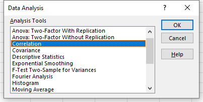
Once enabled, you will see the Data Analysis option on the Data tab. Clicking on that will give you many different options, including to do a Correlation:
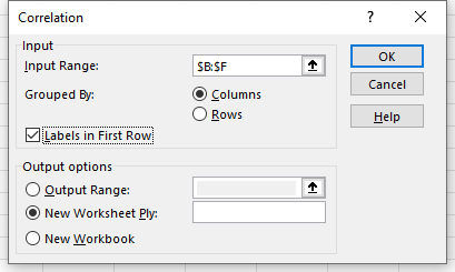
On the next screen, I’ll have the option to select an Input Range. Here, I can select more than just two columns:
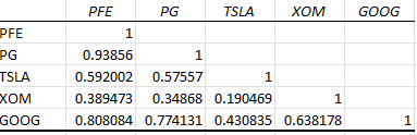
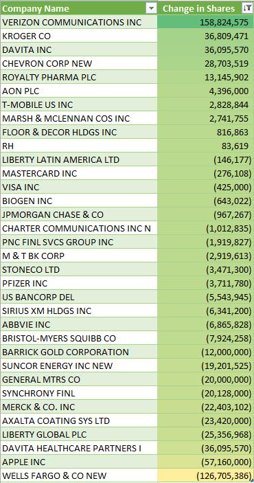
After clicking OK, Excel generates the correlation matrix for me in a new tab, saving me the time of doing all the calculations myself:
The lowest correlation noted here is between Tesla and Exxon Mobil, while the highest is between Pfizer and Procter & Gamble.
If you liked this post on How to Calculate Correlations Between Stocks, please give this site a like on Facebook and also be sure to check out some of the many templates that we have available for download. You can also follow us on Twitter and YouTube.
Billionaire investor Warren Buffett is the CEO of Berkshire Hathaway. And what trades his company is making is always big news among his followers and fans. In this post, I’ll show you how you can use Excel, and specifically Power Query, to determine what the company’s holdings are as of their most recent quarter, and how much they’ve changed over time.
Start with getting the most recent 13f report
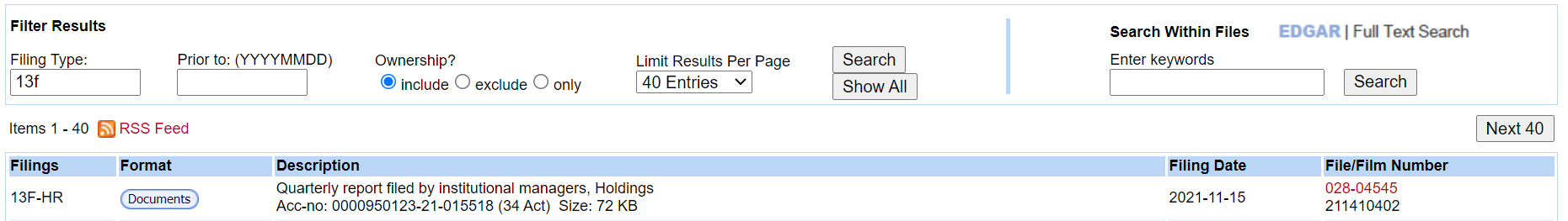
Berkshire Hathaway reports its holdings every quarter and you can find those filings on the SEC website. This link filters out the 13f filings for you already. I’m going to click on the Documents button of the most recent report:
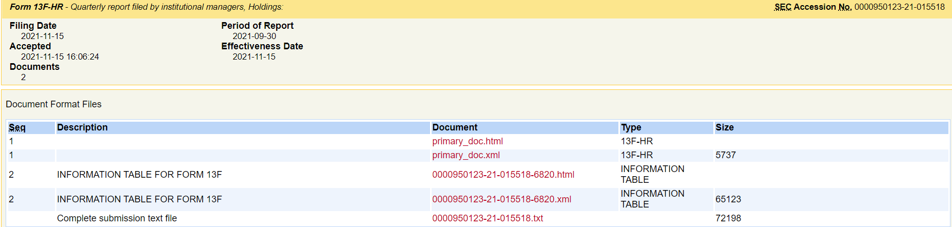
On the next page, the key link to use is the html file for the Information Table:
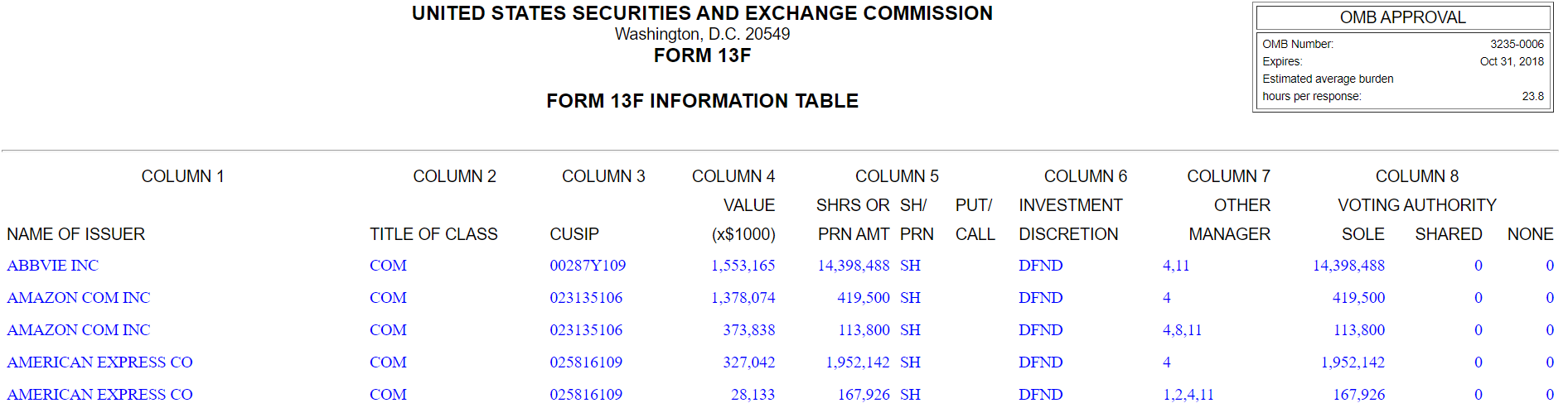
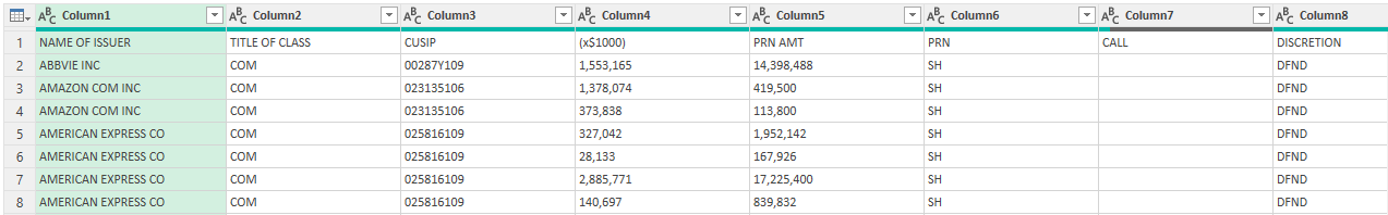
When I click on it, the report itself looks like a convenient table format:
It’s here that you can see the holdings as of the end of the period for Berkshire Hathaway. I’m not going to copy this into Excel but instead, I am going to use the link itself.
Setting up the Power Query link
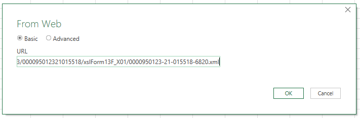
Back in Excel, I’m going to set up a connection by going to the Data tab and clicking From Web in the Get & Transform Data section. This will prompt me for a URL, where I will enter the link from the SEC website.
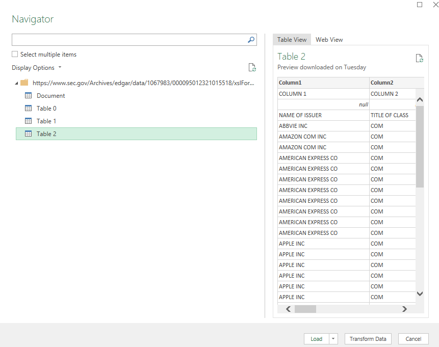
Upon clicking OK, the Navigator box shows up, where I have multiple tables to choose from:
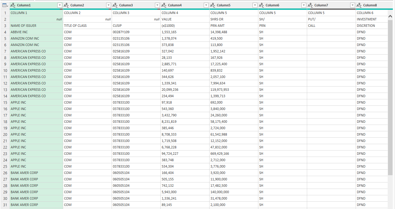
Table 2 is the one that I want as that is the table that has the company names listed and all the other holding details. Since I want to make changes to the data, I’ll click on Transform Data rather than just loading it directly into Excel. Here’s how the table looks:
There are a few things right off the bat that I’m going to fix here:
The headers are not at the top.
The holdings need to be grouped so that I see the total per company.
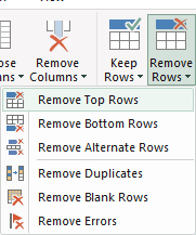
To reference the columns easier, it’s important that the headings are correct. First up, I’ll remove the first two rows by clicking on the Remove Rows option in the Home tab in Power Query:
Removing the first two will get the names closer to the top, but the header names remain generic:
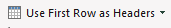
To fix this, I’ll click the option to Use First Row as Headers:
Now the first issue is fixed:
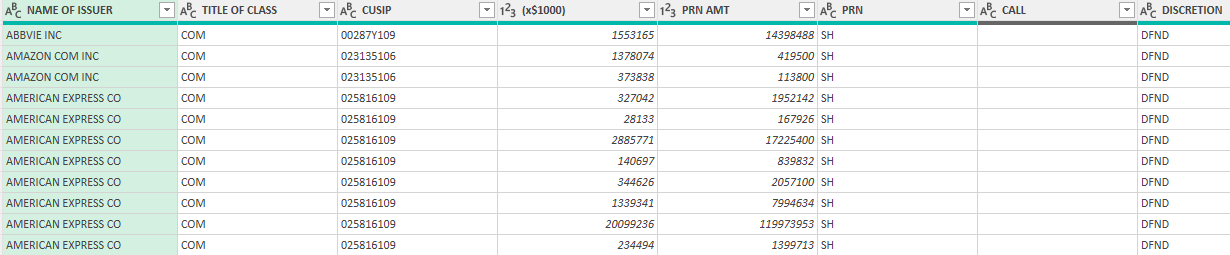
To group the companies, I’ll use the Group By option in Power Query:
On the next screen, I’ll group by issuer (i.e. the name of the company’s shares that are held), set the new column so that it is called ‘Total Shares’, and sum the PRN Amount (shares held):
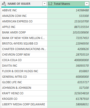
Now I get a summary of all the shares that are held when grouped by company:
Now I can load this into Excel and have a list of the most recent Berkshire Hathaway holdings.
Comparing to a previous period
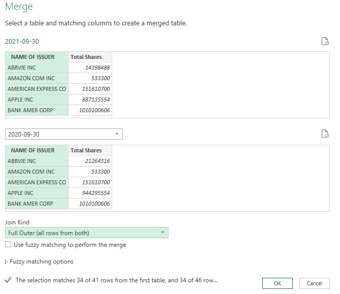
Next, I’ll compare the change in position from a previous period. Let’s say I want to go back a year. I can copy this query and just change the source so that it looks at this link from a year ago.
I’ve re-named the queries 2021-09-30 and 2020-09-30 (you can do this simply by right-clicking on the query name). To compare the two periods, what I’m going to do is merge the two queries. In the Merge options, make sure to select a Full Outer join so that all the rows are included. This ensures that you aren’t including just those companies that Berkshire Hathaway still owns shares of.
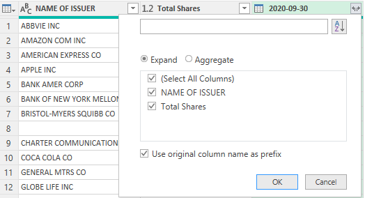
Next, I’ll expand the table to pull in the company name and the shares from the previous report:
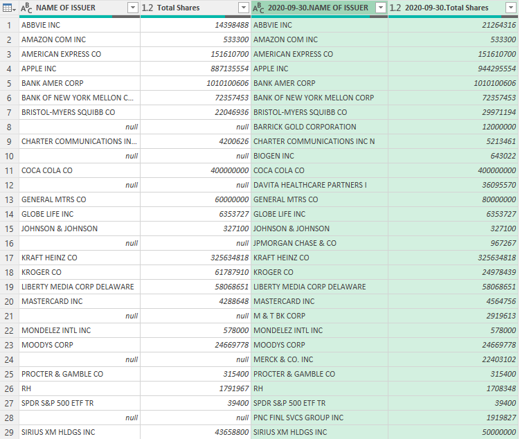
This will give me the same values from both tables. One of the things you’ll notice is because of the full outer join, some companies and share values show as null because they don’t exist on both reports:
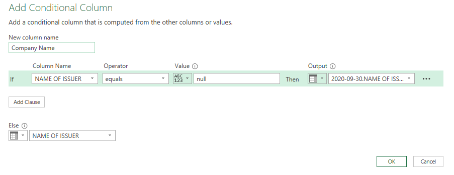
To fix this, I’m going to create a Conditional Column, which you can select from the Add Column tab. The rule I’m going to set up is as follows: if the value in one issuer/name column is null, take the other column’s value. Here’s how it looks:
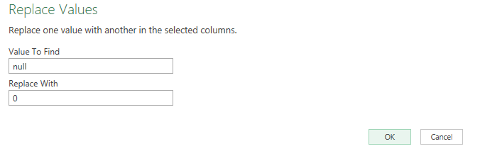
For the change in shares, I’ll need to do a calculation that takes the current holdings and subtracts the previous holdings. But before that, I need to convert the null values where the share numbers are to 0. To do this, select those columns and on the Home tab select the option to Replace Values
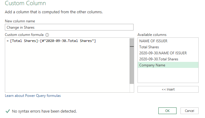
Now I can create a Custom Column to calculate the change in shares:
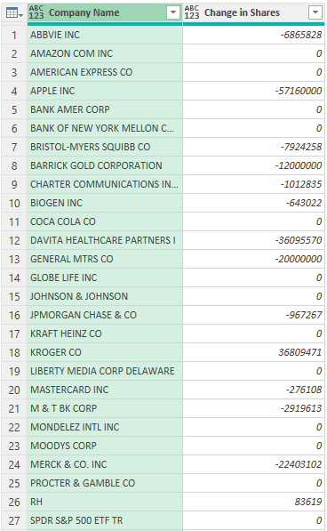
Here’s my updated table after removing the other columns:
All that’s left is to load the data in Excel. Here’s what the end result looks like after applying some formatting and sorting the values in descending order:
If you liked this post on How to Track Warren Buffett’s Portfolio Using Power Query, please give this site a like on Facebook and also be sure to check out some of the many templates that we have available for download. You can also follow us on Twitter and YouTube.
In Excel, there are multiple different stock charts you can create. All you need is some combination of the date, opening price, high price, low price, closing price, and volume to generate what you need. In this post, I’ll show you how you can utilize Power Query to pull that data in and transform it, without having to apply any manual changes to it every time. For an overview, you can check out this post on How to Get Stock Quotes From Yahoo Finance Using Power Query. I’m not going to repeat those steps and will assume that you’re familiar with that process.
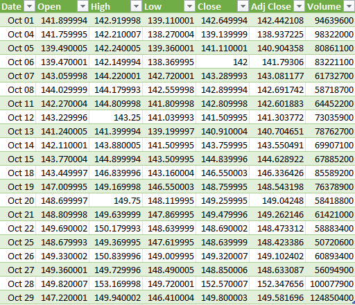
In this example, I’ve downloaded the stock prices for Apple (NASDAQ:AAPL) for the month of October 2021:
This already has all the data that is needed to create the four types of stock charts in Excel:
High-Low-Close
Open-High-Low-Close
Volume-High-Low-Close
Volume-Open-High-Low-Close
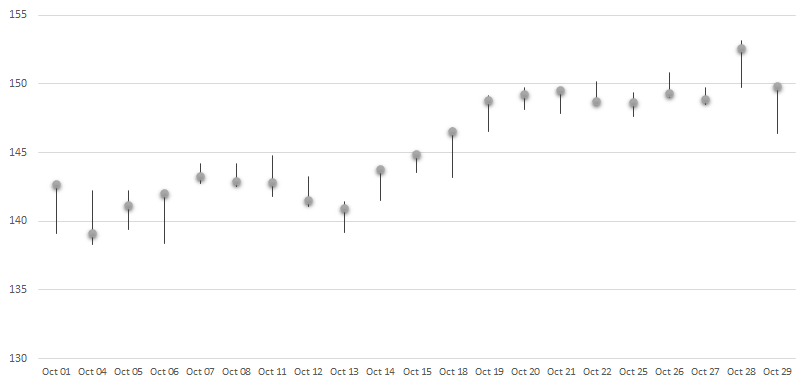
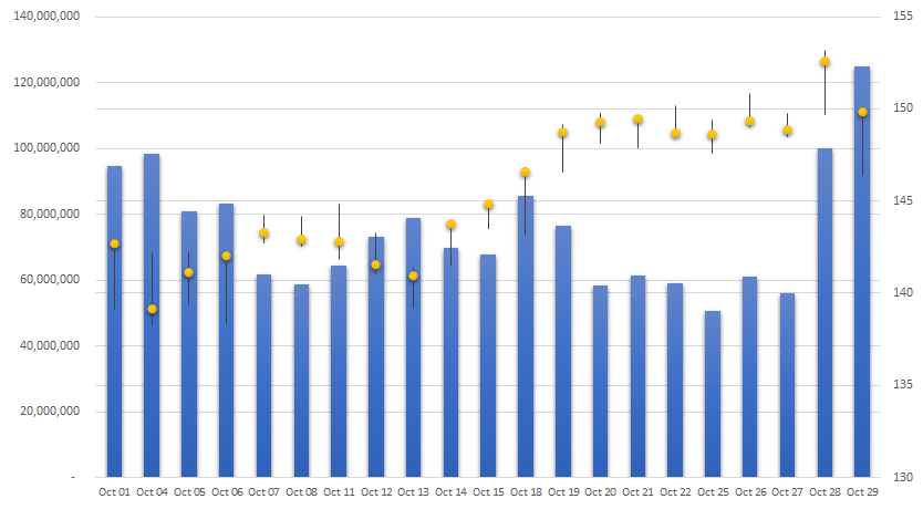
The key to making these different charts is just ensuring that you’ve got the correct fields in your download, and in the right order. For the High-Low-Close chart, you only need three fields to generate the following chart:
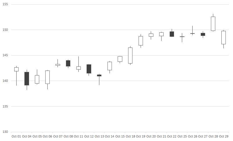
If you’re creating the open-high-low-close chart, all you need is to add the open field to the data set:
And for the volume-high-low-close chart, it’s just the volume instead of the open that goes at the start, and then you get something that looks like this:
The last chart includes both the volume and the open before the high, low, and close values:
These charts are fairly straightforward to generate once your data is in the right order. But rather than moving around different fields, you can make all the changes within Power Query so that right when your data loads, it’s in the correct format.
Using Power Query to adjust your download
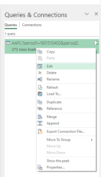
To modify an existing query, go to the Data tab and select Queries & Connections. Off to the right, you should see your query, where you can right-click and Edit it:
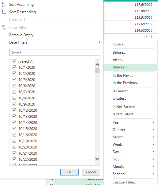
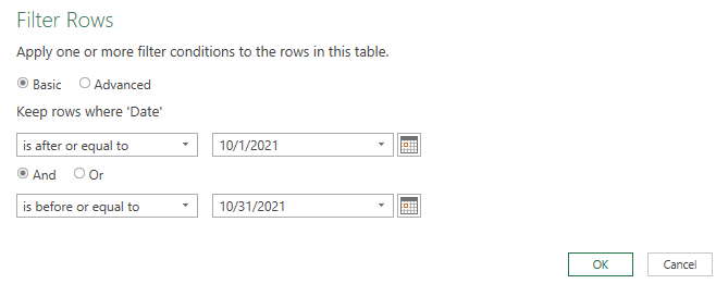
The first thing I’ll edit is the date range. In my earlier post, I just downloaded the full year of data. But if I want to filter only for October, then I can click on the drop-down for the Date field and select Date Filters to filter Between a range of dates.
Using the calendar icon, I can specify the range of dates I want to include in my download:
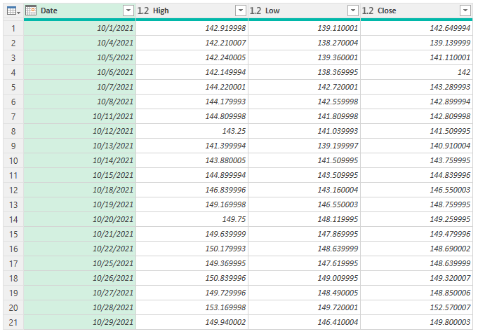
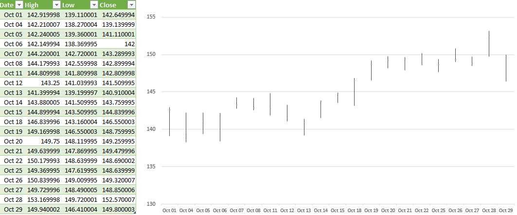
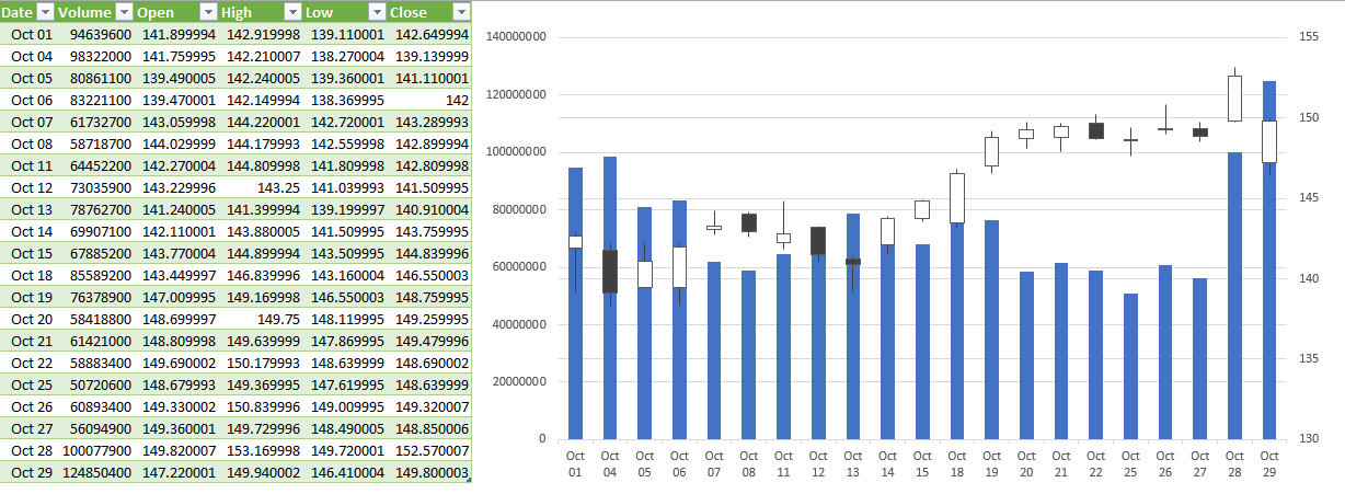
Next, if I want to just include the data for the most basic chart, the high-low-close chart, I’ll right-click on the Open, Adj Close, and Volume columns to remove them. Then, I’m left with the following:
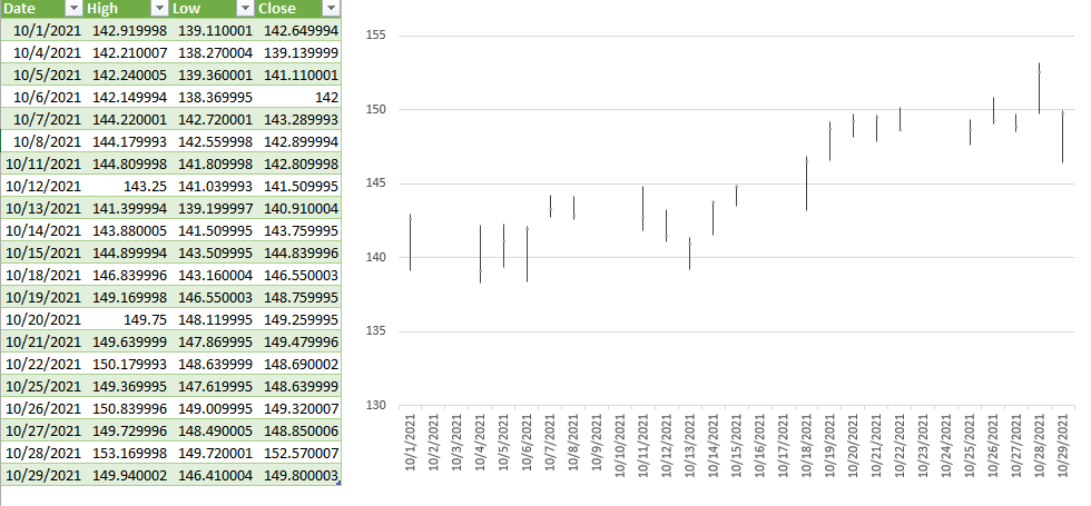
Now, if I were to load the data in Excel, I would already have all the columns I need to create the chart:
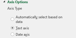
Note: if you want to get rid of the gap in dates on the chart, click on Format Axis and for the Axis Type, select Text axis:
This prevents Excel from trying to fill in any missing dates from your data set Another thing you may want to do is format the date field so that it is a custom format showing MMM DD so that it saves space:
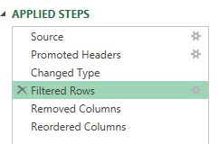
Now, let’s go back into Power Query and this time create the more complex download, for the volume-open-high-low-close chart. I’ll start by removing the last step I applied which removed more columns than I need for this current download. To remove any steps in Power Query, click on the ‘X’ next to it:
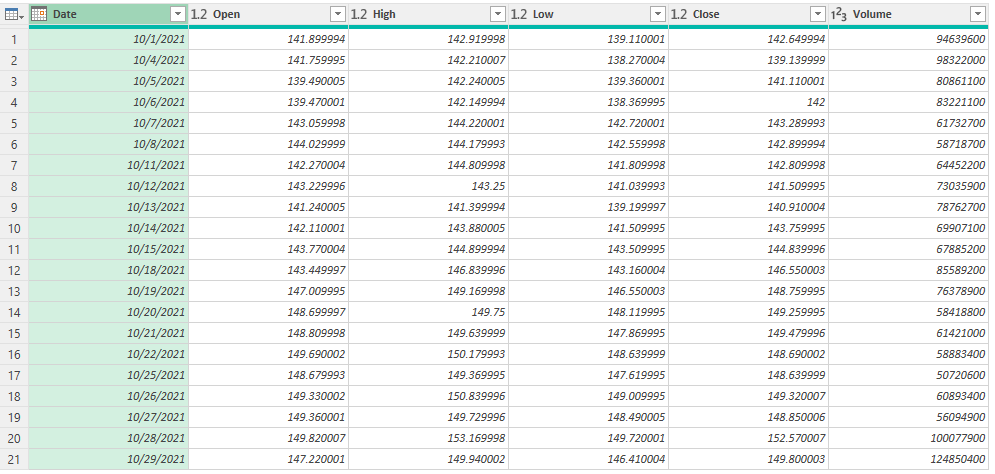
In this example, it’s just the Removed Columns step I will eliminate. The only column I need to remove from the download this time around is the Adj Close. So that’s what I’ll do, right-click and remove that column. However, my table still is not in the correct order:
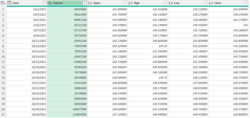
The Volume column needs to go before the Open column. This is as easy as just dragging the column and putting it in front:
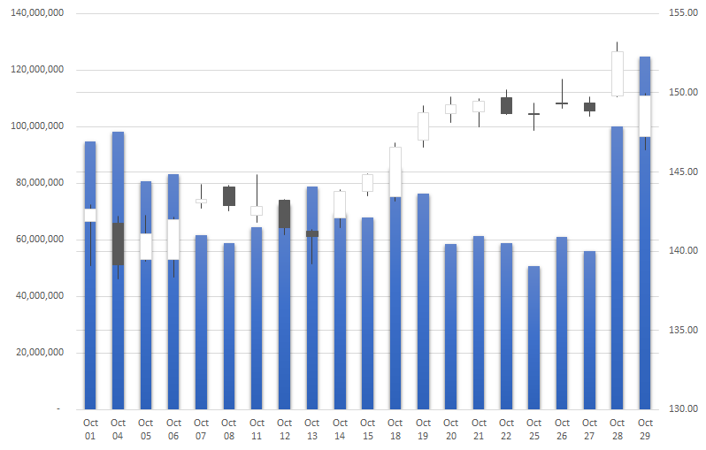
Now that it’s in the right order, I can load and close this into Excel. And now, the volume-open-high-low-close chart can easily generate:
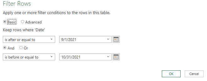
Suppose I want to adjust my chart to include data from September as well. Again, I can go back to edit my query. This time, I’ll select the gear icon next to the Filtered Rows step:
There, I can just modify my date range using the calendar:
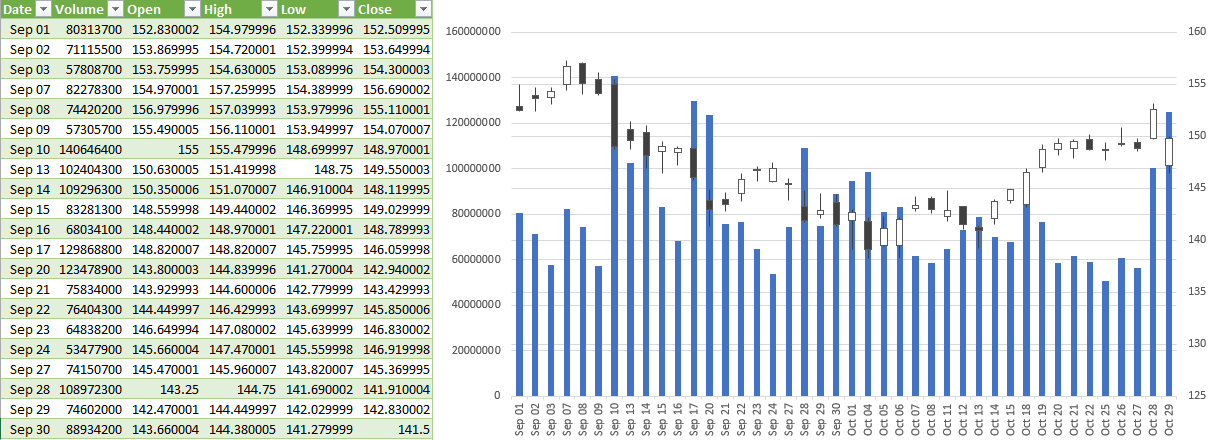
Now, re-loading the data into Excel automatically updates my chart with a simple refresh:
The beauty of this is this query will update with new data and your chart will also update, taking out the manual steps of having to make any changes yourself. And if you incorporate named ranges like in my post covering pulling stock prices, then the data will easily refresh based on the variables that you’ve entered.
If you liked this post on How to Create Stock Charts in Excel Using Power Query, please give this site a like on Facebook and also be sure to check out some of the many templates that we have available for download. You can also follow us on Twitter and YouTube.
Excel can be a useful tool in helping you make investment decisions. And in this post, I’ll use it to show you five excellent dividend stocks that you can buy on the Toronto Stock Exchange (TSX) that can help generate some strong recurring income for your portfolio for many years. Dividend stocks are great options to put into a tax-free savings account (TFSA), where you can earn recurring income without incurring taxes.
1. Fortis (TSX:FTS)(NYSE:FTS)
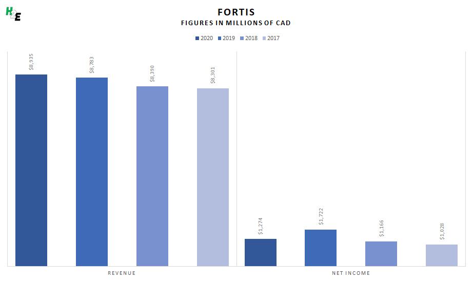
Fortis is a top utility company in Canada that also has operations in other countries. What’s great about the utility business is that it generates lots of recurring income; Fortis doesn’t need to constantly seek out customers to sell its services to, they are essential for millions of families. A great example of that consistency can be seen through its revenue and profit over the years:
You can see that even amid the pandemic, Fortis’ revenue actually increased. And its profits were in line with previous years. That’s a big part of the reason why the company can afford to not just consistently pay a dividend but also grow it over the years. As the business grows and expands to its operations, the company will have a greater pool of customers to collect revenue from.
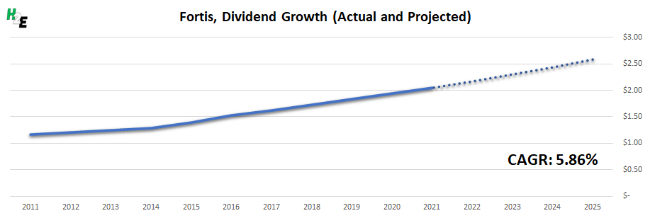
From an annual dividend payment of $1.16 in 2010, Fortis has increased its payouts to $2.05 in 2021. That averages out to a compounded annual growth rate (CAGR) of 5.86%. If Fortis were to continue raising its dividend by that rate, then by 2025, it will be paying an estimated $2.58 per share:
What does that mean for an investor? If you invest in Fortis today, the stock pays a yield of approximately 3.9%. So on a $10,000 investment, you would be collecting roughly $390 in dividends for the year (based on the company’s current quarterly payment of $0.535). But by 2025, if the dividend is up to $2.58 per share, then you would be collecting $469 annually. That would mean you’re earning just under 4.7% in dividends on your initial investment of $10,000.
2. Canadian Utilities Limited (TSX:CU)
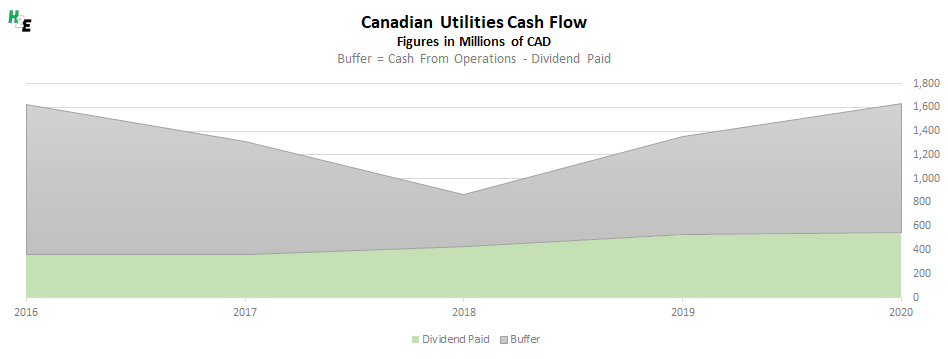
Another utility stock that’s on this list is Canadian Utilities. Like Fortis, this is another solid company that regularly posts strong numbers. This time, I’ll use the company’s cash flow to illustrate why Canadian Utilities is a reliable dividend-paying investment. Cash flow is arguably more important than just accounting income since it only involves cash and excludes expenses such as amortization.
Over the years, Canadian Utilities has generally had a safe buffer between what it has brought in from its day-to-day operations and the amount of dividends it has paid out to its shareholders. This is important because it confirms, regardless of what accounting income says, the business is in good shape to continue making dividend payments.
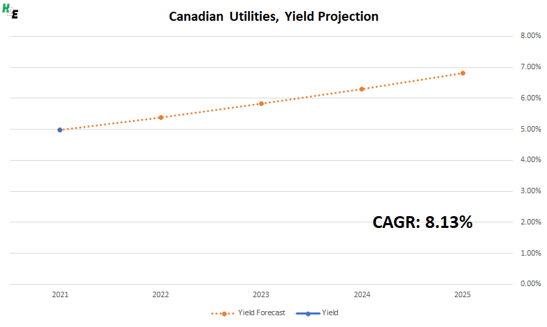
Like Fortis, Canadian Utilities has been one of the most reliable dividend growth stocks in Canada. From annual dividend payments of $0.81 in 2011, they have more than doubled to $1.76 today, averaging a CAGR of 8.13% during that time. For investors, that means the impressive 5% dividend yield today could eventually lead to you collecting more than 6.8% of your investment in dividends by 2025:
3. Canadian Imperial Bank of Commerce (TSX:CM)(NYSE:CM)
One type of dividend stock that’s always a popular option for income investors is a bank stock. These are businesses that print money and make terrific margins simply because the rate they charge loans out is higher than what they pay depositors. And the higher the interest rate is, the more of an opportunity there is for them to profit from more of a spread. That’s why with interest rates potentially on the rise as early as next year, CIBC and other bank stocks could be in for great years.
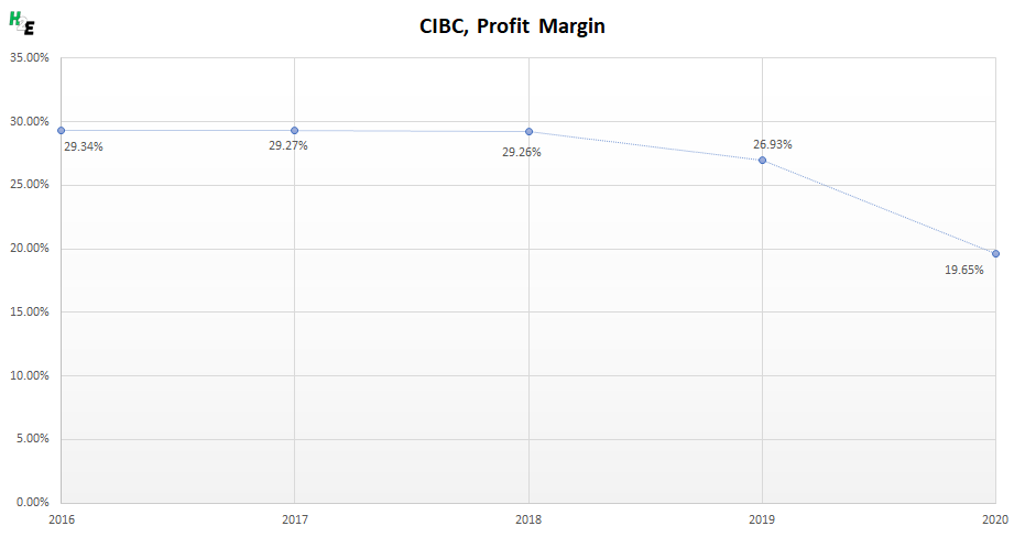
A simple way to illustrate the company’s strength is through its profit margins. Here’s how it has fared over the years:
Prior to the pandemic, the bank was consistently generating margins of around 27% to 29%. With the drop in interest rates in 2020 plus greater credit reserves needed to prepare for a potentially gloomier period amid the pandemic, the bank’s margins have suffered. But in the future, these margins should recover back to their pre-pandemic highs.
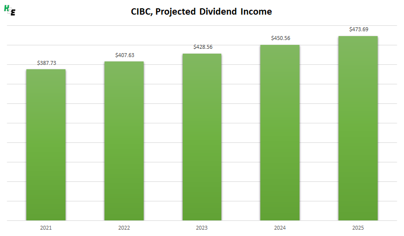
CIBC hasn’t raised its dividend since early 2020 but now that the bank’s profitability should improve, it’s likely that it will resume making more regular increases to its payouts. At close to 4%, the yield is reasonably high and over the past decade, CIBC has increased its dividend by a CAGR of 5.1% — that’s even with factoring in the recent slowdown. If the bank were to raise its dividend at that rate moving forward, here’s how much recurring income you could expect to collect:
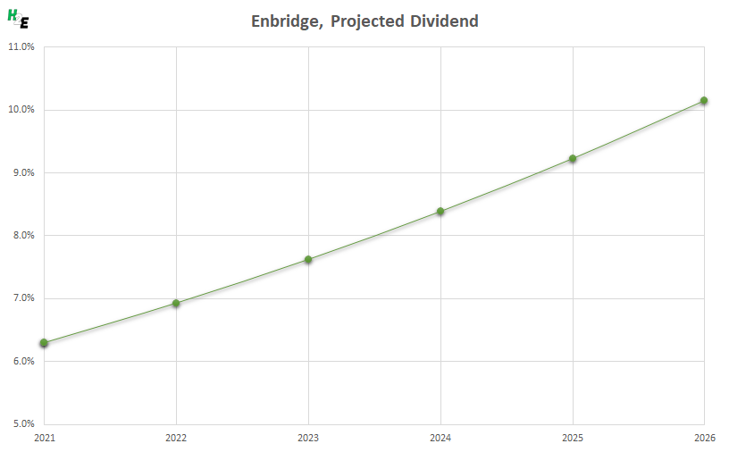
4. Enbridge (TSX:ENB)(NYSE:ENB)
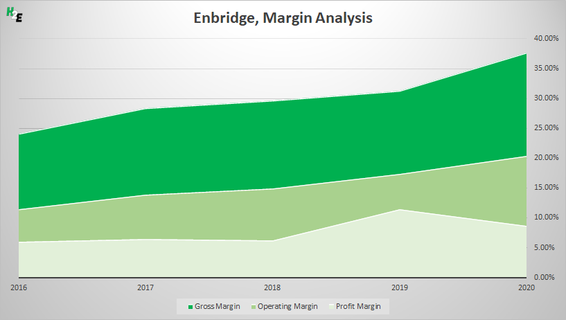
The highest-yielding stock on this list is pipeline giant Enbridge, paying its investors 6.3%. Although conditions in the oil and gas industry haven’t been great in recent years as low oil prices have squeezed profits for businesses, Enbridge has become more efficient and has benefitted from stronger margins:
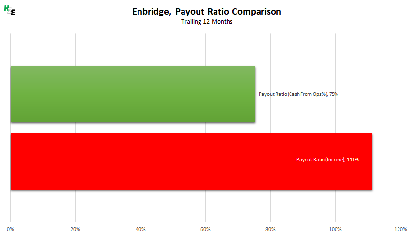
Enbridge is an example where looking simply at net income could give you a distorted picture of the company’s ability to pay a dividend. With high fixed costs and depreciation expenses, a look at its payout ratio as a percentage of net income can be very misleading. Over the trailing 12 months, here’s how Enbridge’s payout ratio looks like when you are comparing it as a percentage of net income and as a percentage of operating cash flow:
The company has increased its dividend by a CAGR of 10% over the past 26 years. If it were to continue to raise its dividend by that rate, then here’s how long it would take you to earn 10% on your original investment every year, just in dividends:
5. Telus (TSX:T)(NYSE:TU)
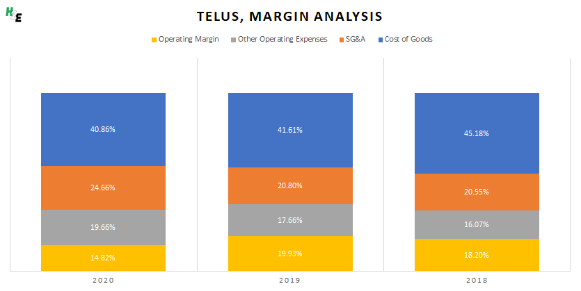
Telecom giant Telus is another safe dividend stock for Canadian investors. The business generates solid gross margins of around 60% of revenue and without significant expenses elsewhere, the company normally nets operating margins of 15% or better. Its strong position in the industry makes it likely that these percentages likely won’t change significantly in the future:
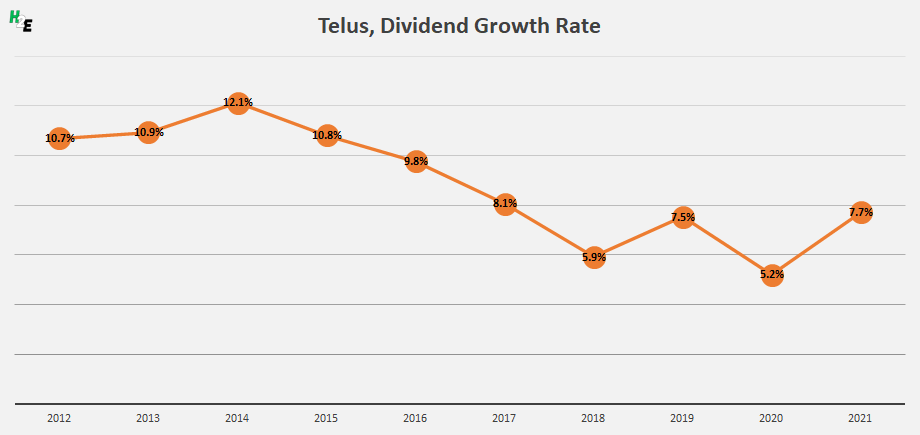
One of the challenges, with Telus, however, is in predicting the rate of dividend growth. Although it is a safe bet that it will continue raising its payouts, its growth rate has varied considerably in the past 10 years:
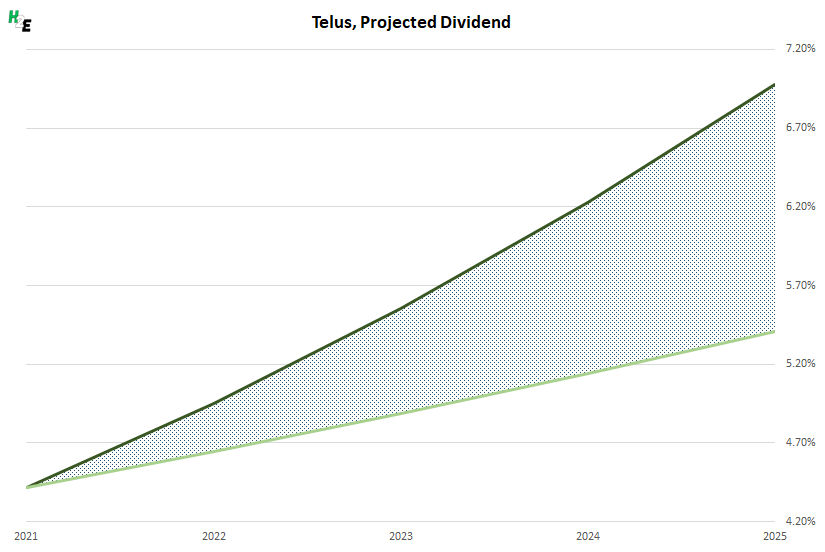
In some years, it has been as high as 12% while in others it has been barely above 5%. Today, the stock yields just over 4.4%, which is a fairly high payout. Here’s a look at how much you could be earning on your initial investment, given the possible variation in dividend growth rates:
In a best-case scenario, you could be earning more than 7% while under a more conservative estimate, you could be collecting approximately 5.4% by 2025.
In this post, I’ll show you how you can calculate stock returns using Google Sheets. However, you can use a similar approach in Excel by using the STOCKHISTORYFUNCTION.
First thing’s first — let’s pull in the historical data
For this example, I’m going to pull in the S&P 500’s historical values to see how the index has performed both in the past 12 months and over the course of several years.
To do that in Google Sheets, I’m going to use the GOOGLEFINANCE function which allows me to pull in historical prices. To get the values from the S&P 500, the ticker symbol I’m going to use is ‘.INX’ and to get the last year of data, I’m going to set my start date equal to TODAY()-365 and my end date will be TODAY(). Here’s the full formula:
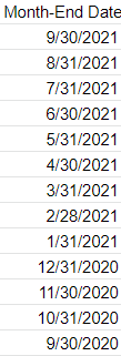
Once you’ve got the data loaded, then what you’ll want to do is enter the dates that you need values for. In this example, I’m going to use the last day of every month. For this, I can use the EOMONTH function. It takes two arguments: the start_date and the number of months. If I want the current month-end date, then I just set the second argument (months) to zero. As for start date, that can just be any date that falls within the month, which I can enclose within a DATE function. Here’s how the formula would look if I want the last day of September 2021:
=EOMONTH(date(2021,9,1),0)
But since I need to adjust this so that I can copy the formula down and have it automatically adjust, I am going to use the ROW function, which will return the current row number. Since I want the values to be increasingly negative as I copy down the formula (e.g. the current month should be 0, the following one -1, then -2, and so on), I will multiply this by a factor of negative 1 and add 1 to the total (to ensure the first value start at zero):
ROW(A1)*-1+1
That replaces the zero value from the earlier formula:
=EOMONTH(date(2021,9,1),ROW(A1)*-1+1)
And now, I can easily copy this formula down and my month-end dates will populate without requiring me to make any manual adjustments along the way:
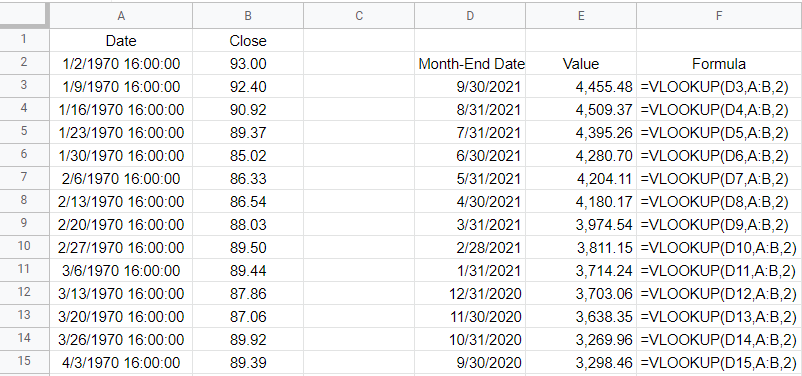
Next, I’ll do a lookup to get the values. And that’s as simple as a VLOOKUP on my dates, which are in column A with the corresponding values in column B. If you use weekly dates, then be careful not to set the last argument in the VLOOKUP function to false because you’ll end up with errors as the weekly values won’t always fall neatly on the end of the month. Instead, leave the last argument blank or set it to TRUE so that it finds the closest match. Here’s what that looks like:
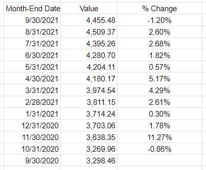
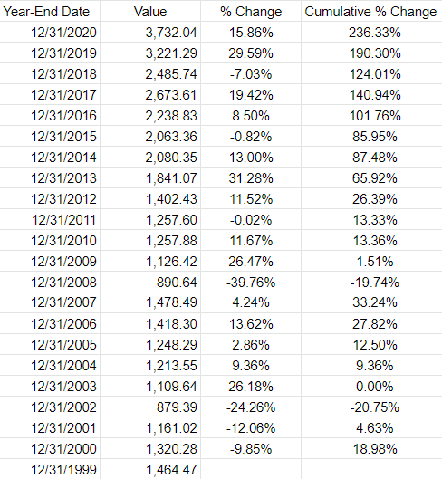
All that’s left at this point is to now just calculate the change in value. I can take the new value, divide it by the previous period’s value, and subtract one from it. This will give me a percent change:
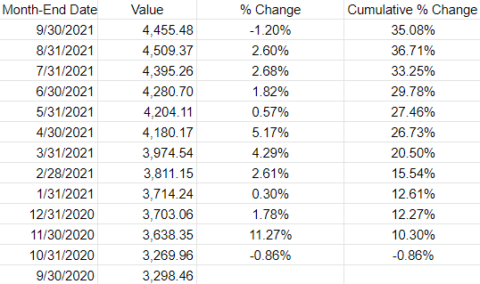
If I wanted to determine the cumulative % change since my first month-end date, then the old value would always remain the same — it would be the first date in the series. By freezing that cell, I can calculate the cumulative % change:
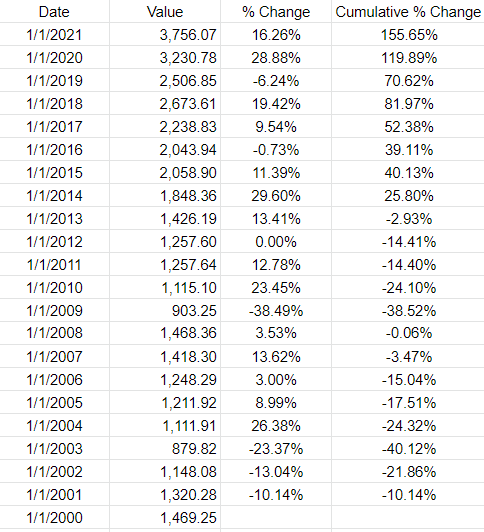
If you wanted to pull in the returns by year, you can do the same thing. All that changes is that instead of pulling in the month-end dates you will use the year-end dates. The main difference here is in calculating the different dates. Rather than multiplying by a factor of -1, you’ll need to use -12. And the starting date should be Dec. 1. Here’s how my formula looks like:
=EOMONTH(date(2020,12,1),ROW(A1)*-12+12)
And when I copy that down, it will automatically adjust for each previous year:
The one thing you may notice in Google Sheets is that the GOOGLEFINANCE function returns a timestamp for the date. Each day ends at 16:00:00. This can create some unintended results. For example, using the VLOOKUP function, if I use the date 12/31/2020, because it looks for an approximate match, it will actually return the value from 12/30/2020. Unless you add the timestamp, an exact match won’t work. And since a date with no time will by default by 0:00, the lookup of 12/31/2020 16:00:00 won’t be a match. One way to get around this is just to use a different date. Rather than using the EMONTH function, I can just adjust the date by reducing the year by 1. This is the formula I can use if instead I want to get the first day of the year:
=DATE(2021-ROW(A1)+1,1,1)
Using the ROW function again can allow me to automatically adjust the year. Here is the updated table:
If you liked this post on Using Tags in Excel, please give this site a like on Facebook and also be sure to check out some of the many templates that we have available for download. You can also follow us on Twitter and YouTube.
Want to create a dashboard to track the stock market and the latest business-related news? Below, I’ll show you how you can create a stock market dashboard using Excel and Google Sheets to pull in all the data you’ll need. If you’d prefer to just download the file, you can do so here.
Step 1: Compiling the data
You can get stock prices into Excel using the STOCKHISTORY function. However, that isn’t available on older versions of Excel and it also doesn’t pull in the current day’s prices. Using Google Sheets can be more effective for this purpose. Plus, on there, I can pull in business-related news as well.
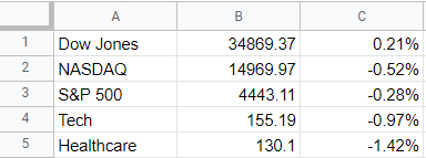
To start, I’m going to pull in values for the Dow Jones, Nasdaq, and S&P 500. I’ll also download the values of a couple of exchange-traded funds (ETFs) that track healthcare and tech stocks. To get the latest price, you can use the built-in GOOGLEFINANCE function that’s only available on Google Sheets. To get the latest value of the Dow Jones, the following formula will work:
=GOOGLEFINANCE(“.DJI”,”price”)
And to calculate the percentage change:
=GOOGLEFINANCE(“.DJI”,”changepct”)/100
For the Nasdaq, you’ll use “.IXIC” and for the S&P 500 the ticker is “.INX”
For the ETFs, since they aren’t indexes, there is no period beforehand and I reference XLK for tech and XLV for healthcare. In my Google Sheets file, I have a simple layout for the values and their changes that I will later pull into Power Query:
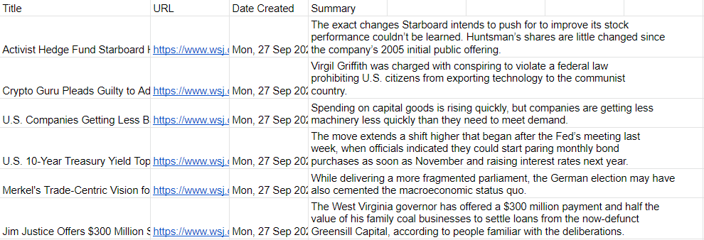
Next, I’ll also download the latest business-related news. Google Sheets has another unique function for this: IMPORTFEED. All you need to do is find an rss feed from a website that you want to pull information from. Not every website has an rss feed but what you can do is just do a Google search for the name of a source and ‘rss’ to see if you can find a link. There are three sources I’m going to use for this dashboard:
In Google Sheets, the top articles from each of those rss feeds will show up, including the title, URL, date created, and even a brief summary:
Now, it’s time to pull all this data into Excel.
Step 2: Loading the data into Excel using Power Query
To import data from Google Sheets into Excel, you need to first share the sheet. While in Google Sheets, go into File -> Share -> Publish to web. Then, you’ll be prompted to select what you want to share. I’ll start with the Markets tab I created and then the News tab:
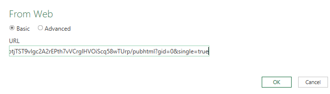
Copy this URL as you’ll need it to load the data into Power Query. While you’re back in Excel, go under the Data tab and click on the From Web button under the Get & Transform Data section. You’ll be prompted to enter a URL. This is where you’ll paste the link that you copied from Google Sheets:
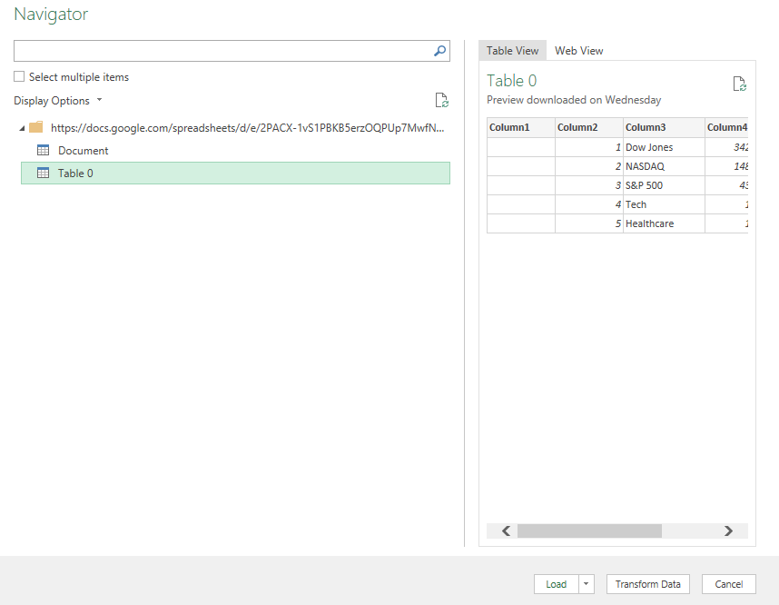
On the next page, select Table 0 as where you want to extract data from. And if you want to do some cleanup (getting rid of extra columns), you can do so by clicking on the Transform Data button:
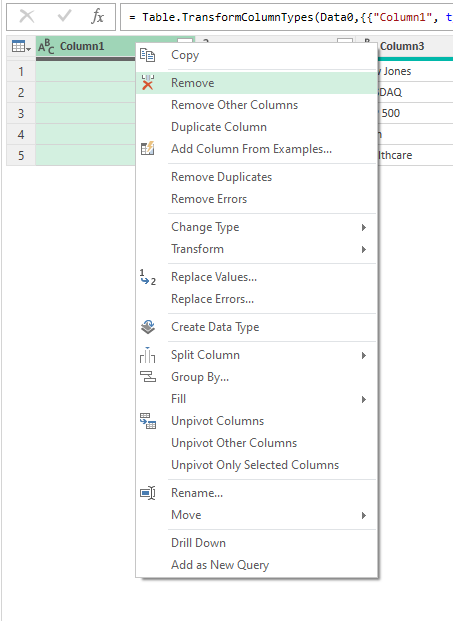
To remove any unneeded columns in Power Query, just right-click on a column header and click Remove:
Once you’re done, click on the button to Close & Load if you want the data to be loaded on a new sheet. If you want to control where it gets pasted, then use the drop down and select Close & Load To.
Repeat these steps for the other Google Sheets tab.
In addition, I’m also going to load data from a few other sources:
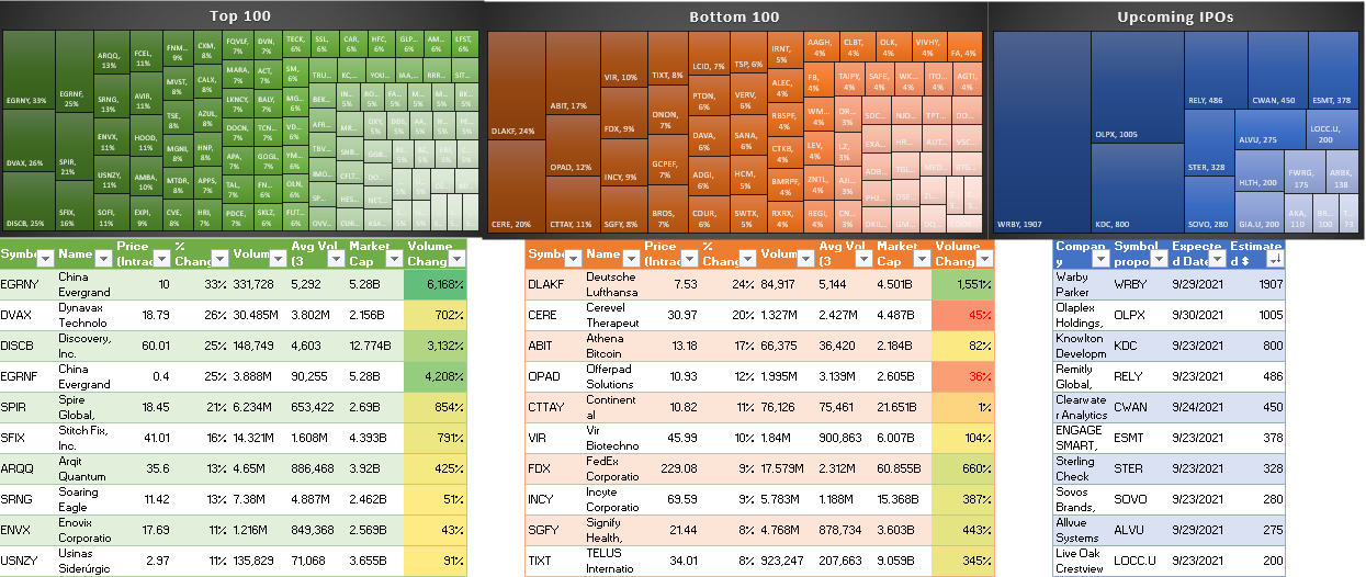
Top 100 Gainers on Yahoo Finance: https://finance.yahoo.com/gainers/?offset=0&count=100
Top 100 Losers on Yahoo Finance: https://finance.yahoo.com/losers?offset=0&count=100
Upcoming IPOs from IPOScoop: https://www.iposcoop.com/ipo-calendar/
The process for importing these links into the dashboard is the same as for Google Sheets. Go through Power Query, import from web, and paste in the URL plus make any formatting changes necessary. The next step involves putting all this data together in a dashboard.
Step 3: Creating the dashboard
In my spreadsheet, I’ve created two tabs: one that hold all my Power Query downloads (the ‘Data’ tab) and a ‘Dashboard’ tab for where all the information will be displayed.
To make the set up of the dashboard easy to manage, I’m going to change the column width to 10 for everything. To do that, press CTRL+A to select all the cells on the Dashboard tab, then right-click on any of the headers, and there you’ll be able to select column width.
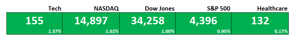
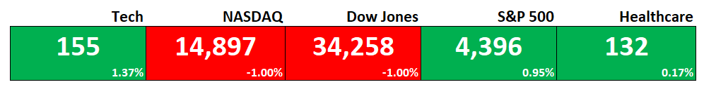
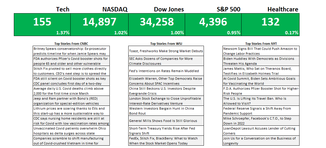
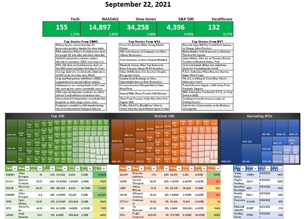
First up, I’m going to get the indexes and market indicators as a starting point. To do this, all I need to do is link to the values and the percentages for the S&P 500, Dow Jones, Nasdaq, Tech, and Healthcare tickers I imported from Google Sheets. By default, I’ll set the formatting for all the cells to be green:
To make this more dynamic, I will add some conditional formatting so that if the percentage change is negative, the corresponding cells will highlight in red. For this, I can select all the cells in green above and create a conditional formatting rule the starts with where the first percentage is (in my spreadsheet, it is cell E6):
=E$6<0
This is a simple rule but by not freezing the column (E) and freezing only the row (6), it can be applied to all the cells above. I can apply a red background color so that if any of the percentages are negative, the cells will highlight accordingly:
For the next part of the dashboard, I will copy over the news stories that were also downloaded from Google Sheets. This time, I’m going to use the HYPERLINK function so that I can not just link to the title but also create a clickable link that will allow me to open the story should I want to open it in my default browser. The function itself is simple and involves just two arguments, one for the actual URL and another for what the text should show up. Since it’s shorter, I’m going with the title. After applying some formatting and copying all three sources, this is what my dashboard looks like:
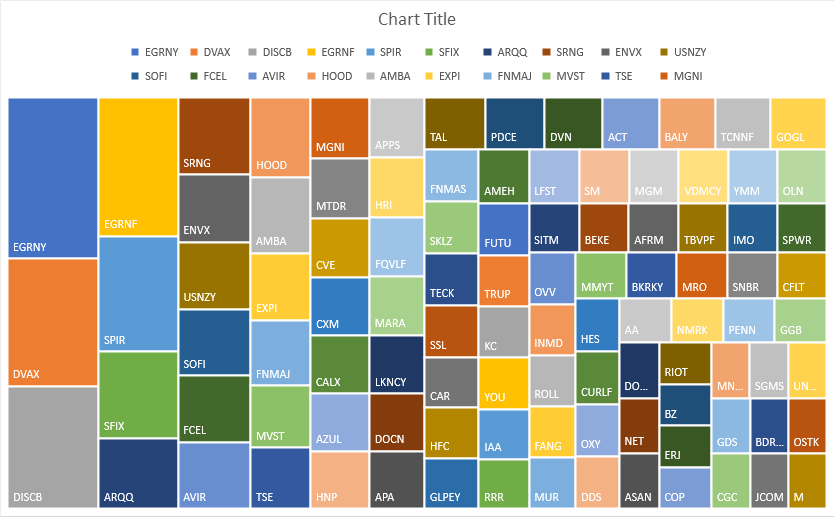
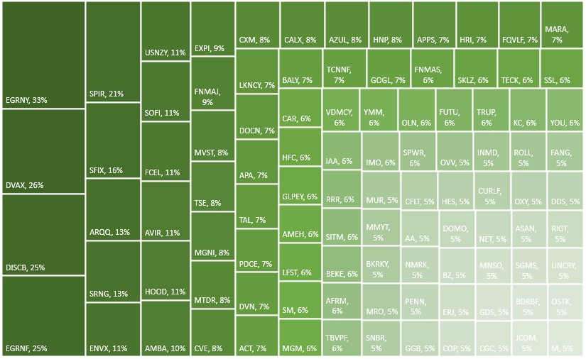
For the last part of the dashboard, I’m going to pull in the tables from the other data sources (top 100 gainers, losers, and upcoming IPOs). If these are on the Data tab, you can just cut and paste them onto the Dashboard tab. And for each one of the tables, I’m going to create a chart based on the symbol and the percent change.
To do this, select the Symbol column and the % Change columns. Then under the Insert tab in Excel, open up the charts and select Treemap. If you selected too many columns or didn’t specify which ones you wanted, you might get a different look. But if you only selected those two, you should see something like this:
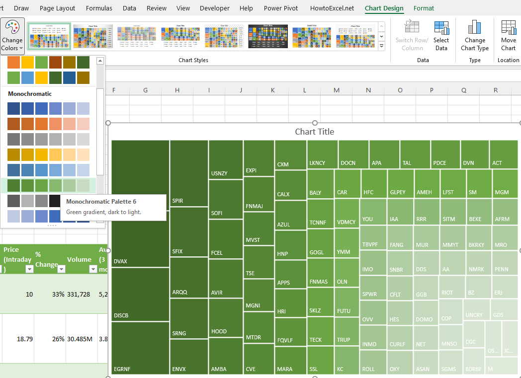
Since the chart includes the symbols, the legend can be deleted. Also, I’m going to change the color scheme so that it goes from dark green to light green. This change can be made by clicking the Change Colors button next to the chart:
To add the percentage to each of the boxes, right-click on one of the ticker symbols and click Format Labels. Then, check off the box for value so that the percentages will also show up next to the symbols:
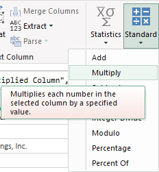
These steps can be repeated for the other charts. However, for the losers table, since the percentage change is negative, it needs to be flipped to positive first. To do that, that query needs to be edited. If you click on Queries & Connections section under the Data tab, you’ll see a list of all your queries. Click on the one that takes you to the top losers query. Right-click edit and Power Query will open up.
Once in Power Query, select the % Change column and under the Transform column at the top, click on the Standard drop down, which will show you all the different calculations you can apply:
Click on Multiply and then for the value in the next box, enter -1. Pressing OK will then flip all the values to negatives.
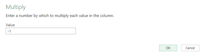
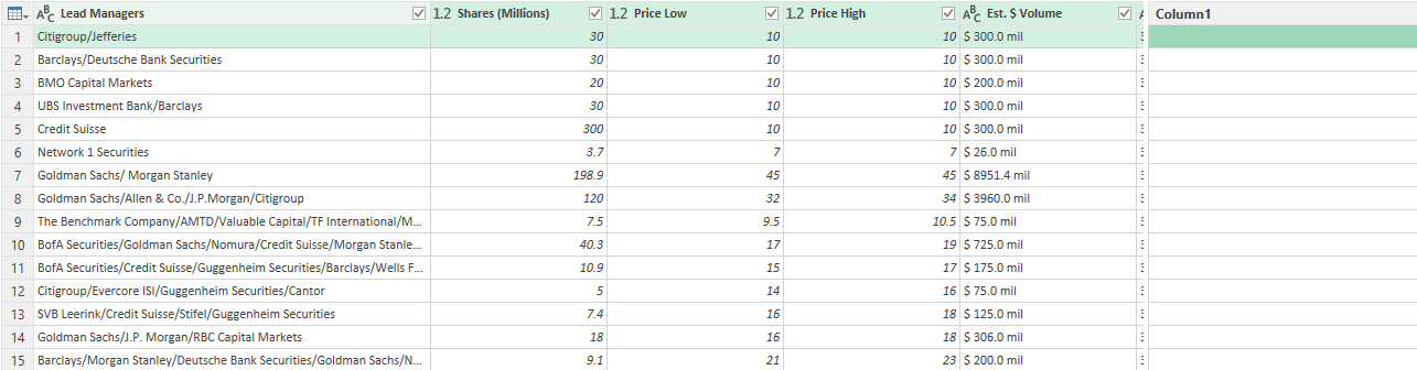
Now, you can create the same Treemap chart for this table. For the IPOScoop download, the field I’m going to use is Est. $ Volume. This query will also need to be edited in order to use that field since it is text. Although it is a bit more complex since this field contains text and dollar signs, there’s a relatively easy way to parse out what you need.
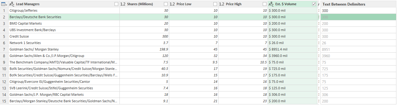
In Power Query, select the column, and under the Add Column tab, click on the Column From Examples button (choose the option for From Selection):
That will create a new column:
In Column1, I can enter the value that I want Power Query to extract. If I just enter a few values to show what I want (in this case, I only need to enter 300), Power Query fills in the rest, figuring out what I am trying to do. It’s an easy way to parse data in Power Query.
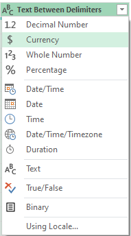
After creating the new column, I can change the format from text to currency by clicking on the ‘abc’ letters in the title:
Now that I have the column created, I can remove the original one and load the data back into Excel and proceed with making a Treemap for this chart using the symbol and the newly created column.
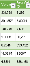
The last thing I’m going to do is create a new column to show the change in volume to determine how much more (or less) trading there was for each stock on the day compared to the average. This will compare the average three-month volume with the current day’s volume. The one complication is that some of the values contain letters:
To convert these values, it’s important to first parse out the letters. If a value doesn’t contain a letter, then it is in thousands. I’m going to set everything to millions. So if the value doesn’t contain a letter, it will be multiplied by 0.000001 to convert it into a fraction of a million. And if it contains a ‘B’, it will multiply by a factor of 1,000. Otherwise, the value will remain as is. Here’s how the first part of the formula will look like, which involves determining the multiplication factor:
Since the letter is always at the end of the string, just using the RIGHT function (which looks at the right-most string) will suffice. This result needs to be multiplied by the remaining value. That value can be extracted by using the SUBSTITUTE function which will replace one value with another:
SUBSTITUTE([@Volume],”B”,””)
In the above formula, the value of B will be replaced with an empty string. This is the same as simply removing the value. To ensure that any ‘M’s are also removed, I will embed this formula within another one that will substitute out those values:
SUBSTITUTE(SUBSTITUTE([@Volume],”B”,””),”M”,””)
I multiply this by the first part of the formula, and my numerator is as follows:
For the denominator, I’m going to use the exact same formula, except instead of the current volume, I’m going to use the field for the three-month average:
The -1 at the end is to put the change in a percentage of less than 100%.
Another step you might consider at this point to help identify these changes is to format these numbers so they are easier to read. You can use conditional formatting (color scales) to easily highlight the highs and lows. And if you want to format the percentages so that they show commas and negative percentages show up red, use the following in the custom number format:
#,##0%;[Red]#,##0%
The semi-colon before the [Red] separates out what the percentages should look like when they are positive (the part before the semi-colon) and what they should like when negative (the part that comes afterward). The [Red] text indicates the value should be in red text.
Here’s how this section looks as part of my dashboard:
And here’s a snapshot of the dashboard as a whole.
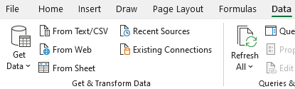
One thing to remember: if you want to update the queries and the dashboard, make sure you go under the Data tab and click the Refresh All button. Otherwise, your data may not be up to date.
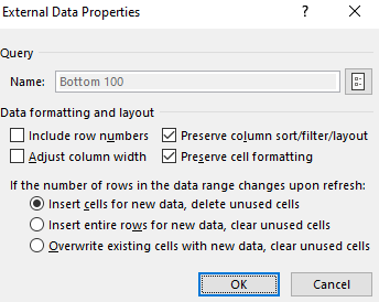
Also, to prevent your tables from stretching out when updating the queries, select each one of them and under the Table Design tab, click the Properties button (under the External Table Data section), where you should see this:
Make sure the Adjust column width checkbox is unticked. This will prevent your columns from stretching out and disrupting your layout.
If you liked this post on Creating a Stock Market Dashboard in Excel, please give this site a like on Facebook and also be sure to check out some of the many templates that we have available for download. You can also follow us on Twitter and YouTube.
In this post, I’ll show you how you can import a company’s financial statements into Excel using Power Query. Previously, I’ve covered how to get stock prices from both Yahoo Finance and Google Sheets. But to get financial statement information, I’m going to use a different source: wsj.com. The reason being, is it’s in an easy format to export and that makes the import process very easy for Power Query.
Downloading the data
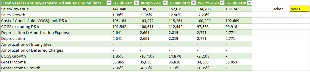
I’m going to use Walmart’s financials for this example. And if you navigate to the following URL, you will get a summary of Walmart’s quarterly financial statements:
What’s convenient about this URL is that it contains both the ticker, the statement type, and indicates that the financials are quarterly. That makes it easy to alter in case you wanted to look for annual statements or a balance sheet rather than an income statement. Just changing the URL will get you to the right page. The above link is what I’m going to use for this example.
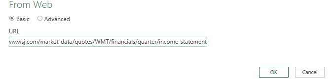
To load the data into Power Query, go to the Data tab and click on From Web:
Then, paste the URL in the following box:
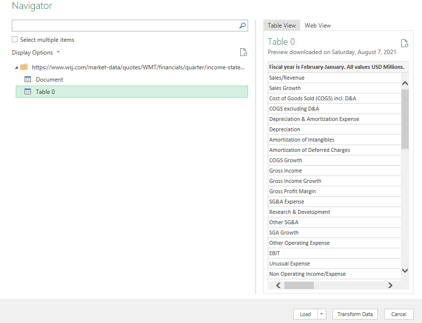
After clicking OK, you can select which table to import. In this case, it’s going to be Table 0:
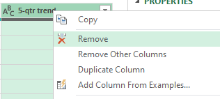
Next, press the Transform Data button to make changes before it gets imported. I’ll start with removing the column at the very end, showing the trend, as it doesn’t contain any information. To remove it, right-click on the header and click Remove:
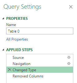
I’m also going to remove the Changed Type step, which automatically changes the data types. To get rid of the step, click on the X next to the step:
This is important because since the header names change based on the quarter, it isn’t going to be helpful to have this step since it looks for hardcoded values. An optional step you could take is to Demote Headers so that the header names are generic and not tied to a specific quarter. However, this isn’t necessary if you remove the Changed Type step. For more information on changing header names, refer to this post.
Once you’re done making changes, click on Close & Load in the top-left corner, and then your data will load into a sheet.
The download will work just fine right now. However, let’s also make the file a bit more versatile in case you want to quickly change the ticker symbol.
Setting up the variables
First up, I’ll create a named range for the ticker symbol, called ‘Ticker’ :
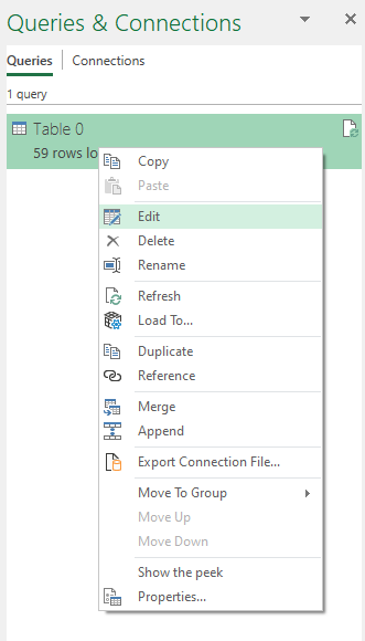
I’ll now go back into the query editor to account for this named range. To edit a query, go into the Data tab, click on Queries and Connections, and then off to the right you should see your queries. Right-click edit on the one you want to adjust:
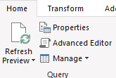
Then, click on the Advanced Editor button near the top of the Power Query window:
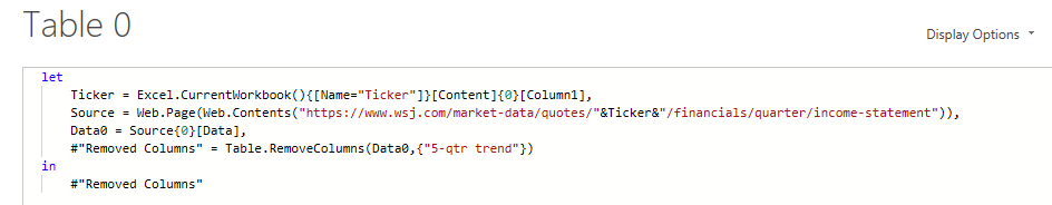
I’m going to add the Ticker variable under the let section as follows:
Note that Power Query is case-sensitive and you will get an error if what you’ve entered doesn’t match exactly what you’ve set as your named range. Also, make sure to add a comma at the end.
I will also need to adjust the Source variable so that it uses the Ticker variable:
The key thing here is to break up the part of the URL that mentions WMT and replace it with the named range. Here’s what the code looks like within the Advanced Editor:
Now, you can Close & Load back into the worksheet. To test the named range, what you can do is replace the ticker value from WMT to AMZN, and if it works correctly, it should load Amazon’s income statement instead. After changing the ticker symbol, remember to press the Refresh All button under the Data tab:
If it works, you should see a whole new set of data populate on your spreadsheet:
If you liked this post on How to Import Financial Statements Using Power Query, please give this site a like on Facebook and also be sure to check out some of the many templates that we have available for download. You can also follow us on Twitter and YouTube.
If a stock you invested in dropped in price, it could be a good opportunity to buy more shares and bring your average down. You can use the average down calculator on this page to do a quick what-if calculation to determine how many more shares you would need to be. However, you can also use this template, which will allow you to run through the same scenarios within Excel.
This is how much money you have already invested into the stock.
Shares owned
The number of shares that you own.
Current share price
What the share price is.
Desired average price
What price you want to average down to.
Budget
How much money you can afford to invest.
Increment price by
This is for the sensitivity analysis and determines by how much you want it to move by. The default is set to $0.50.
Once you’ve entered that data, the rest of the template will populate. Here are the two scenarios that it will show you:
1. Getting to your desired average price
In this scenario, the template will show you how much to invest at different price points to get your average down to your desired average price. You will see up to 20 different data points to show you if the price continues to get lower, how many shares you will need to buy to reach the average price you are targeting.
And any scenarios that fall within your budget will be highlighted in green, and so will the corresponding chart:
If all the data points aren’t filled in or it looks like the chart doesn’t go all the way to the right, this is a sign you need to fix your Increment Price by value. Enter a smaller price increment and you’ll see more data points and a more complete chart.
2. How low you can get your average
The second scenario ignores the desired average price and simply tells you the different average prices you can average down to if you buy at the current price. This is good if you don’t have a specific average in mind and just want to see how low you might be able to go.
You’ll notice on the x-axis it refers to the average price rather than the share price in the earlier chart.
Please note that the template is locked down and this is to prevent overwriting formulas which could lead to errors in the calculations and the charts.
Download the file
You can download the file for free, from here. The free version is limited to five price points. On the full version, there are 20 different prices, no ads, and there are more scenarios:
If you liked this Average Down Calculator Template, please give this site a like on Facebook and also be sure to check out some of the many templates that we have available for download. You can also follow us on Twitter and YouTube.
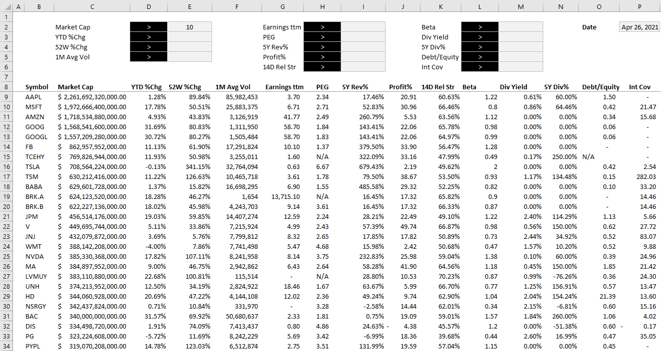
A stock screener allows you to filter through stocks that meet your investment criteria. It can help you find undervalued stocks and great dividend investments. But sometimes it can be cumbersome to always go back to a website and re-apply filters, even if you save them. In this post, I’ll go over how you can populate a list of stock data into Excel and then run your own filters on it, and thus, creating a screener you can easily access from within your own spreadsheet.
Step 1: Populating the list
The one thing you’ll want to do before you can create the screener in Excel is to download an array of stock data from a database. Personally, I like using Barchart because it has lots of useful information on there and you can get a wide range of data, and it is easily downloadable into an Excel format. It lets you do five free downloads each day and you can download 1,000 rows at a time. That’s thousands of stocks you can add. Using that in conjunction with the STOCKHISTORY function, and you can create a pretty versatile template. After all, since data like earnings, dividends, and other fields won’t often change, downloading a snapshot from Barchart once a month or even less frequently shouldn’t be a big issue. You can obviously use other databases but I’m going to use a free example for the purpose of this post.
On Barchart, I’ve customized the fields I want to use for my downloads, and this allows me to re-use them again and make subsequent downloads easier. To keep it simple, I am going to download just the top 1,000 North American stocks based on market cap. This is what my download looks like in Excel:
Now that the data is loaded, the next step is to create the layout.
Step 2: Organizing the stock screener and setting up the fields
I find it most convenient to always put any inputs on a spreadsheet on the top of the page, and the results below. This way, you can freeze panes to make it easy to scroll through all the rows while seeing your selections.
To start, I will create a field for each major field I have downloaded. After formatting some of my values, this is how my screener looks thus far:
Off to the right, I’ve added a date field because I am going to utilize Excel’s STOCKHISTORY function to pull in the price. This will allow me to calculate the current price to earnings ratio without having to download it from the screener as that multiple will change every day based on the stock’s price.
When downloading so many stock prices, it may take a while for the formulas to update. But once they are loaded, then I can calculate the P/E ratio by just taking the stock price and dividing it by the earnings per share.
Step 3: Creating the formulas to evaluate the criteria
The part that will take the most time is to now evaluate each of the criteria to determine if a stock meets all of it and whether it should be included in the results. Rather than trying to do this in one large formula, I’m going to break this up into one formula per field. I’m going to name these fields exactly the same so that it is easy to reference them.
For the first criteria, Market Cap, my formula looks as follows:
D2 is where I have the dropdown for the > or < symbol and E2 is the value that I want to filter for market cap. C9 is the first row of data. My goal here is to evaluate to either a TRUE or FALSE value. I also divide the value in C9 by 1,000,000 just to make it easier to filter the market cap by millions.
For the % change calculations, I will do a similar calculation. Except this time I don’t need to divide by 1,000,000 and so it looks a lot simpler:
=IF(E3=””,TRUE,IF(D3=”>”,D9>E3,D9<E3))
D3 is my > or < dropdown while E3 is the percent change I am entering. Since I will enter a percentage here, I don’t need to make any special calculations. This is the same format that I will follow for the other fields.
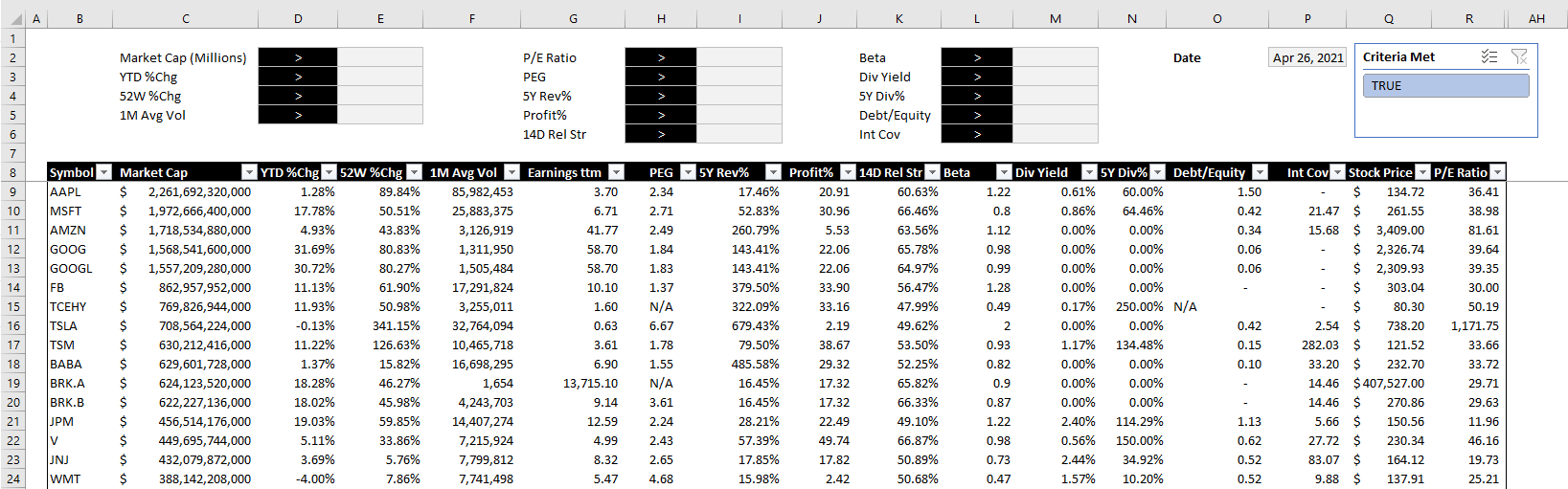
Once I have set up all my calculations for the various criteria, I’m going to add one column that will check to see if the stock meets all of them. This is a simple formula where I can multiple all the values. A TRUE value will compute as 1 and a FALSE will be 0. And so even if there is one FALSE value, the entire result will return FALSE and not meet the criteria. The formula looks as follows:
The final step is a simple one but it’s also important to make this sheet work smoothly. Select anywhere on the data set and on the Insert tab, click on Table. Hit OK and now you should see Excel’s default table applied to your data.
The reason for converting this into a table is that now we can apply slicers to it. And really, only one is needed here. If you go to the Table Design tab, there is a button to Insert Slicer. Click on it and select the one for the field that checks all the other criteria. In my example, it is called Criteria Met.
After hiding all the criteria fields, changing some of the formatting and adding the slicer, this is now how my screener looks like:
The beauty of this stock screener is that by clicking on the TRUE button in the slicer, you are automatically refreshing the data in Excel and updating your filters based on the selections. All this is done without macros and it makes the screener easy to change with the press of a button.
You can download my completed template here. Please note that if you do not have STOCKHISTORY available on your version of Excel, some of the values will not populate.
If you liked this post on creating a stock screener in Excel, please give this site a like on Facebook and also be sure to check out some of the many templates that we have available for download. You can also follow us on Twitter and YouTube.
There are a few different ways you can pull stock prices into Excel. You can use the new STOCKHISTORY function, pull data from Google Sheets which has a native stock function, or you can also use Power Query. In this post, Power Query is what I am going to focus on and show you how you can pull data right from Yahoo Finance. Of course, if you don’t want to do it yourself, I also have a template that is ready to use and download (at the bottom of the page).
Creating the query
For this example, let’s pull Apple’s stock history for the past month. To do this, we can simply go to the Yahoo Finance page that shows the stock’s recent price history, located here and select any interval, whether it is five days, one month, or three, it doesn’t matter.
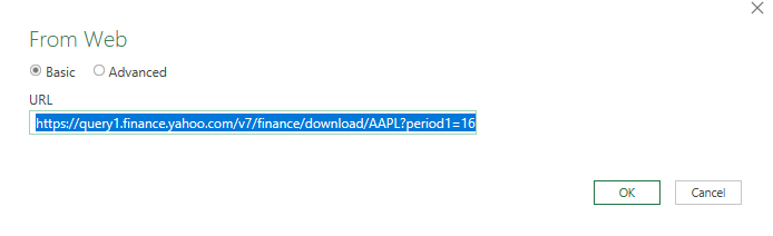
To get the complete data set, I’m going to copy the actual CSV download link from that page, not simply the URL. That way, it is possible to pull a much wider range than the default of 100 days.
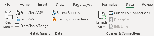
I’m going to use that link to set up the query. To create it, go into the Data tab, select the From Web button next to Get Data:
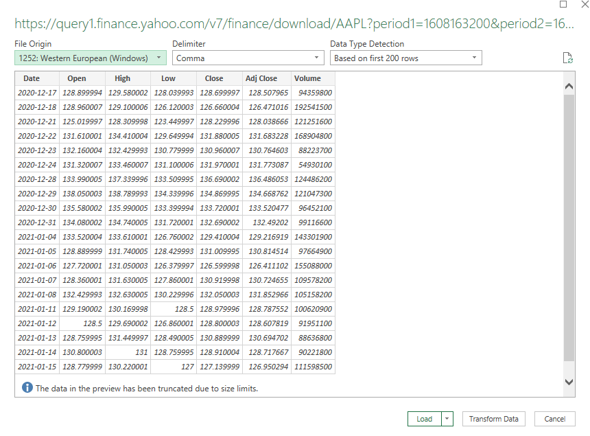
On the next page, you’ll be given a place to enter a URL, and this is where I am going to enter the download link from Yahoo Finance:
Click on OK and Power Query will connect to the web page. Next, you will see a preview of the data and if it looks okay, you can just click on the Load button:
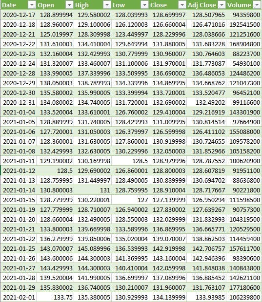
Then, the data will load into your spreadsheet and it should look something like this:
If that’s all you need, you can stop here. The only downside is if you wanted to look at a different ticker or change the date range, you would need to get a new link, and update the query manually, which is not ideal at all. This can be automated and takes a little more effort but it can be done by adding some variables and making some tweaks to the query.
Setting up the variables
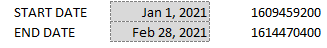
In Power Query, you can utilize named ranges. In this case, I’ll set them up for the ticker symbol, as well as the start and end dates. That way, I can pull up a stock’s history for a specific time frame. The three named ranges I’m going to create are called Ticker, StartDate, and EndDate which can be entered all in the same place:
For the dates to work on Yahoo Finance, they need to be converted to a timestamp. This is what that calculation looks like:
=(A1-DATE(1970,1,1))*60*60*24
Where A1 is the date. This is what the dates look like when converted into this format:
Those timestamps are needed for the Yahoo Finance URL to populate properly. These are the values that need to be tied to a named range.
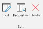
Next, these ranges need to be coded into Power Query. To do this, click anywhere on the table that the query created, and you should now see a section for Query in the Ribbon and click on the Edit button:
That will launch the editor. From there, you will want to click on the Advanced Editor button:
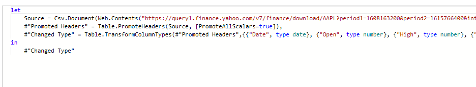
Then, you’ll see how the query is coded:
You can see the source variable is where the URL goes. To insert a named range from the Excel document into this code, we need to use the following format:
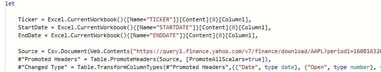
To keep things simple, I kept the name of the variable the same as the named range within the Excel file. Here is what the editor looks like after adding in the variables for the ticker, start date, and end date:
The one thing that I still need to adjust is the source. This is a hardcoded URL and it needs to be more dynamic, utilizing the variables.
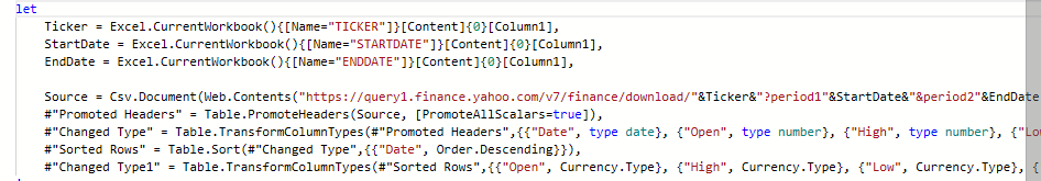
In this part, I’ll need to adjust the query carefully to ensure that it is generated correctly. I will put the ticker variable where the ticker should go, and put the start and end dates (in Unix format). This is an excerpt of how the updated source data looks like:
Note that for the start and end date named ranges, I included the = sign to ensure the variable is read as text.
Now that the source is changed, all you need to do is update the variables and click on the Refresh All button on the data tab, and the table will update based on what you have entered.
If you want to download my template, you can do so here.
If you liked this post on how to get stock quotes from Yahoo Finance using Power Query, please give this site a like on Facebook and also be sure to check out some of the many templates that we have available for download. You can also follow us on Twitter and YouTube.