If you’re looking to buy stocks, a one of the more common ratios you’ll likely consider in your analysis is the price-to-earnings, or P/E multiple. You can look at either the trailing P/E or the forward P/E. Below, I’ll look at what the difference between those multiples is, how to calculate each one, and how you can use them to determine a company’s expected growth rate.
What is the difference between the trailing P/E and the forward P/E?
The P/E ratio looks at the stock price in relation to earnings per share. If it’s a trailing earnings multiple, then that means you’re looking at the company’s earnings over the trailing twelve months, or ttm. A forward earnings multiple is based on analyst expectations and what the company’s earnings will be over the next year.
If a company had a worse year than normal or analysts are expecting lots of growth in the year ahead, the forward P/E will be lower than the trailing P/E. If, on the other hand, the company performed exceptionally well and perhaps benefitted from one-time gains, then its trailing P/E may look better (i.e. lower) than its forward P/E if analysts don’t expect a significant change in the business over the next year.
The smaller the gap between the trailing P/E and the forward P/E, the more consistent the earnings numbers are and the less of a change analysts are expecting from the previous year. If, however, the gap is significant, that could be an opportunity for investors because if a stock has a high trailing P/E multiple (due to an abnormally bad year), it can be missed on stock screeners if people are searching for stocks with low P/E multiples.
You can think of a forward P/E as what the company’s earnings will be in a normal or typical year whereas the trailing P/E is one that may have been distorted for a number of reasons.
How to calculate the trailing and forward P/E ratios
Here are the steps you can take to calculate the trailing P/E multiple:
- Add the company’s net income over the past four quarters. This is its income over the trailing twelve months.
- Take that total and divide it by the averaged diluted shares outstanding over the course of the year. Unless there’s a significant variation over the course of the past year, you can often just use the shares outstanding as of the most recent quarter. The result of this calculation will give you diluted earnings per share, or EPS.
- Get the current share price and divide it by EPS. This will be your trailing P/E multiple.
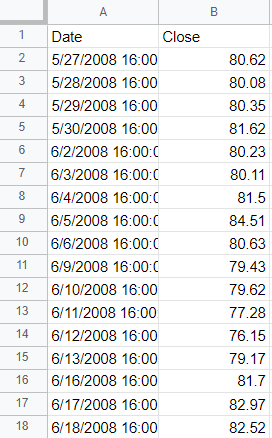
Here’s how I did the above calculations for Tesla’s stock in Excel, based on data as of Jan. 16, 2023 that was pulled from Yahoo Finance:

For the forward P/E multiple, the calculation is more straightforward since it is based on analyst expectations. Here are the steps to calculated the forward P/E multiple:
- Obtain the average analyst earnings per share estimate for the next year.
- Take the current share price and divide it by that estimate.
If you go to Yahoo Finance and go under the Analysis tab, you will see a series of analyst expectations for earnings for the new year:

Since I’m looking for the full year, I’ll take the average estimate for ‘Next Year (2023)’ which is an EPS of $4.79. By taking the share price of $122.40 and dividing by this figure, I arrive at a forward P/E of 25.55. This tells me that analysts are expecting Tesla to have a better year in 2023 as its forecasted EPS of $4.79 is higher than the $3.23 it has reported over the past four quarters.
You can use earnings multiples to estimate the earnings growth analysts are forecasting
This year, analysts are projecting that the company’s EPS will be $4.79, which is 48% higher than the $3.23 it reported over the past four quarters. However, you can estimate how much growth analysts are expecting from the business without having to dive into the EPS numbers.
Since the numerator, price, in the P/E multiples remains constant, the only change is the earnings, the denominator. You can do the same earnings growth calculation by taking the trailing P/E and dividing it by the forward P/E, and then subtracting 1 from that value:

If the forward P/E is lower than the trailing P/E, that tells you that analysts are expecting that the company’s earnings are expected to decline in the coming year.
If you liked this post on How to Calculate Trailing P/E vs Forward P/E in Excel, please give this site a like on Facebook and also be sure to check out some of the many templates that we have available for download. You can also follow us on Twitter and YouTube.