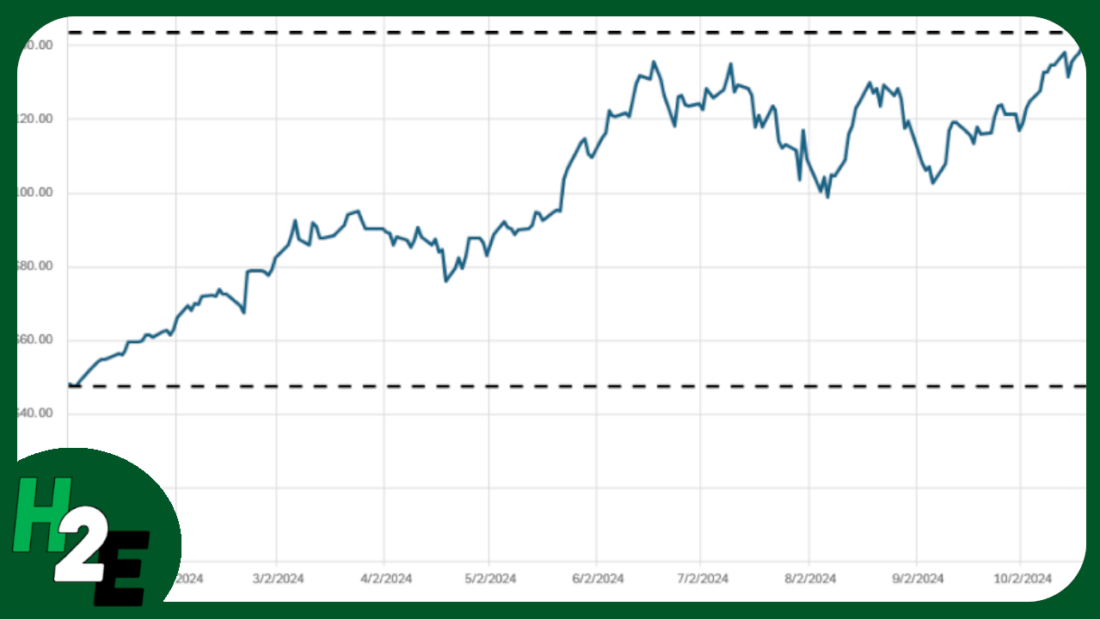
If you’re pulling in stock prices into your spreadsheet, you can easily plot those values on a chart. And one way to help visualize the data is to add horizontal lines to help you identify where the maximum and minimum values are. I’ll go over how this can be done in both Excel and Google Sheets.
Pulling in the historical stock prices in Excel and Google Sheets
In Excel, you can use the STOCKHISTORY function to pull in historical stock prices. And in Google Sheets, there’s the GOOGLEFINANCE function. Both are fairly straightforward functions which can extract stock prices going back days, months, and even years.
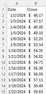
Below, I’ve pulled Nvidia’s stock price history from Jan 1, 2024 through to Oct 31, 2024, in Excel:
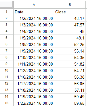
And here is the price history in Google Sheets:
Calculating the highs and lows
In Google Sheets, you can pull in a stock’s 52-week high and low from right within the GOOGLEFINANCE function. But in this example, I’m going to calculate the minimum and maximum values based on the range that has been downloaded. This will make the chart more dynamic, allowing you to have these values updated based on your range.
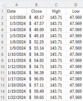
In both Excel and Google Sheets, I’ll setup columns for HIGH and LOW. I’ll use the MAX function to get the highest value and the MIN function to get the lowest value. The only argument needed is the column which contains the closing price. The same value needs to be repeated in both of these columns to ensure the line is horizontal.
The formula is exactly the same whether you’re using Excel or Google Sheets. What’s important, however, is to ensure the values are the same all the way down; you’ll want to copy it all the way to the bottom. Here’s how it looks in Excel:
Plotting the values on a chart
Next, with the highs and lows added, it’s just a matter of creating a line chart which shows these values. The default formatting in Excel already does this effectively for me, displaying the high and low ranges:
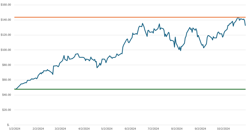
At this stage, it’s just a matter of any additional formatting you may wish to do, such as changing the line colors. I also prefer to make these dotted lines, and this can be done by changing the dash type. Here’s what my finished chart looks like in Excel:
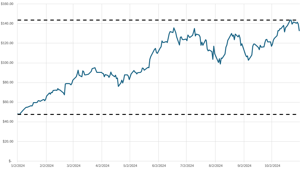
To format the individual lines, right-click to Format Data Series, where you can then change the color and the dash type. The changes I made above are to change the color to black and the lines to a dash. I have also added vertical gridlines to the chart by going to the Chart Design tab and selecting Add Chart Element and Gridlines and then clicking Primary Major Vertical.
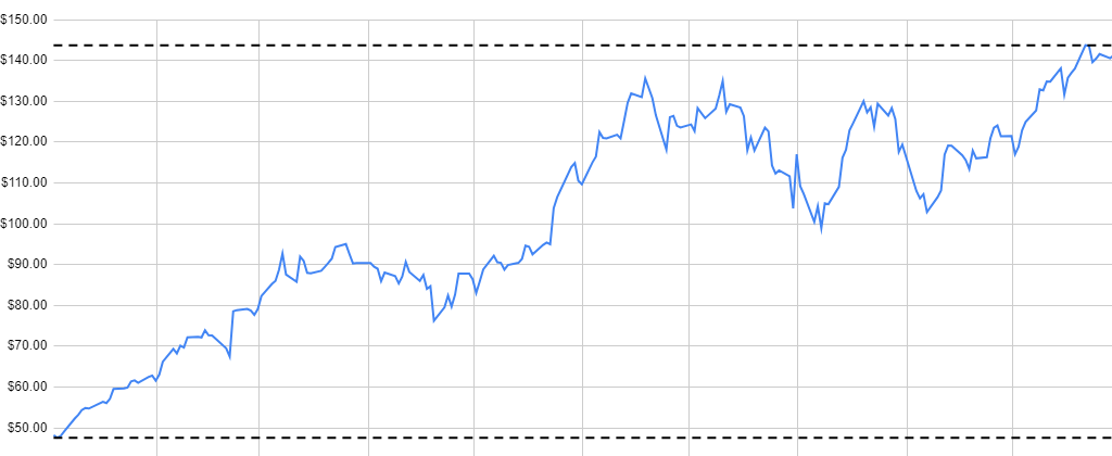
On Google Sheets, the process is largely the same. The main difference is that you need to access the edit chart menu and under the Customize tab, select your options for gridlines, color, and dash type for an individual data series.
If you like this post on Add Horizontal Lines to Stock Charts to Identify Min and Max Values in Excel and Google Sheets, please give this site a like on Facebook and also be sure to check out some of the many templates that we have available for download. You can also follow me on Twitter and YouTube. Also, please consider buying me a coffee if you find my website helpful and would like to support it.

