
Heat maps are visual representations of data where individual values are represented by colors. They are particularly useful for identifying patterns, trends, and outliers in large data sets at a glance. By using a spectrum of colors, typically ranging from cool (blue) to warm (red), heat maps make it easy to see which values are higher or lower, helping users quickly understand the data’s distribution and key insights.
Why heat maps are useful
- Visual Clarity: Heat maps turn complex data sets into easy-to-understand visual formats.
- Quick Analysis: They allow for the rapid identification of trends, patterns, and outliers.
- Enhanced Decision Making: By highlighting critical data points, heat maps aid in making informed business decisions.
- Comparative Insights: They facilitate the comparison of different data points within a set.
How to create heat maps in Google Sheets
Follow these steps to create a heat map in Google Sheets:
Step 1: Prepare Your Data
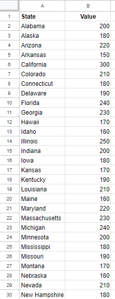
Ensure your data is organized in a clear and structured manner. Each column should represent a different variable, and each row should represent a different observation or data point. You should give Google Sheets enough data so that it can determine the location for your data points. In the example below, I have U.S. states listed in column A and values in column B. Since I’ve labeled column A as ‘State’ that gives Google Sheets sufficient information to map the data points. If I had a list of countries, then I would label the header as ‘Country.’
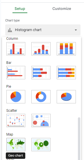
Step 2: Insert the chart
Select any data point on your table and on the Insert menu, select Chart. Google Sheets will create a default chart but you can change it by selecting the Chart Type and then selecting Geo Chart from the Map section.
Step 3: Select the correct map
When the map chart is created, it may not automatically detect the correct area. In my example, it selects the entire world.
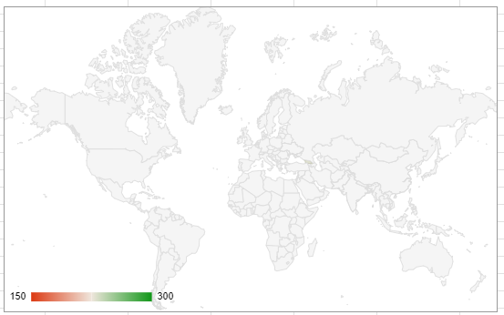
The chart looks incorrect as nothing is filled in, but this is because I’m at too high of a level to see the values. I need to adjust my chart to focus just on the United States. To fix this, edit the chart and under the Customize tab, select the Geo settings and change the region to United States.
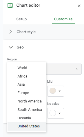
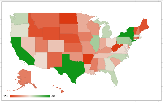
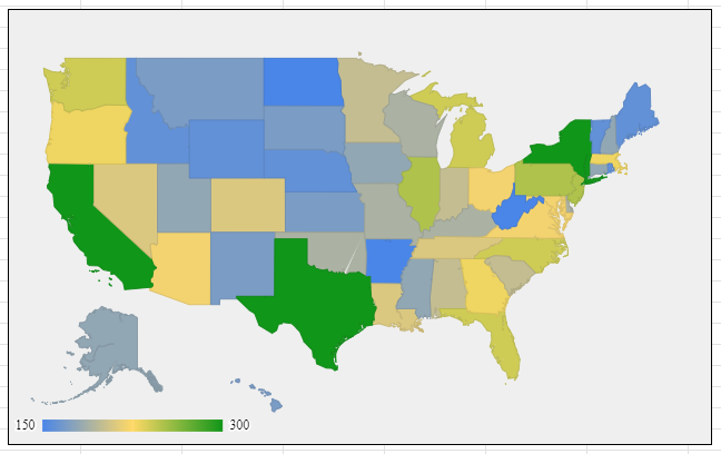
You can adjust the range per your individual data set. But in this example, since my data has U.S. states only, then I need to select the United States. And once I do so, now my chart is filled in:
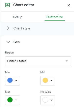
Step 4: Adjust the color scales
By default, the chart shows green and red colors for high and low values, respectively. I can customize this in the Geo section as well. You can modify this so that blue colors are for the low values, green for the maximum values, and yellow for the mid-range values:
Step 5: Modify other chart settings
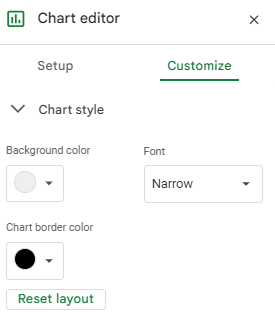
The last step is, as with any other chart, modifying the font, background color, border color, and any other settings for the chart. These can also be changed in the Customize section of the chart settings.
Once you’re done, the heat map chart is ready to go:
If you like this post on How to Create a Heat Map in Google Sheets, please give this site a like on Facebook and also be sure to check out some of the many templates that we have available for download. You can also follow me on Twitter and YouTube. Also, please consider buying me a coffee if you find my website helpful and would like to support it.