formatcharts.gif

Formatting Charts to Make Them More Appealing

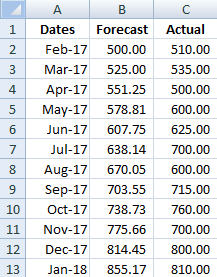
Excel makes it easy to convert a data set into a chart. The problem is that often the default chart settings aren’t the greatest. Below I have some sample data that I will convert into a chart:

If I click on the data and go on the Insert tab and click on a new Column Chart it will create the following chart for me (this may vary based on which version of Excel you are using):

There are a number of things that don’t appeal to me here that I am going to change:
– Gridlines are a little darker and more prominent than they need to be
– Gridlines stretch past the axis
– The legend is off to the side, which takes up chart space
– The border around the chart itself
– The gaps are a bit big
– The flat look of the chart

These may appear minor issues but in terms of presentation they can make a big difference. First I will start with the grid lines.

Formatting Gridlines

If I click on any of the gridlines I can right-click and select Format Gridlines. Under Line Color, the color is set to Automatic. I can change this by selecting Solid line.

I am going to change the color to grey so that it does not stand out as much.

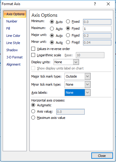
Next I will have to format the axis to stop the gridlines from going past the axis. To do this I click on one of the axis labels to select them and again right-click and select Format Axis

From there, under the Axis Options there is a drop-down option for Major tick mark type. By default it is set to Outside. I am going to change this to None in order to remove it.


I will also change the Line Color here to match the grey from the gridlines. I repeat these steps for the other axis to get rid of the tick marks there as well.

Formatting the Legend and Adding a Chart Title

Next, I will change the legend so that it shows at the bottom of the chart. This is an easy fix and all I need to do is select the Layout tab from under the Chart Tools section of the ribbon. From there I select Legend and choose Show Legend at Bottom.

To the left of the Legend drop down is a section for Chart Title. This is where you can select how you want your title to appear.

If you select Centered Overlay Title you don’t lose chart space but then your title is overlapping with your chart. Above Chart will put the title above the actual chart so that there is no overlap.
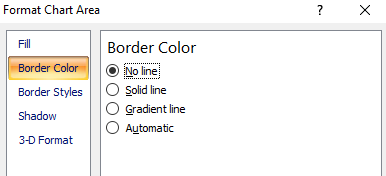
Removing the Border 

Next, I am going to remove the border around the chart itself. To do so, I need to right-click somewhere on the white space that isn’t on the plot area. Somewhere near an axis or the legend will work. Then I can select Format Chart Area.

If I select Border Color I can change the setting from Automatic to No line to remove the border.

It may look a little odd if your gridlines are showing so you may want the outline. However unless you print with gridlines, then the chart will blend in better without them. Below is an example of the two charts with and without borders in print preview mode:

Shrinking the Gaps

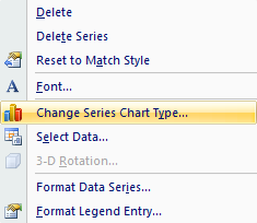
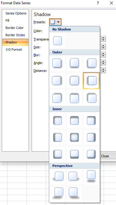
Lastly, I will shrink the gaps in the chart. To do this I will right-click on any of the columns and select Format Data Series.

Under Series Options there is a section for Gap Width. The default is 150%. I normally set this to 50%.

Changing Colors/Effects

If you wanted to change the colors of the chart you can do so individually or just change the theme. To change the theme go under Chart Tools and this time select the Design tab.

Changing the theme will undo the changes I have made to the gridline colors so if you do those changes you will want to change the theme first.

You don’t have to select a theme, you can change colors one by one. To change the color of an individual series you can do so by right-clicking on one of the columns and select Format Data Series and change the fill color under the Fill section.

Instead, what I am going to do is adjust the shadows. Right now they look flat, and I want a bit of an elevated effect. While still in the above menu I can select the Shadow option. If I click on the drop down in the Presets field, I will have a number of shadow options. I don’t use the inner shadows since they make the columns a bit dark, and the outer ones leave too long of a shadow. In this case I select the Offset Left option.

This is what my chart looks like now after all the changes:

Saving a New Template

Rather than making these changes every time I can save my changes to a template. To do so, just click on Save As Template which is under the Design tab in Chart Tools. Then just assign a name and your template is saved.

If you want to use your template again simply when select chart types select the Templates folder and you will see it there.

Forecast

Shading Areas on a Chart to Highlight Gaps and Variances

When comparing forecasted amounts vs actuals one way to help emphasize and highlight variances is by shading those areas. I’ll show you how to easily do that in this post.

Below is my starting data set

Forecast
I will need to create two extra columns to this data set. The first one I will just call Starting Values and they will match my forecasted amounts. The next column, called Variances will be equal to the actuals less forecasted values.
Variances
Next I will plot a line graph with these values. 
line graph
I will need to change the chart type for the starting values and variances data sets. They need to be set to the stacked area charts.
Area charts
For the starting variances series, click on Format Data Series and under the Fill section select No Fill. What remains are the shaded areas in addition the line graphs. You can change the shading to a different fill colour or texture.
shaded chart
horizontal line data

Plotting Vertical and Horizontal Lines in Charts

When charting something on Excel you sometimes may want to add vertical lines to identify key dates, or horizontal lines for target or benchmark amounts. In this post I’ll show you how to do both.
Horizontal lines can be used to identify target or benchmark amounts while vertical lines are useful to mark dates. In my example I’ve downloaded googles historical closing stock prices for the year and I’m going to mark the year long average and identify their earnings dates

Horizontal Lines

I’ll first start with horizontal lines. If you have amounts on the y-axis then a horizontal line can act as an indicator to show if the amounts have crossed a targeted amount. In order to add a horizontal line all you’ll need to do is create another column in your table.
The key thing for this column is all the values have to be identical for each entry. I can set it to a single number and copy it down, or I can do a calculation as well. What I will use is the closing price average in this column using the AVERAGE formula. If I copy this down I am left with a value that stays constant for the entire data set.
horizontal line data
If I chart this graph using a line chart my horizontal line is now visible
chart horizontal line

Vertical Lines 

Vertical lines are a bit more tricky but not difficult. In my example I am going to put a vertical line at every earnings date since I know those days will have a lot of fluctuations and will also create quarterly intervals. I have created a column for all the earnings dates in the year, aka my earnings calendar.
earnings calendar
 Again I will need to create another column in my table. 
In this column I will look to see if the date for this row matches one of the dates in my earnings calendar. If there is a match, I will set the value to 1. Whether you use the MATCH formula or the VLOOKUP formula doesn’t matter. But I will use the MATCH formula in this example. The key is including the IF and ISERROR formulas  because if I do not find a value it will return an error, and specifically I will use the NA() formula to return the NA error so that that amount does not appear on the chart as a zero. And if it is a match, I can make it set to 1.
First I will start with the IF function, add ISERROR, and add the MATCH function to now see if the date on this row matches anything in my earnings calendar), and if it is not a match, make it equal to an NA error, otherwise make it equal to 1 indicate a match.
My formula looks like this:
=IF(ISERROR(MATCH(A2,G:G,0)),NA(),1)

Where column G is where my earnings calendar is located.
Now I will copy my formula all the way down. It may not look terribly nice in your table with all those errors but it will get the job done.
Match function
I’m ready to chart my graph now. Select line chart again. However unlike for the horizontal line, it needs some work.
The earnings dates need to be plotted against the secondary axis. To do this, I right click on the series and click Format Data Series and select Secondary Axis.

Format data series

Next, I need to change the series chart type so that it is a column chart. I will right click on the series again and select Change Series Chart Type and then select a column chart.
column chart
I will go back to format the data series once more to add a border which will allow me to make the line look thicker.  By going to Border Colors this time I can specify the colour, and then under Border Styles I can modify the Weight.
I will now format the secondary data axis. I will set the maximum height equal to 1, the value that I set for the earnings column when there was a match. It doesn’t matter what you set that value to, whether it is 1, 100, 1000, you will just need to change the axis accordingly to make sure that value is at least as large as your scale to have the line go all the way across. If you have values that you are currently using on your secondary axis you will want to take that into account and consider what is a good maximum value for that secondary chart, and use that value, rather than 1.
Next, I will hide the secondary axis (if you need it for other values obviously this is optional). To do this right click on the axis, click Format Axis, and set Axis Labelsto None.
Axis Labels
Now my chart is good to go with both vertical and horizontal lines.
Chart Vertical Line
awater

How to Make a Waterfall Chart in Excel


waterfall chart
This is a chart that is useful in reviewing variances and monitoring change from one period to another. Favourable (positive) variances are green, and unfavourable (negative) variances are red. In this example I used a statement of cash flow. Increases or inflows in cash are favourable, while decreases or outflows of cash are unfavourable.


On the data tab all that is required is the change column (B), and the remaining formulas can stay intact.

If you were to track the changes in an income statement, you want to be careful to make sure favourable changes are positive and unfavourable ones negative. For example, if sales are up 100,000, that should be favourable since it has a positive impact on net income. However if expenses are up 100,000 that is unfavourable since it has a negative impact on net income, so although it is technically an increase, the change should be negative. This is where the cumulative change column is helpful because it shows you the running balance, and the ending figure in that column is what you are reconciling to. If that number is not correct then you know somewhere a sign is wrong or an amount is missing.


The remaining columns (D:H) simply have to do with the appearance of the chart. Columns D:E are positive changes, G:H are negative, and F represents the amount that is not visible or blank. The purpose for the blank values is what allows the waterfall chart to create the effect of starting from the last position and just showing the change in the cumulative value.