A pie chart can be a great way to show percentages, such as how much significant an individual’s product sales are to the total number. However, if you’re dealing with more than 10 items, a pie chart can start to get a bit messy. But there is a way to address that, and that’s with a second pie chart. In this post, I’ll show you how to make a pie of a pie chat so that it’s easier to display more items.
At what point should you consider another chart?
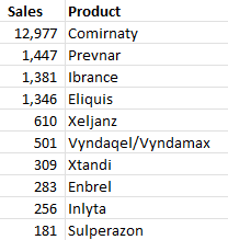
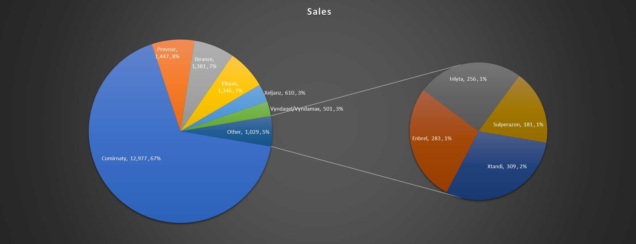
There’s no magic number as to how many items is the limit for a pie chart. It will ultimately depending on how big your slices are, and the size of your text. For my example, I’m going to use data from healthcare company Pfizer‘s most recent quarterly results to show sales of its top-selling products. For the third quarter of 2021, the revenue of its top products were as follows:
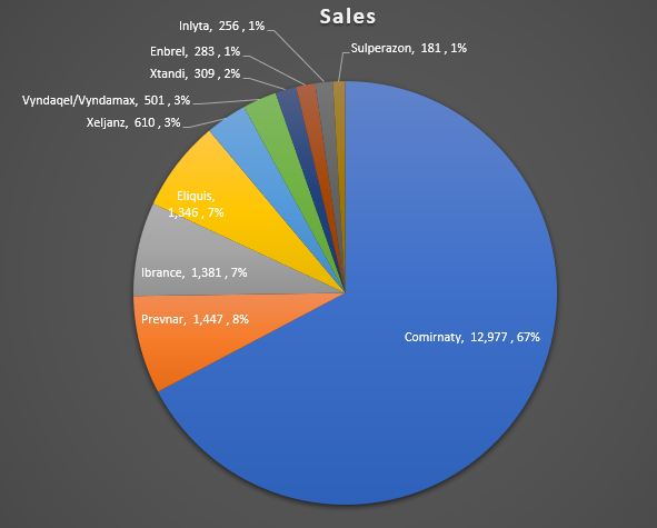
If I were to create a pie chart using this data, this is how it would look like:
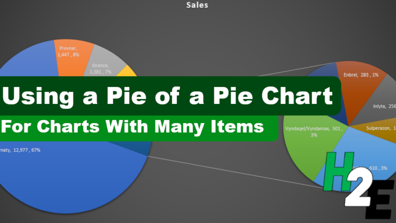
Since there are many small items accounting for 3% or less of revenue, a case could be made for creating a second pie chart here. You don’t have to do so, but it could help make the visual more readable for users.
Creating a second pie chart
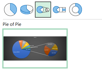
To add a second pie chart, what I need to do is select the chart. Then, go into the Chart Design tab and select the Change Chart Type option. From there, I will select the Pie of pie chart:
Upon making the selection, I now get a second chart that offloads some of the items onto there:
Customizing the size of the pie chart
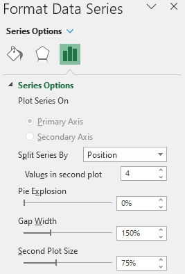
By default the smallest slices will be on to the second pie chart. However, you can specify how you want to split the charts. If you right-click and select Format Data Series, you can specify the number of items that show in the second chart:
In the above example, there are 4 values in the second chart. But you can change this higher or lower and ultimately that will be discretionary; it will depend on how you want your data to look. If you have many small items in your summary that you want to show in a smaller pie chart, then you may want to increase the number of values in the second plot. If that’s not the case, you could opt for a smaller number.
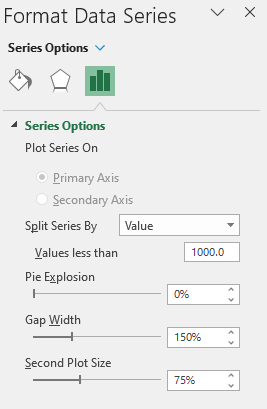
This may seem a bit arbitrary and there are other rules you can apply instead. For example, you can select to Split Series By value:
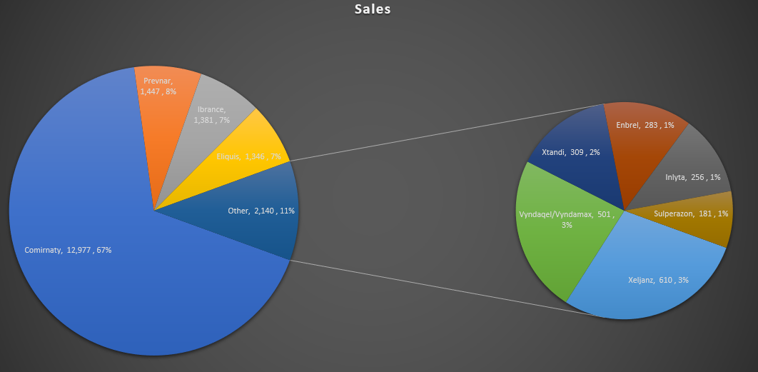
In this case, any value that’s less than 1,000 will be moved off to the second pie chart. Here’s what that looks like:
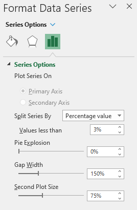
Another option is to split the chart based on the percentage of each slice:
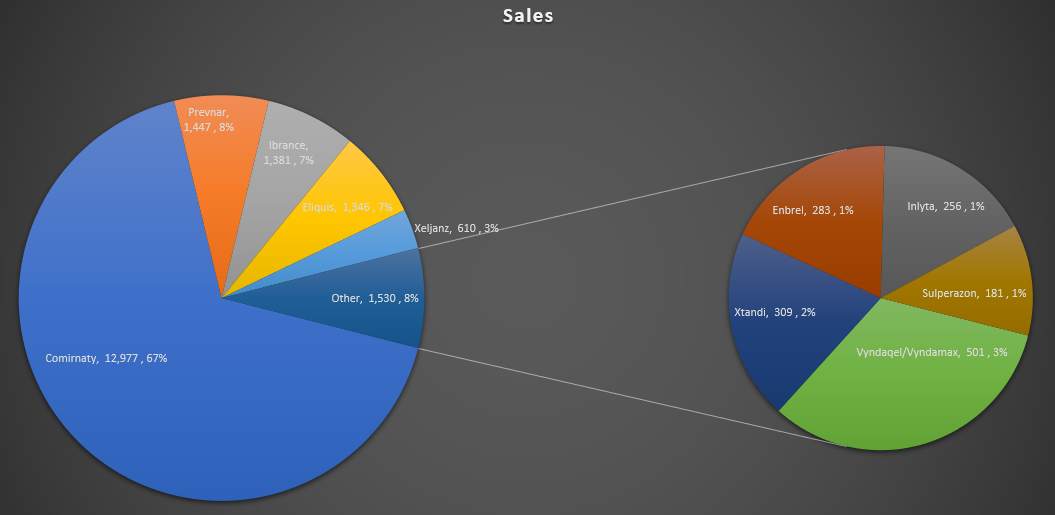
In the above example, I’ve selected any items that account for les than 3% of the total, they will be pushed onto the second pie chart:
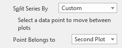
If you want to manually move items from one chart to the other, you can also change the Split Series By option to ‘Custom’ and then click on a slice you want to move. You’ll see an option there to set whether it belongs to the Second Plot or to the First Plot.
Making these changes will move the slice to either the first pie chart or the second one.
If you liked this post on How to Make a Pie of a Pie Chart, please give this site a like on Facebook and also be sure to check out some of the many templates that we have available for download. You can also follow us on Twitter and YouTube.
In Excel, there are multiple different stock charts you can create. All you need is some combination of the date, opening price, high price, low price, closing price, and volume to generate what you need. In this post, I’ll show you how you can utilize Power Query to pull that data in and transform it, without having to apply any manual changes to it every time. For an overview, you can check out this post on How to Get Stock Quotes From Yahoo Finance Using Power Query. I’m not going to repeat those steps and will assume that you’re familiar with that process.
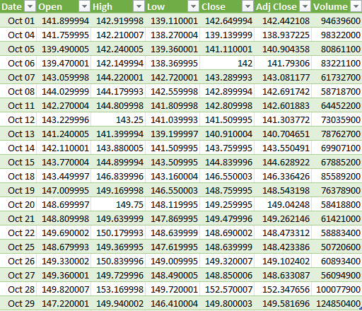
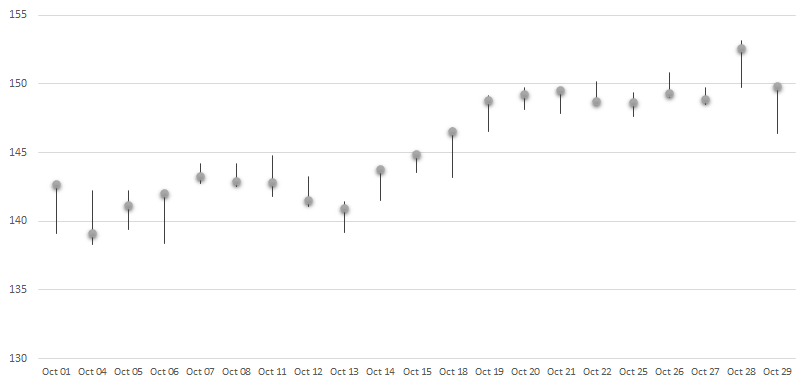
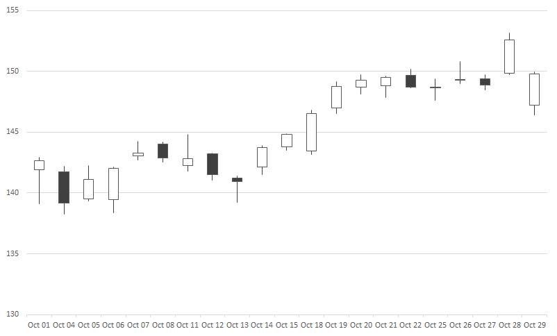
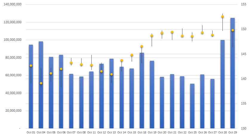
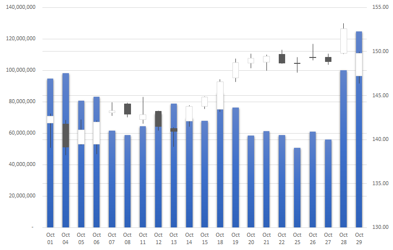
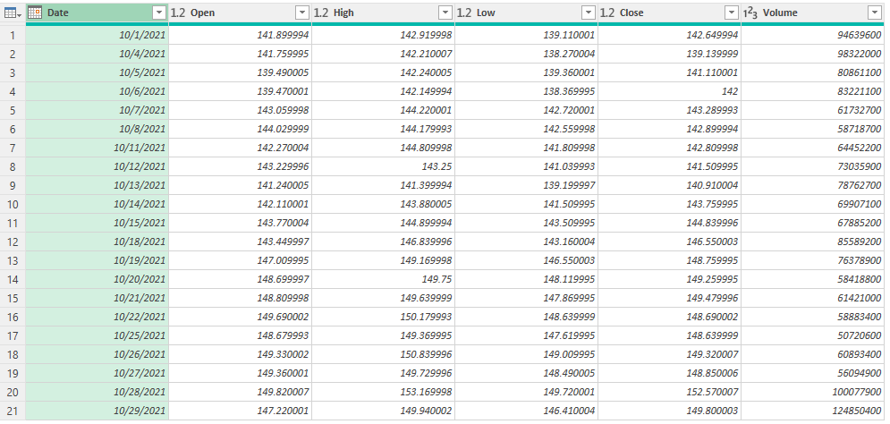
In this example, I’ve downloaded the stock prices for Apple (NASDAQ:AAPL) for the month of October 2021:
This already has all the data that is needed to create the four types of stock charts in Excel:
High-Low-Close
Open-High-Low-Close
Volume-High-Low-Close
Volume-Open-High-Low-Close
The key to making these different charts is just ensuring that you’ve got the correct fields in your download, and in the right order. For the High-Low-Close chart, you only need three fields to generate the following chart:
If you’re creating the open-high-low-close chart, all you need is to add the open field to the data set:
And for the volume-high-low-close chart, it’s just the volume instead of the open that goes at the start, and then you get something that looks like this:
The last chart includes both the volume and the open before the high, low, and close values:
These charts are fairly straightforward to generate once your data is in the right order. But rather than moving around different fields, you can make all the changes within Power Query so that right when your data loads, it’s in the correct format.
Using Power Query to adjust your download
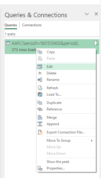
To modify an existing query, go to the Data tab and select Queries & Connections. Off to the right, you should see your query, where you can right-click and Edit it:
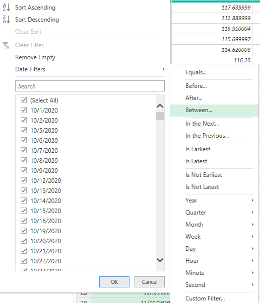
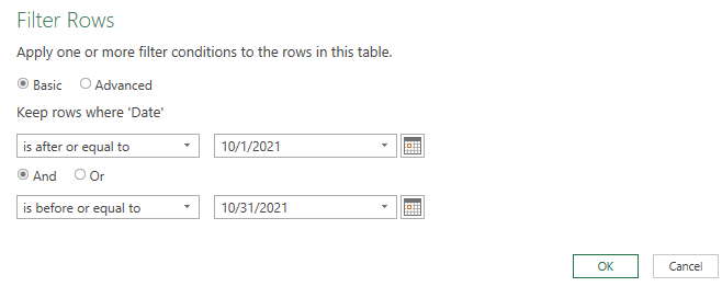
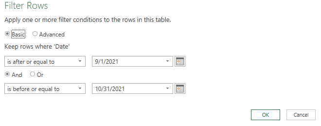
The first thing I’ll edit is the date range. In my earlier post, I just downloaded the full year of data. But if I want to filter only for October, then I can click on the drop-down for the Date field and select Date Filters to filter Between a range of dates.
Using the calendar icon, I can specify the range of dates I want to include in my download:
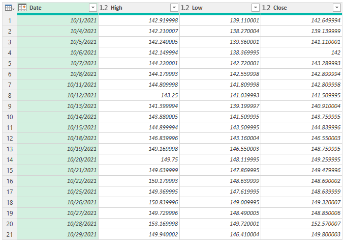
Next, if I want to just include the data for the most basic chart, the high-low-close chart, I’ll right-click on the Open, Adj Close, and Volume columns to remove them. Then, I’m left with the following:
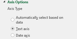
Now, if I were to load the data in Excel, I would already have all the columns I need to create the chart:
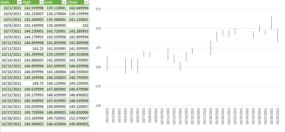
Note: if you want to get rid of the gap in dates on the chart, click on Format Axis and for the Axis Type, select Text axis:
This prevents Excel from trying to fill in any missing dates from your data set Another thing you may want to do is format the date field so that it is a custom format showing MMM DD so that it saves space:
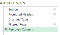
Now, let’s go back into Power Query and this time create the more complex download, for the volume-open-high-low-close chart. I’ll start by removing the last step I applied which removed more columns than I need for this current download. To remove any steps in Power Query, click on the ‘X’ next to it:
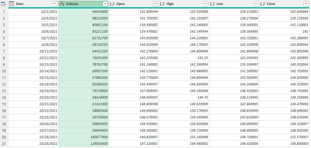
In this example, it’s just the Removed Columns step I will eliminate. The only column I need to remove from the download this time around is the Adj Close. So that’s what I’ll do, right-click and remove that column. However, my table still is not in the correct order:
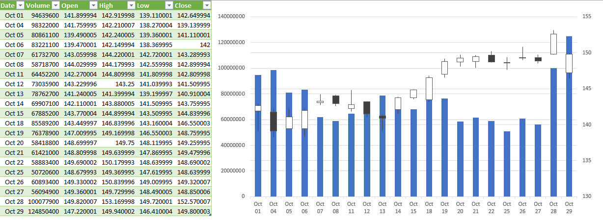
The Volume column needs to go before the Open column. This is as easy as just dragging the column and putting it in front:
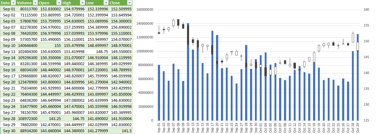
Now that it’s in the right order, I can load and close this into Excel. And now, the volume-open-high-low-close chart can easily generate:
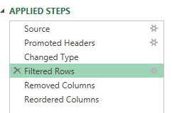
Suppose I want to adjust my chart to include data from September as well. Again, I can go back to edit my query. This time, I’ll select the gear icon next to the Filtered Rows step:
There, I can just modify my date range using the calendar:
Now, re-loading the data into Excel automatically updates my chart with a simple refresh:
The beauty of this is this query will update with new data and your chart will also update, taking out the manual steps of having to make any changes yourself. And if you incorporate named ranges like in my post covering pulling stock prices, then the data will easily refresh based on the variables that you’ve entered.
If you liked this post on How to Create Stock Charts in Excel Using Power Query, please give this site a like on Facebook and also be sure to check out some of the many templates that we have available for download. You can also follow us on Twitter and YouTube.
In a previous post, I showed how to make a forecast chart in Excel with a dotted line. This time around, I’m going to go one step further and show you how to create a chart that shows a range of possible values. This is useful in the event that you want to show some flexibility in your forecast and where providing a range might be a more realistic option.
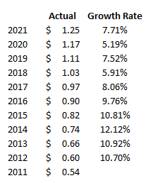
For this example, I’m going to project a company’s future dividend payment. Below, I have a a record of the past dividend payments along with the annual rate of increase:
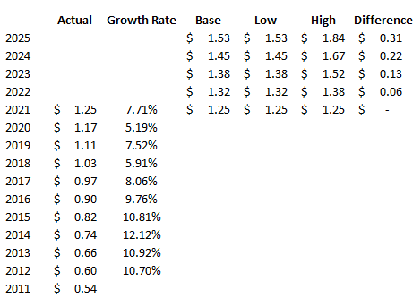
In order to create a range, I’m going to set both a high rate of growth and a low one. Since the company has made 10% increases in the past, I’m going to use that as the high. And for the low rate of growth, that will be 5%. Using those different rates, I can set up additional columns for what the dividend would be if the low rate were used and if the high one were applied. I will also create a column to calculate the difference between the high and low amounts, as well as one for a base amount — which will just be equal to the low amount. This will be used for stacking the difference on top of it to create the desired area chart:
Creating the chart
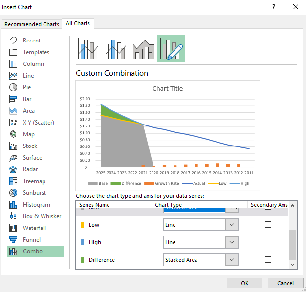
Now that the data is set up, I’m going to start creating the chart. Using a combination approach, I’ll set a line chart for the actual, low, and high columns. And for the base and difference amounts, I will set those to be stacked area charts. The growth rate I’ll leave as is because I will remove that once the chart is created:
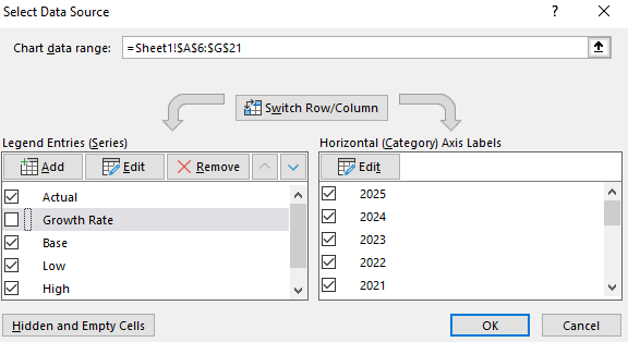
Next, I’ll right-click on the chart and click on Select Data. From the next screen, I will untick the box for the Growth Rate:
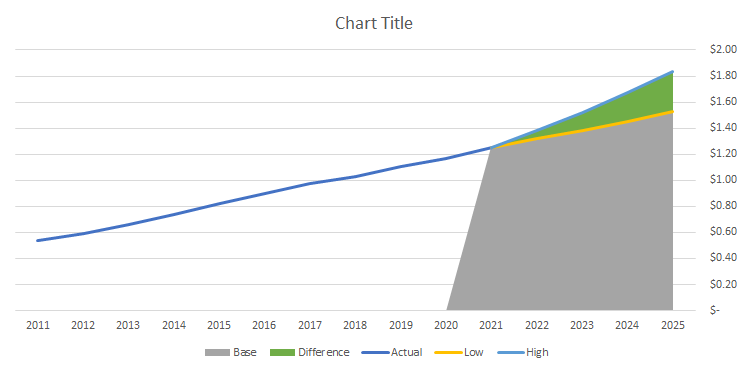
Then, I will right-click on the x-axis, select Format Axis and select the option to put Categories in reverse order. Now my chart looks as follows:
Now, I’ll remove the legend and format the base color, which is currently grey, to a blank fill color:
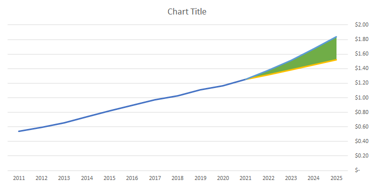
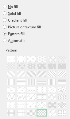
I’ll change the line color for the high amount to green, the low amount to red, and apply dashed lines to both. For the actuals, I’ll set that to a black line. And for the area chart that is in green right now, I will apply a Pattern Fill and use a checkered pattern:
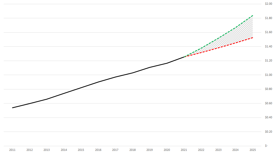
With all those changes, my updated forecast chart now looks like this:
If you liked this post on How to Make a Forecast Chart in Excel With a Dotted Line, please give this site a like on Facebook and also be sure to check out some of the many templates that we have available for download. You can also follow us on Twitter and YouTube.
Charts are an effective tool in forecasting. In this post, I’ll show you can show you can make an actual and forecast chart in Excel look like one continuous line chart, with the forecasted numbers being shown on a dotted line.
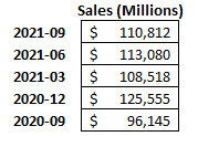
For this example, I’m going to use Amazon’s recent quarterly sales as my starting point:
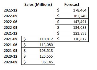
I’m going to create another column for forecasted amounts for future quarters. I’ll make a simple forecast and assume that sales will increase by 10% every quarter:
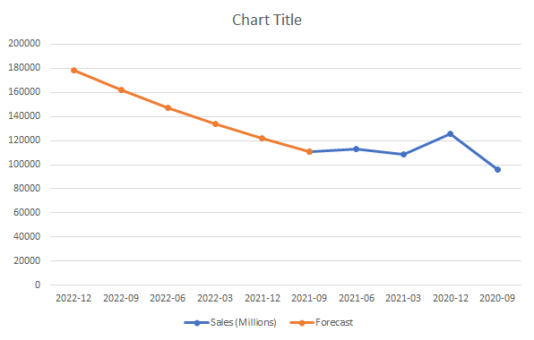
For the last quarter (2021-09), I’m including the same total in the Forecast column. This is to ensure that the new line chart picks up where the last one ends and that there isn’t a gap. Then, I’ll create a line chart for these data points, which, by default, looks like this:
I’m going to flip this chart in reverse order so that the forecasted values are on the right. To do this, right-click on the x-axis and select FormatAxis. Then, check off the box that says Categories in reverse order:
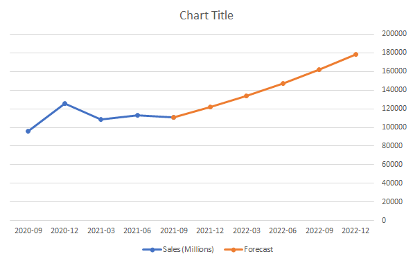
Now, at least my chart is going in the right direction (an alternative could be to structure your data in the opposite direction):
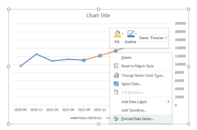
Because of the change in colors, this makes it easy to differentiate my actuals from my forecast. But I want it to be all the same color and only be differentiated by dotted lines. To do this, I will right-click on the forecasted line and select Format Data Series:
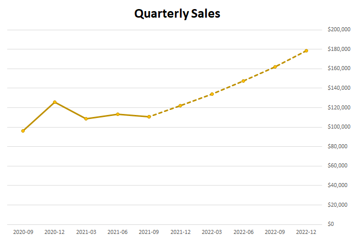
There will be an option to change the Dash type. The default is solid, and I’m going to change that to the second option from the top — Square Dot. After changing that and making the colors the same, and applying some formatting, here’s what my chart looks like:
If you liked this post on How to Make a Forecast Chart in Excel With a Dotted Line, please give this site a like on Facebook and also be sure to check out some of the many templates that we have available for download. You can also follow us on Twitter and YouTube.
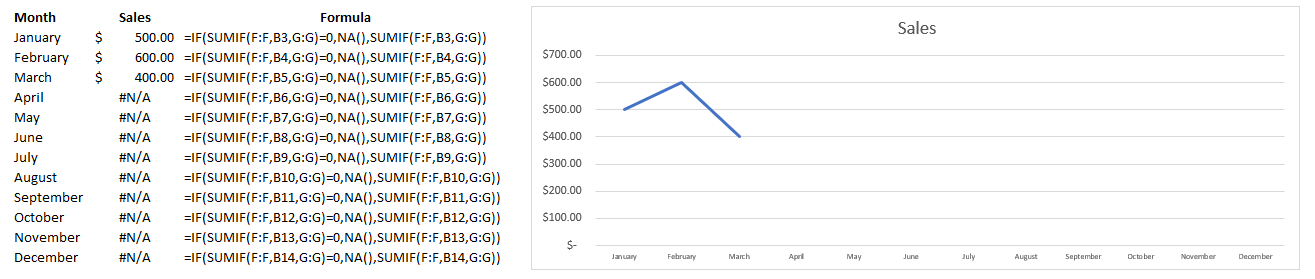
If you have values that you are plotting on a chart and some of them are zeroes, you will likely notice your chart sliding all the way down to the bottom. It can be problematic when you are entering in year-to-date data which will inevitably lead to blank or zero values. That’s why in this post, I’ll show you how to hide zero values from showing up on a chart in Excel.
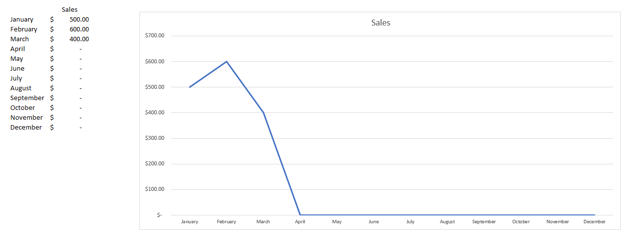
Let’s start with the following example:
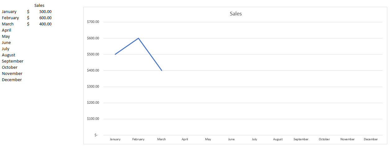
In this case, we have values for just a few months. From April through to December, the values aren’t necessarily zero — we just don’t have data yet. But the problem is that on the chart, the line graph shows them as being zeroes. If we were to get rid of those zero values, it would fix the issue:
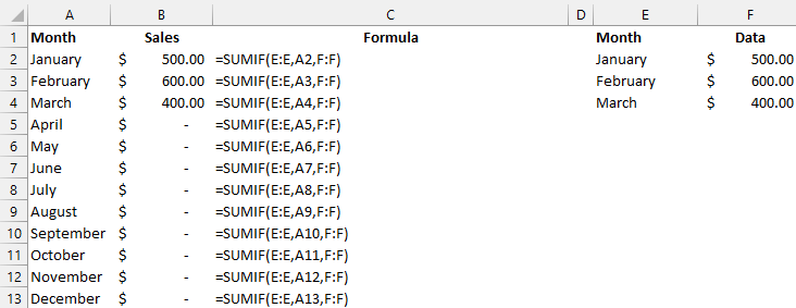
But the problem is that this may not be a convenient solution. If you want to create formulas to calculate the totals for each month, going back and deleting the ones with no values and remembering to put the formulas back in for future months isn’t going to be a very convenient option. There is a way that the calculations can be adjusted so that you can still get the zero values not to show.
Let’s suppose you have a SUMIF calculation for each month which looks as follows:
One way to fix this issue is to add an IF statement to avoid the zero values. But returning a blank value won’t fix the issue. Instead, what we’ll want to do is return an #N/A value. To do that, you just need to use the following formula:
=NA()
That just needs to be incorporated into the formula to say that if the sum is equal to 0, an NA value is returned:
=IF(SUMIF(E:E,A3,F:F)=0,NA(),SUMIF(E:E,A3,F:F))
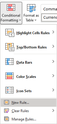
Although this solves the problem, it creates a bit of an eyesore with the #N/A values showing up in our data set. If you want to get rid of that, there’s a solution for that as well. Using conditional formatting, we can adjust the values so that any #N/A values show up blank. To do this, I’ll select column B and under the Conditional Formatting in the Home tab, select the option for a New Rule:
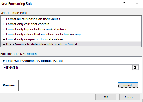
Select the option to Use a formula to determine which cells to format and enter the following:
=ISNA(B1)
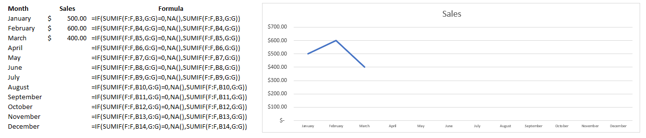
I need to use B1 since that is the start of the range that I have selected. Next, you can just click on the Format button and set the font color to white so that the #N/A values don’t show up. This is what my sheet and chart looks like after applying the formatting:
If you liked this post on How to Hide Zero Values on an Excel Chart, please give this site a like on Facebook and also be sure to check out some of the many templates that we have available for download. You can also follow us on Twitter and YouTube.
It’s time for an updated dashboard post. My original post is now three years old and probably overdue for an update. This time around, I’m going to start from scratch using a real data set from the Bureau of Labor Statistics, where I’ll walk you through my process from start to finish. To follow along, you can download the data I’m going to use from here (I’m going to use the 2020 state data. This is the XLS link).
Preparing the data
If your data is no good, then it won’t matter how great your charts and visuals look. That’s why it’s important to have a look through the data to see how usable it is. And you may not notice any issues until you start populating your charts. But one of the things that are noticeable right of the bat in this data set is that instead of empty values on this sheet, there are # or * signs.
That’s going to be a problem if you want to do any computations on this data. You can use Find and Replace to replace the data with empty values. Note that for the *, you’ll need to find ~* rather than just *, otherwise Excel will interpret the * as a wildcard and find everything.
One other thing that I am going to do is create another column for the occupation titles. In column J, there are more than a dozen titles for the ‘major groups’ (major is indicated in column K). I am going to create a table to group them even further. I’ve put this on a separate lookup sheet:
Now, what I am going to do is insert a column on my main data sheet, after column J, which will do a lookup on this table. The formula will be as follows:
=IF(L2=”major”,VLOOKUP(J2,Sheet1!A:B,2,FALSE),””)
Now, I have a category field in column K for the ‘major’ group classifications:
Next, I’m going to convert the data into a table. To do this, click on any of the cells in your data set, and on the Insert tab, click on Table:
Once done, you should notice some default table formatting gets applied to your data set:
And to make it easy to reference, I’m going to click on the Table Design tab, and under the Table Name section on the left, I’m going to re-name the table to tblData:
To change the name of a table, all you need to do is click on it and make your changes, then press enter.
Creating the pivot tables
For this dashboard, I’m going to create pivot tables and use charts to show the following:
Median salary for the specified position.
Wages by percentile.
Median salary for the specified state based on job categories.
A pie chart showing how many jobs there are by category.
A gauge chart showing how the median salary compares to the national average.
A map chart showing the median wages by state.
Median salary for the specified position
To create this visual, I’m going to create a pivot table from the tblData and put it on a new ‘PT’ tab. For this, I am just going to take the average of the A_MEDIAN column. I will also filter the O_GROUP field so that it only includes the ‘detailed’ group to avoid including the categories. I will also adjust the formatting so that it uses the accounting format. The pivot table itself contains just one value:
I only want this value to show up in a box but what I’m going to do is create a column chart from this. For just the number to be visible, I’m going to add a data label and then remove everything else, including the legend, gridlines, and make the column a clear color. Lastly, I’ll copy my first visual onto a new ‘Dashboard’ tab and put the words ‘Median Salary’ directly above it:
Wages by percentile
Next, I’m going to create a bar chart that shows the wages for a position by the various percentiles that are in the data set. For this, I’m going to grab all the different percentile fields, including the median:
A_PCT10
A_PCT25
A_MEDIAN
A_PCT75
A_PCT90
I’ll need to set these calculations to be averagesjust like on the earlier calculation. I can re-name these to ’10th percentile’, ’25th percentile’, and so on, to make it easier to read. Then, I’m going to create a 3-D bar chart, change the colors, and add some labels so it looks like this:
Median annual wage for the specified state based on job categories
Now, I’m going to create a pivot table and chart to show what the median annual wage is across the different categories I specified earlier for the selected region. This is a simple pivot table set up, all that’s needed is the A_MEDIAN average in the values section of the pivot table, the CATEGORY in the rows, and the O_GROUP to filter just the ‘major’ jobs. This will result in the creation of the following column chart:
A pie chart showing how many jobs there are by category
One of the interesting metrics in the data set is the number of jobs there are per 1,000 jobs in the given region. This is going to be similar to the previous chart, except this time I am going to use the JOBS_1000 field. I’m going to use a pie chart for this visual just to change it up a little bit.
A gauge chart showing how the median salary compares to the national average
I’m going to use a gauge chart to compare the median salary against the national median and how it compares. For detailed steps on how to create a gauge chart, please check out this post. For this visual, I need to create one pivot table just for the national median wage. To do this, I just need to grab the median value and filter the O_GROUP by ‘total.’
For the actual gauge chart, I need to set up a table for the slices and the ranges. I will go with a setup as follows:
The % of completion will take the median value and divide it by the national average. But to avoid it going over 100, I’ll use the MIN formula. And for the ‘high end’ value, I take 200 (think of 100 as the top half of the circle and the other 100 the bottom half) and subtract the % of completion and add the size of the slice. Here is what it looks like when the median salary is greater than the national median:
This is what the gauge chart looks like once it’s been set up following the steps in the previous post:
A map chart showing the median wages by state
Creating a map chart is pretty easy in this situation because we have all the state names and all I need to do here is create a pivot table with the A_MEDIAN value. Here’s what my pivot table looks like:
However, you can’t create a pivot chart directly from a pivot table. But there is a way around that. I’m going to create another table that copies the values from the pivot table. They simply equal the values to the left:
Now, I can create a map chart based on this table:
I now have all of my charts set up:
What’s next is to set up the slicers.
Adding and linking the slicers
I’m going to add two slicers for the dashboard, one for the state and one for the job title.
To insert a slicer, all that’s necessary is to click on any one of the pivot tables and on the Insert tab, click on the Slicer button:
Then, select the fields you want to add. Generally, I add the fields that have the most selections and longest names going down vertically. In this case, that’s the OCC_TITLE field. For the State and Category slicers, I have those going across:
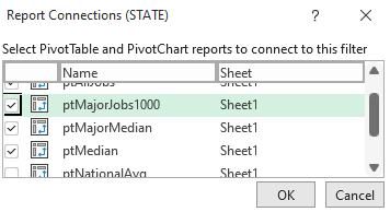
I’ve also added a title just below the slicers to give the dashboard a name. The last piece of the puzzle here is to link the slicers to the pivot tables. Previously, I linked them to all of the tables. But for some of these charts, I don’t want them to link to everything.
For the State and Category slicers, I want them to update everything except the national median pivot table. And for the OCC_TITLE slicer, it should also not update the jobs per 1000 pivot table or the median wage by category. The reason being is that those charts will lose their value if only one job is selected, as the point is they should give an overview of the different categories. Similarly, you could also unlink the state slicer to the map chart.
To manage these connections, you can slicer and select Report Connections:
From there, you can select with pivot tables you want the slicer to link to:
And to keep your slicers from staying in put despite any changes, you can also right-click and select Size and Properties and then select the option to Don’t move or size with cells:
Now, the dashboard is ready to go!
If you liked this post on Making Dashboards in Excel With Map and Gauge Charts, please give this site a like on Facebook and also be sure to check out some of the many templates that we have available for download. You can also follow us on Twitter and YouTube.
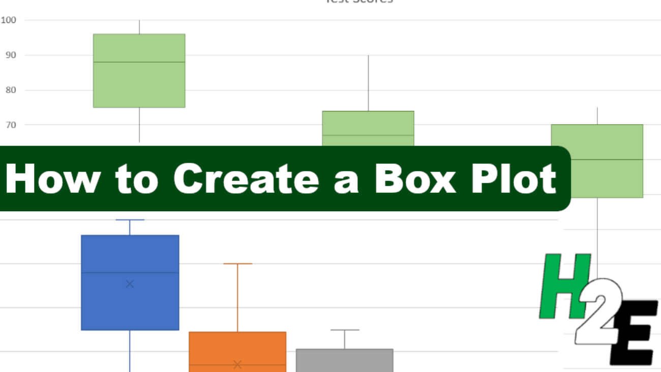
A box plot chart can show you lots of information in just one visual: the minimum, maximum, median, and interquartile range of a data set. It can be a great way to visualize your data to see its range and how narrow or broad the values are. In this post, I’ll show you a couple of ways to create a box plot. The first is through the box and whisker chart on newer versions of Excel, and also how you might create this just from a stacked chart.
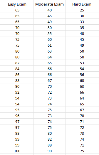
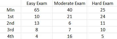
For this data set, I am going to create some random test results to compare an easy test versus one that is average, and another that is difficult.
Creating the box and whisker chart
This is the sample data I’m going to work with for this example:
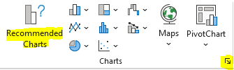
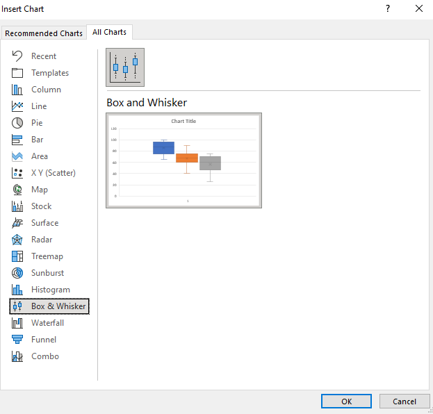
The way the data is formatted, it is already ready to use in a box and whiskers chart. Simply click anywhere on the data set and on the Insert tab, you can click on the pop out button for Charts or just click on the Recommended Charts:
Then, under the All Charts section, there is an option for Box & Whisker. Click on the only chart available in that section:
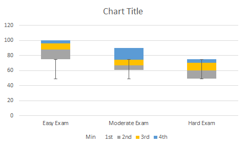
And then that will put your data into a box plot:
Besides adjusting the range so that it does not go higher than 100, the box and whiskers chart is ready to use immediately with minimal adjustments. From the above chart, we can see that the easy exam had the smallest range, highest min and max values, and a broader interquartile range than the moderate exam — this suggests more variability. The real value in box plots is in being able to compare them against other data sets.
Creating a box plot using a stacked chart
Another way to make a box plot in Excel is by using a stacked chart. This involves more steps but it allows you to make this work on older versions of Excel. If you have trouble following along, you can download the sheet I created for this purpose here.
First, we’ll need to organize the data by quartiles. A table is needed that starts off with the minimum value, and then the size of each quartile. For the minimum value, you can just use the MIN function and put in the entire range in there. The quartile functions may be a bit unfamiliar for many users but the calculations aren’t complex. The QUARTILE.INC function would look as follows if you want to pull in the first quartile:
=QUARTILE.INC(A1:A100,1)
If your range is in A1:A100, then the above formula would return the position of the first quartile. Changing the last argument to 2 and then 3 will give you the position of the remaining quartiles (you don’t need quartile 4 for this calculation). Once you have the value of each of the quartiles, then the next step is to calculate their respective sizes.
For the first quartile, you’ll take the first quartile and subtract the minimum value. The size of the next quartile will be the Median value (for this you can use the MEDIAN function) less the first quartile. The third quartile size will take the third quartile and subtract the median. Finally, the last quartile size will take the maximum value and subtract the third quartile.
Based on those calculations, the table that will be used in the stacked chart is as follows:
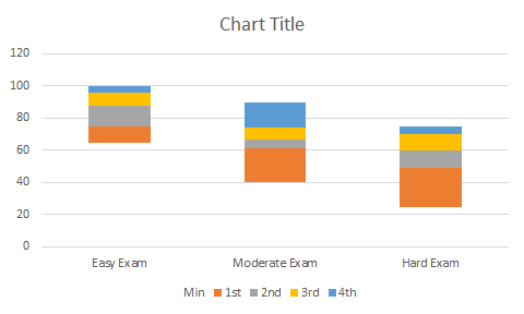
If I go to create a stacked chart using that table, by default it will look like this:
The first thing I need to do is flip the rows/columns. To do this, right-click on the chart and click Select Data. And then, click on the button that says Switch/Row Column, which will transform the chart into this:
This is a bit better but I still need to remove the min section out of sight. To do this, I can right-click on that part of the chart and change the fill color to be blank. Then, my chart starts from the minimum value, rather than from 0:
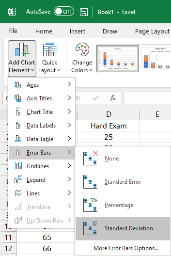
For the bottom (orange) series, I will do the same and change the fill colour to orange. I will also take an additional step afterwards and under the Chart Design tab, select Add Chart Element and click on Error Bars and then Standard Deviation:
That will create the following line leading up to the next quartile:
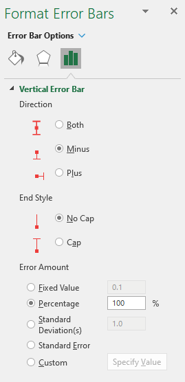
However, this is not exactly what is desired since it should only start from the minimum value. To correct this, right-click on the error bar and click Format Error Bars and change the settings to the following:
Direction: Minus
End Style: No cap
Error Amount: Percentage: 100%
Now, the line starts from the minimum:
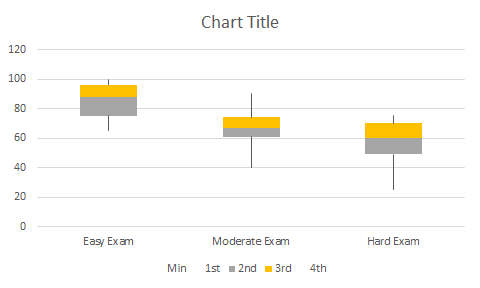
Follow the same steps for the blue quartile range at the top and then the chart will look as follows:
The last steps are really optional but I will get rid of the legend and also change the colors and outlines of the yellow and grey quartiles so they are all one color. My finished box plot looks as follows:
If you liked this post on How to Make a Box Plot in Excel, please give this site a like on Facebook and also be sure to check out some of the many templates that we have available for download. You can also follow us on Twitter and YouTube.
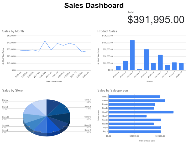
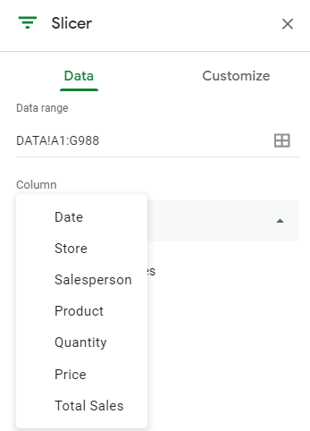
A big advantage of using Google Sheets is that the data is readily accessible online and you don’t need to worry about if people are running different versions of it like you would with Excel. One of the areas where it may be lacking is in creating dashboards. Although you can incorporate slicers, they’re not as user-friendly or nice looking as what you would get in Excel. But in this post, I’ll go over how to make dashboards in Google Sheets quickly and easily.
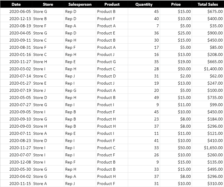
Here is a sample of what my data set looks like. If you want to view the data plus the dashboard I created here, you can check out the Google Sheets file here.
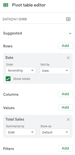
Step one is to create some pivot tables. Like with Excel, I prefer to create a pivot table for each view that I want. I will set up four pivot tables, categorizing sales by:
Store
Salesperson
Product
Date
To keep things simple, you can put each one of those fields in the ROW section while the sales can be in the VALUES section:
When creating the pivot tables, be sure to un-check the option to Show totals (this is so that they don’t show up in the charts):
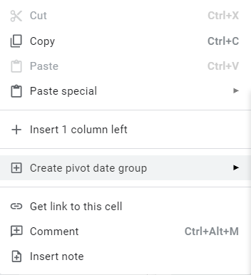
What you may want to do is create one pivot table and then copy and paste others, and just change the rows. One additional step you will need to do for the pivot table that contains the dates is to also group them by month. To do that, right-click on any of the dates and select Create Pivot Date Group:
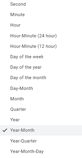
Then, from the following menu, select Year-Month:
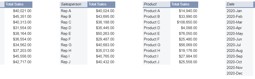
This is how your pivot tables might look like once you are done:
Where you put these pivot tables isn’t important. The key is leaving enough space between them so that they don’t potentially overlap should your data get bigger. Otherwise, you will run into errors and have difficulty updating your data. Since my pivot tables won’t get any wider based on the selections I’ll make, there doesn’t need to be any extra columns between any of them.
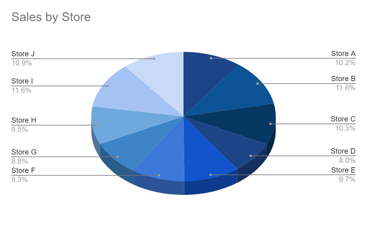
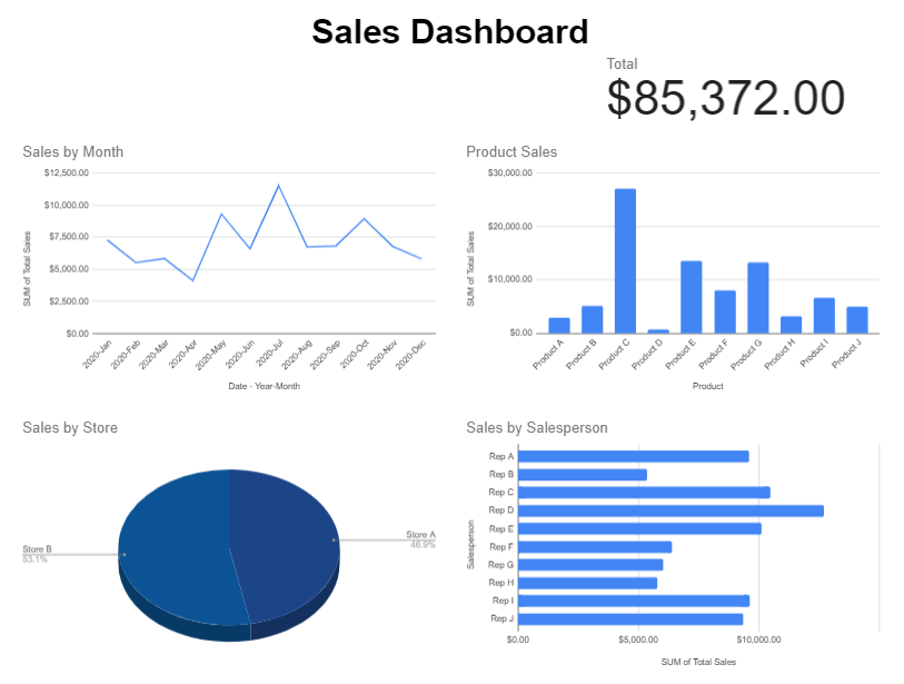
Now that the pivot tables are set up, the next step is to set up the different charts for each of them. For the sales by store, I will create a pie chart to show the split among the stores:
The one thing you will want to pay attention to for each chart is the range. Since your pivot table could expand, it’s a good idea to make the range bigger than it needs to be, even if it will contain blank values. For example, changing this:
To this:
This will ensure that additional data gets picked up by the chart should your pivot table get bigger. This is also why it is important to ensure you don’t place any other pivot tables below one another. Ideally, you’ll want to keep them side by side rather one on top of the other.
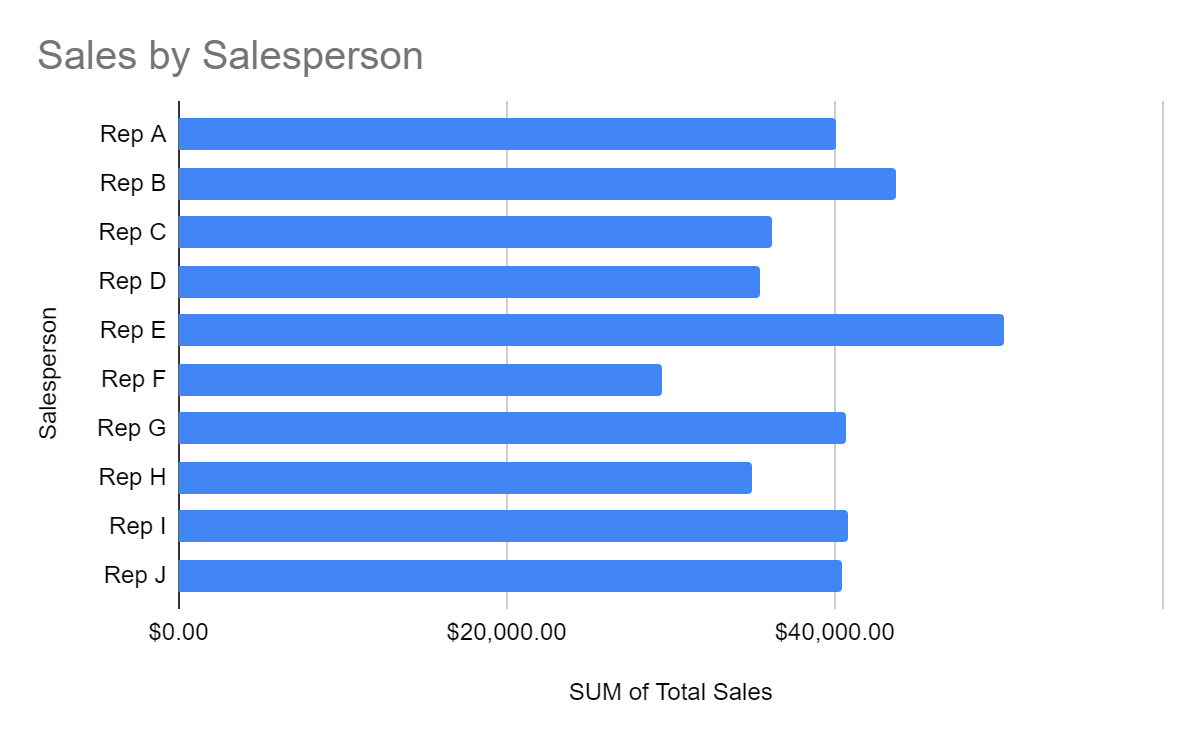
For the pivot table that shows sales by salesperson, I’ll use a bar chart since the names can be long:
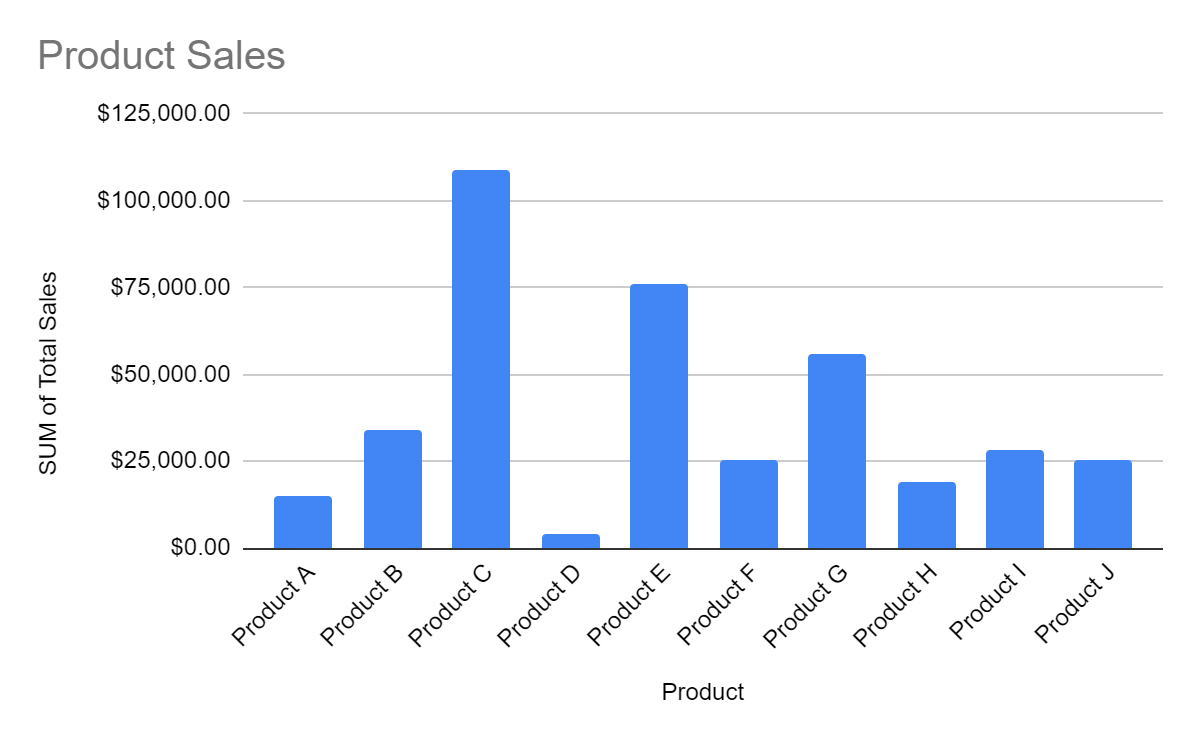
For the product sales, I’ll mix it up and have those as column charts:
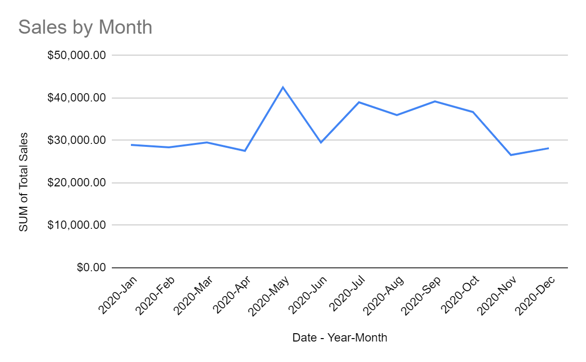
And for the sales by date, I will set those up as a line chart:
I will also add a scorecard chart, using any of the pivot tables. For this, I just want to pull the total sales:
Now that these charts all set up, it’s just a matter of organizing how you want to see them on your worksheet:
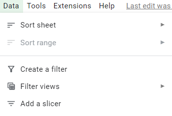
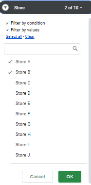
The one thing missing to make this dynamic: slicers. To add slicers to all these pivot tables, click on any of them and click on the Data tab and select the Add a Slicer button:
Then, select the columns you want to filter by:
As long as you are referencing the correct data range, then the slicer will apply to all the pivot tables correctly. And now, if I add a slicer for the stores and only select stores A and B, my dashboard updates as follows:
One thing to remember when you are applying changes: don’t forget to click on the green OK button on the bottom, otherwise your selections won’t be applied:
If you liked this post on How to Make Dashboards in Google Sheets, please give this site a like on Facebook and also be sure to check out some of the many templates that we have available for download. You can also follow us on Twitter and YouTube.
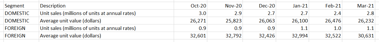
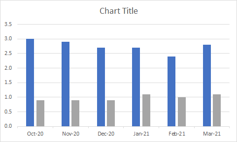
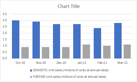
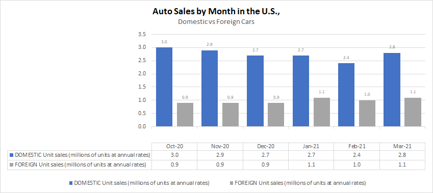
An Excel chart can provide lots of useful information but if it isn’t easy to read, people may skip over its contents. There are many simple things you can do that can quickly add to the visual to make it fit seamlessly within a presentation and that makes it more effective in conveying data. If you want to follow along, in this example, I am going to use data from the Bureau of Economic Analysis. In particular, I am pulling data on automobile sales both in units and average dollars. Here is what my data set looks like right now:
And this is my chart, which shows unit sales by month:
It’s a pretty basic chart that can show me the breakdown between the sales. These are the following changes I can make to improve the look and feel of it:
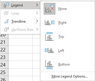
1. Add a legend
Unless you are just charting one item, most visuals will benefit from a legend. Otherwise, it will be difficult to know which data is represented where. To add a legend, all you need to do is select the chart and go into the Chart Design tab and select the Add Chart Element button, there you will see an option to determine where you want it to show up:
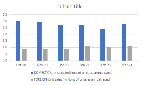
In most cases, you’ll probably want this on the top or bottom as that will help make it blend in easier with the chart. Here’s how it look after I add the legend:
Since my descriptions are long, putting them at the bottom will make more sense. Now I can easily see which bars relate to the foreign sales and which ones relate to domestic.
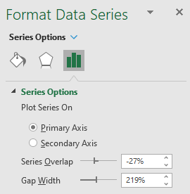
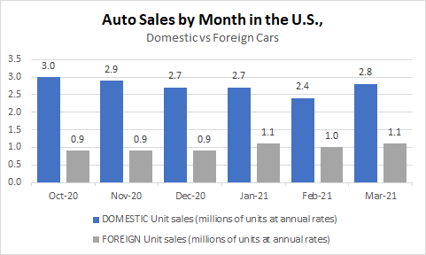
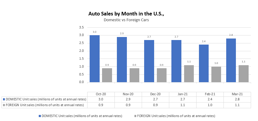
2. Shrink the gaps (for column charts)
If you have column charts, it can help to shrink the space in-between the bars. That will eliminate white space plus you can fit more items in your chart. To adjust the gaps, right-click on any of the bars and select Format Data Series.
I normally set the Gap Width to 50%. Upon doing so, my chart changes to the following:
3. Adding a descriptive title and subheader
I haven’t set a title for my chart and that’s one thing you shouldn’t overlook doing. Although it may not seem necessary, doing so can help ensure that your chart can stand on its own and not have to rely on the context it is used in to give the reader the right information. A good example in this case can be as follows:
The main title is bolded and shows the reader what the chart is about. And the subheading further distinguishes the different groups of data.
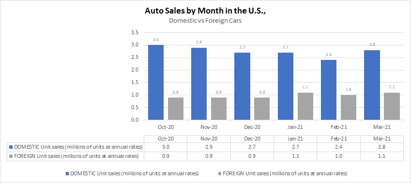
4. Adding data labels
You may want to consider adding data labels to make it easy for the reader to see the exact numbers your chart is showing. This prevents having to make any estimates or rounding off and quoting an incorrect number. To insert data labels, right-click on one of the column charts and select Add Data Labels. Do this for each data series you want to add labels for. This is how my chart looks, with labels:
You can modify the labels if you want to add more information besides just the value. This will depend on the type of chart you have and how much space is available. In this example, you probably wouldn’t want to add more information. However, what I will do is shrink the text size so that it is a bit smaller and so that everything looks less cluttered. To do that, I just click on any of the data labels and under the Home tab, make changes to the font size or color the way I normally would with any other data in Excel. After shrinking the font to size 7 and making it grey, here’ show it looks:
5. Adding a data table
If you don’t want to add data labels, another thing you can do is add a data table. This avoids putting any numbers or labels over top of your data series and still gives the user a helpful table summary. This is a great alternative if you don’t want to crowd too much information into one place and prevent your chart from looking too busy. To add a data table, just go back to the Add Chart Element drop-down option and select Data Table, where you can specify if you want to include the legend key or not. This is how the chart looks with the table:
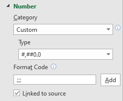
If you want to avoid the repetition in the axis labels without deleting them and losing those headers, one thing you can do is to change the text format. To do that, right-click on any of the axis labels and select Format Axis. Then, in the Number section, enter three semicolons in the Format Code section and click the Add button:
The three semicolons will remove any formatting and now the axis and data table wouldn’t double up on the names:
6. Remove the border
If you are using the chart in a Word document, presentation, or even Excel, eliminating the border around it can make it blend much easily with the background and other information. To remove the border, right-click on the chart, select Format ChartArea, and under the Border section, select No line. After making the change, this is what my chart looks like now:
With my gridlines turned off, you can no longer see the lines that show where the chart starts and ends.
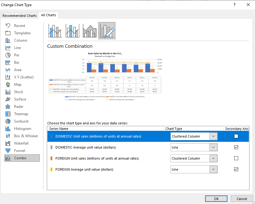
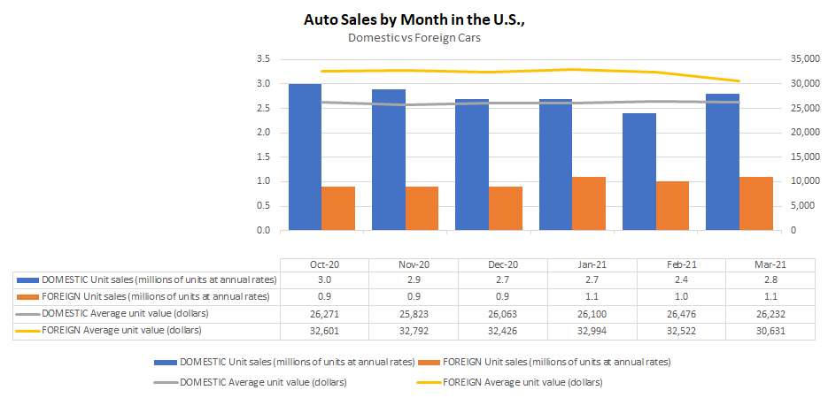
7. Use a secondary axis with multiple chart types
So far, I’ve only used column charts to show the number of units sold. However, now, I will also include the average selling price. But because the selling price can be in the thousands, I’ll want to move this onto another axis. Otherwise, the number of units sold, which are in millions, won’t show up because of the scale as it will need to accommodate values that are in the tens of thousands.
When you want to put a data series onto another axis, you will need to go to where you select the chart type. If you go to the bottom, select the Combo option. There, you can specify which chart type should be used for each data series. That’s also where you can specify which one should be on a secondary axis. In this example, I’m going to use a line chart for the average price and continue using a column chart for the number of units sold. It doesn’t matter which data set I put on the secondary axis. However, note that the one that is secondary will be on the right-hand-side of the chart.
This is what my updated chart looks like:
In this case, I’ve gotten rid of the data labels for the column charts so that it doesn’t interfere with the line charts.
8.Move the axis categories down
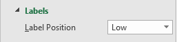
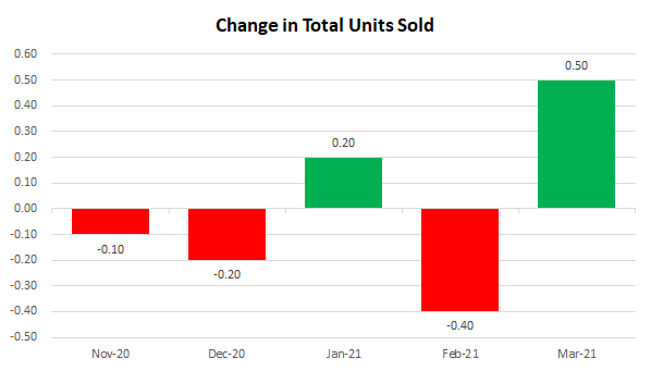
In the examples thus far, I haven’t had any negative values. However, suppose I change my data to now show the change in units sold from one month to the next:
For this example, I combined the data so that it totals both domestic and foreign cars. The above chart shows the month-over-month change. But one problem you’ll notice is that the date labels run along the middle of the chart. This makes it difficult to read when there are negative values.
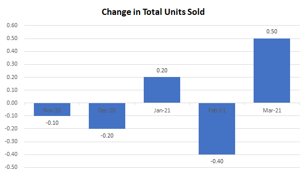
To make this easier to read, I am going to move the axis labels to the bottom This is useful when dealing with negatives. To make this change, right-click on the axis and select Format Axis. Then, under the Labels section, set the Label Position to Low.
Now, when my chart is updated it looks like this:
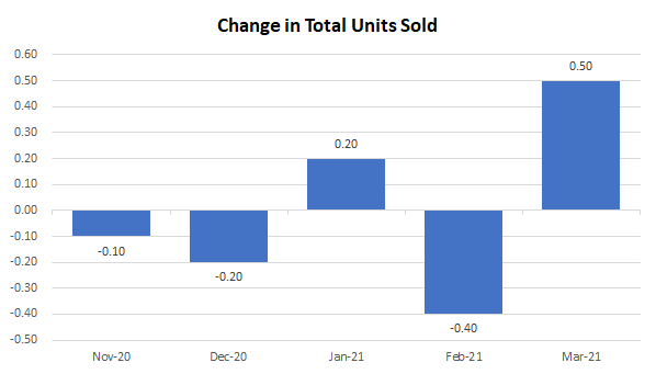
9. Showing negative values in a different color
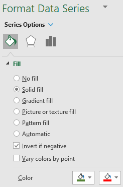
One other change that is going to be helpful when dealing with negatives is to change the color depending on if the value is positive or negative. All you need to do to make this work is to right-click on the column chart, select Format Data Series and switch over to the Fill section. There, you will want to check off the box that says Invert if negative:
Once you do that, you should see two different colors you can set aside for the color section. If you don’t, try and setting one color first, and then toggling the Invert if negative box. With the two different colors, my chart looks as follows:
While you can obviously tell if a chart is going up or down, adding some color to differentiate between positives and negatives just makes the chart all that more readable.
If you liked this post on 9 Things You Can Do to Make Your Charts Easier to Read, please give this site a like on Facebook and also be sure to check out some of the many templates that we have available for download. You can also follow us on Twitter and YouTube.
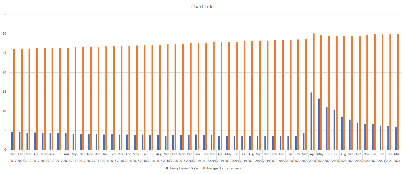
Charts can be great tools to help visualize data. And sometimes, you will want to combine different types of information in one place. That can be tricky because if the scales are different, information may not display the way you would like it to. If something is shown in percentages while another value is in thousands, it isn’t going to be helpful to show that all on the same axis. That is where having a secondary axis can help you show all of that information on just one visual.
Below, I’ll go over how to do that using data from the Bureau of Labor Statistics. I will plot the unemployment rate against the average hourly earnings.
Creating the chart
The first step involves putting all the data together. If you want to follow along, you can download my data file here. This is an excerpt of what my DATA tab looks like:
Next up, I’ll create a Bar Chart by clicking on the data set, selecting the Insert tab and then choosing the option for a clustered column. At first glance, the chart doesn’t look terribly easy to read:
Since the hourly earnings are always above 25, those bar charts aren’t terribly helpful as they make it more difficult for the unemployment rate numbers to stand out. One thing I can do to make this a bit easier to read is to change the chart types.
Use a combo chart and a secondary axis to help display the data more effectively
Before I add another axis, I will first change up the look of these charts by using a combination. Rather than using bar charts for both data series, I’ll use a line chart for the average hourly earnings. Since those values are higher than the unemployment rate, it will help separate the data.
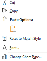
To change the chart type, right-click on the chart and select Change Chart Type
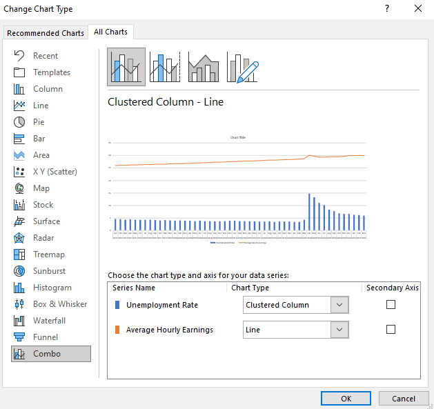
Select Combo on the bottom and off to the right you will see the an area where you can choose the chart type you want for each data series:
By default, Excel has determined I probably want to use a line chart for the average hourly earnings, which is correct. However, I could change it to something else altogether. You will notice this is also where you can check off to use a secondary axis.
While the chart will work fine even without this option, you can see from the preview there is a big gap between the bar graph and the line chart. In the interest of minimizing white space, I will check off the secondary axis for the average hourly earnings. Once I do that and click OK, my chart looks as follows:
You can see the chart now tells a much different story and shows that in the early months of the pandemic, the average hourly earnings spiked. This could possibly be due to a combination of higher-paid earners being less impacted by layoffs and being able to work from home and at the same time, low-wage workers who weren’t laid off may have received bonus pay if they worked in some retail stores. Either way, it definitely shows a much different story than if I didn’t use the secondary axis.
The axis to the left is the primary axis and relates to the unemployment rate. The one on the right is the secondary one and is for the average hourly earnings. This is an important distinction to keep in mind as you can easily be confused if you are not sure which axis relates to which chart. But having the secondary axis makes a big difference to my chart. This is what it would have looked like if everything was just on a single axis:
As you can see, it’s not as easy to visualize the data because of that big gap between the two chart types and them sharing the same scale. As a result, the spike in average hourly earnings is less pronounced than when using a secondary axis.
If you have yet another data series, you can also decide whether to plot that on the primary or secondary axis as multiple charts can be plotted on a single axis. However, if neither one is a good fit then that may be a sign that it is time to consider making a separate chart altogether.
If you liked this post on how to add a secondary axis in Excel, please give this site a like on Facebook and also be sure to check out some of the many templates that we have available for download. You can also follow us on Twitter and YouTube.