A box plot chart can show you lots of information in just one visual: the minimum, maximum, median, and interquartile range of a data set. It can be a great way to visualize your data to see its range and how narrow or broad the values are. In this post, I’ll show you a couple of ways to create a box plot. The first is through the box and whisker chart on newer versions of Excel, and also how you might create this just from a stacked chart.
For this data set, I am going to create some random test results to compare an easy test versus one that is average, and another that is difficult.
Creating the box and whisker chart
This is the sample data I’m going to work with for this example:
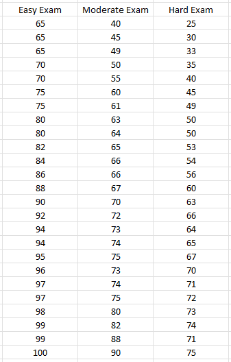
The way the data is formatted, it is already ready to use in a box and whiskers chart. Simply click anywhere on the data set and on the Insert tab, you can click on the pop out button for Charts or just click on the Recommended Charts:

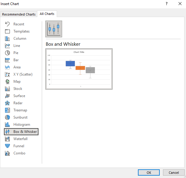
Then, under the All Charts section, there is an option for Box & Whisker. Click on the only chart available in that section:
And then that will put your data into a box plot:
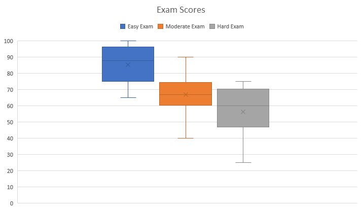
Besides adjusting the range so that it does not go higher than 100, the box and whiskers chart is ready to use immediately with minimal adjustments. From the above chart, we can see that the easy exam had the smallest range, highest min and max values, and a broader interquartile range than the moderate exam — this suggests more variability. The real value in box plots is in being able to compare them against other data sets.
Creating a box plot using a stacked chart
Another way to make a box plot in Excel is by using a stacked chart. This involves more steps but it allows you to make this work on older versions of Excel. If you have trouble following along, you can download the sheet I created for this purpose here.
First, we’ll need to organize the data by quartiles. A table is needed that starts off with the minimum value, and then the size of each quartile. For the minimum value, you can just use the MIN function and put in the entire range in there. The quartile functions may be a bit unfamiliar for many users but the calculations aren’t complex. The QUARTILE.INC function would look as follows if you want to pull in the first quartile:
=QUARTILE.INC(A1:A100,1)
If your range is in A1:A100, then the above formula would return the position of the first quartile. Changing the last argument to 2 and then 3 will give you the position of the remaining quartiles (you don’t need quartile 4 for this calculation). Once you have the value of each of the quartiles, then the next step is to calculate their respective sizes.
For the first quartile, you’ll take the first quartile and subtract the minimum value. The size of the next quartile will be the Median value (for this you can use the MEDIAN function) less the first quartile. The third quartile size will take the third quartile and subtract the median. Finally, the last quartile size will take the maximum value and subtract the third quartile.
Based on those calculations, the table that will be used in the stacked chart is as follows:

If I go to create a stacked chart using that table, by default it will look like this:
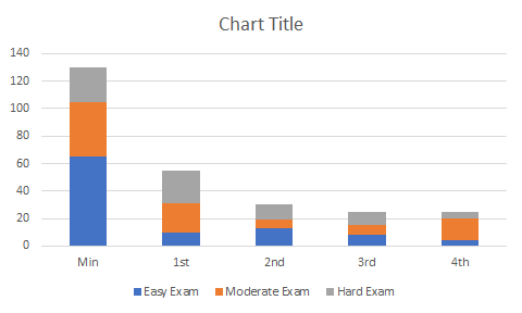
The first thing I need to do is flip the rows/columns. To do this, right-click on the chart and click Select Data. And then, click on the button that says Switch/Row Column, which will transform the chart into this:
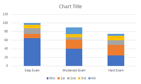
This is a bit better but I still need to remove the min section out of sight. To do this, I can right-click on that part of the chart and change the fill color to be blank. Then, my chart starts from the minimum value, rather than from 0:
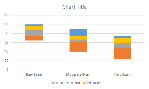
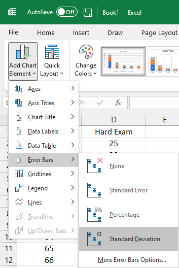
For the bottom (orange) series, I will do the same and change the fill colour to orange. I will also take an additional step afterwards and under the Chart Design tab, select Add Chart Element and click on Error Bars and then Standard Deviation:
That will create the following line leading up to the next quartile:
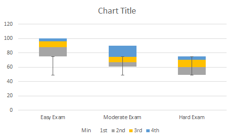
However, this is not exactly what is desired since it should only start from the minimum value. To correct this, right-click on the error bar and click Format Error Bars and change the settings to the following:
- Direction: Minus
- End Style: No cap
- Error Amount: Percentage: 100%
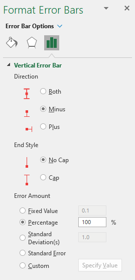
Now, the line starts from the minimum:

Follow the same steps for the blue quartile range at the top and then the chart will look as follows:
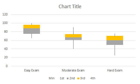
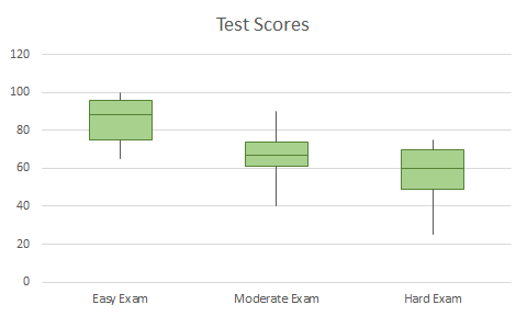
The last steps are really optional but I will get rid of the legend and also change the colors and outlines of the yellow and grey quartiles so they are all one color. My finished box plot looks as follows:
If you liked this post on How to Make a Box Plot in Excel, please give this site a like on Facebook and also be sure to check out some of the many templates that we have available for download. You can also follow us on Twitter and YouTube.


Add a Comment
You must be logged in to post a comment