Charts can be great tools to help visualize data. And sometimes, you will want to combine different types of information in one place. That can be tricky because if the scales are different, information may not display the way you would like it to. If something is shown in percentages while another value is in thousands, it isn’t going to be helpful to show that all on the same axis. That is where having a secondary axis can help you show all of that information on just one visual.
Below, I’ll go over how to do that using data from the Bureau of Labor Statistics. I will plot the unemployment rate against the average hourly earnings.
Creating the chart
The first step involves putting all the data together. If you want to follow along, you can download my data file here. This is an excerpt of what my DATA tab looks like:

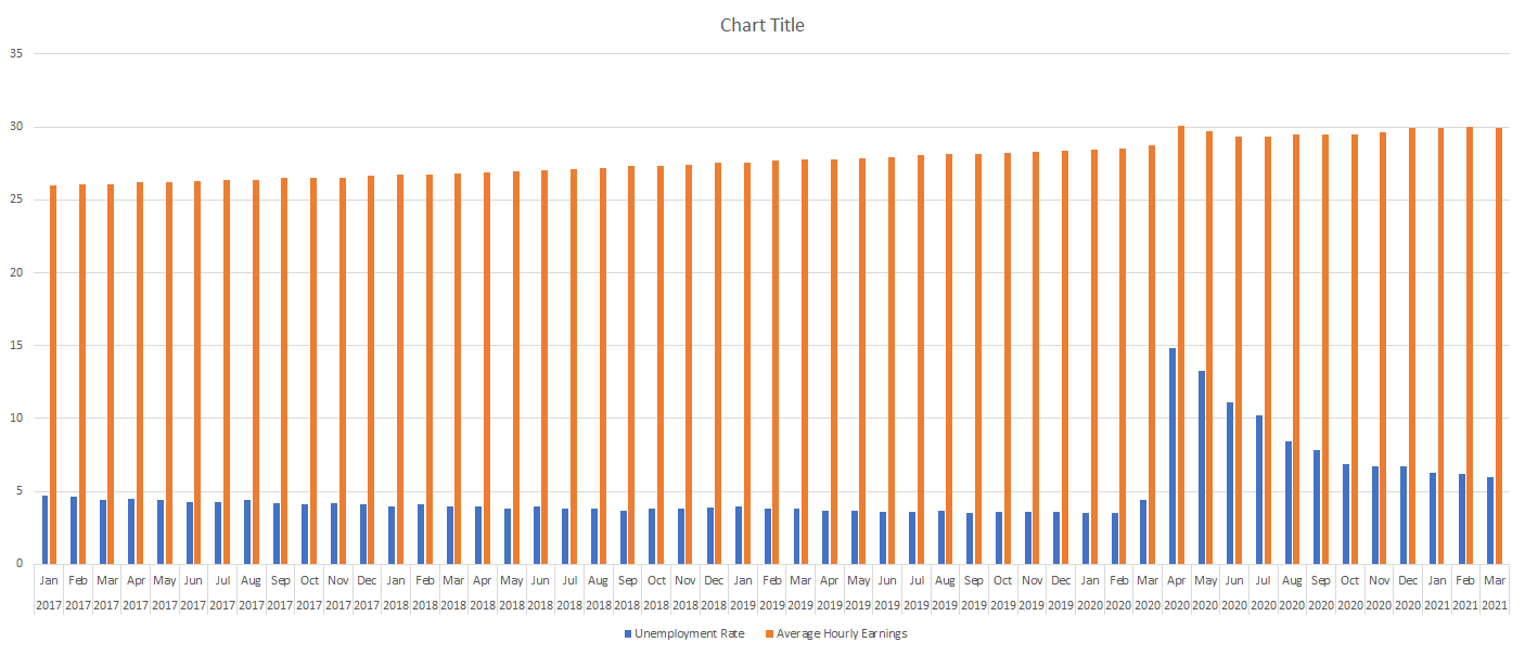
Next up, I’ll create a Bar Chart by clicking on the data set, selecting the Insert tab and then choosing the option for a clustered column. At first glance, the chart doesn’t look terribly easy to read:

Since the hourly earnings are always above 25, those bar charts aren’t terribly helpful as they make it more difficult for the unemployment rate numbers to stand out. One thing I can do to make this a bit easier to read is to change the chart types.
Use a combo chart and a secondary axis to help display the data more effectively
Before I add another axis, I will first change up the look of these charts by using a combination. Rather than using bar charts for both data series, I’ll use a line chart for the average hourly earnings. Since those values are higher than the unemployment rate, it will help separate the data.
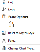
To change the chart type, right-click on the chart and select Change Chart Type

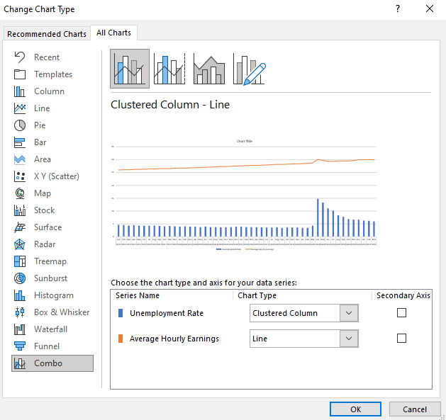
Select Combo on the bottom and off to the right you will see the an area where you can choose the chart type you want for each data series:

By default, Excel has determined I probably want to use a line chart for the average hourly earnings, which is correct. However, I could change it to something else altogether. You will notice this is also where you can check off to use a secondary axis.
While the chart will work fine even without this option, you can see from the preview there is a big gap between the bar graph and the line chart. In the interest of minimizing white space, I will check off the secondary axis for the average hourly earnings. Once I do that and click OK, my chart looks as follows:

You can see the chart now tells a much different story and shows that in the early months of the pandemic, the average hourly earnings spiked. This could possibly be due to a combination of higher-paid earners being less impacted by layoffs and being able to work from home and at the same time, low-wage workers who weren’t laid off may have received bonus pay if they worked in some retail stores. Either way, it definitely shows a much different story than if I didn’t use the secondary axis.
The axis to the left is the primary axis and relates to the unemployment rate. The one on the right is the secondary one and is for the average hourly earnings. This is an important distinction to keep in mind as you can easily be confused if you are not sure which axis relates to which chart. But having the secondary axis makes a big difference to my chart. This is what it would have looked like if everything was just on a single axis:

As you can see, it’s not as easy to visualize the data because of that big gap between the two chart types and them sharing the same scale. As a result, the spike in average hourly earnings is less pronounced than when using a secondary axis.
If you have yet another data series, you can also decide whether to plot that on the primary or secondary axis as multiple charts can be plotted on a single axis. However, if neither one is a good fit then that may be a sign that it is time to consider making a separate chart altogether.
If you liked this post on how to add a secondary axis in Excel, please give this site a like on Facebook and also be sure to check out some of the many templates that we have available for download. You can also follow us on Twitter and YouTube.


Add a Comment
You must be logged in to post a comment