RevPAR

How to Calculate RevPAR in Excel Using a Formula

Revenue per Available Room (RevPAR) is one of the most important metrics in the hospitality industry. It tells hotel owners and investors how efficiently a property is generating revenue from its available rooms. Whether you manage a small motel or analyze hotel stocks, knowing how to calculate and track RevPAR is an essential metric to know how a business is doing. It’s similar to the Average Daily Rate (ADR), but there are important differences to be aware of.

In this guide, I’ll cover:

  • What RevPAR and ADR are (and how they differ)
  • The formulas for each metric
  • How to calculate them in Excel
  • A real-world example dataset

Download the practice file here

How do you calculate RevPAR and ADR?

RevPAR stands for Revenue per Available Room. Unlike average daily rate (ADR), which only looks at occupied rooms, RevPAR takes into account all available rooms, giving you a more complete picture of overall performance.

The formula is as follows:

RevPAR = Room Revenue / Rooms Available

You can also calculate it an alternate way:

RevPAR = ADR x Occupancy Rate

Meanwhile, the formula for ADR is the following:

ADR = Room Revenue / Rooms Sold

As you can see, there is a close relationship between RevPAR and ADR, but each one gives you slightly different information.

A sample data set and calculation

In the below example, which is a sample projection, dates are filled in for 2026 with estimated rooms sold and room revenue. The hotel has 100 rooms available, which doesn’t change over the course of the year.

Hotel revenue in Excel showing dates, available rooms, rooms sold, and room revenue.

To calculate the ADR, we need to take the total room revenue and divide it by the number of rooms sold:

Hotel revenue in Excel showing dates, available rooms, rooms sold, room revenue, and ADR.

Now, to calculate RevPAR, we’ll take room revenue and divide it by rooms available:

Hotel revenue in Excel showing dates, available rooms, rooms sold, room revenue, ADR, and RevPAR.

An alternative way to calculate this would be to compute the occupancy rate for each date, and then multiply that by the ADR:

Hotel revenue in Excel showing dates, available rooms, rooms sold, room revenue, ADR, and RevPAR.

As you can see, unless there is full occupancy, the RevPAR will always be lower than the ADR, simply because its denominator is larger (rooms available versus rooms sold).

Analyzing the data

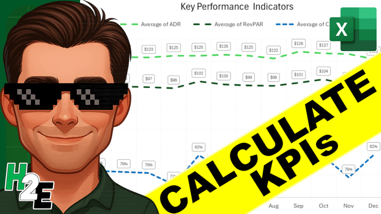
Now that you’ve setup a data set showing these metrics, you can analyze it in Excel in a couple of ways. One way is through the creation of a pivot table, where you can summarize data by months at a time. You can put the date in the Rows section and then group by months. And by putting the ADR, RevPAR, and Occupancy fields into the values section, and setting them to display the average (rather than the sum), you can have an easy way to summarize your key performance indicators:

Pivot table showing ADR, RevPar, and Occupancy rates for a hotel.

In addition, you could create a chart to compare ADR, RevPAR, and Occupancy, to identify trends and patterns in the data set. In the chart below, I’ve plotted all three items on line charts. I’ve put the occupancy on a secondary axis and adjusted the scale so that it fits firmly below the ADR and RevPAR figures, ensuring there is no overlap.

Excel chart comparing ADR, RevPAR, and Occupancy rates.

If you liked this post on How to Calculate RevPAR in Excel Using a Formula, please give this site a like on Facebook and also be sure to check out some of the many templates that we have available for download. You can also follow me on Twitter and YouTube. Also, please consider buying me a coffee if you find my website helpful and would like to support it.

dashboardsgs

How to Make Dashboards in Google Sheets

A big advantage of using Google Sheets is that the data is readily accessible online and you don’t need to worry about if people are running different versions of it like you would with Excel. One of the areas where it may be lacking is in creating dashboards. Although you can incorporate slicers, they’re not as user-friendly or nice looking as what you would get in Excel. But in this post, I’ll go over how to make dashboards in Google Sheets quickly and easily.

Here is a sample of what my data set looks like. If you want to view the data plus the dashboard I created here, you can check out the Google Sheets file here.

Google Sheets data set.

Step one is to create some pivot tables. Like with Excel, I prefer to create a pivot table for each view that I want. I will set up four pivot tables, categorizing sales by:

  • Store
  • Salesperson
  • Product
  • Date

To keep things simple, you can put each one of those fields in the ROW section while the sales can be in the VALUES section:

Pivot table editor in Google Sheets.

When creating the pivot tables, be sure to un-check the option to Show totals (this is so that they don’t show up in the charts):

Show totals option in Google Sheets for pivot tables.

What you may want to do is create one pivot table and then copy and paste others, and just change the rows. One additional step you will need to do for the pivot table that contains the dates is to also group them by month. To do that, right-click on any of the dates and select Create Pivot Date Group:

Creating a pivot date group in Google Sheets.

Then, from the following menu, select Year-Month:

Different pivot date groups in Google Sheets.

This is how your pivot tables might look like once you are done:

Set of pivot tables in Google Sheets.

Where you put these pivot tables isn’t important. The key is leaving enough space between them so that they don’t potentially overlap should your data get bigger. Otherwise, you will run into errors and have difficulty updating your data. Since my pivot tables won’t get any wider based on the selections I’ll make, there doesn’t need to be any extra columns between any of them.

Now that the pivot tables are set up, the next step is to set up the different charts for each of them. For the sales by store, I will create a pie chart to show the split among the stores:

Pie chart showing sales by store in Google Sheets.

The one thing you will want to pay attention to for each chart is the range. Since your pivot table could expand, it’s a good idea to make the range bigger than it needs to be, even if it will contain blank values. For example, changing this:

Default date range for chart in Google Sheets.

To this:

Expanded data range for chart in Google Sheets.

This will ensure that additional data gets picked up by the chart should your pivot table get bigger. This is also why it is important to ensure you don’t place any other pivot tables below one another. Ideally, you’ll want to keep them side by side rather one on top of the other.

For the pivot table that shows sales by salesperson, I’ll use a bar chart since the names can be long:

Bar chart showing sales by salesperson.

For the product sales, I’ll mix it up and have those as column charts:

Column chart showing sales by product.

And for the sales by date, I will set those up as a line chart:

Line chart showing sales by month.

I will also add a scorecard chart, using any of the pivot tables. For this, I just want to pull the total sales:

Scorecard chart showing total sales.

Now that these charts all set up, it’s just a matter of organizing how you want to see them on your worksheet:

The one thing missing to make this dynamic: slicers. To add slicers to all these pivot tables, click on any of them and click on the Data tab and select the Add a Slicer button:

Adding a slicer to a Google Sheets pivot table.

Then, select the columns you want to filter by:

Selecting the column to use in a slicer.

As long as you are referencing the correct data range, then the slicer will apply to all the pivot tables correctly. And now, if I add a slicer for the stores and only select stores A and B, my dashboard updates as follows:

Dashboard filtered by slicers.

One thing to remember when you are applying changes: don’t forget to click on the green OK button on the bottom, otherwise your selections won’t be applied:

Applying filters for slicers in Google Sheets.

If you liked this post on How to Make Dashboards in Google Sheets, please give this site a like on Facebook and also be sure to check out some of the many templates that we have available for download. You can also follow us on Twitter and YouTube.

Creating a Dynamic Dashboard in Excel


Do you want to create a dashboard that will update all of your charts simultaneously based on what filters your users select? Follow the steps below and you can create a professional-looking dashboard without having to use any complex formulas or programming.

Preparing the Data

 
If you have data in Excel that you want to use to create a dashboard, there are a couple of things you’ll want to do first to make sure everything goes well.
 
1. Ensure your data is free of error cells, as this will result in errors.
2. Have proper headings setup so that you know what you are referencing in your dashboard. 
3. Setup a named range for your data, ideally a dynamic one. This will make it easier to link everything to your data quickly and easily.

Making sure your data is clean and ready to go is the most important step, but unfortunately the one that is easily overlooked. After all, if you’re data is no good, your outputs won’t be either. Garbage in, garbage out.

You can follow along with my sample data, which can be downloaded here.

Setting up the Pivot Table

 
First up, let’s look at creating a Pivot Table (see this post for an into into pivot tables). 

I’ve assigned a name of Dataset1 to my data, and this is what I will referencing when I create a pivot table. With a named range, I don’t have to worry about selecting the data before clicking the create pivot table button, I can do it from anywhere.
 
 
Once I’ve got my pivot table ready to go, the next thing to do is to select my fields. The fields that I have to choose from in my data set include: date, store, salesperson, and product. 

For my first pivot table I’ll want to look at the date because I want to start from a high level and work my way down. No sense in starting from the detail when I don’t have any context yet.
 
For the rows, I’ll select Dates, and in the values I’ll select Total Sales. My table now looks like this:
 
 
Ultimately, it doesn’t really matter if you want to select columns or rows for this as it’s going to be in a chart anyway. In Excel 2016, my dates were automatically grouped into months, which is what I wanted. If you want to change the grouping, simply right-click on the dates values and click Group
 
 
Then select the how you want the dates to be grouped


Next, I want to clean up my formatting so that my total sales have commas and so that the data is easier to read. To do this, I’ll right-click on that field and choose Value Field Settings


Then click on Number Format and then select Accounting.


Creating a Pivot Chart


Now it’s time to convert this into a chart. Select the Insert tab and in this example I’m going to select a regular Column Chart


What you have now is a simple column chart that shows your sales by month. The only thing special about a pivot chart is that you’re able to filter it based on your pivot table.
 
You’ll notice there are drop downs on your pivot chart that you select to modify your data. I can select only certain months to look at. 
 
 
The amount of options you have on here depends on how many fields you added to your pivot table. Whether you make the changes on your pivot chart or pivot table doesn’t matter, the chart will update all the same.
 
However, for the purposes of a dashboard, I’m going to get rid of these ugly filter buttons on my chart. To do this, click on your chart and click the button for the Field Buttons and this will remove the buttons. 


Now that the pivot chart is ready to go, you can now go about and format it how you like. 

Formatting and Tidying Up

 
Once you’re done formatting the chart, move it on to another tab. Because you’re creating a dashboard you probably won’t want your original pivot table to show up along with it. For this reason I usually move all the charts onto a separate tab.

Lastly, you’ll probably want to format your chart so that it is more appealing to your users.

Rinse and Repeat

 
For a dashboard, you’ll want to create multiple charts and so you’ll likely want to create another pivot chart following the same steps as above. In the next chart you can focus on a more detailed analysis, such as sales by store or rep.

In my example, I added three more charts in total and decided to mix it up by using a column chart, a pie chart, a stacked chart, and a bar chart. Mixing it up a little will keep your dashboard more interesting for your users.

Adding Slicers


Once you’ve added your charts, the next thing you’ll want to do is add slicers. Note that slicers are new to Excel 2010 and if you have an older version you will not be able to utilize these features.

For an overview on slicers, refer to this post.

The real advantage of using slicers is that they can be linked to multiple pivot tables and pivot charts. This allows you to now turn your dashboard into a dynamic one that will update as the user selects options from the slicers.

Once you’ve inserted slicers, you want to make sure that each slicer is connected to every pivot table. To do this, simply right-click on the slicer and select Report Connections.

 
On the next screen you can see all the pivot tables and charts that the slicer is connected to. Ensure that you have ticked off all the ones you want it connected to and then click on OK.


By doing this your slicer will now update all those charts and tables automatically. Repeat this step for every slicer you create.

Your dashboard is now ready to use and anyone that makes a selection on one of your slicers will see all the charts update immediately.