

A big advantage of using Google Sheets is that the data is readily accessible online and you don’t need to worry about if people are running different versions of it like you would with Excel. One of the areas where it may be lacking is in creating dashboards. Although you can incorporate slicers, they’re not as user-friendly or nice looking as what you would get in Excel. But in this post, I’ll go over how to make dashboards in Google Sheets quickly and easily.
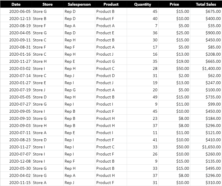
Here is a sample of what my data set looks like. If you want to view the data plus the dashboard I created here, you can check out the Google Sheets file here.
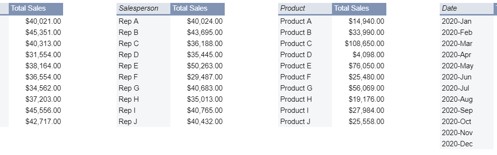
Step one is to create some pivot tables. Like with Excel, I prefer to create a pivot table for each view that I want. I will set up four pivot tables, categorizing sales by:
- Store
- Salesperson
- Product
- Date
To keep things simple, you can put each one of those fields in the ROW section while the sales can be in the VALUES section:
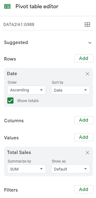
When creating the pivot tables, be sure to un-check the option to Show totals (this is so that they don’t show up in the charts):

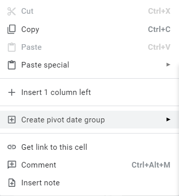
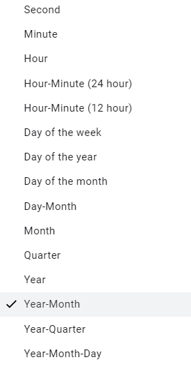
What you may want to do is create one pivot table and then copy and paste others, and just change the rows. One additional step you will need to do for the pivot table that contains the dates is to also group them by month. To do that, right-click on any of the dates and select Create Pivot Date Group:
Then, from the following menu, select Year-Month:
This is how your pivot tables might look like once you are done:
Where you put these pivot tables isn’t important. The key is leaving enough space between them so that they don’t potentially overlap should your data get bigger. Otherwise, you will run into errors and have difficulty updating your data. Since my pivot tables won’t get any wider based on the selections I’ll make, there doesn’t need to be any extra columns between any of them.
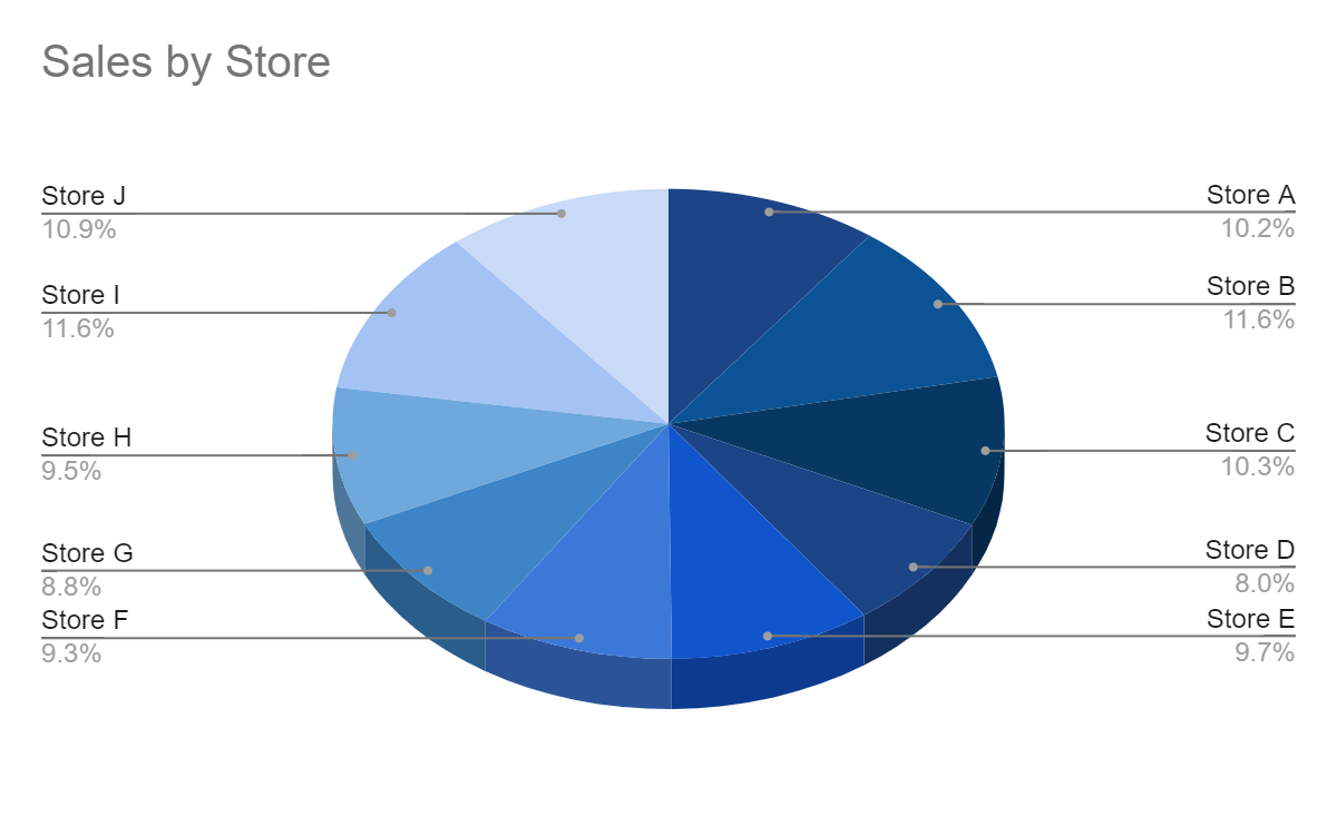
Now that the pivot tables are set up, the next step is to set up the different charts for each of them. For the sales by store, I will create a pie chart to show the split among the stores:
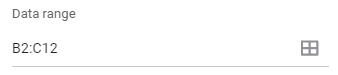
The one thing you will want to pay attention to for each chart is the range. Since your pivot table could expand, it’s a good idea to make the range bigger than it needs to be, even if it will contain blank values. For example, changing this:
To this:
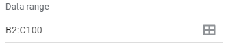
This will ensure that additional data gets picked up by the chart should your pivot table get bigger. This is also why it is important to ensure you don’t place any other pivot tables below one another. Ideally, you’ll want to keep them side by side rather one on top of the other.
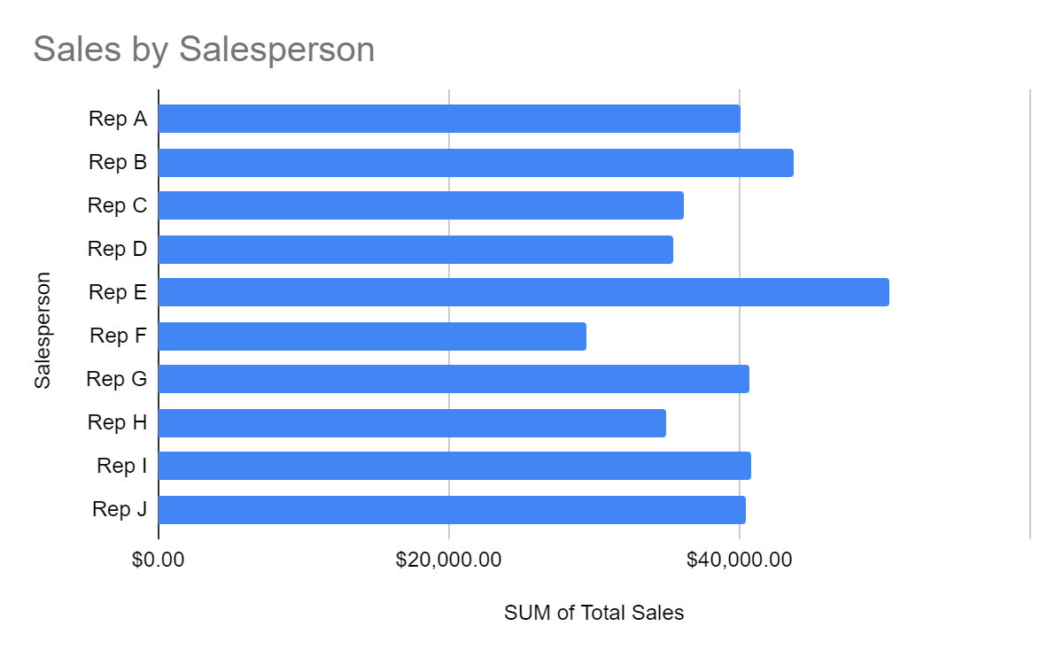
For the pivot table that shows sales by salesperson, I’ll use a bar chart since the names can be long:
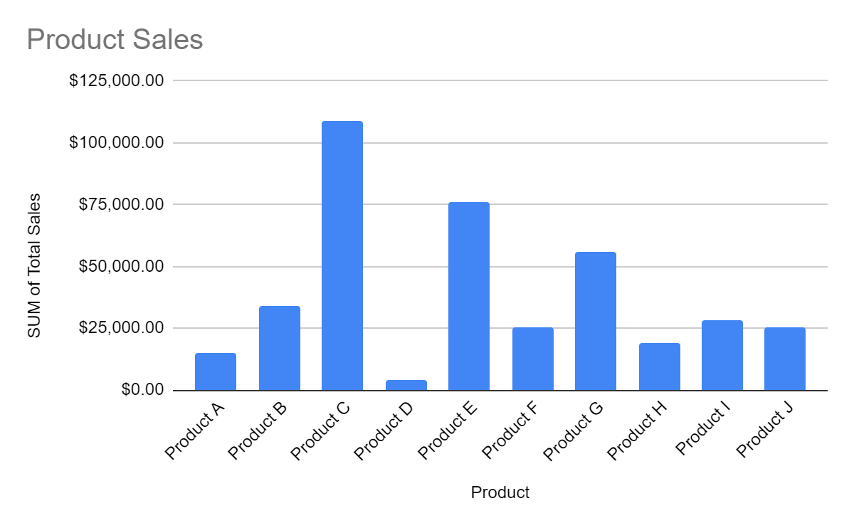
For the product sales, I’ll mix it up and have those as column charts:
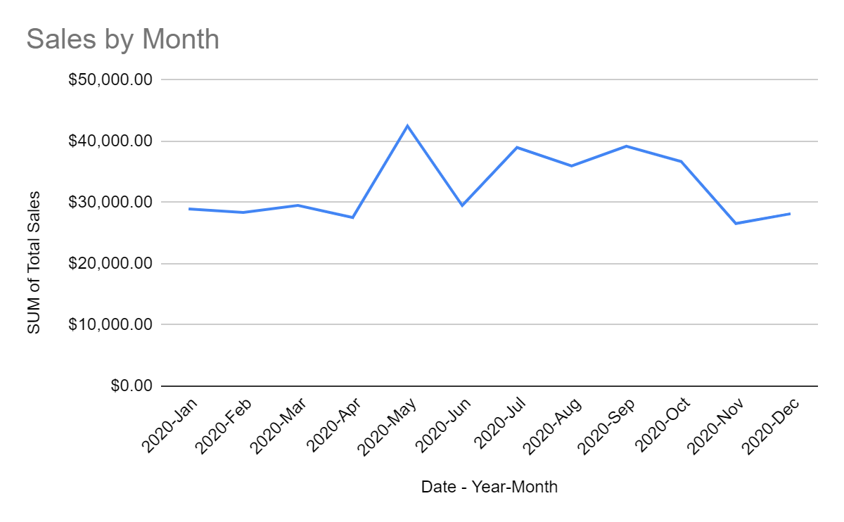
And for the sales by date, I will set those up as a line chart:
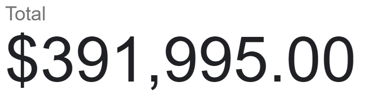
I will also add a scorecard chart, using any of the pivot tables. For this, I just want to pull the total sales:
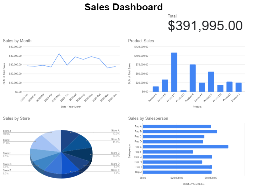
Now that these charts all set up, it’s just a matter of organizing how you want to see them on your worksheet:
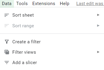
The one thing missing to make this dynamic: slicers. To add slicers to all these pivot tables, click on any of them and click on the Data tab and select the Add a Slicer button:
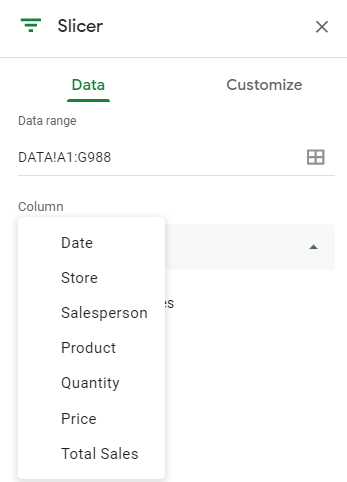
Then, select the columns you want to filter by:
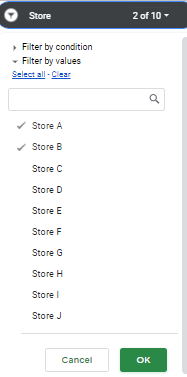
As long as you are referencing the correct data range, then the slicer will apply to all the pivot tables correctly. And now, if I add a slicer for the stores and only select stores A and B, my dashboard updates as follows:
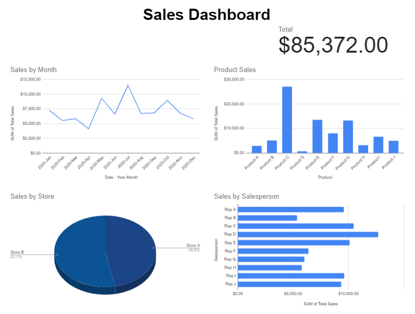
One thing to remember when you are applying changes: don’t forget to click on the green OK button on the bottom, otherwise your selections won’t be applied:
If you liked this post on How to Make Dashboards in Google Sheets, please give this site a like on Facebook and also be sure to check out some of the many templates that we have available for download. You can also follow us on Twitter and YouTube.
Add a Comment
You must be logged in to post a comment