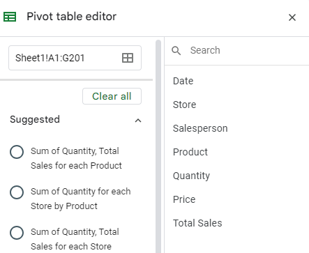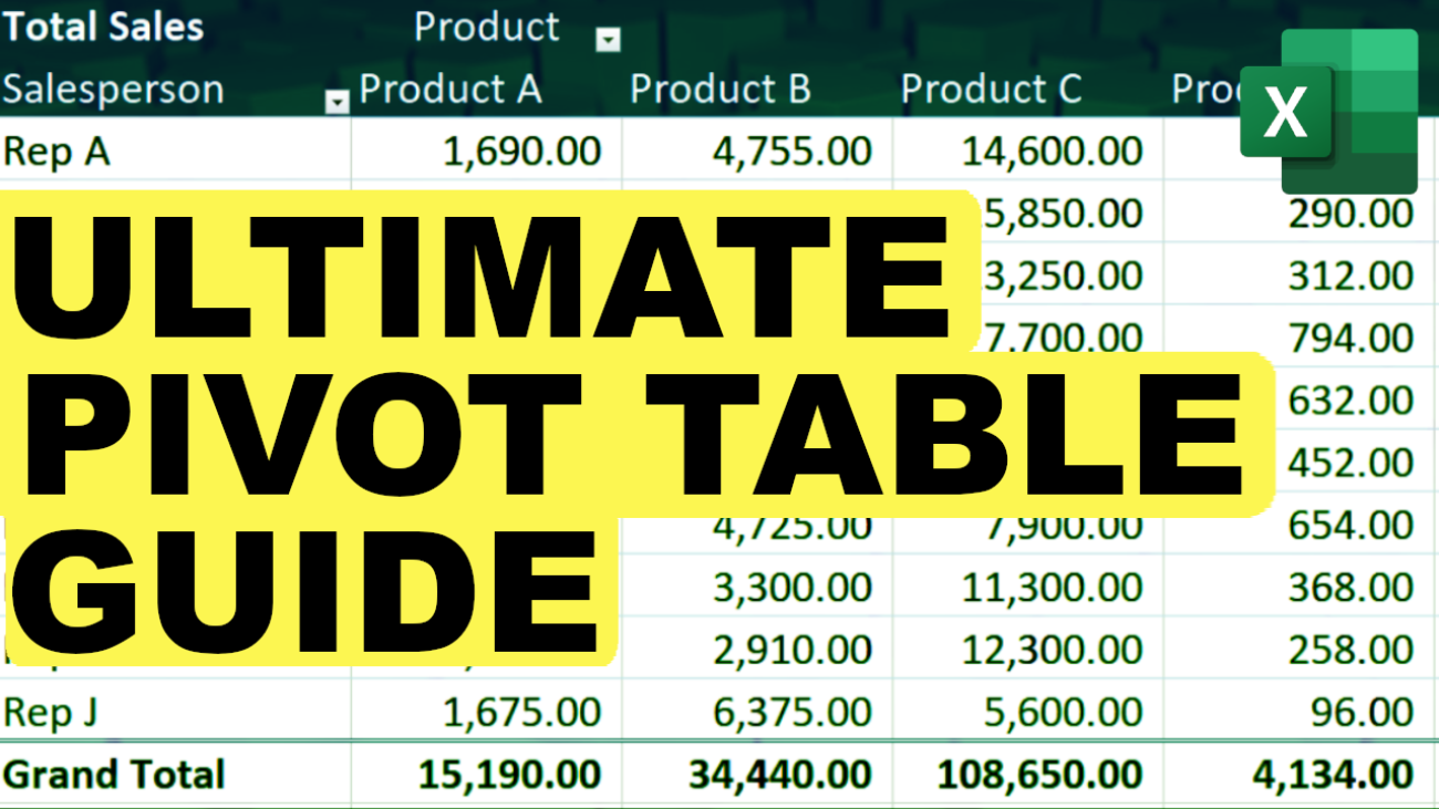
Pivot tables are one of the most powerful tools in Excel and Google Sheets, allowing users to quickly analyze and summarize large datasets. This article will provide a comprehensive guide to pivot tables, including advanced features and common troubleshooting tips.
What is a Pivot Table?
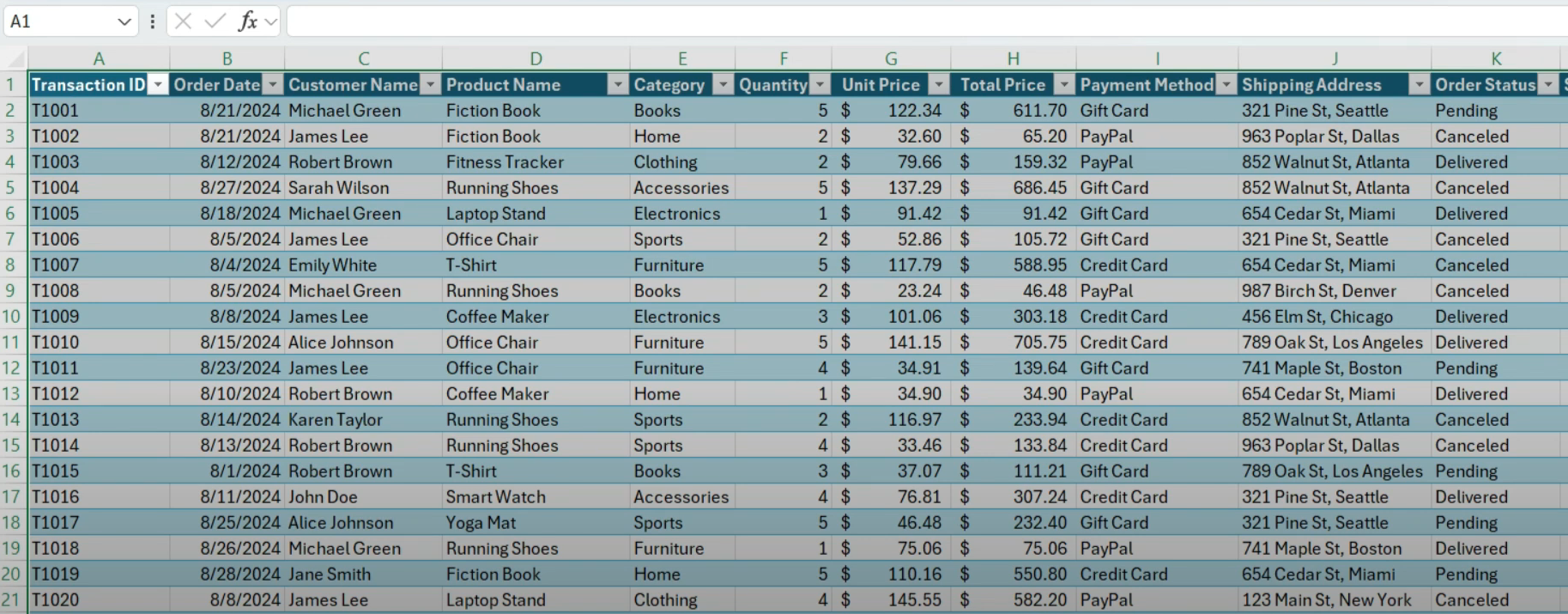
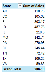
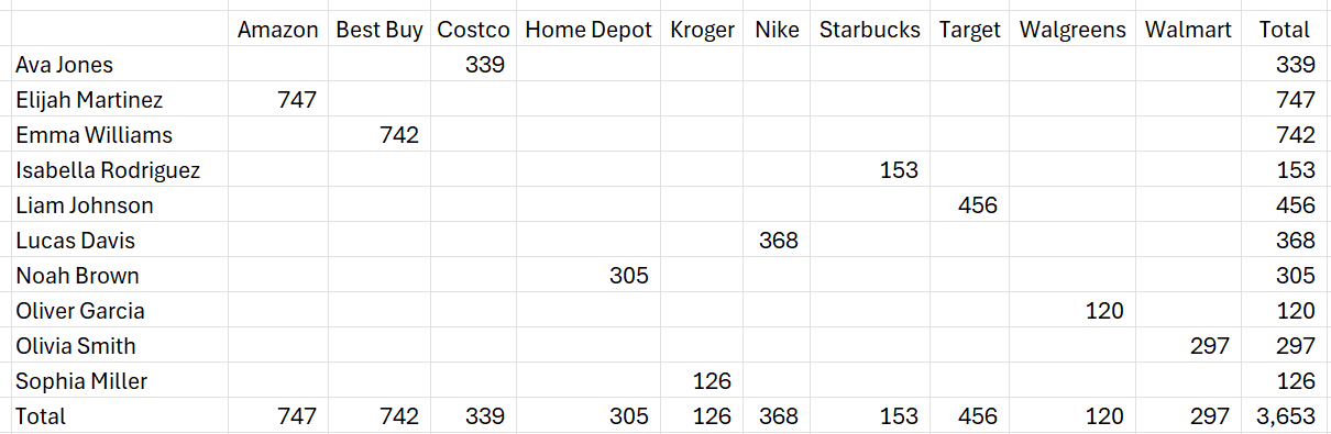
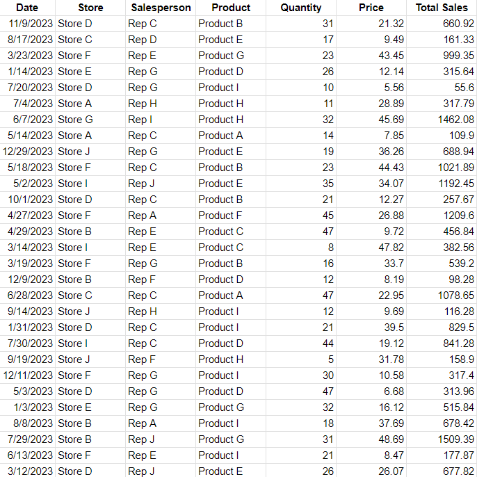
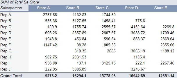
A pivot table is a data summarization tool that is used in the context of data processing. Pivot tables can automatically sort, count, and total data stored in one table or spreadsheet and display the summarized data. This makes them invaluable for data analysis tasks, especially when dealing with large datasets.
How to Create a Pivot Table in Excel
Creating a pivot table in Excel is straightforward:
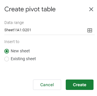
- Select the range of data you want to analyze.
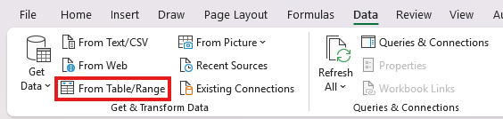
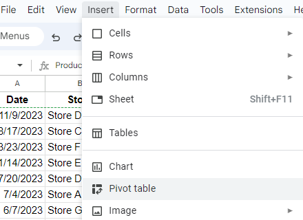
- Go to the
Inserttab and click onPivotTable. - Choose where you want the pivot table to be placed.
- Drag and drop fields into the
Rows,Columns,Values, andFiltersareas to organize your data.
TIP: You can use ALT+N+V+T as a shortcut to create a pivot table in Excel instead of going through the Insert tab.
For a detailed step-by-step guide, check out our article on how to create a pivot table in Excel.
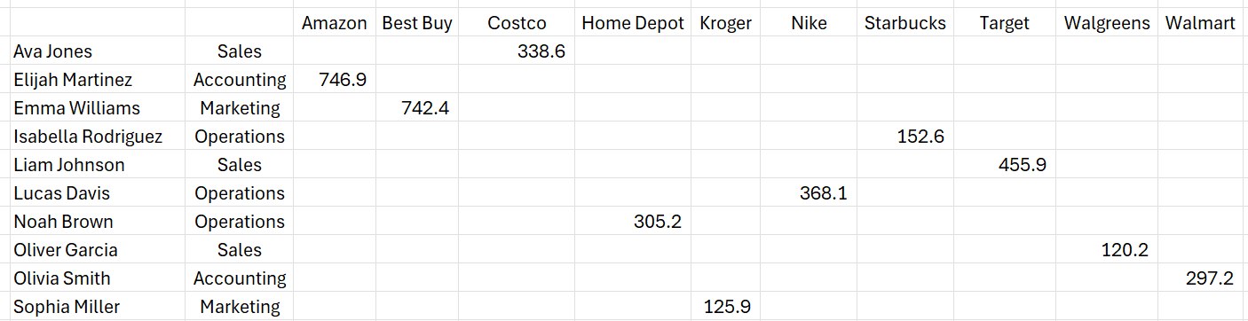
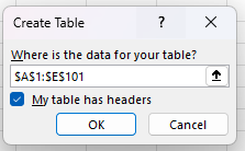
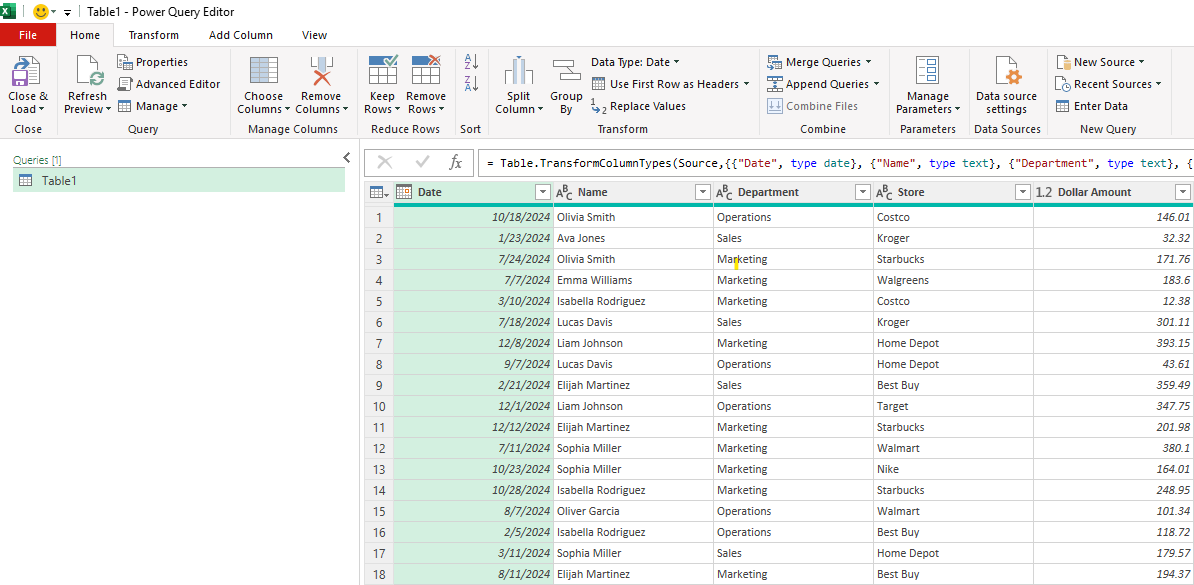
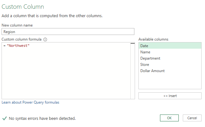
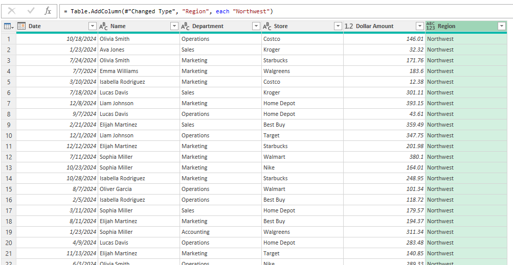
In some cases, you may have a data set which shows as a summary and with important fields going across horizontally rather than vertically. That can be challenging, but you can use Power Query to help you flip your data into a tabular format, which can be more useful for data analysis.
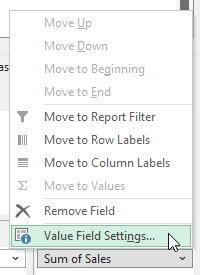
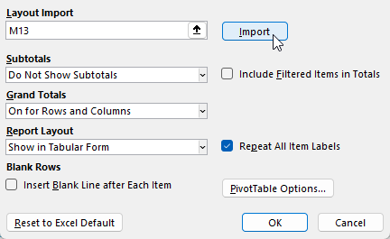
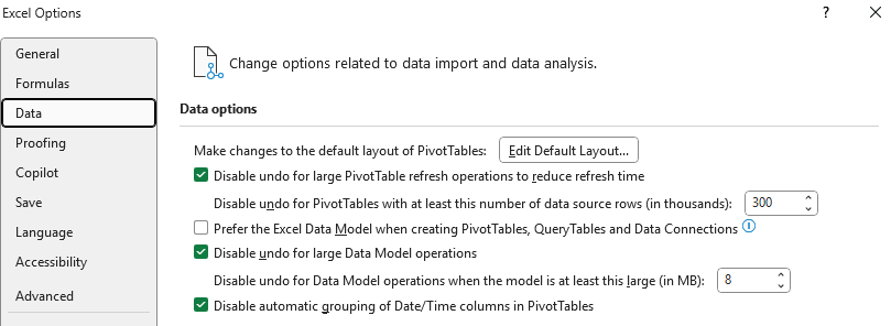
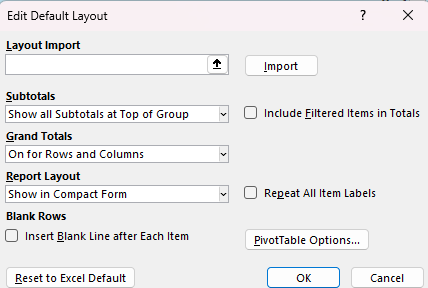
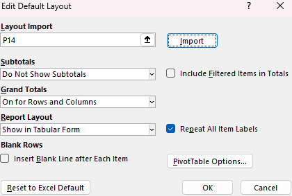
TIP: Do you keep changing the pivot table layout because you don’t like the default Excel setup? You can change the pivot table defaults!
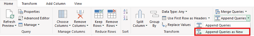
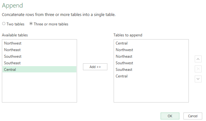
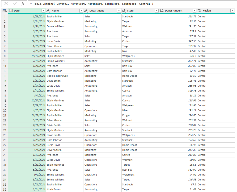
Combining multiple sheets into one pivot table
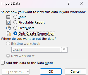
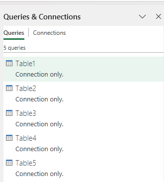
If you are have multiple worksheets, then you don’t have to create one pivot table for each of them. Instead, you can combine them together with the help of Power Query. By doing so, this can drastically make your data analysis more efficient by having multiple sheets linked into just one pivot table, where you can easily slice and dice data. And with Power Query, it’s easy to trigger a refresh.
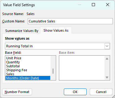
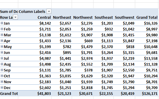
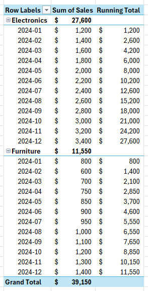
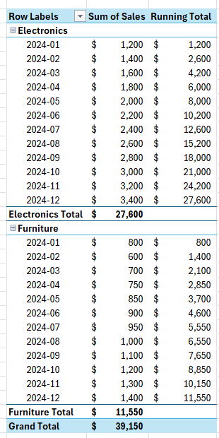
Working with Dates in a Pivot Table
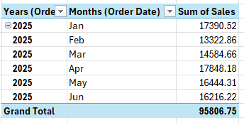
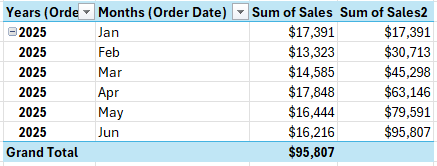
Dates are a common type of data that often require special handling in pivot tables. Analyzing date-related data can provide valuable insights into trends, seasonality, and performance over time. One of the most powerful features of pivot tables is the ability to group dates into various intervals such as months, quarters, and years. This can make your data analysis more effective, especially when dealing with long periods.
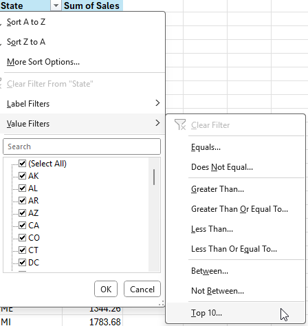
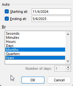
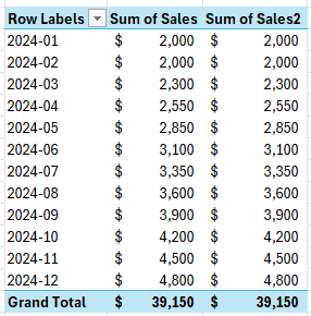
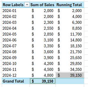
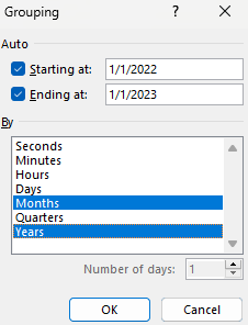
Grouping Dates in a Pivot Table
Grouping dates allows you to summarize data on a periodic basis. This is particularly useful for identifying monthly trends and patterns, such as sales performance or seasonal variations. To group dates in a pivot table, follow these steps:
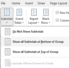
- Right-click on any date in the pivot table.
- Select
Groupfrom the context menu. - In the
Groupingdialog box, selecthow you want to group your dates. - Click
OK.
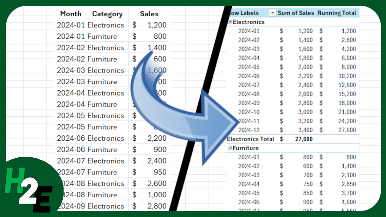
This is a great way of grouping your existing data. But you can also add to your data by creating calculated fields, which can take your pivot table to the next level.
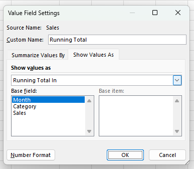
Creating Calculated Fields in a Pivot Table
Calculated fields in pivot tables allow you to perform custom calculations on the data within your pivot table. This feature is invaluable for creating new metrics, combining existing data in meaningful ways, and enhancing your data analysis capabilities without altering the original dataset.
A calculated field is a new field that you add to your pivot table, which derives its value from performing calculations on other fields in the pivot table. For example, you can create a calculated field to calculate profit by subtracting costs from revenue or to determine the percentage change between two periods.
How to Add a Calculated Field
Here are the steps to create a calculated field:
- Go to the
PivotTable Analyzetab. - Click on
Fields, Items & Setsin the Calculations group. - Select
Calculated Fieldfrom the dropdown menu. - Define the Calculated Field:
- In the
Insert Calculated Fielddialog box, enter a name for your new field in theNamebox. - In the
Formulabox, enter the formula you want to use. You can use standard arithmetic operations (e.g.,+,-,*,/) and reference other fields by their names. - For example, to calculate profit, you might enter a formula like
=Revenue - Costs.
5. Click Add and then OK to insert the calculated field into your pivot table.
Benefits of Using Calculated Fields
- Custom Metrics: Create specific metrics tailored to your analysis needs, such as profit margins, growth rates, or weighted averages.
- Dynamic Analysis: Calculated fields update automatically as you change the layout or filter data within your pivot table.
- Enhanced Insights: Combine data from different fields in new ways to uncover deeper insights and trends.
Tips for Using Calculated Fields
- Use Descriptive Names: Give your calculated fields clear and descriptive names to make them easily identifiable in your pivot table.
- Test Your Formulas: Ensure that your formulas are correct and yield the expected results by testing them with sample data.
- Avoid Overcomplicating: Keep your calculated fields as simple as possible. Complex calculations can be harder to manage and troubleshoot.
By mastering calculated fields, you can significantly enhance the analytical power of your pivot tables, allowing for more sophisticated and insightful data analysis. You can even add IF statements to a pivot table with the help of calculated fields.
After leveraging calculated fields to generate custom metrics and enhance your data analysis, the next step is to efficiently filter and explore your pivot table data. This is where slicers come into play, offering an intuitive and interactive way to refine your data views and focus on specific subsets of information.
Setting Up Slicers in a Pivot Table
Slicers provide a user-friendly way to filter data in pivot tables, making it easier to view and analyze specific subsets of your data. They are particularly useful for interactive dashboards and reports, allowing users to quickly change the data displayed without modifying the underlying pivot table.
What is a Slicer?
A slicer is a visual filter in the form of a button that allows you to filter pivot table data quickly. Slicers make it easy to filter data by simply clicking on the values you want to include or exclude, providing a more intuitive and interactive way to work with your pivot tables. This is similar to how you would filter your data on a table by using drop-down options; slicers simply make the process easier.
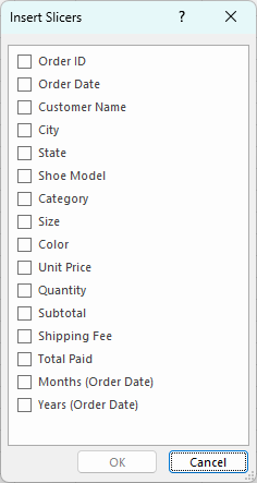
How to Add a Slicer to a Pivot Table
Adding a slicer to your pivot table can be done with just a few clicks. Simply activate your pivot table, then take the following steps:
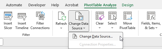
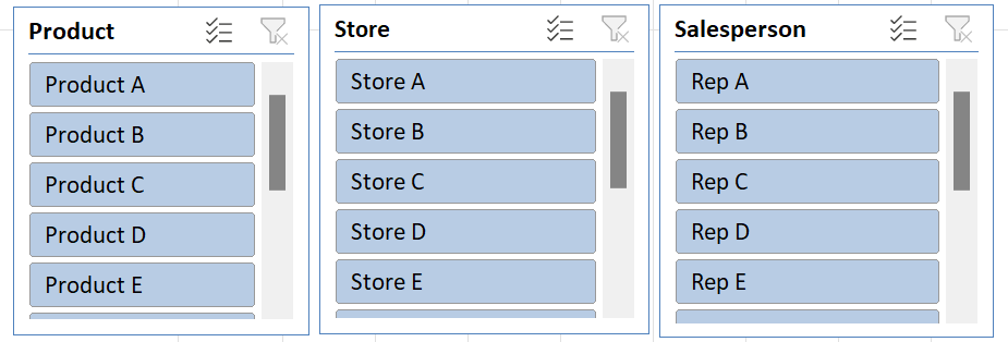
- In the
PivotTable Analyzetab, click onInsert Slicerin the Filter group. - The
Insert Slicersdialog box will appear, listing all the fields available in your pivot table. - Select the fields you want to use as slicers. You can choose multiple fields if needed (e.g., Product, Store, Salesperson).
- Click
OKto add the slicers to your worksheet. Each selected field will have its own slicer.
Using Slicers to Filter Data
Once slicers are added to your worksheet, you can use them to filter your pivot table data:
Filter Data: Click on the buttons within the slicer to filter the data. Each button represents a unique value from the field you selected.
Multi-Select: To select multiple values, hold down the Ctrl key (or Cmd key on Mac) while clicking on the slicer buttons.
Clear Filters: To clear all filters applied by a slicer, click the Clear Filter button (a small filter icon with an X) in the top right corner of the slicer.
Benefits of Using Slicers
- User-Friendly: Slicers provide a simple, visual way to filter data, making it easy for anyone to use, even those unfamiliar with pivot tables.
- Interactive Reports: Slicers are perfect for interactive dashboards and reports, allowing users to dynamically filter data and gain insights quickly.
- Multiple Field Filtering: You can use multiple slicers simultaneously to filter data by different fields, providing a more granular view of your data.
- Consistent Filtering: Slicers ensure consistent filtering across multiple pivot tables that share the same data source, keeping your reports synchronized.
Slicers are not limited to Excel; you can also use slicers in Google Sheets.
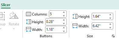
TIP: You can adjust the size and shape of your slicers. You can also spread the selections across multiple columns. Under the Slicer tab, just change the number of columns you want for that selection.
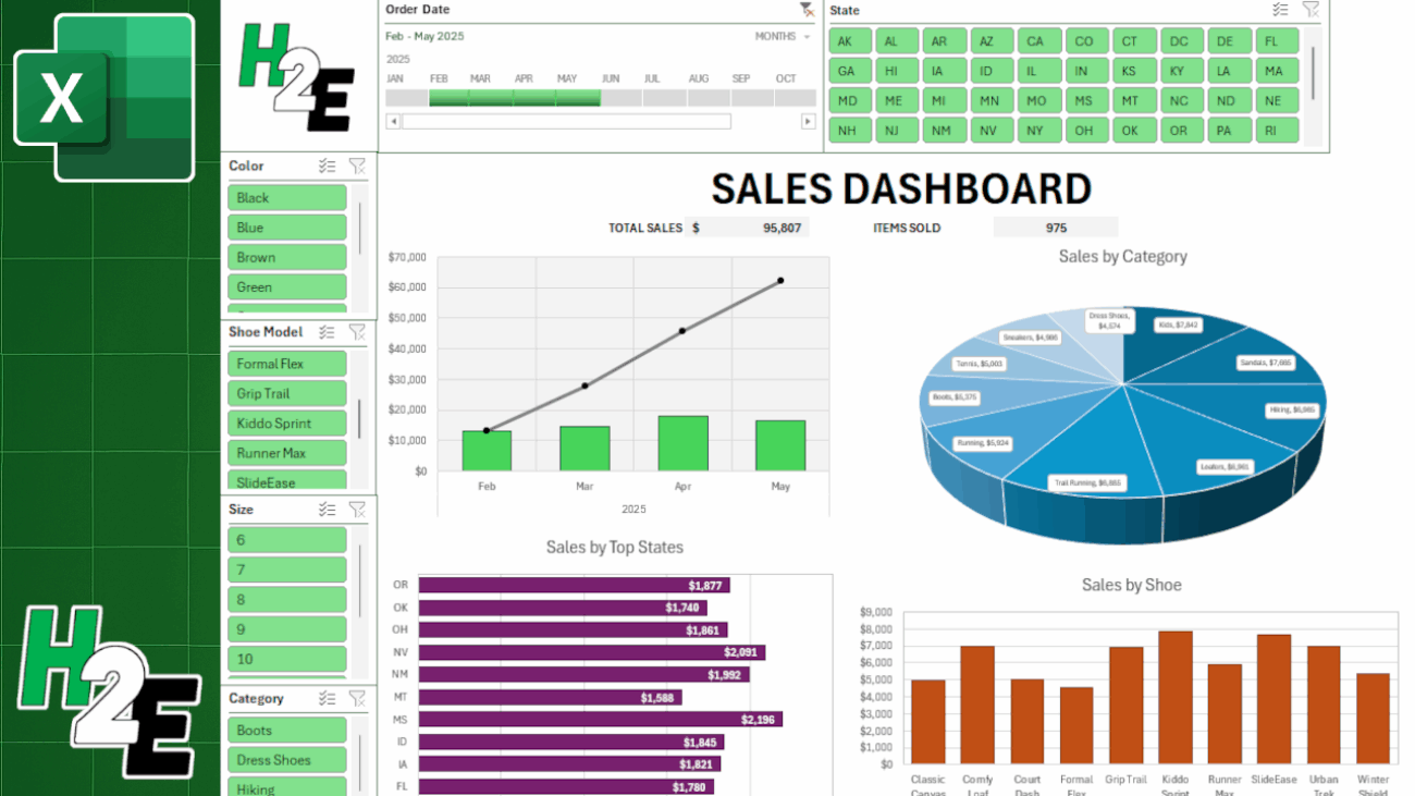
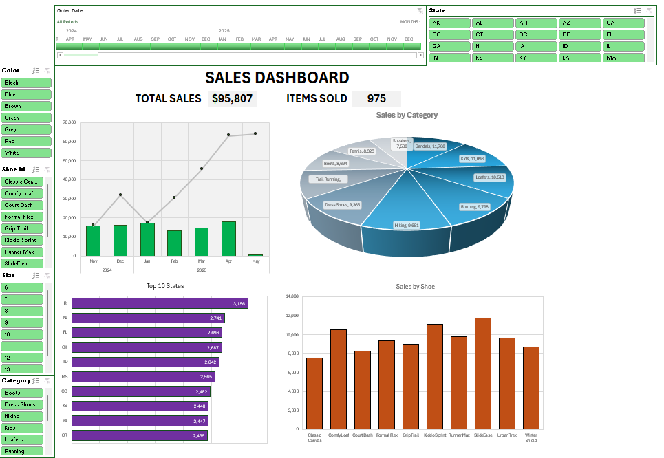
Now that you’re familiar with slicers, the next step is to integrate these elements into a comprehensive and visually engaging dashboard. Dashboards combine multiple pivot tables, charts, and other data visualizations into a single, cohesive view, providing a powerful tool for data analysis and reporting.
Creating Dashboards with Pivot Tables
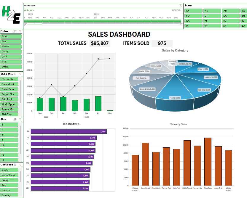
Dashboards are powerful tools that can help visualize a company’s performance, various economic data, travel statistics, and any other reports you want to analyze. They provide an interactive interface for users to explore and analyze data, making it easier to gain insights and make informed decisions.
What is a Dashboard?
A dashboard is a visual representation of key metrics and data points, typically displayed in a single view. Dashboards combine various elements such as pivot tables, charts, and interactive filters to provide a comprehensive overview of your data. They are particularly useful for monitoring performance, identifying trends, and facilitating data-driven decision-making.
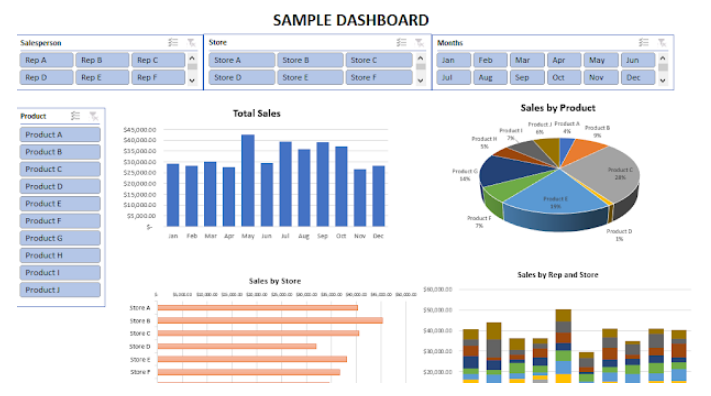
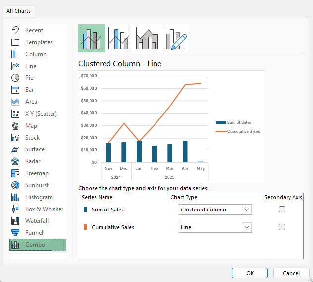
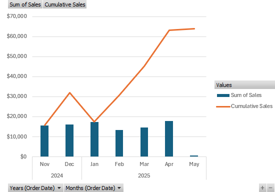
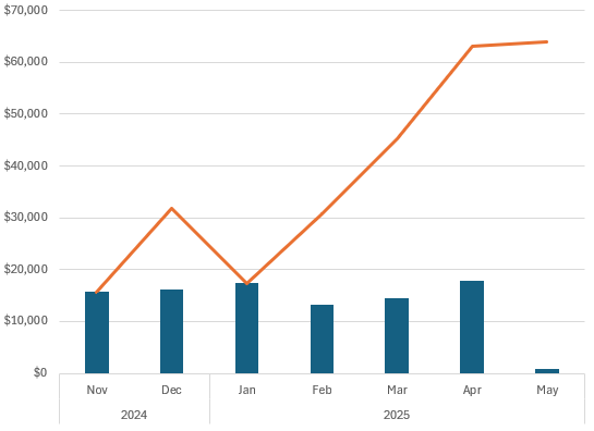
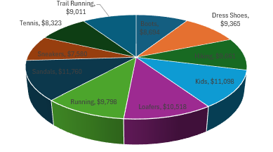
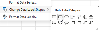
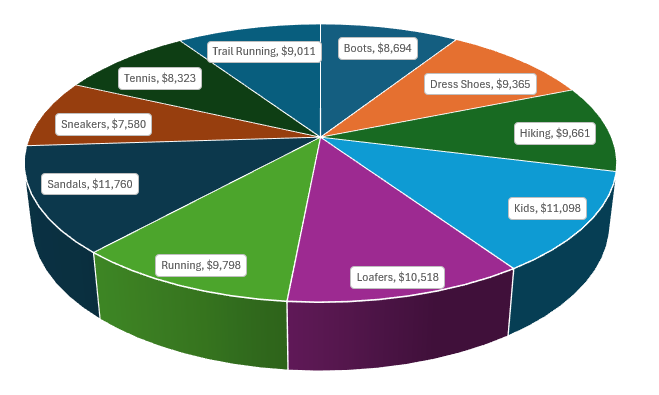
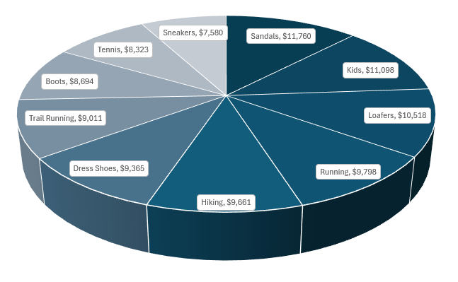
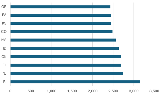
Creating Pivot Charts
For any metric you want to create a chart or visualization for, you’ll want to consider creating a pivot table for it. From there, you can use pivot charts to do the rest.
To insert a pivot chart:
- Click anywhere in your pivot table.
Inserta chart the way you normally would.- Select the type of chart that best represents your data (e.g., bar, line, pie chart) and click
OK.
Format your pivot charts to enhance readability. Add titles, labels, and legends as needed. Use colors and styles that make the charts visually appealing and easy to interpret.
Combining Elements into a Dashboard
To create a cohesive and interactive dynamic dashboard, combine your pivot tables, charts, and slicers into a single worksheet. Some things to consider when doing so:
Layout Design:
- Arrange the pivot tables and charts in a logical and visually appealing layout. Group related elements together.
- Leave space for slicers and ensure they are positioned in a way that is easy for users to interact with.
Add Visual Enhancements:
- Use shapes, colors, and borders to highlight key areas and separate different sections of your dashboard.
- Add headers and text boxes to provide context and explanations for the data presented.
- Arrange the slicers on your dashboard so they are easily accessible. Slicers should be placed near the relevant pivot tables and charts to facilitate easy filtering.
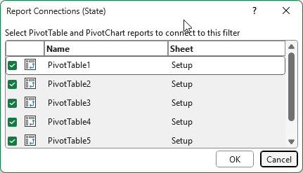
TIP: Connect Slicers to multiple pivot tables. To do this, right-click on the slicer and select Report Connections. Check the boxes for all the pivot tables you want to filter with the slicer.
Benefits of Using Dashboards
- Real-Time Insights: Dashboards update automatically with changes to your underlying data, providing real-time insights.
- User-Friendly Interface: Slicers and interactive charts make it easy for users to explore and filter data without advanced technical skills.
- Comprehensive View: By combining multiple data points and visualizations, dashboards offer a holistic view of performance, trends, and key metrics.
- Improved Decision-Making: Dashboards facilitate data-driven decision-making by presenting clear and actionable insights.
By following these steps, you can create powerful and interactive dashboards that leverage the full capabilities of pivot tables, charts, and slicers. This enables you to present complex data in an accessible and visually engaging format, driving better understanding and more informed decisions. You can create a dashboard in Google Sheets using similar approaches.
While pivot tables offer powerful data analysis capabilities and can significantly enhance your ability to work with large datasets, they are not without their challenges.
Biggest challenges with pivot tables
Some of the most common issues that users often encounter with pivot tables are the following:
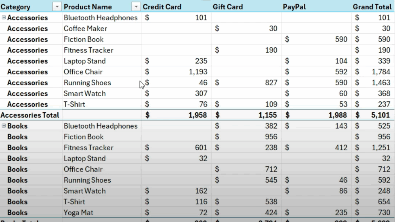
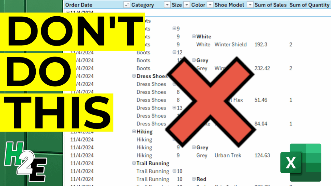
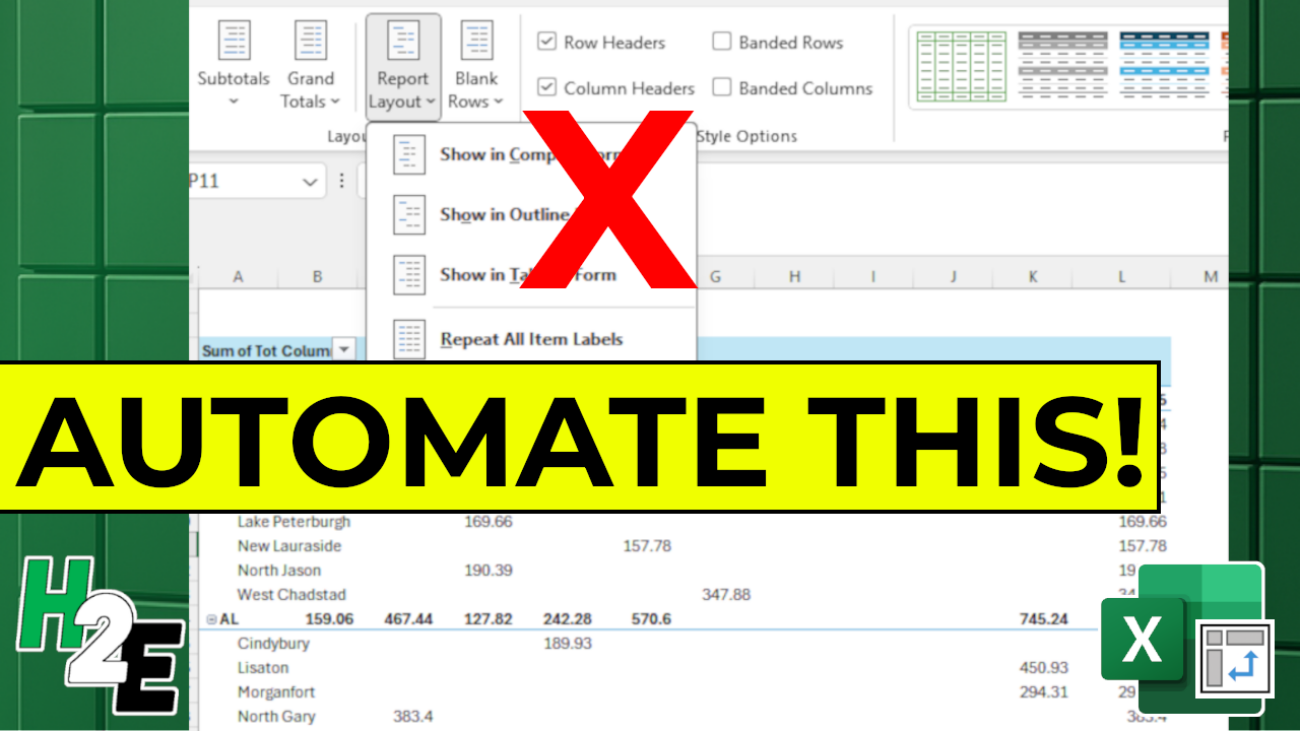
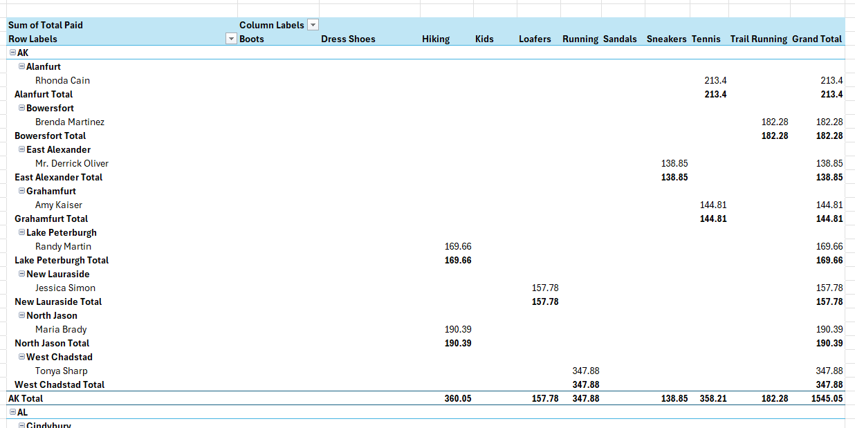
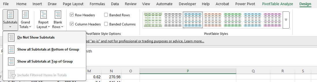
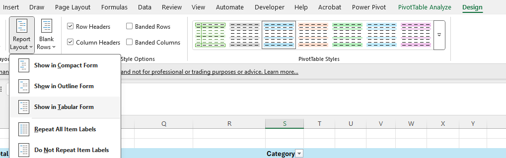
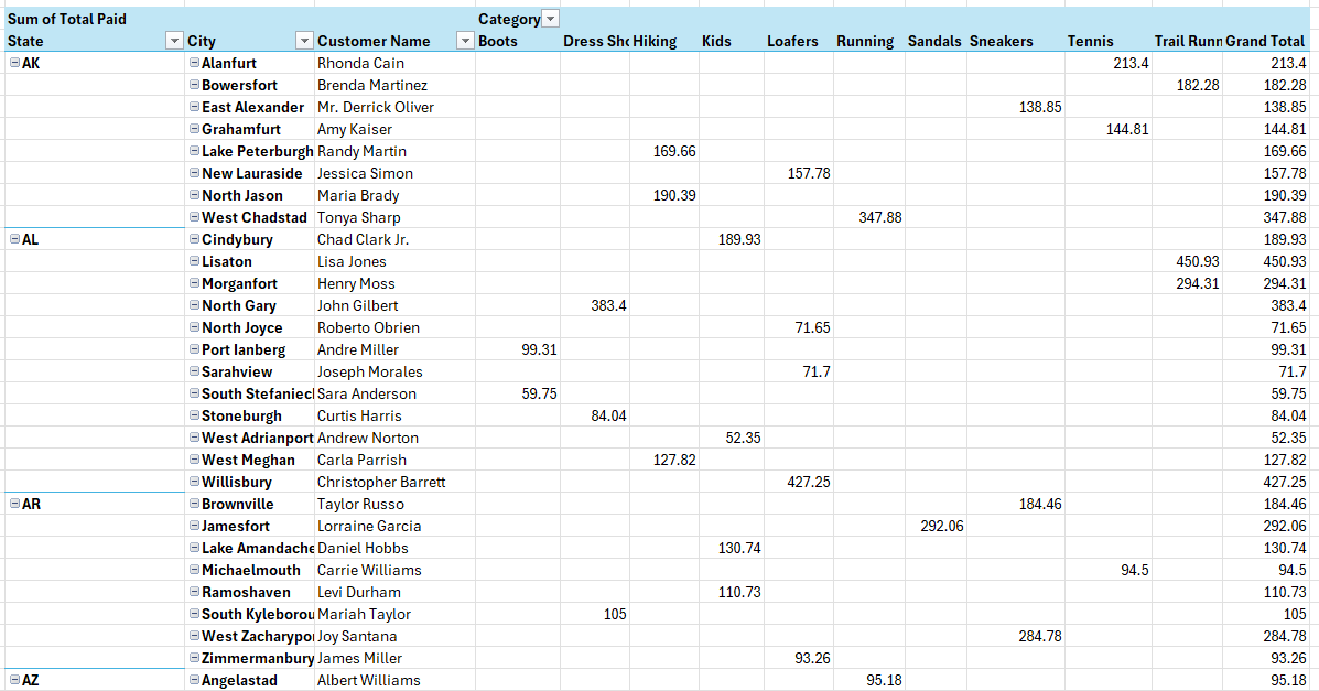
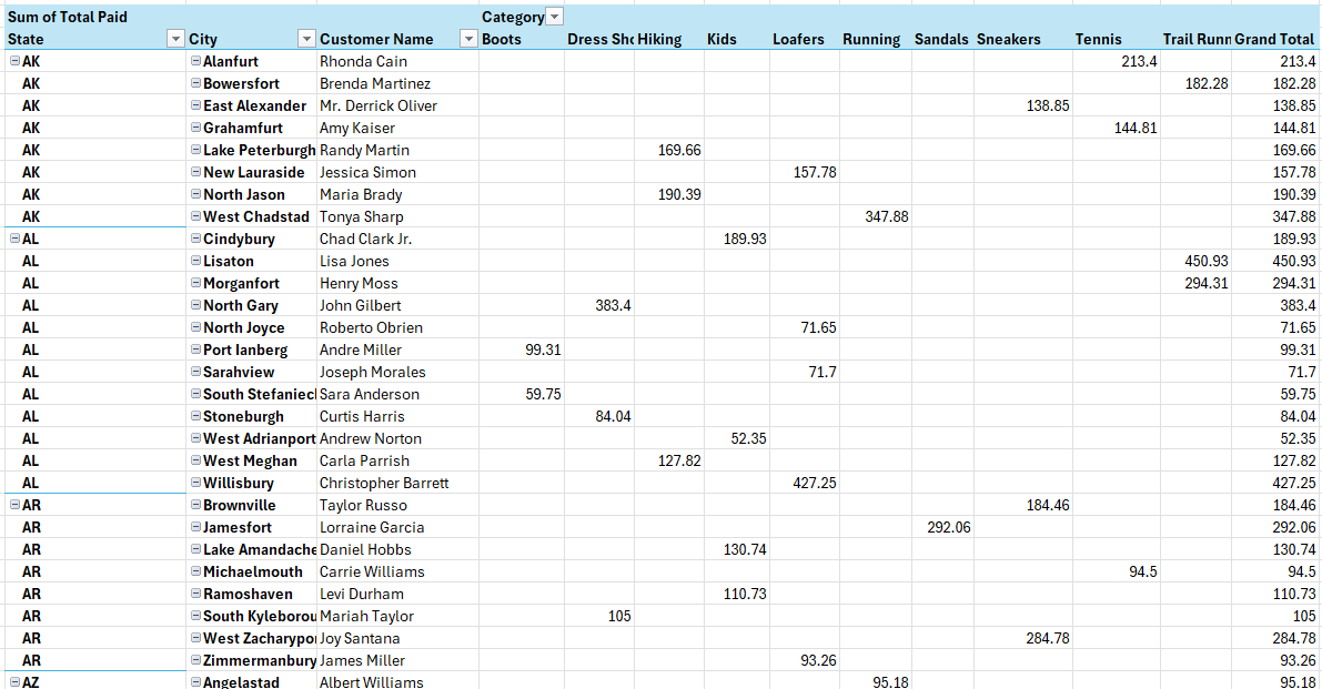
- Pivot tables by default aren’t formatted in a convenient way; users often end up adjusting the layout so that it is in a tabular setup.
- Labels do not repeat, and that can make it difficult to read the table to determine what each line relates to. Here too, users need to change the default layout.
- The formatting for fields can change when the data is refreshed if users haven’t adjusted the actual field settings themselves.
- When referencing a pivot table in a formula, the GETPIVOTDATA function can be triggered if the option isn’t disabled.
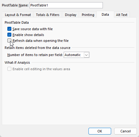
- The data source is updated and when it does, the pivot table doesn’t include the newly added information without manually having to adjust the range.
Pivot tables are incredibly useful in data analysis and by learning how to create and use them, you can improve your data analysis capabilities and create some stunning visuals. But be sure to watch out for some common pitfalls when creating pivot tables.