Google Sheets has come a long way in being a formidable alternative to Excel. While it may not have all of the same features as Excel, Google is adding to its functionality. Creating a pivot table with slicers is now a possibility in Google Sheets, and below, I’ll show you how you can do that with the online spreadsheeting program.
The basics: creating a pivot table in Google Sheets
To create a pivot table in Google Sheets involves about the same steps as it does in Excel: compiling and organizing your data set, and then creating the pivot table. Here’s a quick look of my sample data that I have ready to use:

Then, on the Data menu, select the option to create Pivot Table:

The next step is selecting where you to put your pivot table:
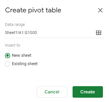
The default, a new worksheet, will often work the best. Although the layout looks a little different, the process remains the same with a blank pivot table being your starting point:

On the right-hand side of the page, you’ll see options to put fields into columns and rows, which is what you’re used to with Excel. Again, the main difference is the layout but the logic remains the same:
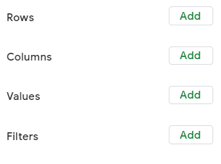
When clicking on the Add button, you’ll see options as to which fields to add, even having the option for a calculated field as well:

In my example, I’m going to select Total Sales so that I can summarize my data based on sales:

Next up, let’s add fields for both the row and column sections of the pivot table. If you have a lot of dates in your data set, you’ll want to put the field into the Row section. Otherwise, Google Sheets may give you an error where there are too many columns.
Even if you want to use dates in the column section, you’ll better of first putting it under Rows. Then, right-click on one of the dates and select Create pivot date group:

From here, you can group your dates so that you don’t have too many entries. In my example, I’m going to use Month as my breakdown. After that, I can move the Date field back into the Column section:

The problem here is that even if you have multiple years, it’ll group it into the same month. For example, I have one entry for Dec. 31, 2018, and it has not separated that out from the 2019 values. In order to fix this, I need to change the grouping from Month to Year-Month. Then my pivot table looks as follows:

Now the data from December 2018 is broken out. Next up, I’ll add another field for the Row section. Here, I’ll add the Store field. And now my pivot table is looking more like what I’d expect it to:

Next, let’s also add the Salesperson field as well so that we have more of a breakdown:
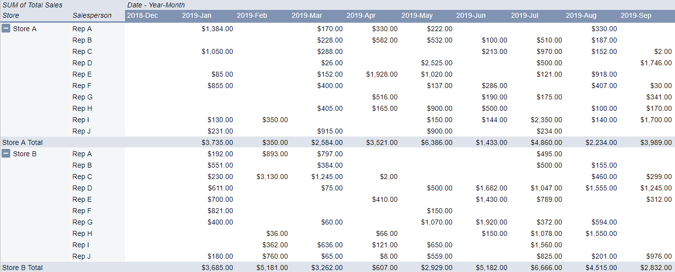
One of the things that stands out right away is that in Google Sheets the layout of the pivot table is much more intuitive. One of the annoyances of pivot tables in Excel is they’re not in a tabular format by default. With Google Sheets, it’s not something you need to worry about.
It still doesn’t have the repeating rows for the Store field, but that’s a quick fix: simply click the option to Repeat row labels:
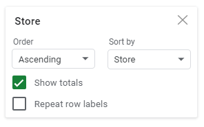
And then, voila:
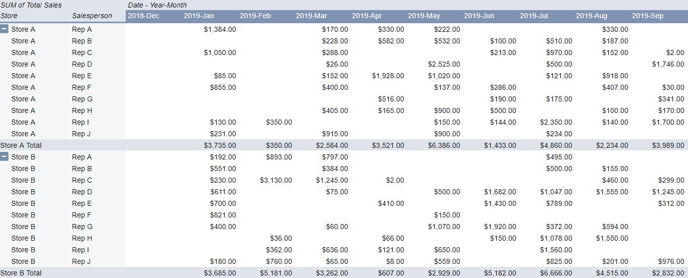
Just like with a regular pivot table you can also drill down into the individual cells to the detail. In Google Sheets, it also gives you a specific name as to what cell you’ve drilled down on, making it easier to refer back to when looking at many different tabs:

Adding slicers to the pivot table
You can also add slicers to your pivot table to make it easier to make changes to it and update it on-the-fly. To add a slicer, just click on the Data tab while you’re on the pivot table and click on Slicer:
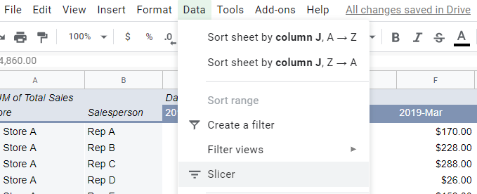
Then that will generate the slicer, where you’ll be prompted to select a column to filter by:

Click on the filter icon and then on the right-hand side you’ll see the option to select a field from a drop-down list. In this example, I’m going to select Salesperson:
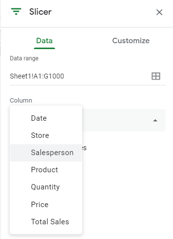
Then, on the slicer you can filter by the values in the column:

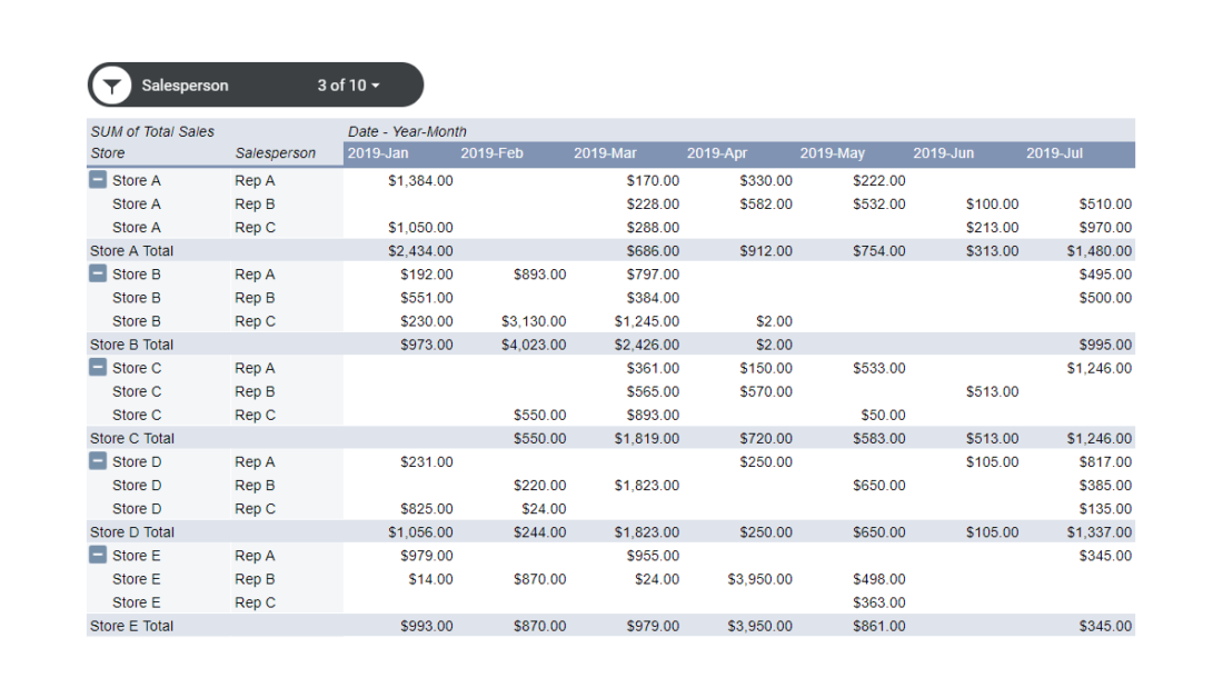
If I hit the clear button and select only Rep A, Rep B, and Rep C, this is what my pivot table now looks like:

The slicer shows the number of items selected and as you can see, it only has the sales reps that I selected in the data. You can add more slicers for other columns but the process remains the same. The big difference you can see from Excel is that your selections are how you’d make the selections in a normal filter; you don’t have buttons for each slicer option the way you do in Excel.
There are changes that you can make to the font and color of the slicer but other than that, visually, there aren’t many changes to make. So if you’re looking to replicate a similar Excel-type dashboard in Google Sheets with many options available for how slicers look then you may be disappointed here. However, in terms of functionality, the slicers work in much the same way that they do in Excel.
A good start, but Google Sheets is still lacking
Google Sheets still has a ways to go in being a real replacement for Excel. While it does have some unique functions that Excel doesn’t, adding pivot tables and slicers is a significant step forward.
However, one area that still needs more improvement is charting. For instance, creating a chart from the pivot table is not an easy task and doesn’t look like Google Sheets is designed yet to create easy-to-use pivot charts. And until that happens, there’s still going to be a big gap between the type of dashboard you can create with Google Sheets and what you can make in Excel.
The good news is that Google Sheets has made a lot of progress and it’ll likely be even better in the future.
If you liked this post on How to Make a Pivot Table in Google Sheets with Slicers, please give this site a like on Facebook and also be sure to check out some of the many templates that we have available for download. You can also follow us on Twitter and YouTube.

Add a Comment
You must be logged in to post a comment