In this post, I’ll show you how to create a pivot table. It’s a key skill in Excel that all users, even beginners, should be familiar with. It can make your analysis a lot easier to do while also presenting your findings in a very easy-to-read format for users of your data.
Why should you use a pivot table?
One of the biggest benefits of using pivot tables is that you can double-click on any total to see the individual items that make it up. This is something that’s not possible with formulas and can sometimes involve a lot of digging. But with pivot tables, the information is only a few clicks away.
Not only is the information easier to drill-down into, but it’s also a lot easier for the person making the report and summarizing the data to create it as well. With formulas, you may have to use many different summation formulas which could get complex very quickly, but a pivot table can take care of all that if your data is organized.
Pivot tables are also good when you’re dealing with lots of data. If you’ve ever used a formula to analyze thousands of rows of data you know that it can start to slow down your spreadsheet, and even your computer. With pivot tables, the data is all stored as a snapshot and a recalculation is only necessary if you add data to it and refresh it. Otherwise, the information will remain there in the background. That saves your spreadsheet the need from always doing calculations in the background.
The one significant downside of pivot tables is that they’re not often as flexible as formulas are it can be difficult to manipulate them to look exactly how you’d like them to.
What this post will cover
In this introductory post I’ll go over a variety of different topics relating to pivot tables, including the following:
- How to create a pivot table
- How to setup the pivot table’s rows and columns
- Grouping dates into months, years, and quarters
- Filtering data in a pivot table
- Changing the formatting of fields
- Changing pivot table values to averages
- Show values as a % of a column or row
- Adding more fields and changing the view to tabular
- Viewing the contents that make up a cell
If you want to follow along with my example you can download my sample file here
1. How to create a pivot table
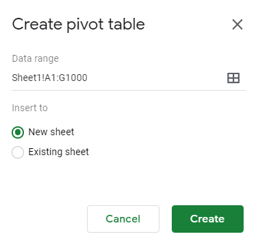
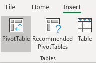
Actually creating a pivot table is a very simple process. The only requirement is that your columns should have headers and there shouldn’t be gaps in your data to make sure it picks everything up. If your data doesn’t need adjusting, then simply elect any cell on your data table and click on the Insert tab and click on the Pivot Table button (you can also use shortcut ALT+N+V)
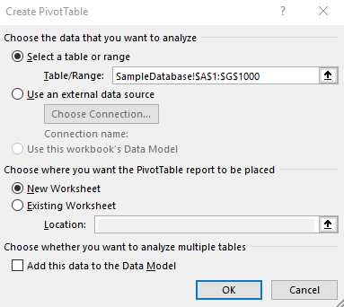
That will pop up the following screen:
Excel automatically determines the table range based on the active cell when the create pivot table action was triggered. If the cell wasn’t on the dataset, Excel may not be able to pull this information accurately. As long as you make sure you click the insert pivot table button when you have your data selected then usually Excel will likely get the correct range. Of course, if the information is incorrect you can change the range at this screen as well.
You can select whether you want the pivot table in a new worksheet or the existing one. In most cases, you’ll want a new worksheet, which is what it will default to. Since you can’t overlap data with a pivot table, it’s usually cleaner to just start on a brand new sheet.
2. Setting up the pivot table
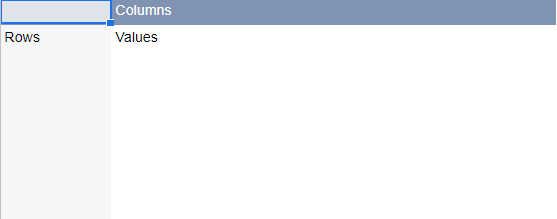
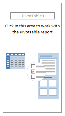
When the pivot table is generated you will see the following:
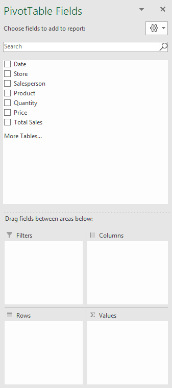
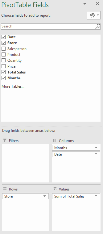
This pivot table is blank and not terribly useful right now. On the right-hand side you will see this:
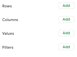
This is where you will select where you want your data to show. This is going to be the nuts and bolts of your pivot table. If you organize your pivot table well, it’ll display the results that you want. But if you don’t, you could end up with a confusing and useless table.
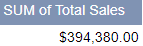
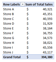
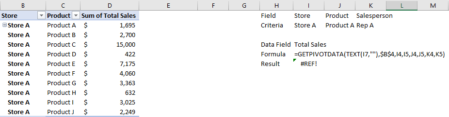
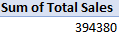
Suppose for example, that you want to see a summary of sales by store, broken down by month. First, you’d find the Total Sales field from the above list and drag it into the Values section of the pivot table. Immediately, the pivot table will show you the total of all the sales for everything:
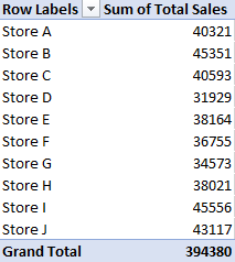
However, let’s see this broken down further by store. To do that, move the Store field into the Rows section. Now, you’ll see the totals by store:
Normally you’ll want the field with the most amount of items to go into the rows section. Otherwise, if you put that field into the columns section you will have to do a lot of scrolling to the right to see the entire table, which isn’t ideal; normally you want to be scrolling up and down instead.
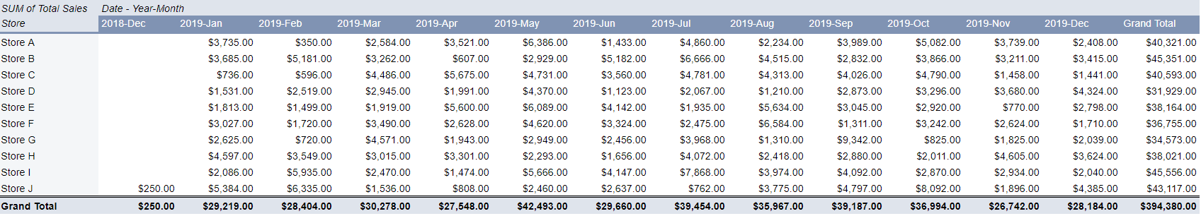
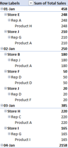
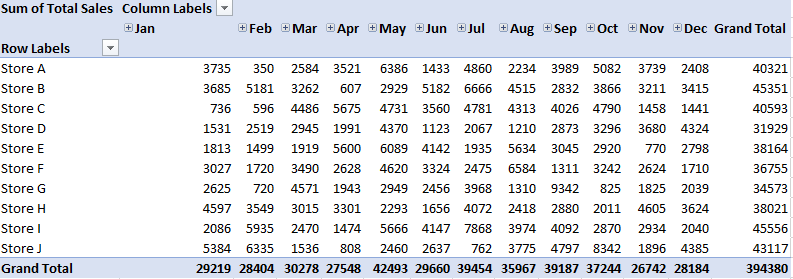
Lastly, let’s also move the Date field into the Columns section. This is what the layout will look like now:
Your pivot table should look something like this:
You’ll notice that the grand total is the same from when you dropped in Total Sales and had nothing else. Now, however, the data has just been split by store and by date. Excel has also automatically formatted the dates into months, but that’s not always a guarantee.
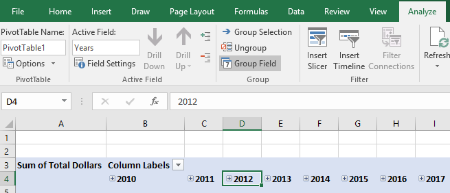
3. Grouping Dates by Month, Year, Quarter, etc…
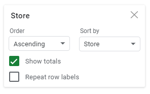
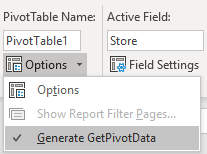
If you want to group your dates or want to change the grouping, select one of the dates on your pivot table and under the PivotTable Tools -> Options (this could be Analyze or PivotTable Analyze, depending on which version of Excel you have) tab, click on Group Field button.
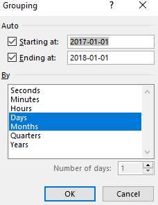
After clicking that button you will see the following options:
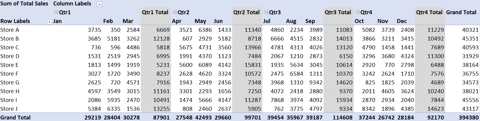
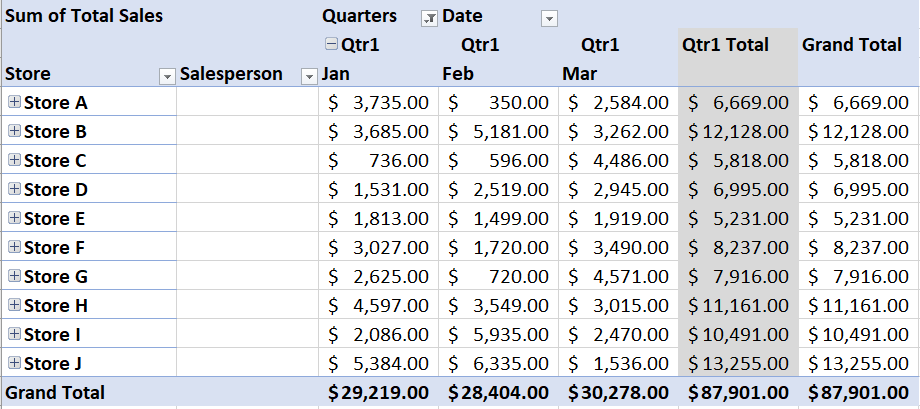
Excel has automatically divided the data into days and months. However, you can group this however it makes sense to do so. If you had multiple years, you could split it accordingly. For the sake of breaking down the data even further, let’s also select quarters. Then the pivot table looks as follows:
This is a good overview of the entire year. However, if you only want a report that looks at a specific quarter, then this might be more than what is needed. Below, I’ll show you how to filter the pivot table to show only certain periods.
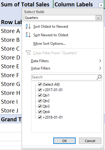
4. Filtering data in a pivot table
To filter the data in the pivot table, you’ll need to click on the Column Labels button since the dates are in columns. Then you will see a drop-down option to select the field you want to filter:
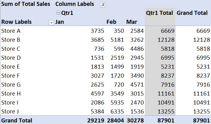
What you can do now is to select the specific quarter that you’re looking for. If you select just the first quarter, then the pivot table will update accordingly:
You’ll notice now the grand total has been updated to include only the data that has been filtered for, rather than everything in the pivot table.
5. Changing the way fields are formatted in a pivot table
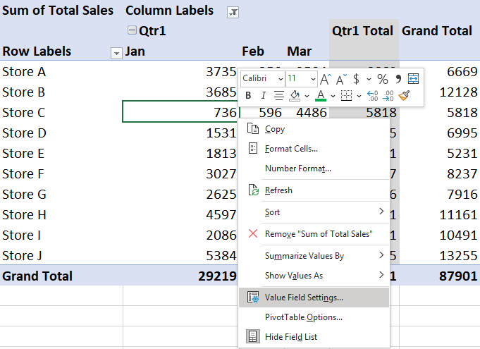
The pivot table looks okay so far except that the way the numbers are formatted is far from optimal. It doesn’t show dollar signs nor is there a comma separating thousands; it’s just not very readable for users at this point. But it can easily be fixed.
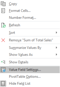
While you could just select the entire columns and make changes like you might normally do to ordinary cells but the problem with that is that it’s only a temporary solution; if you refresh the pivot table, the formatting will go back to what it was before. In order to change the formatting for a field permanently, you’ll need to right-click on one of the data points and click on Value Field Settings.
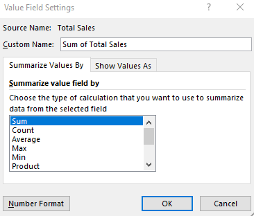
Next, click on the Number Format in the below screen:
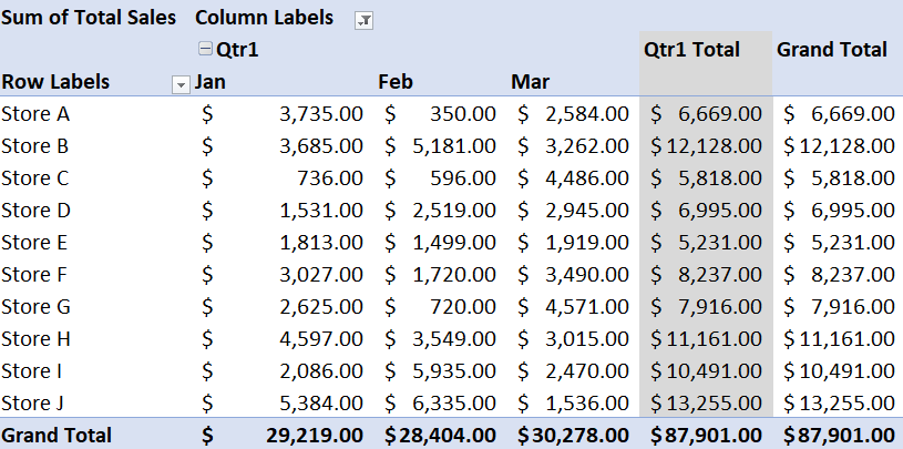
Then it’s just a matter of selecting the number format that you want to use. For dollar signs and a comma after the thousands, Accounting format is the best option. Selecting that, the pivot table will now show the following:
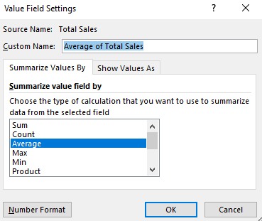
6. Changing pivot table values to look at averages
Currently, the pivot table shows the total sales, but it can be adjusted to show the average sales — this will be made up of the average of each individual line item. This can be useful if you want to see the average transaction size per location. To switch to average, right-click on any of the dollar amounts and again go back and select Value Field Settings.
From there, change from Sum to Average. If you click on OK now the table will show averages
You will notice at the top now instead of Sum of Total Sales it now says Average of Total Sales.
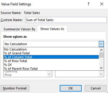
7. Show values as a % of a column or row
Rather than averages, now let’s show the values as a percentage of the total month. Again, go back to Value Field Settings and change the calculation back to Sum and then click over on the tab on the right called Show Values As.
In the drop-down selection, select % of Column Total. This will give show the data as a % of the total for the month. Since the dates are in the columns, you would select columns here. After clicking OK, the pivot table looks like this:
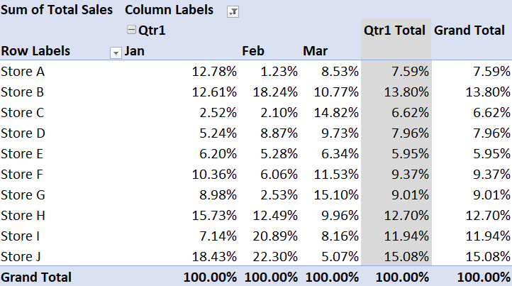
Now it’s easy to see the proportion of sales for the month came from each store. Alternatively, you can also see which month made up most of a store’s sales by using % of Row Total rather than the column total. For now, let’s revert back to just showing totals. To do this, just go back to Value Field Settings and under the Show Values As tab select No Calculation.
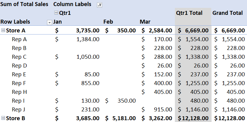
8. Adding more fields and changing views to tabular
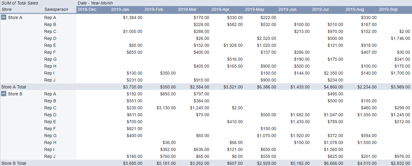
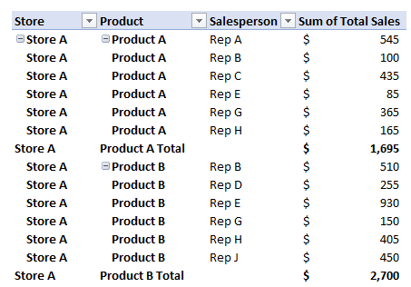
Next up, let’s also add another field, Salesperson, to the rows section which will group the data even further. If you want the pivot table to first be sorted by Store and then Salesperson, the Salesperson field should be dragged under the Store field. If you want the pivot table to first sort by Salesperson and then by Store, then the Salesperson field will need to be above the Store field.
In this example, let’s put the Salesperson field underneath the Store field since it’s might be a more logical hierarchy in this case. After adding the field, you’ll get to a common pivot table problem: it’s in a format that’s just not ideal.
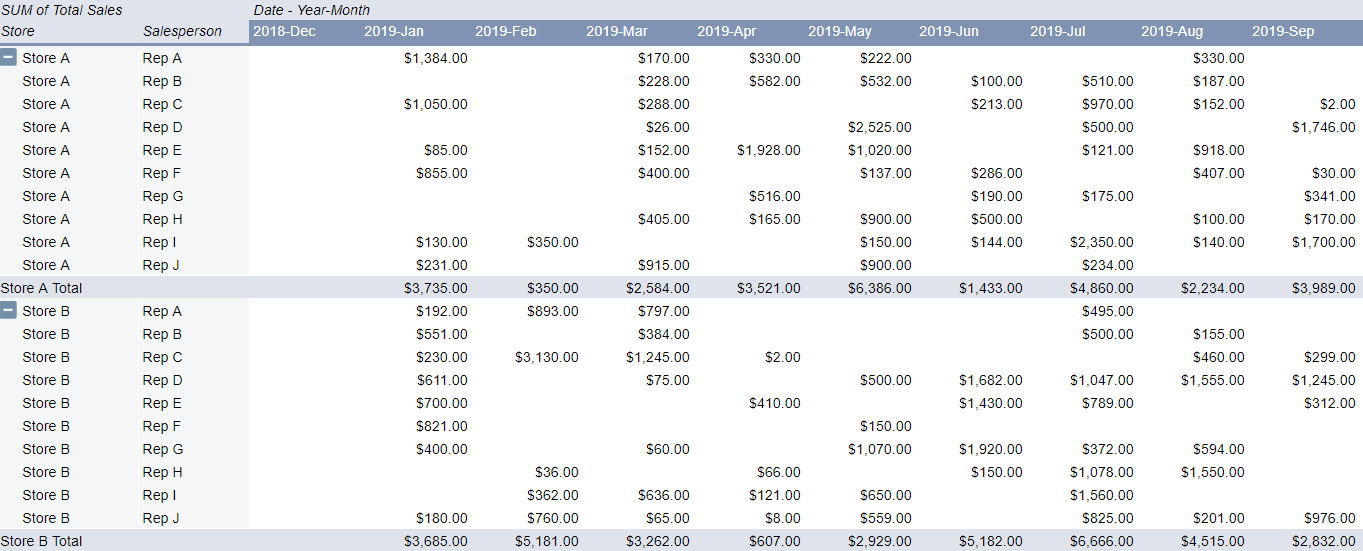
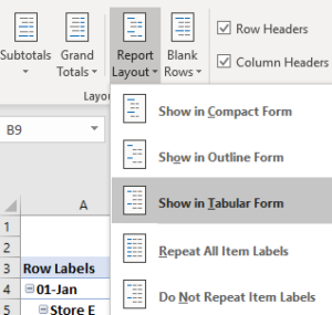
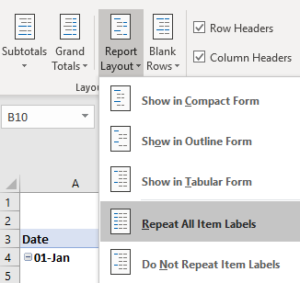
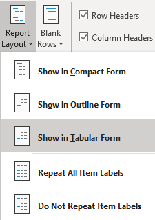
If you want to use the pivot table in a formula or copy it as values somewhere, then this format, Compact, it’s not very helpful since it doesn’t have all the information on one line. Ideally, the store field should show on every line. To do this, go under the PivotTable Tools section again and under Options/Analyze (or the Design tab) and click on Report Layout and select Show in Tabular Form
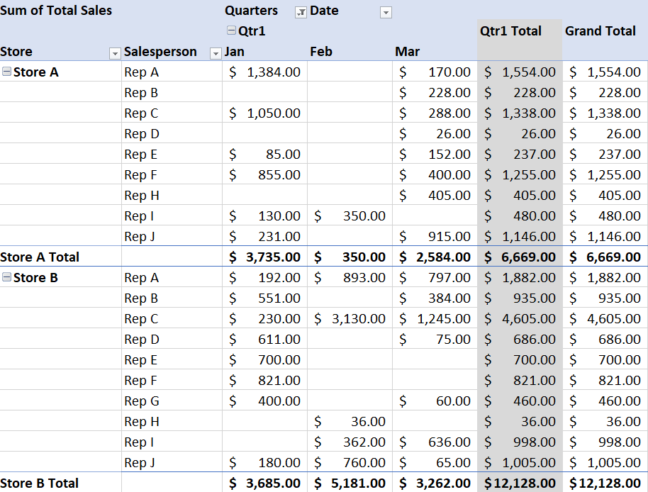
The pivot table should now look like this:
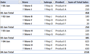
The layout now has store and salesperson on the same line, but only for the first line. The store field is still showing blank for many of the items.
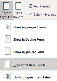
To fix this, go back to the Report Layout options and this time select Repeat All Item Labels
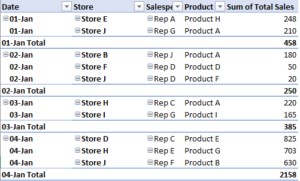
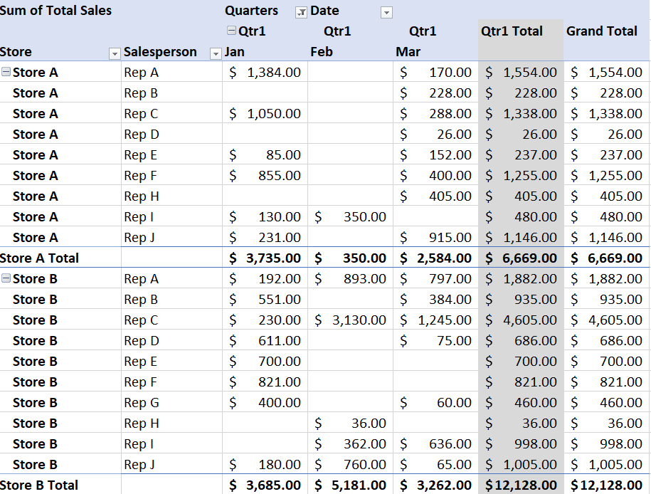
Here’s the updated pivot table:
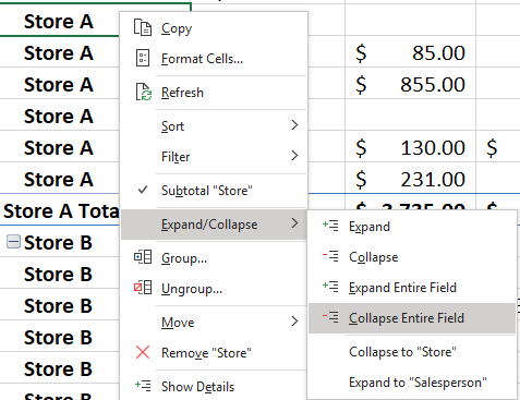
This is an easier format to follow since it has all the relevant data on one line and it is easier to read. If you don’t want to see all the stores and the salesperson detail, you can collapse the field by pressing on the – button next to the store name at the top. This will change it to a + and collapse the field. If you want to do this for all stores, right-click on any store and select Expand/Collapse and select Collapse Entire Field.
This will now give you a tidier pivot table:
9. Viewing contents that make up a cell
Lastly, let’s go over how to see the contents of a cell. As mentioned earlier, one of the benefits of a pivot table is that you can simply double click on a cell to see what makes up its amount.
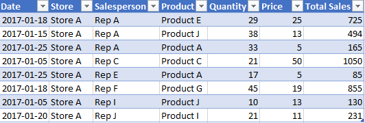
For instance, by double-clicking on the cell in the first row for $3,735, it will open a new sheet with the following data:
What this tells you is that the cell was made up of all of these entries. If you were to double click on the grand total, you would see all of the transactions in the entire pivot table. Once you’re done looking with the tabs, you can modify them how you like or even close them out as they won’t impact the pivot table itself.
More content on pivot tables
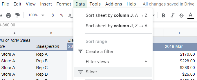
This was just an overview of some of the basic things you’d probably want to do when learning how to create a pivot table in excel. There are more complex items and you can look here for how to use slicers and here for how to make a dashboard.
If you’ve found this content useful please give us a like on Facebook and be sure to check out the many templates that are available on our site.