

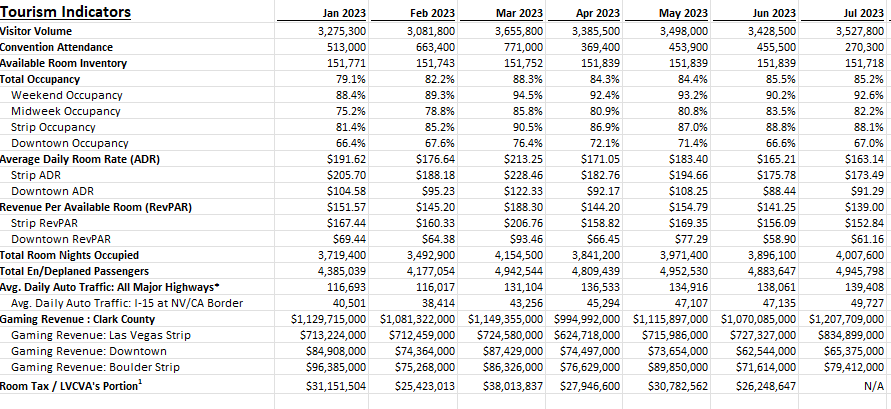
A good way to gauge the strength of the U.S. economy and how well it is returning to normal level is by looking at Las Vegas’ visitor data. The Las Vegas Convention and Visitors Authority (LVCVA) has plenty of important metrics that it tracks on its website. From the number of visitors to the city to occupancy levels to daily room rates, and other key performance indicators (KPIs). Using data from that website, which you can find here, I’ll guide you through the step-by-stop process as to how you can build a dashboard to track some of those key metrics.
Step 1. Preparing and consolidating the data
One of the most important parts of data analysis is to clean up your data from the beginning. By doing this, you’ll avoid headaches later on. It’ll also make it easier for you to do analysis in the first place. To get a proper glimpse of how Las Vegas is doing now, it’ll be useful to track multiple years. On the LVCVA website, you can download data for multiple years. For this example, I’m going to download data from 2019 through to 2023 YTD.
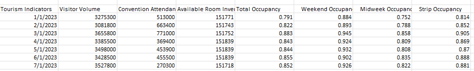
This is what one of the files looks like:
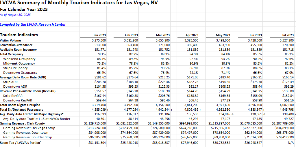
As of writing this article, data for 2023 is available up until the end of July. Since the data is organized in the same format on all of the files I’m downloading, I can just copy and paste one year after another. The key is for the rows to line up.
But I still need to clean up this data. One problem is that there are gaps between the months. Once I’ve loaded all the years together, I’ll remove those blank columns. The easiest way to do this is the highlight the top row. Then, press F5 and select Special. There will be an option to select Blanks:
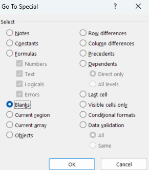
Then, all those gaps are selected:
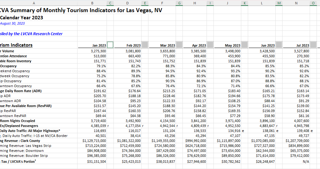
If your right-click on any one of them, select Delete, choose Entire Column, and press OK. Now those columns are gone:
There’s still one problem here. The way the data is structured right now isn’t useful when creating pivot tables. And if you’re creating a dashboard, you’ll want to be able to create pivot tables easily. Doing so can make it easy to create reports on the fly and easy to make changes. It’s easier to have dates going vertically than horizontally to scroll through data. So what I will do is use the TRANSPOSE function to flip it. All that’s necessary here is to use the function and select your entire data set. Then, voila:
Before I make any further changes, I want to convert this into values. Since I used the TRANSPOSE function, it’s sitting as an array. To change this, I’ll select the entire data set, press CTRL+C, and then press CTRL+SHIFT+V to paste as values. If you don’t have that functionality on your version of Microsoft Excel, right-click and select Paste Special and click on Values.
I will also add a few more columns to make the analysis easier. I’ll create a column for the month and year. This will involve using the MONTH and YEAR functions. The only argument that is needed is the original date, which in the screenshot above, appears under ‘Tourism Indicators.’
And since I want to compare 2023 to 2019, I’ll add a column for ‘Current Period’ and ‘Comparable Period.’ The point of this is to make sure that I can filter the current YTD values against the same values from 2019. Since I have data up until July, any comparisons should also run up until July 2019. For the Current Period, I’m using the MAXIFS function to grab the maximum value for the Month field for the current year (I can use the TODAY function to make it dynamically pull in the current year). Then, for the Comparable Period column, I can compare the Month field to see if it is less than or equal to the Current Period. If it is, then I’ll set the value as a “Y” to indicate it falls in the comparable period or “N” if it doesn’t. This way, if I come across month 8 and my current period only goes up to 7, it will mark that as an “N” which will allow me to easily filter out those results.
Lastly, I will convert all this data into a table. The purpose of this is so that I can easily reference the different fields later on, without having to remember column letters. To convert this into a table, select Insert and click on Table. Then, on the Table Design tab, you can name the table something that’s easy to remember. In my example, I’ll refer to it as tblConsolidated.
Step 2: Identifying the KPIs to track
Before rushing out to create the pivot tables, it’s important to know what you want to track. You don’t want to create a pivot table and track everything possible, otherwise it won’t be a useful summary, which is what a good dashboard should aim to do. That’s why you should devote some time to identify what some of your KPIs should be.
There are a lot of metrics on here and these are the ones that I am going to use, which will help gauge how active and busy Las Vegas is:
- Visitor volume. Obviously the number of people visiting the city is a great indication of how many people there are.
- Occupancy levels. If hotels are booked up, that’s another positive sign that the city is busy.
- RevPAR. This takes the room revenue divided by the number of available rooms. It shows how well a hotel is filling up its rooms at a given rate.
- Average Daily Rate. This is partly reflected in RevPAR but it can be a useful indicator as people are more familiar with room prices than they are with RevPAR, especially those who visit Las Vegas often.
- En/Deplaned Passengers. This is a helpful metric to know how much out-of-town traffic there is coming to the city.
- Average Daily Auto Traffic. With this metric, readers can see how busy the roads are.
- Gaming Revenue (Las Vegas Strip). This is another important KPI because it tracks how much people are spending at casinos.
Step 3: Creating the pivot tables
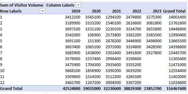
Now it’s on to creating a pivot table for each KPI you want to track. To make this process easier, just create a pivot table one time, and then copy it for as many charts that you want to create. This way, you don’t have to go back and select Insert->Pivot Table over and over again. Just make sure to leave enough room so that they don’t overlap, otherwise you’ll encounter errors.
It’s also a good idea to label your pivot tables by going into the PivotTable Analyze tab. For a pivot table to track visitor volume, you might want to call that ptVisitorvolume, for example. This will be helpful later on if you want to change charts and aren’t sure what PivotTable1 relates to. You’ll also likely want to change the default formatting for a pivot table:
To change the format, don’t just highlight the cells and make the changes, otherwise they’ll revert back once you update the data. Instead, right-click on one of the values and select Value Field Settings. Then, select Number Format and apply the formatting you want to apply to that field.
What I also like to do is put all the pivot tables on a separate tab to keep them organized, while all the charts will go on a main tab dedicated for the dashboard.
Step 4: Creating the charts
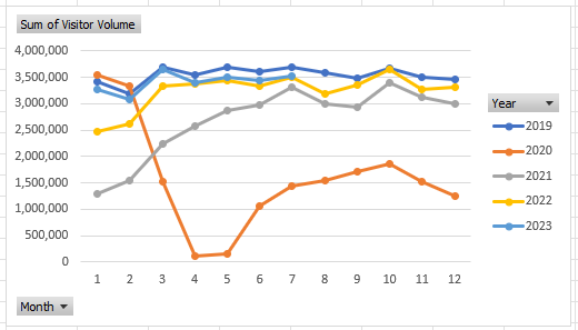
When creating your charts, one thing to consider is how you want the data to be visualized. You can do this as part of the stage to identify KPIs. For visitor volume, for example, I’ll use a line chart since I want to see the month-over-month progression. This will also make it easy to compare against multiple years.
Since these are charts created from pivot tables, they are pivot charts, and they come with drop-down options:
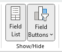
They aren’t terribly appealing and to get rid of them, click on the chart, select the PivotChart Analyze tab and unselect the option for Field Buttons:
One thing that can help with creating charts is by using Excel’s existing Chart Styles, which are on the Design tab (which is visible if the chart is selected):
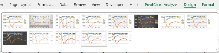
This can be an easy way to customize your charts without having to do so manually.
You may also want to adjust how the data is displayed. Visitor volume, for example, may make sense to leave as the default, which is a summation. But when looking at ADR or RevPAR, you wouldn’t want to sum those values up. Instead, you may want to calculate the average instead. To do that, right-click on one of the fields and select Summarize Values By and select Average
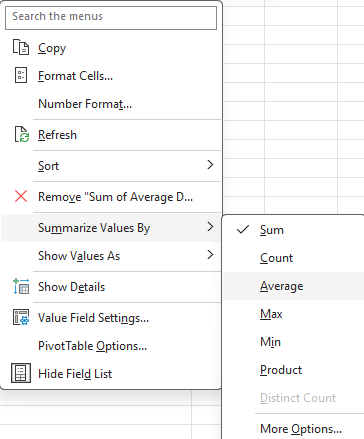
Now, you’ll see an average based on period, which makes more sense than summing up prices.
At this point, it comes down to your personal preferences as to how you want to design the charts, and it would be far too deep to try and get into all those options here. However, I’d suggest mixing up a bit of bar and column charts and also changing up the colors so your dashboard doesn’t look like the same item over and over.
Some additional things you may want to consider are:
- Adding data labels. And if you do use them, consider not using axis labels;
- Using legends where and when make sense to do so;
- Adding background images to your charts to have a different look and feel to them;
- Having descriptive titles to help summarize what the chart is displaying;
- Not plotting too much on on chart. You may want to consider plotting years instead of months;
- Not using a border color so that your charts blend in with the background.
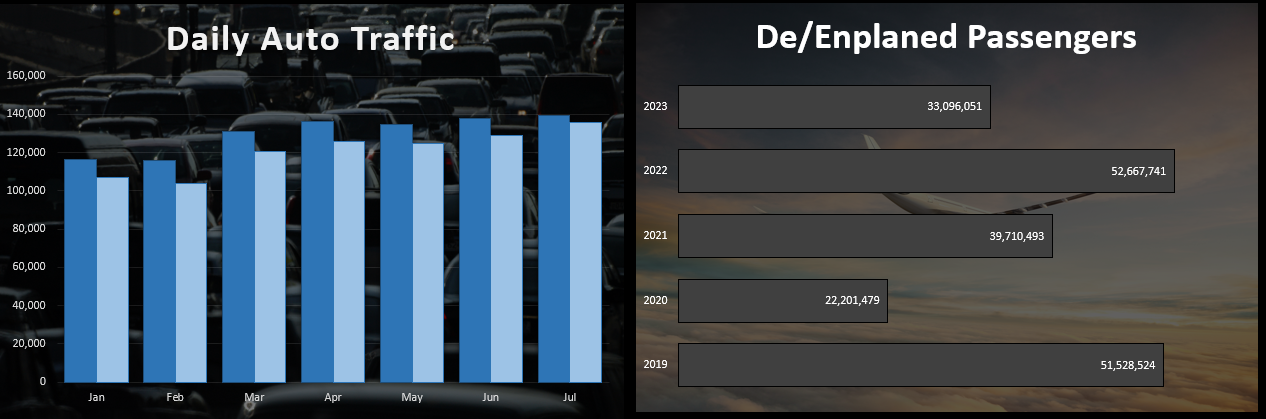
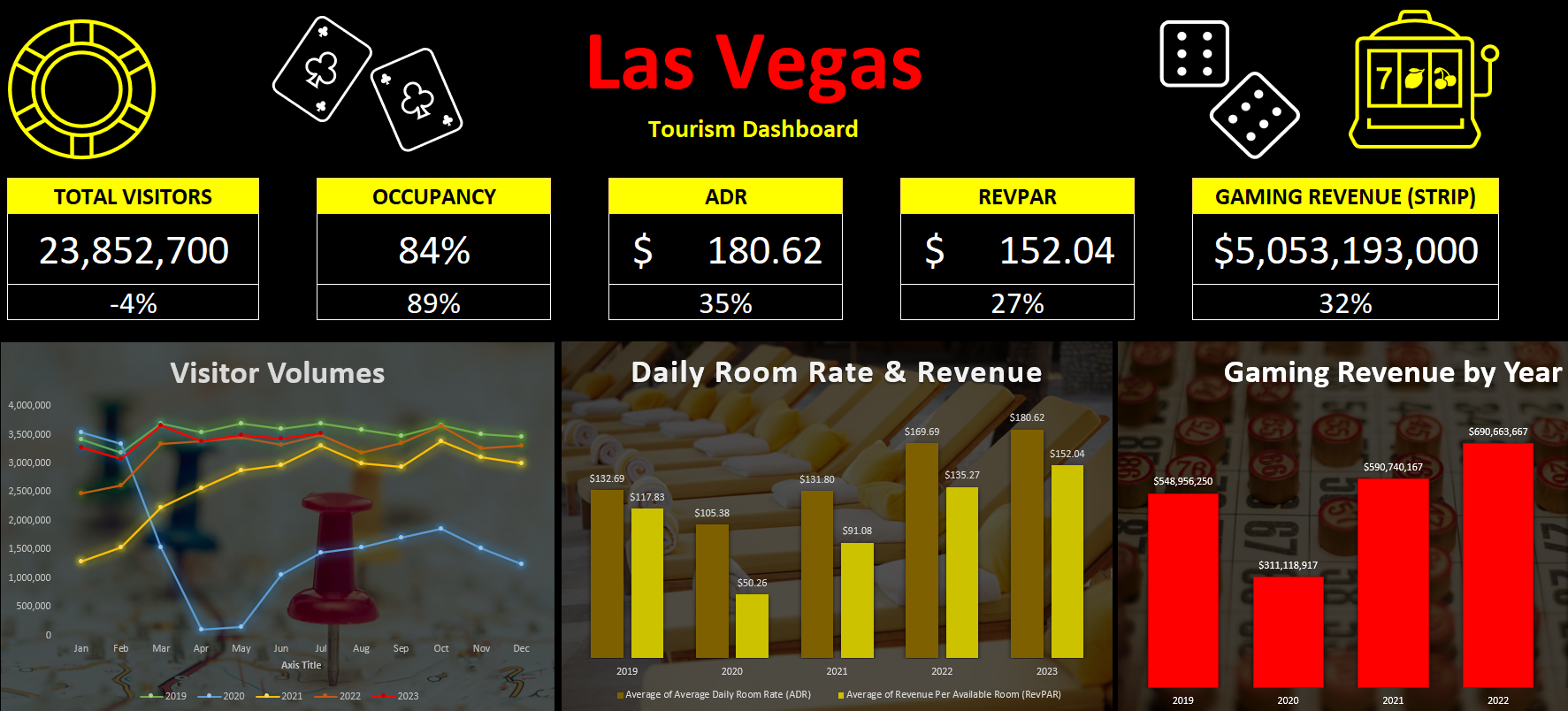
Here are a couple of charts I created with images in the background to make it clear what they are showing:
Step 5: Adding key numbers at the top for further emphasis
Charts are good, but what can also be useful is to put key numbers right at the top so that readers don’t have to spend much time looking for the most important metrics. For example, using formulas, you can pull in the total number of visitors for the period, the occupancy rate, the ADR, RevPAR, and other items, based on the latest information.
While these can be good to include in charts, by making them big and allowing them to stand out as soon as you open up the dashboard, it can help drive the point home even further.
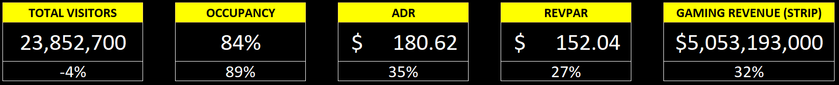
In the example above, I have a list of the current metrics along with the growth rate or comparable percentage from 2019, to help show how the metric is doing compared to that year. You could also add conditional formatting to this to highlight where there is an improvement and where things may have worsened.
Step 6: Finishing touches
Once you’ve got your charts and metrics all on there, the last piece of the puzzle is to add a title as well as any icons or images that may be relevant to help give some added pop to your dashboard. If you go to the Insert tab, you can use that to pull in pictures from the internet. Excel also has built-in icons and stock images that you can use, just by doing a search:
This can be an easy way to help your dashboard stand out even further. Here’s a snapshot of the dashboard I created:
If you liked this post on How to Create a Dashboard to Track Las Vegas’ Visitor Data, please give this site a like on Facebook and also be sure to check out some of the many templates that we have available for download. You can also follow me on Twitter and YouTube. Also, please consider buying me a coffee if you find my website helpful and would like to support it.