SolverExcel

How to Use Solver in Excel: A Simple Step-by-Step Guide

Have you ever stared at a complex business problem in Excel, wondering what the best possible solution is? You might be trying to maximize profit, minimize costs, or hit a specific target, but you have a long list of limitations — like a budget, time limits, or resource constraints.

Instead of manually changing numbers for hours (doing a what-if analysis), you can use Excel’s Solver.

Solver is a powerful add-in that finds the optimal solution for a problem by adjusting a set of input cells while taking into account a set of rules and constraints you define. It’s like Goal Seek on steroids: while Goal Seek finds a single input for a single output, Solver can juggle multiple inputs and complex limitations all at once.

Here’s how to get started.

Step 1: First, Enable the Solver Add-in

By default, Solver isn’t visible on the ribbon. You need to “turn it on” first.

  1. Go to File > Options (at the very bottom).
  2. In the Excel Options window, click on Add-ins from the left-hand menu.
  3. At the bottom of the window, see the “Manage:” dropdown. Make sure it says Excel Add-ins and click Go…
  4. A new, smaller window will pop up. Check the box next to Solver Add-in and click OK.

You will now see a new Solver button on the far-right-hand side of your Data tab.

Step 2: Understand the 3 Key Parts of the Solver Equation

Before we build our example, you need to know the three components Solver works with.

  1. Objective Cell (The Goal): This is one single cell that you want to optimize. It must contain a formula. You’ll tell Solver you want to make this cell’s value:
    • Max (e.g., maximize total profit)
    • Min (e.g., minimize total cost)
    • Value Of (e.g., hit a target sales number of exactly $1,000,000)
  2. Variable Cells (The Levers): These are the cells that Solver is allowed to change to reach your objective. These are your “decision” cells, like the number of units to produce, the amount of money to invest, or the hours to assign to a project.
  3. Constraints (The Rules): These are the rules and limitations that restrict your variable cells. They ensure the solution is realistic. For example:
    • “We can’t spend more than our $10,000 budget.”
    • “We must produce at least 50 units.”
    • “The number of hours worked can’t be negative.”
    • “The number of units produced must be whole numbers (integers).”

Step 3: Set Up Your Model & Run Solver (Example)

Let’s use a classic business problem. Imagine we run a small bakery that makes two products: Cakes and Cookies. We want to find the perfect product mix to maximize our total profit.

Part A: Prepare the Model in Excel

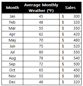
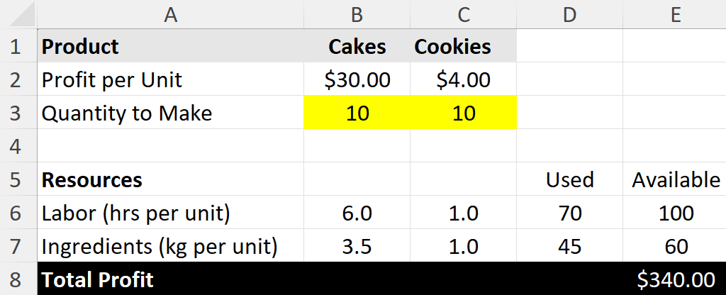
Here’s an example of what the data might look like.

First, set up your data like this. The yellow cells (B3 and C3) are the Variable Cells (the ones we’ll tell Solver to change). The total profit cell (E8) is our Objective Cell. Right now, we’re making an equal number of cakes and cookies, but our resources are underutilized.

A business problem in Excel where a company is selling cakes and cookies.

Key Formulas:

  • Total Profit (E8): =B3*B2+C3*C2
  • Labor Used (D6): =B3*B6+C3*C6
  • Ingredients Used (D7): =B3*B7+C3*C7

Right now, making 10 cakes and 10 cookies gives us a profit of $340. But are we using our resources well? Can we do better? Let’s ask Solver.

Part B: Use the Solver Dialog Box

  1. Click the Data tab and click the Solver button. The main dialog box will appear.
  2. Set Objective: Click in the box, then click cell E8 (our Total Profit cell). Select the Max radio button.
  3. By Changing Variable Cells: Click in this box. Select cells B3:C3 (the “Quantity to Make” for both products).
  4. Subject to the Constraints: This is where we add our rules. Click the Add button.
    • Constraint 1 (Labor): Cell Reference: D6 (Labor Used) <= Constraint: E6 (Labor Available). Click Add.
    • Constraint 2 (Ingredients): Cell Reference: D7 (Ingredients Used) <= Constraint: E7 (Ingredients Available). Click Add.
    • Constraint 3 (No negative products): Cell Reference: B3:C3 >= Constraint: 0. (We can’t make negative cakes). Click Add.
    • Constraint 4 (Integers): Cell Reference: B3:C3 = integer (This forces Solver to find whole numbers, as we can’t sell half a cake). Click OK.

Your Solver window should now look like this:

Solver window in Excel looking to calculate the most profit for a bakery.
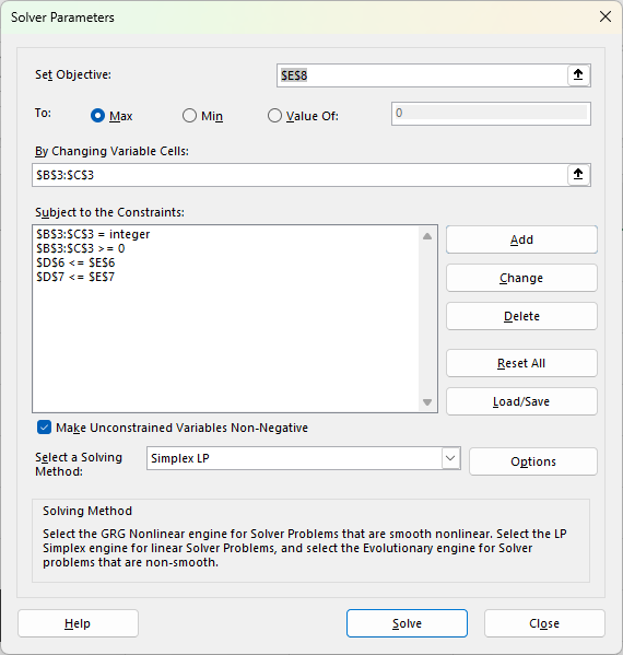
  1. Make sure “Make Unconstrained Variables Non-Negative” is checked (it’s good practice).
  2. Select a Solving Method: For simple problems like this, Simplex LP (Linear Programming) is the best and fastest choice.
    • Pro-Tip: Always try Simplex LP first. If Excel tells you the problem isn’t linear, try GRG Nonlinear next. Use Evolutionary as the last resort when your model is truly complex and non-smooth.
  3. Click Solve!

Part C: Get the Answer

Solver will run for a moment and then a new window will pop up, “Solver Results.”

Solver has found a solution in Excel.

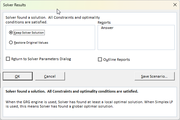
Solver found a solution. All constraints and optimality conditions are satisfied.

This is great news! You can see the solution in the background. Excel has changed your Variable Cells (B3 and C3) to the optimal numbers.

  • Quantity to Make (Cakes): 16
  • Quantity to Make (Cookies): 4

This new mix gives us a total profit of $496 (cell E8), which is better than our initial $340 guess, and it perfectly uses all 100 hours of labor and all 60kg of ingredients.

The result that Solver comes up with in Excel, based on the variables and constraints.

Click OK to keep the solution.

When Should You Use Solver?

Solver is incredibly versatile. Use it any time you need to find the “best” answer while balancing limitations.

  • Finance: Find the optimal investment portfolio to maximize returns for a given level of risk.
  • Operations: Create a production schedule that minimizes cost while meeting all customer orders.
  • Staffing: Design a weekly staff schedule that meets shift requirements with the fewest employees.
  • Marketing: Allocate an advertising budget across different channels (TV, digital, radio) to get the maximum exposure without exceeding the total budget.

If you liked this post on How to Use Solver in Excel: A Simple Step-by-Step Guide, please give this site a like on Facebook and also be sure to check out some of the many templates that we have available for download. You can also follow me on X and YouTube. Also, please consider buying me a coffee if you find my website helpful and would like to support it.

RevPAR

How to Calculate RevPAR in Excel Using a Formula

Revenue per Available Room (RevPAR) is one of the most important metrics in the hospitality industry. It tells hotel owners and investors how efficiently a property is generating revenue from its available rooms. Whether you manage a small motel or analyze hotel stocks, knowing how to calculate and track RevPAR is an essential metric to know how a business is doing. It’s similar to the Average Daily Rate (ADR), but there are important differences to be aware of.

In this guide, I’ll cover:

  • What RevPAR and ADR are (and how they differ)
  • The formulas for each metric
  • How to calculate them in Excel
  • A real-world example dataset

Download the practice file here

How do you calculate RevPAR and ADR?

RevPAR stands for Revenue per Available Room. Unlike average daily rate (ADR), which only looks at occupied rooms, RevPAR takes into account all available rooms, giving you a more complete picture of overall performance.

The formula is as follows:

RevPAR = Room Revenue / Rooms Available

You can also calculate it an alternate way:

RevPAR = ADR x Occupancy Rate

Meanwhile, the formula for ADR is the following:

ADR = Room Revenue / Rooms Sold

As you can see, there is a close relationship between RevPAR and ADR, but each one gives you slightly different information.

A sample data set and calculation

In the below example, which is a sample projection, dates are filled in for 2026 with estimated rooms sold and room revenue. The hotel has 100 rooms available, which doesn’t change over the course of the year.

Hotel revenue in Excel showing dates, available rooms, rooms sold, and room revenue.

To calculate the ADR, we need to take the total room revenue and divide it by the number of rooms sold:

Hotel revenue in Excel showing dates, available rooms, rooms sold, room revenue, and ADR.

Now, to calculate RevPAR, we’ll take room revenue and divide it by rooms available:

Hotel revenue in Excel showing dates, available rooms, rooms sold, room revenue, ADR, and RevPAR.

An alternative way to calculate this would be to compute the occupancy rate for each date, and then multiply that by the ADR:

Hotel revenue in Excel showing dates, available rooms, rooms sold, room revenue, ADR, and RevPAR.

As you can see, unless there is full occupancy, the RevPAR will always be lower than the ADR, simply because its denominator is larger (rooms available versus rooms sold).

Analyzing the data

Now that you’ve setup a data set showing these metrics, you can analyze it in Excel in a couple of ways. One way is through the creation of a pivot table, where you can summarize data by months at a time. You can put the date in the Rows section and then group by months. And by putting the ADR, RevPAR, and Occupancy fields into the values section, and setting them to display the average (rather than the sum), you can have an easy way to summarize your key performance indicators:

Pivot table showing ADR, RevPar, and Occupancy rates for a hotel.

In addition, you could create a chart to compare ADR, RevPAR, and Occupancy, to identify trends and patterns in the data set. In the chart below, I’ve plotted all three items on line charts. I’ve put the occupancy on a secondary axis and adjusted the scale so that it fits firmly below the ADR and RevPAR figures, ensuring there is no overlap.

Excel chart comparing ADR, RevPAR, and Occupancy rates.

If you liked this post on How to Calculate RevPAR in Excel Using a Formula, please give this site a like on Facebook and also be sure to check out some of the many templates that we have available for download. You can also follow me on Twitter and YouTube. Also, please consider buying me a coffee if you find my website helpful and would like to support it.

Sales data set in Excel.

How to Do an 80/20 Sales Analysis in Excel

Marketers know that typically 80% of sales come from just 20% of customers, and by focusing on that group, you can gain valuable insights into your data. With the help of Excel, it’s easy to determine not only who your top 80% of customers are, but also how much revenue they’re actually bringing in. In the example below, we’re going to go over how to do such an analysis, and identify how much your top 20% and bottom 20% of customers generate.

And you can also do further analysis by looking at the top 10% or whatever cutoff points you want. In this example, we’ll create a spreadsheet which will allow you to set these different cutoff points however you want.

This is the data set that I’m going to use for this example.

Sales data set in Excel.

Step 1: Convert the data into a pivot table

The first thing we’ll want to do is to convert this into a pivot table. By doing this, we can sum up the totals by individual customers. We don’t want to apply the analysis on raw numbers as that will only give us the top invoices when instead, we’re looking at sales by customers.

If you select a cell on the data and go to the Insert tab, you can click on the button to create a Pivot Table. Then, pull the sales data into the fields section and the customer field into the Rows section. This now creates a summary by customer.

Pivot table showing sales by customer.

Step 2: Calculate the cutoff points

Now that the data is grouped by customer, we can start to calculate the sales by different percentiles. If you want to determine the top 20%, then we need to get the 80% percentile. At that level, the values will be higher than 80% of the rest of the data, and thus, leave us with the cutoff for the remainder, the top 20%.

With the sales data in column B, we can use the following formula to get this cutoff point:

=PERCENTILE(B:B,0.8)

The 0.8 indicates the 80% percentile, which means that the value returned is higher than 80% of the values in the data set. In my data set, this returns a value of 276.34. Any customer whose total is at or above this cutoff point means that they are part of the top 20%.

To get the cutoff value for the bottom 20%, the same formula is used, except now for the second argument, the value is set to 0.2. This returns a value of 101.90. In this situation, we’ll be focusing on values at or below this cutoff.

Step 3: Calculate the sales that fall within the top and bottom 20%

Now, let’s calculate the total dollar amount of the sales that fall in the top and bottom 20% ranges. For the top 20%, we’ll need to sum up all the values that are equal to or greater than that cutoff point of 276.34. With that value in cell B3, my formula is as follows:

=SUMIF($B$9:$B$1000,”>=”&$B3)

The pivot table sales field is in column B. This calculation returns a value of $35,072. That is the total dollars that my top 20% of customers have generated.

To calculate the bottom 20%, we can use the following formula, assuming that the cutoff point for 101.90 is in cell B4:

=SUMIF($B$9:$B$1000,”<=”&$B4)

The total of this value is 7,894, and that indicates how much revenue the bottom 20% have brought in.

We can visualize these data points by plotting them on a column chart:

If you want to calculate different percentiles and cutoff points, you just need to adjust the second argument in the percentile formula.


If you liked this post on How to Do an 80/20 Sales Analysis in Excel, please give this site a like on Facebook and also be sure to check out some of the many templates that we have available for download. You can also follow me on Twitter and YouTube. Also, please consider buying me a coffee if you find my website helpful and would like to support it.

WeeklySalesReports2

Compare Weekly Sales in Excel Using a Pivot Table

Do you need to create weekly sales reports that compare the same days of the week? This kind of analysis can be tricky to ensure that you are comparing the same day of the week against the same week in the previous year. Simply comparing dates may not be sufficient, as you could end up comparing a Sunday’s revenue numbers against a Friday’s, and depending on the industry you are in, the results could look drastically different. In this post, I’ll show you how you can make reliable comparisons which look at the same weeks and the same days of the week.

Preparing the data

Let’s start with a pretty simple data set which just has the date and the sales amount, as such:

A table in Excel showing daily sales data.

The data set contains sales for January and February of 2024 and 2023. To facilitate the comparisons, I’m going to add fields for the week # and the day of the week. For the week, I can use the WEEKNUM function, which just takes the date as a single argument. And for the day of the week, I’ll use the TEXT function, which can use the “dddd” format type to specify the day. Here’s how the data looks after I’ve added those fields:

A table in Excel showing daily sales data with week and day of the week information.

Loading the data into a Pivot Table

Now that my data is ready to analyze, I can create a pivot table. While any cell on the data set is selected, I’ll click on the Insert tab and select Pivot Table. Next, I’m going to set up the pivot table as follows:

  • Columns: Year
  • Rows: Week , Day
  • Values: Sales Amount

To get the year to show, I’ll select the Date field and put the Years (Date) value under columns. You could also create a formula in the previous step to calculate the year value based on the date. Here is what my pivot table looks like thus far:

Pivot table showing sales by week and day.

There are a few things I will do improve the appearance and usefulness of the pivot table, including:

  • Removing the grand total, since I’m comparing and not adding the values.
  • Changing the report layout to a tabular format so that the Week values will now create subtotals.
  • Change the value field settings for the Sales Amount so that it resembles a currency format.
Pivot table showing sales by week and day after applying formatting.

Now, I’m ready to do the analysis in the pivot table.

Comparing values in a Pivot Table

If I want to compare values from one year to the next, I need to pull in another field for the values section. I’m going to pull in the Sales Amount into the section again. While at first, this looks like I’m just duplicating the values, I’m going to change the appearance of the second field. If I click ok the Sum of Sales Amount2 field and select Value Field Settings, I can change how the values are shown. Instead of a sum, when selecting the Show Values As tab, I have the ability to select % Difference From:

Selecting the percent difference from in a pivot table.

I then select my base field. I need to select the Years (Date) field, since I’m comparing years. As for the base item, I’m going to select (previous). If you’re always going to be comparing against a certain year, you can select the specific year. But if you always want to be comparing against the previous year, choose previous.

Selecting the percent difference from a previous year in a pivot table.

I have also renamed the field to ‘Revenue Growth %’ to signify that the value in the field represents the growth (or decline) compared to the previous year. Here’s how my data looks with the new field:

Pivot table showing percent change from the previous year.

There are a few things I need to fix there. The first is that I have a #NULL! error in the first row. This is because in the previous year, there was no sales, presumably as this would have been a holiday. To fix this, I can go into the Pivot Table options and check off the option For error values show and just leave it blank.

Setting the for error values show in a pivot table to be blank.

That gets rid of the error. Another thing I need to do is get rid of the unnecessary revenue growth field for 2023. As there is no comparable, it will always be blank for the first year. The simple solution here is to just hide the column entirely. Now I’m left with a pivot table that shows my sales data by week, day, and year, and the year-over-year change in percent:

Pivot table showing year-over-year change in revenue by week and day.

One last thing you may want to do is add some conditional formatting, to help highlight the good and bad weeks and days. Using a directional icon set could help make the results stand out:

Creating conditional formatting rules with icon sets in Excel.

By using this formatting, any values where the growth rate is more than 5%, will have a green triangle. Anything less than 0 will be red, while anything in-between will show a yellow horizontal line.

Pivot table showing year-over-year change in revenue by week and day with conditional formatting applied to highlight good and bad days.

If you liked this post on How to Compare Weekly Sales in Excel Using a Pivot Table, please give this site a like on Facebook and also be sure to check out some of the many templates that we have available for download. You can also follow us on Twitter and YouTube.

ComparisonCharts

How to Create Effective Comparison Charts in Excel

Comparison charts are invaluable tools in Excel, widely used across business, education, and research to visually represent data. These charts not only simplify complex information but also highlight key trends and comparisons. A comparison chart in Excel is a visual representation that allows users to compare different items or datasets. These charts are crucial when you need to show differences or similarities between values, track changes over time, or illustrate part-to-whole relationships.

In this article, we’ll compare a company’s sales, expenses, and overall profits by year. Here is some sample data:

Excel table showing sales, expenses, and profit by year.

Types of Comparison Charts in Excel

There are many types of charts you can use in Excel to compare data. Here are a few examples of common charts you might use when comparing data, and how they look:

  • Bar Chart:
    Creating a bar chart in Excel starts with selecting your data and choosing the ‘Bar Chart’ option from the ‘Insert’ tab. Bar charts are particularly useful for comparing individual items or categories. To enhance readability, consider adjusting the bar colors and adding data labels. In the bar chart below, you can easily compare sales versus expenses versus profits, and also compare those values by year.
A bar chart in Excel.
  • Column Chart:
    Similar to bar charts but oriented vertically, column charts are ideal for showing changes over time. After selecting your data, choose ‘Column Chart’ from the ‘Insert’ tab. Play with colors and axes to make your chart stand out. Whether you prefer to go with a column chart or a bar chart may simply come down to your preference.
A column chart in Excel.
  • Line Chart:
    Line charts are perfect for tracking trends over periods. Select your data, click ‘Insert’, and then ‘Line Chart’. Customize your line chart by changing line styles and adding markers for key data points. Line charts may be more useful when there are fluctuations that you want to plot. Here is the chart based on the current sample data:
A line chart in Excel.

Here’s a look at the chart when there are greater fluctuations in the data:

A line chart in Excel with fluctuations.
  • Pie Chart:
    For part-to-whole comparisons, pie charts are your go-to option. After selecting the data, find ‘Pie Chart’ under the ‘Insert’ tab. Enhance your pie chart by experimenting with different slice colors and adding a legend for clarity. This is ideal when you want to compare individual parts of a greater total. Suppose you wanted to analyze what made up the company’s sales. This is where a pie chart might be most appropriate:
A pie chart in Excel that compares revenue by product.

Excel has many more charts available for you to use, but these are good starting options when doing analysis. After you’ve selected the right chart, there are further enhancements you can focus on.

Tips for creating effective comparison charts

Here are some tips and things you can focus on to make your charts even better:

  • Simplify and Focus: Avoid cluttering your chart with too much information. Focus on the key data points you want to compare. This can sometimes mean creating multiple charts instead of trying to fit everything into one.
  • Use Appropriate Scale and Axes: Ensure that your axes are scaled properly to accurately reflect the differences in data. Misleading scales can lead to incorrect interpretations.
  • Color and Design: Use color effectively to differentiate data sets and draw attention to key points. However, be mindful of color blindness and avoid using colors that might be hard to distinguish.
  • Clear Labels and Legends: Use labels and legends that clearly describe what each part of your chart represents. Avoid jargon or abbreviations that might not be understood by all viewers.
  • Consistent Formatting: Keep formatting like font size, color schemes, and line styles consistent across all charts, especially when they will be viewed together.
  • Data Integrity: Ensure your data is accurate and up to date. Misleading or incorrect data can harm credibility.
  • Accessibility: Make your charts accessible to everyone, including those with visual impairments. This can involve using larger text, high-contrast colors, and providing alternative text descriptions where necessary.

Checklist for creating comparison charts

[ ] Chart Type Selection: Choose the most appropriate chart type for your data.

[ ] Data Accuracy: Verify the data for accuracy and relevance.

[ ] Simplification: Remove unnecessary data or split into multiple charts if needed.

[ ] Scaling and Axes: Check that axes are scaled properly to accurately represent the data.

[ ] Color Usage: Use distinct colors to differentiate data sets; consider color blindness.

[ ] Labels and Legends: Ensure all parts of the chart are clearly labeled.

[ ] Consistent Formatting: Maintain consistent formatting across all elements.

[ ] Review for Clarity: Check if the chart conveys the intended message clearly.

[ ] Accessibility Compliance: Ensure the chart is accessible to all audiences.

[ ] Feedback: If possible, get feedback from others to see if the chart is easily understandable.


If you like this post on How to Create Effective Comparison Charts in Excel, please give this site a like on Facebook and also be sure to check out some of the many templates that we have available for download. You can also follow me on Twitter and YouTube. Also, please consider buying me a coffee if you find my website helpful and would like to support it.

ExcelDashboardTitle

How to Create a Dashboard to Track Las Vegas’ Visitor Data

A good way to gauge the strength of the U.S. economy and how well it is returning to normal level is by looking at Las Vegas’ visitor data. The Las Vegas Convention and Visitors Authority (LVCVA) has plenty of important metrics that it tracks on its website. From the number of visitors to the city to occupancy levels to daily room rates, and other key performance indicators (KPIs). Using data from that website, which you can find here, I’ll guide you through the step-by-stop process as to how you can build a dashboard to track some of those key metrics.

Step 1. Preparing and consolidating the data

One of the most important parts of data analysis is to clean up your data from the beginning. By doing this, you’ll avoid headaches later on. It’ll also make it easier for you to do analysis in the first place. To get a proper glimpse of how Las Vegas is doing now, it’ll be useful to track multiple years. On the LVCVA website, you can download data for multiple years. For this example, I’m going to download data from 2019 through to 2023 YTD.

This is what one of the files looks like:

A table of monthly tourism indicators for Las Vegas.

As of writing this article, data for 2023 is available up until the end of July. Since the data is organized in the same format on all of the files I’m downloading, I can just copy and paste one year after another. The key is for the rows to line up.

But I still need to clean up this data. One problem is that there are gaps between the months. Once I’ve loaded all the years together, I’ll remove those blank columns. The easiest way to do this is the highlight the top row. Then, press F5 and select Special. There will be an option to select Blanks:

Selecting all blank values in a range.

Then, all those gaps are selected:

Selecting all the blank values on a table.

If your right-click on any one of them, select Delete, choose Entire Column, and press OK. Now those columns are gone:

A table after removing blank columns.

There’s still one problem here. The way the data is structured right now isn’t useful when creating pivot tables. And if you’re creating a dashboard, you’ll want to be able to create pivot tables easily. Doing so can make it easy to create reports on the fly and easy to make changes. It’s easier to have dates going vertically than horizontally to scroll through data. So what I will do is use the TRANSPOSE function to flip it. All that’s necessary here is to use the function and select your entire data set. Then, voila:

A transposed table.

Before I make any further changes, I want to convert this into values. Since I used the TRANSPOSE function, it’s sitting as an array. To change this, I’ll select the entire data set, press CTRL+C, and then press CTRL+SHIFT+V to paste as values. If you don’t have that functionality on your version of Microsoft Excel, right-click and select Paste Special and click on Values.

I will also add a few more columns to make the analysis easier. I’ll create a column for the month and year. This will involve using the MONTH and YEAR functions. The only argument that is needed is the original date, which in the screenshot above, appears under ‘Tourism Indicators.’

And since I want to compare 2023 to 2019, I’ll add a column for ‘Current Period’ and ‘Comparable Period.’ The point of this is to make sure that I can filter the current YTD values against the same values from 2019. Since I have data up until July, any comparisons should also run up until July 2019. For the Current Period, I’m using the MAXIFS function to grab the maximum value for the Month field for the current year (I can use the TODAY function to make it dynamically pull in the current year). Then, for the Comparable Period column, I can compare the Month field to see if it is less than or equal to the Current Period. If it is, then I’ll set the value as a “Y” to indicate it falls in the comparable period or “N” if it doesn’t. This way, if I come across month 8 and my current period only goes up to 7, it will mark that as an “N” which will allow me to easily filter out those results.

Lastly, I will convert all this data into a table. The purpose of this is so that I can easily reference the different fields later on, without having to remember column letters. To convert this into a table, select Insert and click on Table. Then, on the Table Design tab, you can name the table something that’s easy to remember. In my example, I’ll refer to it as tblConsolidated.

Step 2: Identifying the KPIs to track

Before rushing out to create the pivot tables, it’s important to know what you want to track. You don’t want to create a pivot table and track everything possible, otherwise it won’t be a useful summary, which is what a good dashboard should aim to do. That’s why you should devote some time to identify what some of your KPIs should be.

There are a lot of metrics on here and these are the ones that I am going to use, which will help gauge how active and busy Las Vegas is:

  • Visitor volume. Obviously the number of people visiting the city is a great indication of how many people there are.
  • Occupancy levels. If hotels are booked up, that’s another positive sign that the city is busy.
  • RevPAR. This takes the room revenue divided by the number of available rooms. It shows how well a hotel is filling up its rooms at a given rate.
  • Average Daily Rate. This is partly reflected in RevPAR but it can be a useful indicator as people are more familiar with room prices than they are with RevPAR, especially those who visit Las Vegas often.
  • En/Deplaned Passengers. This is a helpful metric to know how much out-of-town traffic there is coming to the city.
  • Average Daily Auto Traffic. With this metric, readers can see how busy the roads are.
  • Gaming Revenue (Las Vegas Strip). This is another important KPI because it tracks how much people are spending at casinos.

Step 3: Creating the pivot tables

Now it’s on to creating a pivot table for each KPI you want to track. To make this process easier, just create a pivot table one time, and then copy it for as many charts that you want to create. This way, you don’t have to go back and select Insert->Pivot Table over and over again. Just make sure to leave enough room so that they don’t overlap, otherwise you’ll encounter errors.

It’s also a good idea to label your pivot tables by going into the PivotTable Analyze tab. For a pivot table to track visitor volume, you might want to call that ptVisitorvolume, for example. This will be helpful later on if you want to change charts and aren’t sure what PivotTable1 relates to. You’ll also likely want to change the default formatting for a pivot table:

An unformatted pivot table.

To change the format, don’t just highlight the cells and make the changes, otherwise they’ll revert back once you update the data. Instead, right-click on one of the values and select Value Field Settings. Then, select Number Format and apply the formatting you want to apply to that field.

What I also like to do is put all the pivot tables on a separate tab to keep them organized, while all the charts will go on a main tab dedicated for the dashboard.

Step 4: Creating the charts

When creating your charts, one thing to consider is how you want the data to be visualized. You can do this as part of the stage to identify KPIs. For visitor volume, for example, I’ll use a line chart since I want to see the month-over-month progression. This will also make it easy to compare against multiple years.

Since these are charts created from pivot tables, they are pivot charts, and they come with drop-down options:

A line chart showing values by year.

They aren’t terribly appealing and to get rid of them, click on the chart, select the PivotChart Analyze tab and unselect the option for Field Buttons:

Options for the field list and field buttons.

One thing that can help with creating charts is by using Excel’s existing Chart Styles, which are on the Design tab (which is visible if the chart is selected):

Excel's chart styles.

This can be an easy way to customize your charts without having to do so manually.

You may also want to adjust how the data is displayed. Visitor volume, for example, may make sense to leave as the default, which is a summation. But when looking at ADR or RevPAR, you wouldn’t want to sum those values up. Instead, you may want to calculate the average instead. To do that, right-click on one of the fields and select Summarize Values By and select Average

Now, you’ll see an average based on period, which makes more sense than summing up prices.

At this point, it comes down to your personal preferences as to how you want to design the charts, and it would be far too deep to try and get into all those options here. However, I’d suggest mixing up a bit of bar and column charts and also changing up the colors so your dashboard doesn’t look like the same item over and over.

Some additional things you may want to consider are:

  • Adding data labels. And if you do use them, consider not using axis labels;
  • Using legends where and when make sense to do so;
  • Adding background images to your charts to have a different look and feel to them;
  • Having descriptive titles to help summarize what the chart is displaying;
  • Not plotting too much on on chart. You may want to consider plotting years instead of months;
  • Not using a border color so that your charts blend in with the background.

Here are a couple of charts I created with images in the background to make it clear what they are showing:

Charts in Excel that have background images.

Step 5: Adding key numbers at the top for further emphasis

Charts are good, but what can also be useful is to put key numbers right at the top so that readers don’t have to spend much time looking for the most important metrics. For example, using formulas, you can pull in the total number of visitors for the period, the occupancy rate, the ADR, RevPAR, and other items, based on the latest information.

While these can be good to include in charts, by making them big and allowing them to stand out as soon as you open up the dashboard, it can help drive the point home even further.

Key numbers displaying above a dashboard.

In the example above, I have a list of the current metrics along with the growth rate or comparable percentage from 2019, to help show how the metric is doing compared to that year. You could also add conditional formatting to this to highlight where there is an improvement and where things may have worsened.

Step 6: Finishing touches

Once you’ve got your charts and metrics all on there, the last piece of the puzzle is to add a title as well as any icons or images that may be relevant to help give some added pop to your dashboard. If you go to the Insert tab, you can use that to pull in pictures from the internet. Excel also has built-in icons and stock images that you can use, just by doing a search:

A table of icons built-in within Excel.

This can be an easy way to help your dashboard stand out even further. Here’s a snapshot of the dashboard I created:


If you liked this post on How to Create a Dashboard to Track Las Vegas’ Visitor Data, please give this site a like on Facebook and also be sure to check out some of the many templates that we have available for download. You can also follow me on Twitter and YouTube. Also, please consider buying me a coffee if you find my website helpful and would like to support it.

FindStaleValues

Use Manual Calculations in Excel? This New Feature Helps You Find Stale Values

If you’ve got a big, complex spreadsheet with lots of formulas, it can be slow to run. In those situations, turning off calculations can be a life saver. But the downside of doing so, is that you might forget that those calculations haven’t been updated. Relying on stale values can be risky and lead to poor decision making and analysis.

Thankfully, there’s a new feature in Excel that now helps you find and identify those values easily.

Finding stale values

For this example, I’m going to use a simple table. It shows product IDs, prices, quantities, and total sales.

Excel table with price, quantity, and total sales.

The only calculation that happens here is in the total sales column, where price is multiplied by quantity. If the calculations are on, changing either the price or quantity fields will change the value in the total sales field automatically. But if I turn on Manual Calculations, then the calculation won’t happen until I either set the calculations to Automatic, or to manually force calculations (e.g. by pressing F9).

To turn off calculations in Excel, go to the Formulas tab and select Calculations Options, where you’ll see the following options:

Setting the calculation options in Excel.

The one danger is that if you set your calculations to Manual, it will change the setting for all the workbooks you currently have open. This change isn’t just set to one sheet or workbook.

In the above screenshot, the calculations are set to Manual. And if you’ve updated to the latest version of Excel, you’ll see the option at the bottom: Format Stale Values. If you check this off, you will now see different formatting for calculations that Excel hasn’t updated.

After checking that off and making changes to some of the quantities in my table, some of the values in the total sales column haven’t updated. And it’s easy to see which ones those are:

There are now strikethroughs showing for the values which aren’t updated. This tells you that those values are no longer accurate. As you can see from the value of $172.50 where the corresponding quantity is 50 and the price is $5.75, the total sales based on that calculation should be $287.50. Without applying the formatting for stale values, it would be difficult to notice that the value of $172.50 is incorrect.

Once the values are recalculated, either by manually triggering them (F9) or by changing them back to automatic, then the strikethrough goes away. And that’s because the value has also been updated:

Excel table after updating calculations.

If you never turn your calculations off and set them to manual, you’ll never need to use this feature of stale formatting. But if you do occasionally turn off calculations, then it can be valuable to you as it can help you avoid errors and making incorrect decisions based on outdated information.

If you don’t see this option available yet then it may not be available on your version of Excel. You need Microsoft/Office 365 and for the latest beta updates to be installed. Eventually, however, it will be rolled out to all 365 users.. But if you want new features as soon as they are available, be sure to sign up for the (free) Office Insiders Program to ensure that you get them earlier than the general rollout.


If you liked this post on How to Find Stale Values in Excel, please give this site a like on Facebook and also be sure to check out some of the many templates that we have available for download. You can also follow me on Twitter and YouTube. Also, please consider buying me a coffee if you find my website helpful and would like to support it.

PTGroupDates

How to Group Dates by Month in a Pivot Table

In this post, I’m going to show you how to group dates in a pivot table by month. By doing this, you can do analysis by month rather than individual day. And that will also make it easier to plot the data on a chart.

For this example, I’m going to use TSA passenger volumes as my data set and analyze them by month and year. Here is the data I’m going to use, which runs up until Aug. 6, 2023:

TSA passenger volume by day and year.

If I load this into a pivot table, my fields are as follows:

Pivot table fields for TSA passenger volume data.

I have the date field which shows the current year’s dates. And there is also a field for each year, which contains the passenger volumes. If I put the Date in the Rows section of the pivot table and then years into the values section, then my pivot table looks like this:

Pivot table summarizing TSA traffic volumes by year.

There are a few things that I need to fix for this analysis to work:

  • I need to change each year field so that it is taking an average instead of summing the values. If I leave it as is, summing the values may not be helpful as the months are not going to be identical eah year. Taking an average will help smooth the data.
  • The formatting should be changed so that the values are separated by commas. This will make it easier to visually see the data. The numbers are too big and can be difficult to interpret in their current format.
  • The Row labels are broken down by year. But I already have the year values going across. This is not necessary and I need to have only the month values.

Here’s how to address these items.

To change the year field so that it takes an average, right-click on the field and select the option to summarize as an average:

Changing how to summarize values by in a pivot table.

Repeat this for each field, so that everything says average. To fix the number formatting, right-click on each field and select Value Field Settings:

Changing the value field settings in a pivot table.

Change the formatting to Number and check off the option for the 1000 separator. Repeat these steps for the other fields as well.

Next, for the date grouping, right-click on any of the date values and select the Group button:

Grouping dates in a pivot table.

At the following dialog box, uncheck years and quarters and just leave Months:

Grouping dates by month only in a pivot table.

After making all those changes, my pivot table now looks like this:

A pivot table summarizing passenger volumes by year and month.

It’s now easier to compare the different months and years. And it’s also easier to put it on a chart. If I insert a line chart, it’s easy to spot the trends by a monthly and yearly basis:

A chart comparing passenger volumes by year and month.

This is a PivotChart, as it evident from the grey drop-down options. If you prefer to get rid of the filters, go to the PivotChart Analyze tab and uncheck the Field Buttons option. Now you’ll have a cleaner chart layout. In the below example, I have also moved the legend to the bottom:

Chart showing passenger volumes by month and year.

As you can see, by grouping your pivot table dates by month, it becomes easier to analyze data. And by not doing a daily analysis, it’s possible to look at the data from a year-to-date view to compare the monthly averages. This way, you are able to still see the story behind the data without having a crowded chart.


If you liked this post on How to Group Dates by Month in a Pivot Table, please give this site a like on Facebook and also be sure to check out some of the many templates that we have available for download. You can also follow me on Twitter and YouTube. Also, please consider buying me a coffee if you find my website helpful and would like to support it.

TrendFunction

How to Use the Trend Function in Excel

The TREND function in Excel is a powerful tool that allows users to perform linear regression analysis and make predictions based on existing data. This function is particularly valuable for professionals dealing with data analysis, financial modeling, and forecasting. In this article, I will go over how the function works, and provide step-by-step instructions on how to utilize it in your Excel worksheets.

Using the TREND function

To use the TREND function, follow the steps below:

1. Organize the data

Before you can use the function, you need to have your data organized so that it includes at least two columns. One needs to be for the independent variables, or the x-values, and another one for the dependent variables, or y-values. It is necessary for the data to be aligned correctly so that the information correctly relates to one another (i.e. you don’t want the wrong values lined up next to one another).

Below is sample data for a company which sells seasonal products. In warmer weather, revenue rises while in cooler temperatures, sales are lower.

Excel table showing sales by month and the average temperature.

2. Calculate the Trend Line

With the data populated, you can now enter it into the TREND function in Excel. This involves specifying the following arguments:

  • known_y’s
  • known_x’s
  • new_x’s
  • constant

In the above example, the known_y’s are the sales, the known_x’s are the average monthly temperatures. If I don’t fill in any new_x’s or specify the constant, the function will still try and plot out the rest of the values:

Excel table showing the effect of a trend function without plotting in new x values.

The problem in this scenario is that it doesn’t take into account the temperature; it simply assumes a similar trend as before. The function is much more useful if I have forecasted monthly temperatures. That way, the trend calculation will take that into account. Suppose I fill in the data, telling Excel that I expect the temperatures to be much warmer over the next 12 months:

Excel table showing forecasted and actual amounts.

With the previous forecast off to the right, you can see that the TREND function has adjusted to reflect the newer information. Thus, the more data you plug into the function, the more reliable the forecast will be. Otherwise, it will simply assume the same patterns will repeat from before, which may not necessarily be the case.

There is an additional argument in the function that you can also adjust, and that is the constant. If you set it to false it will be 0. If set to true, then the formula will calculate it. This is the b variable which is part of the y=mx+b equation. If you expect there to always be a minimum, a constant amount, then you may want this to be calculated. If, however, the data can fluctuate wildly, then you may want to set it to true so that there is no intercept. Here’s a comparison with the above data both when there is a constant and when there isn’t:

Excel table showing actual and forecasted amounts with a constant and without one.

The forecast in green is where the argument is set to false (constant is set to zero) and blue is where it is true and a constant is calculated. From the chart below, you can see that there isn’t a big difference but the highs are higher and the lows are lower when there is a constant. This may, however, not always be the case as it will depend on your individual data set.

Chart showing the trend calculation with both a constant and without one.

Create a chart to differentiate between actuals and forecast

One thing you may find helpful to do when creating a forecast is to put those amounts on a different column:

Actual and forecasted amounts in a table.

By doing this, you leave yourself space to add actuals later on and to compare them against your forecast. You can also create a chart with the forecast being a different series. In the below chart, I have used a dotted line to show the forecast while the actuals remain solid. For the first forecast amount, I set it to the same as the actual. This way, when I create the chart below, there are no gaps and it is merely a continuation of the line.

Actual and forecasted amounts plotted on an Excel chart.

If you liked this post on How to Use the Trend Function in Excel, please give this site a like on Facebook and also be sure to check out some of the many templates that we have available for download. You can also follow me on Twitter and YouTube. Also, please consider buying me a coffee if you find my website helpful and would like to support it.

EconomicDashboard

Create a Dashboard in Excel to Track Economic Indicators

Creating a dashboard can be an effective and efficient way to pool in many data points. In this post, I’ll show you how to create a dashboard that factors in several economic indicators, including inflation, interest rates, housing starts, GDP, unemployment, and the performance of the stock market. It will utilize power query and allow you to easily refresh the data.

Creating and collecting the data points

To make the data that I’m dynamic, I will also use a variable for the current date, so that the data will automatically update. In this example, it will be called todaysdate which is equal to the following formula:

=TEXT(TODAY(),"YYY-MM-DD")

Below are the sources for the data that I will use in creating this dashboard along with the Power Query links I will use (along with the variable for the date). I’ll also set up the Power Query links as named ranges in the Excel spreadsheet, making it easy to reference them within the queries.

Unemployment:

Named Range: unemployment

Source: https://www.bls.gov/charts/employment-situation/civilian-unemployment-rate.htm

Power Query: https://www.bls.gov/charts/employment-situation/civilian-unemployment-rate.htm

GDP:

Named Range: gdp

Source: https://fred.stlouisfed.org/series/A191RL1Q225SBEA

Power Query: https://fred.stlouisfed.org/graph/fredgraph.xls?drp=0&fo=open%20sans&mode=fred&ts=12&tts=12&width=1168&nt=0&thu=0&trc=0&id=A191RL1Q225SBEA&cosd=1947-04-01&coed=2022-12-07&mw=3&lw=2&ost=-99999&oet=99999&mma=0&fml=a&fq=Quarterly&fam=avg&fgst=lin&fgsnd=2020-02-01&line_index=1&transformation=lin&vintage_date=2022-12-07&revision_date=2022-12-07&nd=1947-04-01

Interest Rate:

Named Range: interest

Source: https://fred.stlouisfed.org/series/DFEDTARU

Power Query: https://fred.stlouisfed.org/graph/fredgraph.xls?bgcolor=%23e1e9f0&drp=0&fo=open%20sans&mode=fred&recession_bars=on&ts=12&tts=12&nt=0&thu=0&trc=0&id=DFEDTARU&cosd=2008-12-16&coed=2022-12-07&mw=3&lw=2&ost=-99999&oet=99999&mma=0&fml=a&fq=Daily%2C%207-Day&fam=avg&fgst=lin&fgsnd=2020-02-01&line_index=1&transformation=lin&vintage_date=2022-12-07&revision_date=2022-12-07&nd=2008-12-16

Inflation:

Named Range: inflation

Source: https://data.bls.gov/timeseries/CUUR0000SA0?years_option=all_years

Power Query: https://data.bls.gov/timeseries/CUUR0000SA0?years_option=all_years

Housing Starts:

Named Range: housing

Source: https://fred.stlouisfed.org/series/HOUST

Power Query: https://fred.stlouisfed.org/graph/fredgraph.xls?bgcolor=%23e1e9f0&drp=0&fo=open%20sans&mode=fred&ts=12&tts=12&nt=0&thu=0&trc=0&id=HOUST&scale=left&cosd=1959-01-01&coed=2022-12-07&mw=3&lw=2&ost=-99999&oet=99999&mma=0&fml=a&fq=Monthly&fam=avg&fgst=lin&fgsnd=2020-02-01&line_index=1&transformation=lin&vintage_date=2022-12-07&revision_date=2022-12-07&nd=1959-01-01

Stock Market:

Named Range: stockmarket

Source: https://finance.yahoo.com/quote/%5EGSPC/history?p=%5EGSPC

Power Query: https://finance.yahoo.com/quote/%5EGSPC/history?p=%5EGSPC

Loading the data into Power Query

Note on named ranges

Using the links above, I’ll create the connections in Power Query and make adjustments where necessary. To reference a named range in Power Query, you can use the following code as an example:

NamedRange = Excel.CurrentWorkbook(){[Name="namedrange"]}[Content]{0}[Column1],

The name is case-sensitive so if you use a named range that is all in lowercase as I have done, then those references also need to be in lowercase in Power Query. However, for the purposes of this example, you don’t need to use named ranges and it is an optional step.

Creating the Power Query connections

To create a Power Query connection, I’m going to start by going into the Data tab and selecting From Web under the Get & Transform Data section. For the unemployment rate data, I’ll use the link for that:

Selecting the URL to create a power query connection from the web.

After click on OK, I’ll select the table that I want to use, which is the first one on the list:

Selecting the table to use in Power Query.

I’ll click on the Transform Data button before loading it. What I will do is split the Month column so that I have both a Month and Year field. To do this, I’ll select the column, right-click and select the option to Split by Delimiter and use a space. I’ll also use this opportunity to put in my named range for the data link. In the Power Query window, under the Home tab, there’s an option to click on the Advanced Editor. Here, I’ll enter my NamedRange variable and use that when referencing the Source:

Using the advanced editor in Power Query to reference a named range.

When you’re running a query for the first time, you may see a warning asking you about Privacy Levels. Set these to Public and select Save.

Setting the privacy levels in Power Query.

Now it’s time to repeat the steps for the other data sources.

Transforming the data in Power Query

There will be some adjustments that need to be made along the way when loading the data. For example, for the data that comes from the FRED website, there are some rows at the top that need to be removed:

Removing extra rows in Power Query that appear at the top.

In this case, I’ll need to click the Remove Rows button at the top, and specify that I want to Remove Top Rows and enter a value of 11, to remove the first 11.

For the housing and inflation data, I need to make additional adjustments since the data is raw and doesn’t show the percent change, which is what I want. Here are the steps I’m going to take for those queries:

  • Unpivoting the data. This is important for the sake of making sure that months are not going across and are instead going vertically. Refer to this post on how to flip and unpivot data in Power Query.
Unpivoting data in Power Query.
  • Generating previous and current period data. I’ll create a calculated column to calculate the current period and the previous period. After the current period column is created (by simply joining the month and year together), I’ll duplicate the query so that there is an additional table for the inflation data. As for the previous period, this involves subtracting 1 from the year to get the previous year’s values. Then, the year and month are concatenated:
Calculating the current and prior-year period dates in Power Query.
  • Doing a lookup of the prior-year period. I’ll now merge the query with the one I copied earlier (the other inflation period). This involves doing a lookup of the previous period on the other table’s current period. The goal here is to get the prior-year period’s value. Here’s an overview of how to merge queries in Power Query.
Merging queries in Power Query.
  • Calculating the percent change. Once the prior-year period’s value is loaded and on the same row, I can create a custom column to calculate the year-over-year change, which is just the new value / old value -1.
  • Removing unneeded values. The final steps involve removing any blank values from the inflation rate and removing and periods that contain the word “HALF” indicating half-year values. Lastly, I’ll split the columns back out so I again have the year and month broken out, this time, along with the inflation rate %:
Power Query table showing the inflation rate by month and year.

These steps will be similar for the housing data, except I won’t need to unpivot the data since it isn’t broken out by month and year.

Creating the pivot tables and linking to the data

Now that the data is loaded, the next step is to link to it or create pivot tables, to populate the dashboard. For the unemployment data, I will summarize the average by year:

Pivot table showing unemployment data averages by year.

For the GDP tab, I’ll pull in just the four most recent quarters. To do this, I can use the INDEX function and the COUNTA function to grab the furthest values. For the most recent period, I can use the following formula:

=INDEX(A:A,COUNTA(A:A),1)

For more recent periods, I’ll deduct 1, 2, and 3 from the COUNTA value:

The GDP growth rates in Excel for the past four quarters.

The interest rates I will leave as is as that data can chart smoothly given that there normally aren’t many interest rate changes.

For the inflation rate, I will again take the average annual rate using a pivot table but only looking at data since 2010:

Pivot table showing the average inflation rate by year.

On the housing tab, I will break out the average housing starts by quarter, again using a pivot table:

Pivot table in Excel showing housing starts by quarter.

Creating the dashboard

Now that the pivot tables are set up, I can start putting together the dashboard.

For starters, I’m going to go for a clear, dark background, setting it to black. I’m going to create headers for each of the different categories: Unemployment, GDP, Interest, Inflation, Housing Starts, and Stock Market. I’ll link to the key data, referencing the key metric that I want from each tab. Each header will take up three columns, with a space between each one:

Key economic indicators showing in Excel.

What I will also do is create some conditional formatting rules for these values so that they can appear green or red based on their values. Refer to this post for an in-depth overview on conditional formatting. Below the values, I will also extract the date of the most recent data and put it within a formula, to show when the data was last updated:

Economic indicators in Excel with conditional formatting applied to them.

Next, I’ll create the charts for the different pivot tables. This is really down to preference and style, but I’ll use a combination of bar, column, and line charts to display the data. Here’s how the dashboard looks after adding a title:

A dashboard showing economic indicators, using headers and charts.

And with the data all coming from the web and utilizing Power Query, you can simply just refresh the data to pull the latest numbers, making your dashboard dynamic and easily updateable.


If you liked this post on How to Create a Dashboard in Excel to Track Economic Indicators, please give this site a like on Facebook and also be sure to check out some of the many templates that we have available for download. You can also follow us on Twitter and YouTube.