When using charts, sometimes you’ll want to highlight items differently depending on if they’re positive or negative, or may if they’re above or below a benchmark or average. While you can apply conditional formatting to cells, it’s not as easily done if you want to do the same to a bar chart. There’s no simple way without it involving a manual process. However, the good news is there is a workaround.
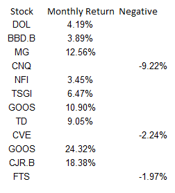
I’m going to use data from my 12 most recent stock picks on fool.ca and how they’ve done over the course of the month they were picked:

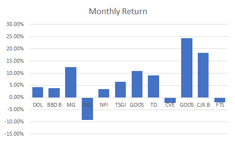
If I were to map the above table out in a bar graph, here’s how it would look:

Adding a column to add another series you can format
While the above chart is a good way to illustrate the performance, if I want to adjust the values so that they’re negative if they’re red, what I’ll want to do is add an extra column:

Then it’s just a matter of updating the chart so that the extra column is included, and changing the color of all the items on the negative series to red. This is also where you can apply whatever formatting you want to the specific series, and hence, conditionally format the results:

Make sure you’re using a stacked chart
The one thing that looks off in the above chart is that the red numbers are on the right-hand side and the blue (positive) numbers are off to the left. To fix this, I’m gonna the chart type to a stacked chart. Then my chart looks like this:

That looks a bit better and is more what I was hoping to achieve.
However, I can even take this a bit further and add more columns. As long as it’s in a stacked chart and only one number is filled in for a column, you can have a lot more customization.
Adding a column for above-average results to add more conditional formatting
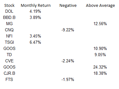
What I can do to help further differentiate the results is to create a column for above-average returns. To do this, I’ll add another column. I could do an if calculation to see if the number was greater than the average of 6.65%. You can have as many columns as you need to help get the number of groups you need. For example, you might have one column for the return, then a separate column for each group that you want to classify the numbers in. In this example, I just used three columns:

Note that what’s key here is that an amount only shows up in one of the three columns. If there’s any overlap, you’ll have multiple colors per item and then that will defeat the purpose of having only one color.
Below is what the chart looks like now, with bright green showing above average, red being negative, and anything else being light green:

Although conditional formatting isn’t very intuitive when it comes to a bar chart, there are ways around it that you can make it work.
If you liked this post on How to Apply Conditional Formatting to a Bar Chart, please give this site a like on Facebook and also be sure to check out some of the many templates that we have available for download. You can also follow us on Twitter and YouTube.


Add a Comment
You must be logged in to post a comment