In this post, I’m going to show you how to group dates in a pivot table by month. By doing this, you can do analysis by month rather than individual day. And that will also make it easier to plot the data on a chart.
For this example, I’m going to use TSA passenger volumes as my data set and analyze them by month and year. Here is the data I’m going to use, which runs up until Aug. 6, 2023:
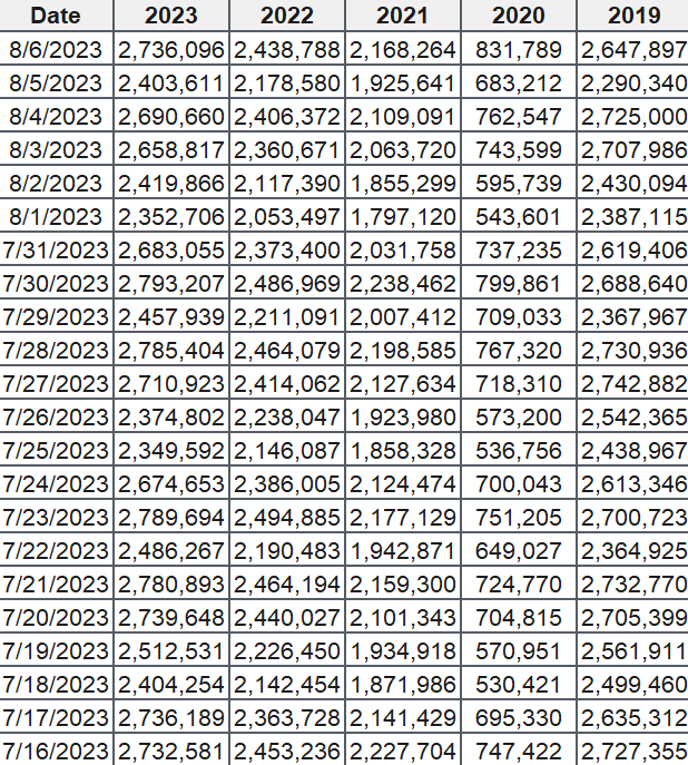
If I load this into a pivot table, my fields are as follows:
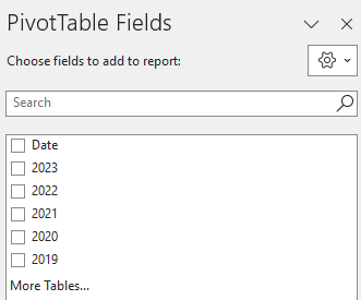
I have the date field which shows the current year’s dates. And there is also a field for each year, which contains the passenger volumes. If I put the Date in the Rows section of the pivot table and then years into the values section, then my pivot table looks like this:

There are a few things that I need to fix for this analysis to work:
- I need to change each year field so that it is taking an average instead of summing the values. If I leave it as is, summing the values may not be helpful as the months are not going to be identical eah year. Taking an average will help smooth the data.
- The formatting should be changed so that the values are separated by commas. This will make it easier to visually see the data. The numbers are too big and can be difficult to interpret in their current format.
- The Row labels are broken down by year. But I already have the year values going across. This is not necessary and I need to have only the month values.
Here’s how to address these items.
To change the year field so that it takes an average, right-click on the field and select the option to summarize as an average:
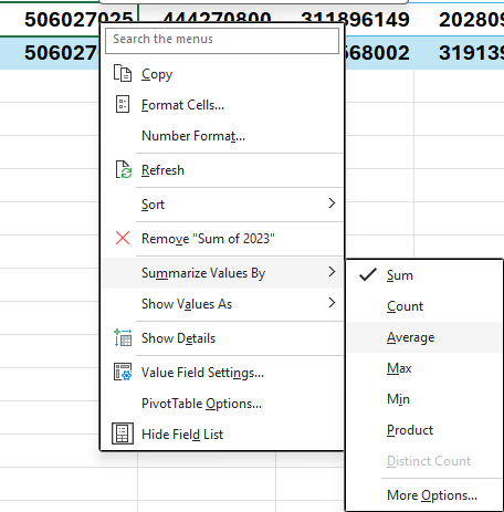
Repeat this for each field, so that everything says average. To fix the number formatting, right-click on each field and select Value Field Settings:
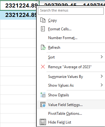
Change the formatting to Number and check off the option for the 1000 separator. Repeat these steps for the other fields as well.
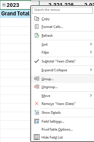
Next, for the date grouping, right-click on any of the date values and select the Group button:
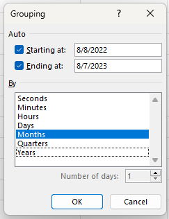
At the following dialog box, uncheck years and quarters and just leave Months:
After making all those changes, my pivot table now looks like this:
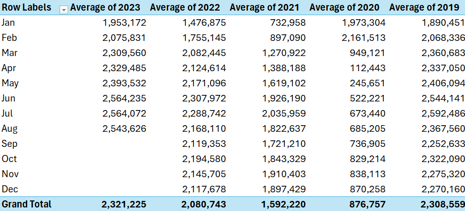
It’s now easier to compare the different months and years. And it’s also easier to put it on a chart. If I insert a line chart, it’s easy to spot the trends by a monthly and yearly basis:
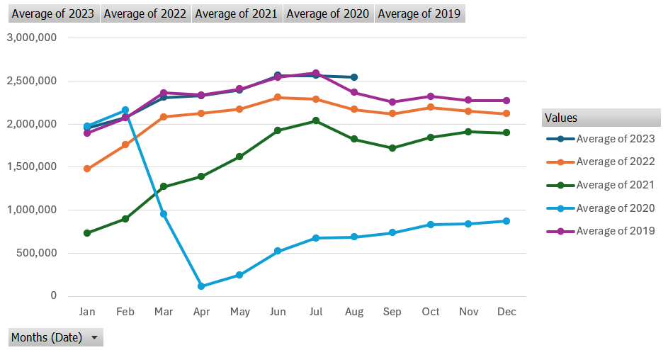
This is a PivotChart, as it evident from the grey drop-down options. If you prefer to get rid of the filters, go to the PivotChart Analyze tab and uncheck the Field Buttons option. Now you’ll have a cleaner chart layout. In the below example, I have also moved the legend to the bottom:
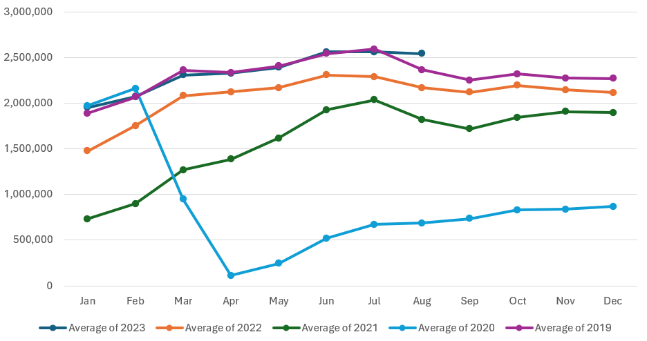
As you can see, by grouping your pivot table dates by month, it becomes easier to analyze data. And by not doing a daily analysis, it’s possible to look at the data from a year-to-date view to compare the monthly averages. This way, you are able to still see the story behind the data without having a crowded chart.
If you liked this post on How to Group Dates by Month in a Pivot Table, please give this site a like on Facebook and also be sure to check out some of the many templates that we have available for download. You can also follow me on Twitter and YouTube. Also, please consider buying me a coffee if you find my website helpful and would like to support it.

