What is a histogram?
A histogram is a type of chart used to visualize the frequency distribution of a dataset. It represents how often different values occur within specific intervals or “bins” in a dataset. Histograms are particularly useful when you want to understand the distribution of continuous or discrete data and identify patterns, trends, or outliers in the data. They provide a clear and concise way to see the shape of the data and assess its central tendency and spread.
What the uses for a histogram?
Frequency Distribution
Histograms help you understand how data is distributed across different ranges or bins, revealing patterns or clusters in the data.
Identifying Outliers
With histograms, you can easily spot extreme values, or outliers, that may skew the chart.
Data Exploration
Histograms are great for data exploration and initial analysis, providing insights that may guide further investigation.
Data Comparison
You can compare multiple datasets or subsets of data to understand differences in their distributions.
How do you define bins for histograms?
One of the most important questions to ask yourself when creating histograms is how the bins should be defined and how big they should be.
Creating bins for histograms involves grouping the data points into intervals or ranges so that you can analyze the frequency distribution of the data effectively. The choice of the number of bins and their width can significantly impact the insights you gain from the histogram. There are various methods to determine the number and width of bins, and some common approaches include:
Square Root Rule
The square root rule suggests that the number of bins should be approximately the square root of the total number of data points. This method provides a simple way to determine the initial number of bins.
Sturges’ Formula
Sturges’ formula is a commonly used method to calculate the number of bins. It suggests that the number of bins (k) can be calculated as follows: k = 1 + log(n) where “n” is the number of data points. Sturges’ formula automatically adjusts the number of bins based on the data size.
Scott’s Normal Reference Rule
Scott’s rule considers the data distribution’s variability and suggests bin width based on the sample standard deviation (σ) and the number of data points (n): bin width = 3.5 * σ / (n^(1/3))
A larger standard deviation or more data points will result in wider bins.
Freedman-Diaconis’ Rule
This method takes into account the data distribution’s interquartile range (IQR) and the number of data points (n) to calculate the bin width.
Bin width = 2 * IQR / (n^(1/3))
The interquartile range is the difference between the 75th and 25th percentiles of the data.
Manual Selection
Depending on your domain knowledge and the specific insights you are seeking, you can manually choose the number of bins and their width. Adjusting the number of bins can highlight different aspects of the data distribution. With Excel, you can also do trial and error to see how many bins may be the best option for your chart.
When determining the bins, you should consider the following points:
- Avoid too few bins, as this may oversimplify the data distribution and hide important details.
- Avoid too many bins, as it may result in overfitting and obscure the underlying patterns.
- Consider the data range and the resolution you want to achieve in the histogram.
Once you have determined the number of bins or their width, you can create the bins in Excel by manually specifying the bin ranges in a new column or using Excel’s built-in histogram function, which will automatically calculate the bins for you based on the data.
Creating a histogram chart in Excel
In creating a histogram in Excel, I’m going to use test scores on an exam as an example. This is an excerpt of my data set:

Here are the step-by-step instructions to creating a histogram chart in Excel.
Step 1. Select the histogram chart
Excel makes it easy to create a histogram. All you need to do is select the entire data set and then click on the option to insert a chart from the histogram section:
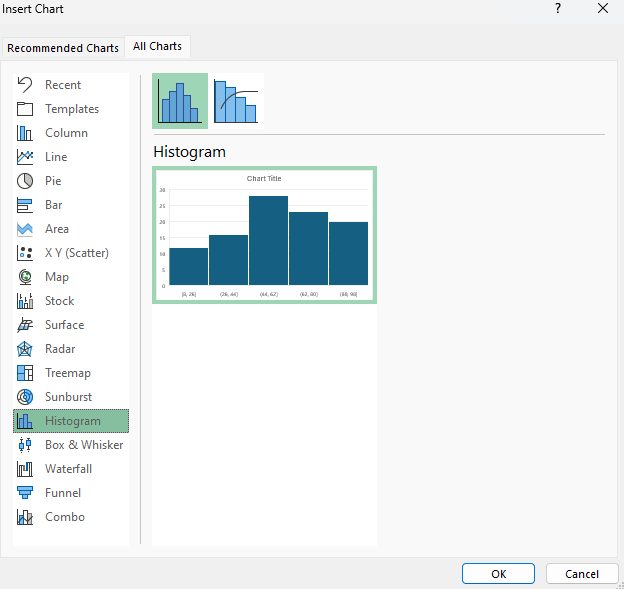
As you can see from the preview, Excel has already set up some bins based on the data, so you may not even need to worry about setting them up yourself.
Step 2: Modifying your bins (if necessary)
This is the chart that Excel has created for me based my data set:

It has created bins of equal size based on the data set. However, you may not agree with the cutoffs given they are a bit random (e.g. 8-26, 26-44, etc.). To change this, you can right-click on the x-axis and select the option to Format Axis. From there, there is a section for the different bin options:
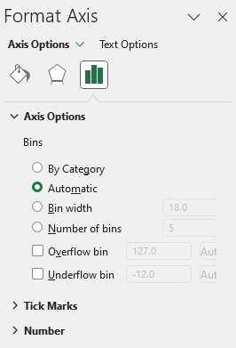
The default options is set to automatic. However, in this situation you may want to consider using either a set bin width or changing the number of bins. As you can see from the greyed out numbers, Excel has created 5 bins with a width of 18 each. If you change the bin width to 10, then Excel starts from the lowest value of 8 and adds 10, and continues on:
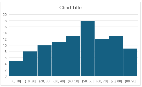
This has created 9 bins. But suppose you want 10 bins. You can change the number of bins to 10 manually. And when doing so, this is the chart Excel creates:
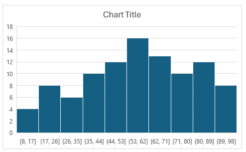
Now the bin width is set to 9. For test scores, this still may not be ideal, as the cutoffs don’t make logical sense. Ideally, they would be in increments of 10 and be round bin numbers. To fix this, what you can do is to set a bin width of 10. And then, set the underflow bin to 10. This means that anything less than or equal to 10 will fall into the first bin. This becomes a catch all for any values of 10 and under, even if the data starts at 8. Now, the histogram looks like this:
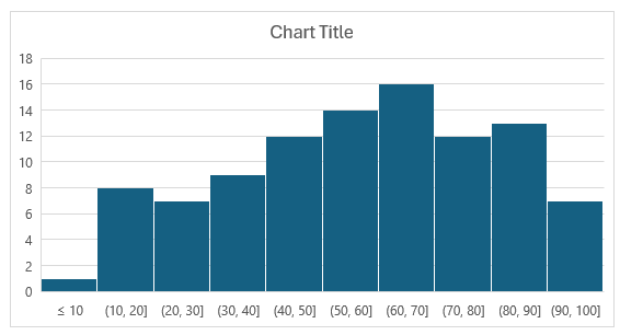
This is a much cleaner look with cutoffs that make more sense. One thing to note is that while there does appear to be an overlap in the bins, that’s not the case. For the (10,20] bin, it counts the number of values that are greater than 10 up to and equal to 20. For the (20,30] bin, it counts values greater than 20 that are up to and including 30.
Step 3: Apply formatting (optional)
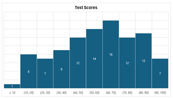
Once you’re satisfied with the number of bins and their width, the last step is to change the formatting, assuming you want to change the look of it. This can involve changing the histogram’s colors, adding or removing gridlines, adding data labels, as well as any other changes you might normally make to a chart.
In my example, I’ve modified the title, added vertical gridlines, and added data labels to show the frequency count, and also removed the axis to the left:
If you liked this post on How to Make a Histogram Chart in Excel, please give this site a like on Facebook and also be sure to check out some of the many templates that we have available for download. You can also follow me on Twitter and YouTube. Also, please consider buying me a coffee if you find my website helpful and would like to support it.

