Regression analysis is a statistical method used to model the relationship between a dependent variable (the outcome you want to predict, like house price) and one or more independent variables (the factors used for prediction, like house size). Its main goal is to find the mathematical “line of best fit” that describes how the dependent variable changes when an independent variable changes.
This is extremely useful for two key reasons: first, it helps you understand the strength and nature of these relationships (e.g., “How much does size actually impact the price?”), and second, it allows you to make educated predictions or forecasts about future outcomes based on new data (e.g., “What is the likely price for a new 2,000 sq. ft. house?”).
There are two ways to do a regression analysis in Excel. One is through the Data Analysis Toolpak, and the other is through a formula. I’ll start with the first approach. Here are the steps to do a regression analysis in Excel using the Data Analysis ToolPak:
Step 1: Enable the Data Analysis ToolPak
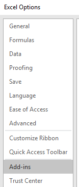
First, you need to make sure the necessary add-in is active.
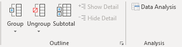
- Go to the Data tab on the ribbon.
- Look for a Data Analysis button on the far right.
- If you don’t see it:
- Go to
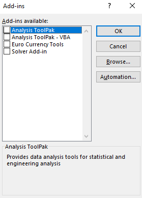
File > Options > Add-ins. - At the bottom, next to “Manage,” make sure Excel Add-ins is selected and click Go
- Check the box for Analysis ToolPak and click OK. The
Data Analysisbutton will now appear on yourDatatab.
- Go to
Step 2: Set Up Your Data
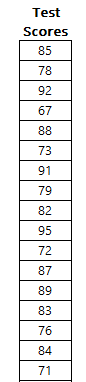
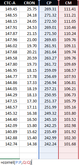
Organize your data into two columns. The independent variable (the one you use to predict) should be in one column, and the dependent variable (the one you want to predict) should be in another. In the following data set, the house size is the independent variable, and it is in column A. The house price is the dependent variable, since it is dependent on the house size, and it is in column B.

Step 3: Run the Regression Tool
Now you’re ready to perform the analysis.
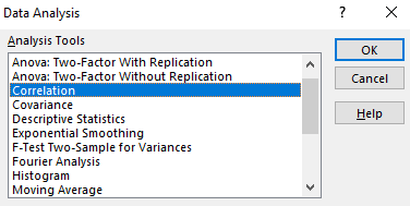
- Click on the Data tab.
- Click on Data Analysis.
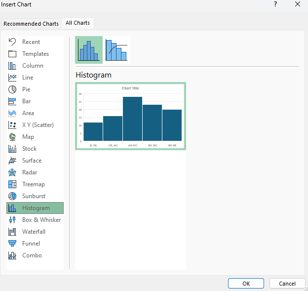
- In the pop-up window, scroll down and select Regression, then click OK.

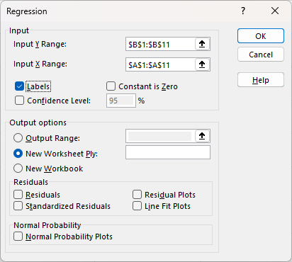
Step 4: Configure the Regression
A dialog box will appear which will allow you to specify the input ranges for the regression analysis, and whether it includes labels.
Step 5: Interpreting and reviewing the results
After you click OK, it will create the following output, summarizing the regression analysis:

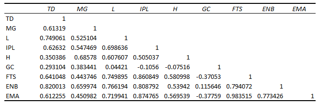
The most important numbers from the table above are the R Square and the two Coefficients. Let’s break down what they mean:
- R Square: This tells you what percentage of the movement in the dependent variable can be explained by the independent variable. In this example, it tells you how much of the change in house prices is explained by square footage. The higher the value, the better the overall goodness of fit is. And generally you want higher values. Anything above 0.7 indicates a strong goodness of fit. An amount above 0.5 would indicate a moderate relationship. Meanwhile, an R Square below 0.5 would suggest there isn’t a strong relationship based on the independent variable.
- Coefficients: To produce the y = mx+b linear equation, you need these data points. The intercept of 191,405 is the b in the equation. And the 213.8399 is the m. The linear equation becomes the following:
- =213.8399(x) + 191,405
- You would substitute x for the independent variable (square footage), to estimate what the price might be.
- =213.8399(x) + 191,405
Optional: Testing your equation
Let’s put the linear equation to work in Excel, alongside the actual results. This will help show how good of a job it does at predicting the values. Column C is the result of plugging in the x values into the mx+b formula defined above.

It may also be helpful to map this out visually, on a chart.

The square footage is going across the x-axis, with the actual prices showing in green, while the estimated values based on the linear equation are in grey.
Creating the linear equation with just a formula
If you don’t want all the data analysis that comes with the regression tool that’s available via the Excel add-in, then you can generate the linear equation through just a single formula in Excel. With the LINEST function, you can just enter your known y and known x values as follows:
=LINEST(B2:B11,A2:A11)
This returns results in an array:

The first value returned is the m value while the second is the b. With this formula, you can still setup the same mx+b formula for the line estimate: =213.8399(x) + 191,405.
If you liked this post on How to Do a Regression Analysis in Excel, please give this site a like on Facebook and also be sure to check out some of the many templates that we have available for download. You can also follow me on Twitter and YouTube. Also, please consider buying me a coffee if you find my website helpful and would like to support it.