
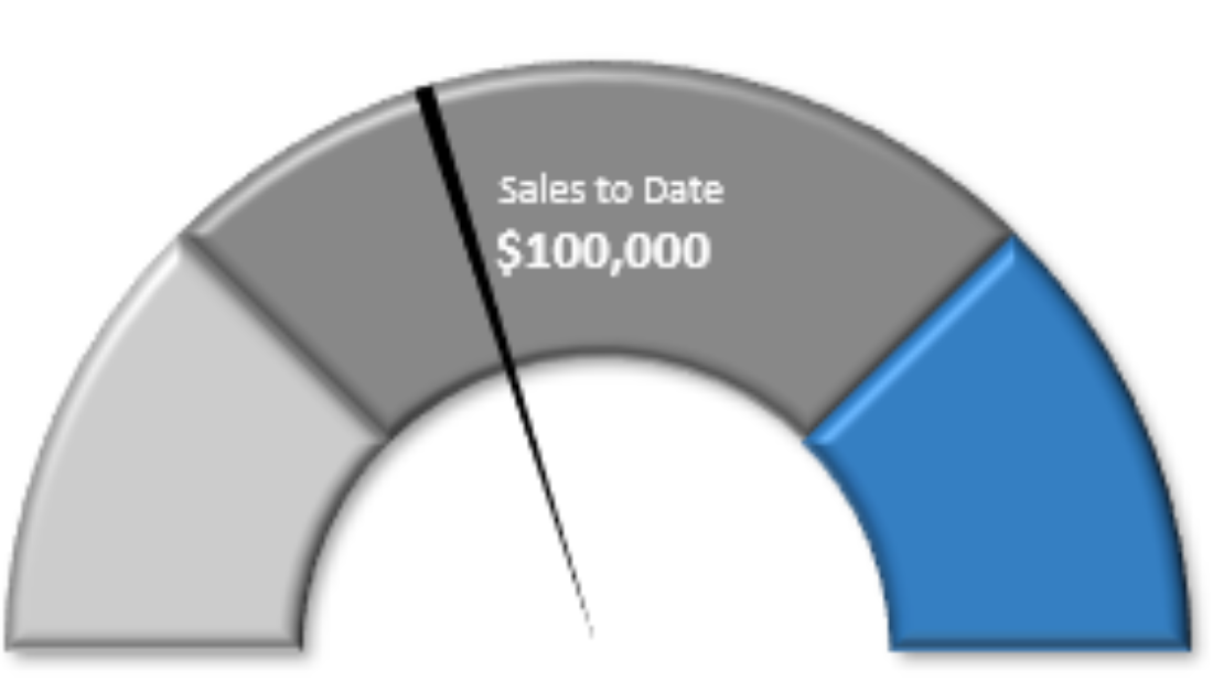
Whether you’re building a dashboard or just wanting another chart to add to your disposal, the gauge chart is always a popular choice. In this post, I’ll show you how you can create it painlessly and add it to your disposal next time you want to use a chart. It’s especially useful if you’re looking to compare actual vs forecast or need to track a completion percentage
As long as the version of Excel you’re using has a doughnut chart available, you’ll be able to follow these steps.
STEP 1: Set Up the Data for the Gauge Chart
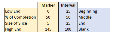
First, you’ll want to set up two columns: one for the intervals and how big the pieces of the gauge chart will be.
For the intervals, normally, what I’ve seen is a 25/50/25 split, meaning the first and last portions are the same size, with the middle being the largest. The column needs to add up to 200, and so the last piece in this example would be 100.
For the second column, this is where you’ll determine where the marker shows up to track your progress or where your actuals come in at.
- The first number should be 0
- The second number the percentage; how far on the gauge chart you want the marker to be. This is where you’ll probably want to use a formula as this is the only number that should move on this chart.
- The third number is how big the marker should be. In this example, I set it to five, and that’s about the highest I’d suggest it should be.
- The last number is the remainder – here too, you’ll want the total for the column to add up to 200.
Here’s how my columns look right now:
To move on to step two, create a chart using the Marker and Interval columns (include the labels).
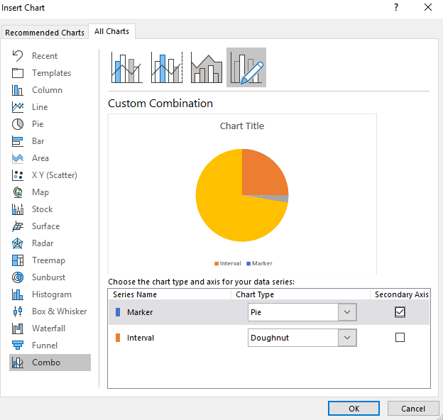
STEP 2: Select the Two Columns and Create a Combo Chart
On the All Charts tab, at the very bottom, you’ll see an option for Combo. The Interval column should be a Doughnut chart while the Marker column should be a Pie chart. You’ll want them on two different axes, so make sure you have Secondary Axis ticked off as well.
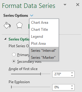
STEP 3: Format the Data Series on the Charts
Right click on the chart and select Format Data Series and select Angle of First Slice to 270 degrees. You’ll need to do this for both charts. To switch between charts, click on the Series Options button and select the other series.
STEP 4: Change the Colors
Using the Series Options from above, make sure you have the Marker series selected. Here is where it gets a little tricky – you’ll need to select every part of the chart and make it blank except for the size of the slice – which you’ll probably want black.
If you have trouble moving across the different parts of the chart, use CTRL + left/right arrow keys to move along the sections. Your chart should now look something like this:

Now, switch over to the Interval series. Here you’ll do the same, except now you’ll be changing the bottom half of the doughnut so that it is blank, and everything else you can change to your liking. In my example, I’m going to go from red to light green to dark green. Here is what the chart looks like after those changes:

STEP 5: Additional Formatting (Optional)
You can do any additional formatting to the chart to make it look how you want. In my example, I added a bevel and some shadows to it to make it stand out a little more. I also shrunk the size of the slice to two:

Save the Gauge Chart for Future Use
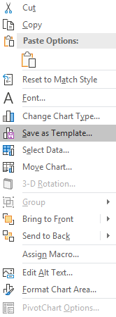
If you like your chart and think you’ll reuse it in the same type of layout, what you can do now is save it as a template. To do that, simply right click on the chart and select Save as Template
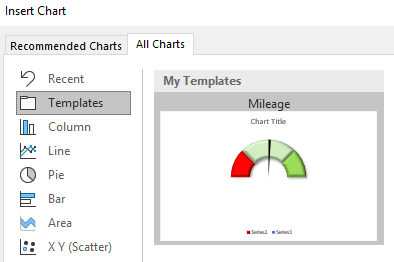
Now, if you have the data in the same format you can go back to insert chart and look for the Templates folder which will now have the saved chart template:
That’s all there is to it! Please let me know if you run into any issues or require clarification on any of the steps above.
If you liked this post on How to Make a Gauge Chart in Excel, please give this site a like on Facebook and also be sure to check out some of the many templates that we have available for download. You can also follow us on Twitter and YouTube.
Add a Comment
You must be logged in to post a comment