

An Excel chart can provide lots of useful information but if it isn’t easy to read, people may skip over its contents. There are many simple things you can do that can quickly add to the visual to make it fit seamlessly within a presentation and that makes it more effective in conveying data. If you want to follow along, in this example, I am going to use data from the Bureau of Economic Analysis. In particular, I am pulling data on automobile sales both in units and average dollars. Here is what my data set looks like right now:
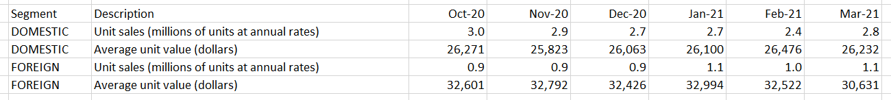
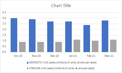
And this is my chart, which shows unit sales by month:
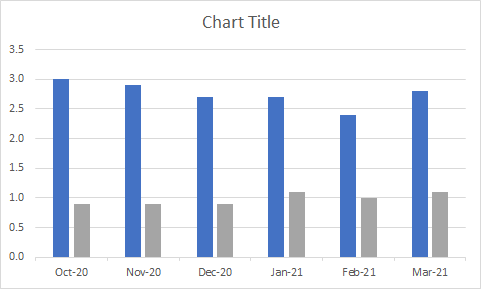
It’s a pretty basic chart that can show me the breakdown between the sales. These are the following changes I can make to improve the look and feel of it:
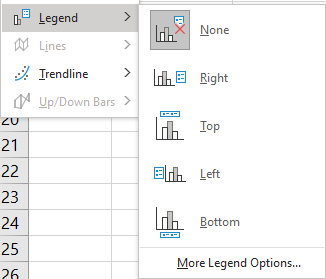
1. Add a legend
Unless you are just charting one item, most visuals will benefit from a legend. Otherwise, it will be difficult to know which data is represented where. To add a legend, all you need to do is select the chart and go into the Chart Design tab and select the Add Chart Element button, there you will see an option to determine where you want it to show up:
In most cases, you’ll probably want this on the top or bottom as that will help make it blend in easier with the chart. Here’s how it look after I add the legend:
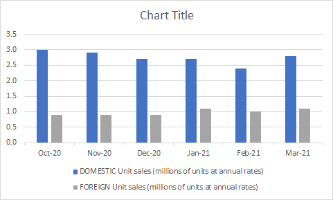
Since my descriptions are long, putting them at the bottom will make more sense. Now I can easily see which bars relate to the foreign sales and which ones relate to domestic.
2. Shrink the gaps (for column charts)
If you have column charts, it can help to shrink the space in-between the bars. That will eliminate white space plus you can fit more items in your chart. To adjust the gaps, right-click on any of the bars and select Format Data Series.
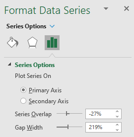
I normally set the Gap Width to 50%. Upon doing so, my chart changes to the following:
3. Adding a descriptive title and subheader
I haven’t set a title for my chart and that’s one thing you shouldn’t overlook doing. Although it may not seem necessary, doing so can help ensure that your chart can stand on its own and not have to rely on the context it is used in to give the reader the right information. A good example in this case can be as follows:

The main title is bolded and shows the reader what the chart is about. And the subheading further distinguishes the different groups of data.
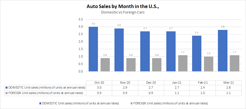
4. Adding data labels
You may want to consider adding data labels to make it easy for the reader to see the exact numbers your chart is showing. This prevents having to make any estimates or rounding off and quoting an incorrect number. To insert data labels, right-click on one of the column charts and select Add Data Labels. Do this for each data series you want to add labels for. This is how my chart looks, with labels:
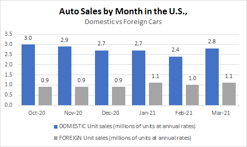
You can modify the labels if you want to add more information besides just the value. This will depend on the type of chart you have and how much space is available. In this example, you probably wouldn’t want to add more information. However, what I will do is shrink the text size so that it is a bit smaller and so that everything looks less cluttered. To do that, I just click on any of the data labels and under the Home tab, make changes to the font size or color the way I normally would with any other data in Excel. After shrinking the font to size 7 and making it grey, here’ show it looks:

5. Adding a data table
If you don’t want to add data labels, another thing you can do is add a data table. This avoids putting any numbers or labels over top of your data series and still gives the user a helpful table summary. This is a great alternative if you don’t want to crowd too much information into one place and prevent your chart from looking too busy. To add a data table, just go back to the Add Chart Element drop-down option and select Data Table, where you can specify if you want to include the legend key or not. This is how the chart looks with the table:
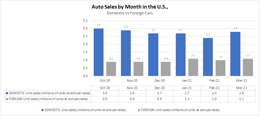
If you want to avoid the repetition in the axis labels without deleting them and losing those headers, one thing you can do is to change the text format. To do that, right-click on any of the axis labels and select Format Axis. Then, in the Number section, enter three semicolons in the Format Code section and click the Add button:
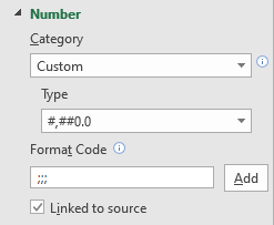
The three semicolons will remove any formatting and now the axis and data table wouldn’t double up on the names:
6. Remove the border
If you are using the chart in a Word document, presentation, or even Excel, eliminating the border around it can make it blend much easily with the background and other information. To remove the border, right-click on the chart, select Format Chart Area, and under the Border section, select No line. After making the change, this is what my chart looks like now:
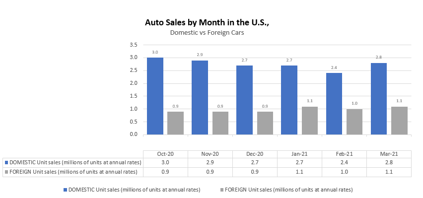
With my gridlines turned off, you can no longer see the lines that show where the chart starts and ends.
7. Use a secondary axis with multiple chart types
So far, I’ve only used column charts to show the number of units sold. However, now, I will also include the average selling price. But because the selling price can be in the thousands, I’ll want to move this onto another axis. Otherwise, the number of units sold, which are in millions, won’t show up because of the scale as it will need to accommodate values that are in the tens of thousands.
When you want to put a data series onto another axis, you will need to go to where you select the chart type. If you go to the bottom, select the Combo option. There, you can specify which chart type should be used for each data series. That’s also where you can specify which one should be on a secondary axis. In this example, I’m going to use a line chart for the average price and continue using a column chart for the number of units sold. It doesn’t matter which data set I put on the secondary axis. However, note that the one that is secondary will be on the right-hand-side of the chart.
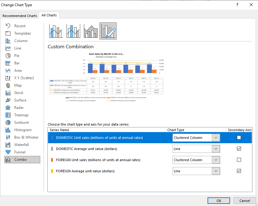
This is what my updated chart looks like:
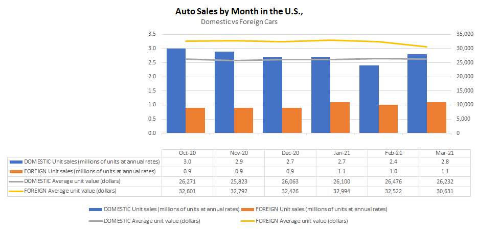
In this case, I’ve gotten rid of the data labels for the column charts so that it doesn’t interfere with the line charts.
8. Move the axis categories down
In the examples thus far, I haven’t had any negative values. However, suppose I change my data to now show the change in units sold from one month to the next:
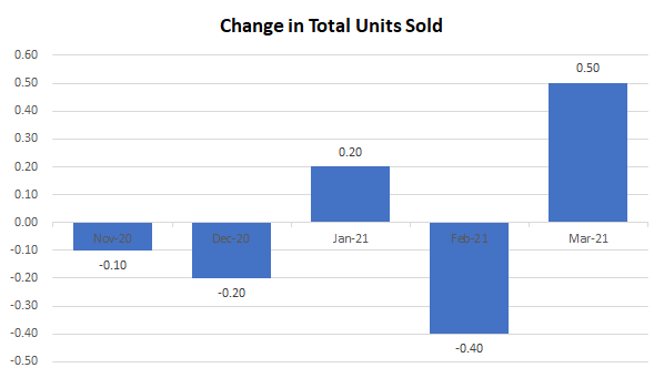
For this example, I combined the data so that it totals both domestic and foreign cars. The above chart shows the month-over-month change. But one problem you’ll notice is that the date labels run along the middle of the chart. This makes it difficult to read when there are negative values.
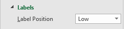
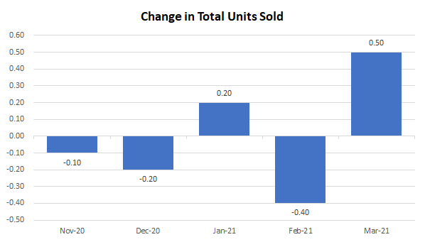
To make this easier to read, I am going to move the axis labels to the bottom This is useful when dealing with negatives. To make this change, right-click on the axis and select Format Axis. Then, under the Labels section, set the Label Position to Low.
Now, when my chart is updated it looks like this:
9. Showing negative values in a different color
One other change that is going to be helpful when dealing with negatives is to change the color depending on if the value is positive or negative. All you need to do to make this work is to right-click on the column chart, select Format Data Series and switch over to the Fill section. There, you will want to check off the box that says Invert if negative:
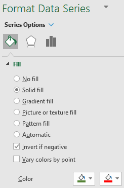
Once you do that, you should see two different colors you can set aside for the color section. If you don’t, try and setting one color first, and then toggling the Invert if negative box. With the two different colors, my chart looks as follows:
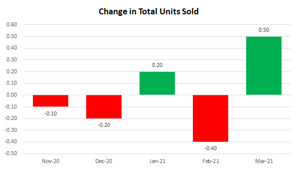
While you can obviously tell if a chart is going up or down, adding some color to differentiate between positives and negatives just makes the chart all that more readable.
If you liked this post on 9 Things You Can Do to Make Your Charts Easier to Read, please give this site a like on Facebook and also be sure to check out some of the many templates that we have available for download. You can also follow us on Twitter and YouTube.
Add a Comment
You must be logged in to post a comment