H2EMapChart-min

How to Make a Map Chart in Excel

If you’re creating a dashboard or just want to visualize your data by what part of the world it’s coming from, a map chart can be a great way to accomplish that. Below, I’ll show how you can use a map chart to show data points at regional and global levels. And while you technically can’t use them with pivot tables, I’ll show you how you can use slicers to seamlessly drill down and dynamically update your chart.

Creating a global map chart

It should be easy to tell if the map chart is available on your version of Excel as the Maps icon stands out in the chart section:

Default chart options on the insert tab.

If you see the maps option, then you have a compatible version to work with.

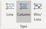
To set up the data to work with the maps chart all you need is a simple table that shows a location along with a value. In this example, I’ll focus on different country data. My data set shows the GDP per capita (in U.S. dollars) by country, courtesy of the World Bank. Here’s what a glimpse of what it looks like:

GDP per capita by country in U.S. dollars.

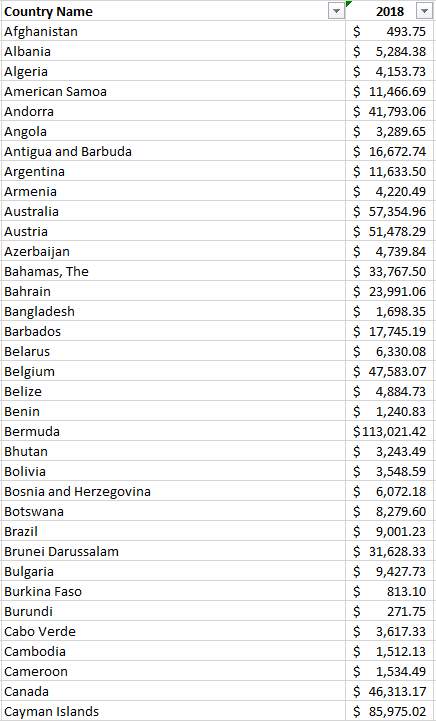
This table doesn’t look terribly great in text and it’s an ideal thing to visualize on a map. As long as your data looks like this and the country names are correct, you can just select this data set and go to insert the map chart, and you’ll get something that looks like this:

GDP per capita by country on a map.

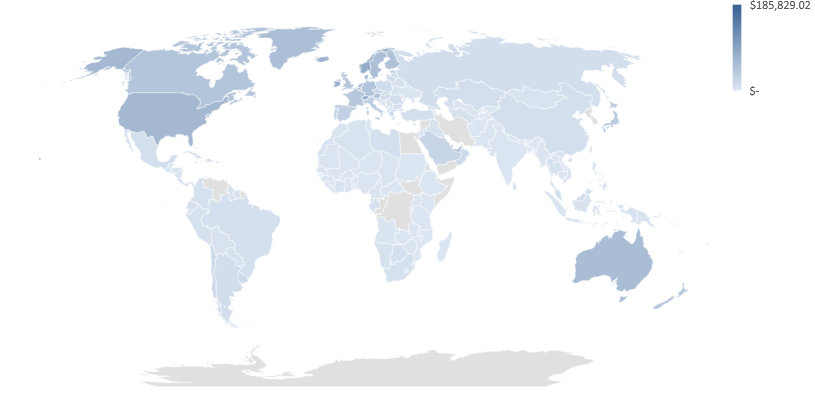
As you can see, the dark blue parts of the world have the highest GDP per capita while the lowest shades are on the bottom end of that scale. And the areas in grey do not contain data.

The map automatically adjusts based on how many countries you have included in your data set. If I only include data for Canada, the U.S., and Mexico, my map looks like this:

Map chart showing only North America.

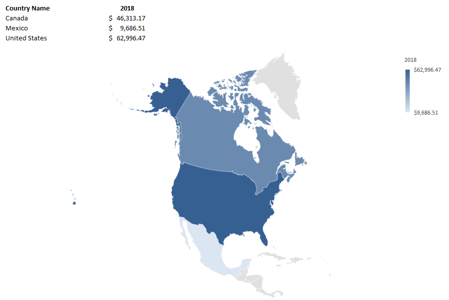
One of the cool things is you can really zero in on specific regions depending on your data set.

The one thing you might be disappointed to learn is that this type of chart does not work with pivot tables. But in the next section, I’ll show you how you can still drill down on the data and the chart using slicers.

Using slicers to break down the data

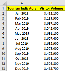
Using data from the Bureau of Economic Analysis, I downloaded data for per capita income by county in the U.S., below is what the table looks like:

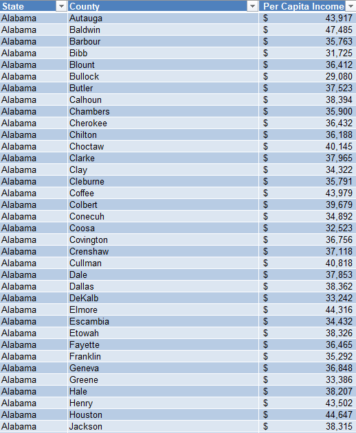
I had to do a bit of cleaning up the data to ensure that every line contained the state. And it’s also important to convert this into a table so that slicers will work with it.

With the maps chart, one of the things you’ll notice is you need to provide enough of a trail for Excel to be able to determine which location you are referring to. Cities, for example, could have the same names in multiple states or countries. And that’s why whether you’re looking at counties or cities, the more information you provide Excel, the more likely the chart will come out as you want it to.

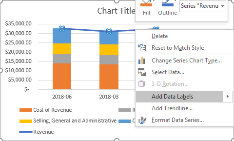
When you first create a map chart it may not look as you expect it to as it could get the categories all wrong, especially if you have multiple fields. You’ll want to make sure that your series and categories are correctly set up if something looks off.

Under the Series, you should only have your values, such as in my example where it only contains per capita income:

Legend entries set up on a map chart.

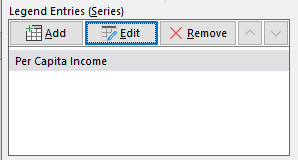
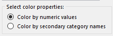
If there’s anything else in there, you may need to delete it and adjust your range. And for your values to show up as a scale (which I’d recommend, otherwise you’ll see a big legend with many colors), you’ll want to edit the legend and make sure the following option is selected:

Selecting color by numeric values in Excel legend for a map chart.

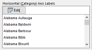
You may also need to adjust the Horizontal Axis to ensure it includes all of your category columns. Again, this is if your map doesn’t look correct and the regions aren’t showing up correctly. Here is how my horizontal category axis looks like, showing both state and county:

Horizontal category axis in Excel for a map chart showing state and county data.

If it’s all set up correctly, your map chart should look something like this:

A map chart that shows per capita income by county.

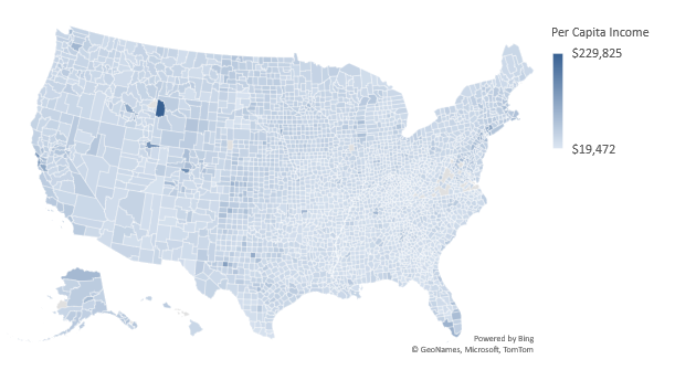
Now, because this is county-level data, it’s not easy to conceptualize what you’re looking at. But with the help of slicers, you can easily jump to different states. Since the data is in a table, you can add a slicer for the state. If you’re not familiar with how slicers work, check out this post. Although that’s for pivot tables, they’ll work the same within a table.

Once the slicers are in place, you can easily jump through and toggle between the different states. Doing so will automatically adjust your map chart which will now focus in on that specific state, just like when it narrowed in on North America when I only had data for three countries:

Map of Washington showing country per capita income.

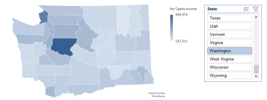
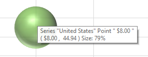
Just like with any other chart, you can hover over and see what the values are and the name of the county.


If you liked this post on how to make a map chart in Excel please give this site a like on Facebook and also be sure to check out some of the many templates that we have available for download. You can also follow us on Twitter and YouTube.

3D Bubble Chart

How to Make a 3D Bubble Chart in Excel

The bulk of Excel users will likely stick to 2D charts that just have an x and y axis. But if you want to add a third element and give your visuals a bit more context, you can create a 3D bubble chart in Excel. Below, I’ll show you how to do just that.

In the following example, I’m going to compare the average mobile data cost in select countries versus their average speeds. I’ll also include what percentage of their populations are smartphone users. Often you hear about one of these metrics but not all three. This is a good example of how adding in more data can provide more context and a more complete picture.

For instance, Canada has one of the highest costs per GB while India has the lowest. But how does that stack up when you consider speed and how much of the country actually uses a smartphone. Using a 3D bubble chart, I can easily add that extra context.

Setting up the data

I pulled in these numbers from a variety of sources to make this work (there were some gaps that I also had to estimate based on older data) and using a series of vlookup formulas I connected them all together.

As far as setting up the data for a chart goes, it’s not much different than what I would do for a 2D chart. Enter the headers and then all of the values. Here’s a summary of what the table looks like with all three data points per country:

Cost per gb, speed, and percentage of smartphone users among countries.

Unfortunately, if I try to just create a 3D chart the way I normally would a 2D chart, I’d get a bit of a mess:

Default 3D bubble chart.

Setting up the chart

As you can see, this initial set up isn’t very intuitive. There’s a bit more manual entry involved when setting up a 3D bubble chart in Excel for the first time. What I’m actually going to do is remove all the default data and delete all these items.

Modifying the data source for a bubble chart.

You’ll get the above dialog box if you right-click on the chart and click Select Data. I then click remove from all the Legend Entries until it’s all empty:

Adding data sources for a 3D bubble chart.

Now, I’ll click on the Add button to add each entry individually to ensure my data’s pulling correctly:

Adding a series.

Here’s an example of one that’s filled out:

Adding values for a 3D bubble chart.

After clicking on OK, then I’ll start to see a bubble chart forming:

One bubble in a 3D chart.

As I repeat and continue adding more items, my bubble chart ends up looking like this:

3D bubble chart showing country average cost per GB, average speed, and percentage of smartphone users.

What the chart tells us

India went from being in the top-right quadrant to the bottom left. This incidates that while it’s low cost per GB, it’s average speed is the slowest of the countries on this list. And its relatively small bubble also tells us that a small fraction of the population uses smartphones compared to the other countries here.

It also confirms Canada’s still the most expensive. Australia offers much cheaper rates while having similar speeds and a similar portion of the population using smartphones.

You can easily see the details of each individual bubble. If you hover over any one of these bubbles you’ll now get information showing all the values related to them. Here’s the U.S. one:

Smartphone with one bubble.

It may seem like a painstaking effort to create all the bubbles but once you’ve got it set up you don’t have to repeat these steps. You can change the values and the 3D bubble chart will automatically update. The problem is that Excel doesn’t make it easy to set it up initially. But once you’ve selected which values you want to pull, then it gets easier to update the information and use the format again.

The big advantage of using a bubble chart in Excel is that it provides much more information in just one snapshot than a simple 2D chart would give you. Using a 2D chart, I’d only be able to display two data points for each country. A 3D chart allows me to add even more information into a single chart. And that makes it much more useful to the reader.


If you liked this post on how to create a 3D bubble chart in Excel, please give this site a like on Facebook and also be sure to check out some of the many templates that we have available for download. You can also follow us on Twitter and YouTube.

lasvegas1

How to Calculate Cumulative and Year-to-Date Totals in Excel

Whether you’re tracking sales or costs in excel, it’s important to capture not just your monthly totals but your cumulative year-to-date amounts as well. And to do that in excel, you’ll need to calculate a cumulative sum. Ideally, you’ll want to see a current month’s total alongside the year-to-date figure. Below, I’ll show you how to do that as well as how to make cumulative totals work with multiple years.

Calculating the current month and cumulative sums

First thing’s first, let’s start with a data set. This time around, I’m going to pull the monthly tourist information for Las Vegas. This year, that could prove to be interesting given the impact of COVID-19 on tourism in the city. Here are what the numbers looked like for 2019:

Las Vegas visitor data in Excel.

If we wanted to calculate the total visitor volume it would be as simple as the following formula:

=SUM(B:B)

However, if we want the cumulative totals then we can’t just grab the entire column. Instead, we’ll need to add another column that has the cumulative amounts for each month. The formulas will still involve the SUM function but they will need to be from January up until the current row. Here’s what the formulas look like:

Las Vegas visitor volume cumulative sum totals.

The formulas for column C are shown in column D. The key here is freezing the first cell (B2) so that as you copy the formula down in C2, it won’t move while the other cells will.

Calculating cumulative values isn’t too complicated, but it’s a bit trickier when your data set spans multiple years.

Calculating the cumulative sum when working with multiple years

The above scenario works well if you have just one year. But it won’t work if you decide to add next year’s data without resetting the formula. Here’s how it would look if we added the 2020 data:

Las Vegas visitor volume cumulative sum totals for multiple years.

As you can see, it just keeps on adding on to the previous year’s data, which is not what we want.

There are multiple ways that you can calculate the cumulative sum per year and so that the calculation resets on its own. Let’s start with the easiest route: adding an extra column for the year. Using the YEAR function we can extra what the year is in column A. Then, rather than using the SUM function, we will use the SUMIF function to do the cumulative count, but only if the year is the same:

Las Vegas visitor volume cumulative sum totals for multiple years with a sumif function.

The logic similar to the earlier formula, we’ve just added a condition where the year in column C has to match the year that specific row belongs to. That’s why once we hit 2020, it resets. For this to work, we still need the months to be in order.

Another way that you can calculate the cumulative total without a helper column is by using an array:

Las Vegas visitor volume cumulative sum totals for multiple years with an array.

We need to evaluate every cell to see if it relates to the correct year, and if it does, it gets included in the range to sum. The array allows us to do two calculations in one: an IF calculation embedded within a SUM calculation which doesn’t require the helper column.

A big advantage of having multiple years on your data set rather than separating them out is then you can put them into a pivot table and create a pivot chart that helps plot both of them:

Las Vegas visitor volume shown on a chart.

From this, we can see that there was a sharp drop off in March due to the outbreak of COVID-19 and that the cumulative figures are now well under 2019’s numbers. By having both cumulative and monthly totals available, we can display them both on one chart that helps to summarize the information quickly and easily.


If you liked this post on How to Calculate Cumulative and Year-to-Date Totals in Excel, please give this site a like on Facebook and also be sure to check out some of the many templates that we have available for download. You can also follow us on Twitter and YouTube.

sparklines3

How to Make Sparklines in Excel

Creating charts and graphs is a great way to display data visually and make it easier for users to read and understand it. However, in some cases, you don’t want or need a big chart, and something smaller would be more useful. This is where sparklines can come in to play and help you get your point across without a big chart in the way. Below, I’ll show you how to quickly and easily make sparklines in Excel that can quickly add context to your data.

*Please note that sparklines were a new feature of Excel 2010. If you’re running an older version of Excel, you won’t have these options available*

Getting the data set ready

I’ll show you how to create sparklines using my data, which is a download of Amazon’s income statement over the past 10 quarters. Here’s what it looks like:

Amazon's income statement for the past 10 quarters.

From afar, it’s not the easiest thing to analyze to identify any trending. And ideally, we’d like to have some trending shown for each major income and expense category. Adding a chart just isn’t useful in this case, and this is where sparklines can help.

Creating sparklines in just one click

I’ll start by selecting the row that has revenue and then on the Insert tab and under the Sparklines category I’ll select the Line button:

Sparklines options in Excel.

It will then show me the range that I’ve selected and it will allow me to select where I want to place my sparklines:

Create sparklines dialog box in Excel.

In most cases, you’ll probably want this right next to your data. And that’s what I’m going to do — put it in the next cell to the right of the data, L3. Now it’s created my sparkline:

But there’s just one problem:

Sparkline showing downward trend.

The sparkline is showing a downward trend. Amazon’s revenue has been increasing, not decreasing. One solution is to re-arrange my data, but that’s not necessary. To fix this, I select the sparkline and then under the Sparklines tab I click on Axis and select the option that says Plot Data Right-to-Left:

Change the direction of the sparklines

Now my sparkline looks a lot better:

This is an optional step and it depends on which direction you want your sparkline to go in.

Applying sparklines to other rows

Now that I’ve got one sparkline setup, it’s time to set up the sparklines for the rest of the income statement line items as well. Surprisingly, this is as easy as just dragging the sparkline down and copying it down to the other rows:

One of the cool features of sparklines is you can quickly add trending to every item without having to add a separate chart or graph for each row. And even for the rows where there was no data, it doesn’t result in an error, either.

If you prefer a column chart to a line chart, then you can easily make the change as well in the Sparklines menu:

It will quickly change the format of the charts:

There’s also a win-loss chart that you can use if you have negative and positive values. However, in most situations, you’re going to use either line or column charts, especially when you’re looking to show trending. But

You can change the color and other features of the sparklines just like with other charts. And all those options are available from within the Sparklines tab.


If you liked this post on how to create a drop-down list in Excel, please give this site a like on Facebook and also be sure to check out some of the many templates that we have available for download. You can also follow us on Twitter and YouTube.

monthly return stocks bar chart stacked

How to Apply Conditional Formatting to a Bar Chart

When using charts, sometimes you’ll want to highlight items differently depending on if they’re positive or negative, or may if they’re above or below a benchmark or average. While you can apply conditional formatting to cells, it’s not as easily done if you want to do the same to a bar chart. There’s no simple way without it involving a manual process. However, the good news is there is a workaround.

I’m going to use data from my 12 most recent stock picks on fool.ca and how they’ve done over the course of the month they were picked:

returns table stocks

If I were to map the above table out in a bar graph, here’s how it would look:

monthly return stocks bar chart

Adding a column to add another series you can format

While the above chart is a good way to illustrate the performance, if I want to adjust the values so that they’re negative if they’re red, what I’ll want to do is add an extra column:

monthly returns table negative

Then it’s just a matter of updating the chart so that the extra column is included, and changing the color of all the items on the negative series to red. This is also where you can apply whatever formatting you want to the specific series, and hence, conditionally format the results:

monthly returns table bar chart negative

Make sure you’re using a stacked chart

The one thing that looks off in the above chart is that the red numbers are on the right-hand side and the blue (positive) numbers are off to the left. To fix this, I’m gonna the chart type to a stacked chart. Then my chart looks like this:

monthly returns bar chart negative

That looks a bit better and is more what I was hoping to achieve.

However, I can even take this a bit further and add more columns. As long as it’s in a stacked chart and only one number is filled in for a column, you can have a lot more customization.

Adding a column for above-average results to add more conditional formatting

What I can do to help further differentiate the results is to create a column for above-average returns. To do this, I’ll add another column. I could do an if calculation to see if the number was greater than the average of 6.65%. You can have as many columns as you need to help get the number of groups you need. For example, you might have one column for the return, then a separate column for each group that you want to classify the numbers in. In this example, I just used three columns:

monthly returns negative average

Note that what’s key here is that an amount only shows up in one of the three columns. If there’s any overlap, you’ll have multiple colors per item and then that will defeat the purpose of having only one color.

Below is what the chart looks like now, with bright green showing above average, red being negative, and anything else being light green:

monthly returns negative bar chart average

Although conditional formatting isn’t very intuitive when it comes to a bar chart, there are ways around it that you can make it work.


If you liked this post on How to Apply Conditional Formatting to a Bar Chart, please give this site a like on Facebook and also be sure to check out some of the many templates that we have available for download. You can also follow us on Twitter and YouTube.

chart-2785979_640

How to Make a Bar Graph in Excel Using a Formula

Excel has a lot of charts and graphs that you can use to visually show data. However, there’s a way to create a graph using just a simple formula and applying some formatting to it. Below, I’ll show you how to make a bar graph easily without having to worry about legends, axis, or any other chart element you might otherwise need to manipulate.

The key function that makes this all possible is REPT, which just repeats a character a set amount of times. Here’s how it works in practice:

REPT function excel

In the first argument, I specify the character that I want to be repeated. The | symbol, in this case, is repeated five times, which is what the second argument specifies. Right now, this doesn’t look anything like a bar chart, but that’s as easy as changing the font. Here’s how it looks like if the font is set to Britannic Bold and size 11:

rept function excel

If I had several of these values, I could make it look like a bar chart pretty quickly. Below are some random numbers from 1-10 and how I turned them into a bar chart using the earlier formula:

rept function excel bar graph chart

In the above formulas, I replaced the second argument with the numbers specified above. If an item had the number 10, the | character would be repeated 10 times.

Scaling the bar graph

Now, if you’re dealing with really small or really large numbers, your bar graph could look very skewed. What I’d suggest doing is determining how big you want your graph to look. For a column with a width of 15, I found that 35 characters would fill the bar chart all the way to the end of the cell (using the font type, size and character that I used above).

So to help make sure that my data was properly scaled, I’d calculate the maximum number from my data set, divide the specified number by that, and then multiply it by 35.

Here’s another example with numbers between 100-1,000, if I were not to adjust anything from the previous formula:

rept function excel bar chart graph

If I were to use the above formula as is, you can see my bar chart is going to explode with bigger numbers. So what I’d want to do is adjust the number of times the characters above repeat, to a maximum of 35.

First, I need to determine what value should maximize the cell or bar chart. In the above data set, 988 is the largest number. However, if my scale goes up to 1,000, that might be a better number to use as the maximum.

In that case, my formula for the number of repeats will look something like this: (value/1000)*35. That way, for the value 988, that will return 34.58 as the number of times I’ll repeat the | character. If I use that formula for the data, here’s how it looks now:

rept function excel bar chart graph

Adding more formatting

Now, I’ve got a bar chart that looks a lot more contained. However, this is still kind of a bit boring. So what I can do is add some conditional formatting to help make some of the items stand out a bit more:

rept function excel bar chart graph conditional formatting

In the above example, I set rules for anything below 300 to be highlighted red and anything above 800 to be green. When applying the conditional formatting, make sure you’re changing the font color, not the fill color. For more information on how to set up conditional formatting, check out this post.


If you liked this post on How to Make a Bar Graph in Excel Using a Formula, please give this site a like on Facebook and also be sure to check out some of the many templates that we have available for download. You can also follow us on Twitter and YouTube.

accounting-1928237_640

How to Save an Excel Chart As a High Resolution Image

Do you use Excel charts in PowerPoint presentations or want to use them in some other programs? Then you probably know it’s not something that’s very intuitive and often when you save a chart from Excel it’s not the high resolution image that that you were hoping for. And embedding charts within PowerPoint is a whole separate headache altogether.

The good news is that there’s a fairly easy solution. In the past, I’ve used code to save a chart as an image file, but even that didn’t always work very well and it involves running a macro. Once you try stretching it out you’ll still likely see a bit of a reduction in quality.

Let’s take this chart as an example:

sales chart excel

If I use the method to save it as a chart using VBA, this is how it will look expanded:

sales chart excel high resolution image

The image starts to get a bit faded and it’s far from ideal.

How do you get around that? Save the file in Microsoft Paint. Select the chart, copy it, and paste it into Paint and then save it as an image file. Besides cropping it, I don’t do any editing or special changes to the chart. However, the chart still needs to be a decent size in Excel so if it still looks faded, try making the chart bigger and then repeat the steps.

Here’s how the same chart looks, but using Paint:

sales chart excel high resolution image

It’s a higher quality image and the process is a bit easier unless you’ve got lots of charts that you want to save quickly. Visuals can be useful tools in presentations and I hope this has helped you learn how to save an excel chart as high resolution image.


If you liked this post on How to Save an Excel Chart As a High Resolution Image, please give this site a like on Facebook and also be sure to check out some of the many templates that we have available for download. You can also follow us on Twitter and YouTube.

guagechart6

How to Make a Gauge Chart in Excel

Whether you’re building a dashboard or just wanting another chart to add to your disposal, the gauge chart is always a popular choice. In this post, I’ll show you how you can create it painlessly and add it to your disposal next time you want to use a chart. It’s especially useful if you’re looking to compare actual vs forecast or need to track a completion percentage

As long as the version of Excel you’re using has a doughnut chart available, you’ll be able to follow these steps.

STEP 1: Set Up the Data for the Gauge Chart

First, you’ll want to set up two columns: one for the intervals and how big the pieces of the gauge chart will be.

For the intervals, normally, what I’ve seen is a 25/50/25 split, meaning the first and last portions are the same size, with the middle being the largest. The column needs to add up to 200, and so the last piece in this example would be 100.

For the second column, this is where you’ll determine where the marker shows up to track your progress or where your actuals come in at.

  • The first number should be 0
  • The second number the percentage; how far on the gauge chart you want the marker to be. This is where you’ll probably want to use a formula as this is the only number that should move on this chart.
  • The third number is how big the marker should be. In this example, I set it to five, and that’s about the highest I’d suggest it should be.
  • The last number is the remainder – here too, you’ll want the total for the column to add up to 200.

Here’s how my columns look right now:

gauge chart table

To move on to step two, create a chart using the Marker and Interval columns (include the labels).

STEP 2: Select the Two Columns and Create a Combo Chart

On the All Charts tab, at the very bottom, you’ll see an option for Combo. The Interval column should be a Doughnut chart while the Marker column should be a Pie chart. You’ll want them on two different axes, so make sure you have Secondary Axis ticked off as well.

excel combo charts

STEP 3: Format the Data Series on the Charts

Right click on the chart and select Format Data Series and select Angle of First Slice to 270 degrees. You’ll need to do this for both charts. To switch between charts, click on the Series Options button and select the other series.

series options selection excel

STEP 4: Change the Colors

Using the Series Options from above, make sure you have the Marker series selected. Here is where it gets a little tricky – you’ll need to select every part of the chart and make it blank except for the size of the slice – which you’ll probably want black.

If you have trouble moving across the different parts of the chart, use CTRL + left/right arrow keys to move along the sections. Your chart should now look something like this:

bar chart and doughnut excel

Now, switch over to the Interval series. Here you’ll do the same, except now you’ll be changing the bottom half of the doughnut so that it is blank, and everything else you can change to your liking. In my example, I’m going to go from red to light green to dark green. Here is what the chart looks like after those changes:

gauge chart basic

STEP 5: Additional Formatting (Optional)

You can do any additional formatting to the chart to make it look how you want. In my example, I added a bevel and some shadows to it to make it stand out a little more. I also shrunk the size of the slice to two:

gauge chart excel bevel

Save the Gauge Chart for Future Use

If you like your chart and think you’ll reuse it in the same type of layout, what you can do now is save it as a template. To do that, simply right click on the chart and select Save as Template

excel chart save template

Now, if you have the data in the same format you can go back to insert chart and look for the Templates folder which will now have the saved chart template:

excel chart template

That’s all there is to it! Please let me know if you run into any issues or require clarification on any of the steps above.


If you liked this post on How to Make a Gauge Chart in Excel, please give this site a like on Facebook and also be sure to check out some of the many templates that we have available for download. You can also follow us on Twitter and YouTube.

stacked1

Using Stacked Charts and Showing Totals


A stacked chart in Excel allows users to take advantage of the best of both worlds: a column chart that shows period-over-period totals and a pie chart that can show what made up those totals. It can be a very useful chart, but knowing how to structure it is half the battle.

In my example, I pulled Alphabet’s earnings for the most recent four quarters. I wanted to show a) the period-over-period sales as well as where those sales went, and how much flowed through to the company’s operating income.

Below is the table that I used:

The key things is you want to make sure that all your categories add up to the amount that you’re trying to reconcile (in my case, it’s revenue).

Once the data is ready, select the data and insert a Stacked Column

stacked column chart excel
In my example, the categories showed on the horizontal axis, which is not what I wanted, so in order to fix that, right click on the chart and press Select Data
stacked column chart excel
From there, you want to hit the button to switch row/column:
chart switch row and column excel
This will give you a stacked chart. The problem, however, is that my total (revenue) is mixed into this, and that’s not going to give me the desired result. After all, I want to see where the revenue goes, not include the revenue in my categories.
To fix this, you’ll want to right click on one of your column charts and select Change Series Chart Type

excel change series chart type

That should take you to the Combo section. If it doesn’t, make sure to select it. All your series should show a stacked chart. You’ll want to change the revenue series to a Line chart. By doing so, it will not contribute to the stacked chart and now it’ll simply be made up of the other categories. 
combo chart excel
Next, add data labels for the line chart so now you’ll see the totals. To do this, right click on the line chart and click Add Data Labels


The problem is the labels show to the right, and it probably makes more sense for these labels to show above the stacked chart. Right click on any of the labels and select Format Data Labels

excel chart format data labels

Make sure that for the label position, Above is selected
excel chart format data labels
Now my chart is starting to come together:
excel stacked line chart
Except I still have that line going over the top of the stacked charts. To get rid of the line, right click on the line chart and select Format Data Series

excel chart format data series

Select No line from the Line section
excel chart format line

Now, select the Marker and make sure the fill option is set to No Fill
excel chart format marker
Now, I’ve gotten rid of the line completely:
excel stacked chart
At this point it just comes down to designing the chart how you want it. Some of the changes I made included:
  • Getting rid of ‘Revenue’ from the legend
  • Changing the color theme
  • Shrinking the gaps between the stacked charts
excel stacked chart
savecharts3.png

Save a Chart as an Image File

Excel has a lot of different charts that you can use to summarize your data with. If you want to use your chart in PowerPoint or Word it’s an easy copy and paste job, but suppose you wanted to save the chart as a .gif, .png, or .jpeg file? Then you would need the help of VBA to accomplish that.

The code below will save the chart that you’ve selected as a .jpeg file into same folder as your Excel file:

____________________________________________________________________

Sub SaveChartAsJPEG()

Dim Fname As String
If ActiveChart Is Nothing Then Exit Sub
Fname = ThisWorkbook.Path & “” & ActiveChart.Name & “.jpeg
ActiveChart.Export Filename:=Fname, FilterName:=”jpeg
End Sub

____________________________________________________________________

The code above will save the file as a jpeg, but you can change it to .png, .gif, or whatever format you prefer by just changing the values in red.

Note: If your chart is small then your image will be as well. If you want the chart to save as a large image you’ll want to stretch it out first and then run the macro.

Once you’ve saved the code then what you’ll probably want to do is assign a shortcut key for the macro so that you can easily save whichever chart you’ve selected.

You can read this post on how to insert code into VBA. It will also show you how you can assign a shortcut key to a macro.