When charting something on Excel you sometimes may want to add vertical lines to identify key dates, or horizontal lines for target or benchmark amounts. In this post I’ll show you how to do both.
Horizontal lines can be used to identify target or benchmark amounts while vertical lines are useful to mark dates. In my example I’ve downloaded googles historical closing stock prices for the year and I’m going to mark the year long average and identify their earnings dates
Horizontal Lines
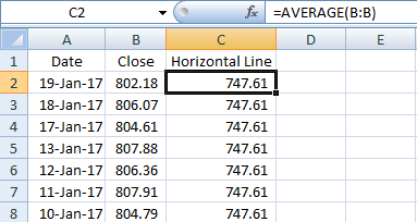
I’ll first start with horizontal lines. If you have amounts on the y-axis then a horizontal line can act as an indicator to show if the amounts have crossed a targeted amount. In order to add a horizontal line all you’ll need to do is create another column in your table.
The key thing for this column is all the values have to be identical for each entry. I can set it to a single number and copy it down, or I can do a calculation as well. What I will use is the closing price average in this column using the AVERAGE formula. If I copy this down I am left with a value that stays constant for the entire data set.
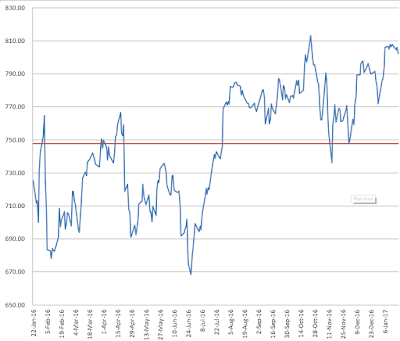
If I chart this graph using a line chart my horizontal line is now visible
Vertical Lines
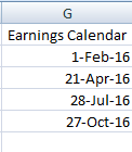
Vertical lines are a bit more tricky but not difficult. In my example I am going to put a vertical line at every earnings date since I know those days will have a lot of fluctuations and will also create quarterly intervals. I have created a column for all the earnings dates in the year, aka my earnings calendar.
Again I will need to create another column in my table.
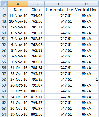
In this column I will look to see if the date for this row matches one of the dates in my earnings calendar. If there is a match, I will set the value to 1. Whether you use the MATCH formula or the VLOOKUP formula doesn’t matter. But I will use the MATCH formula in this example. The key is including the IF and ISERROR formulas because if I do not find a value it will return an error, and specifically I will use the NA() formula to return the NA error so that that amount does not appear on the chart as a zero. And if it is a match, I can make it set to 1.
First I will start with the IF function, add ISERROR, and add the MATCH function to now see if the date on this row matches anything in my earnings calendar), and if it is not a match, make it equal to an NA error, otherwise make it equal to 1 indicate a match.
My formula looks like this:
=IF(ISERROR(MATCH(A2,G:G,0)),NA(),1)
Where column G is where my earnings calendar is located.
Now I will copy my formula all the way down. It may not look terribly nice in your table with all those errors but it will get the job done.
I’m ready to chart my graph now. Select line chart again. However unlike for the horizontal line, it needs some work.
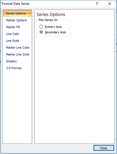
The earnings dates need to be plotted against the secondary axis. To do this, I right click on the series and click Format Data Series and select Secondary Axis.
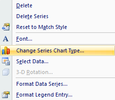
Next, I need to change the series chart type so that it is a column chart. I will right click on the series again and select Change Series Chart Type and then select a column chart.
I will go back to format the data series once more to add a border which will allow me to make the line look thicker. By going to Border Colors this time I can specify the colour, and then under Border Styles I can modify the Weight.
I will now format the secondary data axis. I will set the maximum height equal to 1, the value that I set for the earnings column when there was a match. It doesn’t matter what you set that value to, whether it is 1, 100, 1000, you will just need to change the axis accordingly to make sure that value is at least as large as your scale to have the line go all the way across. If you have values that you are currently using on your secondary axis you will want to take that into account and consider what is a good maximum value for that secondary chart, and use that value, rather than 1.
Next, I will hide the secondary axis (if you need it for other values obviously this is optional). To do this right click on the axis, click Format Axis, and set Axis Labelsto None.
Now my chart is good to go with both vertical and horizontal lines.



Add a Comment
You must be logged in to post a comment