
When comparing forecasted amounts vs actuals one way to help emphasize and highlight variances is by shading those areas. I’ll show you how to easily do that in this post.
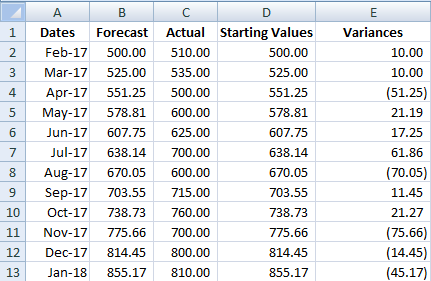
Below is my starting data set

I will need to create two extra columns to this data set. The first one I will just call Starting Values and they will match my forecasted amounts. The next column, called Variances will be equal to the actuals less forecasted values.
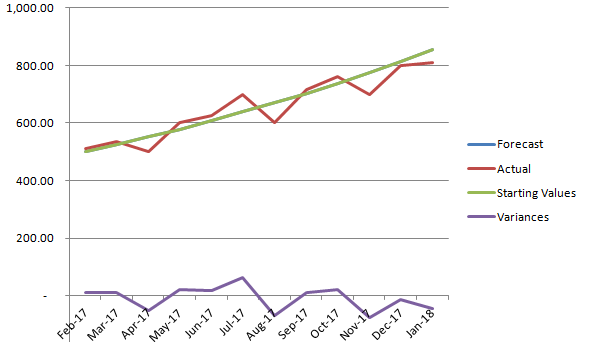
Next I will plot a line graph with these values.
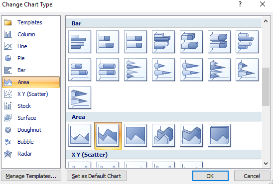
I will need to change the chart type for the starting values and variances data sets. They need to be set to the stacked area charts.
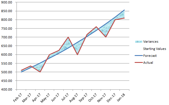
For the starting variances series, click on Format Data Series and under the Fill section select No Fill. What remains are the shaded areas in addition the line graphs. You can change the shading to a different fill colour or texture.
Add a Comment
You must be logged in to post a comment