Excel has a lot of charts and graphs that you can use to visually show data. However, there’s a way to create a graph using just a simple formula and applying some formatting to it. Below, I’ll show you how to make a bar graph easily without having to worry about legends, axis, or any other chart element you might otherwise need to manipulate.
The key function that makes this all possible is REPT, which just repeats a character a set amount of times. Here’s how it works in practice:

In the first argument, I specify the character that I want to be repeated. The | symbol, in this case, is repeated five times, which is what the second argument specifies. Right now, this doesn’t look anything like a bar chart, but that’s as easy as changing the font. Here’s how it looks like if the font is set to Britannic Bold and size 11:

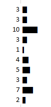
If I had several of these values, I could make it look like a bar chart pretty quickly. Below are some random numbers from 1-10 and how I turned them into a bar chart using the earlier formula:

In the above formulas, I replaced the second argument with the numbers specified above. If an item had the number 10, the | character would be repeated 10 times.
Scaling the bar graph
Now, if you’re dealing with really small or really large numbers, your bar graph could look very skewed. What I’d suggest doing is determining how big you want your graph to look. For a column with a width of 15, I found that 35 characters would fill the bar chart all the way to the end of the cell (using the font type, size and character that I used above).
So to help make sure that my data was properly scaled, I’d calculate the maximum number from my data set, divide the specified number by that, and then multiply it by 35.
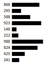
Here’s another example with numbers between 100-1,000, if I were not to adjust anything from the previous formula:

If I were to use the above formula as is, you can see my bar chart is going to explode with bigger numbers. So what I’d want to do is adjust the number of times the characters above repeat, to a maximum of 35.
First, I need to determine what value should maximize the cell or bar chart. In the above data set, 988 is the largest number. However, if my scale goes up to 1,000, that might be a better number to use as the maximum.
In that case, my formula for the number of repeats will look something like this: (value/1000)*35. That way, for the value 988, that will return 34.58 as the number of times I’ll repeat the | character. If I use that formula for the data, here’s how it looks now:

Adding more formatting
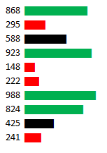
Now, I’ve got a bar chart that looks a lot more contained. However, this is still kind of a bit boring. So what I can do is add some conditional formatting to help make some of the items stand out a bit more:

In the above example, I set rules for anything below 300 to be highlighted red and anything above 800 to be green. When applying the conditional formatting, make sure you’re changing the font color, not the fill color. For more information on how to set up conditional formatting, check out this post.
If you liked this post on How to Make a Bar Graph in Excel Using a Formula, please give this site a like on Facebook and also be sure to check out some of the many templates that we have available for download. You can also follow us on Twitter and YouTube.


Add a Comment
You must be logged in to post a comment