A stacked chart in Excel allows users to take advantage of the best of both worlds: a column chart that shows period-over-period totals and a pie chart that can show what made up those totals. It can be a very useful chart, but knowing how to structure it is half the battle.
In my example, I pulled Alphabet’s earnings for the most recent four quarters. I wanted to show a) the period-over-period sales as well as where those sales went, and how much flowed through to the company’s operating income.
Below is the table that I used:
The key things is you want to make sure that all your categories add up to the amount that you’re trying to reconcile (in my case, it’s revenue).
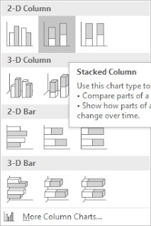
Once the data is ready, select the data and insert a Stacked Column
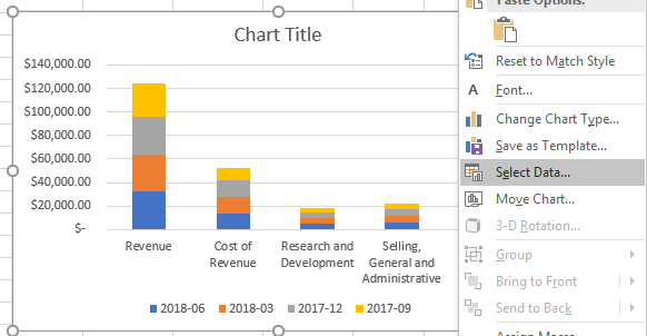
In my example, the categories showed on the horizontal axis, which is not what I wanted, so in order to fix that, right click on the chart and press Select Data
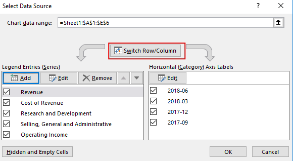
From there, you want to hit the button to switch row/column:
This will give you a stacked chart. The problem, however, is that my total (revenue) is mixed into this, and that’s not going to give me the desired result. After all, I want to see where the revenue goes, not include the revenue in my categories.
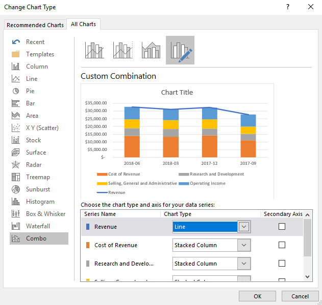
To fix this, you’ll want to right click on one of your column charts and select Change Series Chart Type
That should take you to the Combo section. If it doesn’t, make sure to select it. All your series should show a stacked chart. You’ll want to change the revenue series to a Line chart. By doing so, it will not contribute to the stacked chart and now it’ll simply be made up of the other categories.
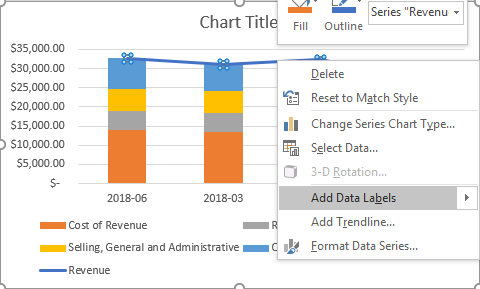
Next, add data labels for the line chart so now you’ll see the totals. To do this, right click on the line chart and click Add Data Labels
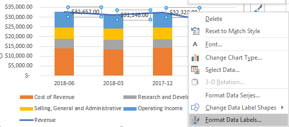
The problem is the labels show to the right, and it probably makes more sense for these labels to show above the stacked chart. Right click on any of the labels and select Format Data Labels
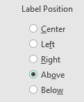
Make sure that for the label position, Above is selected
Now my chart is starting to come together:
Except I still have that line going over the top of the stacked charts. To get rid of the line, right click on the line chart and select Format Data Series
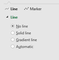
Select No line from the Line section
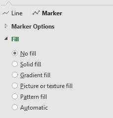
Now, select the Marker and make sure the fill option is set to No Fill
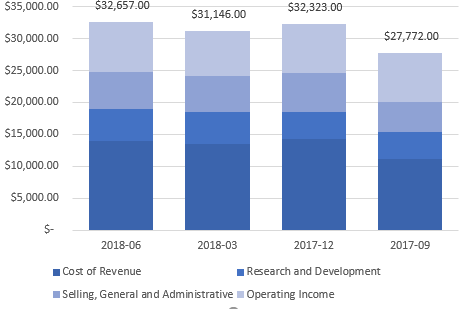
Now, I’ve gotten rid of the line completely:
At this point it just comes down to designing the chart how you want it. Some of the changes I made included:
- Getting rid of ‘Revenue’ from the legend
- Changing the color theme
- Shrinking the gaps between the stacked charts






Add a Comment
You must be logged in to post a comment